
7. Working with Type
This lesson will take approximately an hour to complete. If needed, remove the previous lesson folder from your hard disk, and copy the Lesson07 folder onto it.
![]()
Text as a design element plays a major role in your illustrations. Like other objects, type can be painted, scaled, rotated, and so on. In this lesson, discover how to create basic text and interesting text effects.
Getting started
You’ll be working in one art file during this lesson, but before you begin, restore the default preferences for Adobe® Illustrator® CS5. Then open the finished art file for this lesson to see the illustration.
1. To ensure that the tools and panels function as described in this lesson, delete or deactivate (by renaming) the Adobe Illustrator CS5 preferences file. See “Restoring default preferences” on page 3.
2. Start Adobe Illustrator CS5.
Note
If you have not already done so, copy the resource files for this lesson onto your hard disk from the Lesson07 folder on the Adobe Illustrator CS5 Classroom in a Book CD. See “Copying the Classroom in a Book files” on page 2.
3. Choose File > Open. Locate the file named L7end_1.ai in the Lesson07 folder in the Lessons folder that you copied onto your hard disk.
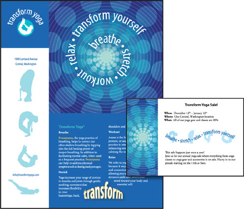
In this lesson, you will create the text for this poster. Leave it open for reference, or choose File > Close without saving.
4. Choose File > Open. In the Open dialog box, navigate to the Lesson07 folder in the Lessons folder. Open the L7start_1.ai file.
This file already has non-text components in it. You will build all the text elements to complete the poster.
5. Choose File > Save As. In the Save As dialog box, navigate to the Lesson07 folder and name the file yoga.ai. Leave the Save As Type option set to Adobe Illustrator (*.AI) (Windows) or the Format option set to Adobe Illustrator (ai) (Mac OS), and click Save. In the Illustrator Options dialog box, leave the Illustrator options at their default settings, and then click OK.
6. Choose View > Smart Guides to deselect smart guides.
7. Choose Window > Workspace > Essentials.
Working with type
Type features are some of the most powerful aspects of Illustrator. You can add a single line of type to your artwork, create columns and rows of text like in Adobe InDesign, flow text into a shape or along a path, and work with letterforms as graphic objects.
You can create text in three different ways: as point type, area type, and text along a path. Following is a short description of each type of text:
• Point type is a horizontal or vertical line of text that begins where you click and expands as you enter characters. Each line of text is independent—the line expands or shrinks as you edit it, but doesn’t wrap to the next line. Entering text this way is useful for adding a headline or a few words to your artwork.
• Area type uses the boundaries of an object to control the flow of characters, either horizontally or vertically. When the text reaches a boundary, it automatically wraps to fit inside the defined area. Entering text this way is useful when you want to create one or more paragraphs, such as for a brochure.
• Type on a path flows along the edge of an open or closed path. When you enter text horizontally, the characters are parallel to the baseline. When you enter text vertically, the characters are perpendicular to the baseline. In either case, the text flows in the direction in which points were added to the path.
Next, you will create point type, and then you will create area type. Later in this lesson you will also create type on a path.
Creating point type
When typing text directly into a document, you select the Type tool and click where you’d like the text. When the cursor appears, you can begin typing.
Next, you will enter a subhead on artboard 1 (of 2).
1. Select the Zoom tool (![]() ) in the Tools panel and click the bottom yoga figure on the left three times.
) in the Tools panel and click the bottom yoga figure on the left three times.
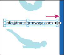
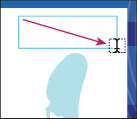
2. Select the Type tool (![]() ) and click above and to the left of the bottom yoga figure. The cursor appears on the artboard. Type [email protected].
) and click above and to the left of the bottom yoga figure. The cursor appears on the artboard. Type [email protected].

By clicking with the Type tool, you create point type. Point type is a line of text that keeps going until you stop typing or press Return or Enter. It’s very useful for headlines.
3. Select the Selection tool (![]() ) in the Tools panel and notice the bounding box around the text. Drag the bounding point on the right to the right. Notice that the text stretches as you drag.
) in the Tools panel and notice the bounding box around the text. Drag the bounding point on the right to the right. Notice that the text stretches as you drag.
Note
Point type that is scaled as in step 3 is still printable, but the font size may not be a whole number (such as 12pt).
4. Choose Edit > Undo Scale.
Creating area type
To create area type, you click with the Type tool where you want the text, and drag to create an area type object. When the cursor appears, you can type. You can also convert an existing shape or object to a type object by clicking on or inside the edge of the object with the Type tool.
Next, you will create area type and enter an address.
1. With the Selection tool (![]() ), hold down the spacebar and drag the artboard down to pan to the top yoga figure in the white area on the left side of the artboard.
), hold down the spacebar and drag the artboard down to pan to the top yoga figure in the white area on the left side of the artboard.
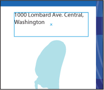
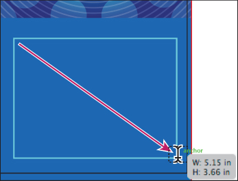
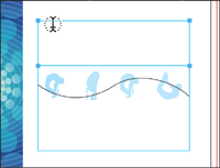
2. Select the Type tool (![]() ), and then drag from the upper left to the lower right to create a rectangle above the top yoga figure. The cursor appears in the new type object.
), and then drag from the upper left to the lower right to create a rectangle above the top yoga figure. The cursor appears in the new type object.
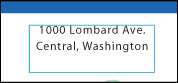
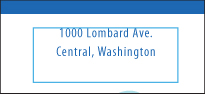
3. Type 1000 Lombard Ave. Central, Washington. The text wraps inside of the type object.
You will now adjust how the text wraps.
Note
For now, keep the default settings for type formatting.
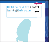
4. Select the Selection tool and notice the bounding box appears that around the address. Drag the right center bounding point to the right and then to the left, noticing how the text wraps within the object. Drag until only the text “1000 Lombard Ave.” appears on the first line.
Note
If the text is already wrapping correctly, try dragging the edge of the bounding box to see how it affects the text.
5. Choose Select > Deselect, and then choose File > Save.
Area type versus point type
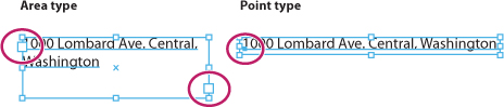
Illustrator provides visual indications to help you tell the difference between point type and area type. With the Selection tool, click to select text and its bounding box.
Area type has two extra boxes, called ports. Ports are used to thread (flow) text from one type area to another. Working with ports and threading is covered later in this lesson. Point type, when selected, does not have ports; instead, it has a point before the first letter in the first line.
Importing a plain text file
You can import text into artwork from a file that was created in another application. Illustrator supports the following formats for importing text:
• Microsoft Word for Windows 97, 98, 2000, 2002, 2003, and 2007
• Microsoft Word for Mac OS X, 2004, and 2008
• RTF (Rich Text Format)
• Plain text (ASCII) with ANSI, Unicode, Shift JIS, GB2312, Chinese Big 5, Cyrillic, GB18030, Greek, Turkish, Baltic, and Central European encoding
You can also copy and paste text, but formatting can be lost when text is pasted. One of the advantages of importing text from a file rather than copying and pasting it, is that imported text retains its character and paragraph formatting. For example, text from an RTF file retains its font and style specifications in Illustrator.
Next you will place text from a simple text file.
1. Double-click the Hand tool (![]() ) to fit the artboard in the window. Choose View > Smart Guides to select the smart guides.
) to fit the artboard in the window. Choose View > Smart Guides to select the smart guides.
2. Before importing text, create an area type object by selecting the Type tool (![]() ) and dragging from the upper-left corner of the guide box that has been provided to the lower-right corner.
) and dragging from the upper-left corner of the guide box that has been provided to the lower-right corner.
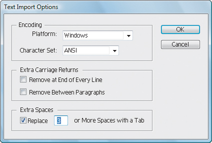
3. Choose File > Place. Navigate to the Lesson07 folder in the Lessons folder, select the L7copy.txt file, and click Place.
Note
If you place text without creating a type area, the type area that is created automatically. The type area spans most of the artboard, by default.
4. In the Text Import Options dialog box, you can set options prior to importing text. Leave the default settings, and click OK.
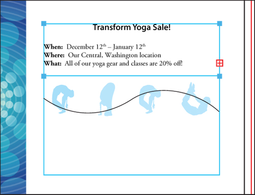
The text is now placed in a type object. You will learn how to apply attributes to format text later in this lesson. Also, if you see a red plus sign (![]() ) in the lower-right corner of the type object, this indicates that the text does not fit in the type object. You will fix this later in the lesson.
) in the lower-right corner of the type object, this indicates that the text does not fit in the type object. You will fix this later in the lesson.
5. Choose File > Save, and leave this file open.
Creating columns of text
You can create columns and rows of text easily by using the Area Type options.
1. If the type object is no longer selected, use the Selection tool (![]() ) to select it.
) to select it.
Note
If the cursor is still in the type object, you don’t have to select the text area with the Selection tool to access the Area Type options.
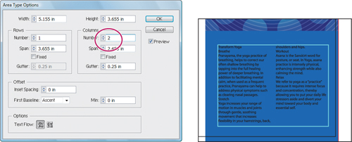
2. Choose Type > Area Type Options.
3. In the Area Type Options dialog box, select Preview. In the Columns section of the dialog box, change Number to 2., and click OK.
4. Choose Select > Deselect.
5. Choose File > Save. Leave this document open.
Understanding text flow
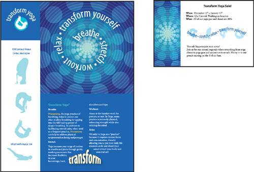
For this next section, you will place a Microsoft Word document (.doc) into a rectangle shape to create area type in the second artboard of the currently open file, yoga.ai. This will add text to a postcard that accompanies the poster.
1. Click the Next button in the status bar in the lower left of the Document window to navigate to the second artboard. Choose View > Fit Artboard In Window if the entire postcard is not showing.
2. Select the Rectangle tool (![]() ) in the Tools panel.
) in the Tools panel.
3. Press D to set the default fill (white) and stroke (black).
4. Position the pointer in the upper-left corner of the square guide in the center of the artboard and drag down and to the right to create a rectangle about 1 inch in height. The word “path” appears when the pointer snaps to the guide.
Note
The square that appears after you drag may have a black fill and/or stroke that covers the content. When the shape is converted into a type area, the fill and stroke change to None.
5. Select the Type tool (![]() ) and move it over the edge of the rectangle shape. The word “path” appears when you are near the edge of the rectangle. The text insertion cursor is in parentheses (
) and move it over the edge of the rectangle shape. The word “path” appears when you are near the edge of the rectangle. The text insertion cursor is in parentheses (![]() ), indicating that when you click, the cursor will appear inside this shape. Click to insert the cursor.
), indicating that when you click, the cursor will appear inside this shape. Click to insert the cursor.
Note
When you hold down the Type tool in the Tools panel, you see the Area Type tool. The Area Type tool converts objects to type areas. It is not necessary to switch to this tool.
6. With the cursor active in the rectangle, choose File > Place and navigate to the Lesson07 folder in the Lessons folder on your hard disk. Select the file yoga_pc.doc, and then click Place. You are placing a native Microsoft Word document, so you will have additional options to set.
7. In the Microsoft Word Options dialog box, ensure that Remove Text Formatting is deselected to keep the Word formatting. Leave the remaining settings as is. Click OK. The text appears in the square.
Note
You may have more or less text appearing in the text area than is shown in the figure. That’s not important, since you will resize the text area later in the lesson.
Notice the red plus sign that appears in the lower-right corner of the type object. This indicates that the text does not fit in the object. You will fix this in the next section.
Note
When you place a Word document and do not select Remove Text Formatting, paragraph styles that were used in Word are brought into Illustrator. Paragraph styles are discussed later.
Working with overflow text and text reflow
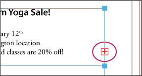
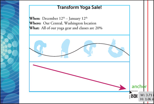
Each area type object contains an in port and an out port. The ports enable you to link to other objects and create a linked copy of the type object. An empty port indicates that all the text is visible and that the object isn’t linked. A red plus sign (![]() ) in an out port indicates that the object contains additional text, which is called overflow text.
) in an out port indicates that the object contains additional text, which is called overflow text.
There are two main methods for remedying overflow text:
• Thread the text to another type object
• Resize the type object
Threading text
To thread, or continue, text from one object to the next, you have to link the objects. Linked type objects can be of any shape; however, the text must be entered in an object or along a path, not at a point.
Next, you will thread the overset text to another type object.
1. Use the Selection tool (![]() ) to select the type object.
) to select the type object.
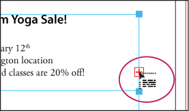
2. With the Selection tool, click the out port of the selected type object. The pointer changes to the loaded text icon (![]() ).
).
Note
If you double-click, a new type object appears. If this happens, you can either drag the new object into place, or choose Edit > Undo Link Threaded Text and the loaded text icon reappears.
3. Click below the yoga figures, on the left edge of the guide box and drag down and to the right corner of the guide box.
Tip
Another way to thread text between objects is to select an area type object, select the object (or objects) you want to link to, and then choose Type > Threaded Text > Create.
Note
With the loaded text icon, you can simply click the artboard instead of dragging to create a new type object. This creates a much larger type object.
4. Choose File > Save.
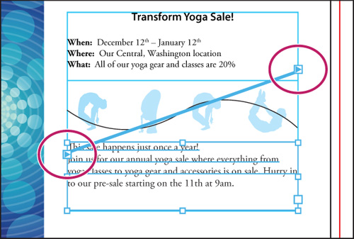
With the bottom type object still selected, notice the line between the two objects, which is the thread that tells you that the two objects are connected. Notice the out port (![]() ) of the top type object and the in port (
) of the top type object and the in port (![]() ) of the bottom type object (both circled in the figure at right). The arrow indicates that the object is linked to another object.
) of the bottom type object (both circled in the figure at right). The arrow indicates that the object is linked to another object.
Note
Your text may not look exactly like the figure. That’s OK. In the next part of the lesson, you will resize the type objects.
Note
If you delete the second type object (created in step 3), the text is pulled back into the original object as overflow text. Although not visible, the overflow text is not deleted.
Resizing type objects
For this next lesson, you will see how to resize type objects to make room for additional text.
1. Select the Selection tool (![]() ) and click the text in the top area type object.
) and click the text in the top area type object.
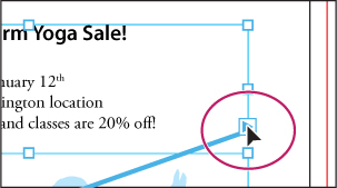
2. Double-click the out port (![]() ) in the lower-right corner of the type object.
) in the lower-right corner of the type object.
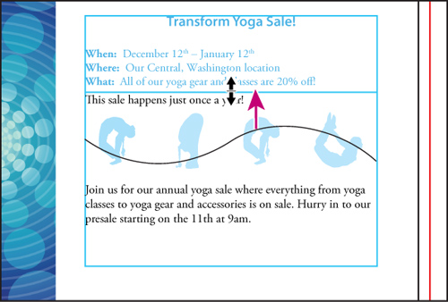
Because the type objects are threaded, double-clicking the out port or the in port breaks the connection between them. Any text threaded between the two type objects flows back into the first object. The bottom object is still there, but it has no stroke or fill.
3. Choose View > Smart Guides to deselect them.
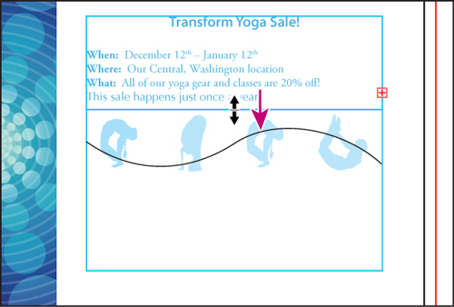
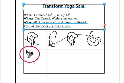
4. Using the Selection tool, drag the bottom middle handle of the bounding box down to the top of the yoga figures. The type object changes in size vertically. Notice that the further you drag down, the more text is revealed.
5. With the Selection tool, click the out port (![]() ) in the lower-right corner of the top type object. The pointer changes to the loaded text icon (
) in the lower-right corner of the top type object. The pointer changes to the loaded text icon (![]() ).
).
6. Choose View > Outline to reveal the bottom type object.
7. Position the loaded text icon (![]() ) over the edge of the bottom type object until it changes in appearance to (
) over the edge of the bottom type object until it changes in appearance to (![]() ). Click to thread the two objects together.
). Click to thread the two objects together.
8. Choose View > Preview.
9. Choose Select > Deselect.
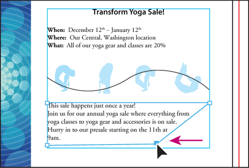
10. With the Selection tool, click to select the top type object. Drag the bottom middle handle up until the text “This sale happens just once a year!” is no longer highlighted in blue. This indicates that it will move to the next type object when the mouse button is released. Release the mouse button to see the text.
When type objects are threaded, you can move them anywhere and still maintain the connection between them. You can even thread between artboards. When type objects are resized, especially those in the beginning of the thread, text can reflow.
11. Choose File > Save.
Tip
You can create unique type object shapes by deselecting the type object and choosing the Direct Selection tool (![]() ). Drag the edge or corner of the type object to adjust the shape of the path. This method is easier to use when View > Hide Bounding Box is selected. Adjusting the type path with the Direct Selection tool is easiest when you’re in Outline view (View > Outline).
). Drag the edge or corner of the type object to adjust the shape of the path. This method is easier to use when View > Hide Bounding Box is selected. Adjusting the type path with the Direct Selection tool is easiest when you’re in Outline view (View > Outline).
Note
If you edit the type object by following the previous tip, choose Edit > Undo before continuing.
Formatting type
In this section, you’ll discover how to change text attributes, such as size, font, and style. You can quickly change most attributes in the Control panel.
1. With the yoga.ai file still open, click the Previous button (![]() ) in the status bar to return to artboard 1 (the poster).
) in the status bar to return to artboard 1 (the poster).
2. Choose View > Fit Artboard In Window if the poster isn’t completely visible in the window.
3. Select the Type tool (![]() ) in the Tools panel and insert the cursor anywhere in the text in the two column text area that you created earlier.
) in the Tools panel and insert the cursor anywhere in the text in the two column text area that you created earlier.
Tip
If you double-click text with the Selection or Direct Selection tool, the Type tool becomes selected.
4. Choose Select > All, or press Ctrl+A (Windows) or Command+A (Mac OS) to select all the text in the type object.
In this next section, you’ll learn two different methods for selecting a font.
First, you’ll change the font of selected text using the Font menu in the Control panel.
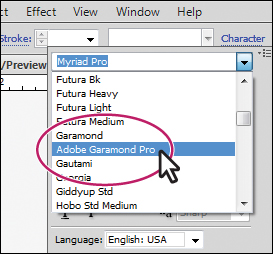
5. Click the arrow to the right of the Font menu and scroll to find and select Adobe Garamond Pro.
Note
The Adobe Garamond Pro font is in the G section of the menu (not the A section). Also, you may see the word Character instead of Font menu listed in the Control panel. Click the word Character to reveal the Character panel.
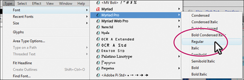
6. With the text still selected, choose Type > Font to see a list of available fonts. Scroll down and select Myriad Pro > Regular. If your font list is long, you may need to scroll quite far to find this font.
Note
You may need to click the arrow that appears at the bottom of the font list continue scrolling through the list.
7. Make sure that the text is still selected and then follow the instructions below. This next method is the most dynamic method for selecting a font.
• Click the word Character in the Control panel to reveal the Character panel.
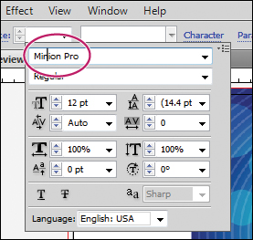
• With the font selected in the Character panel, begin typing the name Minion Pro. Illustrator filters through the list and displays the name in the field.
• Press Enter or Return to set the font.
Tip
To keep the Character panel open, choose Window > Type > Character.
8. Click the arrow in the Font Style menu, below the Font menu, to see the available styles for Minion Pro and to make sure Regular is selected.
Font styles are specific to each font family. Although you may have the Minion Pro font family on your system, you may not have the bold and italic styles of that family.
Fonts installed and on the Illustrator CS5 DVD
The following fonts and accompanying documentation are installed, and included in the Documentation folder on the Illustrator CS5 product DVD, or in the packaged download file if you download Illustrator CS5 from the Adobe Store. For trial customers, the fonts are not available until after purchase.
Changing the font size
1. If the two column text is not active, use the Type tool (![]() ) to insert the cursor in the area type object and choose Select > All.
) to insert the cursor in the area type object and choose Select > All.
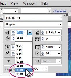
2. Type 13. pt in the Font Size field in the Control panel and press Enter or Return. Notice the text change. Choose 12 pt from the Font Size menu. Leave the text selected.
Note
You may see the word Character instead of the Font Size field in the Control panel. Click the word Character to reveal the Character panel.
The Font Size menu has preset sizes. If you want a custom size, select the value in the Font Size field, enter a value in points, and then press Enter or Return.
Tip
You can dynamically change the font size of selected text using keyboard shortcuts. To increase the font size in increments of 2 pts, press Ctrl+Shift+> (Windows), or Command+Shift+> (Mac OS). To reduce the font size, press Ctrl+Shift+< (Windows), or Command+Shift+< (Mac OS).
Changing the font color
You can change the font color of the fill and stroke of selected text. In this example, you will change only the fill.
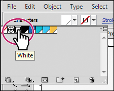
1. With the text still selected, click the Fill color in the Control panel. When the Swatches panel appears, select White. The text fill changes to white.
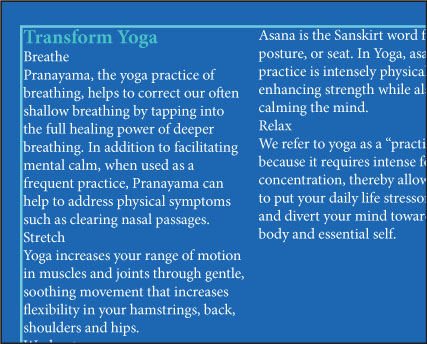
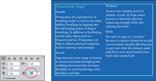
2. With the Type tool, drag to select the first line of text, Transform Yoga, in the area type object, or triple-click the text.
Tip
Double-click to select a word; triple-click to select an entire paragraph. The end of a paragraph is defined by a hard return.
3. Change the Fill color in the Control panel to Aqua.
4. Keep the first line of text selected. Select the text in the Font Size field in the Control panel and change the font size by typing 13.. Press Enter or Return.
5. Choose Bold from the Font Style menu in the Control panel to change the font style for the selected text.
6. Choose Select > Deselect.
7. Chose File > Save.
Changing additional text attributes
You can change many additional text attributes in the Character panel, which you can access by clicking the blue, underlined word Character in the Control panel. In this lesson, you will apply some of the many possible attributes, to experiment with the different ways you can format text.
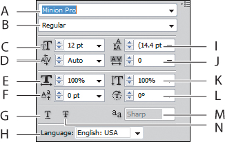
A. Font
B. Font Style
C. Font Size
D. Kerning
E. Horizontal Scale
F. Baseline Shift
G. Underline
H. Language
I. Leading
J. Tracking
K. Vertical Scale
L. Character Rotation
M. Text anti-aliasing
N. Strikethrough
1. With the Type tool, click the address above the top yoga figure on the left side of the artboard. With the cursor in the text, triple-click to select the entire paragraph.
2. Select the Zoom tool (![]() ) and click the selected text several times to zoom in.
) and click the selected text several times to zoom in.
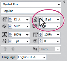
3. Click Character in the Control panel to reveal the Character panel. Click the up arrow to the left of the Leading field a few times to increase the leading to 16 pt. Leading is the vertical space between lines. Keep the Character panel open.
Tip
To reset the leading value to the default, choose Auto from the Leading menu.
Notice the change in the vertical distance between the lines. Adjusting the leading is useful for fitting text into a text area.
Next, you will change the spacing between letters.
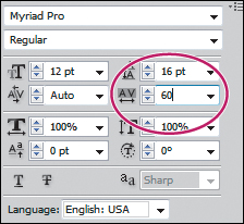
4. With the text still selected, click the Tracking icon in the Character panel to select the Tracking field. Type 60., and press Enter or Return.
Note
If the text becomes overflow text, as indicated by the red plus sign, you can fit the text into the area type object by decreasing the Tracking value, or by changing the size of the area type object with the Selection tool.
Tracking changes the spacing between characters. A positive value pushes the letters apart horizontally; a negative value pulls the letters closer together.
5. Double-click the Hand tool (![]() ) in the Tools panel to fit the artboard in the window.
) in the Tools panel to fit the artboard in the window.
6. Select the Zoom tool in the Tools panel and drag a marquee around the headline Transform Yoga, at the top of the first column in the type object.
7. Select the Type tool (![]() ) in the Tools panel and click to place the cursor at the end of the headline, Transform Yoga.
) in the Tools panel and click to place the cursor at the end of the headline, Transform Yoga.
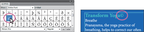
8. Choose Type > Glyphs to open the Glyphs panel.
The Glyphs panel is used to insert type characters like trademark symbols (™) or bullet points(•). It shows all the characters (glyphs) available for a given font.
Next, you will insert a copyright symbol.
9. In the Glyphs panel, scroll down until you see a copyright symbol (©). Double-click the symbol to insert it at the text insertion cursor. Close the Glyphs panel.
Tip
The Glyphs panel lets you select another font in the bottom of the panel. You can also increase the size of the glyph icons by clicking the larger mountain (![]() ) in the lower-right corner or make them smaller by clicking the smaller mountain (
) in the lower-right corner or make them smaller by clicking the smaller mountain (![]() ).
).
10. With the Type tool, drag to select the copyright symbol (©) you just inserted.
11. Choose Window > Type > Character to open the Character panel.
12. Choose Superscript from the Character panel menu (![]() ).
).

Tip
To remove kerning changes, insert the cursor in the text, and choose Auto from the Kerning menu.
13. Click with the Type tool between the word Yoga and the copyright symbol to insert the cursor.
14. Choose 75 from the Kerning menu in the Character panel. Close the Character panel group, and choose File > Save.
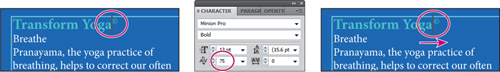
Kerning is similar to tracking, but it adds or subtracts space between a pair of characters. It’s useful for situations such as this one, when you’re working with a glyph.
Changing paragraph attributes
As with character attributes, you can set paragraph attributes, such as alignment or indenting, before you enter new type, or reset them to change the appearance of existing type. If you select several type paths and type containers, you can set attributes for them all at the same time.
Now, you’ll add more space before all the paragraphs in the column text.
1. Choose View > Fit Artboard In Window.
2. Using the Type tool (![]() ), insert the cursor in either column of the text, and choose Select > All.
), insert the cursor in either column of the text, and choose Select > All.
3. Click the word Paragraph in the Control panel to open the Paragraph panel.
4. Type 5. in the Space After Paragraph text field (in the bottom-right corner), and press Enter or Return. Setting a spacing value after paragraphs, rather than pressing the Return key, is recommended when working with large type objects.
5. Choose Select > Deselect.
Note
Your text may not look exactly like the figure above. That’s okay.
6. With the Type tool, click the address above the top yoga figure on the left side of the artboard to insert the cursor.
7. Click the Align Center button (![]() ) in the Control panel.
) in the Control panel.
Note
If you don’t see alignment options in the Control panel, click the blue, underlined word Paragraph to open the Paragraph panel.
8. Choose Select > Deselect.
9. Choose File > Save.
Saving and using styles
Styles allow you to format text consistently and are helpful when text attributes need to be globally updated. Once a style is created, you only need to edit the saved style. Then, all text formatted with that style is updated.
Illustrator provides two types of styles:
• Paragraph—Retains text and paragraph attributes and applies them to an entire paragraph.
• Character—Retains the text attributes and applies them to selected text.
Creating and using a paragraph style
1. Using the Type tool (![]() ), select the subhead Breathe. Choose Bold from the Font Style menu in the Control panel.
), select the subhead Breathe. Choose Bold from the Font Style menu in the Control panel.
Note
You may see the word Character instead of the Font Style menu in the Control panel. Click the word Character to reveal the Character panel.
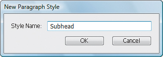
2. With the Type tool, place the cursor anywhere in the text Breathe. You do not need to select text to create a paragraph style, but you do have to place the text insertion point in the line of text that has the attributes you are going to save.
3. Choose Window > Type > Paragraph Styles, and choose New Paragraph Style from the panel menu (![]() ).
).
4. In the New Paragraph Style dialog box, type the name Subhead, and click OK. The text attributes used in the paragraph have been saved in a paragraph style named Subhead.
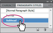
5. Apply the new paragraph style by selecting the text Breathe and then selecting the Subhead style in the Paragraph Styles panel. The text attributes are applied to the selected text.
Note
If you see a plus sign (+) to the right of the style name, the style has an override. An override is any formatting that doesn’t match the attributes defined by the style, for example, if you changed the font size for the selected paragraph. If you see the plus sign (+), press the Alt (Windows) or Option (Mac OS) key when you select the style name to overwrite existing attributes on the selected text.
Notice the Normal style in the Paragraph Styles panel. When you placed the Word document earlier in this lesson, the Normal style from Word was brought into the Illustrator document.
6. Select the text Stretch, and Alt-click (Windows) or Option-click (Mac OS) the Subhead style in the Paragraph Styles panel. Repeat this step to apply the style to the text, Workout and Relax.
Creating and using a character style
Whereas paragraph styles apply attributes to an entire paragraph, character styles can be applied to selected text only.
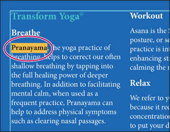
1. Using the Type tool (![]() ), select the first occurrence of the text Pranayama in the first column of the paragraph text.
), select the first occurrence of the text Pranayama in the first column of the paragraph text.
2. Choose Bold from the Font Style menu in the Control panel.
Note
You may see the word Character instead of the Font Style menu in the Control panel. Click the word Character to reveal the Character panel.
Now, you will save these attributes as a character style, and apply it to other instances in the text.
3. In the Paragraph Styles panel group, click the Character Styles panel tab.
4. In the Character Styles panel, Alt-click (Windows) or Option-click (Mac OS) the Create New Style button (![]() ) at the bottom of the Character Styles panel. Alt or Option-clicking the New Style button lets you name the style as it is added to the panel. You can also double-click a style to name and edit it.
) at the bottom of the Character Styles panel. Alt or Option-clicking the New Style button lets you name the style as it is added to the panel. You can also double-click a style to name and edit it.
5. Name the style Bold and click OK. The style records the attributes applied to your selected text.
Now, you will apply that character style to other text.
6. With the Pranayama text still selected, Alt-click (Windows) or Option-click (Mac OS) the style named Bold in the Character Styles panel to assign the style to that text. This removes any existing attributes from the text that are not part of the character style.
7. Select the next occurrence of Pranayama and apply the Bold style again.
Note
You must select the entire word rather than just placing the cursor in the text.
8. Choose Select > Deselect.
Tip
Perhaps you decide that you want to change the color of all text that is formatted with the Bold character style. Using styles (either character or paragraph), you can change the type attributes of the original style, and all instances are updated.
Next, you will change the color of the Bold character style.
9. Double-click the Bold style name in the Character Styles panel. In the Character Style Options dialog box, click the Character Color category on the left side of the dialog box and make sure that the Fill box is selected. Click the Mustard swatch in the Swatches panel that appears.
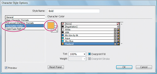
10. Select the Preview checkbox in the lower-left corner of the Character Style Options dialog box if it isn’t already selected. As you change the style formatting, the text that uses the Bold style changes automatically.
11. Click OK, and close the Character Style panel group.
12. Choose File > Save. Leave the file open.
Sampling text
Using the Eyedropper tool, you can quickly sample type attributes and apply them to text without creating a style.
1. Choose View > Fit Artboard In Window.
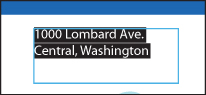
2. With the Zoom tool (![]() ), drag a marquee across the text “1000 Lombard Ave. Central, Washington,” above the top yoga figure on the left.
), drag a marquee across the text “1000 Lombard Ave. Central, Washington,” above the top yoga figure on the left.
3. Using the Type tool (![]() ), triple-click to select the paragraph.
), triple-click to select the paragraph.
4. In the Control panel, change the Fill color to blue (C=89, M=61, Y=0, K=0), the Font to Myriad Pro (if it isn’t already selected), and the Font Style to Condensed or something similar.
Note
If the word Central is included in the first line of text, use the Type tool to place the cursor before “Central” and press Shift+Enter or Shift+Return to add a soft return, pushing the text to the next line.
5. Double-click the Hand tool (![]() ) to fit the artboard in the window.
) to fit the artboard in the window.
6. Choose View > Smart Guides to select them.
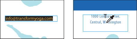
7. With the Type tool, select the text “[email protected]” above the bottom yoga figure on the left side of the artboard.
8. Select the Eyedropper tool (![]() ) in the Tools panel and click anywhere in the line of text “1000 Lombard Ave. Central, Washington.” A letter T appears above the eyedropper pointer. The attributes are immediately applied to your selected text. If the e-mail address shifts to the left, move it to its original position with the Selection tool.
) in the Tools panel and click anywhere in the line of text “1000 Lombard Ave. Central, Washington.” A letter T appears above the eyedropper pointer. The attributes are immediately applied to your selected text. If the e-mail address shifts to the left, move it to its original position with the Selection tool.
Note
If you position the Eyedropper cursor over text with smart guides selected, a line appears beneath that text, to confirm that you are clicking in the right place to sample formatting.
9. Choose Select > Deselect.
10. Choose File > Save. Leave the file open.
Reshaping text with an envelope warp
Warping text is fun because it allows you to give text a more interesting shape. An envelope warp lets you fit the text into a shape that you create or that is created for you. An envelope is an object that distorts or reshapes selected objects. You can use a preset warp shape or a mesh grid as an envelope, or you can create and edit your own using objects on the artboard.
1. Select the Type tool (![]() ) in the Tools panel. Before typing, in the Control panel, change the font family to Myriad Pro (if it is not already selected), the font style to Bold Condensed, and the font size to 48. pt.
) in the Tools panel. Before typing, in the Control panel, change the font family to Myriad Pro (if it is not already selected), the font style to Bold Condensed, and the font size to 48. pt.
2. With the Type tool, click the poster below the two columns of text once. Exact placement is not important. A cursor appears.
Note
You may want to zoom in.
3. Type the word transform.
4. Select the Selection tool (![]() ). If the text overlaps the text in the two columns above, drag it down until it no longer overlaps. Change the Fill color in the Control panel to White.
). If the text overlaps the text in the two columns above, drag it down until it no longer overlaps. Change the Fill color in the Control panel to White.
Tip
With the Type tool selected, you can temporarily switch to the Selection tool by pressing the Ctrl (Windows) or Command (Mac OS) key.
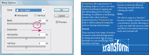
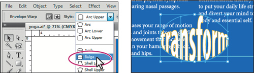
5. Select the text with the Selection tool, and then click the Make Envelope button (![]() ) in the Control panel. In the Warp Options dialog box, select Preview. The text appears as an arc.
) in the Control panel. In the Warp Options dialog box, select Preview. The text appears as an arc.
6. Choose Arc Upper from the Style menu. Drag the Bend slider to the right to see it bend up further. You can experiment with many combinations. Drag the Horizontal and Vertical Distortion sliders to see the effect on the text. When you are finished experimenting, drag the Distortion sliders to 0%, and click OK.
Note
The Make Envelope button (![]() ) does not apply an effect. It just turns the text into an envelope object. The same visual result is achieved by choosing Effect > Warp > Arc Upper. For more information about envelopes, see “Reshape using envelopes” in Illustrator Help.
) does not apply an effect. It just turns the text into an envelope object. The same visual result is achieved by choosing Effect > Warp > Arc Upper. For more information about envelopes, see “Reshape using envelopes” in Illustrator Help.
7. Use the Selection tool to move the envelope object (warped text) until the bottom of the warped text is aligned roughly with the bottom of the two columns of text.
If you want to make any changes, you can edit the text and shape separately. Next, you will edit the text transform, and then the warp shape.
8. With the warped text still selected, click the Edit Contents button (![]() ) in the Control panel. This is how you edit the text in the warped shape.
) in the Control panel. This is how you edit the text in the warped shape.
9. Using the Type tool, position the cursor over the warped text. Notice the text transform text is in blue and is underlined. The smart guides show you the original text. Click the text transform to insert the cursor, and then double-click to select it.
Note
If you double-click with the Selection tool instead of the Type tool, you enter isolation mode. Press Escape to exit isolation mode.
10. Type workout and notice the text warps automatically in the arc upper shape. Choose Edit > Undo Typing to return to the original text.
Note
Notice that the text you are editing seems to float in the warped shape, which indicates that the text is being forced into the shape. It is still editable as text.
11. In the Control panel, change the Stroke Weight to .75 pt, and the Stroke color to Mustard. Press Escape to close the Swatches panel.
Notice that the attributes are applied to the warped text. Next, you will edit the warp shape.
12. With the Selection tool, make sure that the warped text is still selected. Click the Edit Envelope button (![]() ) in the Control panel.
) in the Control panel.
13. Choose Bulge from the Select Warp Style menu in the Control panel. Notice the other options in the Control panel, such as Horizontal, Vertical, and Bend. Choose Arc Upper to return to the arc upper shape.
Note
You may have to reposition the warped text to align it with the bottom of the columns of text. Changing the warp style may move the text on the artboard.
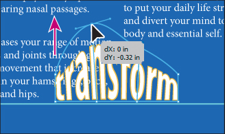
14. Select the Direct Selection tool (![]() ) in the Tools panel. Notice the anchor points around the warped shape. First, click to select the anchor point above the letter “n” in transform. Then, drag the selected point up to change the warp shape.
) in the Tools panel. Notice the anchor points around the warped shape. First, click to select the anchor point above the letter “n” in transform. Then, drag the selected point up to change the warp shape.
Tip
To take the text out of the warped shape, select the text with the Selection tool and choose Object > Envelope Distort > Release. This gives you two objects: the text and the arc upper shape.
15. Choose Edit > Undo Move to return the shape to the arc upper shape.
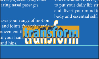
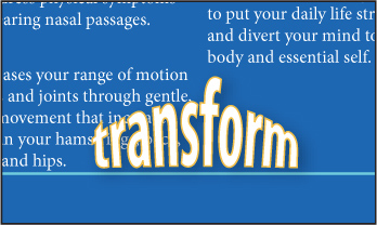
Next, you will add a drop shadow effect to the warped text.
16. Switch to the Selection tool and click transform.
17. Choose Effect > Stylize > Drop Shadow from the Illustrator effects. In the Drop Shadow Options dialog box, change Opacity to 30.%, X Offset to 3. pt, Y Offset to 3. pt, and Blur to 3. pt, and click OK.
18. Choose Select > Deselect, and File > Save. Leave the file open.
Wrapping text around an object
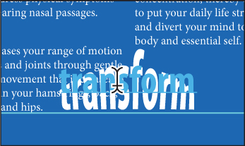
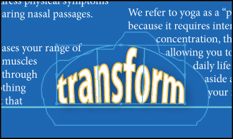
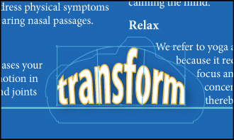
You can create interesting and creative results by wrapping text around an object. Next, you will wrap text around the warped text.
1. With the Selection tool, click to select the warped text, transform.
2. Choose Object > Text Wrap > Make. The text in the two columns wraps around the warped text, transform.
Note
To wrap text around an object, the wrap object must be in the same layer as the text and located directly above the text in the layer hierarchy.
3. With the Selection tool, drag the transform text to see the effect on the text in the two columns.
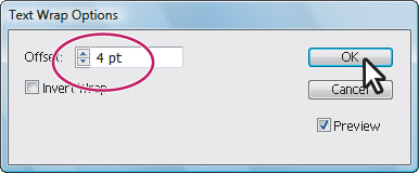
4. If text is flowing in areas where you don’t want it, choose Object > Text Wrap > Text Wrap Options. In the Text Wrap Options dialog box, change Offset to 4. and select Preview to see the change. Click OK.
5. Using the Selection tool, reposition the text transform to create a better text flow. For this example, it is okay if some of your text overflows out of the text area.
6. Choose Select > Deselect.
7. Choose File > Save. Keep the file open.
Creating text on open paths
Using the Type tools, you can type on paths and shapes to flow text along the edge of an open or closed path.
1. Click the Next button (![]() ) in the status bar in the lower left of the Document window to navigate to the second artboard.
) in the status bar in the lower left of the Document window to navigate to the second artboard.
2. Choose View > Fit Artboard In Window if the entire postcard is not showing.
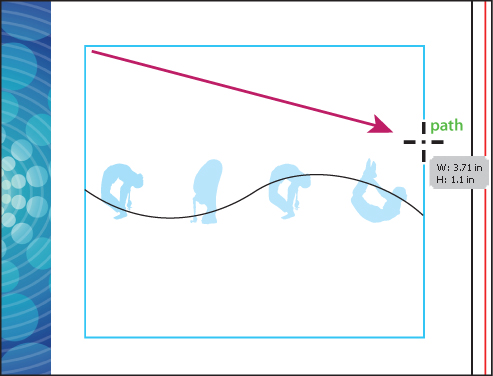
3. With the Selection tool (![]() ), select the wavy path crossing the yoga figures.
), select the wavy path crossing the yoga figures.
Tip
To quickly switch to the Selection tool and back to the Type tool, press the Ctrl (Windows) or Command (Mac OS) key.
4. With the Type tool (![]() ), cross the cursor over the left side of the path to see an insertion point with an intersecting wavy path (
), cross the cursor over the left side of the path to see an insertion point with an intersecting wavy path (![]() ). Click when this cursor appears. The stroke attributes change to None and a cursor appears. Don’t type yet.
). Click when this cursor appears. The stroke attributes change to None and a cursor appears. Don’t type yet.
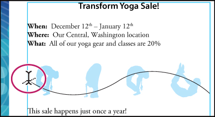
5. Change the font size to 20. pt in the Control panel. Change the Fill color to blue (C=89, M=61, Y=0, K=0). Make sure that the font is Myriad Pro and change the font style to Condensed.
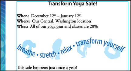
6. Type the word breathe and press the spacebar to add a space. Note that the newly typed text follows the path.
7. Choose Type > Glyphs, and find a bullet point in the Glyphs panel. Double-click to insert the bullet point. Keep the Glyphs panel open. Insert a space after the inserted bullet.
8. Type the text stretch • relax • transform yourself. Add a space before and after each bullet point.
9. Close the Glyphs panel.
Note
If the text doesn’t fit on the path, a small box with a plus sign (+) appears at the bottom of the bounding box. You can make the font size smaller or the line bigger, among other options.
10. Choose Select > Deselect.
11. Click in the text you just typed with the Type tool. In the Control panel, make sure the Align Center button (![]() ) is selected to center the text on the path.
) is selected to center the text on the path.
Note
Click the word Paragraph if the align options are not visible.
Note
You can apply any character and paragraph formatting you want to the text on the path.
12. With the Selection tool, make sure that the text path is still selected. In the Control panel, change Opacity to 60.% to make the text semitransparent.
Note
If you don’t see the opacity settings in the Control panel, you can open the Transparency panel by choosing Window > Transparency.
13. Choose Select > Deselect, and then File > Save.
Creating text on closed paths
Now, you will put text on a closed path.
1. Click the Previous button in the status bar in the lower left of the Document window to navigate to the first artboard.
2. Choose View > Fit Artboard In Window if the entire poster is not showing. Select the Zoom tool (![]() ) in the Tools panel and click the blue circle with the yoga figure in the upper-left corner of the poster three times to zoom in.
) in the Tools panel and click the blue circle with the yoga figure in the upper-left corner of the poster three times to zoom in.
3. With the Selection tool (![]() ), select the aqua circle behind the yoga figure.
), select the aqua circle behind the yoga figure.
Next, you will copy the blue circle so that you can put text on it. This is necessary because putting text on the existing aqua circle would remove the stroke and fill of that circle. Remember, putting text on a path removes the stroke and fill from the path.
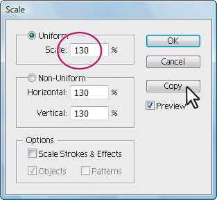
4. Double-click the Scale tool (![]() ) in the Tools panel to open the Scale dialog box. In the Scale dialog box, change Uniform Scale to 130., and click Copy to make a copy of the circle. This makes a copy that is 130% larger than the original circle.
) in the Tools panel to open the Scale dialog box. In the Scale dialog box, change Uniform Scale to 130., and click Copy to make a copy of the circle. This makes a copy that is 130% larger than the original circle.
Note
Read more about transforming objects in Lesson 4, “Transforming Objects.”
5. Switch to the Type tool. While pressing the Alt (Windows) or Option (Mac OS) key, move the pointer across the left side of the circle. The insertion point with an intersecting wavy path (![]() ) appears. Click, but don’t type. The path now has a stroke and fill of None, but the type will have a black fill, and a cursor is on the path.
) appears. Click, but don’t type. The path now has a stroke and fill of None, but the type will have a black fill, and a cursor is on the path.
6. In the Control panel, change the font size to 30. pt, the font to Myriad Pro (if not already selected), the font style to Condensed or something similar, and the Fill color to White.
7. Click the Align Left button (![]() ) in the Control panel.
) in the Control panel.
8. Type transform yoga. The text flows on the circular path.
Note
Instead of using the Alt (Windows) or Option (Mac OS) key, you can select the Type On A Path tool by holding down the Type tool in the Tools panel.

9. To adjust the placement on the path, switch to the Selection tool. The type object is selected. Brackets appear at the beginning of the type, at the end of the path, and at the midpoint between the start and end brackets.
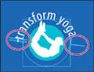
Note
It may look like there are only two brackets. That’s because the start and end brackets are next to each other on the left side of the circle.
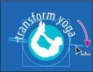
10. Position the cursor over the center bracket until a small icon (![]() ) appears next to the cursor. Drag the center bracket along the outside of the path. Press the Ctrl (Windows) or Command (Mac OS) key to prevent the type from flipping to the other side of the path. Position the text so that it is relatively centered across the top of the circle.
) appears next to the cursor. Drag the center bracket along the outside of the path. Press the Ctrl (Windows) or Command (Mac OS) key to prevent the type from flipping to the other side of the path. Position the text so that it is relatively centered across the top of the circle.
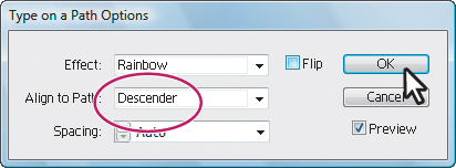
11. With the path type object selected with the Selection tool, choose Type > Type On A Path > Type On A Path Options. In the Type On A Path Options dialog box, select Preview, and then choose Skew from the Effect menu. Select other options from the Effect menu, and then change the effect to Rainbow. Choose Descender from the Align To Path menu. Click OK.
Note
Read more about Type On A Path options in Illustrator Help. Search for, “Creating type on a path.”
12. Choose Select > Deselect.
13. Choose File > Save, and leave the file open.

Creating text outlines
When creating artwork for multiple purposes, it is a good idea to create outlines of text so that the file recipient doesn’t need to have your fonts installed in order to open and use the file correctly. Always keep your original artwork because you cannot change outline text back to editable text.
1. Click the Next button in the status bar in the lower left of the Document window to navigate to the second artboard.
2. Choose View > Fit Artboard In Window if the entire postcard is not showing.
3. Select the Type tool (![]() ) in the Tools panel and click away from the left edge of the postcard artboard on the canvas.
) in the Tools panel and click away from the left edge of the postcard artboard on the canvas.
4. Change the Fill color in the Control panel to blue (C=89, M=61, Y=0, K=0).
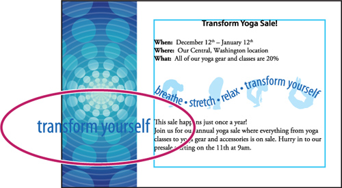
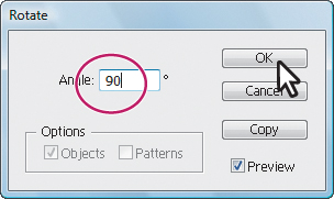
6. Double-click the Rotate tool (![]() ) in the Tools panel. In the Rotate dialog box, type 90. in the Angle field. Click OK. The text is rotated 90 degrees counterclockwise.
) in the Tools panel. In the Rotate dialog box, type 90. in the Angle field. Click OK. The text is rotated 90 degrees counterclockwise.
7. With the Selection tool (![]() ), position the text in the lower-right corner of the blue background image on the left.
), position the text in the lower-right corner of the blue background image on the left.
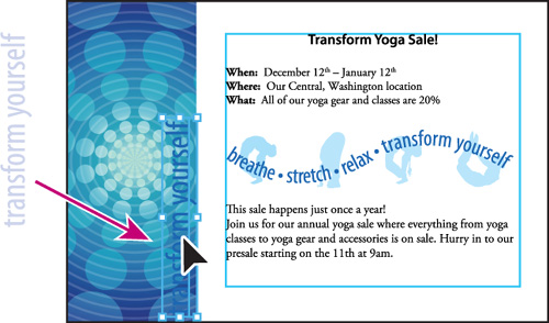
8. Using the Selection tool, Shift-click the upper-right handle of the bounding box of the text and drag to proportionally enlarge the text to the height of the postcard.
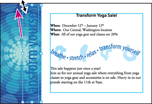
Note
If the descender of the letters appear in the white area to the right, then drag the text to the left.
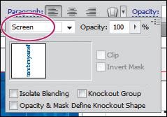
9. Click the word Opacity in the Control panel to open the Transparency panel. Choose Screen from the Blending Mode menu.
10. With the text area still selected with the Selection tool, choose Type > Create Outlines. The text is no longer linked to a particular font. Instead, it is now artwork, much like any other vector art in your illustration. Choose Select > Deselect.
Tip
One benefit of creating outlines from text is that it allows you to fill the text with a gradient. If you want a gradient fill and also want to maintain text editing control, select the text with the Selection tool, and choose Effect > Path > Outline Object.
11. Choose File > Save.
Exploring on your own
Experiment with text features by integrating paths with illustrations. Use the clip art provided in the Lesson07 folder and try some of these type techniques:
• coffee.ai—Using the Pen tool, create paths representing steam rising from the coffee cup. Create text on the wavy paths and apply varying levels of opacity.

• airplane.ai—Complete a banner following the airplane by including your own text.

Take the project further by using this artwork to create a one-page sales flyer that has the following text elements on the page:
• Using the placeholder.txt file in the Lesson07 folder, create a three-column text area.
• Use the graphic of the pizza or plane for a text wrap.
• Create a masthead across the top of your page that has text on a curve.
• Create a paragraph style.
• On the yoga poster, choose View > Outline to see all the paths on the page. Notice a spiral shape at the top of the page. Try adding text to that spiral path and choose Type > Type On A Path > Type On A Path Options to change the attributes.
Review questions
1 Name two methods for creating a text area in Adobe Illustrator CS5.
2 What are two benefits of using an OpenType font?
3 What is the difference between a character and paragraph style?
4 What are the advantages and disadvantages of converting text to outlines?
Review answers
1. The following three methods can be used for creating text areas:
• With the Type tool, click the artboard, and start typing when the cursor appears. A text area is created to accommodate the text.
• With the Type tool, drag to create a text area. Type when a cursor appears.
• With the Type tool, click a path or closed shape to convert it to text on a path or a text area. Alt-clicking (Windows) or Option-clicking (Mac OS) when crossing over the stroke of a closed path creates text around the shape.
2. The two main benefits of OpenType fonts are cross-platform compatibility (they work the same on both Windows and Mac OS), and support of widely expanded character sets and layout features, which provide richer linguistic support and advanced typographic control.
3. A character style can be applied to selected text only. A paragraph style is applied to an entire paragraph. Paragraph styles are best for indents, margins, and line spacing.
4. Converting type to outlines eliminates the need to send the fonts along with the file when sharing with others. You can also fill the type with a gradient and create interesting effects on individual letters. However, when you create outlines from text, you should consider the following:
• Text is no longer editable. The content and font cannot be changed for outlined text. It is best to save a layer with the original text, or use the Outline Object effect.
• Bitmap fonts and outline protected fonts cannot be converted to outlines.
• Outlining text that is less than 10 points in size is not recommended. When type is converted to outlines, the type loses its hints—instructions built into outline fonts to adjust their shape to display or print optimally at many sizes. When scaling type, adjust its point size before converting it to outlines.
• You must convert all type in a selection to outlines; you cannot convert a single letter within a string of type. To convert a single letter into an outline, create a separate type area containing only that letter.