Here in this last chapter on filters, we'll cover three often-overlooked but important entries — Custom, Displace, and Pattern Maker — that enable you to create your own, custom-tailored special effects. Custom and Displace require some mathematical reasoning skills, and even then, you'll probably have occasional difficulty predicting the outcomes. It's not like other filters where you drag a slider and watch the Preview change, so you know when to stop or reverse your adjustments. With these first two filters, you're using numbers to make changes to the image, and you don't see the results until you've entered the numbers. Pattern Maker isn't quite so math-dependent.
Now, if math isn't your strong suit, or worse, if you simply hate dealing with any mathematical stuff, by all means don't put yourself through the torture; you can skip ahead to the Pattern Maker coverage at the end of this chapter. In defense of mathematical bravery, however, there are some cool results to be had by using these filters; but your life will remain rich and worth living, even if you choose to skip them.
If you'd like to read about some of the more math-free custom effects, skip all the mathematical background in this chapter and read the sections on applying custom values and using displacement maps, for some specific, visually exciting effects. As stated, you also find out about making your own patterns and textures with filters, something that should make you feel better if the whole math thing has you depressed.
The Custom filter enables you to design your own convolution kernel, which is a variety of filter in which neighboring pixels get mixed together. The kernel can be a variation on sharpening, blurring, embossing, or a half-dozen other effects. You create your filter by entering numerical values into a matrix of options.
When you choose Filter
Like most of Photoshop's filters, the Custom filter also includes a constantly updating preview box, which you'll have lots of time to appreciate if you decide to try your hand at designing your own effects. Select the Preview check box to view the effect of the kernel in the image window as well.
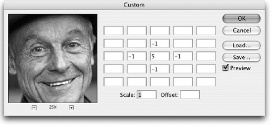
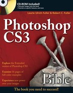
Figure 12.1. The Custom dialog box lets you design your own convolution kernel by multiplying the brightness values of pixels.
Here's how the filter works: When you press Enter or Return to apply the values in the Custom dialog box to a selection, the filter passes over every pixel in the selection, one at a time. For each pixel being evaluated — called the "PBE" from here on out, just to save ink and paper — the filter multiplies the PBE's current brightness value by the number in the center option box (the one that contains a 5 in Figure 12.1). To help keep things straight, this value is referred to as the CMV, for central matrix value.
The filter then multiplies the brightness values of the surrounding pixels by the surrounding values in the matrix. For example, Photoshop multiplies the value in the option box just above the CMV by the brightness value of the pixel just above the PBE. It ignores any empty matrix option boxes and the pixels they represent.
Finally, the filter totals the products of the multiplied pixels, divides the sum by the value in the Scale option, and then adds the Offset value to calculate the new brightness of the PBE. It then moves on to the next pixel in the selection and performs the calculation all over again. Figure 12.2 shows a schematic drawing of the process.
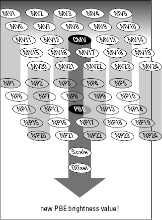
Figure 12.2. The Custom filter multiplies each matrix value by the brightness value of the corresponding pixel, adds the products together, divides the sum by the Scale value, adds the Offset value, and applies the result to the pixel being evaluated.
Perhaps seeing all this spelled out in an equation will help you understand the process; or, you may now know that you have absolutely no interest in using this filter and will be quickly flipping to the latter sections on displacement maps. Either way, here it is. Note that in the following equation, NP stands for neighboring pixel and MV stands for the corresponding matrix value in the Custom dialog box.
New brightness value = ( ( (PBE × CMV) + (NP1 × MV1) + (NP2 × MV2) + . . .) ÷ Scale) + Offset
Luckily, Photoshop calculates the equation without any help from you. All you have to do is punch in the values and see what happens.
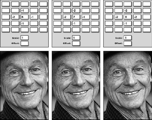
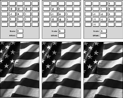
Now obviously, if you go around multiplying the brightness value of a pixel too much, you end up making it white. And a filter that turns an image white is pretty much useless. The key, then, is to filter an image and at the same time maintain the original balance of brightness values. To achieve this, just be sure that the sum of all values in the matrix is 1. For example, the default values in the matrix shown back in Figure 12.1 are 5, −1, −1, −1, and −1, which add up to 1. If the sum is greater than 1, use the Scale value to divide the sum down to 1. Figures 12.3 and 12.4 show the results of increasing the CMV to 6, 7, and 8. This raises the sum of the values in the matrix to 2, then 3, and finally 4.
In Figure 12.3, the sum was entered into the Scale option to divide the sum back down to 1; any value divided by itself is 1, after all. The result is that Photoshop maintains the original color balance of the image while at the same time filtering it slightly differently. When the Scale value was not raised, the image became progressively lighter, as illustrated in Figure 12.4.
Figure 12.3. Raising the Scale value to reflect the sum of the values in the matrix maintains the color balance of the image.
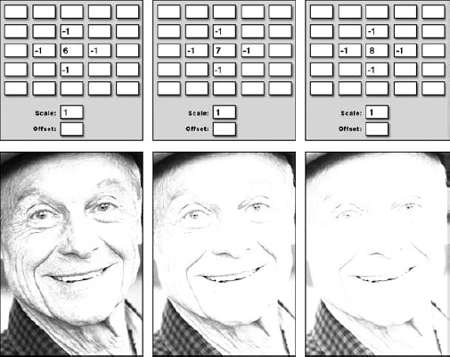
Figure 12.4. Raising the sum of the matrix values without counterbalancing it in the Scale option lightens the image.
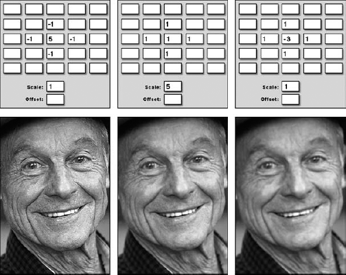
If the sum is less than 1, increase the CMV until the sum reaches the magic number. For example, in Figure 12.5, the values were lowered to the left of the CMV and then above and to the right of the CMV by 1 apiece to increase the sharpening effect. To ensure that the image did not darken, the CMV was also raised to compensate. When the CMV was not raised, the image turned black.
Tip
Although a sum of 1 provides the safest and most predictable filtering effects, you can use different sums, such as 0 and 2, to try out more destructive filtering effects. If you do, be sure to raise or lower the Offset value to compensate. For some examples, see the "Non-1 variations" section later in this chapter.
The following sections show you ways to sharpen, blur, and otherwise filter an image using specific matrix, Scale, and Offset values. We hope that, by the end of the Custom filter discussions, you not only know how to repeat the following examples, but also how to apply what you've learned to design special effects of your own.
Values that are symmetrical both horizontally and vertically surrounding the central matrix value produce sharpen and blur effects:
Sharpening: A positive CMV surrounded by negative values sharpens an image, as demonstrated in the first example of Figure 12.6. Figures 12.3 through 12.5 also demonstrate varying degrees of sharpening effects.
Blurring: A positive CMV surrounded by symmetrical positive numbers — balanced, of course, by a Scale value as explained in the preceding section — blurs an image, as demonstrated in the second example of Figure 12.6.
Blurring with edge detection: A negative CMV surrounded by symmetrical positive values blurs an image and adds an element of edge detection, as illustrated in the last example of the figure. These effects are unlike anything provided by Photoshop's standard collection of filters.
The Custom command provides as many variations on the sharpening theme as the Unsharp Mask filter. In a sense, it provides even more, for whereas the Unsharp Mask filter requires you to sharpen an image inside a Gaussian radius, you get to specify exactly which pixels are taken into account when you use the Custom filter.
To create Unsharp Mask–like effects — well, more like the Sharpen tool, actually — enter a large number in the CMV and small values in the surrounding option boxes, as demonstrated in the first two examples of Figure 12.7. To go beyond Unsharp Mask, you can violate the radius of the filter by entering values around the perimeter of the matrix and ignoring options closer to the CMV, as demonstrated in the last example of Figure 12.7.
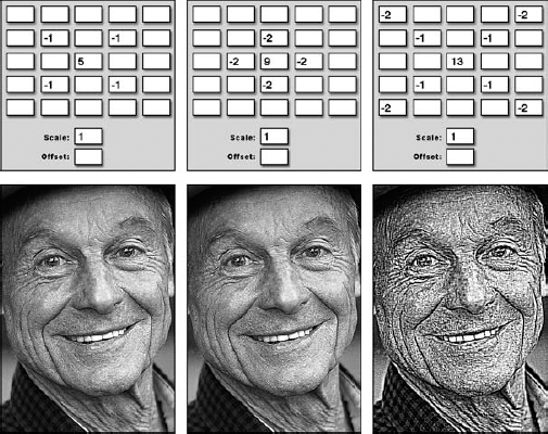
Figure 12.7. To create severe sharpening effects, enter a CMV just large enough to compensate for the negative values in the matrix (first and second examples). To heighten the sharpening effect even further, shift the negative values closer to the perimeter of the matrix (last example).
You can sharpen an image using the Custom dialog box in two basic ways. First, you can enter lots of negative values into the neighboring options in the matrix and then enter a CMV just large enough to yield a sum of 1. This results in radical sharpening effects, as demonstrated in the examples in Figure 12.7.
Second, you can tone down the sharpening by raising the CMV and using the Scale value to divide the sum down to 1. Figure 12.8 shows the results of raising the CMV and Scale values to lessen the impact of sharpening effects typical of those performed in the first two examples of Figure 12.7. Figure 12.9 shows what happens when you apply slightly more adventurous values. Although the arithmetic is a little more involved, the values remain symmetrical and the sums remain 1.
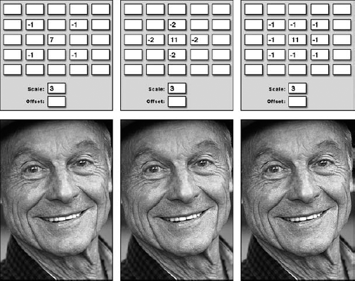
Figure 12.8. To sharpen more subtly, increase the central matrix value and then enter the sum into the Scale value.
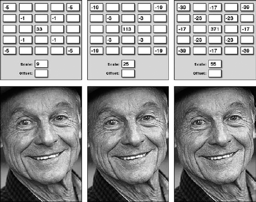
Figure 12.9. When you soften the effect of radical sharpening, you create a thicker, higher-contrast effect, much as when raising the Radius value in the Unsharp Mask dialog box.
The philosophy behind blurring is very much the same as that behind sharpening. To produce extreme blurring effects, enter lots of values or high values into the neighboring options in the matrix, enter 1 into the CMV, and then enter the sum into the Scale option. Examples appear in Figure 12.10. To downplay the blurring, raise the CMV and the Scale value by equal amounts. In the last example of Figure 12.10, the same neighboring values were used as in the middle image, but the CMV and the Scale values were increased by 3.
We hope that this is all beginning to make sense by now. However, in case you're still feeling a little confused, let's go through it one more time in the venue of edge detection. If you really want to see those edges, enter 1s and 2s into the neighboring options in the matrix, and then enter a CMV just small enough — it's a negative value, after all — to make the sum 1. The first two examples in Figure 12.11 illustrate.
To lighten the edges and bring out the blur, raise the CMV and enter the resulting sum into the Scale option box. The last example in Figure 12.11 pushes the boundaries between edge detection and a straight blur.

Every image shown in Figures 12.6 through 12.11 is the result of manipulating matrix values and using the Scale option to produce a sum total of 1. Earlier in this chapter, you saw what can happen if you go below 1 (black images) or above 1 (white images). But you haven't seen how you can use non-1 totals to produce interesting, if somewhat washed-out, effects.
The key is to raise the Offset value, thereby adding a specified brightness value to each pixel in the image. By doing this, you can offset the lightening or darkening caused by the matrix values to create an image that has half a chance of printing well.
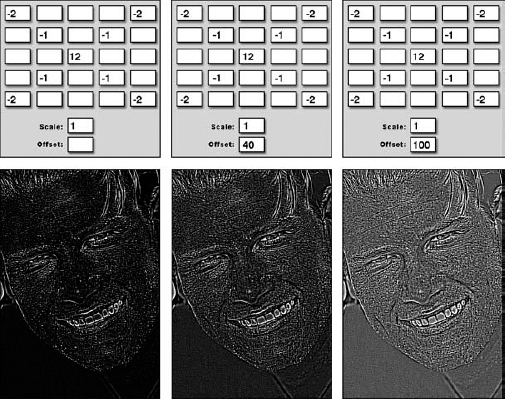
The first image in Figure 12.12 uses nearly the same values used to create the extreme sharpening effect in the last image of Figure 12.7. The only difference is that the CMV is 1 lower (12, down from 13), which in turn lowers the sum total from 1 to 0.
The result is a dark image with hints of brightness at points of high contrast. The image reads well onscreen, but many of the details are likely to fill in during the printing process. To prevent the image from going too dark, lighten it using the Offset value. Photoshop adds the value to the brightness level of each selected pixel. A brightness value of 255 equals solid white, so you don't need to go too high. As illustrated by the last example in Figure 12.12, an Offset value of 100 is enough to raise most pixels in the image to a medium gray.
You also can use the Offset value to darken filtering effects with sum totals greater than 1. The images in Figures 12.13 and 12.14 show sharpening and edge detection effects whose matrix totals add up to 2. On their own, these filters produce effects that are too light. However, as demonstrated in the middle and right examples in the figures, you can darken the effects of the Custom filter to create high-contrast images by entering a negative value into the Offset option box.

If a brightness value of 255 produces solid white and a brightness value of 0 is solid black, why in the world does the Offset value permit any number between negative 9,999 and positive 9,999, a number 40 times greater than solid white? The answer lies in the fact that the matrix options can force the Custom filter to calculate brightness values much darker than black and much lighter than white. Therefore, you can use a very high or very low Offset value to boost the brightness of an image in which all pixels are well below black or diminish the brightness when all pixels are way beyond white.
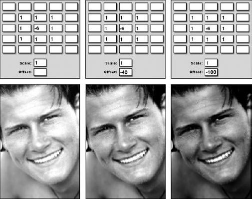
Figure 12.14. These three examples show edge detection effects with sum totals of 2, darkened incrementally with progressively lower Offset values.
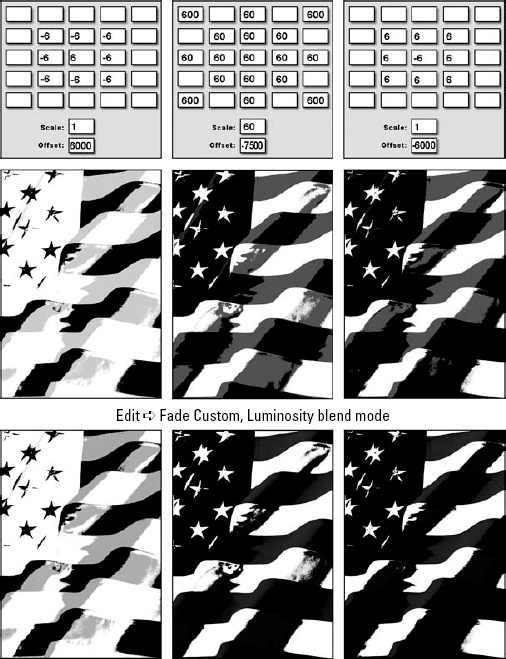
Figure 12.15 shows exaggerated versions of the sharpening, blurring, and edge detection effects. The sum totals of the matrices (when divided by the Scale values) are −42, 52, and 42, respectively. Without some help from the Offset value, each of these filters would turn every pixel in the image black (in the case of the sharpening effect) or white (blurring and edge detection). But as demonstrated in the figure, using enormous Offset numbers brings out those few brightness values that remain. The images are so polarized that there's little difference between the three effects, the first image being an inverted version of the last. The second row shows the results of choosing Edit
By now, you may see what a very cool and flexible tool the Custom filter can be. At the very least, you now have a better idea of how it works, and if you tried any of the settings shown, you have seen it go to work on your images. In truth, another 20 or 30 pages easily could have been devoted to the myriad ways the Custom filter can be used, and even that wouldn't truly do the topic justice.
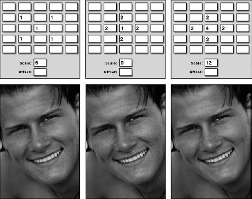
Given that the demonstrations thus far have been fairly tame — showing you how to use the Custom filter to achieve effects that also can be obtained through other filters, either alone or in combination — you may be wondering what happens if you just go absolutely berserk, in a crazed computer-geek sort of way, and start entering matrix values in random, arbitrary arrangements. The answer is that as long as you maintain a sum total of 1, you can achieve some pretty interesting and even usable effects. Many of these effects will be simple variations on blurring, sharpening, and edge detection, which are covered in upcoming sections of this chapter.
Figure 12.16 shows examples of entering positive matrix values all in one row, all in a column, or in opposite quadrants. As you can see, as long as you maintain uniformly positive values, you get a blurring effect. However, by keeping the values lowest in the center and highest toward the edges and corners, you can create directional blurs. The first example resembles a slight horizontal motion blur, the second looks like a slight vertical motion blur, and the last example looks like it's vibrating horizontally and vertically.

Figure 12.16. Enter positive matrix values in a horizontal formation (left) or vertical formation (middle) to create slight motion blurs. By positioning positive values in opposite corners of the matrix, you create a subtle vibration effect (right) as the content is blurred in two directions, as though it's being shaken in place.
So far, you aren't going very nuts, are you? Despite their unusual formations, the matrix values in Figures 12.16 still manage to maintain symmetry. Well, now it's time to lose the symmetry, which typically results in an embossing effect.
Figure 12.17 shows three variations on embossing, all of which involve positive and negative matrix values positioned on opposite sides of the CMV. (The CMV happens to be positive merely to maintain a sum total of 1.)
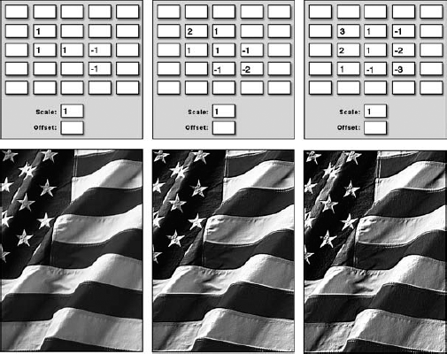
Figure 12.17. You can create embossing effects by distributing positive and negative values on opposite sides of the central matrix value.
This type of embossing has no hard-and-fast light source, but you might imagine that the light comes from the general direction of the positive values. Therefore, when the positive and negative values are swapped throughout the matrix (all except the CMV), an underlighting effect is achieved, as demonstrated by the images in Figure 12.18.
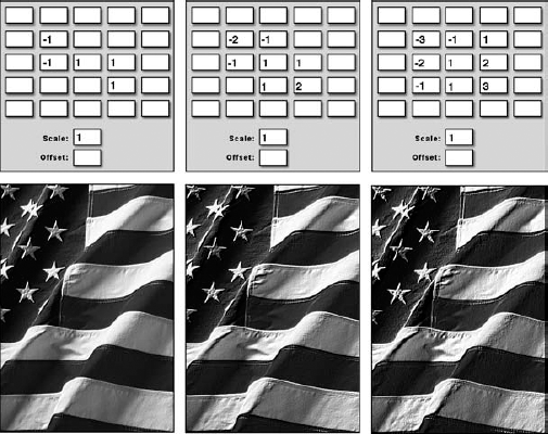
Figure 12.18. Change the location of positive and negative matrix values to change the general direction of the light source.
In truth, it's not so much a lighting difference as a difference in edge enhancement. White pixels collect on the side of an edge represented by positive values in the matrix; black pixels collect on the negative-value side. So when the locations of positive and negative values are swapped between Figures 12.17 and 12.18, the distribution of white and black pixels in the filtered images is changed as well.
Embossing is the loosest of the Custom filter effects. As long as you position positive and negative values on opposite sides of the CMV, you can distribute the values in almost any way you see fit. Figure 12.19 demonstrates three entirely arbitrary arrangements of values in the Custom matrix, downplayed by raising the CMV and entering the sum of the matrix values in the Scale option box. Notice, too, that unlike Filter
Photoshop's second custom effects filter is Filter
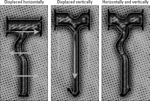
Black: The black areas of the displacement map move the colors of corresponding pixels in the selection a maximum prescribed distance to the right and/or down. Lighter values between black and medium gray move colors a shorter distance in the same direction.
White: The white areas move the colors of corresponding pixels a maximum distance to the left and/or up. Darker values between white and medium gray move colors a shorter distance in the same direction.
Medium gray: A 50-percent brightness value, such as medium gray, ensures that the colors of corresponding pixels remain unmoved.
Imagine that you start with the letter T pictured at the outset of Figure 12.20. Next, you create a new image window the same size as the letter T. Do this by choosing File
When finished, save the dmap image in the native Photoshop format (PSD) so that the Displace filter can access it. Then return to the original image, choose Filter
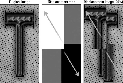
Figure 12.20. The Displace filter moves colors in an image (left) according to the brightness values in a separate image, called the displacement map (middle). The green arrows indicate the direction that the dmap moves colors in the displaced image (right).
Note
A dmap must be a grayscale or color image, and you must save the dmap as a flattened image in the native Photoshop file format. The Displace command does not recognize PICT, TIFF, or any of the other non-native file formats. It's an old filter, so it has its peculiarities.
At this point, you likely have two questions: How do you use the Displace filter, and why in the world would you possibly want to? The hows of the Displace filter are covered in the following section.
Note
To discover some whys — which should in turn help you dream up some whys of your own — read the "Using Displacement Maps" section later in this chapter.
Like any custom filtering effect worth its weight in table salt, you need a certain degree of mathematical — or at least, geometric — reasoning skills to predict the outcome of the Displace filter. Don't be surprised if you're a bit befuddled by your first few experiments with this filter; you won't be alone in that, and your companions-in-befuddlement won't necessarily be the math-challenged. With some time and a reasonable amount of effort, you can learn to anticipate the approximate effects of this filter.
As mentioned just a paragraph or so ago, the black areas of a dmap move colors in an image to the right and/or down and the white areas move colors to the left and/or up. This may have caused you to wonder what all this "and/or" stuff is about, and rightly so. Is it right or is it down?
In fact, the direction of a displacement can go either way. It's up to you. Here's how it works: A dmap can contain one or more channels. If the dmap is a grayscale image with one color channel only, the Displace filter moves colors that correspond to black areas in the dmap both down and to the right, depending on your specifications in the Displace dialog box. The filter moves colors that correspond to white areas in the dmap both up and to the left.
Figure 12.21 shows two examples of an image displaced using a single-channel dmap, which appears on the left side of the figure. (To create this dmap, the middle image from Figure 12.20 was used, and the Filter
Note
The upcoming section "The Displace dialog box" explains exactly how the percentage values work.
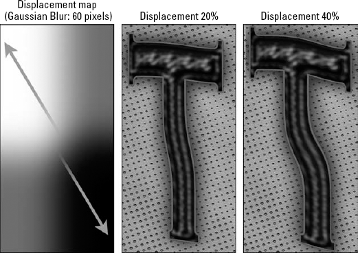
Figure 12.21. After blurring the displacement map from the previous figure (left, with arrows added to show direction), this single-channel dmap was applied to the image at 20 percent (middle) and 40 percent (right).
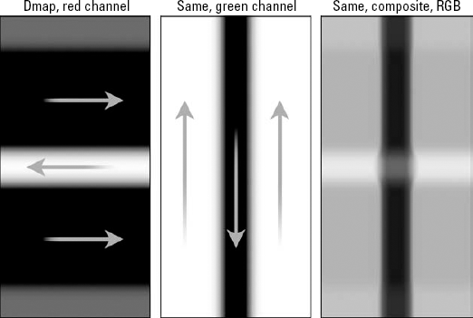
However, if the dmap contains more than one channel — whether it's a color image or a grayscale image with an independent mask channel — the first channel (red in the case of an RGB image) indicates horizontal displacement, and the second channel (green in RGB) indicates vertical displacement. All other channels are ignored. Therefore, the Displace filter moves colors that correspond to black areas in the first channel to the right and colors that correspond to white areas to the left. It then moves colors that correspond to the black areas in the second channel downward and colors that correspond to white areas upward.
Figure 12.22 examines an RGB image that contains a series of gradations. The first example shows the red channel, which transitions from gray to black to white to black and finally back to gray. The second example shows the green channel, which is filled with a white-to-black-to-white gradient. If the blue channel is filled with gray, the RGB dmap looks like the full-color image on right.
Figure 12.23 shows the effects of applying the RGB displacement map to a capital letter T. The first example shows a strictly horizontal displacement (again, set to 40 percent). The second example shows a vertical displacement. And the third shows both displacements calculated together.
If you look closely at the images in Figure 12.23, you'll notice stretching effects, most noticeable along the left edge of the image. Although very common with displacement maps, this is an effect you'll most likely want to avoid.
The cause of the stretching is twofold: First, the left and right edges of both channels in the dmap from Figure 12.22 are laced with black and white, which displace pixels around the perimeter of the image. This forces Photoshop to duplicate border pixels, hence the stretching. Second, neighboring brightness values in a gradient may be less similar than they appear. These differences are magnified when the gradient is expressed as a displacement map.
When you choose Filter
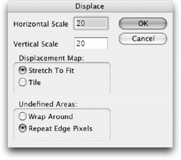
Figure 12.24. Use these options to specify the degree of distortion, how the filter matches the displacement map to the image, and how it colors the pixels around the perimeter of the selection.
Scale: You can specify the degree to which the Displace filter moves colors in an image by entering percentage values in the Horizontal Scale and Vertical Scale option boxes. At 100 percent, black and white areas in the dmap each have the effect of moving colors 128 pixels. That's 1 pixel per each brightness value over or under medium gray. You can isolate the effect of a single-channel dmap vertically or horizontally — or ignore the first or second channel of a two-channel dmap — by entering 0 percent into the Horizontal Scale or Vertical Scale option boxes, respectively.
Figure 12.25 shows the effect of distorting an image exclusively horizontally (top row) and vertically (bottom row) using a variety of positive, negative, and even radical Scale values. In all cases, the single-channel dmap originally pictured in the first example in Figure 12.21 was used. Obviously, just as easily, a multi-channel map could have been applied. But this was already aptly demonstrated in Figure 12.23.
Displacement Map: If the dmap contains fewer pixels than the image, you can either scale it to match the size of the selected image by selecting the Stretch To Fit radio button or repeat the dmap over and over within the image by selecting Tile. The first row of images in Figure 12.26 shows a single-channel dmap magnified to twice its normal size. It starts as a simple gradient stroked with gray and ends twirled to 999 degrees. The second row of images shows the T subjected to each of the dmaps above it with the Horizontal Scale and Vertical Scale values set to 25 percent and Stretch To Fit selected. The bottom row shows the same settings, except this time Tile was selected. The Displace command is unique in enabling you to distort an image using a repeating pattern.
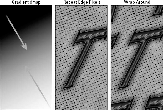
Undefined Areas: These radio buttons let you tell Photoshop how to color pixels around the outskirts of the selection that are otherwise undefined. By default, the Repeat Edge Pixels radio button is selected, which repeats the colors of pixels around the perimeter of the selection. This can result in extreme stretching effects, as shown in the middle example in Figure 12.27. To repeat the image inside the undefined areas instead, as demonstrated in the final example in the figure, select the Wrap Around option.
Tip
The Repeat Edge Pixels setting was active in all displacement map figures prior to Figure 12.28. As stated previously, you can avoid stretching effects by coloring the edges of the dmap with medium gray and gradually lightening or darkening the brightness values toward the center.
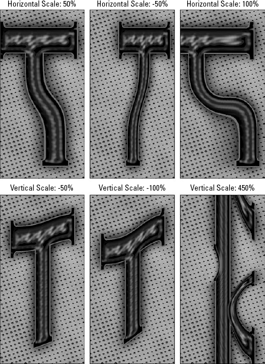
Figure 12.25. The results of applying the displacement map from Figure 12.21 to the letter T are shown here exclusively horizontally (top row) and vertically (bottom row) at each of several different percentage values. As illustrated by the right-hand examples, values over 100 percent can produce some surprising liquid image effects.
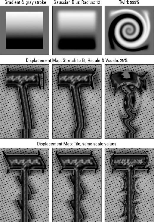
Figure 12.26. Using a sequence of tiny dmaps, each measuring only a sixth the size of the letter (top row), dmap was alternately stretched to fit the image (middle row) and the dmap repeated using the Tile setting (bottom row).
After you finish specifying options in the Displace dialog box, press Enter or Return to display the Open dialog box, which invites you to select the displacement map saved to disk. Only native Photoshop documents show up in the scrolling list.
So far, all the displacement maps demonstrated involve gradations of one form or another. Gradient dmaps distort the image over the contours of a fluid surface, like a reflection in a fun-house mirror. In this respect, the effects of the Displace filter closely resemble those of the Pinch and Spherize filters as well as the Free Transform command. But the Displace filter also offers its share of unique functions, including the ability to add texture to an image.
Since the Displace filter was introduced in Photoshop 2.0, the program has shipped with a collection of predefined dmap files. These reside in the Displacement Maps folder that's inside the Plug-Ins folder, inside the folder that contains the Photoshop application file.
Figure 12.28 details four of the dozen images in the Displacement Maps folder. As you can see, the files contain sometimes independent information in the red and green channels. The blue channel is left white, hence the tendency of the colors toward blue, cyan, and magenta. In the final column of Figure 12.28, the blue channels are filled with 50 percent gray. This merely helps the colors to print better; because the Displace filter ignores the blue channel, it has no effect on the performance of the displacement map.
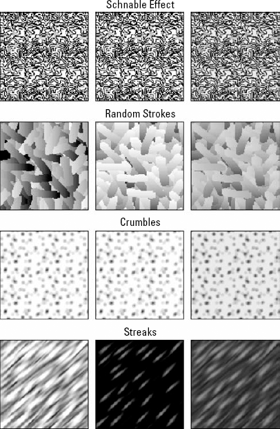
Figure 12.28. We're using four random files from the Displacement maps folder (typically a subfolder of the Plug-ins folder). Note that the red (left column) and green (middle column) channels often differ, thus conveying unique horizontal and vertical displacement information. The final column shows the full-color dmap, with the blue channel set to 50 percent gray.
Figure 12.29 shows a sample image subjected to each of the four dmaps from Figure 12.28. The second and third columns in Figure 12.29 show the image displaced exclusively horizontally or vertically by the amounts described in the labels. Figure 12.30 shows the image displaced using a host of arbitrary Horizontal Scale and Vertical Scale values applied in tandem.
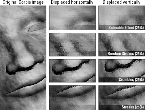
Figure 12.29. The stock photo from the Corbis image library (left) is displaced horizontally (middle) or vertically (right) using the dmaps featured in the previous figure.
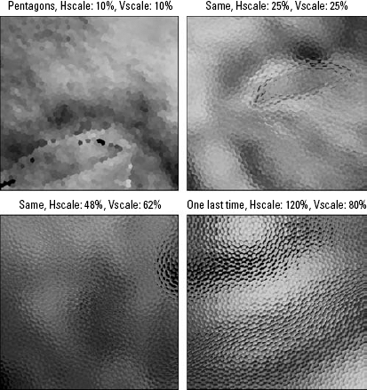
You may notice that some of the dmap file names recommend a percentage amount for you to use, as in the case of Pentagons (10%). This happens to be the Scale value, Horizontal and Vertical, that precisely divides the image into solid blocks of color, as in the first example in Figure 12.31. In this regard, the Displace filter map may produce an effect similar to Filter
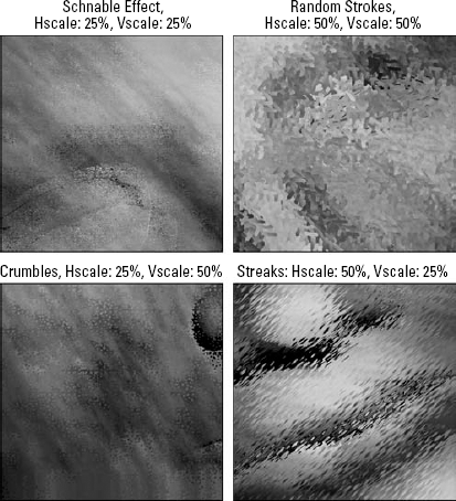
Figure 12.30. Here you see more applications of Photoshop's predefined dmaps, this time using independent Horizontal Scale and Vertical Scale values.
As illustrated in Figure 12.31, many of Photoshop's predefined dmaps produce the effect of viewing the image through textured glass — an effect known in the 3D realm as glass refraction. Those few patterns that contain too much contrast to pass off as textured glass — including Fragment Layers, Mezzo Effect, and Schnable Effect — can be employed to create images that appear as if they were printed on coarse paper or even textured metal. Note that the Fragment Layers dmap has nothing to do with Photoshop's layers; in fact, it was so named before Photoshop even had layers. Rather, it is intended to separate an image into multiple veins of fragmented color.
Want to get carried away? Then by all means, get carried away. Just as masking is the art of selecting an image using any tool inside Photoshop, displacing is the admittedly more arcane art of distorting an image using any tool inside Photoshop. The more fun you allow yourself to have with displacement maps, the more you'll come to understand how they work and the more likely you'll be to divine practical applications for them.
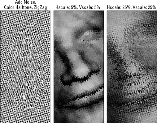
Case in point: In Figure 12.32, working in the standard composite RGB view, the Add Noise filter was applied three times in a row using the same 100-percent setting as before. Then Filter
The second and third images in Figure 12.32 show displacements achieved using the Color Halftone dmap. Because the dmap texture is so busy, dramatic effects are produced using small Scale values. The results are ripple patterns that aren't possible using any filter but Displace.
Located under the Filter menu, the Pattern Maker is a repeating tile generator. It enables you to fill an entire image or layer with a repeating pattern — or even one massive texture — or save a pattern to Photoshop's presets for later use.
Unlike other patterning tools on the market, the Pattern Maker does not blur the edges of an image or create reflections to ensure seamless transitions. Rather, it chops an image into random clumps, pieces that clump together in random formation. It then makes a sort of chopped salad of the image to produce the randomness you see in the natural world. In most cases, the results are only marginally successful, and they often exhibit unacceptably defined edges. But every so often, you get something you can actually use. If that sounds like faint praise, bear in mind that the upside is that the Pattern Maker requires very little effort to use. It works like a free slot machine, so even though the odds are against you, you can take as many chances as you like. Just keep pulling the crank, and sooner or later you'll come up with a winner.
Start with an image that contains some basic texture like gravel or grass or something else that you'd want to repeat over a large image area. If you don't have such an image, you're in luck: Photoshop has already given you some. Inside the folder that contains the Photoshop application, open the Presets folder, and then open the Textures folder. Inside you should find close to 30 images with names like Leafy Bush and Snake Skin. These are photographic textures provided specifically for use with the Pattern Maker filter.
When you get started on your own image, give yourself room to work:
STEPS: Creating a pattern
Expand the canvas size by choosing Image

Choose Filter
Outline the portion of the image upon which you want to base the pattern. (If you prefer, you can select the area before entering the Pattern Maker dialog box, or you can copy an image and select the Use Clipboard as Sample check box to base the pattern on that.)
Click the Generate button to fill the image area with a random repeating pattern. If that looks beautiful, you're in luck. But more likely, it won't look very good.
Click Generate again. And again. And again.

That's really the gist of it. Some might argue that there's more to using the Pattern Maker than clicking the Generate button like a couch potato searching for a good TV show, but of course they'd be wrong. Still, at the risk of overcomplicating the topic, here are a few things you might want to know:
Tweaking the settings: If the filter consistently falls short of spawning a satisfactory effect, you can modify the Tile Generation options — Width, Height, Offset, and so on, all of which are discussed in the following section — and then click Generate Again to see what kind of difference your new settings make. You may want to click Generate Again two or three times before giving up on a setting and moving on.
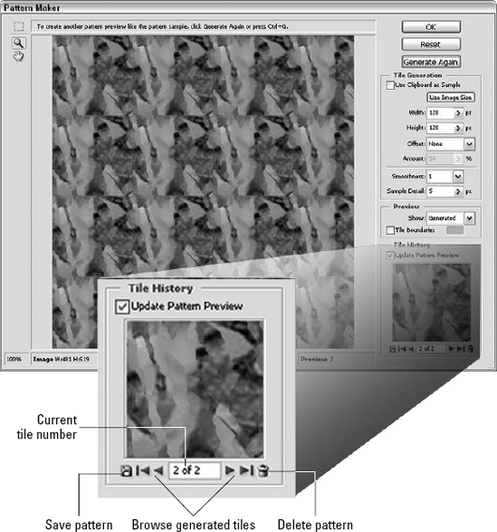
History is now full: The Pattern Maker saves your last 20 tiles to a temporary history buffer so that you can go back and compare them. After you generate your 20th tile, Photoshop warns you that the history buffer is full. After that point, an old tile drops off into the pit of pattern despair every time you generate a new one.
Managing your tiles: Fortunately, you can manage the tiles in the history buffer, so you don't lose your best tiles. You do this using the Tile History options in the lower-right corner of the dialog box, magnified in Figure 12.34. So when you get the "History is now full" error message, go down to the Tile History options and browse through the tiles you've created so far by clicking the arrowhead icons. You also can click inside the tile number — 15 of 20, for example — and enter a different tile number. When you come across a bad pattern, click the trash can icon to delete it.
Saving a tile: After you arrive at a tile that you deem satisfactory, don't just click the OK button. Instead, click the little disk icon in the Tile History area, labeled "Save pattern" in Figure 12.34. This saves the pattern to Photoshop's presets for later use. In fact, you may want to save several patterns, because they take up very little room.
When you're finished and you've saved the pattern or patterns you want to use, click Cancel. Yes, you read that right. Click Cancel. Clicking OK fills the entire image or active layer with the pattern, even if you have a selection active, which is almost never what you want. (The one exception occurs when using the Pattern Maker's exclusive Offset option, as explained in the next section.) With the pattern saved to the presets, you can apply it with more precision using the Pattern Stamp tool, History Brush, Fill command, or other function. So clicking Cancel opens up a wider world of options.
The options in the Tile Generation section of the dialog box allow you to change the size of the repeating tile and adjust other parameters that affect how the Pattern Maker calculates patterns. To make a modified setting take effect, you must click the Generate Again button. In order, here's how the options work:
Use Clipboard as Sample: When selected, this check box generates the pattern from an image you copied to the Clipboard rather than the selected area in the image window.
Use Image Size: Nothing says that you have to generate a repeating tile pattern: You can fill the image with one enormous texture. To do so, click the Use Image Size button to load the size of the foreground image into the Width and Height option boxes, and then click Generate Again. It takes several seconds to generate a very large tile, so be patient.
Width and Height: By default, the Pattern Maker creates 128-×-128-pixel tiles, a common standard for background patterns inside your computer's operating system and on the Web. However, you can enter any values you like. And they can be different: Rectangular tiles are completely acceptable.
Offset and Amount: Use the Offset option to offset rows or columns of tiles in the final pattern. The Horizontal setting offsets the rows; Vertical offsets the columns. Then use the Amount value to determine the amount of offset, measured as a percentage of the tile dimensions.
Warning
Note that the Offset values only work when you apply the pattern directly from the Pattern Maker by clicking the OK button. The Offset data is not saved with a pattern and cannot be accessed from other pattern functions inside Photoshop.
Smoothness: If you keep seeing sharp edges inside your pattern, no matter how many times you regenerate it, try raising the Smoothness value. The value can only vary from 1 to 3, but higher values generally result in smoother transitions.
Sample Detail: As mentioned earlier, the Pattern Maker works by chopping up an image and reassembling its parts. The size of those chopped up bits is determined by the Sample Detail value. Very small details result in faster pattern generation, with the potential for more cut lines and harsh transitions. A higher Sample Detail value creates a chunkier pattern, with better detail and more natural transitions, but it takes longer to generate as well. It's a good idea to try this value at its minimum and maximum settings, 3 and 21, to see if it makes much of a difference. If so, endure the delays and play with the value to get the desired results. If not, crank it down to 5 and focus on the other settings instead.
Bear in mind that, as you work on a pattern, you can zoom in and out of the preview area in the central portion of the dialog box to get a better idea of how the pattern will look. The Pattern Maker provides specific tools for this purpose, but it's generally easiest to rely on the keyboard shortcuts Ctrl+plus and Ctrl+minus (
The Pattern Maker is just the beginning of Photoshop's patterning capabilities. You also can create your own patterns, just as you'd expect from an accommodating program like Photoshop. And as luck would have it, you can do so without painting a single line. In fact, you can create a nearly infinite variety of background textures by applying several filters to a blank document. Figure 12.35 presents four examples. Note that none of these textures repeats seamlessly like the pattern tiles you've looked at so far; they're each intended to fill an entire background with very little effort.

Figure 12.35. A series of four different background textures is created using commands from the Filter menu, as noted. The background contains the Rusted Metal pattern fill, with the Crumble displacement map applied via the Filter
Using the Noise, Median, and Emboss filters: To create the texture shown in the top row of the figure, start with a blank image. Then choose Filter
Using the Noise, Crystallize, Gaussian Blur, and Emboss filters: To get the second row of effects in Figure 12.35, start at the point labeled "Add Noise (100%) × 3" in the first row, and apply Filter
Using the Clouds, Difference Clouds, and Emboss filters: To create the third row of textures, start with a blank image, and press the D key to make the foreground and background colors black and white. Choose Filter
Using the Cloud Difference, Emboss, Fade, and Pin Light filters: For the fourth row, take the second effect in the third row — the one labeled "Difference Clouds × 8" — and apply Filter
In this chapter, you learned about creating custom effects with the Custom filter; mastering the math behind that filter's ability to adjust light, color, blurring, sharpening; and a host of other effects. You also learned about displacement maps and how to make and use them, as well as creating displacement textures.
You learned to use the Pattern Maker to build custom patterns from images and selections, and you learned how to build textures and patterns with a variety of Photoshop's more specialized filters.