Excel offers you much more than just a way of keeping track of your data and doing calculations. It also provides tools to analyze your data so that you can understand it and use it to make more effective decisions.
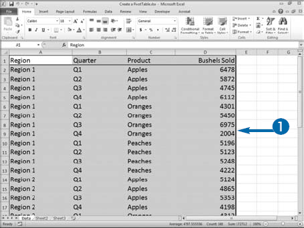
One of the most useful tools, the PivotTable, is also one of the least understood. PivotTables help you answer questions about your data. Similar to a cross-tabulation in statistics, a PivotTable shows how data is distributed across categories. For example, you can use a PivotTable to see how different products sell by region and by quarter.
You base PivotTables on lists. Lists are made up of rows and columns. You can use a worksheet list or you can connect to a list from another data source, such as Access.
For more information on lists, see Chapter 8. For more information on external data sources, see Chapter 11.
The row and column labels of a PivotTable usually contain discrete information, meaning the values fall into categories. For example, gender is a discrete category because all values are either male or female. Quarter is another discrete category because all values fall into one of four quarters: Quarter 1, Quarter 2, Quarter 3, or Quarter 4. Salary and weight are not discrete (they are continuous) because a wide range of values is possible for each.
The body of a PivotTable — the data area — usually has continuous data and shows how the data are distributed across rows and columns. For example, you could show how the number of units sold is distributed among sales regions in different quarters.
Create a PivotTable

Note: Make sure to include the row and column labels.
If you are going to use an external data source, skip this step.


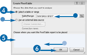
If you selected a range in the current workbook, the range appears here.
If you are going to use an external data source, click here.

If you want to place the PivotTable on the existing worksheet, click the cell in which you want to place the PivotTable, or type a location.

Excel opens the PivotTable Field List.
The PivotTable tools appear.
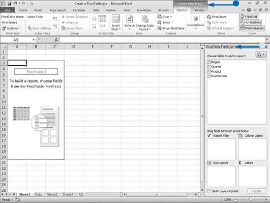
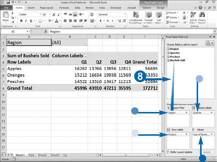
A PivotTable consists of several elements: report filters, data, column labels, and row labels. To organize the elements, use the PivotTable Field List. When working with a PivotTable, you can bring the Field List into view by clicking anywhere in the PivotTable, clicking the Options tab, and then clicking Field List in the Show/Hide group.
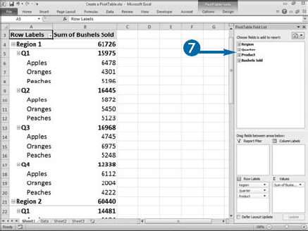
To construct a PivotTable, choose the fields you want to include in your report and then drag fields from the PivotTable Field List into the Report Filter, Column Labels, Row Labels, and Σ Values boxes. You can click and drag more than one field into an area. By using Report Filter fields, you can filter the data that appears in your report. Row Label fields appear as row labels down the left side of your PivotTable, and Column Label fields appear as column labels across the top of your PivotTable. Place your continuous data fields in the Σ Values box. Fields placed in the Σ Values box make up the data area. You can sort and filter your PivotTable column and row data, and you can arrange and rearrange field layouts.
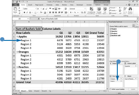
Column and row labels display in the order you place them in the Column and Row Labels boxes. You can change the display order by clicking and dragging the fields within the box.
When you create a PivotTable, you can place it on a new worksheet or on the existing worksheet. If you choose New Worksheet in the Create PivotTable dialog box, Excel creates and moves you to a new worksheet in your workbook and opens the PivotTable Field List. If you choose Existing Worksheet, Excel opens the PivotTable Field List so you create your PivotTable on the current worksheet.


Click and drag the fields you want to filter by to the Report Filter box.
Click and drag fields you want to display as columns to the Column Labels box.
Click and drag fields you want to display as rows to the Row Labels box.
Click and drag fields you want to display as data to the Σ Values box.
As you build the PivotTable, your changes instantly appear.

Note: For more information on sorting and filtering, see Chapter 8.
Extra
By default, Excel has divided the PivotTable Field List into two sections: Field and Areas. The Field section lists all the fields available for you to use when creating your PivotTable. The Areas section gives you the ability to design your report.
To change the way the PivotTable Field List displays, click the Field List button (
The Fields Section and Areas Section Stacked option places the Field section at the top of the PivotTable Field List box and the Area section directly below it. The Fields Section and Areas Section Side by Side option places the Field section on the left side of the PivotTable Field List box and the Area section to the right of it. The Fields Section Only option only displays the Fields section and the Areas Section Only option only displays the Area section; both display in either a two-by-two or one-by-four format.
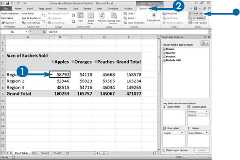
When you create a PivotTable, Excel groups the data for you. All items with the same row label are grouped together and all items with the same column label are grouped together. You can add subtotals to your PivotTable. For example, if you sell apples, oranges, and peaches, in Regions 1, 2 and 3, you can subtotal by product to find the total number of apples, the total number of oranges, and the total number of peaches sold.
You should structure your data so that Excel groups by product, shows the total number of products sold in Region 1, the total number of products sold in Region 2, and the total number of products sold in Region 3. You can then then have Excel show a subtotal for each product. By default, subtotals appear at the top of each group. You can place them at the bottom of each group or you can eliminate them.
By including grand totals you can easily see totals across all groupings. You can calculate grand totals for both rows and columns, for just rows, for just columns, or for neither rows nor columns. For example, if you sell three products and they are shown in the rows, you can use a row grand total to show the total amount sold. If there are subtotals in your PivotTable, the grand total is equal to the sum of the subtotals. If the columns in your PivotTable show the number of products sold by quarter, you can use a column grand total to show the total amount sold for the year.
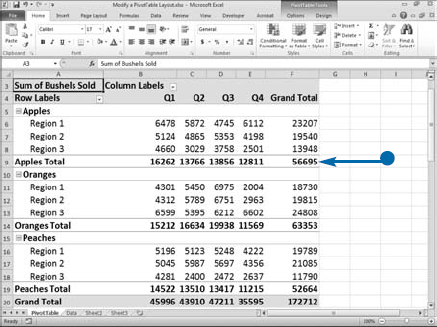
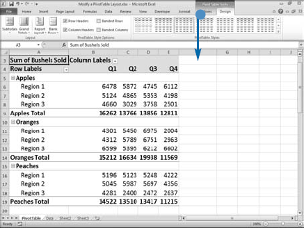
Modify a PivotTable Layout
Modify a Subtotal
The PivotTable tools appear.
A menu appears.
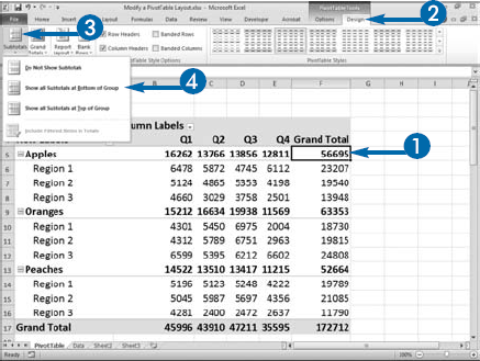
Excel adds, removes, or moves the subtotal.
The PivotTable tools appear.
A menu appears.

Excel adds or removes Grand Totals.
In this example, Excel removes the Grand Totals.
Apply It
The data in a PivotTable can get crowded and difficult to read. To remedy this situation, you can choose to have Excel show a blank row after each group in your Pivot table. Click anywhere in your PivotTable. The PivotTable tools appear. Click the Design tab. Click Blank Rows in the Layout group. A menu appears. Click Insert a Blank Line after Each Item.
By default, Excel creates or modifies your PivotTable as you click and drag fields among the Report Filter, Column Labels, Row Labels, and Sum Values fields. If you do not want your PivotTable created or modified dynamically, click the Defer Layout Update check box (
You can display a PivotTable in compact, tabular, or outline form. Click anywhere in your PivotTable. The PivotTable tools appear. Click the Design tab and then choose Report Layout in the Layout group. A menu appears. Click the PivotTable layout you want.
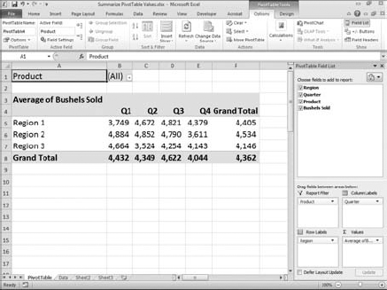
You can use PivotTables to compare categories of data. Column and row intersections divide data into categories. By default, for numeric fields the intersection of row and column labels is the sum of the values of the field in the Σ Values box. For example, if you have a column labeled Quarter 1 and a row labeled Region 1, by default the intersection of Quarter 1 and Region 1 is the sum of the Quarter 1, Region 1 values for the field in the Σ Values box of the Pivot Table field list. If the field in the Σ Values box is a text field, Excel performs a count.
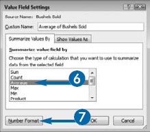
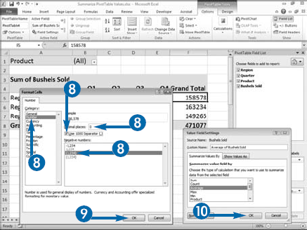
In addition to sum, there are a variety of other calculations you can perform on Σ Values. To tell Excel which calculation to perform, click the Calculations option on the Options tab and then select Summarize Values By. A menu will appear. You can choose from Sum, Count, Average, Max, Min, Product or More Options. Choosing More Options opens the Value Field Settings dialog box, which provides you with additional options, such as standard deviation and variance.
Calculations used to generate values can result in poorly formatted data. To remedy this, use the Number Format button in the Value Field Settings dialog box to access the number-formatting capabilities of the Format Cells dialog box. You might, for example, want to reduce the number of decimal places so you see 1235 instead of 1234.56789.
If you are using an Online Analytical Processing (OLAP) data source, you cannot change the calculation.
Summarize PivotTable Values
The PivotTable tools appear.
A menu appears.
Alternatively, click the option you want and Excel performs the calculation.

The Value Field Settings dialog box appears.
Note: See Chapter 2 to learn how to format numbers.

Excel recalculates the PivotTable using the function you chose.
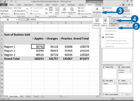
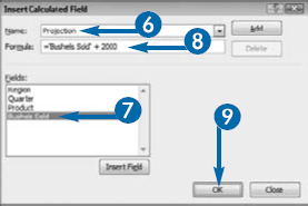
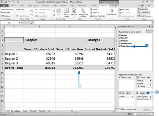
Within a PivotTable, you can create new fields, called calculated fields, which you can base on the values in existing fields. You create a calculated field by creating a formula. Your formula can include functions; operators such as +, –, *, and /; and existing fields, including other calculated fields; but your formula cannot use cell references. For example, you could enter the following formula:
= 'Bushels Sold' + 2000
You usually use calculated fields with continuous data such as incomes, prices, miles, and sales. For example, you can add a value to each value in a field called Bushels to create a calculated field called Projection.
Use the Insert Calculated Field dialog box to name your calculated field and to enter the formula you want to use. You can also use this dialog box to modify existing calculated fields or delete fields you no longer want to use. Once created, your calculated fields are available in the PivotTable Field List for use in your PivotTable. You cannot place calculated fields in report filters, column labels, or row labels. You can only place calculated fields in the data area, therefore place your calculated field in the Σ Values box.
If you want to see a list of all the formulas used by your PivotTable, choose the List Formulas option under Calculations; Field, Items, and Sets on the Options tab.
Create a PivotTable Calculated Field
The PivotTable tools appear.
If the PivotTable Field List does not open, click Field List.
A menu appears.
The calculated field appears at the end of the Field List.
You can place the calculated field in the Σ Values box.
Values for the calculated field fill the data area.
Apply It
If you no longer want to include a calculated field in your PivotTable report, you can delete it. If you want to change the formula, you can modify it. Click anywhere in your PivotTable. Click the Options tab. Click Calculations. Click Fields, Items, & Sets and then click Calculated Field. The Insert Calculated Field dialog box appears. Click the
You can base one calculated field on another calculated field. If you do, you may want to use the Calculated Item Solve Order dialog box to tell Excel the order in which you want it to perform your calculations. Click a cell in your PivotTable. The PivotTable tools appear. Click the Options tab. Click Calculations. Click Fields, Items, & Sets and then click Solve Order. The Calculated Item Solve Order dialog box appears. Use the Move Up button to move a calculation up in the solve order. Use the Move Down button to move a calculation down in the solve order.
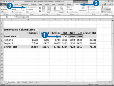
Grouping enables you to compare groups of data. For example, if your PivotTable shows each month as a column, you can group the months so that you can compare quarters. When you group columns or rows, Excel totals the data, creates a field header, and creates a field with an expand/collapse button. If the expand/collapse button displays a plus (+), you can click it to expand the group. If the expand/collapse button displays a minus (−), you can click it to collapse the group. If you do not want to display the button, you can click Buttons in the Show/Hide group on the Options tab to toggle the button display off. If after grouping your data, you want to ungroup it, you can.
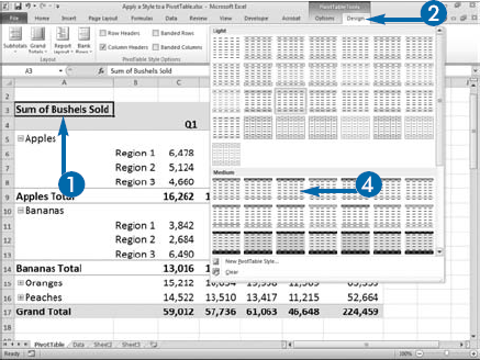
PivotTable styles format the cells in the rows and columns of your PivotTable to make your PivotTable attractive and easier to read. You can use PivotTable styles to change the look of your PivotTable. Excel has a number of predesigned styles from which to choose.
When you create a PivotTable, Excel applies the default style. You can change the style by using the Style gallery. There are three buttons along the side of the Style gallery. To move up and down through the gallery, use the Up and Down buttons. To open the gallery, use the More button. As you position your mouse pointer over each style in the gallery, Excel provides you with a live preview of how the style will appear when you apply it.

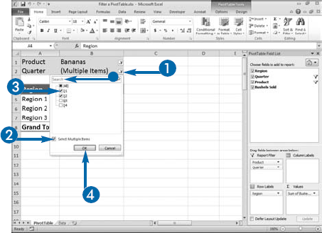
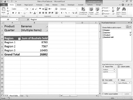
When you create a PivotTable, you can place fields in the Report Filter box and use those fields to filter your data. Filtering enables you to view only the data that is relevant to you. For example, if your data consists of Quarters 1 through 4 and you want to focus on Quarter 1; you can filter your PivotTable so only Quarter 1 data appears.
Down arrows appear next to Row Label, Column Label, and Report Filter fields in a PivotTable. You can click these down arrows and use the options in the box that appears to filter. You can search for the item you want to filter by or click check boxes to select the fields.
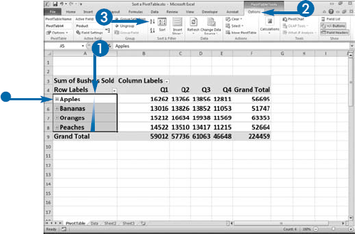
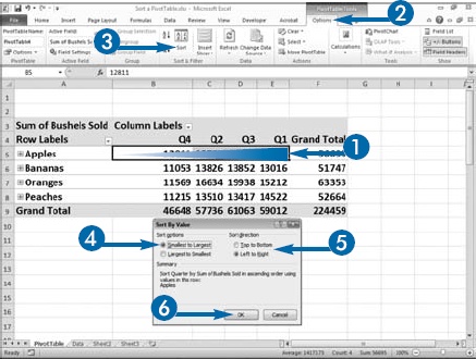
Putting a list in alphabetical order can make finding data easier. Ordering numerical data can help you spot trends. You can sort PivotTables by field labels or by data values. When you sort by field labels, the corresponding data values are sorted as well. The opposite is also true: sorting the data values rearranges the field labels.
You can sort your PivotTable in either ascending or descending order. You can also specify the sort direction: top to bottom or left to right.
You can manually rearrange column and row labels by clicking and dragging them to a new location. As you move your mouse pointer over the border of a cell, a four-sided arrow indicates that you can click and drag the cell.
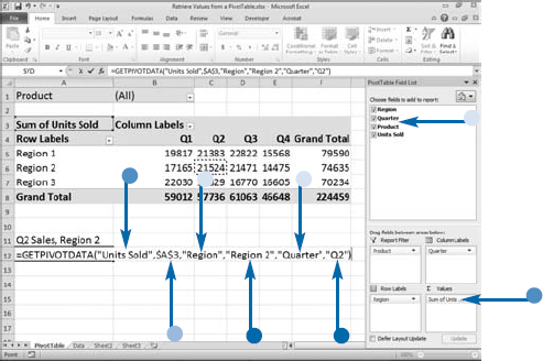
When you create a PivotTable, down arrows appear next to Row Label, Column Label, and Report Filter fields. You can use these down arrows for filtering. Filtering enables you to view only the data that is relevant to you. For example, if your data consists of Regions 1 to 4 and you want to focus on Region 4, you can filter your PivotTable so only Region 4 data appears. As you filter your data, Excel changes the cell in which the data is located. If you use cell references to retrieve data from your PivotTable, filtering can cause you to retrieve the wrong data. To avoid this problem, use the GETPIVOTDATA function to retrieve data from your PivotTable.
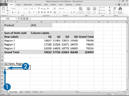
The GETPIVOTDATA function is complex. You must supply two required arguments: a data field that contains the results you want to retrieve and the cell address of a cell in your PivotTable. You may also need to supply up to 126 pairs of fields that describe the data you want to retrieve. The easiest way to create a GETPIVOTDATA function is to type an equal sign (=) and then click the PivotTable cell whose value you want. Excel automatically generates the GETPIVOTDATA function.
PivotTables summarize data. You should use the GETPIVOTDATA function whenever you want to create a report based on the summary data found in a PivotTable. If the data you want to retrieve is not visible in the PivotTable, Excel will display a #REF! error.
If you want to create a formula that uses PivotTable data, use the GETPIVOTDATA function. By default, Excel automatically generates the GETPIVOTDATA function whenever you create a formula by clicking in a cell in a Pivot table. If the GETPIVOTDATA function does not automatically generate, click Options in the PivotTable group on the Options tab and make sure that Generate GetPivotData is selected.
Retrieve Values from a PivotTable
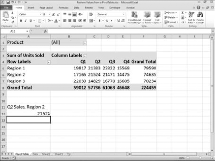
Excel retrieves the value you entered into your function.
If the cell location changes because of filtering, Excel is still able to retrieve the value.
Note: Excel cannot retrieve a value that does not appear on-screen.

Extra
A cell in a PivotTable may summarize several rows of information. To view the underlying data for a cell, double-click the cell. The rows appear in a new worksheet. Changes you make to the new worksheet have no effect on the original data.
You can move a PivotTable. Click anywhere in the PivotTable. The PivotTable tools appear. Click the Options tab. Click Move PivotTable in the Actions group. The Move PivotTable dialog box appears. Click to select whether you want to move the PivotTable to a new worksheet or to another location on the existing worksheet (
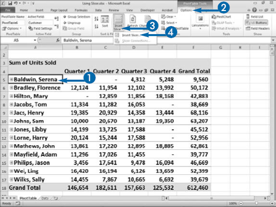
Filtering enables you to view only the data that is relevant to you. You can use the down arrows that appear next to Row Label, Column Label, and Report Filter fields to filter a PivotTable. You can also use Slicer. With Slicer, you can dynamically filter your data and quickly zero in on just the data you want.
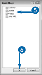
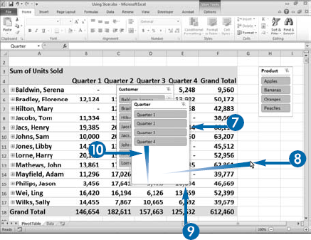
Slicer creates a panel for each field you select. The panel displays every item in the field. You can use the panel to select the items you want to see. For example, if you have Customer, Quarter, and Product panels, you can select the customers, quarters, and products you want to see in your PivotTable.
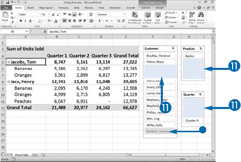
A Slicer panel can also provide you with useful information. The state of each item can be represented by a different format. For example, selected items can have a dark blue fill, unselected item can have a gray fill, items with data can appear with regular type, items with no data can appear with italic type, and when you hover you mouse pointer over an item, it can appear with a gradient fill. How items in a panel appear depend on the style you apply.
You can resize a Slicer panel. When you click a Slicer panel a border appears around it. There are sets of dots on the sides and corners of the border. If you hover your mouse pointer over the dots, the mouse pointer turns into a double-sided arrow. You can then click and drag to resize the panel. You can also move a slider panel. If you hover your mouse pointer over a solid section of the border, the mouse pointer turns into a four-sided arrow. You can then click and drag to move the panel.
Using Slicer