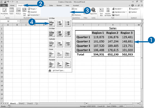
With Excel, you can quickly create a chart. A chart is a visual representation of the numbers in your worksheet. Charts can clarify patterns that can get lost in columns of numbers and text, and they make your data more accessible to people who are not familiar with, or do not want to delve into the details. Charts can be easier to understand than rows and columns of numbers because the mind perceives, processes, and recalls visual information more quickly than textual or numerical information.
In Excel, you can create charts with dramatic visual appeal quickly and easily. Your data should be organized into rows and columns with each row and column labeled. When you select the data, include the row and column labels. You must choose a chart type. Excel provides several chart types from which to choose, including column, line, pie, bar, area, and scatter charts. In addition, each chart type has a number of subtype options.
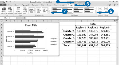
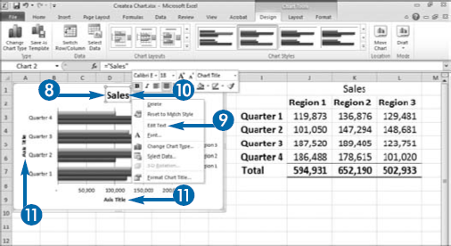
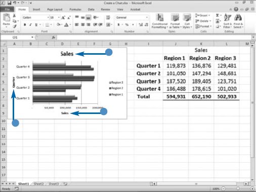
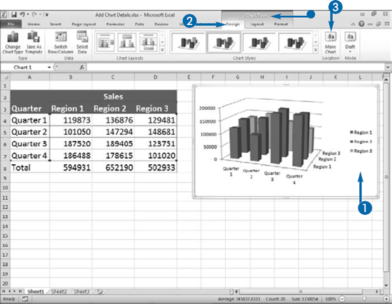
After you create a chart, Excel makes Chart tools available to you through the Design, Layout, and Format contextual tabs. Using the Chart tools, you can choose a chart style and layout. You can change the color scheme of your chart by applying a chart style. You can use layouts to add a chart title, axis labels, a legend, or a data table to your chart. A chart title summarizes chart content, axis labels explain each axis, a legend explains the colors used to represent data, and a data table displays the data presented in the chart. You can edit the chart title and axis labels.
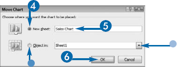
After you create a chart in Excel, modifying it or adding details is easy. In fact, you can modify virtually all the elements of a chart. For example, when you create a chart, Excel places it on the same worksheet as the data from which you created it. You can move the chart to another worksheet or to a special chart sheet. If you choose to move your chart to a chart sheet, you must name the sheet. Excel creates the chart sheet and places the name you gave it on the sheet's tab.
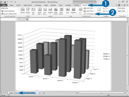
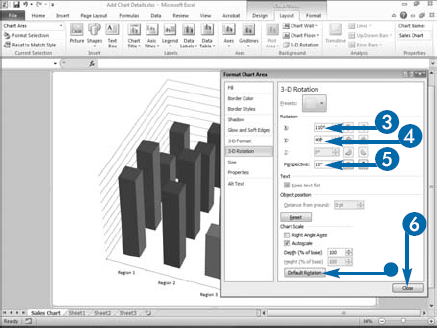
Many chart types have a 3-D option. To make a 3-D chart easier to read, you can use the X and Y fields in the 3-D Rotation pane to change the chart rotation. The X field rotates the horizontal axis of your chart and the Y field rotates the vertical axis of your chart.
As you rotate your chart, Excel provides a live preview of your changes. If at any time you want to return to the default rotation, click the Default Rotation button near the bottom of the Format Chart Area dialog box. In addition to changing your chart's rotation, you may also want to change your chart's perspective. Changing the rotation and/or perspective is useful if the bars in the front of your bar chart hide bars in the back of your bar chart. Use the Perspective field in the 3-D Rotation dialog box to change the perspective.
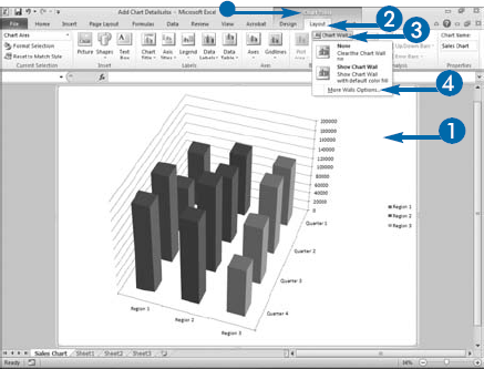
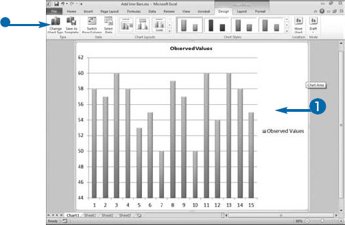
Add Chart Details
Change Chart Location

The Chart tools appear.


The Move Chart dialog box appears.

Alternatively, click Object in (

If you click Object in, click the down arrow (


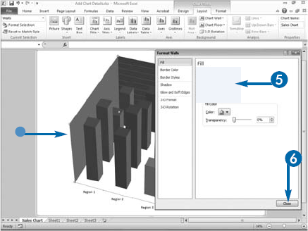
To make your chart more readable, you may want to change some of the attributes of your chart. You can easily change the walls and floor of your three-dimensional charts. The walls are the side and back of your chart, and the floor is the bottom of your chart. You can choose to show the chart walls and/or floor, not show the walls and/or floor, or fill the chart walls and/or floor with a color, gradient, or picture. Choose Solid Fill in the appropriate format dialog box to fill with a color, choose Gradient Fill to fill with a gradient, or choose Picture or Texture Fill to fill with a picture or texture.
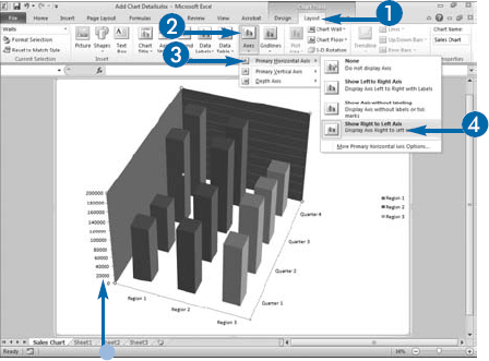
Excel bases axis values on the range of values in your data. Axis values encompass the range. For example, if the lowest value represented in your chart is 101,020 and the highest value represented in your chart is 189,405, your axis values might range from 0 to 200,000. Axis labels describe the data displayed on each axis. Excel provides several options for choosing whether to display axis values and how to display the axis values and labels on each axis, including the horizontal, vertical, and depth axis of a 3-D chart.
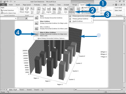
When you create a chart in Excel, Excel creates horizontal and vertical gridlines to mark major and minor intervals in your data series. If your axis values run from 0 to 200,000, major gridlines might be at 20,000, 40,000, 60,000, and so on. Minor gridlines might be at 2,000, 4,000, 6,000, and so on. You can remove gridlines with the None option, display major units only with the Major Gridlines option, display minor units only with the Minor Gridlines option, or display major and minor units with the Major and Minor option.
Change the Wall and Floor
Note: To change the vertical axis, click Primary Vertical Axis. To change the depth axis, click Depth Axis.
Excel changes the display of your horizontal axis.
Note: To change the vertical gridlines, click Primary Vertical Gridlines and choose a menu option. To change the depth gridlines, click Depth Gridlines and choose a menu option.
Excel changes the display of your horizontal axis.
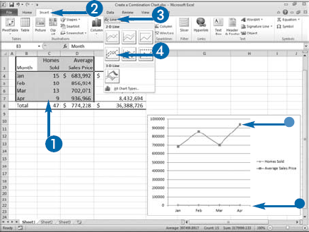
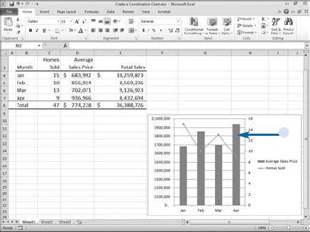
If you show two or more data series in a single chart, you can change the chart type for one or more series and create a combination chart. Using different chart types can make it easier to distinguish different categories of data shown in the same chart. For example, you can create a combination chart that shows the number of homes sold as a line chart and the average sales price as a column chart.
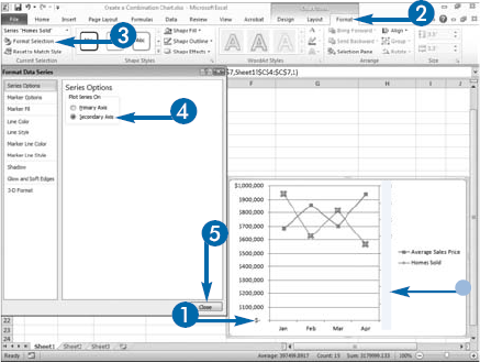
When you plot two different types of data in the same chart, the range of values can vary wildly. For example, the range of values for homes sold might be between 9 and 15, while the range of values for the average sales price might be between 750,000 and 950,000. You can plot each of these data series on a different vertical axis to make it easier for the user to see values for the associated series. In the example, you could plot average sales prices on one vertical axis and number of homes sold on the other vertical axis.
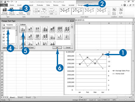
To create a combination chart, you first create a chart with both data series shown as the same chart type. Then if the data series' values vary wildly, you can change the legend and chart type for one of the data series.
The chart legend changes to reflect the changes you have made to your chart. For example, if a chart changes from a line chart to a bar chart, an appropriate colored bar displays in the legend.
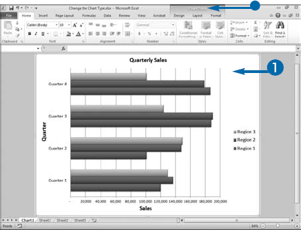
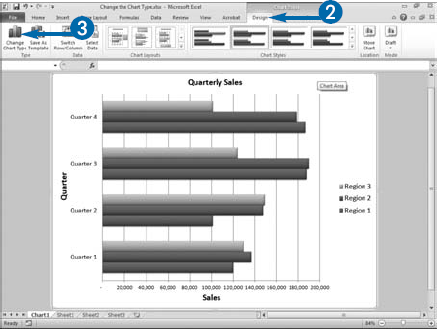
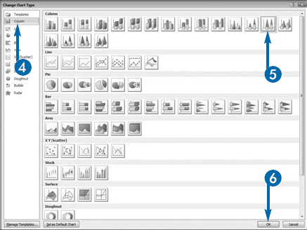
Excel provides a variety of chart types and subtypes from which to choose. If you are not satisfied with the chart type you have chosen, you can easily make another choice.
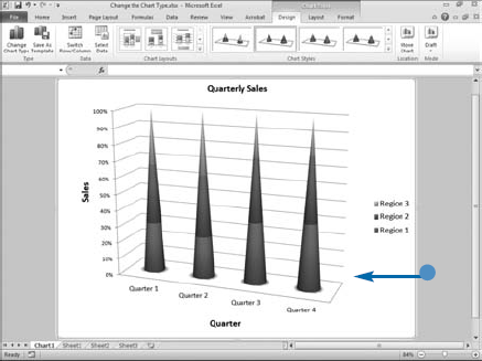
Use a column or bar chart to plot data arranged in rows and columns. Both types are useful when your data changes over time or when you want to compare data values. Use a stacked bar or a stacked column chart to show the relationship of individual items to the whole. Use a 3-D chart to show data on two axes. The cylinder, cone, and pyramid bar and column subtypes all provide you with interesting ways to present your charts.
Area and line charts are also good for plotting data organized into columns and rows. Use an area chart to show how values change over time and how each part of the whole contributes to the change. Line charts are ideal for showing trends in your data; consider using a line chart to show changes measured at regular intervals.
Pie charts are useful when you want to display data arranged in one column or one row. Each data point in a pie chart represents a percentage of the whole pie. Like pie charts, each data point in a doughnut chart represents a percentage of the whole pie; however, a doughnut chart can display more than one column or row of data.
Excel stock charts display the high, low, and close; open, high, low, and, close; volume, high, low, and close; and volume, open, high, low, and close values of a stock. When creating a stock chart, you must arrange your columns of data with the date in the first column followed by the order given in the chart name; for example, date, high, low, close.
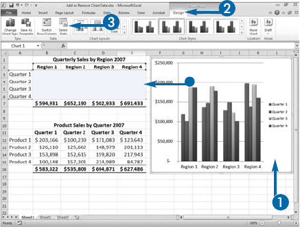
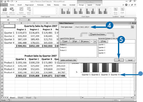
If you want to include new data in your chart or exclude data from your chart, you can use the Select Data Source dialog box to add and remove entire columns or rows of information or to change your data series entirely without changing your chart's type or other properties. Excel defines a data series as the related data points you plot in a chart. Excel gives each data series in your chart a unique color or pattern and provides a key to each data series in the chart legend. It also creates a series formula for each data series. If you select a series in a chart by clicking a data point, you can see the series formula in the formula bar. For example, if you click a bar in a bar chart, you can see the series formula in the formula bar. You can edit the series formula, but it is easier to change the data in a chart by using the Select Data Source dialog box.
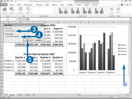
The Select Data Source dialog box Legend Entries (Series) box lists the names of your data series. You can use this box to add, edit, or remove a data series. When you click the Add button, the Edit Series dialog box appears. You can use it to select new ranges or to define your series name and your series values; or you can type a name in the Series Name field and/or enter an array in the Series Values field. An array is a series of values, separated by commas. You must enclose arrays in curly braces; for example, {100000, 110000, 90000}.
Add or Remove Chart Data
Change the Data Area
Charted data.
The Chart tools appear.
The Select Data Source dialog box appears.
Excel redefines the data series area.
The Select Data Source dialog box appears.
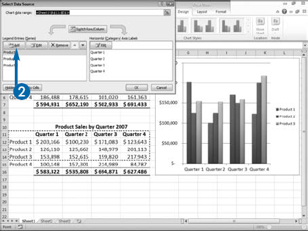
The Edit Series dialog box appears.
Excel adds the data series and legend name to your chart.
Extra
You can click the Switch Row/Column button in the Select Data Source dialog box to switch the plotted data from the rows in your worksheet to the columns in your worksheet or vice versa.
To delete a data series from your chart, click the data series you want to delete in the Legend Entries (Series) box of the Select Data Source dialog box and then click Remove. Or click the data series in the chart and then press the Delete key.
To edit using the Select Data Source dialog box, you must click the data series and then click the Edit button. To change the order of your data series, you click the series and then click the up or down arrow keys. The Select Data Source dialog box Horizontal (Category) Axis Label box lists the labels on your horizontal axis. Click the Edit button to edit them.
Here is a quick way to add data to a chart: Click and drag to select the data you want to include in the chart. Click the Copy button (
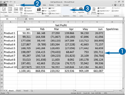
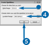
Sparklines enable you to see trends in your data at a glance. Sparklines are charts that appear in a single cell. There are three types of sparklines: Line, Column, and Win/Loss. If you choose Line as your sparkline type, Excel creates a line chart. If you choose Column as your sparkline type, Excel creates a bar chart. If you choose Win/Loss as your sparkline type, Excel creates a Win/Loss chart.
A line chart shows each point in a data series on a line. With a line chart, you can easily see how your data fluctuates. A column chart is a bar chart. Negative values appear below the zero line; positive values appear above the zero line. The size of each bar corresponds to the relative size of the value it represents. A Win/Loss chart is also a bar chart. And, as with a column chart, negative values appear below the zero line and positive values appear above the zero line. However, with a Win/Loss chart, the size of each bar is the same.
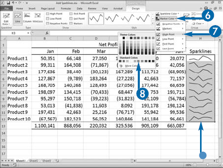
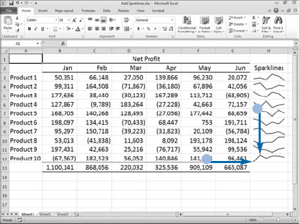
You can mark points on a sparkline. There are six point types: High Point, Low Point, Negative Points, First Point, Last Point, and Markers. The High Point is the highest value, the Low Point is the lowest value, Negative Points are points that are below zero, the First Point is the first value, and Last Point is the last value. Markers can only be used with line charts. They mark every point in the series. You can specify the color of each point type. For example, you can have the high point appear in green and the low point appear in red.
Apply It
When you click in a field that contains a sparkline, the Sparkline Tools appear. If you activate the Design tab, you can use the Style gallery to apply a style to your sparklines. In addition, you can use the Sparkline Color field to change the color or weight of your sparklines. Click Sparkline Color and then choose the color, if you want to change the color or click Sparkline Color and then choose the weight, if you want to change the weight.
You can also change the sparkline type. Click in a cell that contains a sparkline. The Sparkline tools appear. Activate the Design tab. In the Type group, click the sparkline type you want.
If you create your sparklines by selecting a cell range, Excel groups the sparklines. You can clear sparklines from a cell, cell range, or cell group. Click in a cell or cell range that contains sparklines. The Sparkline tools appear. Activate the Design tab. Click the down arrow (
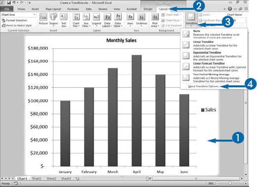
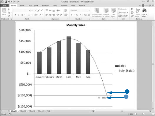
Trendlines help you see both the size and direction of changes in your data, and you can use them to forecast future or past values based on available data. A trendline is the line through your data series that is as close as possible to every point in your data series. You can add a trendline to any chart type except 3-D, stacked, radar, pie, surface, and doughnut charts. Excel superimposes the trendline over your chart.
Excel provides the following trendline types: linear, logarithmic, polynomial, power, exponential, and moving average. You choose a trendline type based on the type of data you have. Excel generates a statistic called R-squared. R-squared represents the fraction of the observed data that is explained by the fitted trendline/curve. The closer R-squared is to 1, the better the line fits your data. You can choose to have the R-squared value appear on your chart.
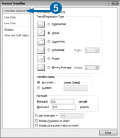
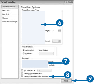
Use a linear trendline if your data increases or decreases at a steady rate. Use a logarithmic trendline when your data increases or decreases quickly and then levels out. Use a polynomial trendline when your data fluctuates up and down. Generally, you can estimate the order of a polynomial by the number of hills or valleys that occur. If your data has one hill or valley, it is usually somewhere around an order-2 polynomial. If it has two hills or valleys, it is usually somewhere around an order-3 polynomial, and so on. Use a power trendline to compare data that increases at a specific rate. Use a moving average trendline to smooth out your data so you can see fluctuations in your data. A moving average trendline averages groups of sequential points in your data and then creates a trendline. Use the Period field in the Format Trendline dialog box to tell Excel how many fields to average.
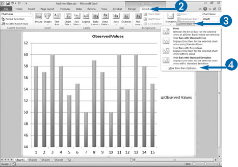
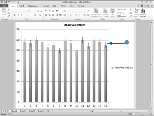
With Excel, you can generate error bars to provide an estimate of the potential error in experimental or sampled data. In science, marketing, polling, and other fields, people make conclusions about the real world by sampling or devising controlled experiments. When you sample data or generate data under laboratory conditions, the resulting numbers are approximates. If the entire population were surveyed, the actual results could be higher or lower. An error bar shows the range of possible values that could have occurred.
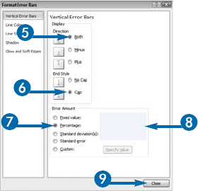
With Excel, you can show the range of possible values in several ways, including as a fixed number, as a percentage of the data point, or in terms of standard deviation units. Use the Format Error Bars dialog box to make your choice. If you choose Fixed value, you specify the constant value Excel displays as the error amount for each data point. If you choose Percentage, Excel uses the percentage you specify in the Percentage box to calculate the possible error amount as a percentage of the value of the data point. If you choose Standard deviation(s), Excel calculates the standard deviation, multiplies it by the number you enter into the Standard deviation(s) box, and then uses the result. If you choose Standard error, Excel calculates and uses the standard error. If you choose Custom, you can specify the error values Excel uses.
You can choose how Excel displays error bars. Choose Both if you want to display the actual data point plus and minus the error amount. Choose Minus if you want to display the actual data point minus the error amount. Choose Plus if you want to display the actual data point plus the error amount. You can display your error bar with or without caps on the ends.
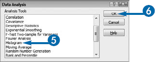
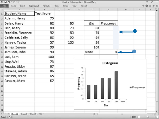
With Excel, you can use histograms to group a list of values into categories and compare the categories. Excel calls these categories bins. To display the test scores for a group of students, for example, your first bin might be <=60, representing scores lower than or equal to 60 percent, your second bin might be 70, and so on, up to a bin for test scores higher than 100 percent. Excel counts the number of occurrences in each bin.
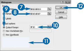
When creating a histogram, you must provide three pieces of information: the data you want to categorize, the bins, and the cell ID of the cell in the upper-left corner of the range in which you want the results to appear. Your bins must be in lowest to highest order. The results can appear in the current worksheet, in a new worksheet, or in a new workbook.
To create a histogram and a chart at the same time, click the Chart Output option in the Histogram dialog box. You can modify the chart just as you would any other chart. Click the Cumulative Percentage option in the Histogram dialog box to create a histogram output table that includes cumulative percentages. Click the Pareto (sorted histogram) option to create a histogram output table that includes frequency data sorted from highest to lowest.
As you make changes to your data, Excel does not automatically make changes to your histogram. You must regenerate your histogram when you make changes to your data.
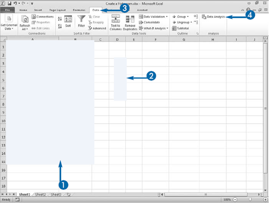
The histogram tool is part of the Data Analysis Toolpak, which you may need to install as explained in the Extra portion of this section.
With Excel, you can quickly create a chart of the information in a worksheet. Charts show trends and anomalies that may be otherwise difficult to detect in columns of numbers. By choosing the appropriate type of chart and formatting the chart features, you can share your results with others and convey patterns in your data.
To create a chart, use the options in the Charts group on the Insert tab. See the section, "Create a Chart" in this chapter to learn more. You can position your chart next to the data on which you base it, so when you change the data, you can instantly observe the changes in the chart.
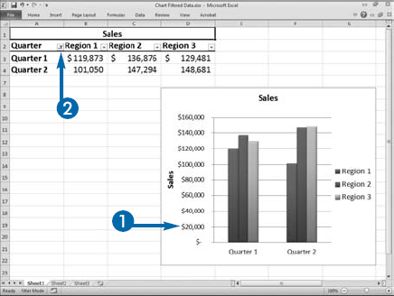
By using Excel's filtering features, you can filter your data. Filtering your data enables you to limit the data you see. For example, if your worksheet has data for Quarter 1, Quarter 2, Quarter 3, and Quarter 4, you can filter your data so you see only Quarter 1 and Quarter 2. You can use the Filter option on the Data tab to filter your data, you can define your data as a table and use the table filtering options, or you can use functions to filter your data. To learn more about filtering, see Chapter 8.
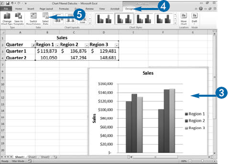
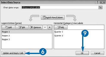
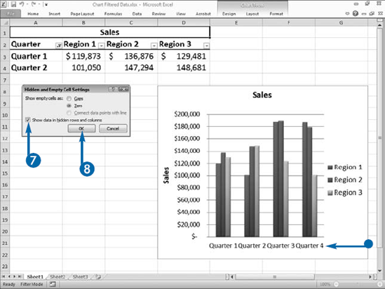
By default, as you filter your data, Excel removes the filtered data from your chart. If you do not want Excel to remove filtered data, use the Show Data in Hidden Rows and Columns option in the Hidden and Empty Cell Settings dialog box to instruct Excel to display all the data in your chart.
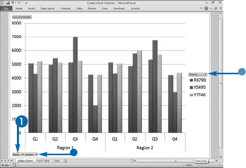
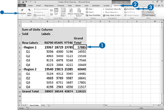
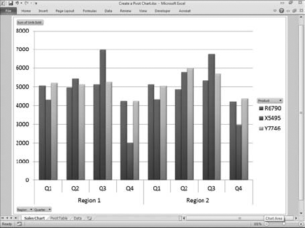
A PivotChart is a graphical representation of a PivotTable. PivotCharts combine the cross-tabulation capabilities of a PivotTable with the visual appeal of a chart. PivotTables reveal patterns in your data. PivotCharts can make patterns even more apparent. Like all Excel charts, PivotCharts have a chart type, axis, legend, and data, all of which you can modify.
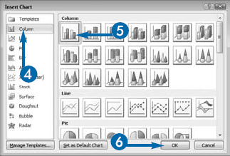
You can create a PivotChart by creating a PivotTable and then selecting a chart type from the Insert Chart dialog box. The option for creating a PivotChart is located on the Options tab, which is a contextual tab that appears when you click in a PivotTable. Most of the standard chart types are available to you, including column, line, pie, bar, and area charts. In addition, each chart type has a number of subtype options from which you can choose. Most of the standard chart subtypes are available to you as well.
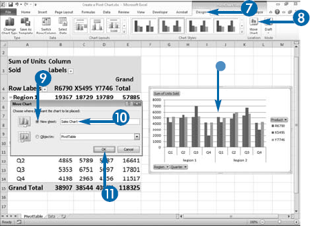
After you create a PivotChart, Excel makes PivotChart tools available to you through the Design, Layout, Format, and Analyze contextual tabs. The Design, Layout, and Format tools provide you with all the same options you have when creating a standard chart. These options are explained in this chapter. You can use them to layout and format your chart. The Analyze contextual tab is unique to PivotCharts. It has options that you can use to work with your PivotChart and PivotTable data.
By default, Excel embeds your PivotChart in the same worksheet where your PivotTable is located. You may want to move your PivotChart to make it easier to work with.
Extra
To save time, you can create a PivotChart when you create a PivotTable. Select the data on which you want to base your PivotTable. Click the Insert tab. Click the down arrow (
With a Standard Chart, you can click the Design tab. Click Select Data in the Data group and then click Switch/Row column to switch the row/column orientation. You cannot use the Select Data Source dialog box to switch the row/column orientation in a PivotChart. However, you can click the Switch Row/Column button in the Data group to make the switch.
In a standard chart, you can use the Select Data Source dialog box to change the chart data range. You cannot change the data range for a PivotChart by using the Select Data Source dialog box.
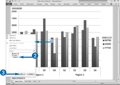
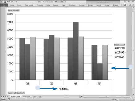
PivotCharts have filter buttons that you can use to sort and filter the data in your PivotChart. Changes you make to your PivotChart are automatically reflected in your PivotTable. For example, if your chart displays Region 1 and Region 2, you can filter it so that it only displays Region 1. When you filter your PivotChart, you also filter your PivotTable. Therefore, your PivotTable will also only display Region 1.
PivotCharts have Axis fields and Legend fields. You can use these fields to filter your PivotChart. Axis fields correspond to the Row Label fields in the PivotTable Field List. Axis Field categories appear on an axis of a PivotChart. For example, if the Row Labels in your PivotTable are Region and Quarter, Region and Quarter will appear on the Axis of your chart. You can use the Axis filter button to filter the data on the axis.
Legend fields correspond to the Column Label fields in the PivotTable Field List. Legend fields appear in the Legend of your PivotChart. They are the data series in your chart. You can use Legend filter buttons to filter the legend data. For example, if the Column Label in your PivotTable is Product, you can use the Legend filter button to filter products.
If your PivotTable has a report filter, you can also use it to filter your PivotChart. Report filters appear in the Report Filter box of the PivotTable Field List.