Chapter 12. Creating Fixed or Liquid Layouts
So far you’ve learned a lot about styling web content, from font sizes and colors to images, block elements, lists, and more. But what has yet to be discussed is a high-level overview of page layout. In general, there are two types of layouts—fixed and liquid—but also a layout that is a combination of the two, wherein some elements are fixed while others are liquid.
In this chapter, you’ll first learn about the characteristics of these two types of layouts and see a few examples of websites that use them. At the end of the chapter, you will see a basic template that combines elements of both types of layouts. Ultimately, the type of layout you decide is up to you—it’s hard to go wrong as long as your sites follow HTML and CSS standards.
Understanding Fixed Layouts
A fixed layout, or fixed-width layout, is just that: a layout in which the body of the page is set to a specific width. That width is typically controlled by a master “wrapper” <div> in which all content is contained. The width property of that <div> would be set in the style attribute or in a style sheet entry if the <div> was given an ID value such as “main” or “wrapper” (although the name is up to you).
When creating a fixed-width layout, the most important decision is determining the minimum screen resolution you want to accommodate. For many years, 800×600 has been the “lowest common denominator” for web designers, resulting in a typical fixed width of approximately 760 pixels. However, since 2007, the number of people using 800×600 screen resolution has been less than 8% (and is currently approximately 4%). Given that, many web designers consider 1024×768 the current minimum screen resolution, leading to fixed-width designs anywhere between 800 and 1000 pixels wide.
Caution
Remember, the web browser window contains non-viewable areas, including the scroll bar. So, if you are targeting a 1024-pixel-wide screen resolution, you really can’t use all 1024 of those pixels.
A main reason for creating a fixed-width layout is so that you can have precise control over the appearance of the content area. However, if users visit your fixed-width site with smaller or much larger screen resolutions than the resolution you had in mind while you designed it, they might encounter scrollbars (if their resolution is smaller) or a large amount of empty space (if their resolution is greater).
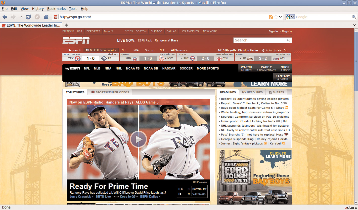
The current ESPN.com home page provides a visual example of this issue; it has a content area fixed at 964 pixels wide. In Figure 12.1, the browser window is a shade under 800 pixels wide. On the right side of the image, important content is cut off (and at the bottom of the figure, a horizontal scrollbar displays in the browser).
Figure 12.1 A fixed-width example with a smaller screen size.
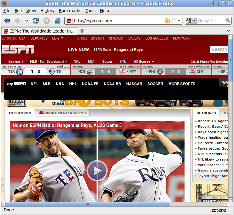
However, Figure 12.2 shows how this site looks when the browser window is more than 1400 pixels wide: There is a lot of empty space (or “real estate”) on both sides of the main body content.
Figure 12.2 A fixed-width example with a larger screen size.
There is another consideration when creating a fixed-width layout: whether to place the content flush-left or whether to center it. Placing the content flush-left produces extra space on the right side only; centering the content area creates extra space on both sides.
Understanding Liquid Layouts
A liquid layout—also called a fluid layout—is one in which the body of the page does not use a specified width in pixels, although it might be enclosed in a master “wrapper” <div> that uses a percentage width. The idea behind the liquid layout is that it can be perfectly usable and still retain the overall design aesthetic even if the user has a very small or very wide screen.
Three examples of a liquid layout in action are shown in Figures 12.3, 12.4, and 12.5.
Figure 12.3 A liquid layout as viewed in a relatively small screen.
Figure 12.4 A liquid layout as viewed in a very small screen.
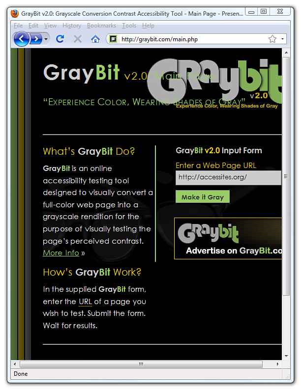
Figure 12.5 A liquid layout as viewed in a wide screen.
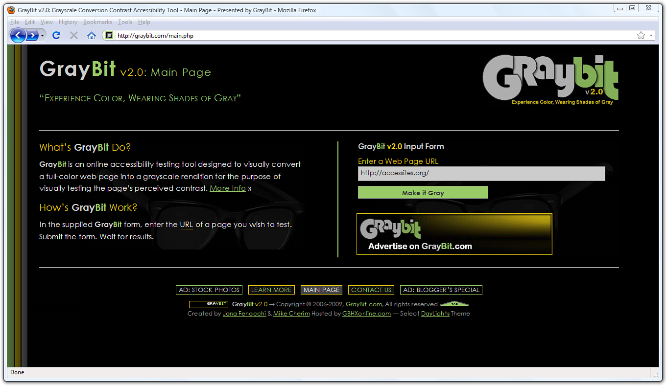
In Figure 12.3, the browser window is approximately 770 pixels wide. This example shows a reasonable minimum screen width before a horizontal scrollbar appears. In fact, the scrollbar does not appear until the browser is 735 pixels wide. On the other hand, Figure 12.4 shows a very small browser window (545 pixels wide).
In Figure 12.4, you can see a horizontal scrollbar; in the header area of the page content, the logo graphic is beginning to take over the text and appear on top of it. But the bulk of the page is still quite usable. The informational content on the left side of the page is still legible, and it is sharing the available space with the input form on the right side.
Figure 12.5 shows how this same page looks in a very wide screen.
In Figure 12.5, the browser window is approximately 1330 pixels wide. There is plenty of room for all of the content on the page to spread out. This liquid layout is achieved because all the design elements have a percentage width specified (instead of a fixed width). In doing so, the layout makes use of all the available browser real estate.
The liquid layout approach might seem like the best approach at first glance—after all, who wouldn’t want to take advantage of all the screen real estate available to them? There is a fine line between taking advantage of space and not allowing the content to breathe, as it were. Too much content is overwhelming; not enough content in an open space is underwhelming.
The pure liquid layout can be quite impressive, but it requires a significant amount of testing to ensure that it is usable in a wide range of browsers at varying screen resolutions. You might not have the time and effort to produce such a design; in that case, a reasonable compromise is the fixed/liquid hybrid layout.
Creating a Fixed/Liquid Hybrid Layout
A fixed/liquid hybrid layout is one that contains elements of both types of layouts. For example, you could have a fluid layout that includes fixed-width content areas either within the body area or as anchor elements (such as a left-side column or as a top navigation strip). You can even create a fixed content area that acts like a frame, as you’ll see in Chapter 20, “Using Windows and Frames,” in which the fixed content area remains fixed even as users scroll through the content.
Starting with a Basic Layout Structure
In this example, you’ll learn to create a template that is liquid but with two fixed-width columns on either side of the main body area (which is a third column, if you think about it, only much wider than the others). The template will also have a delineated header and footer area. Listing 12.1 shows the basic HTML structure for this layout.
Listing 12.1 Basic Fixed/Liquid Hybrid Layout Structure
<?xml version="1.0" encoding="UTF-8"?>
<!DOCTYPE html PUBLIC "-//W3C//DTD XHTML 1.1//EN"
"http://www.w3.org/TR/xhtml11/DTD/xhtml11.dtd">
<html xmlns="http://www.w3.org/1999/xhtml" xml:lang="en">
<head>
<title>Sample Layout</title>
<link href="layout.css" rel="stylesheet" type="text/css" />
</head>
<body>
<div id="header">HEADER</div>
<div id="wrapper">
<div id="content_area">CONTENT</div>
<div id="left_side">LEFT SIDE</div>
<div id="right_side">RIGHT SIDE</div>
</div>
<div id="footer">FOOTER</div>
</body>
</html>
First, note that the style sheet for this layout is linked to with the <link> tag rather than included in the template. Because a template is used for more than one page, you want to be able to control the display elements of the template in the most organized way possible. This means you need only to change the definitions of those elements in one place—the style sheet.
Next, you’ll notice that the basic HTML is just that: extremely basic. And, truth be told, this basic HTML structure can be used for a fixed layout, a liquid layout, or the fixed/liquid hybrid you’ll see here because all the actual styling that makes a layout fixed, liquid, or hybrid happens in the style sheet.
What you actually have with the HTML structure in Listing 12.1 is an identification of the content areas you want to include in your site. This planning is crucial to any development; you have to know what you want to include before you even think about the type of layout you are going to use, let alone the specific styles that will be applied to that layout.
At this stage, the layout.css file includes only this entry:
body {
margin:0;
padding:0;
}
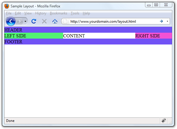
If you look at the HTML in Listing 12.1 and say to yourself “but those <div> elements will just stack on top of each other without any styles,” you are correct. As shown in Figure 12.6, there is no layout to speak of.
Figure 12.6 A basic HTML template with no styles applied to the <div> elements.

Defining Two Columns in a Fixed/Liquid Hybrid Layout
We can start with the easy things first. Because this layout is supposed to be liquid, we know that whatever we put in the header and footer areas will extend the width of the browser window regardless of how narrow or wide the window might be.
Adding the following code to the style sheet gives the header and footer area each a width of 100% and the same background color:
#header {
float: left;
width: 100%;
background-color: #7152F4;
}
#footer {
float: left;
width: 100%;
background-color: #7152F4;
}
Now things get a little trickier. We have to define the two fixed columns on either side of the page, plus the column in the middle. In the HTML, note that there is a <div> that surrounds all three, and it is called wrapper. This element is defined as follows:
#wrapper {
float: left;
padding-left: 200px;
padding-right: 125px;
}
The use of the two padding definitions is to essentially reserve space for the two fixed-width columns on the left and right of the page. The column on the left will be 200 pixels wide, the column on the right will be 125 pixels wide, and each will have a different background color. But we also have to position the items relative to where they would be placed if the HTML remained unstyled (see Figure 12.6). This means adding position: relative to the style sheet entries for each of these columns. Additionally, we indicate that the <div> elements should float to the left.
But in the case of the left_side <div>, we also indicate that we want the right-most margin edge to be 200 pixels in from the edge. (This is in addition to the column being defined as 200 pixels wide.) We also want the margin on the left side to be a full negative margin; this will pull it into place (as you will soon see). The right_side <div> does not include a value for right but it does include a negative margin on the right side:
#left_side {
position: relative;
float: left;
width: 200px;
background-color: #52f471;
right: 200px;
margin-left: -100%;
}
#right_side {
position: relative;
float: left;
width: 125px;
background-color: #f452d5;
margin-right: -125px;
}
At this point, let’s also define the content area so that it has a white background, takes up 100% of the available area, and floats to the left relative to its position:
#content_area {
position: relative;
float: left;
background-color: #ffffff;
width: 100%;
}
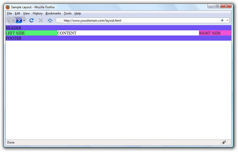
At this point, the basic layout will look something like that shown in Figure 12.7, with the areas clearly delineated.
Figure 12.7 A basic HTML template after some styles have been put in place.
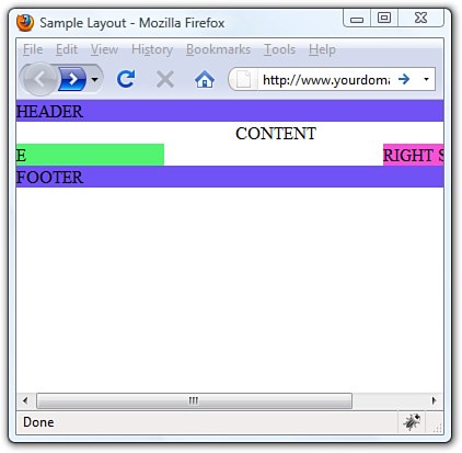
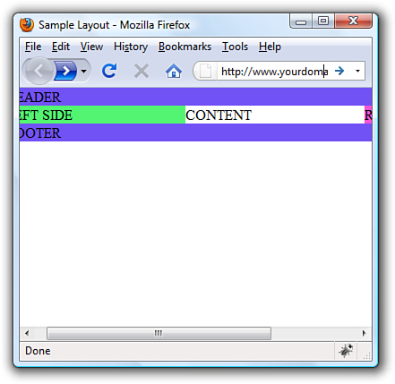
However, there’s a problem with this template if the window is resized below a certain width. Because the left column is 200 pixels wide, the right column is 125 pixels wide, and you want at least some text in the content area, you can imagine this page will break if the window is only 350 to 400 pixels wide. Figure 12.8 shows what happens when the window is resized just under 400 pixels wide (390, to be exact).
Figure 12.8 A basic HTML template resized under 400 pixels: bad!
Setting the Minimum Width of a Layout
Although it is unlikely that users will visit your site with a browser less than 400 pixels wide, the example serves its purpose within the confines of this book’s pages. You can extrapolate and apply this information broadly: Even in fixed/liquid hybrid sites, there will be a point at which your layout breaks down unless you do something about it.
That “something” is to use the min-width property. The min-width property sets the minimum width of an element, not including padding, borders, or margins. Figure 12.9 shows what happens when min-width is applied to the <body> element.
Figure 12.9 shows a wee bit of the right column after scrolling to the right, but the point is that the layout does not break when resized below a minimum width. In this case, the minimum width is 525 pixels:
body {
margin: 0;
padding: 0;
min-width: 525px;
}
Figure 12.9 A basic HTML template resized under 400 pixels: better!
The horizontal scrollbar appears in this example because the browser window itself is less than 500 pixels wide. The scrollbar disappears when the window is slightly larger than 525 pixels wide, and it’s definitely out of the picture entirely when the browser is approximately 875 pixels wide (see Figure 12.10).
Figure 12.10 A basic HTML template when viewed in a browser window wider than 800 pixels.
Handling Column Height in a Fixed/Liquid Hybrid Layout
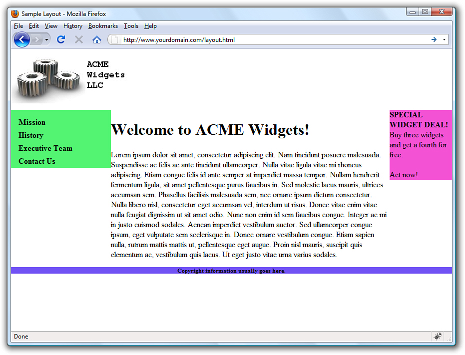
This example is all well and good except for one problem: It has no content. When content is added to the various elements, more problems arise. As shown in Figure 12.11, the columns become as tall as necessary for the content they contain.
Figure 12.11 Columns are only as tall as their contents.
Because you cannot count on a user’s browser being a specific height, or that the content will always be the same length, you might think this poses a problem with the fixed/liquid hybrid layout. Not so. If you think a little outside the box, you can apply a few more styles that will bring all the pieces together.
First, add the following declarations in the style sheet entries for the left_side, right_side, and content_area IDs:
margin-bottom: -2000px;
padding-bottom: 2000px;
These declarations add a ridiculous amount of padding and assign a ridiculously large margin to the bottom of all three elements. You must also add position:relative to the footer ID in the style sheet so that it is visible despite this padding.
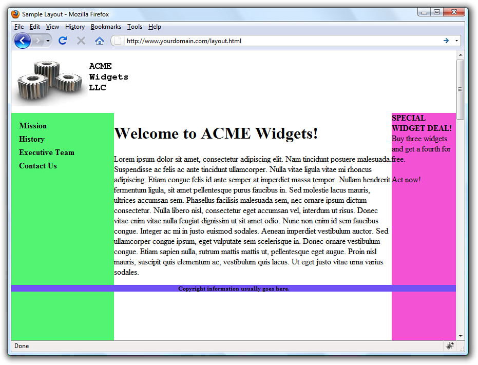
At this point, the page looks like Figure 12.12—still not what we want, but closer.
Figure 12.12 Color fields are now visible despite the amount of content in the columns.
To clip off all that extra color, add the following to the style sheet for the wrapper ID:
overflow: hidden;
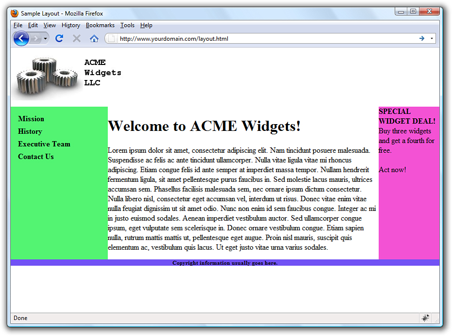
Figure 12.13 shows the final result: a fixed-width/liquid hybrid layout with the necessary column spacing.
Figure 12.13 Congratulations! It’s a fixed-width/liquid hybrid layout.
The full HTML code can be seen in Listing 12.2, and the final style sheet is shown in Listing 12.3.
Listing 12.2 Basic Fixed/Liquid Hybrid Layout Structure (with Content)
<?xml version="1.0" encoding="UTF-8"?>
<!DOCTYPE html PUBLIC "-//W3C//DTD XHTML 1.1//EN"
"http://www.w3.org/TR/xhtml11/DTD/xhtml11.dtd">
<html xmlns="http://www.w3.org/1999/xhtml" xml:lang="en">
<head>
<title>Sample Layout</title>
<link href="layout.css" rel="stylesheet" type="text/css" />
</head>
<body>
<div id="header"><img src="acmewidgets.jpg" alt="ACME Widgets
LLC"/></div>
<div id="wrapper">
<div id="content_area">
<h1>Welcome to ACME Widgets!</h1>
<p>Lorem ipsum dolor sit amet, consectetur adipiscing elit.
Nam tincidunt posuere malesuada. Suspendisse ac felis ac ante
tincidunt ullamcorper. Nulla vitae ligula vitae mi rhoncus
adipiscing. Etiam congue felis id ante semper at imperdiet
massa tempor. Nullam hendrerit fermentum ligula, sit amet
pellentesque purus faucibus in. Sed molestie lacus mauris,
ultrices accumsan sem. Phasellus facilisis malesuada sem, nec
ornare ipsum dictum consectetur. Nulla libero nisl,
consectetur eget accumsan vel, interdum ut risus. Donec
vitae enim vitae nulla feugiat dignissim ut sit amet odio.
Nunc non enim id sem faucibus congue. Integer ac mi in justo
euismod sodales. Aenean imperdiet vestibulum auctor. Sed
ullamcorper congue ipsum, eget vulputate sem scelerisque in.
Donec ornare vestibulum congue. Etiam sapien nulla, rutrum
mattis mattis ut, pellentesque eget augue. Proin nisl mauris,
suscipit quis elementum ac, vestibulum quis lacus. Ut eget
justo vitae urna varius sodales. </p>
</div>
<div id="left_side">
<ul>
<li><a href="#">Mission</a></li>
<li><a href="#">History</a></li>
<li><a href="#">Executive Team</a></li>
<li><a href="#">Contact Us</a></li>
</ul>
</div>
<div id="right_side"><strong>SPECIAL WIDGET DEAL!</strong><br/>
Buy three widgets and get a fourth for free.<br/><br/>
Act now!
</div>
</div>
<div id="footer"> Copyright information usually goes here.</div>
</body>
</html>
Listing 12.3 Full Style Sheet for Fixed/Liquid Hybrid Layout
body {
margin:0;
padding:0;
min-width: 525px;
}
#header {
float: left;
width:100%;
background-color: #ffffff;
}
#footer {
float: left;
width:100%;
background-color: #7152f4;
font-size: 8pt;
font-weight: bold;
text-align: center;
position: relative;
}
#wrapper {
float: left;
padding-left: 200px;
padding-right: 125px;
overflow: hidden;
}
#left_side {
position: relative;
float: left;
width: 200px;
background-color: #52f471;
right: 200px;
margin-left: -100%;
padding-bottom: 2000px;
margin-bottom: -2000px;
}
#right_side {
position: relative;
float: left;
width: 125px;
background-color: #f452d5;
margin-right: -125px;
padding-bottom: 2000px;
margin-bottom: -2000px;
}
#content_area {
position: relative;
float: left;
background-color: #ffffff;
width: 100%;
padding-bottom: 2000px;
margin-bottom: -2000px;
}
#left_side ul {
list-style: none;
margin: 12px 0px 0px 12px;
padding: 0px;
}
#left_side li a:link, #nav li a:visited {
font-size: 12pt;
font-weight: bold;
padding: 3px 0px 3px 3px;
color: #000000;
text-decoration: none;
display: block;
}
#left_side li a:hover, #nav li a:active {
font-size: 12pt;
font-weight: bold;
padding: 3px 0px 3px 3px;
color: #ffffff;
text-decoration: none;
display: block;
}
Summary
In this chapter, you saw some practical examples of the three main types of layouts: fixed, liquid, and a fixed/liquid hybrid. In the third section of the chapter, you saw an extended example that took you through the process bit-by-bit for creating a fixed/liquid hybrid layout in which the HTML and CSS all validate properly. Remember, the most important part of creating a layout is figuring out the sections of content you think you might need to account for in the design.
Q&A
Q. I’ve heard about something called an elastic layout. How is that different from the liquid layout?
A. An elastic layout is a layout whose content areas resize when the user resizes the text. Elastic layouts use ems, which are inherently proportional to text and font size. An em is a typographical unit of measurement equal to the point size of the current font. When ems are used in an elastic layout, if a user forces the text size to increase or decrease in size by pressing Ctrl and using the mouse scroll wheel, the areas containing the text increase or decrease proportionally. Elastic layouts are very difficult to achieve and are more commonly found in portfolios rather than actual practice due to the number of hours involved in perfecting them.
Q. You’ve spent a lot of time talking about liquid layouts or hybrid layouts. Are they better than a purely fixed layout?
A. “Better” is a subjective term; in this book, the concern is with standards-compliant code. Most designers will tell you that liquid layouts take longer to create (and perfect), but the usability enhancements are worth it. When might the time not be worth it? If your client does not have an opinion and if they are paying you a flat rate rather than an hourly rate, then it might not be worth it. In that case, you are working only to showcase your own skills—that might be worth it to you, however.
Workshop
The workshop contains quiz questions and activities to help you solidify your understanding of the material covered. Try to answer all questions before looking at the “Answers” section that follows.
Quiz
1. Which is the best layout to use, in general: fixed, liquid, or a hybrid?
2. Can you position a fixed layout anywhere on the page?
3. What does min-width do?
Answers
1. This was a trick question; there is no “best” layout. It depends on your content and the needs of your audience.
2. Sure. Although most fixed layouts are flush-left or centered, you could assign a fixed position on an XY axis where you could place a <div> that contains all the other layout <div>s.
3. The min-width property sets the minimum width of an element, not including padding, borders, or margins.
Exercises
• Figure 12.13 shows the finished fixed/liquid hybrid layout, but notice there are a few areas for improvement. There isn’t any space around the text in the right-side column, there aren’t any margins between the body text and either column, the footer strip is a little sparse, and so on. Take some time to fix up these design elements.
• After you’ve added margin or padding as appropriate in the first exercise, spruce up this page with a horizontal navigation strip and fancier vertical navigation based on what you learned in Chapter 11, “Using CSS to Do More with Lists, Text, and Navigation.”