
Using the ListView and FormView controls to display data
Creating the ListView’s templates by hand and through the Configure ListView dialog box
Sorting data with the ListView
Paging through data with the DataPager control
Paging through the FormView’s records
As we have seen through the past several hours, the GridView and DetailsView controls make displaying, inserting, editing, and deleting database data as easy as point and click. However, these two controls render a rather boxy and unimaginative interface. By default, the GridView and DetailsView use BoundFields to display the database columns returned by their data source controls, which simply display the value as text when in read-only mode and as a text box when in edit or insert mode.
In the preceding hour, “Exploring Data Binding and Other Data-Related Topics,” we saw how to customize the GridView and DetailsView using alternative field types. The TemplateField offers the most flexibility because its templates can contain a mix of HTML, Web controls, and data binding syntax. TemplateFields are often used to customize the editing or inserting interfaces by adding validation controls or replacing the text box with a more suitable input Web control. But even with TemplateFields, the GridView and DetailsView controls still produce a boxy interface.
The ListView and FormView controls are two data Web controls that offer the same rich features found in the GridView and DetailsView—sorting, paging, inserting, editing, and deleting—but with a much more flexible layout. Rather than using fields, the ListView and FormView controls define their layout via templates. Because templates allow for a mix of HTML, Web controls, and data binding syntax, the ListView and FormView controls can be configured to render any values from their data source controls using any Web control and in any order.
Like the GridView, the ListView control displays all the records returned by its data source control. Instead of displaying its underlying data as a grid, the ListView renders its contents based on its templates. Templates provide a finer degree of control over the rendered markup and therefore enable the ListView to display data in more interesting and customizable ways than is possible with the GridView.
By the Way
The ListView control is new to ASP.NET version 3.5. Prior to version 3.5, developers used the DataList or Repeater controls to display multiple records using a template. The DataList and Repeater controls are still available in ASP.NET version 3.5 and can be found in the Toolbox along with the ListView. This book focuses on the ListView because it includes additional features not found in the DataList or Repeater.
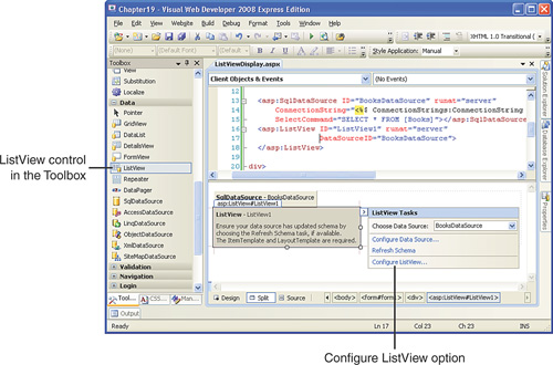
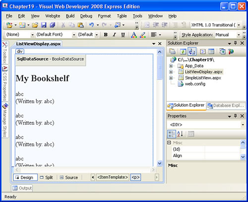
Let’s practice using the ListView control to display data. Create a new ASP.NET page and add a SqlDataSource to the page, naming it BooksDataSource. Configure the BooksDataSource control to return all the columns from the Books table. Next, add a ListView control to the page. The ListView control is located in the Data section of the Toolbox alongside the other data Web controls and data source controls.
The ListView control is displayed in the Design view as a gray box until its ItemTemplate and LayoutTemplate are defined. The ItemTemplate and LayoutTemplate are two of the ListView’s templates and are both required. These templates can be created manually or automatically through the Configure ListView dialog box. Regardless of how these templates are created, we first need to specify the control’s data source. To accomplish this, go to the ListView control’s smart tag and choose the BooksDataSource from the drop-down list. Upon selecting the data source, the smart tag is refreshed and includes a new option, Configure ListView (see Figure 19.1).
By the Way
If you do not see the Configure ListView option in your ListView’s smart tag after binding it to a data source, click the Refresh Schema link in the smart tag.
At this point we’re ready to create the LayoutTemplate and ItemTemplate. Before we examine how to create these templates, let’s first discuss how these two templates are used by the ListView when rendering its output.
The GridView displays the contents of its underlying data source control in a grid. Each record returned by the data source control is rendered as a row; the grid’s columns are defined by the GridView’s fields.
The ListView, on the other hand, displays the contents of its underlying data source control using templates. The LayoutTemplate is rendered exactly once and includes any HTML or text that you want to appear around the data. For example, if you want to display a message above the data, you can do so by typing in the text in the LayoutTemplate.
The ItemTemplate is rendered once for each record returned by the data source control and typically contains HTML, Web controls, and data binding syntax. Recall from Hour 18 that data binding syntax is markup in the form <%# Eval("columnName") %> or <%# Bind("columnName") %>. These expressions return the value of the database column columnName for the current data source record.
Finally, the LayoutTemplate must contain a server-side control that has its ID set to itemPlaceholder. This specifies the location within the LayoutTemplate that the contents of the ItemTemplate are added.
If all this information is a bit overwhelming, don’t worry, an example should clear things up. Listing 19.1 shows the declarative markup of a sample ListView control. The LayoutTemplate is defined in lines 2–5, the ItemTemplate in lines 6 through 12.
Example 19.1. A Simple ListView Control’s Declarative Markup
 1: <asp:ListView ID="ListView1" runat="server" DataSourceID="BooksDataSource">
 2:     <LayoutTemplate>
 3:         <h2>My Bookshelf</h2>
 4:         <asp:PlaceHolder runat="server" ID="itemPlaceholder"> </asp:PlaceHolder>
 5:     </LayoutTemplate>
 6:     <ItemTemplate>
 7:         <p>
 8:             <asp:Label ID="TitleLabel" runat="server" Text='<%#  Eval("Title") %>'></asp:Label>
 9:             <br />
10:             (Written by: <%# Eval("Author") %>)
11:         </p>
12:    </ItemTemplate>
13: </asp:ListView>
The LayoutTemplate displays the text My Bookshelf in an <h2> HTML element on line 3. <h2> is an HTML element that displays its inner content in a large, bold font. The <asp:PlaceHolder> markup on line 4 specifies the location where the rendered ItemTemplate contents will be placed. As its name implies, the PlaceHolder control’s purpose is to serve as a marker. Because the PlaceHolder’s ID is set to itemPlaceholder, the ListView will place the rendered contents of its ItemTemplate here.
The ItemTemplate displays the Title and Author columns using data binding syntax. A Label Web control is used on line 8, with the Title column assigned to the Label’s Text property. Data binding expressions can be used outside of Web controls, as the syntax on line 10 shows.
In addition to the data binding syntax, the ItemTemplate contains text and HTML elements. The Author value displayed on line 10 is prefaced with the text Written by:. There’s also a paragraph element (lines 7 and 11) and a line break element (line 9) to add some whitespace when displayed in the browser.
Watch Out!
When assigning a database column value to a Web control property using data binding syntax, it is imperative that you use apostrophes to delimit the property value and quotation marks to delimit the column name in the Eval or Bind method. For example, the markup used on line 8 to assign the Title column value to the TitleLabel’s Text property is:
Text='<%# Eval("Title") %>'Note that apostrophes delimit the value assigned to the Text property, and quotation marks delimit the column name (Title). The following examples are invalid and will result in an error:
Text="<%# Eval("Title") %>"
Text="<%# Eval('Title') %>"
Figure 19.2 shows this ListView control when viewed through a browser.
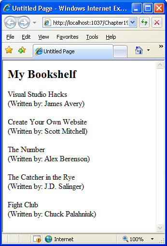
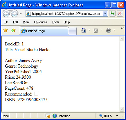
When the ASP.NET engine rendered the ListView control shown in Figure 19.2, it started by emitting the contents in the LayoutTemplate, namely the title My Bookshelf. It then enumerated the records in the data source control and, for each record, rendered the ItemTemplate. This resulted in HTML that displayed the book’s title and author within a paragraph element. For example, the following markup was rendered for the ItemTemplate rendered for the book Visual Studio Hacks:
<p>
   <span id="ListView1_ctrl0_TitleLabel">Visual Studio Hacks</span>
   <br />
   (Written by: James Avery)
</p>
By going to your browser’s View menu and choosing Source, you can see the complete HTML that was generated.
The important concept to take away from this discussion is that the ListView generates it markup by first rendering the LayoutTemplate and then rendering the ItemTemplate for each record, placing the rendered markup at the location in the LayoutTemplate designated by the server control whose ID is itemPlaceholder.
After specifying the ListView’s data source, its smart tag is refreshed to include a Configure ListView option. Clicking this displays the Configure ListView dialog box, from which we can pick a layout and style and whether to include paging support. After specifying these options and clicking the OK button, Visual Web Developer automatically generates the ListView’s templates.
Let’s practice using the Configure ListView option. For this example, use the Grid layout and Professional style; leave the Enable Paging check box unchecked. Figure 19.3 shows the Configure ListView dialog box after these selections have been made.
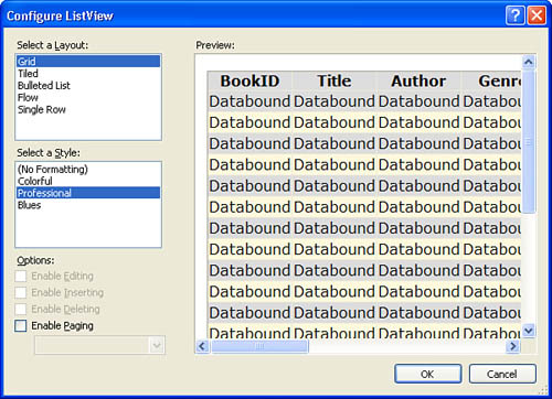
Based on your choices made in the Configure ListView dialog box, Visual Studio creates a series of templates for the ListView. The Grid layout uses an HTML <table> element in the LayoutTemplate to create a gridlike configuration. The Professional style adds assorted style-related markup to the templates to apply various formatting rules, such as the grid’s background colors and border settings.
Take a second to peer through the Source view. Along with the LayoutTemplate and ItemTemplate, the Configure ListView dialog box created the following additional templates:
AlternatingItemTemplate
InsertItemTemplate
SelectedItemTemplate
EmptyDataTemplate
EditItemTemplate
Table 19.1 summarizes the ListView’s most commonly used templates.
Table 19.1. The Most Commonly Used ListView Templates
Template | Description |
|---|---|
AlternatingItemTemplate | If present, this template is rendered in place of the ItemTemplate for alternating rows. |
EditItemTemplate | If the ListView is configured to support editing, this template is used to render the editing interface. |
EmptyDataTemplate | Rendered if no records are returned by the data source control. |
GroupTemplate | A ListView can be configured to render several ItemTemplates as a “group.” The markup for each group is defined by this template. |
InsertItemTemplate | If the ListView is configured to support inserting, this template is used to render the inserting interface. |
ItemSeparatorTemplate | If specified, this template’s markup is injected between each rendered ItemTemplate. |
ItemTemplate | This template is rendered once for each record returned from the data source control. This template is required. |
LayoutTemplate | This template is rendered once for the entire control and specifies where the contents of the ItemTemplate are located. This template is required. |
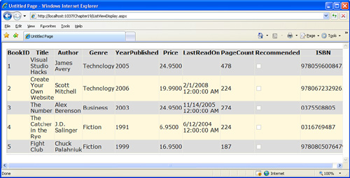
Figure 19.4 shows the ListView when viewed through a browser.
As we’ve seen in previous hours, the GridView and DetailsView controls include an Edit Templates option in their smart tags that, when clicked, displays a template editing interface in the Design view. Unfortunately, the ListView does not include a template editing interface. All template content must be added directly to the Source view.
To practice specifying the markup for these templates manually, create a new page named SimpleListView.aspx. Add a SqlDataSource control and configure it to return all records from the Books table. Next, add a ListView control to the page and bind it to the SqlDataSource control. Finally, type in the LayoutTemplate and ItemTemplate content from Listing 19.1 (lines 2–12) into the ListView control’s declarative markup. After entering these templates, the ListView no longer displays as a gray box in the Design view, but instead offers a WYSIWYG interface (see Figure 19.5).
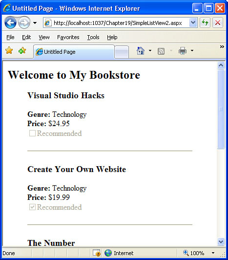
Let’s try another example. Create a new page named SimpleListView2.aspx and add a SqlDataSource and ListView control like before. This time, define the LayoutTemplate so that it includes an <h2> element displaying the text Welcome to My Bookstore and indents the contents of the ItemTemplates using the <blockquote> element.
In the ItemTemplate, use an <h3> element to display the Title. Beneath that, display the Genre and Price values, formatting the price as a currency. Include a CheckBox Web control and set its Checked property to the value returned from the Recommended database column. Also set the CheckBox’s Text property to Recommended and the Enabled property to False.
Finally, use the <hr /> HTML element to display a horizontal rule between each rendered item. As noted in Table 19.1, the ListView’s ItemSeparatorTemplate’s content is rendered between each ItemTemplate, so put this HTML there.
The markup for these three templates is provided in Listing 19.2. However, I encourage you to first try to create the markup for these three templates on your own. Don’t worry about making a mistake or doing things wrong; just try your best, knocking off one little piece at a time. Frequently check your progress by viewing the WYSIWYG display in the Design view and by visiting the page through a browser.
Example 19.2. This ListView Uses Three Templates: LayoutTemplate, ItemTemplate, and ItemSeparatorTemplate
 1: <asp:ListView ID="ListView1" runat="server" DataSourceID="BooksDataSource">
 2:     <LayoutTemplate>
 3:         <h2>Welcome to My Bookstore</h2>
 4:         <blockquote>
 5:             <asp:PlaceHolder runat="server" ID="itemPlaceholder"> </asp:PlaceHolder>
 6:         </blockquote>
 7:     </LayoutTemplate>
 8:     <ItemTemplate>
 9:         <h3><%#Eval("Title")%></h3>
10:         <p>
11:             <b>Genre: </b>
12:             <asp:Label runat="server" id="GenreLabel" Text='<%# Eval("Genre") %>'></asp:Label>
13:             <br />
14:             <b>Price: </b>
15:             <%#Eval("Price", "{0:c}")%>
16:             <br />
17:             <asp:CheckBox ID="RecommendedCheckBox" runat="server"
18:                           Checked='<%# Eval("Recommended") %>'
19:                           Text="Recommended" Enabled="false" />
20:         </p>
21:     </ItemTemplate>
22:     <ItemSeparatorTemplate>
23:         <hr />
24:     </ItemSeparatorTemplate>
25: </asp:ListView>
Let’s review each of the templates in Listing 19.2. The LayoutTemplate spans lines 2 through 7. It starts with an <h2> element (line 3). Next, the PlaceHolder with ID itemPlaceholder is defined within a <blockquote> element (lines 4–6).
The ItemTemplate follows, starting on line 8. Line 9 displays the Title column in an <h3> element. Next, a paragraph element is defined and, within that, the Genre, Price, and Recommended columns are displayed. The Genre column value is bound to the Text property of the GenreLabel Label Web control (line 12). Recall that the Eval and Bind methods can display the specified column using a format specified. The Eval method on line 15 is passed two input parameters: Price and {0:c}. This displays the value of the Price column using the currency format. A CheckBox is used to indicate whether a book is recommended. Because the value of the Recommended column is bound to the CheckBox’s Checked property, the resulting check box will be checked only if Recommended is True.
ItemSeparatorTemplate is the third and final template (lines 22–24). It indicates that a horizontal rule should separate each ItemTemplate.
Figure 19.6 shows the SimpleListView2.aspx page when viewed through a browser.
By the Way
Although the Configure ListView dialog box automatically generates the templates for you, it’s likely that you’ll need to further customize the templates’ contents. Because no Edit Templates interface exists, these customizations must be made through the Source view. Therefore, I suggest that you become comfortable with creating and editing the ListView’s templates through the Source view.
Like the GridView, the ListView can be configured to include options for the user to sort and page through the data. Recall that with the GridView, configuring the sorting and paging features is as simple as checking the Enable Sorting and Enable Paging check boxes in the GridView’s smart tag. Enabling sorting converts each of the GridView’s column headers from plain text to a LinkButtons that, when clicked, causes a postback and redisplays the GridView data sorted by the selected column. With paging enabled, the GridView includes a paging interface with page numbers or next and previous links.
Implementing sorting and paging in the ListView control requires a little more work on our end. Because of the ListView’s highly customizable layout, it cannot automatically insert sort LinkButtons or render a paging interface. Instead, we must define the sorting and paging interfaces. The good news is that this can be accomplished by adding various Web controls to the ListView’s templates, and it does not require us to write any code.
The next two sections look at implementing sorting and paging in a ListView. In “Creating a Sorting Interface” we will look at how to add sorting LinkButtons to the ListView. The “Adding Paging Support” section builds on the sortable ListView and adds a paging interface.
Defining a sorting interface for the ListView entails adding specially configured LinkButton controls to the ListView’s templates. Usually these LinkButtons are placed in the LayoutTemplate so that they appear just once; defining them in the ItemTemplate would have them appear once for each record returned by the data source control.
Create a new page named SortAndPageListView.aspx. Add a SqlDataSource control and configure it to return all the records from the Books table; set its ID to BooksDataSource. Next, add a ListView control, binding it to the BooksDataSource SqlDataSource; set the ListView’s ID property to BookList. Re-create the templates from SimpleListView2.aspx and Listing 19.2 in the BookList ListView. You can reenter the templates’ syntax or copy and paste the declarative markup.
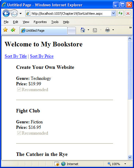
Let’s add two sorting options to the ListView—one to sort by title and one to sort by price. Add two LinkButton controls to the LayoutTemplate beneath the <h2> element, but above <blockquote>. Set the LinkButtons’ ID properties to SortByTitle and SortByPrice. Similarly, set the Text properties to Sort By Title and Sort By Price.
View the SortListView.aspx page through a browser. You should now see the two sort LinkButtons below the Welcome to My Bookstore title. Clicking these links causes a postback, but the data is not sorted. For these LinkButtons to sort the data, we need to configure two of their properties:
CommandName—. This property must be set toSort.CommandArgument—. Set this property to the column name by which to sort the results.
Set the SortByTitle LinkButton’s CommandName property to Sort and its CommandArgument property to Title; likewise, set the SortByPrice LinkButton’s CommandName property to Sort and its CommandArgument property to Price. With these changes in place, your ListView’s LayoutTemplate should look similar to the following
<LayoutTemplate>
    <h2>Welcome to My Bookstore</h2>
    <asp:LinkButton ID="SortByTitle" runat="server"
                    Text="Sort By Title"
                    CommandName="Sort"
                    CommandArgument="Title"></asp:LinkButton> |
    <asp:LinkButton ID="SortByPrice" runat="server"
                    Text="Sort By Price"
                    CommandName="Sort"
                    CommandArgument="Price"></asp:LinkButton>
    <blockquote>
        <asp:PlaceHolder runat="server" ID="itemPlaceholder"></asp:PlaceHolder>
    </blockquote>
</LayoutTemplate>
Visit the page through a browser again. This time, clicking the LinkButtons not only causes a postback, but sorts the data by the specified column. Moreover, clicking a particular LinkButton multiple times toggles between sorting the data in ascending and descending order.
Did you Know?
The SortListView.aspx page uses LinkButtons for the sorting interface. Alternatively, you can use Buttons or ImageButtons. The same configuration steps apply—namely, set the CommandName and CommandArgument properties.
Figure 19.7 shows the results of clicking the Sort By Title LinkButton. Refer to Figure 19.6 to see what the page looks like when first visited, before a sort LinkButton has been clicked.
The ListView does not offer built-in paging support itself. Instead, paging is provided through a separate Web control, the DataPager. The DataPager control renders a paging interface for a specified data Web control. To allow the user to page through the ListView’s records, then, add a DataPager to the page wherever you want the paging interface to appear and configure its properties.
By the Way
Like the ListView, the DataPager control is new to ASP.NET version 3.5. The DataPager works only with the ListView control, but I wouldn’t be surprised if in future versions of ASP.NET the DataPager also works with the GridView, DetailsView, and FormView controls.
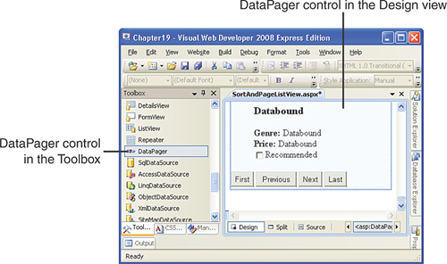
Let’s update the SortAndPageListView.aspx page so that visitors can page through the books using a First, Previous, Next, Last paging interface. Add a DataPager to the page, placing it beneath the ListView control. The DataPager control is located in the Data section of the Toolbox.
The Design view displays the DataPager control as a gray box until its pager fields are defined. The pager fields are what make up the paging interface. The DataPager’s smart tag contains a Choose Pager Style drop-down list with two common pager field options:
Next/Previous Pager—. Displays First, Previous, Next, and Last buttons
Numeric Pager—. Displays up to five numeric page links
You may optionally use a custom pager field.
For now, choose the Next/Previous Pager option from the smart tag’s drop-down list. As Figure 19.8 shows, the DataPager now appears in the Design view as four Button controls labeled First, Previous, Next, and Last.
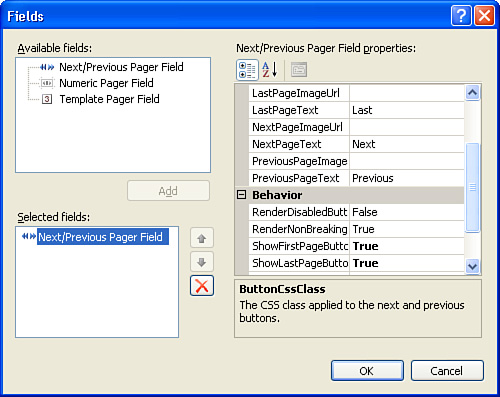
To customize the DataPager’s appearance, select the Edit Pager Fields option from its smart tag. This launches a dialog box from which you can customize the pager field’s properties (see Figure 19.9). For example, you can specify whether to display the First and Last options by configuring the Next/Previous Pager Field’s ShowFirstPageButton and ShowLastPageButton properties. To alter the text displayed in these buttons, use the FirstPageText, PreviousPageText, NextPageText, and LastPageText properties.
After you have the pager field looking the way you want, the last step is to wire up the DataPager to the ListView control. This is accomplished by setting the DataPager’s PagedControlID property to the ID of the ListView. Select the DataPager to load its properties in the Properties window. The PagedControlID property lists the available ListView controls on the page in a drop-down list—select BookList.
The DataPager’s PageSize property indicates how many records to display per page and defaults to 10. Because only five books are in the Books table, if we leave property set at its default, all the records will be displayed on the first page, and the paging interface will be disabled. Therefore, set the PageSize to 2 so that the list of books is spread across three pages.
After making these changes, visit the page through a browser. As Figure 19.10 shows, when the page is first visited, only the first two books are displayed—Visual Studio Hacks and Create Your Own Website. The Next and Last buttons are enabled.
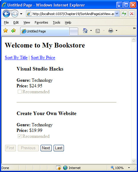
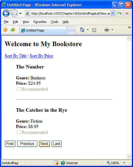
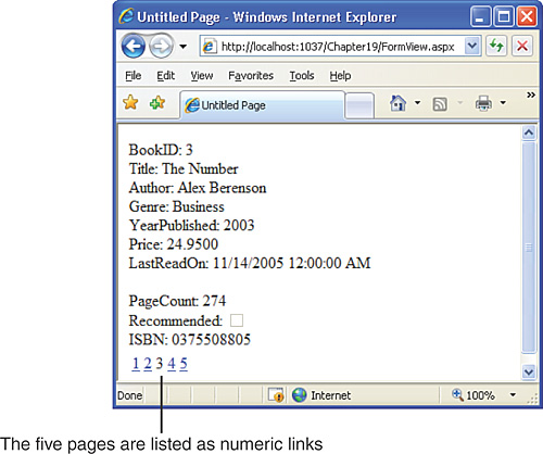
Figure 19.11 shows the page after the Next button is clicked. The books The Number and The Catcher in the Rye are listed, and all four pager buttons are enabled.
The ListView control displays all the records from its data source control using, at minimum, a LayoutTemplate and ItemTemplate. The FormView is similar to the ListView in that it uses templates to render its output, but instead of displaying all the records from its data source, it displays only one at a time, much like the DetailsView control.
Let’s practice using the FormView control. Create a new page named FormView.aspx. Start by adding a SqlDataSource to the page; configure it to return all columns from the Books table and set its ID property to BooksDataSource. Next, add a FormView control to the page. The FormView can be found in the Data section of the Toolbox.
Like the ListView, the FormView initially appears in the Design view as a gray box. It cannot be rendered in the Design view until its ItemTemplate is defined. The FormView’s smart tag includes three options:
Auto Format—. This option works like the DetailsView’s Auto Format option. Selecting it displays a number of predefined styles in the Auto Format dialog box, and choosing one of the styles sets a number of the FormView’s formatting properties.
Choose Data Source—. Select the data source to bind to the FormView from the drop-down list.
Edit Templates—. This option displays the same WYSIWYG template editor available from the GridView and DetailsView’s smart tags.
Bind the FormView to the BooksDataSource SqlDataSource control by selecting it from the Choose Data Source drop-down list. This automatically creates an ItemTemplate, EditItemTemplate, and InsertItemTemplate for the FormView control. Moreover, the smart tag is updated to include an Enable Paging check box.
The ItemTemplate that was automatically generated by Visual Web Developer when selecting the FormView’s data source displays the name and value of each column returned by the data source control. Figure 19.12 shows the FormView when viewed through the Design view. The Designer lists each column name and then 0 or abc to represent where the value of the column will be displayed.
View the FormView through a browser. As Figure 19.13 shows, the FormView displays only the first record returned by its data source control (Visual Studio Hacks).
You may have noticed that the FormView, by default, doesn’t provide any mechanism by which to view the next record in the data source. Like the DetailsView, we see just one record at a time, but there’s no way to move to the next record. To provide a means to step through the records, check the Enable Paging check box in the FormView’s smart tag. This adds a paging interface to the bottom of the FormView’s rendered markup. By default, the paging interface uses page numbers to allow the user to jump to a particular record, but the paging interface is configurable through the PagerSettings property.
After checking the Enable Paging check box, take a moment to view the page in a browser. Note that now there are five links at the bottom of the DetailsView, allowing you to navigate to any of the five records in the Books table by clicking the appropriately numbered link. Figure 19.14 shows this default paging interface.
The paging interface can be customized through the Properties window. From the Properties window, scroll down to the Paging section. There, you’ll find two properties:
AllowPaging—. This property indicates whether paging is supported (it defaults toFalse). When you checked the Enable Paging check box in the smart tag, this property was set toTrue.PagerSettings—. This property contains a number of subproperties that customize the appearance of the pager row. For example, instead of having page number links, you can use Next/Previous links.
These paging options should be familiar because the DetailsView control offers the same paging-related properties.
By the Way
You may have noticed that the FormView is more similar to the DetailsView than the ListView is to the GridView. For example, the FormView’s smart tag includes an EditTemplates option. Paging is enabled through the FormView’s AllowPaging property rather than the DataPager control. The reason is that the FormView control was introduced in ASP.NET version 2.0, at the same time as the GridView and DetailsView controls. Not surprisingly, they all have roughly the same set of features and configuration options. The ListView and DataPager controls, however, were added to the ASP.NET Toolbox in version 3.5, which explains why they may seem like the oddballs of the data Web controls.
Because the FormView displays only one record at a time, it does not need as many templates as the ListView. For example, the ListView has an ItemSeparatorTemplate that, if present, is rendered between each item bound to the ListView. With the FormView, only one item is rendered, so there’s no need to have a separator template.
Table 19.2 lists the FormView’s seven templates. The only required template is the ItemTemplate.
Table 19.2. The FormView’s Seven Available Templates
Template | Description |
|---|---|
EditItemTemplate | If the FormView is configured to support editing, this template is used to render the editing interface. |
EmptyDataTemplate | Rendered if no records are returned by the data source control. |
FooterTemplate | If present, this template’s rendered markup appears after all other templates. |
HeaderTemplate | If present, this template’s rendered markup appears before all other templates. |
InsertItemTemplate | If the FormView is configured to support inserting, this template is used to render the inserting interface. |
ItemTemplate | This template is rendered for the current data source record. This template is required. |
PagerTemplate | The FormViewUse automatically renders a paging interface. Use this template to render a custom paging interface. |
The ItemTemplate generated by Visual Studio is rather bland and uninspiring. Let’s update this default ItemTemplate so that it displays only a subset of the database column values. Furthermore, let’s format the values we do display so that they stand out more.
Working with the FormView’s templates is much easier than working with the ListView’s because the FormView offers the WYSIWYG Edit Templates interface. Go to the FormView’s smart tag and click the Edit Templates link. This displays the template editing view, with the smart tag listing the available templates.
The ItemTemplate displays each column name as text. This text is followed by a Label Web control or a CheckBox Web control, depending on the column’s data type. Let’s remove the text and Label controls that display the BookID, YearPublished, LastReadOn, and ISBN columns. To remove this content, click within the ItemTemplate editing interface and use your keyboard’s Delete or Backspace keys.
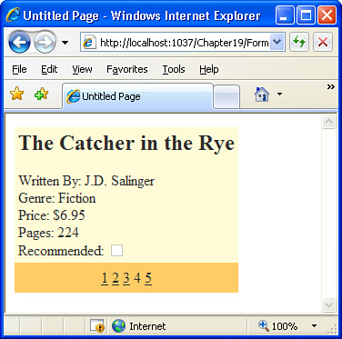
Let’s format the Title column so that it displays in a large, bold font. First, remove the Title: text preceding the TitleLabel Label control. Then select the TitleLabel so that its properties are loaded in the Properties window. From there, expand the Font property and set its Bold and Size subproperties to True and X-Large, respectively.
At this point your screen should look similar to Figure 19.15.

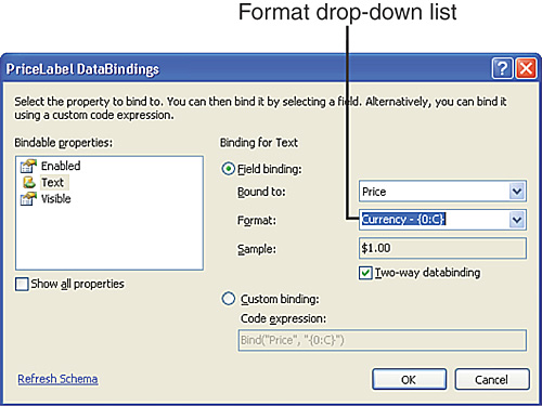
Next, change the Author: and PageCount: text to Written By: and Pages:. Last, format the value of the Price column as a currency. To accomplish this, bring up the PriceLabel’s smart tag and choose the Edit DataBindings option. This brings up the PriceLabel DataBindings dialog box, indicating that the Label’s Text property is bound to the Price column value. This dialog box includes a Format drop-down list that’s currently set to None—change this to Currency (see Figure 19.16).
Finally, let’s add some color to our FormView. Exit the Edit Template interface by selecting the End Template Editing link from the smart tag. Next, choose the Auto Format option from the smart tag and pick a scheme. Like with the GridView and DetailsView controls, picking a scheme from the Auto Format dialog box sets a number of the control’s formatting properties. Rather than choosing a predefined format scheme, you can alternatively select custom colors and styles from the Properties window in the Appearance, Layout, and Style sections.
After completing these customizations, view the page through a browser. The FormView now displays the book information in a more appealing format: the title is bold and displayed in a large font size; the price is formatted as a currency; superfluous columns, like BookID, have been removed from the display; and a dash of color has been added. To fully appreciate the changes and customizations we just made, compare the appearance of the FormView in Figure 19.17 with the one in Figure 19.13.
ASP.NET offers a number of data Web controls that are ideal for different situations. The past several hours focused on two of the most commonly used controls, the GridView and DetailsView. In some scenarios, however, a more flexible layout is needed, which is where the ListView and FormView controls come in.
Like the GridView, the ListView control displays a set of records from its data source control, but instead of using fields, the ListView’s makeup is defined via templates. In particular, a ListView must use two templates—LayoutTemplate and ItemTemplate—and these templates may be defined manually through the Source view or automatically via the Configure ListView dialog box. As we saw in the “Adding Paging Support” section, the DataPager control is used to implement paging within the ListView control.
The FormView control is similar to the DetailsView in that both display one record at a time. Moreover, both controls offer paging support, which can be enabled and customized through the AllowPaging and PagerSettings properties. Like the ListView, the FormView renders its contents using templates.
This hour wraps up our look at accessing and modifying database data through an ASP.NET web page. Working with data through a web page is a very common task, so it’s important that you’re comfortable with the processes examined in the past several hours. Before you continue, it behooves you to spend adequate time practicing creating data-driven ASP.NET pages. I strongly encourage that you work through all the exercises from Hour 13 through Hour 19 before moving onward in your studies.
In what circumstances would you consider using a ListView over a GridView? | |
Both the ListView and GridView are designed to display a set of records. It is easier to implement sorting, paging, editing, and deleting with the GridView than with the ListView. Moreover, the GridView’s Edit Templates interface allows you to manage its TemplateFields’ templates through the Design view. The ListView requires more effort to enable paging and sorting, because you have to add and configure LinkButtons or a DataPager control rather than just checking a check box. And the ListView does not offer an Edit Templates interface, meaning any template changes must be made directly through the Source view. However, the ListView offers much greater flexibility in its rendered output. Personally, I strive to use the GridView more often than the ListView because of its ease of configuration. However, certain pages require a more fluid layout than the GridView can offer, and in those cases I’ll use a ListView. | |
I noticed that the Configure ListView dialog box offers a Tiled layout option, which appears to display data source records in a multicolumn table. Where can I learn more about this? | |
The ListView examples we examined in this hour focused on the LayoutTemplate and ItemTemplate. However, the ListView includes a GroupTemplate that, if present, groups together the rendered output of multiple ItemTemplates. The ListView’s To generate a multicolumn table layout, you can either select the Tiled layout from the Configure ListView dialog box or you can build the necessary LayoutTemplate, GroupTemplate, and ItemTemplate by hand. In either case, the value of the For more information on using the GroupTemplate, as well as a simple example of using the LayoutTemplate, GroupTemplate, and ItemTemplate in tandem to display data in a multicolumn table, refer to http://aspnet.4guysfromrolla.com/articles/010208-1.aspx. | |
The GridView and DetailsView controls offer inserting, updating, and deleting support. Are these features found in the ListView and FormView controls? | |
The ListView and FormView can be configured to support inserting, editing, and deleting. Unfortunately, we did not have time in this hour to cover these topics, but I invite you to try out these features on your own. To start, add a SqlDataSource to the page and have it generate the To enable inserting, editing, or deleting in the ListView, click the Configure ListView option from the smart tag. The Configure ListView dialog box will include check boxes labeled Enable Editing, Enable Inserting, and Enable Deleting. When binding a SqlDataSource to a FormView, Visual Web Developer automatically generates an InsertItemTemplate and EditItemTemplate. If the SqlDataSource control has |