PROPERTIES
A property is some value associated with a control. Often, a property corresponds in an obvious way to the control’s appearance or behavior. For example, the Text property represents the text that the control displays, BackColor represents the control’s background color, Top and Left represent the control’s position, and so forth.
Many properties, including Text, BackColor, Top, and Left, apply to many kinds of controls. Other properties work only with certain specific types of controls. For example, the ToolStrip control has an ImageList property that indicates the ImageList control containing the images the ToolStrip should display. Only a few controls such as Button and TabControl have an ImageList property.
The following sections explain how you can manipulate a control’s properties interactively at design time or using code at run time.
Properties at Design Time
To modify a control’s properties at design time, open its form in the Windows Forms Designer and click the control. The Properties window lets you view and edit the control’s properties.
You can set many properties by clicking a property’s value in the Properties window and then typing the new value. This works with simple string and numeric values such as the controls’ Name and Text properties, and it works with some other properties where typing a value makes some sense.
For example, the HScrollBar control (horizontal scrollbar) has Minimum, Maximum, and Value properties that determine the control’s minimum, maximum, and current values, respectively. You can click those properties in the Properties window and enter new values. When you press the Enter key or move to another property, the control validates the value you typed. If you entered a value that doesn’t make sense (for example, if you typed ABC instead of a numeric value), the IDE reports the error and lets you fix it.
Compound Properties
A few properties have compound values. The Location property includes the X and Y coordinates of the control’s upper-left corner. The Size property contains the control’s width and height. The Font property is an object that has its own font name, size, boldness, and other font properties.
The Properties window displays these properties with a plus sign on the left. Figure 8-2 shows the Properties window displaying a TextBox’s properties. Notice the plus sign next to the Lines property near the bottom.
FIGURE 8-2: The Properties window lets you change complex properties at design time.

When you click the plus sign, the window expands the property to show the values that it contains. Figure 8-2 shows the Font property expanded. You can click the Font property’s subvalues and set them independently just as you can set any other property value.
When you expand a compound property, the plus sign changes to a minus sign (see the Font property in Figure 8-2). Click this minus sign to collapse the property and hide its members.
Some compound properties provide more sophisticated methods for setting the property’s values. If you click the ellipsis button to the right of the Font property shown in Figure 8-2, the IDE presents a font selection dialog box that lets you set many of the font’s properties.
Restricted Properties
Some properties allow more restricted values. For example, the Visible property is a Boolean, so it can only take the values True and False. When you click the property, a drop-down arrow appears on the right. If you click this arrow, a drop-down list lets you select one of the choices, True or False.
Many properties have enumerated values. The Button control’s FlatStyle property allows the values Flat, Popup, Standard, and System. When you click the drop-down arrow to the right of this property, a drop-down list appears to let you select one of those values.
You can also double-click the property to cycle through its allowed values. After you select a property, you can use the up and down arrows to move through the values.
Some properties allow different values at different times. For example, some properties contain references to other controls. The Button control’s ImageList property is a reference to an ImageList component that contains the picture that the Button should display. If you click the drop-down arrow to the right of this value, the Properties window displays a list of the ImageList components on the form that you might use for this property. This list also contains the entry (none), which you can select to remove any previous control reference in the property.
Many properties take very specialized values and provide specialized property editors to let you select values easily. For example, the Anchor property lets you anchor a control’s edges to the edges of its container. Normally, a control is anchored to the top and left edges of the container so that it remains in the same position even if the container is resized. If you also anchor the control on the right, its right edge moves in or out as the container gets wider or narrower. This lets you make controls that resize with their containers in certain useful ways.
If you select the Anchor property and click the drop-down arrow on the right, the Properties window displays the small graphical editor shown in Figure 8-3. Click the skinny rectangles on the left, top, right, or bottom to anchor or unanchor (sometimes called float) the control on those sides. Press the Enter key to accept your choices or press Esc to cancel them.
FIGURE 8-3: Some properties, such as Anchor, provide specialized editors to let you select their values.

Other complex properties may provide other editors. These are generally self-explanatory. Click the ellipsis or drop-down arrow to the right of a property value to open the editor, and experiment to see how these editors work.
You can right-click any property’s name and select Reset to reset the property to a default value. Many complex properties can take the value “(none),” and for those properties, selecting Reset usually sets the value to “(none).”
Collection Properties
Some properties represent collections of objects. For example, the ListBox control displays a list of items. Its Items property is a collection containing those items. The Properties window displays the value of this property as “(Collection).” If you select this property and click the ellipsis to the right, the Properties window displays a simple dialog box where you can edit the text displayed by the control’s items. This dialog box is quite straightforward: Enter the items’ text on separate lines and click OK.
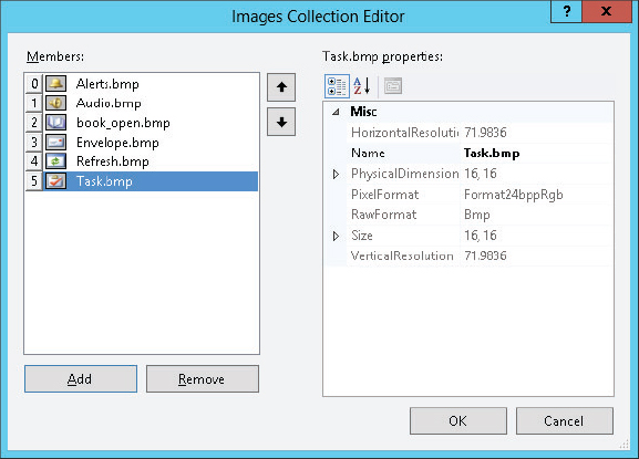
Other properties are much more complex. For example, to create a TabControl that displays images on its tabs, you must also create an ImageList component. Select the ImageList component’s Images property, and click the ellipsis to the right to display the dialog box shown in Figure 8-4. When you click the Add button, the dialog box displays a file selection dialog box that lets you add an image file to the control. The list on the left shows you the images you have loaded and includes a small thumbnail picture of each image. The values on the right show you the images’ properties.
FIGURE 8-4: This dialog box lets you load images into an ImageList control at design time.
After you add pictures to the ImageList control, create a TabControl. Select its ImageList property, click the drop-down arrow on the right, and select the ImageList control that you created previously. Next, select the TabControl’s TabPages property, and click the ellipsis on the right to see the dialog box shown in Figure 8-5.
FIGURE 8-5: This dialog box lets you edit a TabControl’s tab pages.
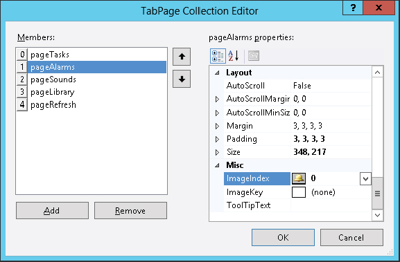
Use the Add button to add tab pages to the control. To set a tab’s image, select a tab page, click its ImageIndex property, click the drop-down arrow to the right, and pick the number of the image in the ImageList that you want to use for this tab.
Some properties even contain a collection of objects, each of which contains a collection of objects. For example, the ListView control has an Items property that is a collection of items. Each item is an object that has a SubItems property, which is itself a collection. When you display the ListView control as a list with details, an object in the Items collection represents a row in the view and its SubItems values represent the secondary values in the row.
To set these values at design time, select the ListView control and click the ellipsis to the right of its Items property in the Properties window. Create an item in the editor, and click the ellipsis to the right of the item’s SubItems property.
Other complicated properties provide similarly complex editors. Although they may implement involved relationships among various controls and components, they are usually easy enough to figure out with a little experimentation.
Properties at Run Time
Visual Basic lets you set most control properties at design time, but often you will need to get and modify property values at run time. For example, you might need to change a label’s text to tell the user what is happening, disable a button because it is not allowed at a particular moment, or read the value selected by the user from a list.
As far as your code is concerned, a property is just like any other public variable defined by an object. You get or set a property by using the name of the control, followed by a dot, followed by the name of the property. For example, the following code examines the text in the TextBox named txtPath. If the text doesn’t end with a / character, the code adds one. This code both reads and sets the Text property:
If Not txtPath.Text.EndsWith("/") Then txtPath.Text &= "/"If a property contains a reference to an object, you can use that object’s properties and methods in your code. The following code displays a message box indicating whether the txtPath control’s font is bold. It examines the TextBox control’s Font property. That property returns a reference to a Font object that has a Bold property.
If txtPath.Font.Bold Then
    MessageBox.Show("Bold")
Else
    MessageBox.Show("Not Bold")
End IftxtPath.Font = New Font(txtPath.Font, FontStyle.Bold)If a property represents a collection or array, you can loop through or iterate over the property just as if it were declared as a normal collection or array. The following code lists the items the user has selected in the ListBox control named lstChoices:
For Each selected_item As Object In lstChoices.SelectedItems()
    Debug.WriteLine(selected_item.ToString())
Next selected_item
A few properties are read-only at run time, so your code can examine them but not change their values. For example, a Panel’s Controls property returns a collection holding references to the controls inside the Panel. This property is read-only at run time so you cannot set it equal to a new collection. (The collection provides methods for adding and removing controls so you don’t really need to replace the whole collection; you can change the controls that it contains instead.)
Note also that at design time, this collection doesn’t appear in the Properties window. Instead of explicitly working with the collection, you add and remove controls interactively by moving them in and out of the Panel control on the form.
A control’s Bottom property is also read-only and not shown in the Properties window. It represents the distance between the top of the control’s container and the control’s bottom edge. This value is really just the control’s Top property plus its Height property (control.Bottom = control.Top + control.Height), so you can modify it using those properties instead of setting the Bottom property directly.
Useful Control Properties
This section describes some of the most useful properties provided by the Control class. Appendix A, “Useful Control Properties, Methods, and Events,” summarizes these and other Control properties for quick reference.
All controls (including the Form control) inherit directly or indirectly from the Control class. That means they inherit the Control class’s properties, methods, and events (unless they take explicit action to override the Control class’s behavior).
Although these properties are available to all controls that inherit from the Control class, many are considered advanced, so they are not shown by the IntelliSense pop-up’s Common tab. For example, a program is intended to set a control’s position by using its Location property not its Left and Top properties, so Location is in the Common tab whereas Left and Top are only in the Advanced tab.
Figure 8-6 shows the Common tab on the IntelliSense pop-up for a Label control. It shows the Location property but not the Left property. If you click the All tab, you can see Left and the other advanced properties.
FIGURE 8-6: The Location property is on the IntelliSense Common tab but the Left property is not.

When you type the control’s name and enough of the string Left to differentiate it from the Location property (in this case “lblDirectory.Le”), the pop-up automatically switches to show a smaller version of the IntelliSense pop-up listing only properties that contain “Le” such as Left, RightToLeft, and TopLevelControl.
Many of the Control class’s properties are straightforward, but a few deserve special attention. The following sections describe some of the more confusing properties in greater detail.
Anchor
The Anchor property allows a control to automatically resize itself when its container is resized. Anchor determines which of the control’s edges should remain a fixed distance from the corresponding edges of the container.
Normally a control’s Anchor property is set to Top, Left. That means the control’s top and left positions remain fixed when the container resizes. If the control’s upper-left corner is at the point (8, 16) initially, it remains at the position (8, 16) when you resize the container. This is the normal control behavior, and it makes the control appear fixed on the container.
Now suppose that you set a control’s Anchor property to Top, Right, and you place the control in the container’s upper-right corner. When you resize the container, the control moves, so it remains in the upper-right corner.
If you set two opposite Anchor values, the control resizes itself to satisfy them both. For example, suppose that you make a button that starts 8 pixels from its container’s left, right, and top edges. Then suppose that you set the control’s Anchor property to Top, Left, Right. When you resize the container, the control resizes itself so that it is always 8 pixels from the container’s left, right, and top edges.
In a more common scenario, many forms have Label controls on the left with Anchor set to Top, Left so they remain fixed on the form. On the right, the form holds TextBoxes and other controls with Anchor set to Top, Left, Right, so they resize themselves to take advantage of the resizing form’s new width.
Similarly, you can make controls that stretch vertically as the form resizes. For example, if you set a ListBox control’s Anchor property to Top, Left, Bottom, the control stretches vertically to take advantage of the form’s height and display as much of its list of items as possible.
If you do not provide any Anchor value for either the vertical or the horizontal directions, the control anchors its center to the container’s center. For example, suppose you position a Button control in the bottom middle of the form and you set its Anchor property to Bottom. Because you placed the control in the middle of the form, the control’s center coincides with the form’s center. When you resize the form, the control moves so it remains centered horizontally.
If you place other controls on either side of the centered one, they will all move so they remain together centered as a group as the form resizes. You may want to experiment with this property to see the effect.
At run time, you can set a control’s Anchor property to AnchorStyles.None or to a Boolean combination of the values AnchorStyles.Top, AnchorStyles.Bottom, AnchorStyles.Left, and AnchorStyles.Right. For example, the example program AnchorButton, available for download on the book’s website, uses the following code to move the btnAnchored control to the form’s lower-right corner and set its Anchor property to Bottom, Right, so it stays there:
Private Sub Form1_Load() Handles MyBase.Load
    btnAnchored.Location = New Point(
        Me.ClientSize.Width - btnAnchored.Width,
        Me.ClientSize.Height - btnAnchored.Height)
    btnAnchored.Anchor = AnchorStyles.Bottom Or AnchorStyles.Right
End Sub
Dock
The Dock property determines whether a control attaches itself to one or more of its container’s sides. For example, if you set a control’s Dock property to Top, the control docks to the top of its container so it fills the container from left to right and is flush with the top of the container. If the container is resized, the control remains at the top, keeps its height, and resizes itself to fill the container’s width. This is how a typical toolbar behaves. The effect is similar to placing the control at the top of the container so that it fills the container’s width and then setting its Anchor property to Top, Left, Right.
You can set a control’s Dock property to Top, Bottom, Left, Right, Fill, or None. The value Fill makes the control dock to all of its container’s remaining interior space. If it is the only control in the container, then it fills the whole container.
If the container holds more than one control with Dock set to a value other than None, the controls are arranged according to their stacking order (also called the Z-order). The control that is first in the stacking order (the one that would normally be drawn first at the back) is positioned first using its Dock value. The control that comes next in the stacking order is arranged second in the remaining space, and so on until all of the controls are positioned.
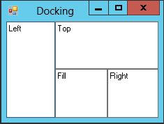
Figure 8-7 shows example program Docking, which is available for download on the book’s website. It contains four TextBoxes with Dock set to different values. The first in the stacking order has Dock set to Left, so it occupies the left edge of the form. The next control has Dock set to Top, so it occupies the top edge of the form’s remaining area. The third control has Dock set to Right, so it occupies the right edge of the form’s remaining area. Finally, the last control has Dock set to Fill, so it fills the rest of the form.
FIGURE 8-7: Docked controls are arranged according to their stacking order.
Controls docked to an edge resize to fill the container in one dimension. For example, a control with Dock set to Top fills whatever width the container has available. A control with Dock set to Fill resizes to fill all of the form’s available space.
The Dock property does not arrange controls very intelligently when you resize the container. For example, suppose that you have two controls, one above the other. The first has Dock set to Top and the second has Dock set to Fill. You can arrange the controls so that they evenly divide the form vertically. When you make the form taller, however, the second control, with Dock set to Fill, takes up all of the new space, and the other control keeps its original size.
You cannot use the Dock or Anchor properties to make controls divide a form evenly when it is resized, but you can do that with a TableLayoutPanel control. For example, to make two TextBoxes divide a form horizontally, create TableLayoutPanel and dock it to fill the form. Give the control one row and two columns. Edit the Columns collection so each column is sized by percentage and the percent value is 50 percent. (This is the default for a new TableLayoutPanel so you don’t need to change anything.) Now add the two TextBoxes to the TableLayoutPanel and dock them so they fill the two cells. Now when the user resizes the form, the TableLayoutPanel resizes, its columns divide the available space evenly, the TextBoxes resize to fill the columns.
Example program UseTableLayoutPanel, which is available for download on the book’s website, demonstrates this method.
You can also use a SplitContainer to divide a form. The user can drag the divider between the two panels to adjust the size allocated to each.
Position and Size Properties
Controls contain many position and size properties, and the differences among them can be confusing. Some of the more bewildering aspects of controls are client area, non-client area, and display area.
A control’s client area is the area inside the control where you can draw things or place other controls. A control’s non-client area is everything else. In a typical form, the borders and title bar are the non-client area. The client area is the space inside the borders and below the title bar where you can place controls or draw graphics.
A control’s display area is the client area minus any internal decoration. For example, a GroupBox displays an internal border and a title. Although you can place controls over these, you normally wouldn’t. The display area contains the space inside the GroupBox’s borders and below the space where the title sits.
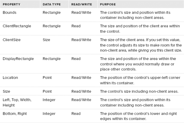
The following table summarizes properties related to the control’s size and position.