CHAPTER 21
Statistical Functions
INTRODUCTION
This chapter provides examples of many of the functions in Excel's Statistical category. These are often required to conduct data analysis, investigate relationships between variables, and to estimate or calibrate model inputs or results. Most of the calculations concern:
- The position, ranking, spread and shape of a data set.
- Probability distributions (X-to-P and P-to-X calculations).
- Co-relationships and regression analysis.
- Forecasting and other statistical calculations.
Since Excel 2010, the category has undergone significant changes, which were introduced for several reasons:
- To provide clearer definitions, for example as to whether the calculations are based on samples of data or on full population statistics.
- To allow additional function possibilities and user-options, such as whether probability distributions are expressed in their cumulative or density form.
- To create new types of calculations that previously may not have existed, such as those within the FORECAST-related suite of functions.
In order to create backward compatibility with earlier versions of Excel, many of the changes have been introduced by naming the new functions with a “.”, such as MODE.SNGL, or RANK.EQ or STDEV.S.
Note that Excel's function categories are in some cases slightly arbitrary constructs, with the result that some functions are not necessarily in the category that one might expect. In particular, the distinction between Statistical and Math&Trig functions is not totally clear-cut. For example, SUMIFS, COMBIN and RAND are classified within the Math&Trig category, whereas AVERAGEIFS, PERMUT, NORM.DIST, NORM.IN and PROBE are within the Statistical category. Note that this chapter provides no further specific treatment of functions that have already been covered earlier (such as AVERAGE, AVERAGEA, AVERAGEIF, AVERAGEIFS, MAXIFS, MINIFS, COUNT, COUNTA, COUNTBLANK, COUNTIF, COUNTIFS, MAX, MAXA, MIN, MINA).
PRACTICAL APPLICATIONS: POSITION, RANKING AND CENTRAL VALUES
In general, when presented with a set of data, one may wish to calculate summary information, such as:
- The average, minimum and maximum values.
- The most likely value (mode or most frequently occurring).
- The median point, i.e. where 50% of items are higher/lower than this value.
- The value which is exceeded in 10% of cases, or for which 10% of the items in the data set are below this value.
- Measures of dispersion, range or the spread of the data.
The main functions relating to such information are:
- MODE.SNGL calculates the most common (most frequent) value in a data set, as long as a unique value exists. MODE.MULT calculates a vertical array of the most frequently occurring in a range of data, including repetitive values. MODE is a legacy version of the MODE.SNGL function.
- GEOMEAN and HARMEAN calculate the geometric and harmonic means of a set of data, and TRIMMEAN calculates the mean of the interior of a data set.
- LARGE and SMALL calculate the specified largest or smallest values in a data set (e.g. first, second, third largest or smallest etc.)
- RANK.EQ (RANK in earlier versions of Excel) calculates the rank of a number in a list of numbers, with RANK.AVG giving the average rank in the case of tied values.
- PERCENTILE.EXC and PERCENTILE.INC (and its legacy PERCENTILE) calculate a specified percentile of the values in a range, exclusive and inclusive respectively. The QUARTILE.EXC and QUARTILE.INC functions (QUARTILE in earlier versions) calculate percentiles for specific 25th percentage multiples. MEDIAN calculates the median of the given numbers, i.e. the 50th percentile.
- PERCENTRANK.INC (PERCENTRANK in earlier versions) and PERCENTRANK.EXC calculate the percentage rank of a value in a data set, inclusive and exclusive respectively.
Example: Calculating Mean and Mode
The average of a set of data can be calculated by summing the individual values and dividing by the number of items. In Excel, it can be calculated directly using the AVERAGE function or by dividing the result of using SUM and COUNT.
In relation to the average, note that:
- The average as calculated from the full (raw) set of individual data points is also called the “weighted-average”. This because every value will automatically be included in the calculations in the total according to the frequency with which it occurs in the data set.
- In mathematics, the (weighted) average is also called the “mean” or the “Expected Value (EV)”. At the time of writing, there is no “MEAN” or “WEIGHTEDAVERAGE” function in Excel. However, in the case where the full data set of individual items (including repeated values) is not provided, but rather the values and the frequency of each value is given, the SUMPRODUCT function can be used to calculate the (weighted) average.
- In order to calculate the frequency of each item in a data set, one can use either COUNTIFS-type functions (see Chapter 17), or the FREQUENCY array function (covered in Chapter 18). An important application is to count the frequency in which points in a data set fall within ranges (“buckets” or “bins”).
- Other conditional calculations may also be required: for example, AVERAGEIFS, MINIFS and MAXIFs (and array functions relating to these) can be used to calculate the corresponding figures for a subset of the data according to specified criteria. These were covered in Chapter 17 and Chapter 18, and so are not discussed further.
The most likely (or most frequently occurring) value in a data set is known as the mode (or modal value). Some of its key properties include:
- It may be thought of as a “best estimate”, or indeed as the value that one might “expect” to occur; to expect anything else would be to expect something that is less likely. Therefore, it is often the value that would be chosen as the base case value for a model input, especially where such values are set using judgment or expert estimates.
- It is not the same as the mathematical definition of “Expected Value”, which is the (weighted) average (or mean); generally, these two “expectations” will be different, unless the data set is symmetric.
- It exists only if one value occurs more frequently than others. Thus, for a simple sample of data from a process (in which each measurement occurs just once), the mode would not exist, and the functions would return and error message.
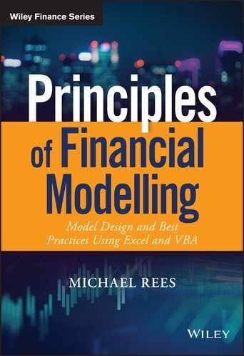
The file Ch21.1.MODE.xlsx shows examples of the MODE and MODE.SNGL functions, as well as of the MODE.MULT array function (see Figure 21.1). One can see that the MODE.MULT function will report multiple values when there are several that are equally likely (the last three items in the data set are repetitions of other values, and there are three modes; the last field returns #N/A as the function has been entered to return up to four values).
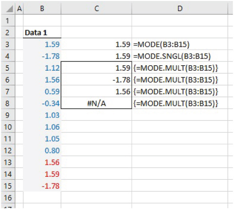
FIGURE 21.1 Use of the MODE-type Functions
The same file also shows that these functions will return #N/A when each value in a data set occurs only once (see Figure 21.2).
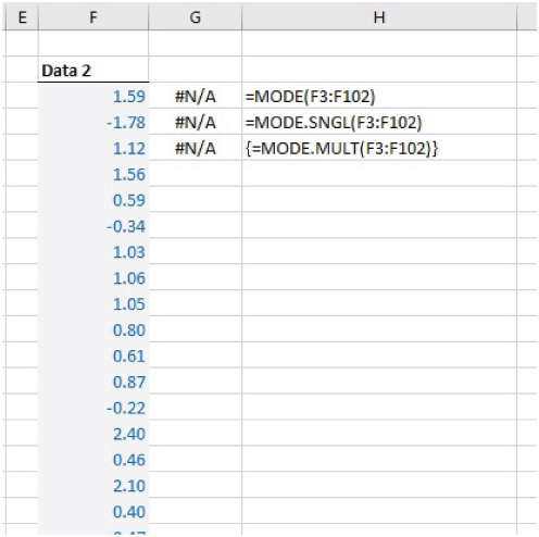
FIGURE 21.2 Use of MODE-type Functions in Situation Containing Only Unique Values
Note that although there is no simple “MEAN” function in Excel, the functions TRIMMEAN, GEOMEAN and HARMEAN do exist:
- TRIMMEAN calculates the average after excluding a specified number of the largest and smallest items (the number excluded is the same at both the high end and low end, and so the function calculates the required number to exclude based on the user's input percentage value; therefore, one needs to be careful when using the function to ensure that the number of exclusions corresponds to the desired figure).
- GEOMEAN calculates the geometric mean of a set of n positive numbers; this is the n-th root of the product of these numbers.
- HARMEAN calculates the harmonic mean of a set of positive numbers, which is the reciprocal of the average of the reciprocals of the individual values.
The file Ch21.2.MEANS.xlsx shows some examples of these (see Figure 21.3).
FIGURE 21.3 Examples of TRIMMEAN, GEOMEAN and HARMEAN
Example: Dynamic Sorting of Data Using LARGE
Although the sorting of data can be achieved using the tools on Excel's Data tab, this is a process that must be done manually (or using a VBA macro that runs the sorting procedure). An alternative is to use the LARGE function to calculate the data in sorted order. This is especially useful in models that need to be dynamic (either if new data will be brought in regularly, or if a sensitivity analysis of the output needs to be run). Of course, the function can also be used to find only the largest, or second or third largest, item of data, and there is no requirement to have to place all of the original data set in order. The SMALL function is analogous, returning the smallest values first. (Of course, if one is interested only in the largest or smallest value, one can simply use MAX or MIN.)
The file Ch21.3.LARGE.SMALL.xlsx provides an example (see Figure 21.4). The LARGE and SMALL functions are used to list the 11 largest and smallest items in a data set of 100 items.
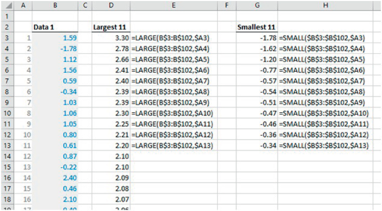
FIGURE 21.4 Using LARGE and SMALL to Sort and Manipulate Data
Example: RANK.EQ
The rank of an item within its data set is its ordered position; that is, the largest number has rank 1 (or the smallest does, depending on the preferred definition), the second largest (or smallest) has rank 2, and so on. The ranking is closely linked to the LARGE and SMALL functions, essentially as inverse processes (e.g. the rank of a number is its ordered position as if the data set were sorted, whereas the LARGE function returns the actual number for a given ordered position).
The ranking of items is sometimes required in financial modelling, such as for reporting on how important an item is. It is also required in calculation of rank (Spearman) correlation coefficients when analysing relationships between multiple data sets, as discussed later in this chapter.
The file Ch21.4.RANKEQ.xlsx shows examples of the RANK.EQ function applied to a data set of 100 unique values, showing both the cases where the optional parameter is omitted and where it is included (to provide the descending or ascending rank order respectively) (see Figure 21.5). The legacy function RANK is also shown in the file (but not in the screenshot).
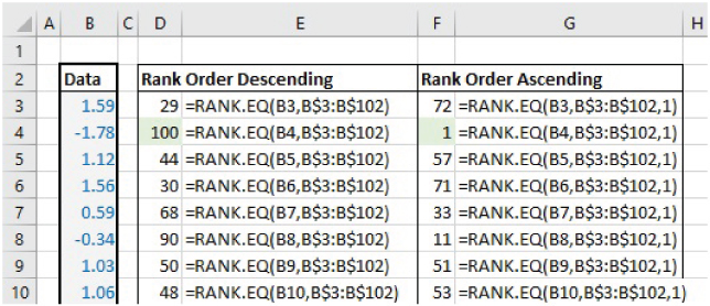
FIGURE 21.5 Examples of the RANK.EQ Function
Example: RANK.AVG
The file Ch21.5.RANKAVG.xlsx (see Figure 21.6) shows a data set containing duplicate values (such as in cells B5 and B16), so that there is a tied ranking. The RANK.EQ function provides an equal rank for each tie and skips over the ordered position (e.g. there is no item with rank of 4). The RANK.AVG value instead provides the average value of the items (that is 3.5, as the average of 3 and 4 in this example).
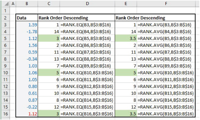
FIGURE 21.6 RANK.EQ and RANK.AVG in the Case of Tied Items
Example: Calculating Percentiles
Another important statistic is the percentile (sometimes called centile). This shows – for any assumed percentage figure – the x-value below which that percentage of outcomes lie. For example, the 10th percentile (or P10) is the value below which 10% of the outcomes lie, and the P90 would be the value below which 90% of occurrences lie. Note that the minimum and maximum are the 0th and 100th percentile respectively. Another important special case is the 50th percentile (P50), i.e. the point where 50% of items are higher/lower than this value. This is known as the median.
Functions such as PERCENTILE, PERCENTILE.INC and PERCENTILE.EXC can be used to calculate percentiles of data sets, depending on the Excel version used (with the special cases P0, P100 and P50 also able to be captured through the MIN, MAX and MEDIAN functions as an alternative).
Whereas these statistical properties are in theory generally clearly defined only for continuous (infinite) data sets, in practice they would be applied in many contexts to finite (discrete) data. In this regard, one needs to be careful to apply them correctly, as well as understanding the results that are returned: the PERCENTILE-type functions will generally need to interpolate between values to find an approximation to the true figure (an implicit assumption is that the underlying process that produces the data is a continuous one). For example, the value of PERCENTILE.INC({1,2,3,4,5},10%) is returned as 1.4, and PERCENTILE.INC({1,2,3,4,5},20%) is returned as 1.8.
The file Ch21.6.PERCENTILES.xlsx shows some implementations of the PERCENTILE-type functions. Note that, whereas PERCENTILE.INC and the legacy PERCENTILE functions can be applied with any percentage value (including 0% or 100%), the PERCENTILE.EXC function will only work where the input percentage is between 1/n and 1−1/n, where n is the number of points in the data set. Within this range, its interpolation procedure may provide a more accurate estimate of the underlying percentile value; this can partly be seen from the file with respect to the P10 calculations (the right-hand side of the file shows the data in sorted order, using the LARGE function, in order to see the more accurate value produced by PERCENTILE.EXC) (see Figure 21.7). (Later in the chapter, we provide a further example of where this latter function is also more accurate, although our general testing indicates that it may not always be so.)
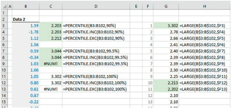
FIGURE 21.7 Use of the PERCENTILE-type and MEDIAN Functions
Example: PERCENTRANK-type Functions
The file Ch21.7.PERCENTRANK.xlsx (see Figure 21.8) contains examples of some PERCENTRANK-type functions; these calculate the percentage rank of a value in a data set. The PERCENTRANK.INC (inclusive) function corresponds to the legacy PERCENTRANK function, whereas the PERCENTRANK.EXC (exclusive) provides a new set of calculations.
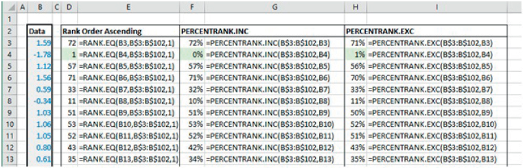
FIGURE 21.8 Examples of PERCENTRANK Functions
Note that, whereas the default settings for the RANK.EQ, RANK.AVG and RANK functions are to show the descending rank order (i.e. when the optional parameter is omitted), for the PERCENTRANK-type functions the implicit ranking is ascending.
PRACTICAL APPLICATIONS: SPREAD AND SHAPE
The spread and overall “shape” of the points are also key aspects of a data set, providing aggregate indications, rather than those associated with individual data points.
Some key measures associated with the shape include:
- FREQUENCY is an array function that counts the number of times that points within a data set lie within each of a set of pre-defined ranges (or bins), i.e. the frequency distribution.
- The symmetry of the data set. In Excel, SKEW.P (Excel 2013 onwards) calculates the skewness of a full population of data, and SKEW estimates the skewness of the population based on a sample (SKEW.S does not exist at the time of writing).
- The extent to which data points are within the tails (towards the minimum or maximum extremes) versus being of a more central nature. KURT estimates (excess) kurtosis of a population for a data set that represents a sample (KURT.P and KURT.S do not exist at the time of writing).
Some key measures of the dispersion of points in a range include:
- The total width of the range (the maximum value less the minimum value), or the difference between two percentiles (P90 less P10). The MIN, MAX, PERCENTILE-type and other related functions could be used in this respect (see earlier in the chapter).
- The standard deviation, or other measures of deviation, such as the semi-deviation. At the time of writing, there are many functions related to the calculation of the standard deviation and the variance of data sets. However, there is no function for the semi-deviation (see later in this chapter for calculation methods, and also Chapter 33 for its implementation as a user-defined function using VBA):
- VAR.P (VARP in earlier versions) calculates the population variance of a set of data, i.e. the average of the squares of the deviations of the points from the mean, assuming that the data representing the entire population. Similarly, VAR.S (VAR in earlier versions) estimates the population variance based on the assumption that the data set represents a sample from the population (so that a correction term for biases is required to be used within the formula).
- STDEV.P (STDEVP in earlier versions) and STDEV.S (STDEV in earlier versions) calculate or estimate the standard deviations associated with the population, based on population or sample data respectively. Such standard deviations are the square root of the corresponding variances.
- AVEDEV calculates the average of the absolute deviations of data points from their mean (the average deviation from the mean is of course zero).
Other related functions include:
- VARPA, STDEVPA, VARA and STDEVA calculate the population and sample-based statistics, including numbers, text and logical values in the calculations.
- DEVSQ calculates the sum of squares of deviations from the mean for a data set.
- STANDARDIZE calculates the number of deviations that the input value is from an assumed figure, and with an assumed standardised deviation factor.
It is worthwhile noting that in most cases such functions assume that the data set given is a listing of individual occurrences of a sample or population. Thus they do not allow one to use explicitly any data on the frequency of occurrences. (An exception is the use of SUMPRODUCT in which the frequency is one of the input fields.)
Example: Generating a Histogram of Returns Using FREQUENCY
FREQUENCY counts the number of data points that lie within each of a set of pre-defined ranges (or bins). It can be used to create the data to produce a bar chart (histogram) of the data set. Note that it is an array function that must be entered in a vertical (not horizontal) range.
The file Ch21.9.FREQUENCY.xlsx shows an example in the context of returns data for a market-quoted asset over several periods (see Figure 21.9). (Cell G2 also contains the Sparkline form of a Column chart, created using Excel's Sparklines options within the main Insert menu.)
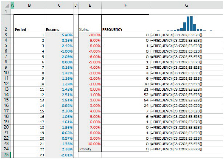
FIGURE 21.9 Using the FREQUENCY Function
Note some additional points in relation to this function:
- As an array function, the whole range which is to contain the function must be selected (this range must be one cell larger than the bin range, because there could be data points larger than the upper value of the largest bin).
- The choice of the definition of the (width of) the bins will be important; if the width is too wide, the histogram will not be sufficiently detailed, whereas if it is too narrow, the histogram will look fragmented and perhaps multi-moded.
- Since the function calculates the number of data points that lie between the lower and upper bin values, one could instead create the same result using the COUNTIFS function for each bin (with two criteria: one relating to the lower bound of a particular bin and the other to its upper bound, with appropriate adjustments for the first and last bins, which have no lower or upper bound respectively). Histograms can also be created using variations of applications of the PERCENTRANK functions, but often in practice there is little if any benefit in doing so.
Figure 21.10 shows the use of the COUNTIFS function in the same context.
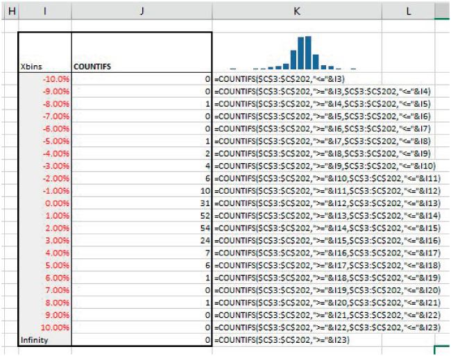
FIGURE 21.10 Use of COUNTIFS as an Alternative to FREQUENCY
Example: Variance, Standard Deviation and Volatility
The standard deviation (σ) provides a standardised measure of the range or spread. It is a measure of the “average” deviation around the mean. All other things being equal, a distribution that has standard deviation that is larger than that of another is more spread (and has more uncertainty or risk) associated with it.
The standard deviation is calculated as the square root of the variance (V):
and
Here
where the p's are the relative probability (or the frequency of occurrence) of the corresponding x-values; μ denotes the mean or mathematical expectation (Expected Value), also given by E.
One can also write the equation for variance as:
or
which can be expanded as:
or
So
This last equation is often the most computationally efficient way to calculate the variance, as well as being convenient for deriving other related formulae. It describes the variance as “the expectation of the squares minus the square of the expectation”.
There are several other points worth noting:
- The standard deviation measures the square root of the average of the squared distances from the mean, which is not the same as the average deviation of the (non-squared) distances; the squaring procedure involved in calculating standard deviations slightly emphasises values that are further from the mean more than the absolute deviation does. Therefore, in some cases the absolute deviations (as calculated by the AVEDEV function) may be more pertinent as a measure of spread or risk.
- The standard deviation has the same unit as measurement as the underlying data (e.g. dollar or monetary values, time, space etc.), and so is often straightforward to interpret in a physical or intuitive sense; the variance does not have this property (e.g. in a monetary context, its unit would be dollar-squared).
- As well as being a measure of risk, the standard deviation is one of the parameters that define the Normal and Lognormal distributions (the other being the mean). These distributions are very important in financial modelling, especially relating to asset returns, stock prices and so on.
- In many financial market contexts, the standard deviation of an asset's returns (or price changes) is thought of as a core measure of risk, and is often called volatility. Other measures, such as value-at-risk, one-sided risk, semi-deviation and default probabilities are also important, depending on the context.
Generally, one is dealing with only a sample of all possible values (i.e. a subset), so that one may need to consider whether the standard deviation of the sample is representative of the standard deviation of the whole population from which the sample was drawn. In other words, any statistical measure of a sample can be considered as an estimate of that of the underlying population (rather than the true figure); the data in the sample could have been produced by another underlying (population) processes which has slightly different means or standard deviations. Thus, there are two issues that may need consideration:
- The calculation of an unbiased point estimate of the population parameters, when the data is a sample.
- The calculation of the range of possible values (confidence interval) for these parameters (since the calculations based on sample data are only an estimate of the true figure).
In this example, we show the calculations of the estimates of the variance and the standard deviation, and the associated correction factors. The formulae for the confidence intervals around the base estimates require the use of the inverse distributions of the Student (T) distribution (for the mean), and of the Chi-squared distribution (for the standard deviation), and so are covered later in the chapter.
For the calculation of the unbiased estimates:
- The average of a sample is a non-biased estimate of that of the population.
- The standard deviation of a sample is a slight underestimate of that of the population; a multiplicative correction factor of
 (where n is the number of points in the sample) is required in order to provide a non-biased estimate of the population value. The function STDEV.S (or the legacy STDEV) calculate the estimated population standard deviation from sample data, and have the correction factor built in to the calculations. On the other hand, STDEV.P (or STDEVP) calculate the standard deviation on the assumption that the data is the full population (so that no correction terms are required).
 - The same approach is of course required when considering the variance (using VAR.S or VAR.P), except that the correction factor is
 , rather than the square root of this.
 - Other statistical measures (skewness and kurtosis, see later) also require correction factors to be applied in order to create an unbiased estimate.
The file Ch21.9.VARIANCE.STDDEV.xlsx contains an example of the calculations of the variance and the standard deviation of a data set of 5 years of monthly logarithmic returns for the S&P 500 index (see Figure 21.11).
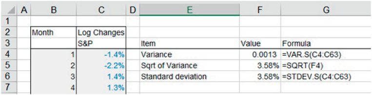
FIGURE 21.11 Variance and Standard Deviation of Returns Based on a Sample of Data
In Figure 21.12, we show a screen-clip from the same file, showing also the figures that would apply if the sample instead represented the full population, as well as the reconciliation calculations based on the sample size.

FIGURE 21.12 Reconciliation of Sample and Population Statistics
The file Ch21.10.DeviationsGeneral.xlsx shows examples of other functions related to deviation, including the DEVSQ function (which totals the square of the deviations from the mean, so is similar to VAR.P after dividing by the total sample size, without the correction factor), as well as the AVEDEV function, which takes the average of the absolute deviations from the mean (see Figure 21.13).
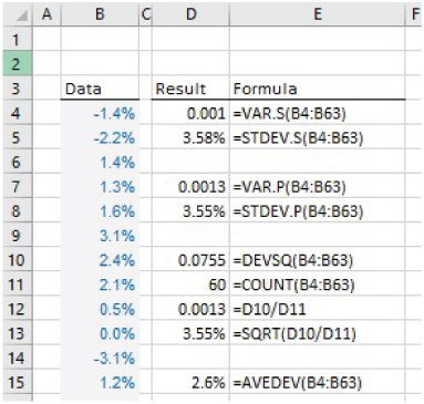
FIGURE 21.13 Examples of the DEVSQ and AVEDEV Functions
Example: Skewness and Kurtosis
The coefficient of skewness (or simply skewness or skew) is a measure of the non-symmetry (or asymmetry), defined as:
The numerator represents the average “cube of the distance from the mean”, and the denominator is the cube of the standard deviation–, so that skewness is a non-dimensional quantity (i.e. it is a numerical value, and does not have a unit, such as dollars, time or space).
For population data, the SKEW.P function can be used. For sample data, this function would underestimate the skewness of the population; the appropriate multiplicative correction factor to give a non-biased estimate of the population's skewness is ![]() . This factor is built into the SKEW function (no SKEW.S function currentlyexists), which therefore gives the non-biased estimate based on a sample.
. This factor is built into the SKEW function (no SKEW.S function currentlyexists), which therefore gives the non-biased estimate based on a sample.
Although there are some general rules of thumb to interpret skew, a precise and general interpretation is difficult because there can be exceptions in some cases. General principles include:
- A symmetric distribution will have a skewness of zero. This is always true, as each value that is larger than the mean will have an exactly offsetting value below the mean; their deviations around the mean will cancel out when raised to any odd power, such as when cubing them.
- A positive skew indicates that the tail is to the right-hand side. Broadly speaking, when the skew is above about 0.3, the non-symmetry of the distribution is visually evident when the data is displayed in a graphical (histogram or similar) format.
Kurtosis is calculated as the average fourth power of the distances from the mean (divided by the fourth power of the standard deviation, resulting in a non-dimensional quantity):
Kurtosis can be difficult to interpret, but in a sense it provides a test of the extent to which a distribution is peaked in the central area, whilst simultaneously having relatively fat tails. A normal distribution has a kurtosis of three; distributions whose kurtosis is equal to, greater or less than three are known as mesokurtic, leptokurtic or platykurtic respectively.
The Excel KURT function deducts three from the standard calculation to show only “excess” kurtosis:
As for the standard deviation and the skewness, corrections are available to estimate population kurtosis from a sample kurtosis in a non-biased way. However, these are not built into Excel at the time of writing.
The file Ch21.11.Moments.xlsx shows examples of several of these functions using the same set of data as the earlier example (5-year logarithmic returns for the S&P 500 index) (see Figure 21.14).

FIGURE 21.14 Examples of SKEW.S and KURT Functions
Example: One-sided Volatility (Semi-deviation)
As covered earlier, the STDEV-type function can be used to calculate or estimate standard deviations, and hence volatility. Such a measure is often appropriate as an indication of general risk or variation, and indeed forms the basis of much of the core standard theory and concepts in risk measurement and portfolio optimisation for financial market applications.
On the other hand, the standard deviation represents the effect of deviations around the average, whether these are favourable or unfavourable. In some risk calculations, one may wish to focus only on the unfavourable outcomes (negative or downside risk), and to not include favourable outcomes. An extreme case of such an approach is where the risk measure used is that which is based only on the worst possible outcome. A less extreme possibility is to use the semi-deviation; this is analogous to the standard deviation, except that the only outcomes that are included in the calculation are those which are unfavourable relative to the average.
At the time of writing, there is no Excel function to directly calculate the semi-deviation of a data set. Therefore, there are three main alternative approaches:
- Perform an explicit step-by-step calculation in a tabular range in Excel (i.e. calculate the average of the data set, then sum the squared deviations of each value that is either higher or lower than the average, count how many items are within each category, and finally perform the square root calculation).
- Use an array function to calculate the sum and count of the deviations above or below the average (i.e. without having to calculate the corresponding value for each individually data point explicitly).
- Create a user-defined function which calculates the value directly from the data (with all calculations occurring within the VBA code, and a parameter to indicate whether the positive or negative deviations are to be included in the calculation). As for many other user-defined functions, this approach can help to avoid having to explicitly create tables of calculation formulae in the Excel sheet, allows a direct reference from the data set to the associated statistic and allows for more rapid adaptation of the formulae if the size of the data set changes.
The file Ch21.12.SemiDeviation.xlsx shows an example of both the explicit step-by-step calculation and the use of an array formula. The screen-clip in Figure 21.15 shows the approach using the array formula; the reader can consult the Excel file for the explicit calculation steps (the implementation of the user-defined function is covered in Chapter 33).
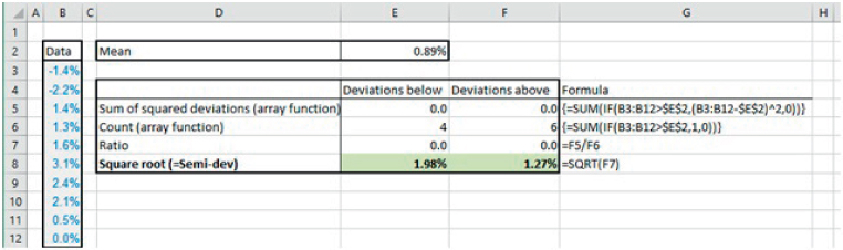
FIGURE 21.15 Using an Array Formula to Calculate the Semi-deviation of a Data Set of Returns
Note that the classical definition of semi-deviation is based on the deviation of the points from their mean (average). However, it is simple to generalise this, so that the deviation is measured with respect to any other reference figure (such as a minimum acceptable return), by using this figure within the calculations, in place of the mean.
PRACTICAL APPLICATIONS: CO-RELATIONSHIPS AND DEPENDENCIES
In both data analysis and in modelling, it is important to explore what relationships may exist between variables; an X–Y (or scatter) plot is a good starting point for such analysis, as the visual inspection aids in the development of hypotheses about possible relationships, such as:
- No apparent relationship of any form, with points scattered randomly.
- A general linear relationship but with some (as yet) unexplained (or random) variation around this. Such a relationship could be of a positive nature (an increase in the value of one variable is generally associated with an increase in the value of the other) or of a negative one. Where a relationship appears to be of a fairly linear nature, one may also choose to ask Excel to show a regression line, its equation and associated statistics.
- A more complex type of relationship, such as a U-curve, or one in which there are apparent close links between the variables in part of the range, but a looser relationship in other parts of the range.
Note that, when creating an X–Y scatter plot for exploratory purposes, there need not (yet) be any notion of dependent or independent variables (even if typically a variable that is considered more likely to be independent would be chosen to be placed on the x-axis).
Example: Scatter Plots (X–Y Charts) and Measuring Correlation
The file Ch21.13.Scatter.SLOPE.CORREL.xlsx shows an example of a scatter plot (Figure 21.16); some associated statistics are placed on the chart by right-clicking on any data point on the chart (to invoke the context-sensitive menu in Excel):
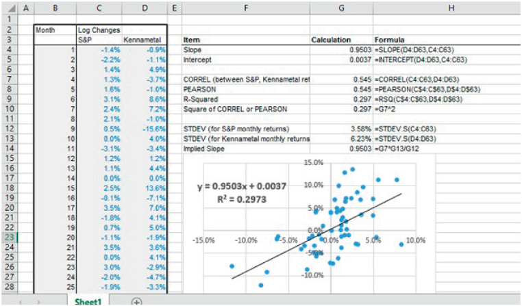
FIGURE 21.16 Using Scatter Plots and the Relationship Between Slope and Correlation
- The SLOPE and INTERCEPT functions are to calculate the slope of the regression line (i.e. which should in principle be the same as the values shown by the equation of the chart).
- The product or Pearson method is used to calculate the “linear” correlation, using either (or both) of the CORREL or PEARSON functions. The RSQ function calculates the square of these.
- The STDEV.S function calculates the standard deviation of each data set.
- The slope as implied by using the mathematical relationship between the correlation coefficients and the standard deviation. That is:
Of course, the slope of a line also describes the amount by which the y-value would move if the x-value changes by one unit. Therefore, the above equation shows that if the x-value is changed by σx then the y-value would change by an amount equal to ρxyσy.
Example: More on Correlation Coefficients and Rank Correlation
The above example showed the use of the CORREL and PEARSON functions to calculate the (linear, product or PEARSON) correlation between variables. In mathematical terms, this (ρ) is defined as:
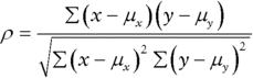
where x and y represent the individual values of the respective data set, and μx represents the average (mean or expected value) of the data set X (and similarly μy for the Y data set).
From the formula, we can see that:
- The correlation between any two data sets can be calculated if each set has the same number of points.
- The coefficient is a non-dimensional quantity that lies between −1 and 1 (and is usually expressed as a percentage between −100% and 100%).
- Correlation captures the simultaneous movement of each variable relative to its own mean, i.e. it measures the co-relationship between two processes in the sense of whether, when observed simultaneously, they each tend to take values that are both above or both below their own means, or whether there is no relationship between the occurrence of such relative values: by considering the numerator in the above formula, it is clear that a single value, x, and its counterpart, y, will contribute positively to the correlation calculation when the two values are either both above or both below their respective means (so that the numerator is positive, being either the product of two positive or of two negative figures).
- The correlation coefficient would be unchanged if a constant were added to each item in one of the data sets, since the effect of such a constant would be removed during the calculations (as the mean of each data set is subtracted from each value).
- The correlation coefficient would be unchanged if each item in a data set were multiplied by a constant (since the effect of doing so would be equal in the numerator and the denominator).
From a modelling perspective, the existence of a (statistically significant) correlation coefficient does not imply any direct dependency between the items (in the sense of a directionality or causality of one to the other). Rather, the variation in each item may be driven by a factor that is not explicit or known, but which causes each item to vary, so that they appear to vary together. For example, a correlation would be shown between the change in the market value of two oil-derived end products; the cost of producing each would partly be determined by the oil price, but there will also be some other independent cost components, as well as other factors (beyond cost items) that affect the market price of each.
Further, a measured coefficient is generally subject to high statistical error, and so may be statistically insignificant or volatile; quite large data sets are required to reduce such error.
Although the correlation measurement used above (i.e. the linear, product or Pearson method, using CORREL or PEARSON) is the most common for general purposes, there are several other ways to define possible measures of correlation:
- The rank or Spearman method (sometimes called “non-linear” correlation), which involves replacing each value by an integer representing its position (or rank) within its own data set (i.e. when listed in ascending or descending order), and calculating the linear correlation of this set of integers. Note that this measure of correlation represents a less stringent relationship between the variables. For example, two variables whose scatter plot shows a generally increasing trend that is not a perfect straight line can have a rank correlation which is 100%. (This looser definition allows for additional flexibility in applications such as the creation and sampling of correlated multivariate distributions when using simulation techniques.) At the time of writing there is no direct Excel function to calculate a rank (Spearman) correlation; this can be done either using explicit individual steps, or an array formula or a VBA user-defined function.
- The Kendall tau coefficient. This uses the ranks of the data points, and is calculated by deriving the number of pair ranks that are concordant. That is, two points (each with an x–y co-ordinate) are considered concordant if the difference in rank of their x-values is of the same sign as the difference in rank of their y-values. Note that the calculation requires one to compare the rank of each point with that of every other point. The number of operations is therefore proportional to the square of the number of points. By contrast, for the Pearson and the rank correlation methods, the number of operations scales linearly with the number of data points, since only the deviation of each point from the mean of its own data set requires calculation.
The file Ch21.14.RankCorrel&ArrayFormula.xlsx shows an example of the calculation of the rank correlation between two data sets. Figure 21.17 shows the explicit calculation in Excel, which first involves calculation ranks of the values (Columns F and G shows the ranks, calculated from the raw data in Columns B and C), before the CORREL function is applied (cell G14). Further, the array formula in Cell C16 shows how the same calculation can be created directly from the raw data without explicitly calculating the ranked values:
FIGURE 21.17 Calculation of Ranked Correlation Using Explicit Steps and an Array Formula
Example: Measuring Co-variances
The co-variance between two data sets is closely related to the correlation between them:
Or
It is clear from these formulae (and from those relating to the standard deviations) that:
- A scaling (or weighting) of all of the points in one of the data sets will result in a new data set whose covariance scales in the same way:
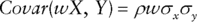
- The co-variance of a process with itself is simply the same as the variance (since the correlation is 100%):
The function COVARIANCE.S (COVAR in earlier versions) calculates the sample covariance (i.e. an estimate of the population covariance, assuming that the data provided is only a sample of the population), and COVARIANCE.P calculates the population covariance of two data sets which represent the full population.
The file Ch21.15.CORREL.COVAR.xlsx shows examples of these functions and the reconciliation between the direct use of the COVARIANCE.S function and the indirect calculation of covariance from the correlation coefficient and the standard deviations (see Figure 21.18).
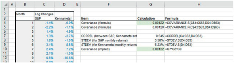
FIGURE 21.18 Calculation of the Covariance Between Two Data Sets Using Various Functions
Example: Covariance Matrices, Portfolio Volatility and Volatility Time Scaling
Where there are data on more than two variables, a full correlation matrix may be calculated. Each element of this is simply the correlation between the variables that correspond to the row and column of the matrix (i.e. Row 1 of the matrix relates to the first variable, as does Column 1 etc.) It is clear (and directly visible from the formula that defines the correlation coefficient) that:
- The diagonal elements of a correlation matrix are equal to one (or 100%), since each item is perfectly correlated with itself.
- The matrix is symmetric: the X and Y data sets have the same role and can be interchanged with each other without changing the calculated coefficient.
Similarly, one could create a covariance matrix, in which every element is equivalent to the corresponding correlation multiplied by the associated standard deviations of the variables.
A particularly important application of correlation and covariance matrices is in portfolio analysis. In particular, a portfolio made up of two assets of equal volatility will be less volatile than a “portfolio” of the same total value that consists of only one of the assets (unless the assets are perfectly correlated). This is simply because outcomes will arise in which one asset takes a higher value whilst the other takes a lower value (or vice versa), thus creating a centring (diversification) effect when the values are added together. The lower the correlation between the assets, the stronger is this effect.
Note that if a variable, X, is the sum of other (fundamental or underlying) processes (or assets):
then
where Cov represents (the definition of) the covariance between the Y's. That is, the variance of the portfolio is the sum of all of the covariances between the processes.
Therefore, where a portfolio is composed from a weighted set of underlying processes (or assets):
then
so
In practical terms, when calculating the variance (or standard deviation) of the returns of a portfolio, one may be provided with data on the returns of the underlying components, not the weighted ones. For example, when holding a portfolio of several individual stocks in different proportions (e.g. a mixture of Vodafone, Apple, Amazon, Exxon, …), the returns data provided directly by data feeds will relate to the individual stocks. Therefore, depending on the circumstances, it may be convenient to use one or other of the above formulae.
The file Ch21.16.COVAR.PORTFOLIO.xlsx contains an example of each approach. A data set of the returns for three underlying assets is contained in Columns D:F. Figure 21.19 shows the calculations in which the returns data is taken from the underlying assets, and using portfolio weights explicitly in the (array) formula for the variance (cell M4):
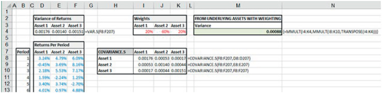
FIGURE 21.19 Portfolio Volatility Calculation Based on Data for Underlying Assets
On the other hand, Figure 21.20 shows the calculation in which returns for the weighted assets (i.e. actual portfolio composition) are calculated, so that the variance (cell U4) is simply the sum of the elements of the corresponding covariance matrix:
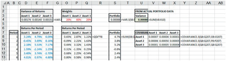
FIGURE 21.20 Portfolio Volatility Calculation Based on Data for Weighted Assets
Note that, where the co-variance between the processes is zero (as would be the case for independent processes in theory for large data sets), then the variance of their sum is equal to the sum of the variances (i.e. to the sum of the co-variance of each process with itself). Thus, in the special case of a time series in which returns in each period are independent of those in other periods, the variance of the total return will be the sum of the variances of the returns in the individual periods. If these variances are constant over time (i.e. the same in each period), the total variance of return will therefore increase linearly with time, so that the standard deviation will scale with the square root of time:
where σ is the standard deviation of the individual periodic return and σT that for T periods. One can use this to convert between annual, monthly or daily volatilities. (Such simple conversion methods do not apply if the semi-deviation is used as a risk measure.)
PRACTICAL APPLICATIONS: PROBABILITY DISTRIBUTIONS
The use of frequency (probability) distributions is essentially a way of summarising the full set of possible values for an uncertain (random or risky) process by showing the relative likelihood (or weighting) of each value. It is important to correctly distinguish the values of a process (x-axis) and the likelihood (or cumulative likelihood) associated with each value (y-axis). Thus, there are two distinct function types:
- “X-to-P” processes, in which, from a given input value, one determines the probability that a value less (or more) than this would occur (or the relative probability that the precise value would occur). Functions such as NORM.DIST (NORMDIST prior to Excel 2010) are of this form.
- “P-to-X” processes, in which the probability is an input, and one wishes to find the corresponding (percentile) value associated with that percentage. This is the same as inverting the frequency distribution. In Excel, functions such as NORM.INV (or NORMINV) are of this form. The main application areas are random sampling, hypothesis testing and the calculation confidence intervals. (The PERCENTILE-type functions are analogous, but are applied to data sets of individual or sample points, not to distribution functions.)
In this section, we provide some examples of the use of some of these distributions (a detailed presentation is beyond the scope of this text; the author's Business Risk and Simulation Modelling in Practice provides a detailed analysis of approximately 20 key distributions that are either directly available, or can be readily created, in Excel).
Excel's X-to-P (or standard definition) distribution functions include:
- BETA.DIST calculates the beta distribution in density or cumulative form (BETADIST in earlier versions provided only the cumulative form).
- BINOM.DIST (BINOMDIST in earlier versions) calculates the density or cumulative form of the binomial distribution; BINOM.DIST.RANGE (Excel 2013 onwards) calculates the probability of a specified range of outcomes.
- CHISQ.DIST.RT calculates the right-hand one-tailed probability of the Chi-squared distribution, in either density or cumulative form (CHIDIST in earlier versions calculated only the cumulative form). Similarly, CHISQ.DIST calculates its left-hand one-tailed probability.
- EXPON.DIST (EXPONDIST in earlier versions) calculates the density or cumulative probability for the exponential distribution.
- F.DIST.RT calculates the right-hand tail form of the F distribution in density or cumulative form (FDIST in earlier versions calculated only the cumulative form). Similarly, F.DIST calculates the left tailed form.
- GAMMA.DIST (GAMMADIST in earlier versions) calculates the gamma distribution in either cumulative or density form.
- HYPGEOM.DIST calculates the probabilities for the hypergeometric distribution in either density or cumulative form (HYPGEOMDIST in earlier versions calculated only the cumulative probability associated with a value).
- LOGNORM.DIST calculates the density or cumulative probability for Lognormal distribution based on a logarithmic parameterisation (LOGNORMDIST in earlier versions calculated only the cumulative probability).
- NEGBINOM.DIST calculates the probabilities for a negative binomial distribution in density or cumulative form (NEGBINOMDIST in earlier versions calculates only the cumulative probability).
- NORM.DIST and NORM.S.DIST (NORMDIST and NORMSDIST in earlier versions) calculate the general and the standard normal cumulative distribution respectively. PHI (Excel 2013 onwards) calculates the value of the density for a standard normal distribution GAUSS (Excel 2013 onwards) calculates 0.5 less than the standard normal cumulative distribution.
- POISSON.DIST (POISSON in earlier versions) calculates the density or cumulative form of the Poisson distribution.
- PROB uses a discrete set of values and associated probabilities to calculate the probability that a given value lies between a specified lower and upper limit (i.e. within the range specified by these bounds).
- T.DIST.2T (TDIST in earlier versions) calculates the two-tailed probability for the Student (T) distribution. Similarly, T.DIST.RT calculates the right-hand tail probability, and T.DIST calculates the left-hand probability.
- WEIBULL.DIST (WEIBULL in earlier versions) calculates the density and cumulative forms of the probability of a value associated with a Weibull distribution.
Excel's P-to-X (inverse or percentile) distribution functions that are directly available are:
- BINOM.INV (prior to Excel 2007, there is no equivalent function, i.e. “BINOMINV” did not exist but a similar function CRITBINOM was available).
- NORM.INV (or NORMINV) for general Normal distributions and NORM.S.INV or NORMSINV for the standard Normal distribution (with mean of 0 and standard deviation of 1).
- LOGNORM.INV (or LOGINV) calculates the inverse of the Lognormal cumulative distribution (based on logarithmic parameters, not the natural parameters).
- BETA.INV (or BETAINV) for the Beta distribution.
- GAMMA.INV (or GAMMAINV) for the Gamma distribution.
- T.INV.2T (TINV in earlier versions) calculates the inverse of the two-tailed T (Student) distribution. T.INV returns the left-tailed (note the syntax modification between versions).
- CHISQ.INV.RT (CHIINV in earlier versions) calculates the inverse of the right-tail for the Chi-squared distribution. CHISQ.INV calculates the inverse of the left-tail (once again, note the syntax modification).
- F.INV.RT (FINV in earlier versions) calculates the inverse of the right-tail of the F-distribution. F.INV returns the inverse of the left-tailed distribution (note the syntax modification).
Example: Likelihood of a Given Number of Successes of an Oil Exploration Process
A Bernoulli process (or distribution) is one in which there are only two possible outcomes of a trial that is conducted once (often characterised as either success/failure, or heads/tails, or 0/1). A binomial process is a generalisation, in which there may be multiple trials, each of which is independent to others, and each of which has the same probability of occurrence. Examples of binomial processes include multiple tosses of a coin, the conducting of a sequence of oil drilling activities in separate geological areas (where each drill may succeed or fail), and so on.
In such contexts, one may ask questions such as:
- What is the likelihood that there will be exactly three successes?
- What is the likelihood that there will be zero, one, two or three successes (i.e. three or less)?
- What is the likelihood that the number of successes would be between 2 and 5?
The file Ch21.17.BINOMDISTRANGE.xlsx contains examples of the BINOM.DIST and the BINOM.DIST.RANGE functions to answer such questions (see a separate worksheet for each function in the file), with screen-clips of each shown in Figure 21.21 and Figure 21.22. Note that the BINOM.DIST.RANGE function is more general, as it can produce both the density form equivalent (by setting the two number arguments to be equal) or the cumulative form (by setting the lower number argument to zero) or a range form (by appropriately choosing the lower and upper number arguments). Note also that the order of the required parameters is not the same for the two functions.
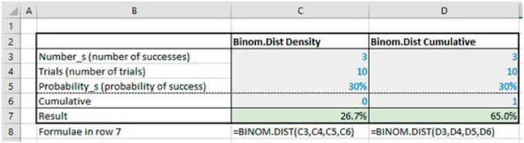
FIGURE 21.21 Use of the BINOM.DIST Function in Density and Cumulative Form
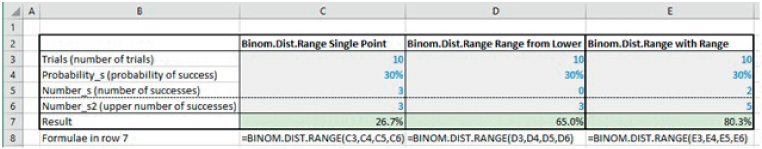
FIGURE 21.22 Use of the BINOM.DIST.RANGE Function in Density, Cumulative and Range Form
Example: Frequency of Outcomes Within One or Two Standard Deviations
The function NORM.S.DIST can be used to calculate both the density and cumulative form of the standard normal distribution (with mean equal to zero and standard deviation equal to one), by appropriately using the optional parameter (argument).
The file Ch21.18.NormalRanges.xlsx shows the use of the function to calculate the density curve and the cumulative probabilities for a range of values. By subtracting the cumulative probability of the point that is one standard deviation larger than the mean from the cumulative probability of the point that is one standard deviation below the mean, one can see (Cell E19) that approximately 68.27% of outcomes for a normal distribution are within the range that is one standard deviation on either side of the mean. Similarly, approximately 95.45% of outcomes are within a range that is either side of the mean by two standard deviations (Cell E23) (see Figure 21.23).
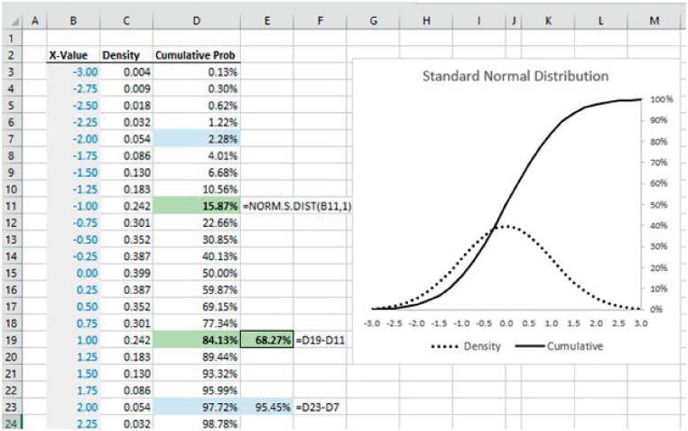
FIGURE 21.23 The Normal Distribution and the Frequency of Outcomes in Ranges Around the Mean
Example: Creating Random Samples from Probability Distributions
The P-to-X or inverse (percentile) functions can be used to create random samples from any distribution for which the inverse function is available. Essentially, one uses random samples drawn from a standard uniform random process (i.e. a continuous range between zero and one) to define percentages, which are then used to calculate the corresponding percentile values. Because the percentages are chosen uniformly, the resulting percentile values will occur with the correct frequency.
The file Ch21.19.NORMSINV.Sample.xlsx shows an example in which Excel's RAND() function is used to generate a random percentage probability, and the NORM.S.INV function is used to find the value of a standard normal distribution corresponding to that cumulative probability (see Figure 21.24).
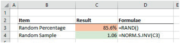
FIGURE 21.24 Generating of Random Samples from a Standard Normal Distribution
The standard normal distribution has a mean of zero and standard deviation of one; the generation of samples from other normal distributions can be achieved either by multiplying the sample from a standard normal distribution by the desired standard deviation and adding the mean, or by applying the same inversion process to the function NORM.INV (which uses the mean and standard deviation as its parameters).
Example: User-defined Inverse Functions for Random Sampling
The inverse functions provided in Excel (such as NORM.S.INV) are generally those for which the inverse process cannot be written as a simple analytic formula. For many distributions, the inversion process can in fact be performed analytically (which is perhaps one reason why Excel does not provide them as separate functions): to do so involves equating the value of P to the mathematical expression that defines the cumulative probability of any point x, and solving this equation for x in terms of P.
For example, the Weibull distribution is most often used to describe probability for the time to (first) occurrence of a process in continuous time, where the intensity of occurrence may not be constant. It has two parameters α and β, with β acting as a scale parameter. The density function is (for ![]() :
:
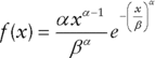
and the cumulative function is:
By replacing the left-hand side of this latter equation with a particular probability value, P, and solving for x, we have:
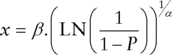
so that the right-hand side is the inverse (P-to-X, or percentile) function.
The file Ch21.20.Weibull.Sample.xlsx shows an example of creating a random sample of a Weibull distribution (see Figure 21.25). (Within the file, one can also see a graphical representation of the cumulative Weibull distribution, formed by evaluating the formula for each of several (fixed) percentages.)
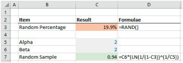
FIGURE 21.25 Generation of Random Samples from a Weibull Distribution
Example: Values Associated with Probabilities for a Binomial Process
A similar inversion process applies to discrete distributions (such as binomial) as it does to continuous ones, although in some cases an iterative search process must be used in order to find the appropriate value associated with a cumulated probability.
The file Ch21.21.BinomialInverseDists.xlsx shows an example of the BINOM.INV function, as well as the legacy CRITBINOM function to determine the number of outcomes associated with a cumulated probability. Figure 21.26 shows a screen-clip, from which one can see that, with a probability of (approximately) 65%, the number of successes would be three or less.
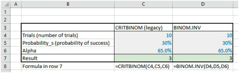
FIGURE 21.26 Inverse Function for a Binomial Process
Example: Confidence Intervals for the Mean Using Student (T) and Normal Distributions
In an earlier section, we noted that the statistics calculated from a data set (such as its average and standard deviation) provide an estimate of the true (but unknown) figures of the distribution that generated the data (in other words, the distribution of the whole population). However, a distribution with a different average could also have generated the same data set, although this becomes less likely if the average of this second distribution differs significantly from the average of the data set. We also noted that the average (or mean) of a sample provides a non-biased estimate of the true mean (i.e. is an unbiased estimate, albeit nevertheless subject to uncertainty), whereas the standard deviation of a sample needs to have a correction factor applied in order to provide a non-biased (but also uncertain) estimate of the true population standard deviation.
In fact, the range of possible values (or confidence interval) of the population mean is given by:
where t is the value of the T-distribution corresponding to a desired confidence percentage (in other words, after selecting the percentage, one needs to find the corresponding value of the inverse distribution) and σs is the unbiased (corrected) standard deviation as measured from the sample. In other words, whilst one can be (100%) sure that the true mean is between ![]() and
and ![]() , such information is not very useful for practical purposes. Rather, in order to be able to meaningfully determine a feasible range, one needs to specify a confidence level: for 95% confidence, one would determine the half-width of the corresponding T-distribution so that 95% of the area is either side of the sample mean (or 2.5% in each tail). The standard T-distribution is a symmetric distribution centred at zero, which has a single parameter, n, known as the number of degrees of freedom (which in this case is equal to the sample size less 1). Its standard deviation is
, such information is not very useful for practical purposes. Rather, in order to be able to meaningfully determine a feasible range, one needs to specify a confidence level: for 95% confidence, one would determine the half-width of the corresponding T-distribution so that 95% of the area is either side of the sample mean (or 2.5% in each tail). The standard T-distribution is a symmetric distribution centred at zero, which has a single parameter, n, known as the number of degrees of freedom (which in this case is equal to the sample size less 1). Its standard deviation is ![]() , and hence is larger than 1, but very close to 1 when n is large (in which case the T-distribution very closely resembles a standard normal distribution; for large sample sizes, the Normal distribution is often used in place of the T-distribution).
, and hence is larger than 1, but very close to 1 when n is large (in which case the T-distribution very closely resembles a standard normal distribution; for large sample sizes, the Normal distribution is often used in place of the T-distribution).
Note that, when using Excel functions for the T-distribution, one should take care as to which version is being used: whereas T.INV returns the t-value associated with the cumulated probability (i.e. only on the left tail of the distribution), the legacy function TINV returns the value associated with the probability accumulating on both the left- and right-hand tails, as well as having a sign reversal. Thus, TINV(10%) would provide the t-value for the case where 5% of outcomes are excluded on each side of the tail, whereas this would correspond to T.INV(5%), in addition to the change of sign. In fact, the legacy TINV function corresponds to the more recent T.INV.2T function. Thus, a confidence level of (say) 95% means that 5% is excluded in total, or 2.5% from each tail. Therefore, one may use either T.INV after dividing the exclusion probability by 2, or use T.INV.2T directly applied to the exclusion probability, as well as ensuring that the signs are appropriately dealt with.
The file Ch21.22.TINV.Dists.xlsx shows examples of these, calculated at various probability values (see Figure 21.27).
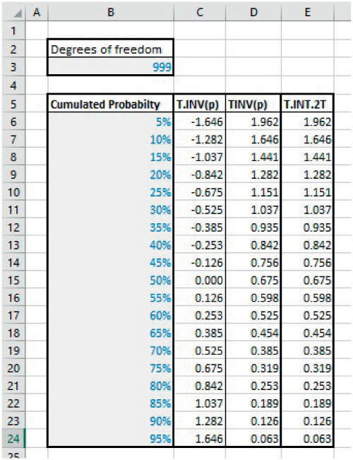
FIGURE 21.27 Various Forms of the Inverse Student Distribution Function in Excel
The file Ch21.23.ConfInterval.Mean.xlsx contains an example of these functions in determining the confidence interval for the mean of a sample of data. Note that the actual data sample is not needed: the only information required is the summary statistics concerning the mean and standard deviation of the sample, the total number of data points (sample size) and the desired confidence level; from this, the required percentiles are calculated using the inverse function(s), and these (non-dimensional) figures are then scaled appropriately (see Figure 21.28).
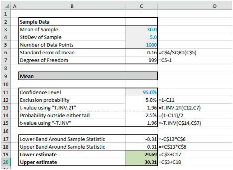
FIGURE 21.28 Confidence Interval for the Mean Based on Sample Data
Example: the CONFIDENCE.T and CONFIDENCE.NORM Functions
Concerning the confidence interval for the mean, Excel has two functions which allow for a more direct calculation than the one shown in the prior example; these are CONFIDENCE.T and CONFIDENCE.NORM, depending on whether one wishes to base the analysis on a T-distribution or on a normal distribution (which are very similar except for very small sample sizes, as mentioned above).
The file Ch21.24.CONFIDENCE.Mean.xlsx shows an example of these (see Figure 21.29).
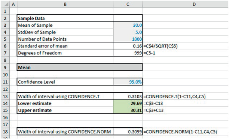
FIGURE 21.29 Confidence Interval for the Mean Using CONFIDENCE Functions
Example: Confidence Intervals for the Standard Deviation Using Chi-squared
The confidence interval for the standard deviation can be calculated by inverting the Chi-squared distribution (rather than the T-distribution, as was the case for the mean). In this case, the Chi-squared distribution has the same parameter and degrees of freedom (n) as the T-distribution in the earlier example. However, it is a positively skewed distribution that becomes more symmetric (i.e. less skewed) as n increases; thus, the confidence interval for the standard deviation is also positively skewed, unlike that for the mean (which is symmetric).
The file Ch21.25.ConfInterval.StdDev.xlsx contains an example (see Figure 21.30). The example uses separate distributions for the left- and right-tail probabilities, i.e. CHISQ.INV and CHISQ.INV.RT, although the legacy left-tail CHIINV function could also have been used.
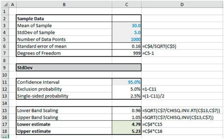
FIGURE 21.30 Confidence Interval for the Standard Deviation Based on Sample Data
Example: Confidence Interval for the Slope of Regression Line (or Beta)
Earlier in this chapter, we noted that the slope of a linear regression line is related to the standard deviations and the correlation between the two variables:
In financial market contexts, if the x-values are the periodic returns on a well-diversified market index, and the y-values are the periodic returns for some asset (such as changes to a stock's price), then the slope of the regression line is known as the (empirical) beta (β) of the asset:
(where ρsm is the correlation coefficient between the returns of the market and that of the asset, and σs and σm represent the standard deviation of the returns of the asset and the market respectively).
Thus the beta (as the slope of the line) represents the (average) sensitivity of the returns of the asset to a movement in the market index.
The importance (for any asset) of being able to estimate its beta is because of its use in the Capital Asset Pricing Model (CAPM). This theoretical model about asset pricing is based on the idea that asset prices should adjust to a level at which the expected return is proportional to that part of the risk which is not diversifiable, i.e. to that which is correlated with the overall market of all assets. In other words, the expected return on an asset (and hence the expectations for its current price) is linearly related to its beta.
Of course, the calculation of the slope of a regression line from observed data will give only an estimate of the (true) beta. The confidence interval for the slope of a regression line (i.e. of the beta) can be calculated using formulae from classical statistics (just as earlier examples calculate confidence intervals for the population mean and standard deviation).
The file Ch21.26.Beta.ConfInterval.Explicit.xlsx shows an example of the required formulae (see Figure 21.31). The calculations involve (amongst other steps) calculating the residuals (i.e. the errors) between the actual data and the regression line at that x-value, which itself first requires that the slope and intercept of the regression line be known.
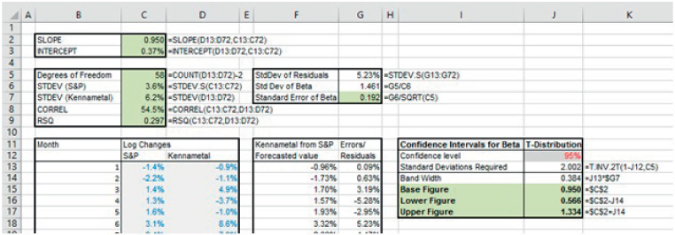
FIGURE 21.31 Confidence Interval for the Slope (Beta) of a Regression Line by Explicit Calculation
It is worth noting that (for monthly data over 5 years, i.e. 60 data points), the confidence interval for the slope is rather large. Whilst larger sample sizes for a single asset should generically increase the accuracy of the calculations, the longer the time period over which data is collected, the more likely it is that fundamental aspects of the business or the macro-economic environment have changed (so that the true sensitivity of the business to the market may have changed). Thus, the data set may not be internally consistent, and hence less valid. This presents one challenge to the assessment of the correct value for beta of an asset. Therefore, in practice, in order to estimate the beta of an asset (e.g. of the stock of a particular company), regression is rarely applied to the data of that asset only; rather larger sample sizes are created by using the data for several companies in an industry, in order to estimate industry betas.
PRACTICAL APPLICATIONS: MORE ON REGRESSION ANALYSIS AND FORECASTING
In addition to the foundation functionality relating to regression and forecasting covered earlier (such as X–Y scatter plots, linear regression, forecasting and confidence intervals), Excel has several other functions that provide data about the parameter values of a linear regression, confidence intervals for these values, the performance of simple multiple-regressions and the forecasting of future values based on historic trends, including:
- LINEST, which calculates the parameters of a linear trend and their error estimates.
- STEYX, which calculates the standard error of the predicted y-value for each x in a linear regression.
- LOGEST, which calculates the parameters of an exponential trend.
- TREND and GROWTH, which calculate values along a linear and exponential trend respectively. Similarly, FORECAST.LINEAR (FORECAST in versions prior to Excel 2016) calculates a future value based on existing values.
- The FORECAST.ETS-type functions. These include:
- FORECAST.ETS, which calculates a future value based on existing (historical) values by using an exponential triple smoothing (ETS) algorithm.
- FORECAST.ETS.CONFINT, which calculates a confidence interval for the forecast value at a specified target date.
- FORECAST.ETS.SEASONALITY, in which Excel detects and calculates the length of a repetitive pattern within a time series.
- FORECAST.ETS.STAT, which calculates statistical values associated with the in-built time-series forecast method.
Example: Using LINEST to Calculate Confidence Intervals for the Slope (or Beta)
LINEST is an array function that calculates not only the slope and intercept of a regression line, but also several items relating to statistical errors and to confidence intervals. In fact, the information provided by LINEST can be used to determine the confidence interval for the slope (beta) of a regression line without having to conduct any explicit forecasting of residuals (as was done in the earlier section).
The file Ch21.27.Beta.ConfInterval.LINEST.xlsx shows an example (see Figure 21.32). The function has been entered in the range H3:I7, with the range F3:G7 showing the (manually entered) labels which describe the meaning of each. The data required to conduct the confidence interval calculation is shown in the highlighted cells (H3, H4, I6) and the actual confidence interval calculation is shown in the range G13:G15 (as earlier, this requires additional assumptions about the desired confidence level, and the inversion of the T-distribution).
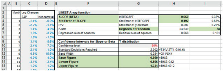
FIGURE 21.32 Confidence Interval for the Slope (Beta) of a Regression Line Using LINEST
The STEYX function in Excel returns the standard error of the Y-estimate, which is equivalent to the value shown by the LINEST function in cell I5.
It is also worth noting that, where one is interested in the slope and intercept parameters only (and not in the other statistical measures), the last (optional) parameter of the function can be left blank; in this case, the function is entered as an array function in a single row (rather than in five rows).
Example: Using LINEST to Perform Multiple Regression
The LINEST function can also be used to perform a multiple regression (i.e. when there are several independent variables and one dependent variable). Each independent variable will have an associated slope, which describes the sensitivity of the dependent variable to a change in that independent input.
The file Ch21.28.LINEST.MultipleRegression.xlsx shows an example of the use of LINEST to derive the slope coefficients, the intercept and other relevant statistical information relating to the market values of various offices based on their characteristics (see Figure 21.33). Several points are worth noting:
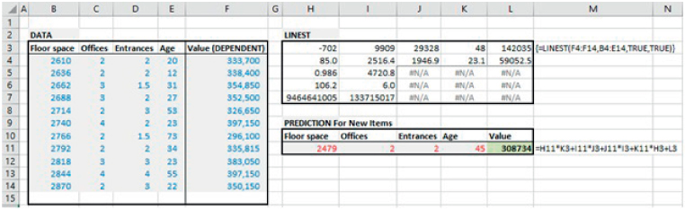
FIGURE 21.33 Using LINEST to Perform a Multiple Regression and an Associated Forecast
- The column range into which the function is entered is extended to reflect the number of variables (i.e. there are five rows and the number of columns is equal to the total number of variables): one column is required for each of the independent variables and one for the intercept.
- The values in each cell follow the same key as shown in the prior example, simply that the first row shows the slope for each independent variable (with the last column showing the intercept), and the second row shows the standard errors of these.
- The slopes and standard errors are shown in reverse order to that in which the data on the independent variables is entered; thus, when using this data to make a prediction, one needs to take care linking the predictive calculations to the slope coefficients (as shown in the formula for cell L11).
Once again, if one is interested only in the regression slope coefficients and the intercept, then the last (optional) parameter of the LINEST function can be left blank, and the function entered in a single row (rather than in five rows).
Example: Using LOGEST to Find Exponential Fits
In a fashion analogous to LINEST, the LOGEST function can be used where one wishes to describe the relationship between variables with a curve such as:
This can also be written as:
showing that this is equivalent to an exponential curve.
In addition, one could write the relationship by:
In this latter formulation, in which the original Y-data is transformed by taking its logarithm, the LINEST function could be applied to calculate the intercept and slope, which would be equivalent to log(b) and log(m) respectively (from which b and m can be calculated). The LOGEST function would provide these (b and m) values directly from the (non-logarithmic or untransformed) data.
The file Ch21.29.LOGEST.LINEST.xlsx shows an example in which (in the worksheet named Data) the LOGEST function is applied to data for which there appears to be an exponential relationship. Note that an exponential trend-line has also been added to the graph (by right-clicking on the data points to produce the context-sensitive menu). This also shows the value of the fitted parameters (see Figure 21.34); for the trend-line equation note that ![]() (i.e. as shown in cell G3).
(i.e. as shown in cell G3).
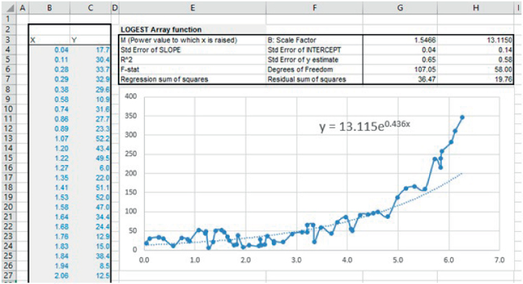
FIGURE 21.34 Use of the LOGEST Function
In the same file, the worksheet named LNofData shows the result of applying the LINEST function to the natural logarithm of the data. It also shows that the reconciliation between the coefficients calculated for the slope and intercept of this linear fit are equal to the logarithms of the values calculated by using LOGEST (see Figure 21.35).
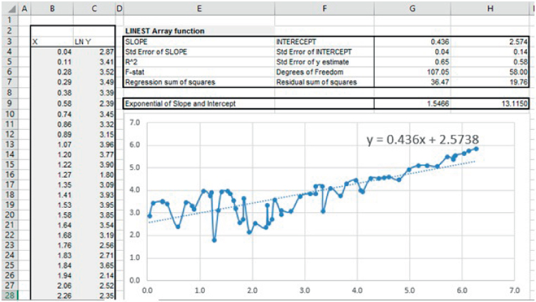
FIGURE 21.35 Comparison of LOGEST and LINEST Applied to the Logarithm of the Data
The LOGEST function can also be used for multiple independent variables, in the same way shown for LINEST to perform multiple regression, i.e. for the context where one wishes to describe the relationships by:
Example: Using TREND and GROWTH to Forecast Linear and Exponential Trends
The functions TREND (linear growth) and GROWTH (exponential growth) can be used to calculate (for a given x-value) a forecast of the y-value of a trend line. Of course, one would expect that the use of these functions would produce the same results as if an explicit forecast were made using the data about the slope and intercept of the trend-line:
- For the TREND function, the equivalent explicit calculations would require using SLOPE and INTERCEPT, or the equivalent values taken from the result of LINEST.
- For the GROWTH function, the explicit forecast could be done either by first calculating the logarithm of the Y-data, then applying SLOPE and INTERCEPT to this (to forecast a logarithmic y-value) and taking the exponent of the result. Alternatively, the required scaling parameters for the explicit forecast (b and m) can be calculated from the LOGEST function.
The file Ch21.30.TREND.GROWTH.xlsx shows an example of each approach (see Figure 21.36). By way of explanation, the X-data set is common in all cases, the Y1-data set is assumed to have essentially a linear relationship, and the Y2-data set to be essentially exponential. Both calculation approaches for forecasting are shown, i.e. using TREND applied to the logarithm of the data or GROWTH applied to the original data. Note that in the approach in which a Y2-value is forecast using the output from LOGEST, the function has been used in the single row form, in which only the regression coefficients (and not the full statistics) are given.
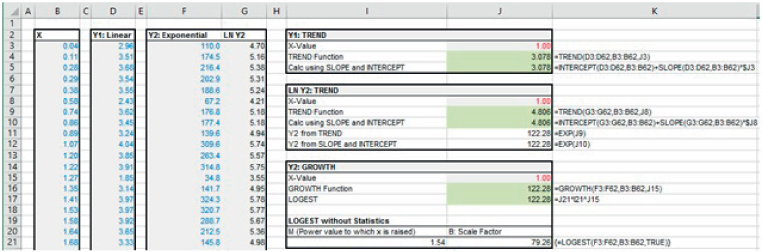
FIGURE 21.36 Use of TREND and GROWTH Functions and Comparison with Explicit Calculations
Example: Linear Forecasting Using FORECAST.LINEAR
The FORECAST.LINEAR function (and the legacy FORECAST function) conducts a linear forecast, and is similar to TREND, except that the order of the parameters is different.
The file Ch21.31.FORECASTLINEAR.xlsx shows an example which should be self-explanatory to a reader who has followed the discussion in the previous examples (see Figure 21.37).
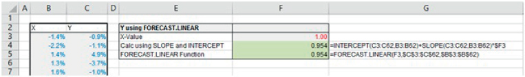
FIGURE 21.37 Use of FORECAST.LINEAR Function and Comparison with Explicit Calculations
Example: Forecasting Using the FORECAST.ETS Set of Functions
The suite of FORECAST.ETS-type functions provides the ability to conduct more-sophisticated forecasting of time series than the linear methods discussed earlier. The functions are based on an “exponential triple smoothing” method, which allows one to capture three major characteristics of a data set:
- A base value.
- A long-term trend.
- A potential seasonality.
The file Ch21.32.FORECASTETS.xlsx shows an example (see Figure 21.38). The core function is simply FORECAST.ETS, which provides a central forecast at some specified date in the future. The FORECAST.ETS.CONFINT function provides the width of the confidence band around that forecast (for a specified confidence level, by default 95%). The FORECAST.ETS.SEASONALITY function can be used to report on the length of the seasonality period that the function has detected within the data. Finally, the FORECAST.ETS.STAT function can be used to provide the values of the eight key statistical parameters that are implicit within the exponential triple smoothing method.
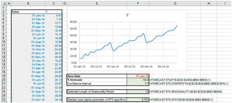
FIGURE 21.38 Example of the Use of the FORECAST.ETS Suite
Note that the dates are required to be organised with a constant step between the time points, e.g. monthly or annually. Optional parameters include seasonality (i.e. the length of the seasonal period to be used, or 1 for seasonality to be detected automatically), data completion (i.e. 0 to treat missing data as zero, 1 to complete missing points based on the average of neighbouring points) and aggregation (i.e. how points on the same date are to be treated, the default being average).
Within this context, it is also worth mentioning another potentially useful Excel feature, which is the forecast graph; after selecting the data set of timeline and values, and choosing “Forecast Sheet” on Excel's Data tab, Excel will create a new worksheet with a forecast chart, including confidence intervals. Figure 21.39 shows the result of doing this.

FIGURE 21.39 The Result of Using the Forecast Sheet Feature