
Introduction
Some of us have been doing web development for a number of years but only in the last few were given portable, connected computers in our pockets. Though phones with web browsers are nothing new, the popularity of smartphones is making it much more tolerable, and in some cases very natural, to access the Internet on our phones. And because of the touch experience on the nicer devices, browsing on phones and tablets can often be better than on a desktop browser. Perhaps you have picked up this book because you are a web developer by trade and your own mobile usage piqued your interest in doing mobile web development. Maybe your employer wants a mobile site and you need a resource for that. Or maybe you are a hobbyist and developing for the mobile web sounds fun. Whatever the reason, I can help you.
Though I have had a mobile phone for years, I only bought a smartphone a few years ago (a Windows Phone 7 device). Now I am an iPhone user and can barely imagine not having instant access to the Internet while on the go. Fast forward a bit and I now manage mobile web development at Match.com. For the last two years I have been leading the effort to deliver a good mobile web experience to our customers. I have spent longer than that doing mobile web development and longer still doing web development for the desktop browser. Over the last few years I have had a lot of fun and learned a lot about this quickly changing topic of mobile web development. My goal is to share what I have learned with you in this book.
Who This Book Is For
This book is for the ASP.NET developer who knows how ASP.NET MVC works and is eager to learn how to use it for building mobile websites. Thorough knowledge of ASP.NET MVC is not at all required but a little is assumed. This book also assumes a little knowledge of HTML, CSS and JavaScript. You do not need any prior experience in mobile development.
What This Book Is Not
I am not here to tell you how to write native applications for iPhone, Android, or Windows Phone. Building native applications for these phones is often a fine idea. I have even tried it a bit myself. But this is not a book about writing these types of applications.
But this book is about writing cool stuff for all of those phones and more. If you want to write an app for iPhone in its native development environment, you will need to create it using Objective-C. If you want to do the same for Android, you will use Java. As for Windows Phone, you will use C# or VB.NET. One of the benefits of mobile web development is that you get to target all three and more without having to learn all of those different development platforms.
What Tools Do You Need?
To do mobile web development with ASP.NET MVC 5, you will need a copy of Visual Studio 2013. But almost nothing changed between ASP.NET MVC 4 and 5, so everything except a few things (covered in Chapter 12, “Useful Libraries for Mobile”) will be the same between those two versions. If you are stuck using older versions of ASP.NET MVC and unable to upgrade, everything other than parts of Chapter 6 (“Display Modes, View Engines and Html Helpers”) and Chapter 12 is still relevant. So whatever version of ASP.NET MVC you are using, this material will help you.
It is also very handy to have a wide range of mobile devices to test with. If you do not have all the mobile devices that you need, you can also use simulators or emulators. If those are not available, you can use services like Device Anywhere (http://www.keynotedeviceanywhere.com/) to test. Though you do have various options, I have found that it’s much easier to test things if you have a device to use.
Why Mobile Web Development Is Awesome
There are a number of good reasons to choose the mobile Web as a development platform. First, with mobile web development, you only need one development tool set as I mentioned before. You do not need to learn Java, Objective-C, and C# to build for each major phone.
Second, this also means that you can target multiple types of devices with one codebase. This a major boost for both productivity and maintenance. Because of browser incompatibilities, it is not “write once, run anywhere.” That would be fantastic. But a lot (or perhaps even most) of the code can be shared across browsers in modern smartphones.
Third, if you already have experience in web development generally, you are already on your way to working on the mobile web. Everything you learned in doing web development applies to mobile. All you need to do to be effective in mobile development is to pick up some additional skills.
Fourth, you can deploy anytime. This is actually a very big deal. Find a critical bug in a mobile website? Push a quick fix out to the server farm. Find a critical bug in a native application? Go through the relevant app store and their (sometimes) finicky process to get your change pushed out.
Fifth, no one can keep you off of their platform. For many, this may not even come up as a concern but it can be a very big deal. Anyone’s application can be removed from any app store (though Apple is most notorious for this) and there is nothing you can do about it. Having a mobile website along with native applications gives you a backup strategy if a store decides to remove your application. By targeting the mobile web, you are not held captive by those who run the app stores. The only one holding you back is you.
Where Mobile Web Development Has Its Challenges
So what is not to like about mobile web development? In reality, there are several advantages to doing native mobile application development. Here are a few things to keep in mind.
First, if you ever found yourself complaining about desktop browser fragmentation, you haven’t seen anything yet. On the desktop, you primarily have Internet Explorer, Chrome, and Firefox and their various versions. Since the latter two automatically update, you really only have to deal with one version of both Chrome and Firefox and a few of Internet Explorer. The mobile browser landscape is far more fragmented. Users of iOS tend to upgrade quickly, which pushes the newer, more interesting browser versions of mobile Safari more quickly. Android users are the exact opposite. They rarely upgrade and old browsers stay around for much longer. Additionally, manufacturers tweak their Android implementations and their default browsers, so you will get (seemily endless) inconsistencies at times. Along with that you also have two versions of the Windows Phone 7.x browser out as well as mobile Firefox and Opera. At the moment you may not want to forget Blackberry as it is still hanging on to some market share, which gives you another few variants of a webkit-based browser like you have on iOS and Android (though traffic from Blackberry devices is on a serious decline). And we have the recent addition of Firefox OS, though the numbers remain small for now. And that is just the browser landscape for smartphones. Fragmentation only gets worse if you start supporting older devices.
Second, native applications get more capabilities than mobile web counterparts. Native applications can register a phone for push notifications, even while the app is not running. You cannot do this with mobile websites. You can’t currently upload a photo directly from a phone to a site through the browser except in iOS 6+ and Android 4+. Native applications with their native rendering also benefit from improved performance. But the good news is that as time goes on the browsers improve and get more functionality than they had before. They also become faster. But it is likely that mobile web applications will continue to trail native applications in terms of capabilities.
Third, native mobile applications also have a great story around being an acquisition tool for new customers. The native app stores can be a great channel for exposing your services to customers.
Fourth, native mobile applications already have a built-in monetization strategy through their respective app stores. If a company wants to make money on the mobile web, they have to implement payment in their web application and don’t get the convenient buy for “$0.99” button that makes purchasing native applications so painless.
Ideally, the best strategy for most companies would be to target both web and native because both have their advantages. This is our strategy at Match.com. But you do not always have resources to do everything at once, so sometimes you have to weigh the advantages and disadvantages of each approach.
The Big Questions
If you have bought this book, you probably already plan on building a mobile web site. Good for you because now the adventure can begin. And it should begin with a short discussion of mobile strategy. There is more than one way to build mobile websites and your goals, circumstances, and company dynamics can really affect the direction you take. To think through this, I like to pose four questions.
First, do you plan for your mobile website to be separate from your desktop website? Some of the later questions will help you answer this one but in some cases this is easy to answer without further consideration. Let us say that you are on the mobile team for your company and another team altogether has the responsibility for making and maintaining the desktop website. In these cases it will often be best to plan on having different sites. Sharing the code and product direction may be very difficult from an organizational perspective, and having a separate site may make the most sense.
Also, if your mobile website will have very different functionality or structure than your desktop website, it is often smart to have separate sites. By having one site you can more easily share code; but if there are significant differences, you will already know that any potential sharing is going to be more difficult.
However, there are cases where having the same site is really the smart choice. If you are tasked with creating a mobile-friendly version of your company’s blog, duplicating the site is likely a bad approach because responsive design techniques make this kind of task relatively easy to solve without creating a separate site. And even for more complicated sites, in the long term having two sites will often cause more hassle. As mobile devices proliferate in both number and size, desktop versus mobile becomes a hard distinction to maintain.
Second, are you trying to create a mobile web site or a mobile web app? At first glance you might think these are not that much different, but in some cases this will radically change how you approach the project.
A few examples might be helpful. If you take the previously mentioned example of a company blog, in most cases the best approach will be to use responsive web design principles to make an existing design (or new, if necessary) work well on both smartphones and desktop browsers. Other similar sites would be personal portfolios, consulting company websites or sites that are more content-oriented. This works especially well if you are targeting modern smartphones only.
On the flip side, an attempt to create a web app will definitely affect how you approach creating your mobile project. For example, when we created Match.com’s mobile website for iOS and Android (those were our original target devices), we explicitly patterned our interface after our iPhone native application. This also led us to leverage a certain set of HTML5 capabilities to create a more app-like experience. From a purely code-sharing perspective, it would have been next to impossible to try and take Match.com’s desktop website and try to turn it into the app that we wanted to create.
But this is often not going to be the best choice for you. Making a mobile website act like a native web app adds a great deal of difficulty to the task. Though doing this can be a fun technical exercise, this is rarely something normal users would expect, so you may be simply creating more work for yourself.
Third, are you starting something new? If you have an existing website and you are tasked with creating a mobile version, it can sometimes be very difficult to take the existing site and mobilize it. If you want to have a single site that works on both mobile and desktop, sometimes it will be easier to start another site that is built with both in mind that would eventually replace the existing desktop site, perhaps targeting a range of different devices and browsers through responsive design techniques.
If you are building something new and it is a content-heavy site (question #2 above), it is probably best to plan from the beginning for the single site to serve both purposes. But if you are creating an alternative to an existing site, sometimes it is best to plan on replacing the existing site with the new site at some point.
Fourth, who is your audience? If your audience is primarily in North America or Europe, modern smartphones like iPhone or Android will be the vast majority of your traffic in the near future. In Match’s case, over 80 percent of our traffic comes from either iPhone or Android, so those were the first devices for us to target with our new mobile site. Blackberry devices, Windows Phones, and feature phones made up the remaining amount. And that made sense for us, because that is where most of our users are.
Though iOS and Android dominate US mobile traffic, itnternationally, there is a wide variety of phones outside of the iPhone/Android space. If your audience is primarily international, prepare for a very diverse device market.
So About Those Questions
I asked those four questions above because they help you think through your approach to mobile and how that corresponds to what we will discuss in this book. But for now, let us take a few examples. Say you have a blog, and you want to give users a good reading experience on their mobile devices. If your audience primarily has smartphones, section one of this book will be the primary resource for you. In many cases you will be able to use responsive web design to make a single site work fine for both smartphones and desktop browsers. For content-heavy sites like blogs, this goal is easily achievable. But if you want your blog readable by smartphones in North America and Europe as well as the feature phones of India and the keitai phones of Japan, you will find all the material in the book of useful for leveraging the server-side and developing for phones with less features.
Or perhaps you are creating an e-commerce platform. If you are a US- or European-based company, it might make sense for your business to just focus on modern smartphones. But if you want the widest reach for your project and want to handle old Blackberry devices and feature phones, you will want to learn how to target both differently (discussed in Chapter 6, “Display Modes, View Engines and Html Helpers”). And you almost surely want a different experience for both. Targeting the lowest common denominator browser capabilities to support older phones will mean ignoring the beneficial features in smartphones, which could have negative ramifications for your bottom line.
Whatever you are building, these four questions should help you think through your future mobile web efforts. Even though our mobile website is a year and a half old as of the publication this book, we are still asking ourselves these same questions and trying to decide our own direction.
ASP.NET MVC 5 and Mobile
ASP.NET MVC 5 is a great platform on which to develop mobile websites; but I want to go ahead and clarify some things that may not be so obvious from a quick glance at the project types for ASP.NET in Visual Studio 2013, as seen in this figure:
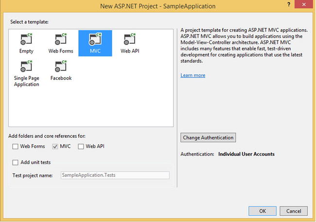
The new ASP.NET project dialog in Visual Studio 2013
As you can see, there is no “Mobile” web project. There was one in ASP.NET MVC 4 for Visual Studio 2012 and this project type pre-installed jQuery Mobile (discussed in Chapter 12, “Useful Libraries for Mobile”) and was probably what some thought was the default way to approach doing mobile web development simply because that was what you got when you created a “Mobile” project. But they removed this option with Visual Studio 2013.
I can’t comment on why Microsoft did this because I don’t know. But I do believe that this was a good choice. Though jQuery Mobile is a cool open-source project and is a good fit for some sites, it is certainly not the first place to start on mobile projects. I would strongly recommend starting with a responsive web design approach instead, which is how this book starts (as I will explain below). The good news is that the default ASP.NET MVC website templates in both MVC 4 (not the “Mobile” option) and MVC 5 are responsive by default. This is a better pattern to follow, so I am pleased with the changes in Visual Studio 2013.
To see a responsive approach in action, create a new ASP.NET MVC project, start it up and start shrinking and explanding your browser width. The site should flexibly adapt to the changing browser side.
Of course you might ask what relevance there is between building a mobile website and the server-side framework you use to server up your client-side assets. You can build responsive websites on any server platform, as well as basic mobile websites for older phones. Though this is true, there is quite a bit on the server you can leverage. Much of this book is about what you should use and when.
How This Book Is Structured
I’ve split this book into three parts, each focusing on a particular subject or area of programming. The first section is on responsive web design and comprises five chapters.
- Chapter 1 “The Basics of Responsive Web Design” introduces you to responsive web design by building a responsive version of the APress homepage. This chapter should give you a good overview of the basic ideas in responsive web design.
- Chapter 2 “CSS Layout Bootcamp” is a primer on layout with CSS with a focus on creating layouts with CSS floats. Many developers find laying out pages in CSS instead of tables to be very difficult, and this chapter aims to solve that problem, since tables are not a very flexible layout mechanism. Table-based layouts are difficult or impossible to make responsive, so we need to have an alternative way to layout web pages.
- Chapter 3 “Flexible Layouts” covers a number of different ways to create layouts that are responsive and flexible enough to handle screens both large and small.
- Chapter 4 “Flexible Navigation” is related to Chapter 3 and covers navigation as a special case. Like Chapter 3, numerous patterns are discussed.
- Chapter 5 “Flexible Content” discusses how to make our content flexible enough to work on both desktop-size and mobile-size screens. This chapter discusses creating flexible text, tables, video, and images.
The next section switches to discuss primarily server-side topics, though there are some important client-side discussions as well.
- Chapter 6 “Display Modes, View Engines and Html Helpers” begins our first discussion of how we can use the server-side in mobile web development. This chapter describes three different mechanisms we can use to flexibly control what HTML, CSS, and JavaScript get returned to the client.
- Chapter 7 “Device and Feature Detection” discusses how you can decide what your devices are capable of doing, which is very important for progressive enhancement and can be useful for informing how we use the techniques described in Chapter 6.
The third and final section shifts the focus again to client-side mobile web development, though Chapter 8 continues with one foot planted firmly on both the client and server-sides.
- Chapter 8 “Mobile Performance” shows you several techniques that are important for well-performing mobile web applications.
- Chapter 9 “Native APIs, HTML5 and CSS3 on Mobile Today” gives an overview of how advanced our mobile browsers are. You might be surprised to see what the average iOS, Android, or Windows Phone can do.
- Chapter 10 “Programming for Touch” introduces you to the very interesting world of touch-based programming. This chapter covers how to handle the various and incompatible touch programming models and ends with a very practical use case for developing with touch.
- Chapter 11 “Advanced Touch Programming” takes us deeper into touch development with more practical yet complex samples.
- Chapter 12 “Useful Libraries for Mobile” shows us a number of useful libraries for building mobile websites. Though this book is mostly about core principles and techniques, libraries can be very helpful at times.
Device Testing
“What devices should I own?” is a common question by those getting into mobile web development. “All of them” is an appropriate but not feasible answer. Here are the devices I used to test all the client-sides samples in this book, in no particular order, followed by the OS version and browsers I tested with on the devices.
- iPhone 3G (iOS 4, Safari)
- iPhone 4 (iOS 5, Safari)
- iPhone 4S (iOS 6, Safari)
- iPhone 5S (iOS 7, Safari)
- iPad (3rd gen, iOS 6, Safari)
- Samsung Galaxy S (SGH-I897, Android 2.1, Android Webkit)
- Samsung Galaxy S (SGH-I897, Android 2.2, Android Webkit)
- LG Nitro (P930, Android 2.3.5, Android Webkit)
- Samsung Galaxy SIII (Android 4.1, Android Webkit, Chrome, Android, Opera Class, Opera Webkit)
- BlackBerry Z10 (BlackBerry OS 10, BlackBerry browser)
- Lumia 900 (Windows Phone 7.5, IE 9)
- Lumia 820 (Windows Phone 8, IE 10)
- Lumia 920 (Windows Phone 8, IE 10)
- Samsung Slate Tablet (Windows 8, IE 10)
- Geeksphone Keon (Firefox OS 1.0.1.0-prerelease)
- Kindle Fire (first generation)
- Kindle Fire HD
- Galaxy Nexus 7 (*, Android Webkit, Chrome)
So why these devices? In some cases it is obvious. In the United States (my focus) iOS takes the largest share of mobile web traffic so testing your mobile web work on iOS is clearly the most important thing to do in almost all cases. In my experience iOS browsers tend to have fewer regressions and bugs as the newer versions were released, but it is still a good idea to test on multiple if you can. If you cannot, own a device running iOS 7. People do a great deal of web browsing on iPads as well, and if you want to support tablet traffic on your mobile site, you will need at least one iPad to test on.
Android takes the second place in mobile web traffic. Even though Android users upgrade slower than iOS users, Android 4 is still the best device to have if you can only have one. But it is on Android that you really see mobile browser fragmentation to its greatest extent, so testing on as many Android devices as possible is very important.
As for Windows Phone, it is probably best to own a Windows Phone 8 device even though at Match we still have more Windows Phone 7.5 users. Version 8 will probably surpass 7.5 in adoption at some point. The browsers are drastically different, so owning both would be good, though the small traffic you will likely get from these devices probably doesn’t justify owning multiple unless you have the cash to spend or a particular affinity to Windows Phone.
It is important to have some touch device running Internet Explorer 10 at the very least just so you can test the touch APIs, whether this is a Windows 8 or Windows Phone 8 device.
Kindle and Android tablets are being sold in greater numbers, so testing on these devices is also useful.
At the moment testing a Firefox OS device is a luxury but not a necessity. Perhaps this will change in the future.
BlackBerry 10 device testing is also a luxury. The traffic for these devices is very small and BlackBerry OS’ outlook is exceedingly bleak. In my experience, robust Android device testing and debugging will likely cover you for BlackBerry devices.
Downloading the code
The code for the examples shown in this book is available on the Apress website, www.apress.com. A link can be found on the book’s information page under the Source Code/Downloads tab. This tab is located underneath the Related Titles section of the page.
The author also maintains a site for the book at http://www.mobilemvcbook.com/. Most of the sample code can be viewed and tested live there on the site.
Contacting the Author
Should you have any questions or comments—or even spot a mistake you think I should know about—you can contact me at [email protected]. You can also follow me on Twitter: I go by the handle @mallioch. You can contact me there. I also maintain a site for my blog and personal projects, http://ericsowell.com, on which I keep up-to-date contact information.