
This chapter further develops the data model that you created in the previous chapter. It explains how to augment the existing tables by adding new columns containing calculations to the tables that you have imported. You can then apply these additional metrics to the dashboards that you create using Power BI Desktop.
Admittedly, not every data model in Power BI Desktop
needs extensive calculations. Frequently, the data can speak for itself without much polishing. Yet business intelligence is, at its heart, based on figures. Consequently, sooner or later, you need to apply simple math, calculate percentages, or compare figures over time. You may even want to develop more complex formulas that enable you to extend your analyses and illustrate your insights. Fortunately, Power BI Desktop makes these—and many, many other calculations—amazingly easy. What’s more, if you are an Excel user, you will probably find most of the techniques explained in this chapter to be totally intuitive.
In some cases, you only need to cherry-pick techniques
from the range of available options to finalize a dataset. So, it probably helps to know what Power BI Desktop can do and when to use the techniques outlined in this chapter. Therefore, I leave it to you to decide what is fundamental and what is useful. The objective in this chapter and the next two is to present a tried and tested suite of calculation solutions so you are empowered to deal with a range of the potential challenges that you may encounter in your data analyses.
All calculations in the Power BI Desktop data model are written using a simple language named DAX. This stands for Data Analysis eXpressions
. As you will see, DAX is not in any way a complex programming language. Indeed, it is known as a formula language because it is a set of nearly 300 formulas that you can use and combine to extend data models and to create metrics to underpin the visualizations in your dashboards. Fortunately, DAX formulas are loosely based on the formulas in Excel (indeed, a good third of them are identical) so the learning curve for an Excel user is really quite short.
Given the vast horizons that DAX
opens up to Power BI Desktop users, a single chapter could never be enough to give you a decent idea of the practical uses of this formula language. So the introduction to DAX in this book is spread over three chapters. To apply some structure to a potentially huge and amorphous area, I have broken down DAX into the following areas:
- This chapter covers column-based calculations (where the formula appears as a new column in a table).
- Chapter 12 describes measures (calculations that are added to a table but that do not add a column of calculated data).
- Chapter 13 describes time calculations (measures that are used to aggregate data over time periods or to compare data over time).
If you want to continue enhancing the data based on the kinds of data transformations that you saw in the previous few chapters, download the CarSalesDataWithDataModel.pbix file from the Apress web site. This file lets you follow the examples as they appear in this chapter.
Types of Calculations
If you are lucky, then the data that you have imported contains everything that you need to create all the visualizations you can dream up in Power BI Desktop. Reality is frequently more brutal than that, however, and it necessitates adding further metrics to one or more tables. These calculated metrics will extend the data available for visualization. This is fundamental when you are using tools such as Power BI Desktop that do not allow you to add calculated elements to the output, but insist that all metrics—whether they are source data or calculated metrics—exist in the dataset. This is less of a constraint and more of a nod toward good design practice, because it forces you to develop calculations once and to place them in a single central repository. It also reduces the risk of error, because users cannot develop their own (possibly erroneous) metrics and calculations and so distort the truth behind the data.
When creating DAX metrics, you are defining elements that are of practical use for your dashboard visualizations. This can include
- Creating derived metrics that will appear in visualizations.
- Adding elements that you use to filter pages or visualizations.
- Creating elements that you use to segment or classify data. This can include creating your own groupings.
- Defining new metrics based on existing metrics.
- Adding your own specific calculations (such as accounting or financial formulas).
- Adding weightings to values.
- Ranking and ordering data .
And many, many more…
Adding New Columns
Adding new columns
is one of the two ways in which you can extend a dataset with derived metrics that you can use in Power BI Desktop dashboards. There are multiple reasons why you may need further columns, including:
- Concatenating data from two existing columns into one new column
- Performing basic calculations for every row in the table, such as adding or subtracting the data in two or more columns
- Extracting date elements such as the month or year from a date column and adding them as a new column
- Extracting part of the data in a column into another column
- Replacing part of the data in a column with data from another column
- Creating the column needed to apply a visually coherent sort order to an existing column
- Showing a value from a column in a linked table inside the source table
Indeed, the list could go on. However, I am sure that you get the idea from what you have read so far.
Before you start wondering exactly what you are getting yourself into, I want to add a few words of reassurance about the ways in which a data model can be extended.
- First, extending a table with added columns is designed to be extremely similar to what you would do in Excel. Consequently, you are in all probability building on your existing knowledge as an Excel power user.
- Second, the functions that you will be using are, wherever possible, similar to existing Excel functions. This does not mean that you have to be an Excel super user to add a column, but that knowledge gained using Excel will help with Power BI Desktop and vice versa.
- Finally, most of the basic table extension techniques follow similar patterns and are not complex. So the more you work at adding columns, the easier it will become as you reuse and extend techniques and formulas.
Creating columns
is a bit like creating a formula in Excel that you then copy down over the entire column. They are even closer to the derived columns that you can add to queries in Access. The key thing to note is that any formula will be applied to the entire column.
It is worth noting from the start that a formula that you add to a new column is calculated and applied to a column when it is created. It is only recalculated if you recalculate the entire table or file or if you refresh the source data.
Note
In this chapter and the next, I frequently emphasize that you need to prepare your metrics before building visualizations for dashboards and reports. In practice, Power BI Desktop is extremely forgiving and immensely supple. It lets you switch from Dashboard View to Data View at any time so that you can add any new columns or missing metrics. Indeed, you can even add measures from the Fields list in Dashboard View. However, it can be more constructive to think through all your data requirements before rushing into the fun part that is creating dashboards. This approach can save you creating duplicate measures with different names and can help you to adopt a clear and coherent approach to naming metrics as well.
Naming Columns
If you create new columns, then you need to give them names. Inevitably, there are a few minor limitations on the names that you can apply. So, rather than have Power BI Desktop cause problems, I prefer to explain the overall guidelines on the Power BI Desktop naming conventions earlier rather than later in the course of this chapter.
The first thing to remember is that column names have to be unique inside each table. Therefore, you cannot have two columns with the same name inside the same table. You can, however, have two columns that share a name if they are in separate tables. However, I generally advise that you try to keep column names unique across all the tables in a Power BI Desktop file if you possibly can. This can make building visualizations easier and safer because you do not run the risk of using a column from the “wrong” table in a chart, for instance, and getting entirely inappropriate results as a consequence.
The essential point of note
is that columns cannot contain any of the following:
- Spaces (unless the spaces are enclosed by brackets or single apostrophes)
- The characters: .,;':/*|?&%'!+=()[]{}<>
Fortunately, column names are not case sensitive.
Note
All the restrictions that concern column names also apply to measures (which you will learn about in the next chapter).
Concatenating Column Contents
As an initial example of a new column, I will presume that, when working with Power BI Desktop to create a dashboard for Brilliant British Cars, you have met a need for a single column of data that contains both the make and model of every car sold. Because the data we imported contains this information as separate columns, we need to add a new column that takes the data from the columns Make and Model, and joins them together (or concatenates them, if you prefer) in a new column. The following explains how to do this:
- 1.Open the file C:PowerBiDesktopSamplesCH11CarSalesDataWithDataModel.pbix.
- 2.In the Power BI Desktop window, make sure that you are in Data View.
- 3.Click the Stock table to select it.
- 4.In the Modeling ribbon, click the New Column button. A new empty column will appear to the right of the final column of data. This column is currently entitled Column and is highlighted.
- 5.The formula bar above the table of data will display Column = .
- 6.In the formula bar , click to the right of the equals sign. Press [. A list of the fields in the current table will appear, as shown in Figure 11-1.
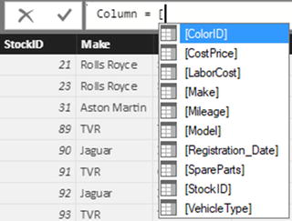 Figure 11-1.Selecting a field for a formula
 - 7.Double-click the [Make] field in the popup list of columns (or use the cursor keys to highlight the [Make] field and press the Tab key). The formula bar now reads =[Make].
- 8.In the formula bar, add & “ ” &. The formula bar now reads =[Make] & " " &.
- 9.Press [. Select [Model] from the list of fields. The formula bar now reads =[Make] & " " & [Model].
- 10.Press Enter (or click the tick icon in the formula bar). The column is automatically filled with the result of the formula and it shows the make and model of each car sold.
- 11.Right-click the column header for the new column and select Rename.
- 12.Type the word Vehicle and press Enter.
The table will now look something like Figure 11-2. Moreover, the new column has been added as a field to the Stock table in the Fields list.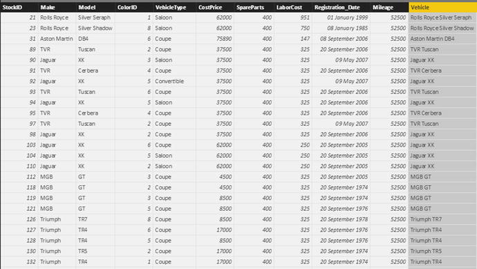
Figure 11-2.
An initial calculated column
I imagine that if you have been using Excel
for any length of time, then you might have a strong sense of déjà vu after seeing this. After all, what you just did is virtually what you would have done in Excel. All you have to remember is that
- Any additional columns are added to the right of the existing columns. You cannot move them elsewhere in the table once they have been created.
- All functions begin with the equals sign.
- Any function can be developed and edited in the formula bar at the top of the table.
- Reference is always made to columns, not to cells (as you would in Excel).
- Column names are always enclosed in square brackets.
- You can nest calculations in parentheses to force inner calculations before outer calculations—again, just as you would in Excel.
Once a new column has been created, it remains at the right of any imported columns in the table where you added it. It is not possible to move the new column elsewhere in the table. The field that it represents is always added to the bottom of the collection of fields for this table in the Fields list. This way the available fields will appear in the order that they were created. However, fields always appear in alphabetical order in the Fields list in Dashboard View.
If you look closely at the field that was added, you will notice that there is a tiny Fx icon to its left. This is how you can distinguish new columns from other fields such as numeric fields (which have a sigma (∑) icon to their left) or measures (which you will meet in the next chapter) that have a small calculator icon to their left.
Note
In this example, you selected columns from the popup list of the available columns in the table. You can enter the column name in the formula bar if you prefer, but if you do then you must enclose the column name in square brackets. You must also enter it exactly as it appears in the Fields list and column title.
Tweaking Text
In Chapter 7, you learned many techniques that you can apply to text-based columns
. If you remember, these included changing the capitalization and removing extra spaces (among other things).
DAX also lets you clean up and modify the text in the tables that you have imported into your data model. Indeed, it offers a wide range of functions that you can apply to standardize and cleanse text in tables. As an example, let’s imagine that you want to create a column in the Clients table that contains a shortened version of each town. In fact, what you want to do is extract a three-letter acronym from the first letters of the town name, which you can use later in charts.
- 1.In the Power BI Desktop window, make sure that you are in Data View.
- 2.Click the Stock table in the Fields list.
- 3.In the Modeling ribbon, click the New Column button. A new empty column will appear to the right of the final column of data. This column is currently entitled Column and is highlighted.
- 4.The formula bar above the table of data will display Column = .
- 5.In the formula bar, click to the right of the equals sign.
- 6.Type LEFT(. Once the function appears in the popup menu, you can select it if you prefer.
- 7.Click inside the Town column of the Clients table. Clients[Town] will appear in the formula bar. Alternatively, you can type a left square bracket and select the [Town] field.
- 8.Enter a comma.
- 9.Enter the number 3. This indicates to the LEFT() function that it is the three characters on the left that you want to isolate for each row in this column.
- 10.Add a right parenthesis, ).
- 11.Still inside the formula bar , replace Column with TownAbbreviation. The formula bar will readTownAbbreviation = LEFT(Clients[Town],3)
- 12.Press Enter (or click the tick icon in the formula bar). The column is automatically filled with the result of the formula and it shows the first three letters of every town’s name.
As you can see, the LEFT() function takes two parameters:
- First, the field from which you want to extract the leftmost characters
- Second, the number of characters to extract
And that is all that you have to do. By applying a simple text formula, you have prepared a column of text for effective use in a visualization.
DAX contains a couple of dozen functions that you can apply to the text in columns. Most of them follow the same principle as the
LEFT() function
in that they take at least two parameters, the first of which is the column that you want to take as the basis for your new column and the second (or even third) parameters provide information about how the modification is to be applied. Since I do not have space to explain each and every one of these functions, Table 11-1 contains a succinct overview of a selection of some of the most useful text functions. This table does not explain all the subtleties of every function, but is designed to be both a brief introduction and a starting point for your DAX formulas that rework the text elements of your data tables.
Table 11-1.
Core Power BI Desktop Text Functions
Function
|
Description
|
Example
|
|---|---|---|
LEFT()
| Extracts a specified number of characters from the left of a column. |
LEFT(Clients[Town], 3)
|
RIGHT()
| Extracts a specified number of characters from the right
of a column. |
RIGHT(Invoices[InvoiceNumber], 12)
|
MID()
| Extracts a specified number of characters (the second parameter) from a specified position defined by the number of characters from the left (the first parameter) inside a column. |
RIGHT(Invoices[InvoiceNumber], 10, 4)
|
UPPER()
| Converts the data to uppercase. This function takes no parameters. |
UPPER(Clients[ClientName])
|
LOWER()
| Converts the data to lowercase. This function takes no parameters. |
LOWER(Clients[ClientName])
|
TRIM()
| Removes any extra spaces (trailing or leading) from the text inside a column. This function takes no parameters. |
TRIM(Clients[Address1])
|
LEN()
| Counts the number of characters
in a column. This is often used with the MID() function. This function takes no parameters. |
LEN(Clients[Address1])
|
FIND()
| Gives the starting point (as a number of characters) of a string inside a column. This function is case sensitive. Interestingly, the first parameter is the text to find and the second is the column. |
FIND('Car',Clients[ClientName])
|
SEARCH()
| Gives the starting point (as a number of characters) of a string inside a column. This function is not case sensitive and disregards accents. Interestingly, the first parameter is the text to find and the second is the column. |
SEARCH('Car',Clients[ClientName])
|
SUBSTITUTE()
| Replaces one text with another inside the column. This is a bit like the search and replace function in a word processor. |
SUBSTITUTE(Clients[ClientName], 'Car', 'Vehicle')
|
VALUE()
| Converts a figure in a text column to a numeric data type. This function takes no parameters. |
VALUE(Colors[ColorID])
|
FIXED()
| Takes a number and rounds it to a specified number of decimals then converts it to a text. The second parameter indicates the number of decimals to apply. |
FIXED(Stock[LaborCost], 2)
|
There are a couple of points to note now that you have seen how to use DAX formulas
in Power BI Desktop:
- Functions need not apply to entire columns; they can be applied to specific texts as part of a more complex formula.
- You can enter functions in uppercase or lowercase.
Simple Calculations
To extend the basic principle and to show a couple of variations on a theme, let’s now add a calculation to the Stock table
. More precisely, I assume that our Power BI Desktop visualizations frequently need to display the figure for the direct costs relating to all vehicles purchased, which I define as being the purchase price plus any related costs. You obtain this by applying a variation on a technique that you have used before:
- 1.In Data View, select the Stock table.
- 2.Click New Column in the Modeling ribbon.
- 3.In the formula bar, replace the word Column with the word Direct Costs. (Notice that there is a space, because column names can contain spaces.)
- 4.To the right of the equals sign, enter a left square bracket: [. The list of the fields available in the Stock table will appear in the formula bar.
- 5.Type the first few characters of the column that you want to reference—CostPrice in this example. The more characters you type, the fewer columns are displayed in the list.
- 6.Click the column name. It will appear in the formula bar (including the right bracket).
- 7.Enter the minus sign.
- 8.Enter a left parenthesis.
- 9.Enter a left square bracket and select the SpareParts column.
- 10.Enter a plus sign.
- 11.Enter a left square bracket and select the LaborCost column.
- 12.Enter a right parenthesis. This corresponds to the left parenthesis before the SpareParts field. The formula should readDirect Costs = [CostPrice] - ([SpareParts] + [LaborCost])
- 13.Click the tick box in the formula bar (or press Enter). The new column will be created. It will also appear as a new field in the Fields list for this table.
As you can see, using arithmetic in calculated columns in Power BI Desktop is almost the same as using calculating cells in Excel. If anything, it is easier because you do not have to copy the formula over hundreds or even thousands of rows as the formula is automatically applied to every row in the table.
When selecting fields in steps 5, 9, and 11, you can (if you prefer) click the field name in the Fields list rather than enter a left bracket and scroll through a list of fields. Of course, this assumes that you have not hidden the Fields list and that you have expanded the table name so that you can see the fields that it contains.
If you are a Power Pivot user, then the sense of déjà vu is probably so total as to be overwhelming. In fact, most Power Pivot users will probably only need to skim through this chapter as the Data View of Power BI Desktop is virtually identical to the Power Pivot window in Excel. Except for the tables that now appear on the right (instead of tabs at the bottom of the window) and the absence of a formula button, there are few differences. So feel free to jump over any sections (in this chapter and the next) that you already know by heart if you are a Power Pivot
expert.
Note
You can give a new column an appropriate name either when you create the formula initially (by replacing the word Column with the new column name) or by renaming the column once the formula is correct and confirmed. You can include spaces in column names if you want. After all, this is how the name will appear in your dashboards.
Math Operators
For the sake of completeness, and in case there are any newcomers to the world of Microsoft products out there, I prefer to recapitulate the core math functions that are available in Power BI Desktop. These are given in Table 11-2.
Table 11-2.
Core Power BI Desktop Math Operators
Operator
|
Description
|
Example
|
|---|---|---|
+
| Adds two elements. |
[SpareParts] + [LaborCost]
|
-
| Subtracts one element from another. |
[CostPrice] - [SpareParts ]
|
/
| Divides one element by another. |
[CostPrice] / [SpareParts ]
|
*
| Multiplies one element by another. |
[CostPrice] * 1.5
|
^
| Raises one element
to the power of another. |
[CostPrice] ^ 2
|
If you are working in BI, then you are certainly able to perform basic math operations. Consequently, I will not explain things you most likely already know. Just use the same arithmetical operators as you would use in Excel and, after a little practice, you should be able to produce calculated columns with ease. Remember that you have to enclose in parentheses any part of a formula that you want to have calculated before the remainder of the formula. This way, you will avoid any unexpected results in your dashboards.
Rounding Values
You already saw in Chapter 6 that Power BI Desktop Query can round and truncate values when you are preparing data ready for loading into a data model. In practice, of course, you might not yet be aware that you need to tweak your data at this stage. Fortunately, DAX also contains a range of functions that can be used to round values up and down, or even to the nearest hundred, thousand, or million, if need be.
As an example of this, take the column Direct Costs that you created previously and round it to the nearest integer. This way, you also learn how to modify a formula in DAX.
- 1.In Data View, select the Stock table.
- 2.Click inside the Direct Costs column. The column will be selected and the formula that you created previously will appear in the formula bar.
- 3.Click inside the formula bar to the right of the equals sign.
- 4.Enter Round(. You can also select the formula from the popup if you prefer.
- 5.Click at the right of the formula in the formula bar.
- 6.Enter a comma.
- 7.Enter a 0.
- 8.Add a right parenthesis to complete the ROUND() function. You will see that the corresponding left parenthesis is highlighted in the formula bar to help you track which pair of parentheses is which.
- 9.Click the tick box in the formula bar (or press Enter). The formula will be modified and any decimals removed from the data in the column. The formula will read
= ROUND([Direct Costs], 0)
This example introduced the ROUND() function
. It will round a value (whether calculated or loaded from a data source) to the number of decimals specified as the second parameter of the function, which is zero in this example.
ROUND() is only one of the functions that you can choose when truncating or rounding values. The DAX functions that carry out rounding and truncation are given in Table 11-3.
Note
Remember that using the ROUND() function modifies the data, whereas formatting numbers only changes their appearance.
Table 11-3.
DAX Rounding and Truncation Functions
Function
|
Description
|
Example
|
|---|---|---|
ROUND()
| Rounds the value to 0 if the second parameter is zero. If the second parameter is greater than zero, the function rounds the value to the number of decimals indicated by the second parameter. If the second parameter is less than zero, the figure to the left of the decimal is rounded to the nearest 10 (for a second parameter of –1, 100 (for a second parameter of –2, and so forth). |
ROUND([CostPrice], 2)
|
ROUNDDOWN()
| Rounds the value down to 0 if the second parameter is zero. If the second parameter is greater than zero, the function rounds the value down to the number of decimals indicated by the second parameter. If the second parameter is less than zero, the figure to the left of the decimal is rounded down to the nearest 10 (for a second parameter of –1, 100 (for a second parameter of –2, and so forth). The value is always rounded down; never up. |
ROUNDDOWN([CostPrice], 2)
|
ROUNDUP()
| Rounds the value up to 0 if the second parameter is zero. If the second parameter is greater than zero, the function rounds the value up to the number of decimals indicated by the second parameter. If the second parameter is less than zero, the figure to the left of the decimal is rounded up to the nearest 10 (for a second parameter of –1, 100 (for a second parameter of –2, and so forth). The value is always rounded up; never down. |
ROUNDUP([CostPrice], 2)
|
MROUND()
| Rounds the value to the nearest multiple of the second parameter. |
MROUND(([CostPrice], 2)
|
TRUNC()
| Removes the decimals
from a value. |
TRUNC([CostPrice])
|
INT()
| Rounds down (or up, if the number is negative) to the nearest integer. |
INT([CostPrice])
|
FLOOR()
| Rounds down to the nearest multiple of the second parameter. |
FLOOR([CostPrice], .2)
|
CEILING()
| Rounds up to the nearest multiple of the second parameter. |
CEILING([CostPrice], .2)
|
FIXED()
| Rounds a value to the number of decimals indicated by the second parameter and converts the result to text. |
FIXED([CostPrice], 2)
|
EVEN()
| Rounds a value up to the next even number. |
EVEN([CostPrice])
|
ODD()
| Rounds a value up to the next odd number. |
ODD([CostPrice])
|
CURRENCY()
| Converts a value to the currency data type (with four decimals). |
CURRENCY([CostPrice])
|
Calculating Across Tables
If your data model is not complex (particularly if it consists of a single table), then most calculations should be simple. All you have to do is follow the principle of building math expressions
using column names and arithmetic operators.
The real world of data analysis is rarely this uncomplicated. In most cases, you have metrics on one table that you need to apply in a calculation in a completely different table. Power BI Desktop makes these “cross-table” calculations
really easy, if you have defined a coherent data model. (This can be done even if tables are not joined in a data model, as you will discover in the next chapter.)
As an example, let’s look at how to subtract the Stock table’s Direct Costs column from the InvoiceLines table’s SalePrice column to calculate the margin on sales. To do this, we will add a new column, called Gross Margin
, to the InvoiceLines table
.
- 1.In Data View, select the InvoiceLines table.
- 2.Click New Column in the Modeling ribbon.
- 3.In the formula bar, replace the word Column with the words Gross Margin.
- 4.To the right of the equals sign, enter a left square bracket: [. The list of the fields available in the InvoiceLines table will appear in the formula bar.
- 5.Select the SalePrice field. (Remember that you can type the first few characters to limit the popup list of fields to those most closely resembling the field that you are looking for).
- 6.Enter a minus sign (you can add spaces before and/or after it, if you want).
- 7.Start typing the keyword RELATED, and select this function once you have limited the selection of functions in the popup list. (Alternatively, you can type the whole word and a left parenthesis.) The popup list will list all the fields of all the tables that can be joined to the current table in the data model. The popup list will look like Figure 11-3.
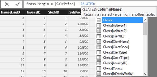 Figure 11-3.The popup list of related tables and fields
 - 8.Scroll down through the list and select the field Direct Costs in the Stock table. You can jump directly to the Stock table by typing the first few characters of the table name.
- 9.Enter a right parenthesis. The formula bar should contain the following formula:Gross Margin = [SalePrice]-RELATED(Stock[DirectCosts)
- 10.Click the check icon in the formula bar or press Enter to complete the definition of the calculated column.
You can now see a new column added to the right of the InvoiceLines table. This column contains the gross margin for every vehicle sold, even if the sale price is on one table and the sum of the costs is in a separate table. This is all thanks to the
RELATED() function
, which links fields from different tables using the joins that you defined in the data model.
If you are an Excel user who has spent hours, or even days, wrestling with the Excel LOOKUP() function
, then you are probably feeling an immense sense of relief. For it really is this easy to look up values in another table in Power BI Desktop. Once again (and at risk of laboring the point), if you have a coherent data model, then you are building the foundations for simple and efficient data analyses further down the line using DAX.
Choosing the Correct Table for Linked Calculations
The nature and structure of a Power BI Desktop data model controls where you can add new columns from another table. In essence, you can only bring data into a table if it is from another table that
- Contains reference data
- Contains many records that are “sub” elements of the current table
So tables such as Countries, Clients, and Colors cannot pull back data from another table using the
RELATED() function
. This is because they are lookup tables and contain reference data that appears only once, but is used many times in other tables. In database terms, these tables are the “one” side of a relationship; whereas tables such as InvoiceLines are on the “many” side of a relationship. In Power BI Desktop (as is the case in a relational database), you can only look up data from the “many” side.
Equally, you can add data to the InvoiceLines table
from the Invoices table, because the latter is considered a “parent” to the former. However, you cannot pull data into the Invoices table from the InvoiceLines table. Quite simply, when an invoice contains many lines, Power BI Desktop does not know which row to select and return to the destination table.
In a data model like the sample Brilliant British Cars example, some tables can return data from several linked tables even if this means traversing multiple links. For instance, the Stock table can reach into the InvoiceLines table (because there is a single record in the Stock table for each record in the InvoiceLines table). Since the InvoiceLines table is a child of the Invoices table, the Stock table can also reach “through” the InvoiceLines table into the Invoices table. Indeed, as the Colors table is a lookup table for the Stock table, and the Invoices table looks up data from the Clients table, these are also accessible to the Stock table.
So essentially, the table where you add a new column has the potential to reach through most, if not all, of the data model and return data from many other tables—providing that the data model has been constructed in a coherent manner, of course.
Cascading Column Calculations
New columns can refer to previously created new columns. This apparently anodyne phrase hides one of the most powerful features of Power BI Desktop: the ability to create spreadsheet-like links between columns where a change in one column ripples through the whole data model.
This implies that you help yourself if you build the columns in a logical sequence, so that you always proceed step by step and do not find yourself trying to create a calculation that requires a column that you have not created yet. Another really helpful aspect of new columns is that if you rename a column, Power BI Desktop automatically updates all formulas that used the previous column name, and uses the new name in any visualizations that you have already created. This makes Power BI Desktop a truly pliant and forgiving tool to work with.
So if we take the DAX formulas that you have created so far, you have the Gross Margin column that depends on the data for the sale price and the calculation of the Direct Costs column, which itself is based on the data for the cost price, spare parts, and labor cost. As a spreadsheet user, you probably won’t be surprised to see that any change to the source data for the four elements causes both the Direct Costs
and Gross Margin columns to be recalculated.
Refreshing Data
Do the following to force Power BI Desktop to recalculate the data model:
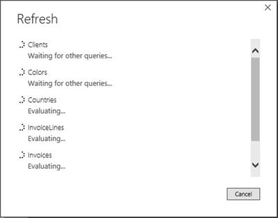
- 1.Activate the Home ribbon in Data View (or in Dashboard View).
- 2.Click the Refresh button. The Refresh dialog will appear, looking something like Figure 11-4.
Figure 11-4.
The Refresh dialog
After a short while (depending on the amount of data that has to be reloaded from the source(s) into the data model), the dialog closes and the data reappears with all calculated columns updated.
Using Functions in New Columns
You have seen just how easy it is to extend a data model with some essential metrics in Power BI Desktop. Yet we have only performed simple arithmetic to achieve our ends. Power BI Desktop can do much more than just carry out simple sums, of course.
Safe Division
I imagine that if you are an Excel user, you have seen your fair share of DIV/0 (divide by zero) errors in spreadsheets. Fortunately, the Power BI Desktop team shares your antipathy to this particular issue and they have endowed Power BI Desktop with a particularly elegant solution to the problem. This solution also serves as a simple introduction to the world of DAX functions in Power BI Desktop.
Suppose that you want to add a new column that divides the contents of one column by the contents of another. Still using the CarSalesDataWithDataModel.pbix sample file, you can implement safe division like this:
- 1.With the InvoiceLines table selected, activate the Modeling ribbon and click the New Column button.
- 2.To the right of the equals sign, type DIVIDE followed by a left parenthesis.
- 3.Type the formula RELATED and a left parenthesis.
- 4.Select the Stock[CostPrice] field from the list. This will be the numerator (the value that will be divided by another value).
- 5.Add a right parenthesis (this is to finish the RELATED() function).
- 6.Enter a comma.
- 7.Enter a left square bracket: [.
- 8.Select the SalePrice field from the list. This will be the denominator (the value that divides the first value).
- 9.Enter a comma.
- 10.Enter a 0. This is the figure that will appear if there is a division by zero error.
- 11.Add a right parenthesis to end the DIVIDE() function. The formula bar will look like Figure 11-5.
 Figure 11-5.The DIVIDE() function
 - 12.To the left of the equals sign, replace Column with SalePriceToSalesCostsRatio.
- 13.Click the tick icon in the formula bar (or press the Enter key). The ratio of sales cost to the sale price will be calculated for every row in the table. The column will fill with zeros and will remain highlighted.
- 14.In the Modeling ribbon , click the percent button, and then add a couple of decimals by using the decimals button. As this metric is a ratio, it is best presented as a percentage to be more easily comprehensible, not only in the current table but also in any visualizations that it appears in.
In this example, you have used a function that required multiple parameters.
- The numerator: The number that is divided by another number.
- The denominator: The number that is used to divide the first value.
- The error value: The number that is used if a divide by zero error is encountered.
I imagine that by now you are feeling that DAX formulas are not only relatively easy, but also made easier by their close relationship to Excel formulas. So let’s move on to see a few more.
Note
I realize that explaining each step in a formula might seem like overkill, especially to Excel or Power Pivot gurus. Nonetheless, I prefer to take this approach as it allows me to draw your attention to the various reasons for each part of an operation. This way I can also explain the different shortcut operations that are available as you build up a formula. If you prefer to type in a formula directly, then feel free to jump to the step that contains the formula ready for use toward the end of the sequence of steps that builds the formula.
Counting Reference Elements
Data models are often assembled to make the best use of reference elements. The Brilliant British Cars data model has a couple of lookup tables (Clients and Colors) that contain essential information that you could need to analyze the underlying data. So as an example of how the data model can be put to good use, let’s look at how DAX can calculate the number of clients per country.
This challenge introduces two new DAX elements:
- The COUNTROWS() function
- The RELATEDTABLE() function
As its name implies, the COUNTROWS() function counts a number of rows in a table. While you can use it simply to return the number of records in the current table, it is particularly useful when used with the RELATEDTABLE() function. Once again, because the data model has been set up coherently, and the Countries table is joined to the Clients table, using the COUNTROWS() and RELATEDTABLE() functions together does not just return the number of records in a table, but also calculates the number of records for each element in the table where it is applied. This means that any elements from the Countries table that exist in the Clients table can be identified because the Clients table is using the Countries table as a lookup table.
Here is an example of how you can use these two functions to count reference elements:
- 1.In Data View, select the Countries table.
- 2.Click New Column in the Modeling ribbon.
- 3.In the formula bar, replace the word Column with the words Clients Per Country.
- 4.To the right of the equals sign, type COUNTROWS(. Once the keyword appears in the popup list, you can select it to save time (and keystrokes), if you want.
- 5.Enter (and/or select) RELATEDTABLE(.
- 6.The list of the tables that are related to the Countries table will appear in the formula bar.
- 7.Select Clients.
- 8.Add two right parentheses. One will close the RELATEDTABLE() function and the other will end the COUNTROWS() function.
- 9.The formula bar will contain the following:Clients Per Country = COUNTROWS(RELATEDTABLE(Clients))
- 10.Click the tick icon in the formula bar (or press the Enter key). The number of customers for each country will appear in the new column named Clients Per Country. The Countries table now looks like what’s shown in Figure 11-6.
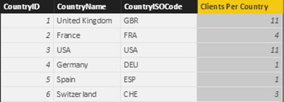 Figure 11-6.Using the COUNTROWS() function to calculate the number of clients per country
Statistical Functions
As an intrinsic part of the Microsoft BI offering, DAX can calculate aggregates. After all, analyzing totals, averages, minima, and maxima (among others) is a core aspect of much business intelligence.
However, I do not want just to show you how to create a column containing the average sale price of all vehicles in the dataset. This would hardly be instructive. So instead of this, let’s begin with a slightly more interesting requirement. Suppose that, for each vehicle, you want to see how the net profit compares to the average net profit.
- 1.Select the InvoiceLines table in the Fields list.
- 2.In the Modeling ribbon, click the New Column button.
- 3.In the formula bar to the left of the equals sign, replace Column with DeltaToAvgNetProfit.
- 4.Click to the right of the equals sign.
- 5.Enter a left square bracket.
- 6.Select the Gross Margin field.
- 7.Enter a minus sign.
- 8.Start typing the word Average. Power BI Desktop will display the list of available fields. When enough of the function name Average appears in the list of functions, select the AVERAGE() function.
- 9.Select the field Gross Margin.
- 10.Add a right parenthesis. The formula will look like this:DeltaToAvgNetProfit = [Gross Margin]-AVERAGE([Gross Margin])
- 11.Confirm the formula by pressing Enter or clicking the tick icon in the formula bar. The new column will display the difference between the net margin for each row and the average net margin.
Once again, if you are an Excel or Microsoft Access
user, you are probably feeling quite at ease with this way of working. Even if you are not a spreadsheet or database expert, you must surely be feeling reassured that creating calculations that apply instantly to an entire column is truly easy.
Now that you have seen the basic principles, look at some of the more common available aggregation functions described in Table 11-4.
Table 11-4.
DAX Statistical Functions
Function
|
Description
|
Example
|
|---|---|---|
AVERAGE()
| Calculates the average (the arithmetic mean) of the values in a column. Any non-numeric values are ignored. |
AVERAGE([Mileage])
|
AVERAGEA()
| Calculates the average (the arithmetic mean) of the values in a column. Empty text, non-numeric values, and FALSE values count as 0. TRUE values count as 1. |
AVERAGEA([Mileage])
|
COUNT()
| Counts the number of cells in a column that contain numeric values. |
COUNT([Mileage])
|
COUNTA()
| Counts the number of cells in a column that contain any values. |
COUNTA([Mileage])
|
COUNTBLANK()
| Counts the number of blank cells in a column. |
COUNTBLANK([Mileage])
|
COUNTROWS()
| Counts the number of rows in a table. |
COUNTROWS(Stock)
|
DISTINCTCOUNT()
| Counts the number of unique values in a table. |
DISTINCTCOUNT([Vehicle])
|
MAX()
| Returns the largest numeric value in a column. |
MAX([Mileage])
|
MAXA()
| Returns the largest value in a column. Dates and logical values are also included. |
MAXA([Mileage])
|
MEDIAN()
| Returns the median numeric value in a column. |
MEDIAN([Mileage])
|
MIN()
| Returns the smallest numeric value
in a column. |
MIN([Mileage])
|
MINA()
| Returns the smallest numeric value in a column. Dates and logical values are also included. |
MINA([Mileage])
|
There are many more statistical functions in DAX, and you can take a deeper look at them in the Power BI online documentation. However, for the moment the intention is not to blind you with science, but to introduce you more gently to the amazing power of DAX. For the moment, then, rest reassured that all your favorite Excel functions are present when it comes to calculating aggregate values in Power BI Desktop.
Applying a Specific Format to a Calculation
Sometimes you will want to display a number in a particular way. You may need to do this to fit more information along the axis of a chart, for instance. In cases like these, you can, in effect, duplicate a column and reformat the data so that you can use it for specific visualizations. As an example of this, and to show how functions can be added to formulas that contain math, you will convert the cost of vehicles and any spare parts from pounds sterling to US dollars and then format the result in dollars.
- 1.In the Power BI Desktop window, make sure that you are in Data View.
- 2.Click the Invoices table.
- 3.In the Modeling ribbon, click the New Column button. A new empty column will appear to the right of the final column of data. This column is currently highlighted and titled Column.
- 4.The formula bar above the table of data will display Column = .
- 5.In the formula bar, click to the right of the equals sign.
- 6.Type FORMAT(. Once the function appears in the popup menu, you can select it if you prefer.
- 7.Click inside the DeliveryCharge column. Invoices[DeliveryCharge] will appear in the formula bar. Alternatively, you can type a left square bracket and select the [DeliveryCharge] field.
- 8.Enter * 1.6.
- 9.Enter a comma.
- 10.Enter the text “Fixed” (include the double quotes).
- 11.Add a right parenthesis.
- 12.Still inside the formula bar, replace Column with Delivery Charge In Dollars.
- 13.To the right of the equals sign, enter “' ” & (include the double quotes and the space after the dollar sign).The formula bar will read as follows:Delivery Charge In Dollars = "' " & FORMAT([DeliveryCharge] * 1.6, "Fixed")
- 14.Press Enter (or click the tick icon in the formula bar). The column will contain the number that is in the DeliveryCharge column multiplied by 30% (this is a very approximate exchange rate). However, it is formatted as a text and preceded by a dollar sign. Figure 11-7 shows a few records from this new column.
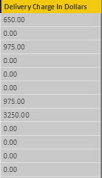 Figure 11-7.Applying a custom numeric format
The FORMAT() function can be applied equally well to dates and times as to numeric columns, as you will see later in this chapter. Indeed, it offers a wealth of possibilities. So many in fact, that rather than illustrate all of them, Tables 11-5 and 11-6 contain the essential predefined formats that you can apply to columns of numbers.
Table 11-5.
Predefined Currency Formats
Format Code
|
Description
|
Example
|
Comments
|
|---|---|---|---|
Currency | Currency |
FORMAT(Stock[CostPrice], "Currency"
)
| The currency indicator will depend on the PC’s settings and language used. |
Scientific | Exponential or scientific notation |
FORMAT(Stock[CostPrice], "Scientific")
| This is also called the scientific format. |
Fixed | Fixed number of decimals |
FORMAT(Stock[CostPrice], "
Fixed")
| Displays at least one figure to the left of the decimal (even if it is a zero) and two decimals. |
General Number | No format |
FORMAT(Stock[CostPrice], "General Number")
| Displays the number with no thousand separators. |
Percent | Percentage (and divided by 100) |
FORMAT(Stock[SalePriceToSalesCostsRatio], "Percent")
| Displays the number as a percentage. |
Table 11-6.
Custom Number Formats
Format Code
|
Description
|
Comments
|
|---|---|---|
0
| The zero placeholder. | Adds a zero even if no number is present. |
#
| The digit placeholder. | Represents a number if one is present. |
.
| The decimal character. | Sets the character that is used before the decimals. |
,
| The thousands separator. | Defines the thousands separator. |
%
| The percentage symbol. | Adds a percentage symbol. |
Should you wish to create your own highly specific date and number formats, you can assemble them using the format code elements found in Tables 11-5 and 11-6.
Using the custom number formats
is not difficult; but rather than explain all the permutations laboriously, here are a couple of examples to help you to see how they work:
- FORMAT([Cost Plus Spares], "#,#.00") gives you 44,500.00 (and any figure less than 1 will have a nothing to the left of the decimal).
- FORMAT([Cost Plus Spares], "0.0") gives you 12250.0 (and any figure less than 1 will have a 0 to the left of the decimal).
Remember that if you want to abandon a formula while you are creating it, all you have to do is click the cross icon in the formula bar or press Escape.
Note
The FORMAT() function actually converts a number to text. Consequently, you might not be able to use a calculated column that is the result of a FORMAT() operation in further calculations.
Simple Logic: The IF( ) Function
Having data available is always a prerequisite for analysis; however, the raw data may not always lend itself to being used in dashboard visualizations in an ideal way.
DAX can help you to see “the wood for the trees” in the thicket of data that underlies your data model. Let’s begin by looking at a series of practical examples that extend your data in ways that use the resources of Power BI Desktop to do the heavy lifting and let you focus on items that need your attention.
Exception Indicators
As a first example of how to use the IF() function, suppose that you want to highlight any records where the cost of spare parts is over £2.000.00. This means comparing the contents of the column PartsCost to a fixed value (3500). If this test turns out to be true (that is, the parts cost is over the threshold that you have set), then you want to display the words Too Much!
The following explains how to add a column that applies this test to the data. I will use the Stock table
here.
- 1.Click the New Column button in the Modeling ribbon. A new column named Column will appear at the right of any existing columns.
- 2.To the right of the equals sign, enter IF(. You will see that as you enter the first few characters, the list of functions will list all available functions beginning with these characters.
- 3.Press the [ key. The list of available fields will appear.
- 4.Scroll down through the list of fields and click the SpareParts field.
- 5.Enter the greater than symbol: >.
- 6.Enter 2000.
- 7.Enter a comma.
- 8.Enter the following text (including the double quotes): “Too Much!”.
- 9.Enter a closing parenthesis: ). The code in the formula bar will look like this:Column = IF([SpareParts]>2000,"Too Much!")
- 10.Press Enter or click the tick icon in the formula bar. The new column will display Too Much! in any rows where the cost of spares is over £2,000.00.
- 11.Rename the column Excessive Parts Cost.
Note
You might not see the results of a logical test like this one in the first few records of a table. So remember to scroll down the dataset and check that the formula has worked as you intended.
Like the
DIVIDE() function
, the IF() function can take up to three arguments (as the separate elements that you enter between the parentheses are called). The first two are compulsory:
- A test, in this case comparing the contents of a column to a fixed value
- The outcome if the test is positive (or TRUE in programming terms)
The IF() function can also have a third argument, although this is optional, as you can see in the example in this section:
- The outcome if the test is negative (or FALSE in programming terms)
This was a simple test to help you to isolate certain records. Later, when building dashboards, you can use the contents of this new column as the basis for tables, charts, and indeed just about any Power BI Desktop visualization.
Creating Alerts
When using the IF() function, the major focus is nearly always on the first argument—the test. After all, this is where you can apply the real force of Power BI Desktop. So here is another example of an IF() function being used, only this time it is to create an alert based on a slightly more complex calculation. This time, the objective is to detect records where the selling price of the vehicle is less than half the average sale price for all cars.
- 1.Click the Stock table in the Fields list.
- 2.Click the New Column button in the Modeling ribbon. A new column named Column will appear at the right of any existing columns.
- 3.To the left of the equals sign, replace the word Column with Price Check.
- 4.To the right of the equals sign, enter IF(. You will see that as you enter the first few characters, the list of functions will list all available functions beginning with these characters.
- 5.Press the [ key. The list of available fields will appear.
- 6.Scroll down through the list of fields and click the CostPrice field.
- 7.Enter >= (it represents “greater than or equals to”).
- 8.Start typing the word Average. Power BI Desktop will display the list of available fields. When enough of the function name Average appears in the list of functions, select the AVERAGE() function.
- 9.Enter a left square bracket.
- 10.Start typing the name of the CostPrice field.
- 11.When the [CostPrice] field is visible in the popup list of fields, select it.
- 12.Add a right parenthesis. This ends the AVERAGE() function.
- 13.Enter *2.
- 14.Enter a comma.
- 15.Enter the following text (including the double quotes before and after the text): “Price too high ”.
- 16.Enter a comma.
- 17.Enter “Price OK” (including the pair of double quotes).
- 18.Enter a closing parenthesis. This ends the IF() function. The code in the formula bar will look like this:PriceCheck = IF([CostPrice] >= AVERAGE([CostPrice]) *2,"Price too high", "Price OK")
- 19.Press Enter or click the tick icon in the formula bar. The new column will display Price too High or Price OK, depending on whether the cost price is more than half the average cost price or not.
You can then use the results of the cost price test as the basis for a visualization to compare the expensive purchases with the others.
Comparison Operators
When carrying out tests like the preceding example, you need to compare values. You may be familiar with the standard comparison operators that many programs and languages use (such as Excel), but for the sake of completeness, Table 11-7 provides a list of the most frequently used operators.
Table 11-7.
DAX Comparison Operators
Operator
|
Description
|
|---|---|
=
| Equals (exactly!) |
<>
| Not equals to |
<
| Less than |
>
| Greater than |
<=
| Less than or equals
to |
>=
| Greater than or equals to |
Flagging Data
As a practical example of how you might use an IF() function to validate data, imagine that Brilliant British Cars is embarking on a “know your customer” program and you envisage a chart that compares the clients that have reliable postcodes with those that do not. This way you can make a business case for cleansing the data and potentially rooting out certain clients.
For the moment, the Clients table either has or does not have a postcode (ZIP code) for each customer. What you want is a clear extra column that contains either HasPostCode or NoPostCode to indicate whether there is a postcode present.
In this example, you will not only test numeric values, but also look at whether a record contains a value for a row. This means introducing a new DAX function. This is the
ISBLANK() function
. It allows you to see if a column contains any data or not. Technically, this DAX function returns TRUE if the column is empty, and FALSE if it contains data. So you can nest it inside an IF() function to detect the presence of data, rather than looking at the data itself.
The following explains how to create a clear indicator of the presence or absence of a postcode:
- 1.Click the Clients table in the Fields list.
- 2.Click the New Column button in the Modeling ribbon.
- 3.To the left of the equals sign, replace Column with IsPostCode.
- 4.To the right of the equals sign, enter IF(. You will see that as you enter the first few characters, the list of functions lists all available functions beginning with these characters.
- 5.Type IsB. The list of functions will show ISBLANK().
- 6.Click ISBLANK() or press the Tab key to select this function. Power BI Desktop will place the function in the formula bar and add the left parenthesis automatically.
- 7.Press the [ key. The list of available fields will appear.
- 8.Select [PostCode].
- 9.Enter a right parenthesis. (This finishes the ISBLANK() function.)
- 10.Enter a comma and then type “NoPostCode”, “HasPostCode”. These are the outputs that the IF() function will return, depending on whether the column is blank or not.
- 11.Enter a final right parenthesis. The formula bar will display this:IsPostCode = IF(ISBLANK([PostCode]),"NoPostCode","HasPostCode")
- 12.Press Enter or click the tick icon in the formula bar. The new column will display either NoPostCode or HasPostCode for every Client.
You can now use this new field to filter data
in dashboards or in tables and charts to separate the clients that do or do not have postcodes.
Nested IF() Functions
A frequent requirement in data analysis is to categorize records by ranges of values. Suppose, for instance, that you want to break down the stock of cars into low-, medium-, and high-mileage models. This requires more than a simple IF() function. However, it is not very difficult, as all that is needed is to “nest” one IF() function inside another, thereby extending the test that is applied to cover three possible outcomes.
Here, then, is how to create a simple nested IF() function:
- 1.Click the Stock table in the Fields list.
- 2.Click the New Column button in the Modeling ribbon.
- 3.To the left of the equals sign, replace Column with Mileage Range.
- 4.To the right of the equals sign, enter IF(. You see that as you enter the first few characters, the list of functions lists all available functions beginning with these characters.
- 5.Press the [ key. The list of available fields will appear.
- 6.Select [Mileage]. You can type it fully if you prefer, but remember to add the right square bracket if you do.
- 7.Enter <= 50000.
- 8.Enter a comma.
- 9.Enter “Low” (including the double quotes).
- 10.Enter a comma.
- 11.Enter IF(.
- 12.Select (or enter) the Mileage column.
- 13.Enter < 100000.
- 14.Enter a comma.
- 15.Enter “Medium”, “High”. This must include the double quotes and the comma separating the two words.
- 16.Enter two right parentheses, one for each of the IF() functions.The formula bar will displayMileage Range = IF([Mileage] <= 50000, "Low", IF([Mileage] < 100000, "Medium","High"))
- 17.Press Enter or click the tick icon in the formula bar. The new column will display Low, Medium, or High for every vehicle in the new Mileage Range column.
You have now categorized
all the cars in stock by their mileage, and can use the category flag in the Mileage Range column to create, for instance, a chart that shows the number of vehicles corresponding to each mileage category.
A nested IF() function works like this:
- 1.You set up a first test. In this example, the test is to flag all cars that have less than 50,000 miles “on the clock.”
- 2.You specify what the outcome is if this initial test is positive. In this example, the word Low appears in the column.
- 3.You then add a second test. By definition, this will only apply to cars that have traveled more than 50,000 miles; otherwise, the formula returns the word Low. So you add a higher threshold for the second test, which is 10,0000 miles in this example.
- 4.If the record passes the test and the vehicle has traveled less than 100,000 miles, then the word Medium will appear in the column. In all other cases (that is, for all mileage over 100,000 miles), the word High is displayed in the column.
When writing nested IF() statements, the essential trick is to use a sequence of tests that follows a logical order, from lowest to highest (or in some cases, from highest to lowest). This way, the succession of IF() statements acts like a series of hoops that catch the values and return an appropriate result.
You can nest up to 64 IF() statements
in a single DAX expression. In fact, you can nest a maximum of 64 DAX expressions, whatever they are. However, more than half a dozen can be painful to write correctly, and getting the correct number of right parentheses in place can be tricky. However, there may be many occasions when you need to segment your data for your visualizations and dashboards, even if it means grappling with complex nested IF() statements. So let’s take a look at one of these to whet your appetite.
Creating Custom Groups Using Multiple Nested IF() Statements
To give you another example of a slightly more complex DAX function (but one that can be very necessary), consider the following requirement. Our data now has the car age, but we want to group the cars by age segments (or buckets, if you prefer). So we will use a nested IF() function to do this. Then, to allow us to sort the column in a more coherent way, we will create a Sort By column for the new Vehicle Age Category column that we will create. If you remember, you saw how to create and use Sort By columns in the previous chapter.
In this example, I will not explain every step, as you have seen how to select functions and fields from popups in the previous examples. Instead, I prefer to concentrate on the logic itself and explain how complex IF() statements can be built.
The code for the Vehicle Age Category column is as follows:
Vehicle Age Category=IF(
[VehicleAgeInYears] <=5,"Under 5",
IF(AND([VehicleAgeInYears]>=6,[VehicleAgeInYears]<=10),"6-10",
IF(AND([VehicleAgeInYears]>= 11,[VehicleAgeInYears]<=15),"11-15",
IF(AND([VehicleAgeInYears]>=16,[VehicleAgeInYears]<=20),"16-20",
IF(AND([VehicleAgeInYears]>=21,[VehicleAgeInYears]<=25),"21-25",
IF(AND([VehicleAgeInYears]>=26,[VehicleAgeInYears]<=30),"26-30",
">30"
)
)
)
)
)
)
The only slight problem with a great technique for segmenting data is that if you sort the Vehicle Age Category
column, you will find that the category that corresponds to the highest age appears at the top of the list. So you need to add a second column that can be used as a sort order column for the new column that you just created. The following is the code for this Vehicle Age Category Sort column:
Vehicle Age Category Sort=IF([VehicleAgeInYears]<=5, "1",
IF(AND([VehicleAgeInYears]>=6, [VehicleAgeInYears]<=10),"2",
IF(AND([VehicleAgeInYears]>= 11, [VehicleAgeInYears]<=15), "3",
IF(AND([VehicleAgeInYears]>=16, [VehicleAgeInYears]<=20), "4",
IF(AND([VehicleAgeInYears]>=21, [VehicleAgeInYears]<=25), "5",
IF(AND([VehicleAgeInYears]>=26, [VehicleAgeInYears]<=30),"6","7"
)
)
)
)
)
)
These formulas could have come straight from an Excel spreadsheet. Indeed, some 80 of the DAX functions are nearly identical to their Excel cousins. So experience and imagination combined have shown me that you have many ways to extend the data you imported by adding calculated columns. Even better, all calculated columns are updated when you refresh the data from the source. The only major caveat is that when you are tweaking the data connection, you must be careful not to delete any source columns on which a calculated column depends, or else you will get errors in the Power BI Desktop table.
Tip
You could have created the formula in this example without creating the VehicleAgeInYears column first, as you could have used the formula that calculates the age of the car each time that you need the vehicle age. However, as you can imagine, it is easier to create a column that contains the vehicle age first and then refer to this in the Vehicle Age Category formula. This makes the more complex formula easier to read. It also helps you to break down the analytical requirement into successive steps, which is good DAX development practice
. Moreover, you can always hide any “intermediate” columns if you do not need them in dashboards and reports. Indeed, you could even do this kind of calculation in Power BI Desktop Query.
Multiline Formulas
By default, all formulas that you create in Power BI Desktop will be on a single line that overflows onto the next line when there is no more room in the formula bar. This can become an extremely tedious way of working, so it is worth knowing that you can tweak long formulas to force them to display over more than one line. All you have to do is force a line return inside the formula bar by pressing Shift+Enter where you want to force a new line. My experience is that Power BI Desktop will not let you create line breaks everywhere in a formula. Nonetheless, with a bit of trial and error, a more complicated formula, such as the VehicleAgeInYears column that you created, can look like the multiline formula in Figure 11-8.
Just in case you were wondering, you do not have to write formulas over multiple lines as I did just. Indeed, the two formulas used to create complex nested IF() statements could be written as follows:
Vehicle Age Category=IF([VehicleAgeInYears] <=5,"Under 5",
IF(AND([VehicleAgeInYears]>=6,[VehicleAgeInYears]<=10),"6-10",
IF(AND([VehicleAgeInYears]>= 11,[VehicleAgeInYears]<=15),"11-15",
IF(AND([VehicleAgeInYears]>=16,[VehicleAgeInYears]<=20),"16-20",
IF(AND([VehicleAgeInYears]>=21,[VehicleAgeInYears]<=25),"21-25",
IF(AND([VehicleAgeInYears]>=26,[VehicleAgeInYears]<=30),"26-30","Over 30"))))))
And
Vehicle Age Category Sort=IF([VehicleAgeInYears] <=5,"1",
IF(AND([VehicleAgeInYears]>=6,[VehicleAgeInYears]<=10),"2",
IF(AND([VehicleAgeInYears]>= 11,[VehicleAgeInYears]<=15),"3",
IF(AND([VehicleAgeInYears]>=16,[VehicleAgeInYears]<=20),"4",
IF(AND([VehicleAgeInYears]>=21,[VehicleAgeInYears]<=25),"5",
IF(AND([VehicleAgeInYears]>=26,[VehicleAgeInYears]<=30),"6","7"))))))
I chose to write the formulas over multiple lines, hoping that by doing so, I’d make the nested logic clearer. You can write your formulas in any way that suits you and that does not cause Power BI Desktop
a problem.
Complex Logic
Categorizing data can sometimes involve applying logic that is more complex than a single simple comparison. You could need to apply two or more conditions when evaluating a record, and this more intricate logic could require you to test the contents of more than one column.
Once again, DAX can help you in circumstances like these. To explain by example, consider the following analytical challenge. You want to flag any vehicle that is a red or blue coupe. This example will show the basics of applying complex logic
to data analysis with DAX.
- 1.In the CarSalesDataWithDataModel.pbix file, click the Stock table in the Fields list.
- 2.Click the New Column button in the Modeling ribbon.
- 3.To the left of the equals sign, replace Column with Special Sales.
- 4.To the right of the equals sign, enter IF(). Since we are dealing with multiple parentheses in this formula, I prefer to enter both the opening and the closing parentheses for each function when adding the function.
- 5.Click inside the parentheses.
- 6.Type the AND() function and then click inside the parentheses. This function ensures that multiple logical conditions are applied and that all must be satisfied for the test to be successful.
- 7.Type [VehicleType] = “Coupe”, (including the comma). This is one of the conditions that has to be true for the test to be successful.
- 8.After the comma, type OR() and then click inside the parentheses. This is a second condition (it is still part of the AND() function), but it can be one of many different tests.
- 9.Type (or use the popup menus to select as well as partially typing) RELATED(Colors[Color]) = “Red”, RELATED(Colors[Color]) = “Blue”. This is the second part of the test. However, because the color is in another table, you have to use the RELATED() function to find the color of the vehicle because it is not in the Stock table. Also there are two alternative conditions inside the parentheses for the OR() expression.
- 10.Click just inside the final parenthesis at the right of the DAX expression (this is the one that ends the IF() function) and type ,“Special” ,“Normal”. Be sure to include the commas. The formula should readSpecial Sales = IF(AND([VehicleType] = "Coupe", OR(RELATED(Colors[Color]) = "Red", RELATED(Colors[Color]) = "Blue")),"Special","Normal")
- 11.Press Enter or click the tick icon in the formula bar . The new column will display either Special or Normal for every vehicle in the new Special Sales column
I realize that a formula like this can seem daunting at first sight. So let’s take another look at this DAX expression formatted a little differently:
Special Sales = IF(
AND(
[VehicleType] = "Coupe",
OR(RELATED(Colors[Color]) = "Red",
RELATED(Colors[Color]) = "Blue")
)
,"Special"
,"Normal"
)
As you can see, at its heart, the expression is an IF() expression. As such, it consists of three parts:
- A test (the car is a coupe that is either red or blue)
- An outcome for a positive result (displays “Special”)
- An outcome for a negative result (displays “Normal”)
The only tricky bit now is the test itself. Since it is built on logic that is more complex, it requires a little explanation:
- First, you have stated that the test is in several parts, all of which must be true for a record to pass the test. This is done by using the AND() function and then separating each individual test (of which there are two in this example—the vehicle type and the color).
- Second, you have told DAX that the second test (on the color) can be any of several possibilities (two in this example). You did this using the OR() function and separating each individual test by a comma.
Although I prefer to build complex functions
from the inside out (that is, by adding all the required parentheses first and adding what goes inside them second), this is not an obligation. You are free to build DAX formulas in any way that works.
Note
This example only showed two alternatives for the AND() and OR() functions. This is because these functions are limited to only two parameters. What is important to remember is that you will have to repeat the field (and possibly the table name if it is not the current table) for each comparison, just as you did here when testing the colors of the cars. If you need more than two alternatives for an AND or an OR operation, then you will have to use the logical operators (&&, ||, and !) that are described in the upcoming “Logical Operators” section.
Armed with this knowledge, you can now build extremely complex logical tests on your data. If you are an Excel or Access power user, then the learning curve should be quite short as the principles and functions are similar to those that you are using already. If you have come from the world of programming, then the concepts are probably familiar. If you are just starting out, then just be prepared to spend a little time practicing, and above all, analyze the question that you want DAX to answer before starting to write the statement.
DAX Logical and Information Functions
So far in this chapter, you have seen three of the DAX logical functions. In practice, you may need to build formulas that use some of the other functions that DAX provides to apply logic and to test the state and type of information in columns. Table 11-8 describes the essential functions for creating complex data models.
Table 11-8.
DAX Logical Functions
Operator
|
Description
|
Example
|
|---|---|---|
IF()
| Tests a condition and applies a result if the test is true, and possibly a result if the test is false. |
IF([PartsCost]> 500, "Check Parts", "OK")
|
AND()
| Extends the logic
to include several conditions all of which must be met. |
IF(AND([PartsCost]> 500,[LaborCost]>1000), "Repair Cost Excessive", "OK")
|
OR()
| Extends the logic to include several conditions any of which must be met. |
IF(OR([PartsCost]> 500,[LaborCost]>1000), "Repair or Labor Cost issue", "OK")
|
NOT()
| Extends the logic to include several conditions none of which must be met. |
IF(NOT([PartsCost]> 500,[LaborCost]>1000), "No Repair or Labor Cost issue", "")
|
ISERROR()
| Tests a value and returns TRUE if there is an error value. |
IF(ISERROR([PartsCost]), "Check parts", "")
|
TRUE()
| Returns TRUE. |
IF(Stock[Mileage] > 100000, TRUE(), FALSE())
|
FALSE()
| Returns FALSE. |
IF(Stock[Mileage] > 100000, TRUE(), FALSE())
|
ISNUMBER()
| Detects if a column value is numeric. |
IF(ISNUMBER([PartsCost]), "", "Data Error")
|
ISTEXT()
| Detects if a column value is a text. |
IF(ISTEXT([PartsCost]), "Data Error", "")
|
ISNONTEXT()
| Detects if a column value is not a text and is not a blank. |
IF(ISNONTEXT([PartsCost]), "", "Data Error")
|
ISODD()
| Detects if a value is an odd number. |
IF(ISODD([PartsCost]), "Data Error", "")
|
ISEVEN()
| Detects if a value is an even number. |
IF(ISEVEN([PartsCost]), "", "Data Error")
|
ISLOGICAL()
| Detects if a column value is a true or false. |
IF(ISLOGICAL([PartsCost]), "Data Error", "")
|
Logical Operators
If you are writing more complex logical statements when specifying intricate conditions that must be met, then DAX has an alternative to the AND(), OR(), and NOT() functions. These are called logical operators, which are explained in Table 11-9.
Table 11-9.
DAX Logical Operators
Operator
|
Description
|
Example
|
|---|---|---|
&&
| AND |
[Color] = "Red" && [VehicleType] = "Coupe"
|
||
| OR |
[Color] = "Red" || [Color] = "Blue"
|
!
| NOT |
[Color] = "Red" ! [VehicleType] = "Coupe"
|
As a simple example, you could want a choice of three possible colors in a logical operation. The code for this would read
[Color] = "Red" || [Color] = "Blue" Color] || [Color] = "Green"
Formatting Logical Results
Sometimes a logical function
might exist only to return a simple true or false. For instance, you could want to test a value and indicate if it is over a certain threshold, using a formula like the following (added to the Stock table):
High Mileage = IF(Stock[Mileage] > 100000, TRUE(), FALSE())
This formula simply tests the mileage figure for each record and returns TRUE() if the mileage is greater than 100,000 miles; it returns FALSE() in all other cases.
However, you might not want to display simply TRUE or FALSE in the column. So DAX also lets you format logical output, whether it is calculated like it is here or imported as a TRUE or FALSE value from a data source. The formula that you just saw can be formatted like this:
High Mileage = FORMAT(IF(Stock[Mileage] > 100000, TRUE(), FALSE()),"Yes/No")
There are only three logical formats available in DAX. These are explained in Table 11-10.
Table 11-10.
DAX Logical Formats
Format Code
|
Description
|
|---|---|
Yes/No | Formats the output as either Yes or No. |
True/False | Formats the output as either True or False. |
On/Off | Formats the output as either Yes or No. |
Note
Different data sources represent True in different ways; however, nearly all represent False as a zero. Consequently, DAX interprets a logical column
as a number, any zeros as a False, and anything else as a True.
Making Good Use of the Formula Bar
If you only ever enter simple formulas, then not only will you be extremely lucky, but you can also content yourself with a single line in the formula bar. I doubt that this is likely to be the case, however, because you will want to do great things with Power BI Desktop. It follows that you may soon be tired of creating long and complex DAX formulas in a limited space. So here is how to expand the formula bar—pretty much as you would in Excel:
- Click the Expand icon at the right of the formula bar (the downward-facing chevron).
The formula bar increases in height to allow you to type and see several lines of text. To reduce the height of the formula bar and reset it to a single line, just click the Reduce icon at the right of the formula bar (which has now become an upward-facing chevron). You can see this icon in Figure 11-8.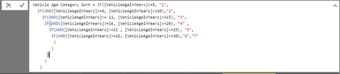
Figure 11-8.
Multiline formulas
Conclusion
This chapter introduced you to some of the core techniques that you can apply to extend a Power BI Desktop data model with further metrics. These additional elements were in the form of new columns that you added to many of the data tables that you had previously loaded, cleansed, and assembled into a structured data model.
All the added columns were based on DAX, the Power BI Desktop formula language. As you saw, this language is not especially difficult and it is fairly close to the Excel formula language.
You also learned how to concatenate fields and how to perform basic arithmetic. Then you practiced carrying out calculations that involve multiple tables. Finally, you learned how to segment records using logical functions.
This brief introduction is nonetheless only a quick foretaste of the power of DAX. There is much, much more that can be accomplished to prepare the quantitative analyses that you are likely to need to produce telling visuals with Power BI Desktop. It is time to move on to the next chapter and take a look at the next feature of DAX: creating measures.