
Chapter 5. Views and View Groups: Enjoy the View
You’ve seen how to arrange GUI components using a linear layout, but so far we’ve only scratched the surface.
In this chapter we’ll look a little deeper and show you how linear layouts really work. We’ll introduce you to the frame layout, a simple layout used to stack views, and we’ll also take a tour of the main GUI components and how you use them. By the end of the chapter, you’ll see that even though they all look a little different, all layouts and GUI components have more in common than you might think.
Your user interface is made up of layouts and GUI components
As you already know, a layout defines what a screen looks like, and you define it using XML. Layouts usually contain GUI components such as buttons and text fields. Your user interacts with these to make your app do something.
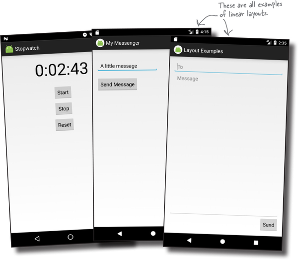
All the apps you’ve seen in the book so far have used linear layouts, where GUI components are arranged in a single column or row. In order to make the most out of them, however, we need to spend a bit of time looking at how they work, and how to use them effectively.
In this chapter, we’re going to take a closer look at linear layouts, introduce you to their close relative the frame layout, and show you other GUI components you can use to make your app more interactive.
Let’s start with linear layouts.
LinearLayout displays views in a single row or column
As you already know, a linear layout displays its views next to each other, either vertically or horizontally. If it’s vertically, the views are displayed in a single column. If it’s horizontally, the views are displayed in a single row.
You define a linear layout using the <LinearLayout> element like this:

The xmlns:android attribute is used to specify the Android namespace, and you must always set it to "http://schemas.android.com/apk/res/android".
You MUST set the layout’s width and height
The android:layout_width and android:layout_height attributes specify how wide and high you want the layout to be. These attributes are mandatory for all types of layout and view.
You can set android:layout_width and android:layout_height to "wrap_content", "match_parent" or a specific size such as 8dp—that’s 8 density-independent pixels. "wrap_content" means that you want the layout to be just big enough to hold all of the views inside it, and "match_parent" means that you want the layout to be as big as its parent—in this case, as big as the device screen minus any padding (there’s more about padding in a couple of pages). You will usually set the layout width and height to "match_parent".
You may sometimes see android:layout_width and android:layout_height set to "fill_parent". "fill_parent" was used in older versions of Android, and it’s now replaced by "match_parent". "fill_parent" is deprecated.
Geek Bits
What are density-independent pixels?
Some devices create very sharp images by using very tiny pixels. Other devices are cheaper to produce because they have fewer, larger pixels. You use density-independent pixels (dp) to avoid creating interfaces that are overly small on some devices, and overly large on others. A measurement in density-independent pixels is roughly the same size across all devices.
Orientation is vertical or horizontal

You specify the direction in which you wish to arrange views using the android:orientation attribute.

As you’ve seen in earlier chapters, you arrange views vertically using:
android:orientation="vertical"
This displays the views in a single column.
You arrange views horizontally in a single row using:
android:orientation="horizontal"
When the orientation is horizontal, views are displayed from left to right by default. This is great for languages that are read from left to right, but what if the user has set the language on their device to one that’s read from right to left?
For apps where the minimum SDK is at least API 17, you can get views to rearrange themselves depending on the language setting on the device. If the user’s language is read from right to left, you can get the views to arrange themselves starting from the right.
To do this, you declare that your app supports languages that are read from right to left in your AndroidManifest.xml file like this:

Padding adds space

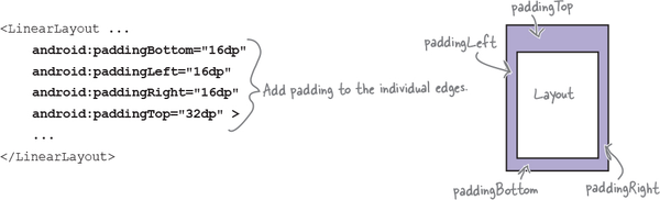
If you want there to be a bit of space around the edge of the layout, you can set padding attributes. These attributes tell Android how much padding you want between each of the layout’s sides and its parent. Here’s how you would tell Android you want to add padding of 16dp to all edges of the layout:

If you want to add different amounts of padding to different edges, you can specify the edges individually. Here’s how you would add padding of 32dp to the top of the layout, and 16dp to the other edges:
If your app supports right-to-left languages, you can use:
android:paddingStart="16dp"
and:
android:paddingEnd="16dp"
to add padding to the start and end edges of the layout instead of their left and right edges.
android:PaddingStart adds padding to the start edge of the layout. The start edge is on the left for languages that are read from left to right, and the right edge for languages that are read from right to left.
android:PaddingEnd adds padding to the end edge of the layout. The end edge is on the right for languages that are read from left to right, and the left edge for languages that are read from right to left.
Watch it!

You can only use start and end properties with API 17 or above.
If you want your app to work on older versions of Android, you must use the left and right properties instead.
Add a dimension resource file for consistent padding across layouts

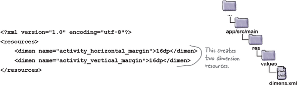
In the example on the previous page, we hardcoded the padding and set it to 16dp. An alternative approach is to specify the padding in a dimension resource file instead. Doing so makes it easier to maintain the padding dimensions for all the layouts in your app.
To use a dimension resource file, you first need to add one to your project. To do this, first select the app/src/main/res/values folder in Android Studio, then go to File menu and choose New→Values resource file. When prompted, enter a name of “dimens” and click on the OK button. This creates a new resource file called dimens.xml.
Note
Android Studio may have already added this file for you, but it depends on which version of Android Studio you’re using.
Once you’ve created the dimension resource file, you add dimensions to it using the <dimen> element. As an example, here’s how you would add dimensions for the horizontal and vertical margins to dimens.xml:
You use the dimensions you create by setting the padding attributes in your layout file to the name of a dimension resource like this:
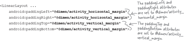
With that kind of setup, at runtime, Android looks up the values of the attributes in the dimension resource file and applies the values it finds there.
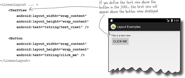
A linear layout displays views in the order they appear in the layout XML

When you define a linear layout, you add views to the layout in the order in which you want them to appear. So, if you want a text view to appear above a button in a linear layout, you must define the text view first:
You specify the width and height of any views using android:layout_width and android:layout_height. The code:
android:layout_width="wrap_content"
means that you want the view to be just wide enough for its content to fit inside it—for example, the text displayed on a button or in a text view. The code:
android:layout_width="match_parent"
android:layout_width and android:layout_height are mandatory attributes for all views, no matter which layout you use.
They can take the values wrap_content, match_parent, or a specific dimension value such as 16dp.
means that you want the view to be as wide as the parent layout.
If you need to refer to a view elsewhere in your code, you need to give it an ID. As an example, you’d give the text view an ID of "text_view" using the code:
...
     <TextView
         android:id="@+id/text_view"
         ... />
...
Use margins to add distance between views

When you position a view using a linear layout, the layout doesn’t leave much of a gap between views. You can increase the size of the gap by adding one or more margins to the view.
As an example, suppose you wanted to put one view below another, but add 48dp of extra space between the two. To do that, you’d add a margin of 48dp to the top of the bottom view:

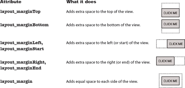
Here’s a list of the margins you can use to give your views extra space. Add the attribute to the view, and set its value to the size of margin you want:
android:attribute="8dp"
Let’s change up a basic linear layout

At first glance, a linear layout can seem basic and inflexible. After all, all it does is arrange views in a particular order. To give you more flexibility, you can tweak your layout’s appearance using some more of its attributes. To show you how this works, we’re going to transform a basic linear layout.
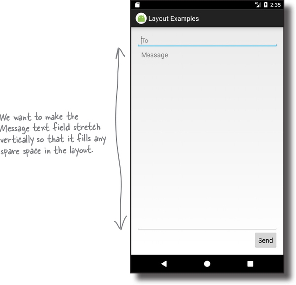
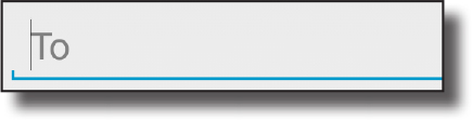
The layout is composed of two editable text fields and a button. To start with, these text fields are simply displayed vertically on the screen like this:

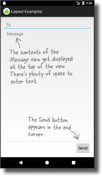
We’re going to change the layout so that the button is displayed in the end corner of the layout, and one of the editable text fields takes up any remaining space.
Here’s the starting point for the linear layout

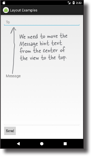
The linear layout contains two editable text fields and a button. The button is labeled “Send,” and the editable text fields contain hint text values of “To” and “Message.”
Hint text in an editable text field is text that’s displayed when the field is empty. It’s used to give users a hint as to what sort of text they should enter. You define hint text using the android:hint attribute:

All of these views take up just as much vertical space in the layout as they need for their contents. So how do we make the Message text field taller?
Make a view streeeeetch by adding weight

All of the views in our basic layout take up just as much vertical space as they need for their content. But what we actually want is to make the Message text field stretch to take up any vertical space in the layout that’s not being used by the other views.
In order to do this, we need to allocate some weight to the Message text field. Allocating weight to a view is a way of telling it to stretch to take up extra space in the layout.
You assign weight to a view using:
android:layout_weight="number"
where number is some number greater than 0.
When you allocate weight to a view, the layout first makes sure that each view has enough space for its content: each button has space for its text, each editable text field has space for its hint, and so on. Once it’s done that, the layout takes any extra space, and divides it proportionally between the views with a weight of 1 or greater.
Adding weight to one view
We need the Message editable text field to take up any extra space in the layout. To do this, we’ll set its layout_weight attribute to 1. As this is the only view in the layout with a weight value, this will make the text field stretch vertically to fill the remainder of the screen. Here’s the code:

Giving the Message editable text field a weight of 1 means that it takes up all of the extra space that’s not used by the other views in the layout. This is because neither of the other two views has been allocated any weight in the layout XML.

Adding weight to multiple views
In this example, we only had one view with a weight attribute set. But what if we had more than one?
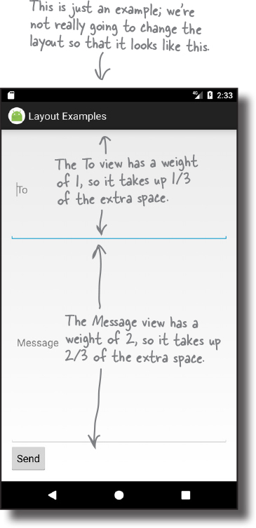
Suppose we gave the To text field a weight of 1, and the Message text field a weight of 2, like this:
<LinearLayout ... >
    ...
    <EditText
        android:layout_width="match_parent"
        android:layout_height="0dp"
        android:layout_weight="1"
        android:hint="@string/to" />
    <EditText
        android:layout_width="match_parent"
        android:layout_height="0dp"
        android:layout_weight="2"
        android:hint="@string/message" />
    ...
</LinearLayout>
To figure out how much extra space each view takes up, start by adding together the layout_weight attributes for each view. In our case, this is 1+2=3. The amount of extra space taken up by each view will be the view’s weight divided by the total weight. The To view has a weight of 1, so this means it will take up 1/3 of the remaining space in the layout. The Message view has a weight of 2, so it will take up 2/3 of the remaining space.
Gravity controls the position of a view’s contents

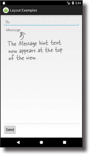
The next thing we need to do is move the hint text inside the Message text field. At the moment, it’s centered vertically inside the view. We need to change it so that the text appears at the top of the text field. We can achieve this using the android:gravity attribute.
The android:gravity attribute lets you specify how you want to position the contents of a view inside the view—for example, how you want to position text inside a text field. If you want the text inside a view to appear at the top, the following code will do the trick:
android:gravity="top"
We’ll add an android:gravity attribute to the Message text field so that the hint text moves to the top of the view:

Test drive

Adding the android:gravity attribute to the Message text field moves the hint text to the top of the view, just like we want.
You’ll find a list of the other values you can use with the android:gravity attribute on the next page.
Values you can use with the android:gravity attribute
Here are some more of the values you can use with the android:gravity attribute. Add the attribute to your view, and set its value to one of the values below:
android:gravity="value"
android:gravity lets you say where you want the view’s contents to appear inside the view.
You can also apply multiple gravities to a view by separating each value with a “|”. To sink a view’s contents to the bottom-end corner, for example, use:
android:gravity="bottom|end"
layout_gravity controls the position of a view within a layout

There’s one final change we need to make to our layout. The Send button currently appears in the bottom-left corner. We need to move it over to the end instead (the bottom-right corner for left-to-right languages). To do this, we’ll use the android:layout_gravity attribute.

The android:layout_gravity attribute lets you specify where you want a view in a linear layout to appear in its enclosing space. You can use it to push a view to the right, for instance, or center the view horizontally. To move our button to the end, we’d need to add the following to the button’s code:
android:layout_gravity="end"

Linear layouts have two attributes that sound similar to one another, gravity and layout_gravity. A couple of pages ago, we used the android:gravity attribute to position the Message text inside a text view. This is because the android:gravity attribute lets you say where you want a view’s contents to appear.
android:layout_gravity deals with the placement of the view itself, and lets you control where views appear in their available space. In our case, we want the view to move to the end of its available space, so we’re using:
android:layout_gravity="end"
There’s a list of some of the other values you can use with the android:layout_gravity attribute on the next page.
More values you can use with the android:layout_gravity attribute

Here are some of the values you can use with the android:layout_gravity attribute. Add the attribute to your view, and set its value to one of the values below:

| Value | What it does |
|---|---|
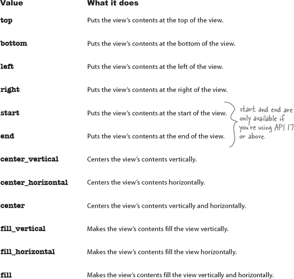
top, bottom, left, right | Puts the view at the top, bottom, left, or right of its available space. |
start, end | Puts the view at the start or end of its available space. |
center_vertical, center_horizontal | Centers the view vertically or horizontally in its available space. |
center | Centers the view vertically and horizontally in its available space. |
fill_vertical, fill_horizontal | Grows the view so that it fills its available space vertically or horizontally. |
fill | Grows the view so that it fills its available space vertically and horizontally. |
android:layout_gravity lets you say where you want views to appear in their available space.
android:layout_gravity deals with the placement of the view itself, whereas android:gravity controls how the view’s contents are displayed.
The full linear layout code

Here’s the full code for the linear layout:

LinearLayout: a summary

Here’s a summary of how you create linear layouts.
How you specify a linear layout
You specify a linear layout using <LinearLayout>. You must specify the layout’s width, height, and orientation, but padding is optional:
<LinearLayout xmlns:android="http://schemas.android.com/apk/res/android"
    android:layout_width="match_parent"
    android:layout_height="match_parent"
    android:orientation="vertical"
    ...>
    ...
</LinearLayout>
Views get displayed in the order they’re listed in the code
When you define a linear layout, you add views to the layout in the order in which you want them to appear.
Stretch views using weight
By default, all views take up just as much space as necessary for their content. If you want to make one or more of your views take up more space, you can use the weight attribute to make it stretch:
android:layout_weight="1"
Use gravity to specify where a view’s contents appear within a view
The android:gravity attribute lets you specify how you want to position the contents of a view—for example, how you want to position text inside a text field.
Use layout_gravity to specify where a view appears in its available space
The android:layout_gravity attribute lets you specify where you want a view in a linear layout to appear in its parent layout. You can use it to push a view to the end, for instance, or center the view horizontally.
That’s everything we’ve covered on linear layouts. Next we’ll take a look at the frame layout.
Frame layouts stack their views
As you’ve already seen, linear layouts arrange their views in a single row or column. Each view is allocated its own space on the screen, and they don’t overlap one another.
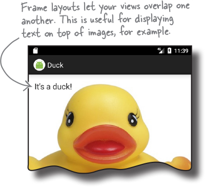
Sometimes, however, you want your views to overlap. As an example, suppose you want to display an image with some text overlaid on top of it. You wouldn’t be able to achieve this just using a linear layout.
If you want a layout whose views can overlap, a simple option is to use a frame layout. Instead of displaying its views in a single row or column, it stacks them on top of each other. This allows you to, for example, display text on top of an image.
How you define a frame layout
You define a frame layout using the <FrameLayout> element like this:

Just like a linear layout, the android:layout_width and android:layout_height attributes are mandatory and specify the layout’s width and height.
Create a new project
To see how frame layouts work, we’re going to use one to overlay text on an image. Create a new Android Studio project for an application named “Duck” with a company name of “hfad.com”, making the package name com.hfad.duck. The minimum SDK should be API 19 so that it will work on most devices. You’ll need an empty activity called “MainActivity” with a layout called “activity_main” so that your code matches ours. Make sure you uncheck the Backwards Compatibility (AppCompat) option when you create the activity.
Add an image to your project

We’re going to use an image called duck.jpg in our layout, so we need to add it to our project.
To do this, you first need to create a drawable resource folder (if Android Studio hasn’t already created it for you). This is the default folder for storing image resources in your app. Switch to the Project view of Android Studio’s explorer, select the app/src/main/res folder, go to the File menu, choose the New... option, then click on the option to create a new Android resource directory. When prompted, choose a resource type of “drawable”, name the folder “drawable”, and click on OK.
Once you’ve created the drawable folder, download the file duck.jpg from https://git.io/v9oet, then add it to the app/src/main/res/drawable folder.

We’re going to change activity_main.xml so that it uses a frame layout containing an image view (a view that displays an image) and a text view. To do this, replace the code in your version of activity_main.xml with ours below:

Then run your app, and we’ll look at what the code does on the next page.
A frame layout stacks views in the order they appear in the layout XML

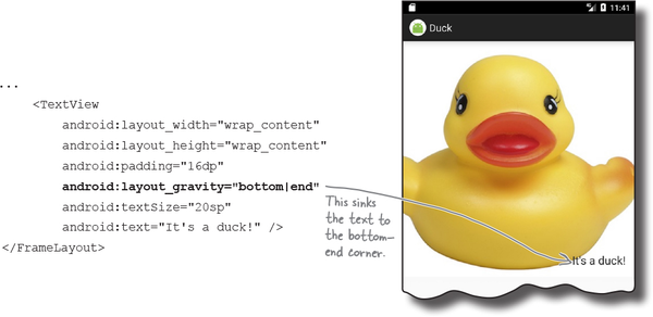
When you define a frame layout, you add views to the layout in the order in which you want them to be stacked. The first view is displayed first, the second is stacked on top of it, and so on. In our case, we’ve added an image view followed by a text view, so the text view appears on top of the image view:

Position views in the layout using layout_gravity
By default, any views you add to a frame layout appear in the top-left corner. You can change the position of these views using the android:layout_gravity attribute, just as you could with a linear layout. As an example, here’s how you would move the text view to the bottom-end corner of the image:
You can nest layouts

One of the disadvantages of using a frame layout is that it’s easy for views to overlap one another when you don’t want them to. As an example, you may want to display two text views in the bottom-end corner, one above the other:

It’s possible to solve this problem by adding margins or padding to the text views. A neater solution, however, is to add them to a linear layout, which you then nest inside the frame layout. Doing this allows you to arrange the two text views linearly, then position them as a group inside the frame layout:

We’ll show you the full code for how to do this on the next page.
The full code to nest a layout

Here’s the full code to nest a linear layout in a frame layout. Update your version of activity_main.xml to include our changes, then run your app to see how it looks.

FrameLayout: a summary
Here’s a summary of how you create frame layouts.
How you specify a frame layout
You specify a frame layout using <FrameLayout>. You must specify the layout’s width and height:
<FrameLayout xmlns:android="http://schemas.android.com/apk/res/android"
    android:layout_width="match_parent"
    android:layout_height="match_parent"
    ...>

    ...

</FrameLayout>
Views are stacked in the order they appear
When you define a frame layout, you add views to the layout in the order in which you want them to be stacked. The first view you add is displayed on the bottom of the stack, the next view is stacked on top of it, and so on.
Use layout_gravity to specify where a view appears
The android:layout_gravity attribute lets you specify where you want a view in a frame layout to appear. You can use it to push a view to the end, for instance, or sink it to the bottom-end corner.
Now that you’ve seen how to use two simple Android layouts, a linear layout and a frame layout, have a go at the following exercise.
Layouts and GUI components have a lot in common
You may have noticed that all layout types have attributes in common. Whichever type of layout you use, you must specify the layout’s width and height using the android:layout_width and android:layout_height attributes. And this requirement isn’t just limited to layouts—the android:layout_width and android:layout_height are mandatory for all GUI components too.
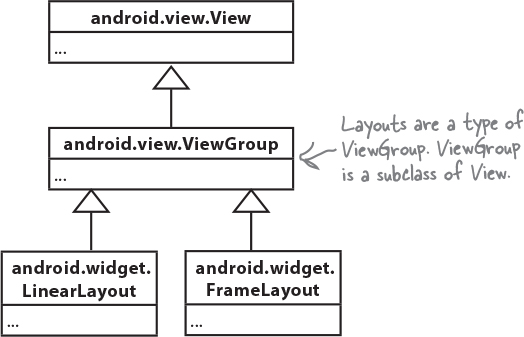
This is because all layouts and GUI components are subclasses of the Android View class. Let’s look at this in more detail.
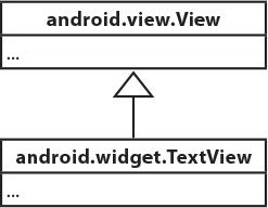
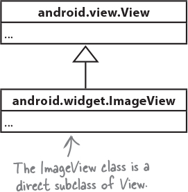
GUI components are a type of View
You’ve already seen that GUI components are all types of views—behind the scenes, they are all subclasses of the android.view.View class. This means that all of the GUI components in your user interface have attributes and behavior in common. They can all be displayed on the screen, for instance, and you get to say how tall or wide they should be. Each of the GUI components you use in your user interface takes this basic functionality and extends it.

A GUI component is a type of view, an object that takes up space on the screen.
A layout is a type of view group, which is a special type of view that can contain other views.
Layouts are a type of View called a ViewGroup
It’s not just the GUI components that are a type of view. Under the hood, a layout is a special type of view called a view group. All layouts are subclasses of the android.view.ViewGroup class. A view group is a type of view that can contain other views.
What being a view buys you
A View object occupies rectangular space on the screen. It includes the functionality all views need in order to lead a happy helpful life in Androidville. Here are some of the qualities of views that we think are the most important:

Getting and setting properties
Each view is a Java object behind the scenes, and that means you can get and set its properties in your activity code. As an example, you can retrieve the value selected in a spinner or change the text in a text view. The exact properties and methods you can access depend on the type of view.
To help you get and set view properties, each view can have an ID associated with it so that you can refer to it in your code.
Size and position
You specify the width and height of views so that Android knows how big they need to be. You can also say whether any padding is needed around the view.
Once your view has been displayed, you can retrieve the position of the view, and its actual size on the screen.
Focus handling
Android handles how the focus moves depending on what the user does. This includes responding to any views that are hidden, removed, or made visible.
Event handling and listeners
Views can respond to events. You can also create listeners so that your app can react to things happening in the view. As an example, all views can react to getting or losing the focus, and a button (and all of its subclasses) can react to being clicked.
As a view group is also a type of view, this means that all layouts and GUI components share this common functionality.
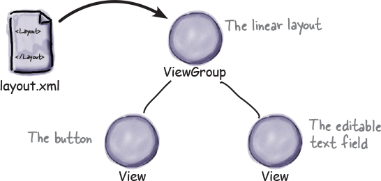
A layout is really a hierarchy of Views
The layout you define using XML gives you a hierarchical tree of views and view groups. As an example, here’s a linear layout containing a button and an editable text field. The linear layout is a view group, and the button and text field are both views. The view group is the view’s parent, and the views are the view group’s children:

Behind the scenes, when you build your app, the layout XML is converted to a ViewGroup object containing a tree of Views. In the example above, the button gets translated to a Button object, and the text view gets translated to a TextView object. Button and TextView are both subclasses of View.
This is the reason why you can manipulate the views in your layout using Java code. Behind the scenes, all of the views are rendered to Java View objects.
Text view
A text view is used for displaying text.

Defining it in XML
You define a text view in your layout using the <TextView> element. You use android:text to say what text you want it to display, usually by using a String resource:
<TextView
    android:id="@+id/text_view"
    android:layout_width="wrap_content"
    android:layout_height="wrap_content"
    android:text="@string/text" />
The TextView API includes many attributes to control the text view’s appearance, such as the text size. To change the text size, you use the android:textSize attribute like this:
android:textSize="16sp"
You specify the text size using scale-independent pixels (sp). Scale-independent pixels take into account whether users want to use large fonts on their devices. A text size of 16sp will be physically larger on a device configured to use large fonts than on a device configured to use small fonts.
Using it in your activity code
You can change the text displayed in your text view using code like this:
TextView textView = (TextView) findViewById(R.id.text_view);
textView.setText("Some other String");
Editable text view
This is like a text view, but editable.

Defining it in XML
You define an editable text view in XML using the <EditText> element. You use the android:hint attribute to give a hint to the user as to how to fill in the field.
<EditText
    android:id="@+id/edit_text"
    android:layout_width="wrap_content"
    android:layout_height="wrap_content"
    android:hint="@string/edit_text" />
You can use the android:inputType attribute to define what type of data you’re expecting the user to enter so that Android can help them. As an example, if you’re expecting the user to enter numbers, you can use:
android:inputType="number"
to provide them with a number keypad. Here are some more of our favorites:
| Value | What it does |
|---|---|
phone | Provides a phone number keypad. NoteYou can find the entire list in the online Android developer documentation at https://developer.android.com/reference/android/widget/TextView.html#attr_android:inputType. |
textPassword | Displays a text entry keypad, and your input is concealed. |
textCapSentences | Capitalizes the first word of a sentence. |
textAutoCorrect | Automatically corrects the text being input. |
You can specify multiple input types using the | character. As an example, to capitalize the first word of a sentence and automatically correct any misspellings, you’d use:
android:inputType="textCapSentences|textAutoCorrect"
Using it in your activity code
You can retrieve the text entered in an editable text view like this:
EditText editText = (EditText) findViewById(R.id.edit_text);
String text = editText.getText().toString();
Button
Buttons are usually used to make your app do something when they’re clicked.
Defining it in XML
You define a button in XML using the <Button> element. You use the android:text attribute to say what text you want the button to display:
<Button
    android:id="@+id/button"
    android:layout_width="wrap_content"
    android:layout_height="wrap_content"
    android:text="@string/button_text" />
Using it in your activity code
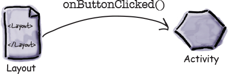
You get the button to respond to the user clicking it by using the android:onClick attribute in the layout XML, and setting it to the name of the method you want to call in your activity code:
android:onClick="onButtonClicked"
You then define the method in your activity like this:
/** Called when the button is clicked */
public void onButtonClicked(View view) {
    // Do something in response to button click
}
Toggle button
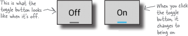
A toggle button allows you to choose between two states by clicking a button.
Defining it in XML
You define a toggle button in XML using the <ToggleButton> element. You use the android:textOn and android:textOff attributes to say what text you want the button to display depending on the state of the button:
<ToggleButton
    android:id="@+id/toggle_button"
    android:layout_width="wrap_content"
    android:layout_height="wrap_content"
    android:textOn="@string/on"
    android:textOff="@string/off" />
Using it in your activity code
You get the toggle button to respond to the user clicking it by using the android:onClick attribute in the layout XML. You give it the name of the method you want to call in your activity code:

You then define the method in your activity like this:

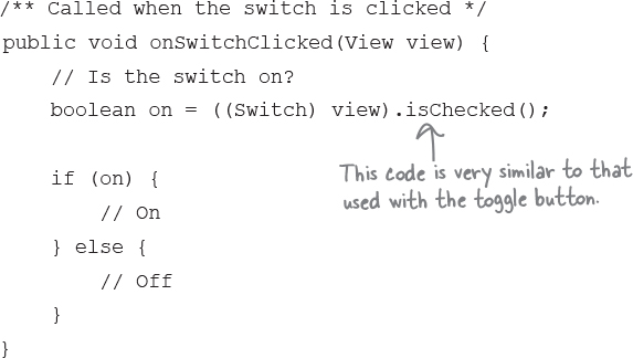
Switch
A switch is a slider control that acts in the same way as a toggle button.

Defining it in XML
You define a switch in XML using the <Switch> element. You use the android:textOn and android:textOff attributes to say what text you want the switch to display depending on the state of the switch:
<Switch
    android:id="@+id/switch_view"
    android:layout_width="wrap_content"
    android:layout_height="wrap_content"
    android:textOn="@string/on"
    android:textOff="@string/off" />
Using it in your activity code
You get the switch to respond to the user clicking it by using the android:onClick attribute in the layout XML, and setting it to the name of the method you want to call in your activity code:
android:onClick="onSwitchClicked"
You then define the method in your activity like this:
Checkboxes
Checkboxes let you display multiple options to users. They can then select whichever options they want. Each of the checkboxes can be checked or unchecked independently of any others.

Defining them in XML
You define each checkbox in XML using the <CheckBox> element. You use the android:text attribute to display text for each option:
<CheckBox android:id="@+id/checkbox_milk"
    android:layout_width="wrap_content"
    android:layout_height="wrap_content"
    android:text="@string/milk" />

<CheckBox android:id="@+id/checkbox_sugar"
    android:layout_width="wrap_content"
    android:layout_height="wrap_content"
    android:text="@string/sugar" />
Using them in your activity code
You can find whether a particular checkbox is checked using the isChecked() method. It returns true if the checkbox is checked:
CheckBox checkbox = (CheckBox) findViewById(R.id.checkbox_milk);
boolean checked = checkbox.isChecked();
if (checked) {
    //do something
}
Checkboxes (continued)
Just like buttons, you can respond to the user clicking a checkbox by using the android:onClick attribute in the layout XML, and setting it to the name of the method you want to call in your activity code:
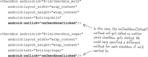
You then define the method in your activity like this:
 public void onCheckboxClicked(View view) {
    // Has the checkbox that was clicked been checked?
    boolean checked = ((CheckBox) view).isChecked();

    // Retrieve which checkbox was clicked
    switch(view.getId()) {
        case R.id.checkbox_milk:
            if (checked)
               // Milky coffee
            else
               // Black as the midnight sky on a moonless night
            break;
        case R.id.checkbox_sugar:
            if (checked)
                // Sweet
            else
                // Keep it bitter
            break;
    }
 }
Radio buttons
These let you display multiple options to the user. The user can select a single option.

Defining them in XML
You start by defining a radio group, a special type of view group, using the <RadioGroup> tag. Within this, you then define individual radio buttons using the <RadioButton> tag:


Using them in your activity code
You can find which radio button is selected using the getCheckedRadioButtonId() method:
RadioGroup radioGroup = (RadioGroup) findViewById(R.id.radioGroup);
int id = radioGroup.getCheckedRadioButtonId();
if (id == -1){
    //no item selected
}
else{
    RadioButton radioButton = findViewById(id);
}
Radio buttons (continued)
You can respond to the user clicking a radio button by using the android:onClick attribute in the layout XML, and setting it to the name of the method you want to call in your activity code:
<RadioGroup android:id="@+id/radio_group"
    android:layout_width="match_parent"
    android:layout_height="wrap_content"
    android:orientation="vertical">

    <RadioButton android:id="@+id/radio_cavemen"
        android:layout_width="wrap_content"
        android:layout_height="wrap_content"
        android:text="@string/cavemen"
        android:onClick="onRadioButtonClicked"  />

    <RadioButton android:id="@+id/radio_astronauts"
        android:layout_width="wrap_content"
        android:layout_height="wrap_content"
        android:text="@string/astronauts"
        android:onClick="onRadioButtonClicked"  />
</RadioGroup>
The radio group containing the radio buttons is a subclass of LinearLayout. You can use the same attributes with a radio group as you can with a linear layout.
You then define the method in your activity like this:
public void onRadioButtonClicked(View view) {
    RadioGroup radioGroup = (RadioGroup) findViewById(R.id.radioGroup);
    int id = radioGroup.getCheckedRadioButtonId();
    switch(id) {
        case R.id.radio_cavemen:
            // Cavemen win
            break;
        case R.id.radio_astronauts:
            // Astronauts win
            break;
    }
}
Spinner
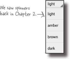
As you’ve already seen, a spinner gives you a drop-down list of values from which only one can be selected.
Defining it in XML
You define a spinner in XML using the <Spinner> element. You add a static array of entries to the spinner by using the android:entries attribute and setting it to an array of Strings.
Note
There are other ways of populating the spinner, which you’ll see later in the book.
<Spinner
    android:id="@+id/spinner"
    android:layout_width="wrap_content"
    android:layout_height="wrap_content"
    android:entries="@array/spinner_values" />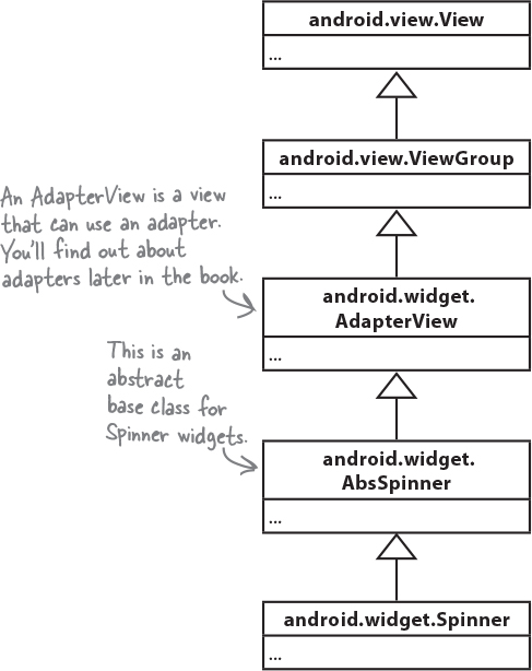
You can add an array of Strings to strings.xml like this:
<string-array name="spinner_values">
    <item>light</item>
    <item>amber</item>
    <item>brown</item>
    <item>dark</item>
</string-array>
Using it in your activity code
You can get the value of the currently selected item by using the getSelectedItem() method and converting it to a String:
Spinner spinner = (Spinner) findViewById(R.id.spinner);
String string = String.valueOf(spinner.getSelectedItem());
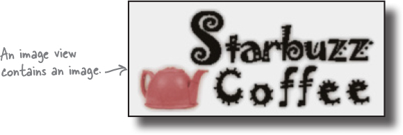
Image view
You use an image view to display an image:
Adding an image to your project
You first need to create a drawable resource folder, the default folder for storing image resources in your app. To do this, select the app/src/main/res folder in your project, go to the File menu, choose the New... option, then click on the option to create a new Android resource directory. When prompted, choose a resource type of “drawable”, name the folder “drawable”, and click on OK. You then need to add your image to the app/src/main/res/drawable folder.
If you want, you can use different image files depending on the screen density of the device. This means you can display higher-resolution images on higher-density screens, and lower-resolution images on lower-density screens. To do this, you create different drawable folders in app/src/main/res for the different screen densities. The name of the folder relates to the screen density of the device:
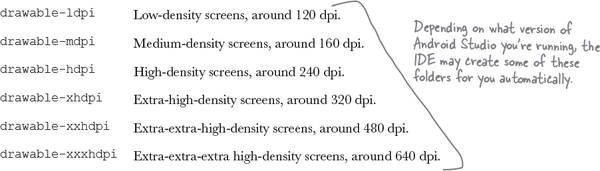
You then put different resolution images in each of the drawable* folders, making sure that each of the image files has the same name. Android decides which image to use at runtime, depending on the screen density of the device it’s running on. As an example, if the device has an extra-high-density screen, it will use the image located in the drawable-xhdpi folder.
If an image is added to just one of the folders, Android will use the same image file for all devices. If you want your app to use the same image regardless of screen density, you’d normally put it in the drawable folder.
Image view: the layout XML
You define an image view in XML using the <ImageView> element. You use the android:src attribute to specify what image you want to display, and the android:contentDescription attribute to add a String description of the image so that your app is more accessible:
<ImageView
    android:layout_width="200dp"
    android:layout_height="100dp"
    android:src="@drawable/starbuzz_logo"
    android:contentDescription="@string/starbuzz_logo" />
The android:src attribute takes a value of the form "@drawable/image_name", where image_name is the name of the image (without its extension). Image resources are prefixed with @drawable, which tells Android that it’s an image resource located in one or more of the drawable* folders.
Using image views in your activity code
You can set the image source and description in your activity code using the setImageResource() and setContentDescription() methods:
ImageView photo = (ImageView)findViewById(R.id.photo);
int image = R.drawable.starbuzz_logo;
String description = "This is the logo";
photo.setImageResource(image);
photo.setContentDescription(description);
This code looks for the image resource called starbuzz_logo in the drawable* folders, and sets it as the source of an image view with an ID of photo. When you need to refer to an image resource in your activity code, you use R.drawable.image_name where image_name is the name of the image (without its extension).
Adding images to buttons
In addition to displaying images in image views, you can also display images on buttons.
Displaying text and an image on a button
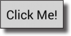
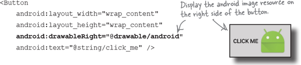
To display text on a button with an image to the right of it, use the android:drawableRight attribute and specify the image to be used:
If you want to display the image on the left, use the android:drawableLeft attribute:
<Button
    android:layout_width="wrap_content"
    android:layout_height="wrap_content"
    android:drawableLeft="@drawable/android"
    android:text="@string/click_me" />
Use the android:drawableBottom attribute to display the image underneath the text:
<Button
    android:layout_width="wrap_content"
    android:layout_height="wrap_content"
    android:drawableBottom="@drawable/android"
    android:text="@string/click_me" />
The android:drawableTop attribute displays the image above the text:
<Button
    android:layout_width="wrap_content"
    android:layout_height="wrap_content"
    android:drawableTop="@drawable/android"
    android:text="@string/click_me" />
Image button
An image button is just like a button, except it contains an image and no text.

Defining it in XML
You define an image button in XML using the <ImageButton> element. You use the android:src attribute to say what image you want the image button to display:
<ImageButton
    android:id="@+id/button"
    android:layout_width="wrap_content"
    android:layout_height="wrap_content"
    android:src="@drawable/button_icon" />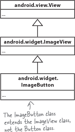
Using it in your activity code
You get the image button to respond to the user clicking it by using the android:onClick attribute in the layout XML, and setting it to the name of the method you want to call in your activity code:
android:onClick="onButtonClicked"
You then define the method in your activity like this:
/** Called when the image button is clicked */
public void onButtonClicked(View view) {
    // Do something in response to button click
}
Scroll view
If you add lots of views to your layouts, you may have problems on devices with smaller screens—most layouts don’t come with scrollbars to allow you to scroll down the page. As an example, when we added seven large buttons to a linear layout, we couldn’t see all of them.

To add a vertical scrollbar to your layout, you surround your existing layout with a <ScrollView> element like this:

To add a horizontal scrollbar to your layout, wrap your existing layout inside a <HorizontalScrollView> element instead.
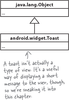
Toasts
There’s one final widget we want to show you in this chapter: a toast. A toast is a simple pop-up message you can display on the screen.
Toasts are purely informative, as the user can’t interact with them. While a toast is displayed, the activity stays visible and interactive. The toast automatically disappears when it times out.
Using it in your activity code
You create a toast using activity code only. You can’t define one in your layout.
To create a toast, you call the Toast.makeText() method, and pass it three parameters: a Context (usually this for the current activity), a CharSequence that’s the message you want to display, and an int duration. Once you’ve created the toast, you call its show() method to display it.
A toast is a message that pops up like toast in a toaster.
Here’s the code you would use to create a toast that appears on screen for a short duration:
CharSequence text = "Hello, I'm a Toast!";
int duration = Toast.LENGTH_SHORT;

Toast toast = Toast.makeText(this, text, duration);
toast.show();

Chapter 5 Your Android Toolbox

You’ve got Chapter 5 under your belt and now you’ve added views and view groups to your toolbox.
Note
You can download the full code for the chapter from https://tinyurl.com/HeadFirstAndroid.