Chapter 8. Support Libraries and App Bars: Taking Shortcuts
Everybody likes a shortcut.
And in this chapter you’ll see how to add shortcuts to your apps using app bars. We’ll show you how to start activities by adding actions to your app bar, how to share content with other apps using the share action provider, and how to navigate up your app’s hierarchy by implementing the app bar’s Up button. Along the way we’ll introduce you to the powerful Android Support Libraries, which are key to making your apps look fresh on older versions of Android.
Great apps have a clear structure
In the previous chapter, we looked at ways of structuring an app to create the best user experience. Remember that one way of creating an app is to organize the screens into three types:
Top-level screens
This is usually the first activity in your app that your user sees.
Category screens
Category screens show the data that belongs to a particular category, often in a list. They allow the user to navigate to detail/edit screens.
Detail/edit screens
These display details for a particular record, let the user edit the record, or allow the user to enter new records.
They also have great shortcuts
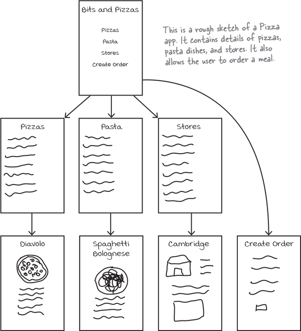
If a user’s going to use your app a lot, they’ll want quick ways to get around. We’re going to look at navigational views that will give your user shortcuts around your app, providing more space in your app for actual content. Let’s begin by taking a closer look at the top-level screen in the above Pizza app.
Different types of navigation
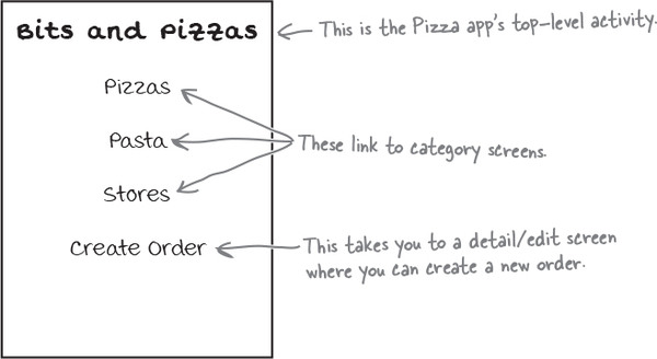
In the top-level screen of the Pizza app, there’s a list of options for places in the app the user can go to.
The top three options link to category activities; the first presents the user with a list of pizzas, the second a list of pasta, and the third a list of stores. They allow the user to navigate around the app.
Note
These are like the navigation options we looked at in Chapter 7.
The fourth option links to a detail/edit activity that allows the user to create an order. This option enables the user to perform an action.
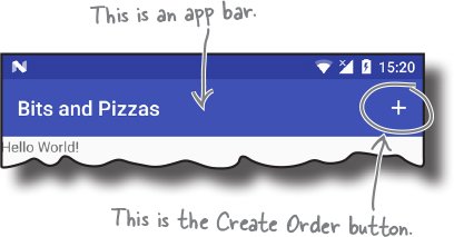
In Android apps, you can add actions to the app bar. The app bar is the bar you often see at the top of activities; it’s sometimes known as the action bar. You generally put your app’s most important actions in the app bar so that they’re prominent at the top of the screen.
In the Pizza app, we can make it easy for the user to place an order wherever they are in the app by making sure there’s an app bar at the top of every activity that includes a Create Order button. This way the user will have access to it wherever they are.
Let’s look at how you create app bars.
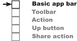
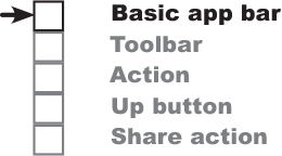
Here’s what we’re going to do
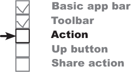
There are a few things we’re going to cover in this chapter.
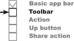
Add a basic app bar.
We’ll create an activity called MainActivity and add a basic app bar to it by applying a theme.
Replace the basic app bar with a toolbar.
To use the latest app bar features, you need to replace the basic app bar with a toolbar. This looks the same as the basic app bar, but you can use it to do more things.
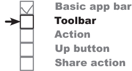
Add a Create Order action.
We’ll create a new activity called OrderActivity, and add an action to MainActivity’s app bar that opens it.
Implement the Up button.
We’ll implement the Up button on OrderActivity’s app bar so that users have an easy way of navigating back to MainActivity.
Add a share action provider.
We’ll add a share action provider to MainActivity’s app bar so that users can share text with other apps and invite their friends to join them for pizza.
Let’s start by looking at how you add a basic app bar.
Add an app bar by applying a theme
An app bar has a number of uses:
Displaying the app or activity name so that the user knows where in the app they are. As an example, an email app might use the app bar to indicate whether the user is in their inbox or junk folder.
Making key actions prominent in a way that’s predictable—for example, sharing content or performing searches.
Navigating to other activities to perform an action.
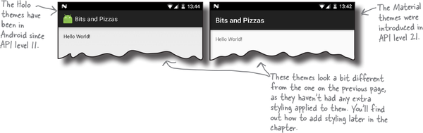
To add a basic app bar, you need to use a theme that includes an app bar. A theme is a style that’s applied to an activity or application so that your app has a consistent look and feel. It controls such things as the color of the activity background and app bar, and the style of the text.
Android comes with a number of built-in themes that you can use in your apps. Some of these, such as the Holo themes, were introduced in early releases of Android, and others, such as the Material themes, were introduced much later to give apps a more modern appearance.
But there’s a problem. You want your apps to look as modern and up-to-date as possible, but you can only use themes from the version of Android they were released in. As an example, you can’t use the native Material themes on devices that are running a version of Android older than Lollipop, as the Material themes were introduced with API level 21.
The problem isn’t just limited to themes. Every new release of Android introduces new features that people want to see in their apps, such as new GUI components. But not everyone upgrades to the latest version of Android as soon as it comes out. In fact, most people are at least one version of Android behind.
So how can you use the latest Android features and themes in your apps if most people aren’t using the latest version? How can you give your users a consistent user experience irrespective of what version of Android they’re using without making your app look old-fashioned?
Support libraries allow you to use new features in older versions of Android
The Android team solved this problem by coming up with the idea of Support Libraries.
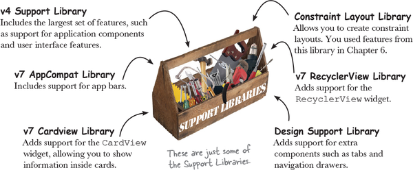
The Android Support Libraries provide backward compatibility with older versions of Android. They sit outside the main release of Android, and contain new Android features that developers can use in the apps they’re building. The Support Libraries mean that you can give users on older devices the same experience as users on newer devices even if they’re using different versions of Android.
Here are some of the Support Libraries that are available for you to use:
Each library includes a specific set of features.
The v7 AppCompat Library contains a set of up-to-date themes that can be used with older versions of Android: in practice, they can be used with nearly all devices, as most people are using API level 19 or above. We’re going to use the v7 AppCompat Library by applying one of the themes it contains to our app. This will add an app bar that will look up-to-date and work the same on all versions of Android that we’re targeting. Whenever you want to use one of the Support Libraries, you first need to add it to your app. We’ll look at how you do this after we’ve created the project.
Create the Pizza app
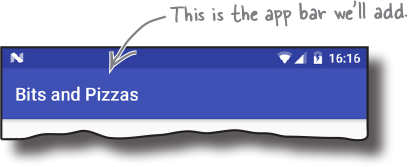
We’ll start by creating a prototype of the Pizza app. Create a new Android project for an application named “Bits and Pizzas” with a company domain of “hfad.com”, making the package name com.hfad.bitsandpizzas. The minimum SDK should be API level 19 so that it works with most devices. You’ll need an empty activity called “MainActivity” and a layout called “activity_main”. Make sure you checkthe Backwards Compatibility (AppCompat) checkbox (you’ll see why a few pages ahead).
Next, we’ll look at how you add a Support Library to the project.
Add the v7 AppCompat Support Library
We’re going to use one of the themes from the v7 AppCompat Library, so we need to add the library to our project as a dependency. Doing so means that the library gets included in your app, and downloaded to the user’s device.
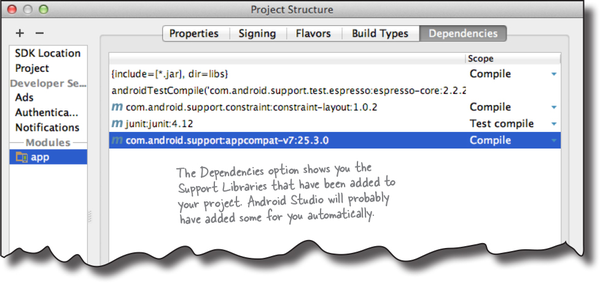
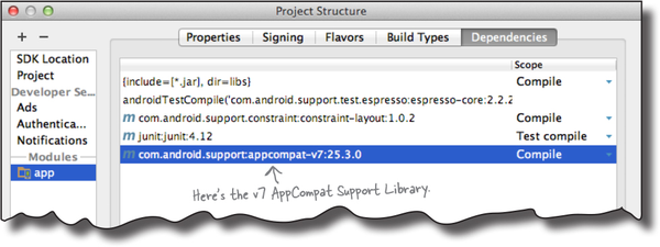
To manage the Support Library files that are included in your project, choose File→Project Structure. Then click on the app module and choose Dependencies. You’ll be presented with the following screen:
Android Studio may have already added the AppCompat Support Library for you automatically. If so, you will see it listed as appcompat-v7, as shown above.
If the AppCompat Library hasn’t been added for you, you will need to add it yourself. Click on the “+” button at the bottom or right side of the Project Structure screen. Choose the Library Dependency option, select the appcompat-v7 library, then click on the OK button. Click on OK again to save your changes and close the Project Structure window.
Once the AppCompat Support Library has been added to your project, you can use its resources in your app. In our case, we want to apply one of its themes in order to give MainActivity an app bar. Before we do that, however, we need to look at the type of activity we’re using for MainActivity.
AppCompatActivity lets you use AppCompat themes
So far, all of the activities we’ve created have extended the Activity class. This is the base class for all activities, and it’s what makes your activity an activity. If you want to use the AppCompat themes, however, you need to use a special kind of activity, called an AppCompatActivity, instead.
The AppCompatActivity class is a subclass of Activity. It lives in the AppCompat Support Library, and it’s designed to work with the AppCompat themes. Your activity needs to extend the AppCompatActivity class instead of the Activity class whenever you want an app bar that provides backward compatibility with older versions of Android.
As AppCompatActivity is a subclass of the Activity class, everything you’ve learned about activities so far still applies. AppCompatActivity works with layouts in just the same way, and inherits all the lifecycle methods from the Activity class. The main difference is that, compared to Activity, AppCompatActivity contains extra smarts that allow it to work with the themes from the AppCompat Support Library.
Here’s a diagram showing the AppCompatActivity class hierarchy:
We’ll make sure MainActivity extends AppCompatActivity on the next page.
MainActivity needs to be an AppCompatActivity
We want to use one of the AppCompat themes, so we need to make sure our activities extend the AppCompatActivity class instead of the Activity class. Happily, this should already be the case if you checked the Backwards Compatibility (AppCompat) checkbox when you first created the activity. Open the file MainActivity.java, then make sure your code matches ours below:
Now that we’ve confirmed that our activity extends AppCompatActivity, we can add an app bar by applying a theme from the AppCompat Support Library. You apply a theme in the app’s AndroidManifest.xml file, so we’ll look at this file next.
AndroidManifest.xml can change your app bar’s appearance
As you’ve seen earlier in the book, an app’s AndroidManifest.xml file provides essential information about the app, such as what activities it contains. It also includes a number of attributes that have a direct impact on your app bars.
Here’s the AndroidManifest.xml code Android Studio created for us (we’ve highlighted the key areas):
The android:icon attribute assigns an icon to the app. The icon is used as the launcher icon for the app, and if the theme you’re using displays an icon in the app bar, it will use this icon. android:roundIcon may be used instead on devices running Android 7.1 or above.
The icon is a mipmap resource. A mipmap is an image that can be used for application icons, and they’re held in mipmap* folders in app/src/main/res. Just as with drawables, you can add different images for different screen densities by adding them to an appropriately named mipmap folder. As an example, an icon in the mipmap-hdpi folder will be used by devices with high-density screens. You refer to mipmap resources in your layout using @mipmap.
The android:label attribute describes a user-friendly label that gets displayed in the app bar. In the code above, it’s used in the <application> tag to apply a label to the entire app. You can also add it to the <activity> tag to assign a label to a single activity.
The android:theme attribute specifies the theme. Using this attribute in the <application> element applies the theme to the entire app. Using it in the <activity> element applies the theme to a single activity.
We’ll look at how you apply the theme on the next page.
How to apply a theme
When you want to apply a theme to your app, you have two main options:
Hardcode the theme in AndroidManifest.xml.
Apply the theme using a style.
Let’s look at these two approaches.
1. Hardcoding the theme
To hardcode the theme in AndroidManifest.xml, you update the android:theme attribute in the file to specify the name of the theme you want to use. As an example, to apply a theme with a light background and a dark app bar, you’d use:
This approach works well if you want to apply a basic theme without making any changes to it.
2. Using a style to apply the theme
Most of the time, you’ll want to apply the theme using a style, as this approach enables you to tweak the theme’s appearance. You may want to override the theme’s main colors to reflect your app’s brand, for example.
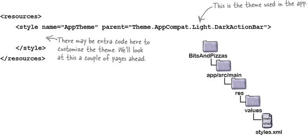
To apply a theme using a style, you update the android:theme attribute in AndroidManifest.xml to the name of a style resource (which you then need to create). In our case, we’re going to use a style resource named AppTheme, so update the android:theme attribute in your version of AndroidManifest.xml to the following:
The @style prefix tells Android that the theme the app’s using is a style that’s defined in a style resource file. We’ll look at this next.
Define styles in a style resource file
The style resource file holds details of any themes and styles you want to use in your app. When you create a project in Android Studio, the IDE will usually create a default style resource file for you called styles.xml located in the app/src/main/res/values folder.
If Android Studio hasn’t created the file, you’ll need to add it yourself. Switch to the Project view of Android Studio’s explorer, highlight the app/src/main/res/values folder, go to the File menu, and choose New. Then choose the option to create a new Values resource file, and when prompted, name the file “styles”. When you click on OK, Android Studio will create the file for you.
A basic style resource file looks like this:
A style resource file can contain one or more styles. Each style is defined through the <style> element.
Each style must have a name, which you define with the name attribute; for example:
name="AppTheme"
In the code above, the style has a name of "AppTheme", and AndroidManifest.xml can refer to it using "@style/AppTheme".
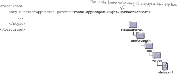
The parent attribute specifies where the style should inherit its properties from; for example:
parent="Theme.AppCompat.Light.DarkActionBar"
This gives the app a theme of "Theme.AppCompat.Light.DarkActionBar", which gives activities a light background, with a dark app bar. We’ll look at some more of Android’s available themes on the next page.
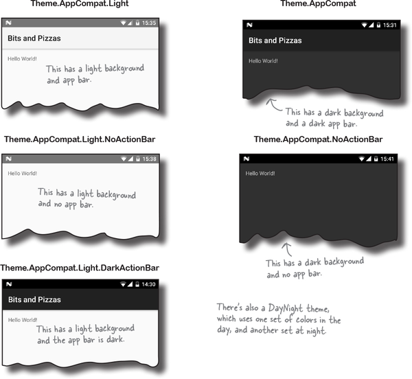
Theme gallery
Android comes with a whole bunch of built-in themes that you can use in your apps. Here are just a few of them:
The theme determines the basic appearance of the app, such as the color of the app bar and any views. But what if you want to modify the app’s appearance?
Customize the look of your app
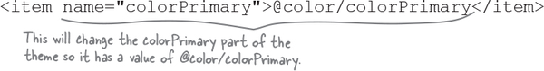
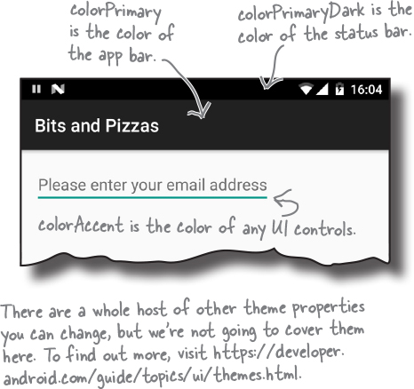
You can use customize the look of your app by overriding the properties of an existing theme in the style resource file. For example, you can change the color of the app bar, the status bar, and any UI controls. You override the theme by adding <item> elements to the <style> to describe each modification you want to make.
We’re going to override three of the colors used by our theme. To do this, make sure that your version of styles.xml matches ours below:
The above code includes three modifications, each one described by a separate <item>. Each <item> has a name attribute that indicates what part of the theme you want to change, and a value that specifies what you want to change it to, like this:
name="colorPrimary" refers to the main color you want to use for your app. This color gets used for your app bar, and to “brand” your app with a particular color.
name="colorPrimaryDark" is a darker variant of your main color. It gets used as the color of the status bar.
name="colorAccent" refers to the color of any UI controls such as editable text views or checkboxes.
You set a new color for each of these areas by giving each <item> a value. The value can either be a hardcoded hexadecimal color value, or a reference to a color resource. We’ll look at color resources on the next page.
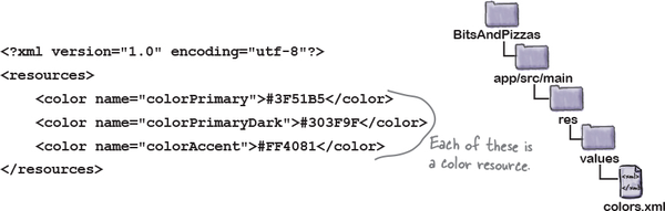
Define colors in a color resource file
A color resource file is similar to a String resource file except that it contains colors instead of Strings. Using a color resource file makes it easy to make changes to the color scheme of your app, as all the colors you want to use are held in one place.
The color resource file is usually called colors.xml, and it’s located in the app/src/main/res/values folder. When you create a project in Android Studio, the IDE will usually create this file for you.
If Android Studio hasn’t created the file, you’ll need to add it yourself. Switch to the Project view of Android Studio’s explorer, highlight the app/src/main/res/values folder, go to the File menu, and choose New. Then choose the option to create a new Values resource file, and when prompted, name the file “colors”. When you click on OK, Android Studio will create the file for you.
Next, open colors.xml and make sure that your version of the file matches ours below:
The code above defines three color resources. Each one has a name and a value. The value is a hexadecimal color value:
The style resource file looks up colors from the color resource file using @color/colorName. For example:
overrides the primary color used in the theme with the value of colorPrimary in the color resource file.
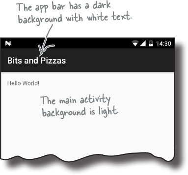
Now that we’ve seen how to add an app bar by applying a theme, let’s update MainActivity’s layout and take the app for a test drive.
The code for activity_main.xml
For MainActivity’s layout, we’re going to display some default text in a linear layout. Here’s the code to do that; update your version of activity_main.xml to match ours below:
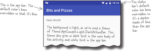
Test drive the app
When you run the app, MainActivity gets displayed. At the top of the activity there’s an app bar.
That’s everything you need to apply a basic app bar in your activities. Why not experiment with changing the theme and colors? Then when you’re ready, turn the page and we’ll move on to the next step.
ActionBar vs. Toolbar
So far, you’ve seen how to add a basic app bar to the activities in your app by applying a theme that includes an app bar. Adding an app bar in this way is easy, but it has one disadvantage: it doesn’t necessarily include all the latest app bar features.
Behind the scenes, any activity that acquires an app bar via a theme uses the ActionBar class for its app bar. The most recent app bar features, however, have been added to the Toolbar class in the AppCompat Support Library instead. This means that if you want to use the most recent app bar features in your app, you need to use the Toolbar class from the Support Library.
Using the Toolbar class also gives you more flexibility. A toolbar is a type of view that you add to your layout just as you would any other type of view, and this makes it much easier to position and control than a basic app bar.
How to add a toolbar
We’re going to change our activity so that it uses a toolbar from the Support Library for its app bar. Whenever you want to use the Toolbar class from the Support Library, there are a number of steps you need to perform:
Add the v7 AppCompat Support Library as a dependency.
This is necessary because the Toolbar class lives in this library.
Make sure your activity extends the AppCompatActivity class.
Your activity must extend AppCompatActivity (or one of its subclasses) in order to use the Support Library toolbar.
Remove the existing app bar.
You do this by changing the theme to one that doesn’t include an app bar.
Add a toolbar to the layout.
The toolbar is a type of view, so you can position it where you want and control its appearance.
Update the activity to set the toolbar as the activity’s app bar.
This allows the activity to respond to the toolbar.
We’ll go through these steps now.
1. Add the AppCompat Support Library
Before you can use the Toolbar class from the Support Library in your activities, you need to make sure that the v7 AppCompat Support Library has been added to your project as a dependency. In our particular case, the library has already been added to our project, as we needed it for the AppCompat themes.
To double-check that the Support Library is there, in Android Studio choose File→Project Structure, click on the app module, and choose Dependencies. You should see the v7 AppCompat Library listed as shown below:
2. Extend the AppCompatActivity class
When you want to use a theme from the AppCompat Library, you have to make sure that your activities extend the AppCompatActivity class. This is also the case if you want to use a toolbar from the Support Library as your app bar.
We’ve already completed this step because, earlier in this chapter, we changed MainActivity.java to use AppCompatActivity:
The next thing we need to do is remove the existing app bar.
3. Remove the app bar
You remove the existing app bar in exactly the same way that you add one—by applying a theme.
When we wanted to add an app bar to our app, we applied a theme that displayed one. To do this, we used the theme attribute in AndroidManifest.xml to apply a style called AppTheme:
The theme was then defined in styles.xml like this:
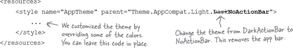
The theme Theme.AppCompat.Light.DarkActionBar gives your activity a light background with a dark app bar. To remove the app bar, we’re going to change the theme to Theme.AppCompat.Light.NoActionBar instead. Your activity will look the same as it did before except that no app bar will be displayed.
To change the theme, update styles.xml like this:
Now that we’ve removed the current app bar, we can add the toolbar.
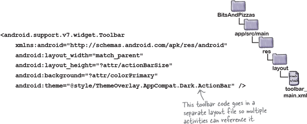
4. Add a toolbar to the layout
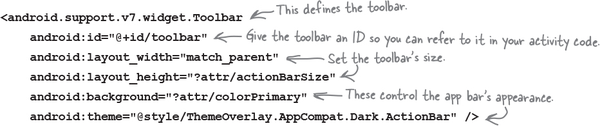
As we said earlier, a toolbar is a view that you add to your layout. Toolbar code looks like this:
You start by defining the toolbar using:
where android.support.v7.widget.Toolbar is the fully qualified path of the Toolbar class in the Support Library.
Once the toolbar has been defined, you then use other view attributes to give it an ID, and specify its appearance. As an example, to make the toolbar as wide as its parent and as tall as the default app bar size from the underlying theme, you’d use:
The ?attr prefix means that you want to use an attribute from the current theme. In this particular case, ?attr/actionBarSize is the height of an app bar that’s specified in our theme.
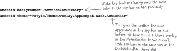
You can also change your toolbar’s appearance so that it has a similar appearance to the app bar that we had before. To do this, you can change the background color, and apply a theme overlay like this:
A theme overlay is a special type of theme that alters the current theme by overwriting some of its attributes. We want our toolbar to look like our app bar did when we used a theme of Theme.AppCompat.Light.DarkActionBar, so we’re using a theme overlay of ThemeOverlay.AppCompat.Dark.ActionBar.
On the next page we’ll add the toolbar to the layout.
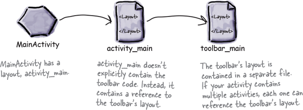
Add the toolbar to the layout...
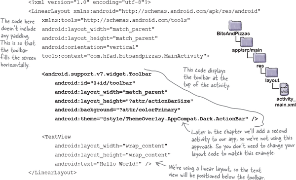
If your app contains a single activity, you can add the toolbar to your layout just as you would any other view. Here is an example of the sort of code you would use in this situation (we’re using a different approach, so don’t update your layout with the code below):
This code displays the toolbar at the top of the activity. We’ve positioned the text view Android Studio gave us so that it’s displayed underneath the toolbar. Remember that a toolbar is a view like any other view, so you need to take this into account when you’re positioning your other views.
Adding the toolbar code to your layout works well if your app contains a single activity, as it means that all the code relating to your activity’s appearance is in a single file. It works less well, however, if your app contains multiple activities. If you wanted to display a toolbar in multiple activities, you would need to define the toolbar in the layout of each activity. This means that if you wanted to change the style of the toolbar in some way, you’d need to edit every single layout file.
So what’s the alternative?
... or define the toolbar as a separate layout
An alternative approach is to define the toolbar in a separate layout, and then include the toolbar layout in each activity. This means that you only need to define the toolbar once, and if you want to change the style of your toolbar, you only need to edit one file.
We’re going to use this approach in our app. Start by creating a new layout file. Switch to the Project view of Android Studio’s explorer, highlight the app/src/res/main/layout folder in Android Studio, then go to the File menu and choose New → Layout resource file. When prompted, give the layout file a name of “toolbar_main” and then click on OK. This creates a new layout file called toolbar_main.xml.
Next, open toolbar_main.xml, and replace any code Android Studio has created for you with the following:
This code is almost identical to the toolbar code you’ve already seen. The main difference is that we’ve left out the toolbar’s id attribute, as we’ll define this in the activity’s main layout file activity_main.xml instead.
On the next page we’ll look at how you include the toolbar layout in activity_main.xml.
Include the toolbar in the activity’s layout
You can display one layout inside another using the <include> tag. This tag must contain a layout attribute that specifies the name of the layout you want to include. As an example, here’s how you would use the <include> tag to include the layout toolbar_main.xml:
We want to include the toolbar_main layout in activity_main.xml. Here’s our code; update your version of activity_main.xml to match ours:
Now that we’ve added the toolbar to the layout, there’s one more change we need to make.
5. Set the toolbar as the activity’s app bar
The final thing we need to do is tell MainActivity to use the toolbar as its app bar.
So far we’ve only added the toolbar to the layout. While this means that the toolbar gets displayed at the top of the screen, the toolbar doesn’t yet have any app bar functionality. As an example, if you were to run the app at this point, you’d find that the title of the app isn’t displayed in the toolbar as it was in the app bar we had previously.
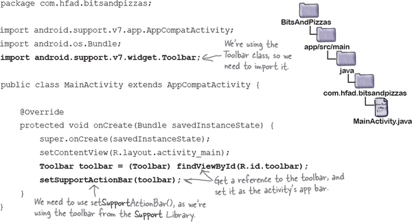
To get the toolbar to behave like an app bar, we need to call the AppCompatActivity’s setSupportActionBar() method in the activity’s onCreate() method, which takes one parameter: the toolbar you want to set as the activity’s app bar.
Here’s the code for MainActivity.java; update your code to match ours:
That’s all the code that you need to replace the activity’s basic app bar with a toolbar. Let’s see how it looks.
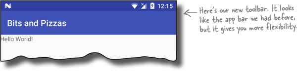
Test drive the app
When you run the app, a new toolbar is displayed in place of the basic app bar we had before. It looks similar to the app bar, but as it’s based on the Support Library Toolbar class, it includes all the latest Android app bar functionality.
You’ve seen how to add an app bar, and how to replace the basic app bar with a toolbar. Over the next few pages we’ll look at how to add extra functionaility to the app bar.
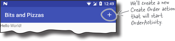
Add actions to the app bar
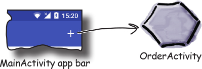
In most of the apps you create, you’ll probably want to add actions to the app bar. These are buttons or text in the app bar that you click on to make something happen. We’re going to add a “Create Order” button to the app bar. When you click on it, it will start a new activity we’ll create called OrderActivity:
Create OrderActivity
We’ll start by creating OrderActivity. Select the com.hfad.bitsandpizzas package in the app/src/main/java folder, then go to File→New...→Activity→Empty Activity. Name the activity “OrderActivity”, name the layout “activity_order”, make sure the package name is com.hfad.bitsandpizzas, and checkthe Backwards Compatibility (AppCompat) checkbox.
Note
If prompted for the activity’s source language, select the option for Java.
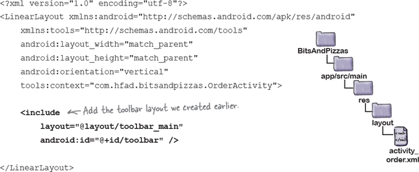
Update activity_order.xml
We’ll start by updating activity_order.xml so that it displays a toolbar. The toolbar will use the same layout we created earlier.
Here’s our code; update yours so that it matches ours:
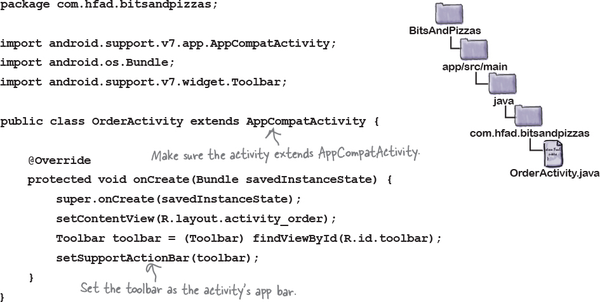
Update OrderActivity.java
Next we’ll update OrderActivity so that it uses the toolbar we set up in the layout as its app bar. To do this, we need to call the setSupportActionBar() method, passing in the toolbar as a parameter, just as we did before.
Here’s the full code for OrderActivity.java; update your version of the code so that it matches ours:
Add a String resource for the activity’s title
Before we move on to creating an action to start OrderActivity, there’s one more change we’re going to make. We want to make it obvious to users when OrderActivity gets started, so we’re going to change the text that’s displayed in OrderActivity’s app bar to make it say “Create Order” rather than the name of the app.
To do this, we’ll start by adding a String resource for the activity’s title. Open the file strings.xml in the app/src/main/res/values folder, then add the following resource:
We’ll update the text that gets displayed in the app bar on the next page.
Change the app bar text by adding a label
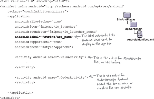
As you saw earlier in the chapter, you tell Android what text to display in the app bar by using the label attribute in file AndroidManifest.xml.
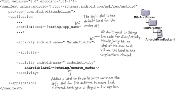
Here’s our current code for AndroidManifest.xml. As you can see, the code includes a label attribute of @string/app_name inside the <application> element. This means that the name of the app gets displayed in the app bar for the entire app.
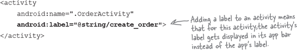
We want to override the label for OrderActivity so that the text “Create Order” gets displayed in the app bar whenever OrderActivity has the focus. To do this, we’ll add a new label attribute to OrderActivity’s <activity> element to display the new text:
We’ll show you this code in context on the next page.
The code for AndroidManifest.xml
Here’s our code for AndroidManifest.xml. Update your code to reflect our changes.
That’s everything we need for OrderActivity. Next we’ll look at how you add an action to the app bar so that we can start it.
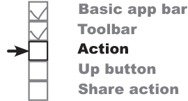
How to add an action to an app bar
To add an action to the app bar, you need to do four things:
Add resources for the action’s icon and text.
Define the action in a menu resource file.
This tells Android what actions you want on the app bar.
Get the activity to add the menu resource to the app bar.
You do this by implementing the onCreateOptionsMenu() method.
Add code to say what the action should do when clicked.
You do this by implementing the onOptionsItemSelected() method.
We’ll start by adding the action’s icon and text resources.
1. Add the action’s resources
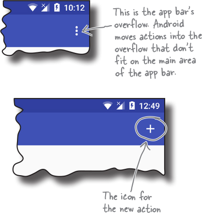
When you add an action to an app bar, you generally assign it an icon and a short text title. The icon usually gets displayed if the action appears in the main area of the app bar. If the action doesn’t fit in the main area, it’s automatically moved to the app bar overflow, and the title appears instead.
We’ll start with the icon.
Add the icon
If you want to display your action as an icon, you can either create your own icon from scratch or use one of the icons provided by Google. You can find the Google icons here: https://material.io/icons/.
We’re going to use the “add” icon ic_add_white_24dp, and we’ll add a version of it to our project’s drawable* folders, one for each screen density. Android will decide at runtime which version of the icon to use depending on the screen density of the device.
First, switch to the Project view of Android Studio’s explorer if you haven’t done so already, highlight the app/src/main/res folder, and then create folders called drawable-hdpi, drawable-mdpi, drawable-xhdpi, drawable-xxhdpi, and drawable-xxxhdpi if they’re not already there. Then go to https://git.io/v9oet, and download the ic_add_white_24dp.png Bits and Pizzas images. Add the image in the drawable-hdpi folder to the drawable-hdpi folder in your project, then repeat this process for the other folders.
Add the action’s title as a String resource
In addition to adding an icon for the action, we’ll also add a title. This will get used if Android displays the action in the overflow area of the app bar, for example if there’s no space for the action in the main area of the app bar.
We’ll create the title as a String resource. Open the file strings.xml in the app/src/main/res/values folder, then add the following String resource:
Now that we’ve added resources for the action’s icon and title, we can create the menu resource file.
2. Create the menu resource file
A menu resource file tells Android what actions you want to appear on the app bar. Your app can contain multiple menu resource files. For example, you can create a separate menu resource file for each set of actions; this is useful if you want different activities to display different actions on their app bars.
We’re going to create a new menu resource file called menu_main.xml in the folder app/src/main/res/menu. All menu resource files go in this folder.
Note
Android Studio may have already created this file for you. If it has, simply replace its contents with the code below.
To create the menu resource file, select the app/src/main/res folder, go to the File menu, and choose New. Then choose the option to create a new Android resource file. You’ll be prompted for the name of the resource file and the type of resource. Give it a name of “menu_main” and a resource type of “Menu”, and make sure that the directory name is menu. When you click on OK, Android Studio will create the file for you, and add it to the app/src/main/res/menu folder.
Here’s the code to add the new action. Replace the contents of menu_main.xml with the code below:
The menu resource file has a <menu> element at its root. Inside the <menu> element, you get a number of <item> elements, each one describing a separate action. In this particular case, we have a single action.
You use attributes of <item> to describe each action. The code creates an action with an id of action_create_order. This is so that we can refer to the action in our activity code, and respond to the user clicking on it.
The action includes a number of other attributes that determine how the action appears on the app bar, such as its icon and text. We’ll look at these on the next page.
Control the action’s appearance
Whenever you create an action to be displayed on the app bar, it’s likely you’ll want to display it as an icon. The icon can be any drawable resource. You set the icon using the icon attribute:
Sometimes Android can’t display the action’s icon. This may be because the action has no icon, or because the action is displayed in the app bar overflow instead of in the main area. For this reason, it’s a good idea to set an action’s title so that the action can display a short piece of text instead of an icon. You set the action’s title using the title attribute:
If your app bar contains multiple actions, you might want to specify the order in which they appear. To do this, you use the orderInCategory attribute, which takes an integer value that reflects the action’s order. Actions with a lower number will appear before actions with a higher number.
Finally, the showAsAction attribute is used to say how you want the item to appear in the app bar. As an example, you can use it to get an item to appear in the overflow area rather than the main part of the app bar, or to place an item on the main app bar only if there’s room. The showAsAction attribute can take the following values:
"ifRoom"
Place the item in the app bar if there’s space. If there’s not space, put it in the overflow.
"withText"
Include the item’s title text.
"never"
Put the item in the overflow area, and never in the main app bar.
"always"
Always place the item in the main area of the app bar. This value should be used sparingly; if you apply this to many items, they may overlap each other.
Note
There are other attributes for controlling an action’s appearance, but these are the most common ones.
In our example, we want the action to appear on the main area of the app bar if there’s room, so we’re using:
app:showAsAction="ifRoom"
Our menu resource file is now complete. The next thing we need to do is implement the onCreateOptionsMenu() method in our activity.
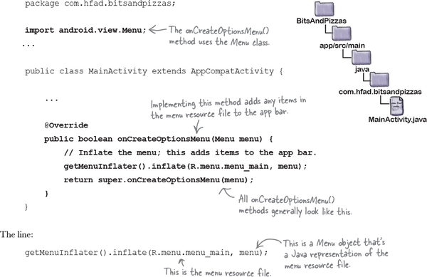
3. Add the menu to the app bar with the onCreateOptionsMenu() method
Once you’ve created the menu resource file, you add the actions it contains to an activity’s app bar by implementing the activity’s onCreateOptionsMenu() method. This method runs when the app bar’s menu gets created. It takes one parameter, a Menu object that’s a Java representation of the menu resource file.
Here’s our onCreateOptionsMenu() method for MainActivity.java (update your code to reflect our changes):
inflates your menu resource file. This means that it creates a Menu object that’s a Java representation of your menu resource file, and any actions the menu resource file contains are translated to MenuItems. These are then added to the app bar.
There’s one more thing we need to do: get our action to start OrderActivity when it’s clicked. We’ll do that on the next page.
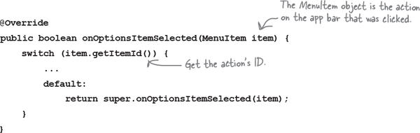
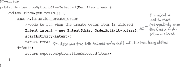
4. React to action item clicks with the onOptionsItemSelected() method
To make your activity react when an action in the app bar is clicked, you implement the onOptionsItemSelected() method in your activity:
The onOptionsItemSelected() method runs whenever an action gets clicked. It takes one parameter, a MenuItem object that represents the action on the app bar that was clicked. You can use the MenuItem’s getItemId() method to get the ID of the action so that you can perform an appropriate action, such as starting a new activity.
We want to start OrderActivity when our action is clicked. Here’s the code for the onOptionsItemSelected() method that will do this:
The full code for MainActivity.java is on the next page.
The full MainActivity.java code
Here’s the full code for MainActivity.java. Update your code so that it matches ours. We’ve highlighted our changes.
Let’s see what happens when we run the app.
Test drive the app
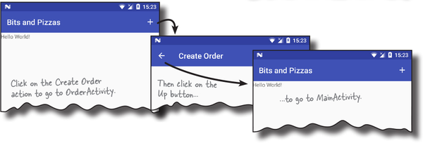
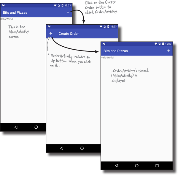
When you run the app, a new Create Order action is displayed in the MainActivity app bar. When you click on the action item, it starts OrderActivity.
But how do we get back to MainActivity?
To return to MainActivity from OrderActivity, we currently need to click on the Back button on our device. But what if we want to get back to it from the app bar?
One option would be to add an action to OrderActivity’s app bar that starts MainActivity, but there’s a better way. We can get OrderActivity to return to MainActivity by enabling the Up button on OrderActivity’s app bar.
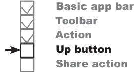
Enable Up navigation
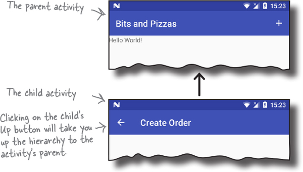
If you have an app that contains a hierarchy of activities, you can enable the Up button on the app bar to let users navigate through the app using hierarchical relationships. As an example, MainActivity in our app includes an action on its app bar that starts a second activity, OrderActivity. If we enable the Up button on OrderActivity’s app bar, the user will be able to return to MainActivity by clicking on this button.
Up navigation may sound the same as using the Back button on the device, but it’s different. The Back button allows users to work their way back through the history of activities they’ve been to. The Up button, on the other hand, is purely based on the app’s hierarchical structure. If your app contains a lot of activities, implementing the Up button gives your users a quick and easy way to return to an activity’s parent without having to keep pressing the Back button.
We’re going to enable the Up button on OrderActivity’s app bar. When you click on it, it will display MainActivity.
Use the Back button to navigate back to the previous activity.
Use the Up button to navigate up the app’s hierarchy.
Set an activity’s parent
The Up button enables the user to navigate up a hierarchy of activities in the app. You declare this hierarchy in AndroidManifest.xml by specifying the parent of each activity. As an example, we want the user to be able to navigate from OrderActivity to MainActivity when they press the Up button, so this means that MainActivity is the parent of OrderActivity.
For API level 16 and above, you specify the parent activity using the android:parentActivityName attribute. For older versions of Android, you need to include a <meta-data> element that includes the name of the parent activity. Here are both approaches in our AndroidManifest.xml:
Finally, we need to enable the Up button in OrderActivity.
Adding the Up button
You enable the Up button from within your activity code. You first get a reference to the app bar using the activity’s getSupportActionBar() method. This returns an object of type ActionBar. You then call the ActionBar setDisplayHomeAsUpEnabled() method, passing it a value of true.
Up button for an activity, you MUST specify its parent.
If you don’t, you’ll get a null pointer exception when you call the setDisplayHomeAsUpEnabled() method.
We want to enable the Up button in OrderActivity, so we’ll add the above code to the onCreate() method in OrderActivity. java. Here’s our full activity code:
That’s all the changes we need to make to enable the Up button. Let’s see what happens when we run the app.
Test drive the app
When you run your app and click on the Create Order action item, OrderActivity is displayed as before.
OrderActivity displays an Up button in its app bar. When you click on the Up button, it displays its hierarchical parent MainActivity.
So far, we’ve looked at how you add an app bar to your app and add basic actions to it. Next we’ll look at how you add more sophisticated actions using action providers.
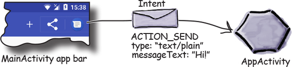
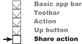
Sharing content on the app bar
The next thing we’ll look at is how to add an action provider to your app bar. An action provider is an action that defines its own appearance and behavior.
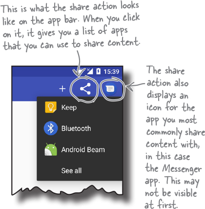
We’re going to concentrate on using the share action provider, which allows users to share content in your app with other apps such as Gmail. As an example, you could use it to let users send details of a particular pizza to one of their contacts.
The share action provider defines its own icon, so you don’t have to add it yourself. When you click on it, it provides you with a list of apps you can use to share content. It adds a separate icon for the most commonly used app you choose to share content with.
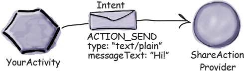
You share the content with an intent
To get the share action provider to share content, you pass it an intent that defines the content you want to share, and its type. As an example, if you define an intent that passes text with an ACTION_SEND action, the share action will offer you a list of apps on your device that are capable of sharing text.
Here’s how the share action works (you’ll see this in action over the next two pages):
Your activity creates an intent and passes it to the share action provider.
The intent describes the content that needs to be shared, its type, and an action.
When the user clicks on the share action, the share action uses the intent to present the user with a list of apps that can deal with the intent.
The user chooses an app, and the share action provider passes the intent to the app’s activity that can handle it.
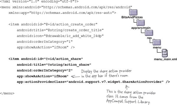
Add a share action provider to menu_main.xml
You add a share action to the app bar by including it in the menu resource file.
To start, add a new action_share String to strings.xml. We’ll use this String to add a title to the share action in case it appears in the overflow:
You add the share action to the menu resource file using the <item> element as before. This time, however, you need to specify that you’re using a share action provider. You do this by adding an attribute of app:actionProviderClass and setting it to android.support.v7.widget.ShareActionProvider.
Here’s the code to add the share action; update your copy of menu_main.xml to match ours:
As we mentioned earlier, when you add a share action to your menu resource file, there’s no need to include an icon. The share action provider already defines one.
Now that we’ve added the share action to the app bar, let’s specify what content to share.
Specify the content with an intent
To get the share action to share content when it’s clicked, you need to tell it what to share in your activity code. You do this by passing the share action provider an intent using its setShareIntent() method. Here’s how you’d get the share action to share some default text when it’s clicked:
You need to call the share action provider’s setShareIntent() method whenever the content you wish to share has changed. As an example, if you’re flicking through images in a photo app, you need to make sure you share the current photo.
We’ll show you our full activity code on the next page, and then we’ll see what happens when the app runs.
The full MainActivity.java code
Here’s the full activity code for MainActivity.java. Update your code to reflect ours.
The code continues on the next page.
The MainActivity.java code (continued)
On the next page we’ll check what happens when the code runs by taking the app for a test drive.
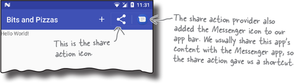
Test drive the app
When you run the app, the share action is displayed in the app bar:
When you click on the share action, it gives you a list of apps to choose from that can accept the intent you want to share:
When you choose an app to share content with, the app gets launched and the default text is shared with it:
Chapter 8 Your Android Toolbox
You’ve got Chapter 8 under your belt and now you’ve added Android Support Libraries and app bars to your toolbox.