
The MainActivity.java code (continued)
None of the code on this page has changed.


The code continues on the next page.

Ever wondered how to develop apps with a rich, slick UI?
With the release of the Android Design Support Library, it became much easier to create apps with an intuitive UI. In this chapter, we’ll show you around some of the highlights. You’ll see how to add tabs so that your users can navigate around your app more easily. You’ll discover how to animate your toolbars so that they can collapse or scroll on a whim. You’ll find out how to add floating action buttons for common user actions. Finally, we’ll introduce you to snackbars, a way of displaying short, informative messages to the user that they can interact with.
In Chapter 8, we showed you a sketch of the top-level screen of the Bits and Pizzas app. It contained a list of places in the app the user could go to. The first three options linked to category screens for pizzas, pasta, and stores, and the final option linked to a screen where the user could create an order.
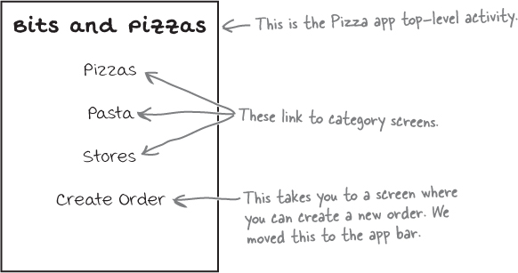
So far you’ve seen how to add actions to the app bar. These are used for simple commands, such as Create Order or Send Feedback. But what about the category screens? As we want to use these for navigating through the app rather than taking an action, we’ll take a different approach.
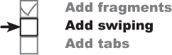
We’re going to change the Bits and Pizzas app so that it uses tab navigation. We’ll display a set of tabs underneath the toolbar, with each option on a different tab. When the user clicks on a tab, the screen for that option will be displayed. We’ll also let the user swipe left and right between the different tabs.
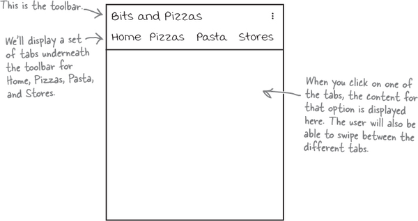
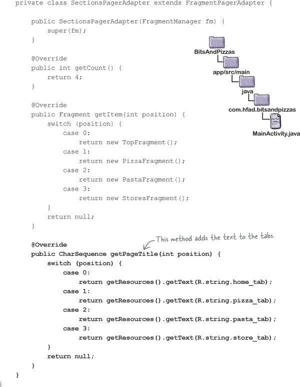
We’re going to change MainActivity so that it uses tabs. The tabs will include options for Home, Pizzas, Pasta, and Stores, so that the user can easily navigate to the main sections of the app.

We’ll create fragments for these different options; when the user clicks on one of the tabs, the fragment for that option will be displayed:

We’ll go through the steps for how to do this on the next page.
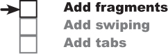
There are three main steps we’ll go through to get tabs working:
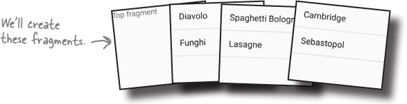
Create the fragments.
We’ll create basic versions of TopFragment, PizzaFragment, PastaFragment, and StoresFragment so that we can easily tell which fragment is displayed on each of the tabs.
Enable swipe navigation between the fragments.
We’ll update MainActivity so that the user can swipe between the different fragments.
Add the tab layout.
Finally, we’ll add a tab layout to MainActivity that will work in conjunction with the swipe navigation. The user will be able to navigate to each fragment by clicking on a tab, or swiping between them.

We’re going to update the Bits and Pizzas app in this chapter, so open your original Bits and Pizzas project from Chapter 8 in Android Studio.
We’ll start by creating the fragments.

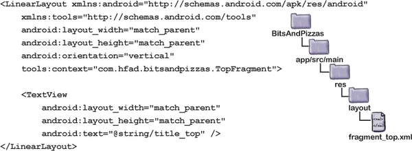
We’ll use TopFragment to display content that will appear on the Home tab. For now, we’ll display the text “Top fragment” so that we know which fragment is displayed. Highlight the com.hfad.bitsandpizzas package in the app/src/main/java folder, then go to File→New...→Fragment→Fragment (Blank). Name the fragment “TopFragment” and name its layout “fragment_top”. Then replace the code for TopFragment.java with the code below:


Add the following string resource to strings.xml; we’ll use this in our fragment layout:

Then update the code for fragment_top.xml as follows:

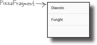
We’ll use a ListFragment called PizzaFragment to display the list of pizzas. Highlight the com.hfad.bitsandpizzas package in the app/src/main/java folder, then go to File→New...→Fragment→Fragment (Blank). Name the fragment “PizzaFragment”, and uncheck the option to create a layout. Why? Because list fragments don’t need a layout—they use their own.
Don’t choose the Fragment (List) option, as this generates more complex code.
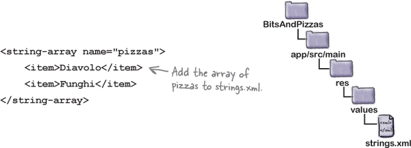
Next, add a new string array resource called "pizzas" to strings. xml (this contains the names of the pizzas):
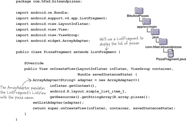
Then change the code for PizzaFragment.java so that it’s a ListFragment. Its list view needs to be populated with the pizza names. Here’s the updated code:

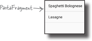
We’ll use a ListFragment called PastaFragment to display the list of pasta. Highlight the com.hfad.bitsandpizzas package in the app/src/main/java folder and create a new blank fragment named “PastaFragment”. You can uncheck the option to create a layout, as list fragments use their own layouts.
Next, add a new string array resource called "pasta" to strings.xml (this contains the names of the pasta):

Then change the code for PastaFragment.java so that it’s a ListFragment that displays a list of the pasta names. Here’s the updated code:

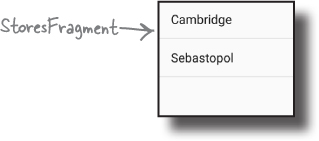
We’ll use a ListFragment called StoresFragment to display the list of stores. Highlight the com.hfad.bitsandpizzas package in the app/src/main/java folder and create a new blank fragment named “StoresFragment.” Uncheck the option to create a layout, as list fragments define their own layouts.
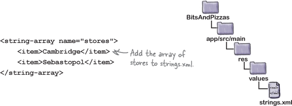
Next, add a new string array resource called "stores" to strings. xml (this contains the names of the stores):
Then change the code for StoresFragment.java so that it’s a ListFragment. Its list view needs to be populated with the store names. Here’s the updated code:

We’ve now added all the fragments we need, so let’s move on to the next step.
We want to be able to swipe through the different fragments we’ve just created. To do this, we’ll use a view pager, which is a view group that allows you to swipe through different pages in a layout, each page containing a separate fragment.

You use a view pager by adding it to your layout, then writing activity code to control which fragments should be displayed. The ViewPager class comes from the v4 Support Library, which is included in the v7 AppCompat Support Library, so you also need to make sure you add one of these libraries to your project as a dependency. In our particular case, we already added the v7 AppCompat Support Library to our project in Chapter 8.
You can check which Support Libraries are included in your project in Android Studio by choosing Project Structure from the File menu, clicking on the app module, and then choosing Dependencies.
You add a view pager to your layout using code like this:
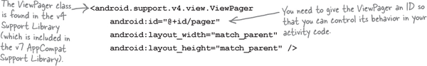
The above code defines the view pager, and gives it an ID of pager. Every view pager you create must have an ID so that you can get a reference to it in your activity code. Without this ID, you can’t specify which fragments should appear on each page of the view pager.
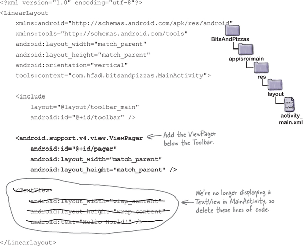
We’re going to add a view pager to MainActivity. We’ll look at the full code for its layout on the next page.

We’re going to add a view pager to MainActivity’s layout, and remove the text view that’s already there. Open the file activity_main.xml, then update your code so that it matches ours below (we’ve bolded our changes):
That’s everything we need to add a view pager to our layout. To get our new view pager to display fragments, we need to write some activity code. We’ll do that next.

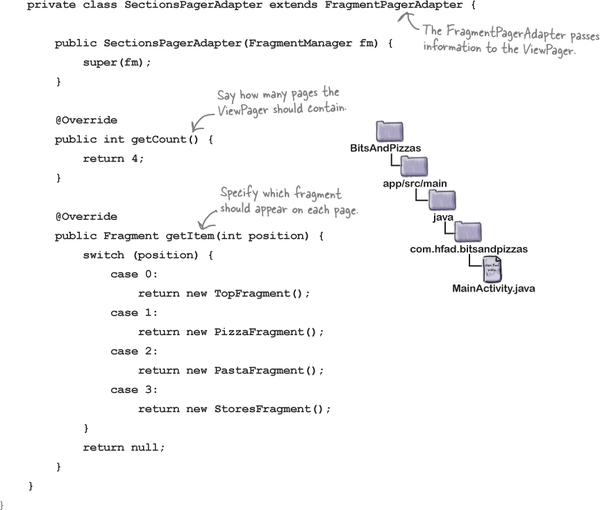
To get a view pager to display a fragment on each of its pages, there are two key pieces of information you need to give it: the number of pages it should have, and which fragment should appear on each page. You do this be creating a fragment pager adapter, and adding it to your activity code.
A fragment pager adapter is a type of adapter that specializes in adding fragments to pages in a view pager. You generally use one when you want to have a small number of pages that are fairly static, as each fragment the user visits is kept in memory.
If you want your view pager to have a large number of pages, you would use a fragment state pager adapter instead. We’re not covering it here, but the code is almost identical.
Fragment pager adapter code looks like this:

When you create a fragment pager adapter, there are two key methods you must override: getCount() and getItem(). You use getCount() to specify how many pages there should be in the view pager, and the getItem() to say which fragment should be displayed on each page.
We’ll show you the code for the Bits and Pizzas fragment pager adapter on the next page.

We want our view pager to have four pages. We’ll display TopFragment on the first page, PizzaFragment on the second, PastaFragment on the third, and StoresFragment on the fourth.
To accomplish this, we’re going to create a fragment pager adapter called SectionsPagerAdapter. Here’s the code (we’ll add it to MainActivity.java in a couple of pages):

That’s all the code we need for our SectionsPagerAdapter. Next we need to get our view pager to use it.

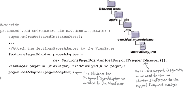
Finally, we need to attach our SectionsPagerAdapter to the view pager so that the view pager can use it. You attach a fragment pager adapter to a view pager by calling the ViewPager setAdapter() method, and passing it a reference to an instance of the fragment pager adapter.
Here’s the code to attach the fragment pager adapter we created to the view pager:
That’s everything we need to be able to swipe through our fragments. We’ll show you the full code for MainActivity on the next page.

Here’s our full code for MainActivity.java. Update your version of the code to match our changes (in bold):

The code continues on the next page.
None of the code on this page has changed.
The code continues on the next page.

Now that we’ve updated our MainActivity code, let’s take our app for a test drive and see what happens.

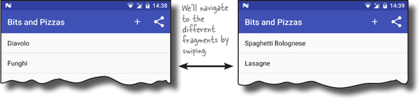
When we run the app, TopFragment is displayed. When we swipe the screen to the left, PizzaFragment is displayed, followed by PastaFragment and StoresFragment. When we swipe the screen in the opposite direction starting from StoresFragment, PastaFragment is displayed, followed by PizzaFragment and TopFragment.

Now that we can swipe through the fragments in MainActivity, let’s add tabs.

We’re going to add tabs to MainActivity as an additional way of navigating through our fragments. Each fragment will be displayed on a separate tab, and clicking on each tab will show that fragment. We’ll also be able to swipe through the tabs using the existing view pager.

You use tabs by adding them to your layout, then writing activity code to link the tabs to the view pager. The classes we need to do this come from the Android Design Support Library, so you need to add this library to your project as a dependency. To do this, choose File→Project Structure in Android Studio, click on the app module, then choose Dependencies. When you’re presented with the project dependencies screen, click on the “+” button at the bottom or right side of the screen. When prompted, choose the Library Dependency option, then select the Design Library from the list of possible libraries. Finally, use the OK buttons to save your changes.
We’ll look at the Design Support Library in more detail later in the chapter.

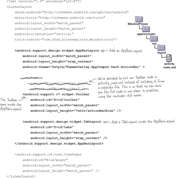
You add tabs to your layout using two components from the Design Support Library: a TabLayout and an AppBarLayout. You use a TabLayout to add the tabs, and the AppBarLayout to group the tabs and your toolbar together.
The code to add tabs to your layout looks like this:
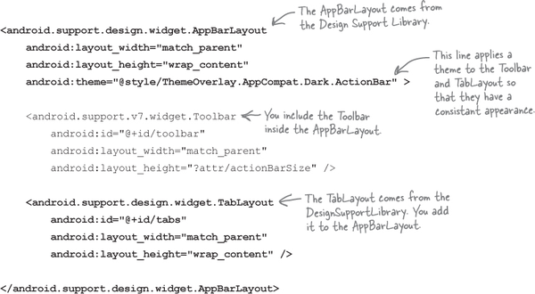
The Toolbar and TabLayout elements both have IDs because you need to be able to reference them in your activity code in order to control their behavior.
The AppBarLayout contains both the Toolbar and the TabLayout. It’s a type of vertical linear layout that’s designed to work with app bars. The android:theme attribute is used to style the Toolbar and TabLayout. We’ve given ours a theme of ThemeOverlay.AppCompat.Dark.ActionBar.
On the next page we’ll show you the code to add tabs to MainActivity’s layout.

Here’s our code for activity_main.xml. Update your version of the code to match our changes (in bold):

Once you’ve added the tab layout, you need to write some activity code to control it. Most of the tab layout’s behavior (such as which fragment appears on which tab) comes from the view pager you’ve already created. All you need to do is implement a method in the view pager’s fragment pager adapter to specify the text you want to appear on each tab, then link the view pager to the tab layout.
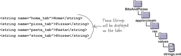
We’re going to add the text we want to appear on each of the tabs as String resources. Open the file strings.xml, then add the following Strings:
To add the text to each of the tabs, you need to implement the fragment pager adapter’s getPageTitle() method. This takes one parameter, an int for the tab’s position, and needs to return the text that should appear on that tab. Here’s the code we need to add the above String resources to our four tabs (we’ll add it to MainActivity.java on the next page):

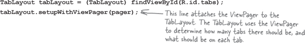
Finally, you need to attach the view pager to the tab layout. You do this by calling the TabLayout object’s setupWithViewPager() method, and passing in a reference to the ViewPager object as a parameter:
That’s everything we need to get our tabs working. We’ll show you the full code for MainActivity on the next page.

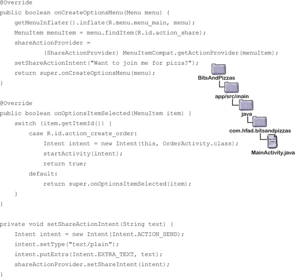
Here’s our full code for MainActivity.java. Update your version of the code to match our changes (in bold):

The code continues on the next page.
None of the code on this page has changed.

The code continues on the next page.


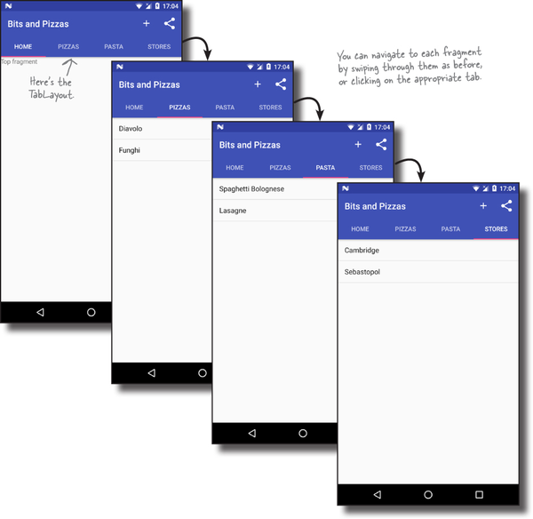
When we run the app, MainActivity includes a tab layout. We can swipe through the fragments as before, and we can also navigate to each fragment by clicking on the appropriate tab.
That’s all the code you need to implement tab and swipe navigation. So what’s next?
So far, we’ve added tabs to our app to help the user navigate around the app. To do this, we’ve used two components from the Design Support Library: the TabLayout and AppBarLayout.
The Design Support Library was introduced as a way of making it easier for developers to use material design components in their apps. Material design was introduced with Lollipop as a way of giving a consistent look and feel to all Android apps. The idea is that a user can switch from a Google app like the Play Store to an app designed by a third-party developer and instantly feel comfortable and know what to do. It’s inspired by paper and ink, and uses print-based design principles and movement to reflect how real-world objects (such as index cards and pieces of paper) look and behave.
You can find the full (and evolving) specs for material design here:
The Design Support Library lets you do more than add tabs to your apps.
It lets you add floating action buttons (FABs).
These are special action buttons that float above the main screen.
It includes snackbars, a way of displaying interactive short messages to the user as an alternative to toasts.
Unlike a toast (which you learned about in Chapter 5), you can add actions to snackbars so that the user can interact with them.

You can use it to animate your toolbars.
You can make your toolbar scroll off the screen, or collapse, if the user scrolls content in another view.
It includes a navigation drawer layout.
This is a slide-out drawer you can use as an alternative to using tabs. We’ll look at this feature in Chapter 14.
For the rest of this chapter, we’re going to show you how to implement some of these features in the Bits and Pizzas app.
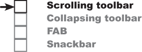
We’re going to add more goodness from the Design Support Library to the Bits and Pizzas app. Here are the steps we’ll go through:
Enable MainActivity’s toolbar to scroll.
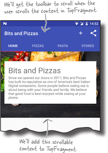
We’ll change MainActivity so that the toolbar scrolls up and down when the user scrolls the contents of the view pager we added earlier. To see this working, we’ll add content we can scroll to TopFragment.
Add a collapsing toolbar to OrderActivity.
We’ll start by adding a plain collapsing toolbar to OrderActivity. The toolbar will collapse when the user scrolls OrderActivity’s contents. After we’ve got the plain collapsing toolbar working, we’ll add an image to it.

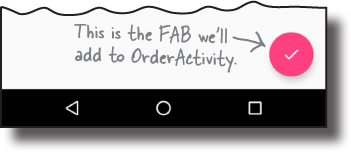
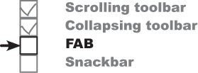
Add a FAB to OrderActivity.
We’ll display a floating action button to the bottom-right corner.
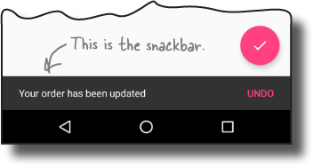
Make the FAB display a snackbar.
The snackbar will appear at the bottom of the screen when the user clicks on the FAB. The FAB will move up when the snackbar appears, and move back down when the snackbar is no longer there.
We’ll start by getting our toolbar to scroll in response to the user scrolling the content in the view pager.

We’re going to change our app so that MainActivity’s toolbar scrolls whenever the user scrolls content in TopFragment. To enable this, there are two things we need to do:
Change MainActivity’s layout to enable the toolbar to scroll.
Change TopFragment to include scrollable content.
We’ll start by changing MainActivity’s layout.
To get the toolbar to move when content in the fragment is scrolled, we’ll add a coordinator layout to MainActivity. A coordinator layout is like a souped-up frame layout that’s used to coordinate animations and transitions between different views. In this case, we’ll use the coordinator layout to coordinate scrollable content in TopFragment and MainActivity’s toolbar.
You add a coordinator layout to an activity’s layout using code like this:
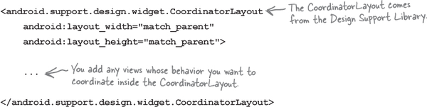
Any views in your layout whose animations you want to coordinate must be included in the <CoordinatorLayout> element. In our case, we want to coordinate animations between the toolbar and the contents of the view pager, so these views need to be included in the coordinator layout.
A CoordinatorLayout allows the behavior of one view to affect the behavior of another.
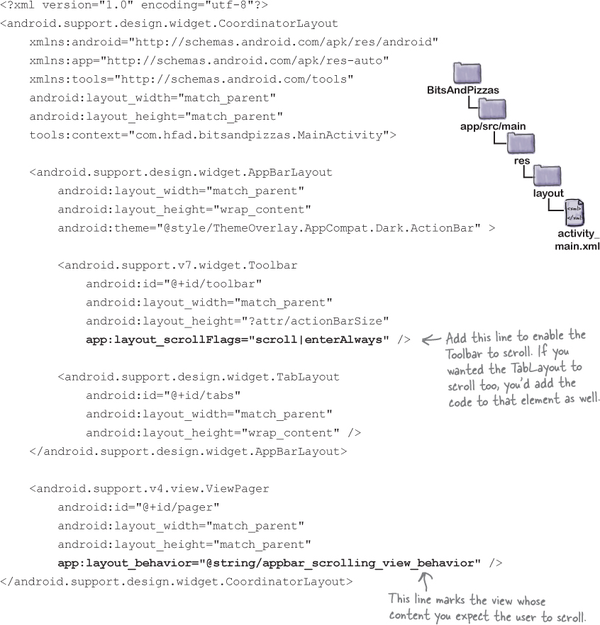
We’re going to replace the linear layout in activity_main.xml with a coordinator layout. Here’s our code; update your version to match our changes (in bold):


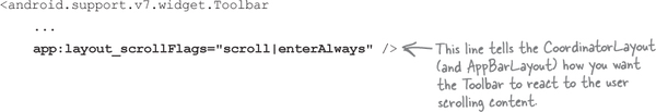
As well as adding views to the coordinator layout, you need to say how you want them to behave. In our case, we want the toolbar to scroll in response to another view’s scroll event. This means that we need to mark the view the user will scroll, and tell the toolbar to respond to it.
You mark the view the user will scroll by giving it an attribute of app:layout_behavior and setting it to the built-in String "@string/appbar_scrolling_view_behavior". This tells the coordinator layout that you want views in the app bar layout to be able to respond when the user scrolls this view. In our case, we want the toolbar to scroll in response to the user scrolling the view pager’s content, so we need to add the app:layout_behavior attribute to the ViewPager element:

You tell views in the app bar layout how to respond to scroll events using the app:layout_scrollFlags attribute. In our case, we’re going to set the toolbar to scroll upward off the screen when the user scrolls the view pager content up, and quickly return to its original position when the user scrolls down. To do this, we need to set the Toolbar app:layout_scrollFlags attribute to "scroll|enterAlways".
The toolbar MUST be contained within an app bar layout in order for it to scroll. The app bar layout and coordinator layout work together to enable the toolbar to scroll.
The scroll value allows the view to scroll off the top of screen. Without this, the toolbar would stay pinned to the top of the screen. The enterAlways value means that the toolbar quickly scrolls down to its original position when the user scrolls the corresponding view. The toolbar will still scroll down without this value, but it will be slower.
Here’s the code we need to add to the toolbar to enable it to scroll:
We’ll look at the full code for MainActivity’s layout on the next page.
Here’s our updated code for activity_main.xml. Update your version of the code to match our changes (in bold):
Those are all the changes we need to make to MainActivity. Next we’ll add scrollable content to TopFragment.

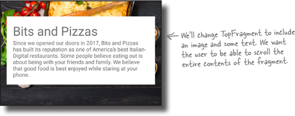
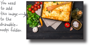
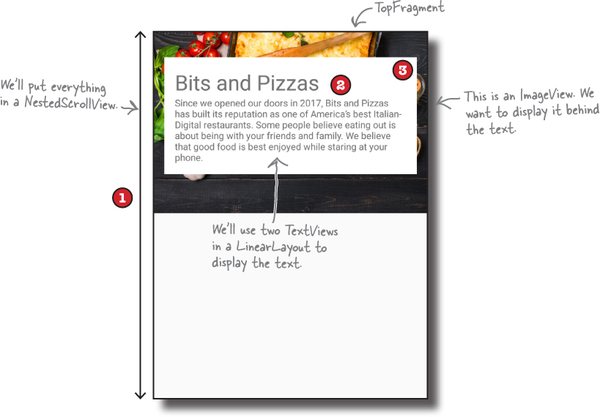
We’re going to change TopFragment’s layout so that it contains scrollable content. We’ll add an image of one of the Bits and Pizzas restaurants, along with some text describing the company ethos.
Here’s what the new version of TopFragment will look like:
We’ll start by adding the String and image resources to our project.
We’ll add the String resources first. Open strings.xml, then add the following:
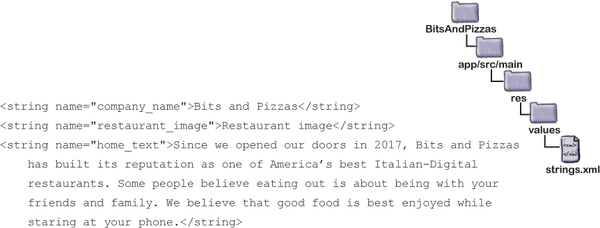
Next we’ll add the restaurant image to the drawable-nodpi folder. First, switch to the Project view of Android Studio’s explorer and check whether the app/src/main/res/drawable-nodpi folder exists in your project. If it’s not already there, highlight the app/src/main/res folder, go to the File menu, choose the New... option, then click on the option to create a new Android resource directory. When prompted, choose a resource type of “drawable”, name it “drawable-nodpi” and click on OK.
Once you have a drawable-nodpi folder, download the file restaurant.jpg from https://git.io/v9oet, and add it to the drawable-nodpi folder.
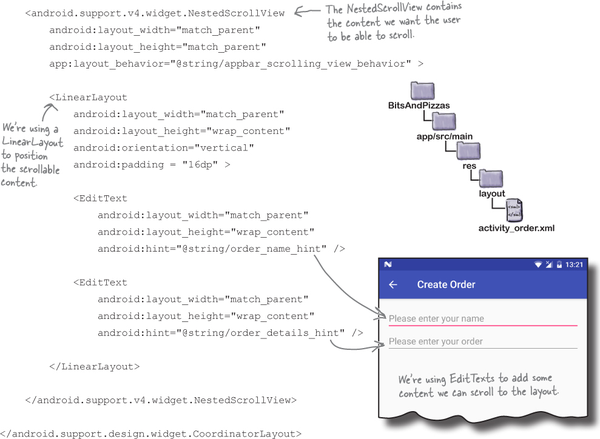
We’ll allow the user to scroll the contents of TopFragment using a nested scroll view. This kind of view works just like a normal scroll view, except that it enables nested scrolling. This is important because the coordinator layout only listens for nested scroll events. If you use a normal scroll view in your layout, the toolbar won’t scroll when the user scrolls the content.
Another view that enables nested scrolling is the recycler view. You’ll find out how to use this in the next chapter.
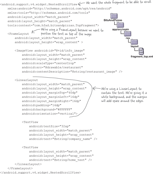
You add a nested scroll view to your layout using code like this:
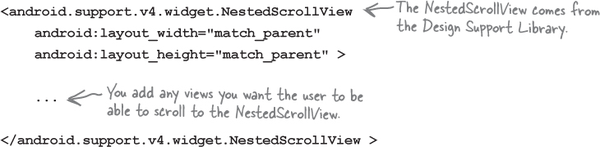
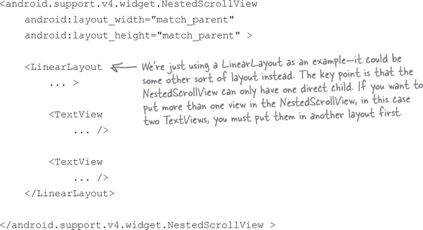
You add any views you want the user to be able to scroll to the nested scroll view. If you just have one view, you can add this to the nested scroll view directly. If you want to scroll multiple views, however, these must be added to a separate layout inside the scroll view. This is because a nested scroll view can only have one direct child. As an example, here’s how you’d add two text views to a nested scroll view with the help of a linear layout:
Next we’ll update TopFragment’s layout so it uses a nested scroll view.

We’re going to add a restaurant image and some text to TopFragment’s layout. Before we write the code, here’s a breakdown of how we’ll structure it.
We want the entire fragment to be scrollable. This means we need to put all the views in a nested scroll view.
We’ll use two text views for the Bits and Pizzas company name and text. We’ll put these in a vertical linear layout with a white background.
We want to display the linear layout containing the two text views on top of the image. We’ll do this by putting them both in a frame layout.
Putting this together, we’ll use a nested scroll view for our layout, and this will contain a frame layout. The frame layout will include two elements, an image view and a linear layout. The linear layout will contain two text views to display the company name and ethos.
On the next page we’ll show you the full code for fragment_top.xml. Once you’ve updated your code, we’ll take the app for a test drive.

Here’s the full code for fragment_top.xml; update your code to match ours:
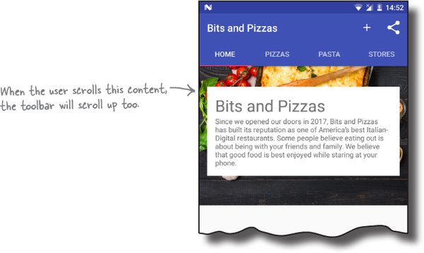
When we run the app, TopFragment displays the new layout. When we scroll the content, the toolbar scrolls too.

By allowing the toolbar to scroll, you free up more space for content. An added bonus is that you don’t have to write any activity or fragment code to control the toolbar’s behavior. All of the functionality came from using widgets from the Design Support Library.

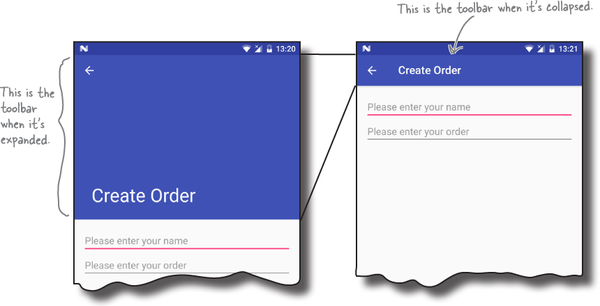
A variant of allowing your toolbar to scroll is the collapsing toolbar. A collapsing toolbar is one that starts off large, shrinks when the user scrolls the screen content up, and grows again when the user scrolls the screen content back down. You can even add an image to it, which disappears when the toolbar reaches its minimum height, and becomes visible again as the toolbar expands:

Over the next few pages, we’re going to change OrderActivity to include a collapsing toolbar.
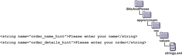
Before we get started, we need to add some String resources to strings.xml that we’ll use in OrderActivity’s layout. Open strings.xml, then add the following resources:
We’ll start updating the layout on the next page.

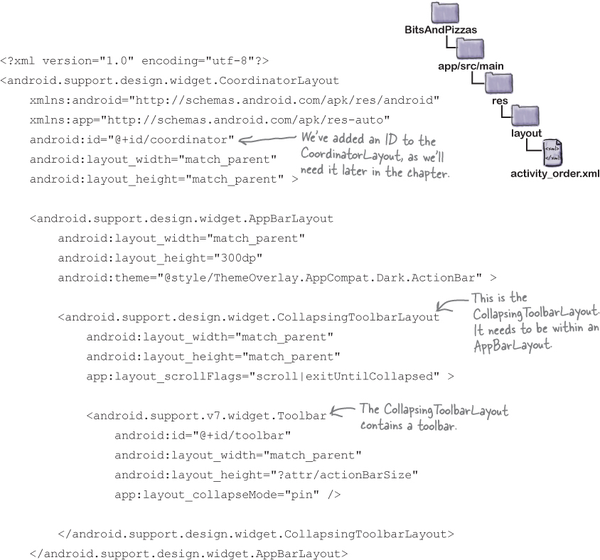
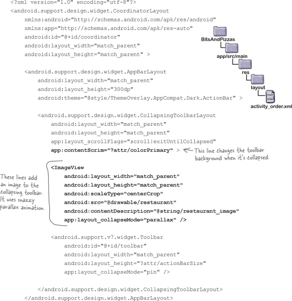
You add a collapsing toolbar to your activity’s layout using the collapsing toolbar layout from the Design Support Library. In order for it to work, you need to add the collapsing toolbar layout to an app bar layout that’s included within a coordinator layout. The collapsing toolbar layout should contain the toolbar you want to collapse.
As the collapsing toolbar needs to respond to scroll events in a separate view, you also need to add scrollable content to the coordinator layout, for example using a nested scroll view.
Here’s an overview of how you need to structure your layout file in order to use a collapsing toolbar:

In addition to structuring your layout in a particular way, there are some key attributes you need to use to get your collapsing toolbar to work properly. We’ll look at these next.
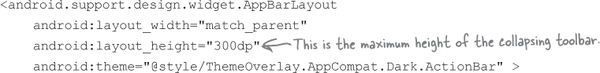
You want the collapsing toolbar layout to collapse and expand in response to scroll events, so you need to set its layout_scrollFlags attribute to control this behavior. In our case, we want the collapsing toolbar layout to collapse until it’s the size of a standard toolbar, so we’ll set the attribute to a value of "scroll|exitUntilCollapsed":

As before, you apply a theme to your app bar layout to control the appearance of its contents. You also need to specify a height for the contents of the app bar layout. This is the maximum height the collapsing toolbar will be able to expand to. In our case, we’ll apply a theme of "@style/ThemeOverlay.AppCompat.Dark.ActionBar" as before and set the height to 300dp:
If you have items on your toolbar such as an Up button, these may scroll off the screen as the toolbar collapses. You can prevent this from happening by setting the layout_collapseMode attribute to "pin":


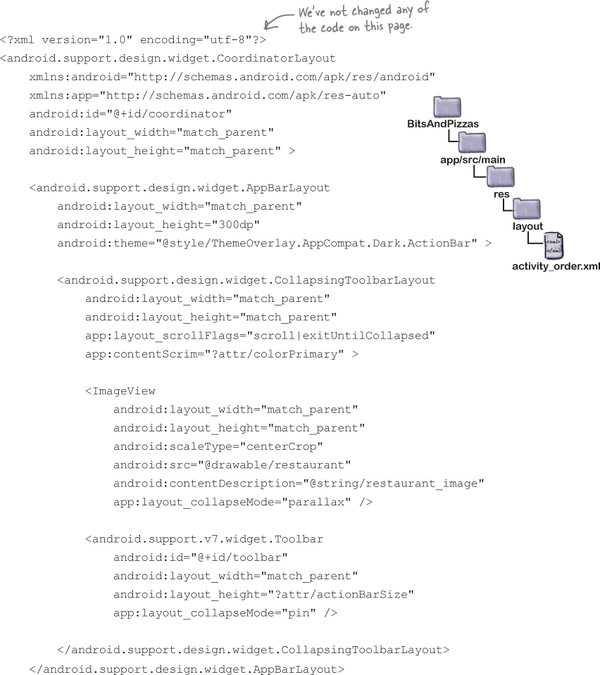
Here’s how to add a collapsing toolbar to OrderActivity’s layout. Replace your existing code for activity_order.xml with the code below:
The code continues on the next page.

Let’s see what happens when we run the app.
When we run the app, OrderActivity displays the new layout, including the collapsing toolbar. The collapsing toolbar starts off large, and collapses as we scroll the content.
The collapsing toolbar we’ve created so far is quite plain. It has a plain background, which grows and shrinks as we scroll the content in the activity.
We can improve this by adding an image to the collapsing toolbar. We’ll display the image when the collapsing toolbar is large, and when it shrinks we’ll display a standard toolbar instead:


We’re going to update the collapsing toolbar we just created so that it includes an image. For convenience, we’ll use the same image that we added to TopFragment.
You add an image to a collapsing toolbar by adding an ImageView to the CollapsingToolBarLayout, specifying the image you want to use. As an optional extra, you can add a parallax effect to the ImageView so that the image scrolls at a different rate than the rest of the toolbar. You do this by adding a layout_collapseMode attribute to the ImageView with a value of "parallax".
We want to use a drawable named “restaurant” for our image. Here’s the code we need:

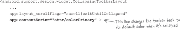
By default, when the toolbar is collapsed, it will continue to display the image as its background. To get the toolbar to revert to a plain background color when it’s collapsed, you add a contentScrim attribute to the CollapsingToolbarLayout, setting it to the value of the color. We want our toolbar to have the same background color as before, so we’ll set it to "?attr/colorPrimary":
Those are all the changes we need, so we’ll update the code on the next page, and then take it for a test drive.

Here’s the updated code for activity_order.xml to add an image to the collapsing toolbar (update your version to match our changes in bold):
The code continues on the next page.


Let’s see what the app looks like when we run it.
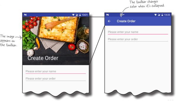
When we run the app, OrderActivity’s collapsing toolbar includes an image. As the toolbar collapses, the image fades, and the toolbar’s background changes to its original color. When the toolbar is expanded again, the image reappears.
There are two final additions we’re going to make to OrderActivity from the Design Support Library: a FAB and a snackbar.
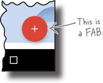
A FAB is a floating action button. It’s a circled icon that floats above the user interface, for example in the bottom-right corner of the screen. It’s used to promote actions that are so common or important that you want to make them obvious to the user.

A snackbar is like a toast except that you can interact with it. It’s a short message that appears at the bottom of the screen that’s used to give the user information about an operation. Unlike with a toast, you can add actions to a snackbar, such as an action to undo an operation.

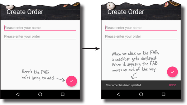
We’re going to add a FAB to OrderActivity. When the user clicks on the FAB, we’ll display a snackbar that shows a message to the user. In the real world, you’d want to use the FAB to perform an action such as saving the user’s pizza order, but we’re just going to focus on showing you how to add the widgets to your app.
Here’s what the new version of OrderActivity will look like:

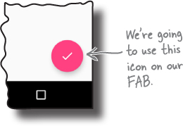
We’ll start by adding an icon to our project to display on the FAB. You can either create your own icon from scratch or use one of the icons provided by Google: https://design.google.com/icons/.
We’re going to use the “done” icon ic_done_white_24dp, and we’ll add a version of it to our project’s drawable* folders, one for each screen density. Android will decide at runtime which version of the icon to use depending on the screen density of the device.
First, switch to the Project view of Android Studio’s explorer, highlight the app/src/main/res folder in your project, then create folders called drawable-hdpi, drawable-mdpi, drawable-xhdpi, drawable-xxhdpi, and drawable-xxxhdpi if they don’t already exist. Then go to http://tinyurl.com/HeadFirstAndroidDoneIcons, and download ic_done_white_24dp.png Bits and Pizzas images. Add the image in the drawable-hdpi folder to the drawablehdpi folder in your project, then repeat this process for the other folders.
You add a FAB to your layout using code like this:
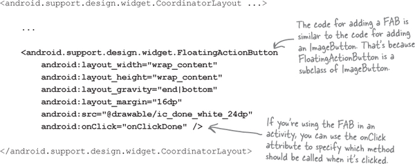
The above code adds a FAB to the bottom-end corner of the screen, with a margin of 16dp. It uses the src attribute to set the FAB’s icon to the ic_done_white_24dp drawable. We’re also using the FAB’s onClick attribute to specify that the onClickDone() method in the layout’s activity will get called when the user clicks on the FAB. We’ll create this method later.
You usually use a FAB inside a CoordinatorLayout, as this means that you can coordinate movement between the different views in your layout. In our case, it means that the FAB will move up when the snackbar appears.
The material design guidelines recommend using no more than one FAB per screen.
On the next page we’ll show you the code for OrderActivity’s layout.

Here’s the updated code for activity_order.xml (update your version to match our changes in bold):
The code continues on the next page.


Now that we’ve added a FAB to OrderActivity’s layout, we need to write some activity code to make the FAB do something when it’s clicked. You do this in the same way that you would for a button, by adding the method described by the FAB’s onClick attribute to your activity code.
In our case, we’ve given the onClick attribute a value of "onClickDone", so this means we need to add an onClickDone() method to OrderActivity.java:

Now we’re going to write some code to display a snackbar when the user clicks on the FAB.

As we said earlier in the chapter, a snackbar is a bar that appears at the bottom of the screen that displays a short message to the user. It’s similar to a toast, except that you can interact with it.
To create a snackbar, you call the Snackbar.make() method. This method takes three parameters: the View you want to hold the snackbar, the text you want to display, and an int duration. As an example, here’s the code for a snackbar that appears on the screen for a short duration:
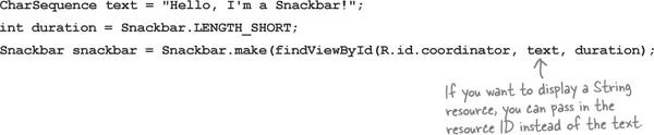
In the above code, we’ve used a view called coordinator to hold the snackbar. This view will usually be your activity’s coordinator layout so that it can coordinate the snackbar with other views.
We’ve set the snackbar’s duration to LENGTH_SHORT, which shows the snackbar for a short period of time. Other options are LENGTH_LONG (which shows it for a long duration) and LENGTH_INDEFINITE (which shows it indefinitely). With any of these options, the user is able to swipe away the snackbar so that it’s no longer displayed.
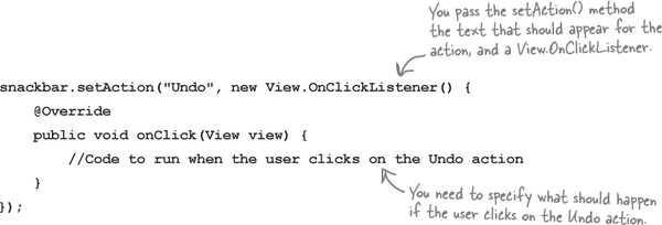
You can add an action to the snackbar by calling its setAction() method. This can be useful if, for example, you want the user to be able to undo an operation they’ve just performed. The setAction() method takes two parameters: the text that should appear for the action, and a View.onClickListener(). Any code you want to run when the user clicks on the action should appear in the listener’s onClick() event:
Once you’ve finished creating the snackbar, you display it using its
snackbar.show();

Here’s our full code for OrderActivity.java, including the code to add a snackbar with an action. Update your version of the code to match our changes (in bold):


When we run the app, a FAB is displayed in OrderActivity. When we click on the FAB, a snackbar is displayed and the FAB moves up to accommodate it. When we click on the Undo action on the snackbar, a toast is displayed.

As you can see, snackbars have a lot in common with toasts, as they’re both used to display messages to the user. But if you want the user to be able to interact with the information you’re showing them, choose a snackbar.

You’ve got Chapter 12 under your belt and now you’ve added the Design Support Library to your toolbox.
You can download the full code for the chapter from https://tinyurl.com/HeadFirstAndroid.

