
MainActivity.java (continued)

The code continues on the next page.

You’ve already seen how tabs help users navigate your apps.
But if you need a large number of them, or want to split them into sections, the navigation drawer is your new BFF. In this chapter, we’ll show you how to create a navigation drawer that slides out from the side of your activity at a single touch. You’ll learn how to give it a header using a navigation view, and provide it with a structured set of menu items to take the user to all the major hubs of your app. Finally, you’ll discover how to set up a navigation view listener so that the drawer responds to the slightest touch and swipe.
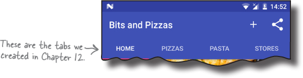
In Chapter 12, we introduced you to the tab layout as a way of making it easy for users to navigate around your app. In that chapter we added a Home screen tab to the Bits and Pizzas app, along with tabs for the Pizzas, Pasta, and Stores categories:
Tab layouts work well if you have a small number of category screens that are all at the same level in the app hierarchy. But what if you want to use a large number of tabs, or group the tabs into sections?
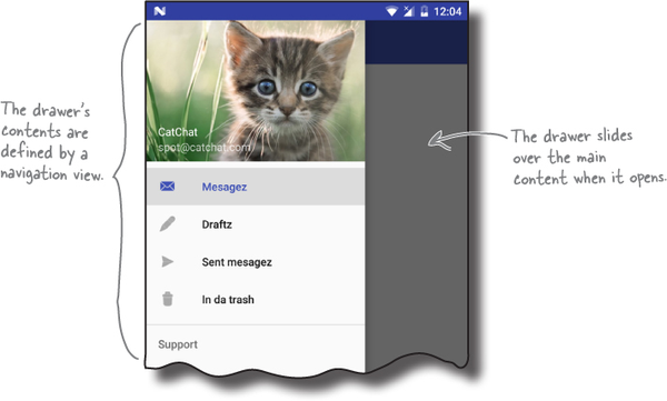
If you want users to be able to navigate through a large number of options, or group them into sections, you might prefer to use a navigation drawer. This is a slide-out panel that contains links to other parts of the app that you can group into different sections. As an example, the Gmail app uses a navigation drawer that contains sections such as email categories, recent labels, and all labels:

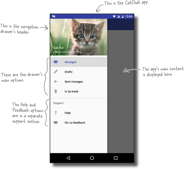
We’re going to create a navigation drawer for a new email app called CatChat. The navigation drawer will contain a header (including an image and some text) and a set of options. The main options will be for the user’s inbox, draft messages, sent items, and trash. We’ll also include a separate support section for help and feedback options:
The navigation drawer is composed of several different components. We’ll go through these on the next page.
You implement a navigation drawer by adding a drawer layout to your activity’s layout. This defines a drawer you can open and close, and it needs to contain two views:
A view for the main content.
This is usually a layout containing a toolbar and a frame layout, which you use to display fragments.
A view for the drawer contents.
This is usually a navigation view, which controls most of the drawer’s behavior.
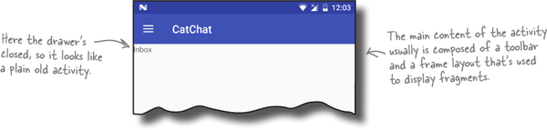
When the drawer’s closed, the drawer layout looks just like a normal activity. It displays the layout for its main content:
When you open the navigation drawer, it slides over the activity’s main content to display the drawer’s contents. This is usually a navigation view, which displays a drawer header image and a list of options. When you click on one of these options, it either starts a new activity or displays a fragment in the activity’s frame layout:
We’re going to create a navigation drawer for the CatChat app. There are four main steps we’ll go through to do this:
Create basic fragments and activities for the app’s contents.
When the user clicks on one of the options in the navigation drawer, we want to display the fragment or activity for that option. We’ll create the fragments InboxFragment, DraftsFragment, SentItemsFragment, and TrashFragment, and activities HelpActivity and FeedbackActivity.

Create the drawer’s header.
We’ll build a layout, nav_header.xml, for the drawer’s header. It will contain an image and text.
Create the drawer’s options.
We’ll build a menu, menu_nav.xml, for the options the drawer will display.
Create the navigation drawer.
We’ll add the navigation drawer to the app’s main activity, and get it to display the header and options. We’ll then write activity code to control the drawer’s behavior.

Let’s get started.

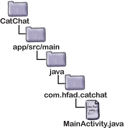
Before we begin, we need a new project for the CatChat app. Create a new Android project with an empty activity for an application named “CatChat” with a company domain of “hfad. com”, making the package name com.hfad.catchat. The minimum SDK should be API level 19 so that it works with most devices. Specify an activity called “MainActivity” and a layout called “activity_main”, and make sure that you check the Backwards Compatibility (AppCompat) option.
We’re going to use components and themes from the v7 AppCompat and Design Support Libraries in this chapter, so we need to add them to our project as dependencies. To do this, choose File→Project Structure in Android Studio, click on the app module, then choose Dependencies. When you’re presented with the project dependencies screen, click on the “+” button at the bottom or right side of the screen. When prompted, choose the Library Dependency option, then select the Design Library from the list of possible libraries. Repeat these steps for the v7 AppCompat Support Library if Android Studio hasn’t already added it for you. Finally, use the OK buttons to save your changes.
Next, we’ll create four basic fragments for the app’s inbox, drafts, sent messages, and trash. We’ll use these fragments later in the chapter when we write the code for the navigation drawer.

We’ll display InboxFragment when the user clicks on the inbox option in the navigation drawer. Highlight the com.hfad.catchat package in the app/src/main/java folder, then go to File→New...→Fragment→Fragment (Blank). Name the fragment “InboxFragment” and name its layout “fragment_inbox”. Then update the code for InboxFragment.java to match our code below:
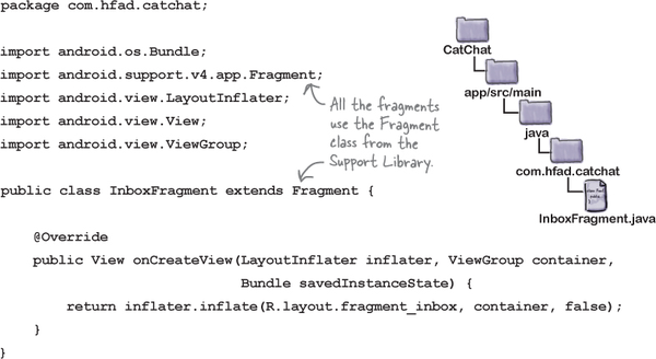
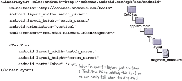
And here’s the code for fragment_inbox.xml (update your version of this code too):


When the user clicks on the drafts option in the navigation drawer, we’ll show DraftsFragment. Select the com.hfad.catchat package in the app/src/main/java folder, and create a new blank fragment named “DraftsFragment” with a layout called of “fragment_drafts”. Then replace the code for DraftsFragment.java with ours below:
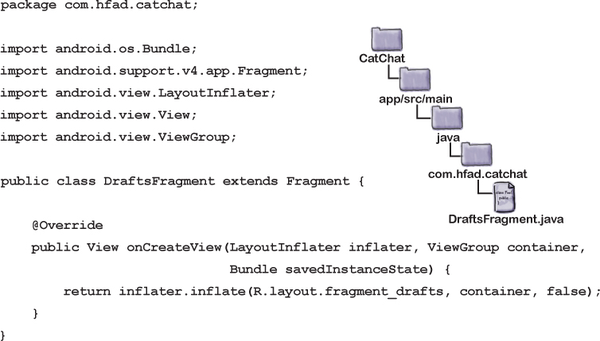
Next replace the code for fragment_drafts.xml too:


We’ll show SentItemsFragment when the user clicks on the sent items option in the navigation drawer. Highlight the com.hfad.catchat package in the app/src/main/java folder, and create a new blank fragment named “SentItemsFragment” with a layout called “fragment_sent_items”. Then update the code for SentItemsFragment.java to match our code below:

And here’s the code for fragment_sent_items.xml (update your version):


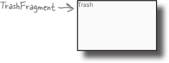
When the user clicks on the trash option in the navigation drawer, we’ll show TrashFragment. Highlight the com.hfad.catchat package in the app/src/main/java folder, and create a new blank fragment named “TrashFragment” with a layout called of “fragment_trash”. Then replace the code for TrashFragment.java with ours below:

Next replace the code for fragment_trash.xml too:

We’ve now created all the fragments we need. Next, we’ll create a toolbar we can include in our activities.

We’re going to add a toolbar in a separate layout so that we can include it in each activity’s layout (we’ll create our activities soon). Switch to the Project view of Android Studio’s explorer, select the app/src/res/main/layout folder, then go to the File menu and choose New → Layout resource file. When prompted, name the layout file “toolbar_main”, then click on OK.
Next, open toolbar_main.xml, and replace the code Android Studio has created for you with the following:

Before we can use the toolbar in any of our activities, we need to change the theme used by your activity. We’ll do this in app’s style resource.
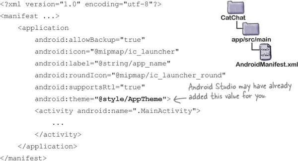
First, open AndroidManifest.xml, and make sure that the value of the theme attribute is set to "@style/AppTheme". Android Studio may have set this value for you; if not, you’ll need to update it to match ours below:
We’ll update the AppTheme style on the next page.
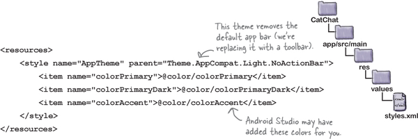
Next, we’ll update the AppTheme style so that it uses a theme of "Theme.AppCompat.Light.NoActionBar". We’ll also override some of the colors that are used in the original theme.
First, open the app/src/main/res/values folder and check that Android Studio has created a file for you called styles.xml. If this file doesn’t exist, you’ll need to create it. To do this, select the values folder, then go to the File menu and choose New → “Values resource file”. When prompted, name the file “styles”, then click on OK.
Next, update styles.xml so that it matches ours:
The AppTheme style uses color resources, and these need to be included in colors.xml. First, make sure that Android Studio has created this file for you in the app/src/main/res/values folder (if it hasn’t, you’ll need to create it yourself). Then update colors.xml so that it matches our code below:

Now that we’ve set up a style so that we can use a toolbar, we’ll create two activities for the help and feedback options in the navigation drawer. We’ll display these activities when the user selects the appropriate option.

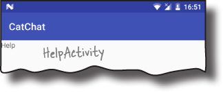
We’ll start by creating HelpActivity. Select the com.hfad.catchat package in Android Studio, then go to the File menu and choose New. Select the option to create a new empty activity, and give it a name of “HelpActivity”, with a layout name of “activity_help”. Make sure the package name is com.hfad.catchat, and check the Backwards Compatibility (AppCompat) checkbox. Then update activity_help.xml so that it matches ours below:

Next update HelpActivity.java to match our version:


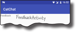
Finally, select the com.hfad.catchat package again and create an empty activity called “FeedbackActivity”, with a layout name of “activity_feedback”. Make sure the package name is com.hfad.catchat, and check the Backwards Compatibility (AppCompat) checkbox. Then update activity_feedback.xml so that it matches ours below:

Then update FeedbackActivity.java to match this version:


We’ve now added all the fragments and activities to our project that the options in the navigation drawer will link to. Next, we’ll create the navigation drawer itself.
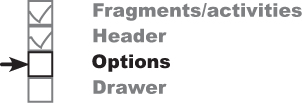
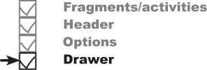
The navigation drawer comprises two separate components:
A navigation drawer header.
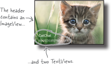
This is a layout that appears at the top of the navigation drawer. It usually consists of an image with some text, for example a photo of the user and their email account.

A set of options.
You define a set of options to be displayed in the navigation drawer underneath the header. When the user clicks on one of these options, the screen for that option is displayed as a fragment within the navigation drawer’s activity, or as a new activity.

We’re going to build these components, then use them in MainActivity to build a navigation drawer. We’ll start with the navigation drawer header.
The navigation drawer’s header comprises a simple layout that you add to a new layout file. We’re going to use a new file called nav_header.xml. Create this file by selecting the app/src/main/res/layout folder in Android Studio, and choosing File→New→Layout resource file. When prompted, name the layout “nav_header”.
Our layout is composed of an image and two text views. This means we need to add an image file to our project as a drawable, and two String resources. We’ll start with the image file.
To add the image file, first switch to the Project view of Android Studio’s explorer if you haven’t already done so, and check whether the app/src/main/res/drawable folder exists in your project. If it’s not already there, select the app/src/main/res folder in your project, go to the File menu, choose the New... option, and then click on the option to create a new Android resource directory. When prompted, choose a resource type of drawable, name it “drawable”, and click on OK.
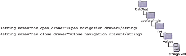
Once you’ve created the drawable folder, download the file kitten_small.jpg from https://git.io/v9oet, and add it to the drawable folder.
Next, we’ll add two String resources, which we’ll use for the text views. Open the file app/src/main/res/values/strings.xml, then add the following resource:

Now that you’ve added the resources, we can write the layout code. You’re already familiar with the code we need to do this, so we’re going to give you the full code on the next page.
Here’s our full code for nav_header.xml; update your version of the file to match ours:

Now that we’ve created the drawer’s header, we’ll create its list of options.

The navigation drawer gets its list of options from a menu resource file. The code to do this is similar to that needed to add a set of options to an app bar.
Before we look at the code to add the options to the navigation drawer, we need to add a menu resource file to our project. To do this, select the app/src/main/res folder in Android Studio, go to the File menu, and choose New. Then select the option to create a new Android resource file. You’ll be prompted for the name of the resource file and the type of resource. Give it a name of “menu_nav”, give it a resource type of “Menu”, and make sure that the Directory name is “menu”. When you click on OK, Android Studio will create the file for you.
Next we’ll add String resources for the titles of our menu items so that we can use them later in the chapter. Open strings.xml and add the following resources:

Next we can start constructing our menu code.
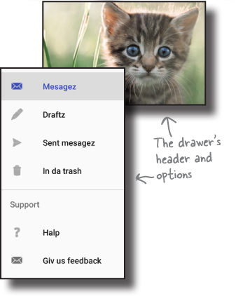
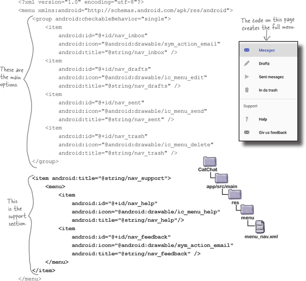
As we said earlier, we want to split the items in our navigation drawer into two sections. The first section will contain options for the main places in the app the user will want to visit: her inbox, draft messages, sent items, and trash. We’ll then add a separate support section for help and feedback options.
Let’s start by adding the main options.

When you design a set of options for a navigation drawer, you generally put the items the user is most likely to want to click on at the top of the list. In our case, these options are for the inbox, draft messages, sent items, and trash.
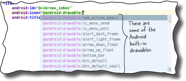
You add items to the menu resource file in the order in which you want them to appear in the drawer. For each item, you specify an ID so you can refer to it in your Java code, and a title for the text you want to appear. You can also specify an icon that will appear alongside the item’s text. As an example, here’s the code to add an “inbox” item:

In the above code, we’re using one of Android’s built-in icons: "@android:drawable/sym_action_email". Android comes with a set of built-in icons that you can use in your apps. The "@android:drawable" part tells Android you want to use one of these icons. You can see the full list of available icons when you start typing the icon name in Android Studio:

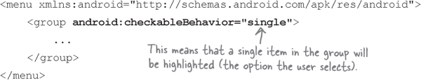
As well as adding menu items individually, you can add them as part of a group. You define a group using the <group> element like this:

This is useful if you want to apply an attribute to an entire group of items. As an example, you can highlight which item in the drawer the user has selected by setting the group’s android:checkableBehavior attribute to "single". This behavior is helpful when you intend to display screens for the items as fragments inside the navigation drawer’s activity (in our case MainActivity), as it makes it easy to tell which option is currently selected:
You can highlight an item in the navigation drawer by default by setting its android:checked attribute to "true". As an example, here’s how you highlight the inbox item:

We’ll show you the full code for the first four menu items on the next page.

We’re going to add the inbox, drafts, sent messages, and trash options to our menu resource file as a group, and highlight the first item by default. We’re using a group for these items because the screen for each option is a fragment, which we’ll display in MainActivity.

Here’s our code; update your version of menu_nav.xml to match ours.

That’s the first group of items sorted. We’ll deal with the remaining items next.

The second set of items in the navigation drawer forms a separate section. There’s a heading of “Support,” along with help and feedback options for the user to click on.
To create this section, we’ll start by adding the Support heading as a separate item. As it’s a heading, we only need to give it a title; it doesn’t need an icon, and we’re not assigning it an ID as we don’t need it to respond to clicks:

We want the help and feedback options to appear within the Support section, so we’ll add them as separate items in a submenu inside the support item:
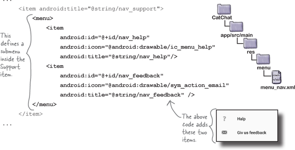
Note that we haven’t put these items inside a group, so if the user clicks one of them, it won’t be highlighted in the navigation drawer. This is because the help and feedback options will be displayed in new activities, not as fragments in the navigation drawer’s activity.
We’ll show you the full menu code on the next page.

Here’s the full code for menu_nav.xml; update your version of the code to match ours:
Now that we’ve added a menu and navigation drawer header layout, we can create the actual drawer.

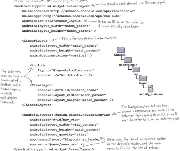
You create a navigation drawer by adding a drawer layout to your activity’s layout as its root element. The drawer layout needs to contain two things: a view or view group for the activity’s content as its first element, and a navigation view that defines the drawer as its second:

There are two key <NavigationView> attributes that you use to control the drawer’s appearance: headerLayout and menu.
The app:headerLayout attribute specifies the layout that should be used for the navigation drawer’s header (in this case nav_header.xml). This attribute is optional.
You use the app:menu attribute to say which menu resource file contains the drawer’s options (in this case menu_drawer.xml). If you don’t include this attribute, your navigation drawer won’t include any items.

We’re going to add a navigation drawer to MainActivity’s layout that uses the header layout and menu we created earlier in the chapter. The layout’s main content will comprise a toolbar and frame layout. We’ll use the frame layout later in the chapter to display fragments.
Here’s our full code for activity_main.xml; update your code to match ours:
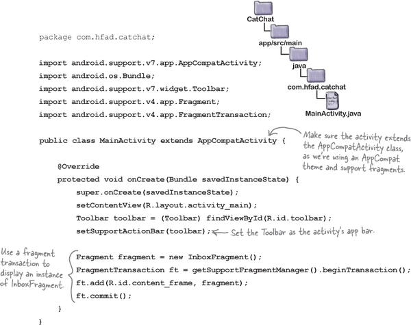
Before we run the app to see how the navigation drawer’s looking, we’ll update MainActivity to display InboxFragment in the frame layout when the activity gets created.

When we created our menu resource file, we set the inbox option to be highlighted by default. We’ll therefore display InboxFragment in MainActivity’s frame layout when the activity is created so that it matches the drawer’s contents. We’ll also set the toolbar as the activity’s app bar so that it displays the app’s title.
Here’s our code for MainActivity.java; replace your version of the code to match ours:
Let’s see what happens when we run the app.


When we run the app, InboxFragment is displayed in MainActivity. When you swipe the app from the left side of the screen (in left-to-right languages like English) the navigation drawer is displayed. The navigation drawer contains a header layout, and the list of options we defined in our menu resource file. The first option is automatically highlighted:
In right-to-left languages, the drawer will appear on the right side of the screen instead.
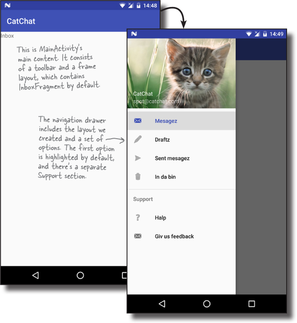
Clicking on the drawer options doesn’t do anything yet, as we haven’t written any code in MainActivity to control how the drawer operates. We’ll do that next.

There are three things we need our activity code to do:
Add a drawer toggle.
This provides a visual sign to the user that the activity contains a navigation drawer. It adds a “burger” icon to the toolbar, and you can click on this icon to open the drawer.

Make the drawer respond to clicks.
When the user clicks on one of the options in the navigation drawer, we’ll display the appropriate fragment or activity and close the drawer.

Close the drawer when the user presses the Back button.
If the drawer’s open, we’ll close it when the user clicks on the Back button. If the drawer’s already closed, we’ll get the Back button to function as normal.
We’ll start by adding the drawer toggle.

The first thing we’ll do is add a drawer toggle so that we can open the navigation drawer by clicking on an icon in the toolbar.
We’ll start by creating two String resources to describe the “open drawer” and “close drawer” actions; these are required for accessibility purposes. Add the two Strings below to strings.xml:
You create the drawer toggle in the activity’s onCreate() method by creating a new instance of the ActionBarDrawerToggle class and adding it to the drawer layout. We’ll show you the code for this first, then add it to MainActivity later in the chapter.
The ActionBarDrawerToggle constructor takes five parameters: the current activity, the drawer layout, the toolbar, and the IDs of two String resources for opening and closing the drawer (the String resources we added above):

Once you’ve created the drawer toggle, you add it to the drawer layout by calling the DrawerLayout addDrawerListener() method, passing the toggle as a parameter:
drawer.addDrawerListener(toggle);
Finally, you call the toggle’s syncState() method to synchronize the icon on the toolbar with the state of the drawer. This is because the icon changes when you click on it to open the drawer:
toggle.syncState();
We’ll add the drawer toggle to MainActivity’s onCreate() method in a few pages.
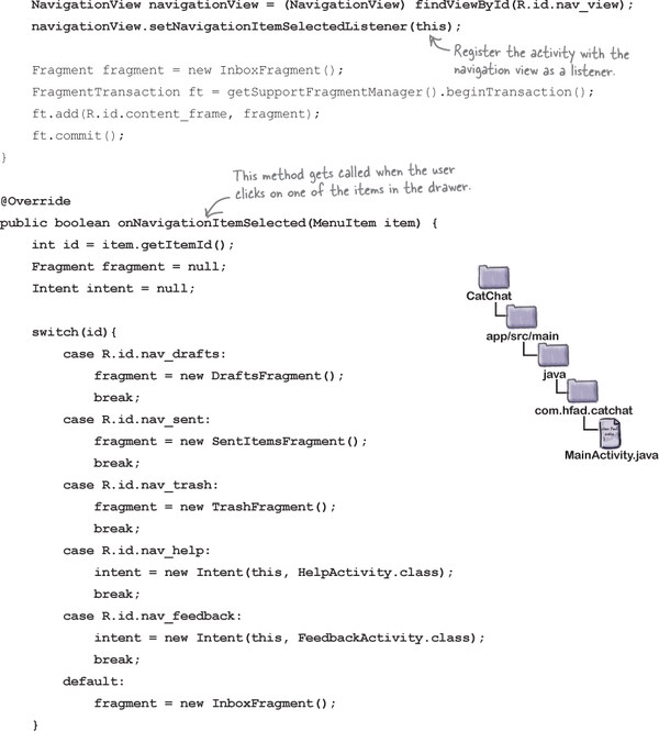
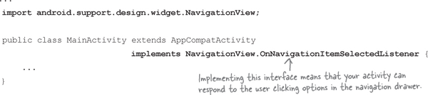
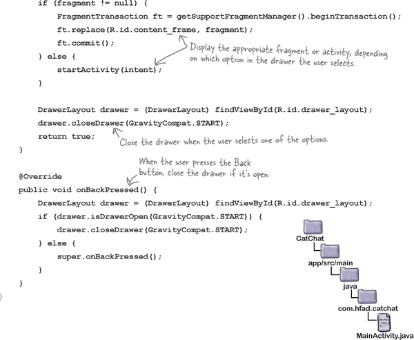
Next, we’ll get MainActivity to respond to items in the navigation drawer being clicked by getting the activity to implement a NavigationView.OnNavigationItemSelectedListener interface. Doing this means that whenever an item is clicked, a new method we’ll create in MainActivity, onNavigationItemSelected(), will get called. We’ll use this method to display the screen for the appropriate option.

First, we’ll get MainActivity to implement the interface using the code below. This code turns MainActivity into a listener for the navigation view:
Next we need to register the listener, MainActivity, with the navigation view so that it will be notified when the user clicks on one of the options in the drawer. We’ll do this by getting a reference to the navigation view in the activity’s onCreate() method, and calling its setNavigationItemSelectedListener() method:

Finally, we need to implement the onNavigationItemSelected() method.

The onNavigationItemSelected() method gets called when the user clicks on one of the items in the navigation drawer. It takes one parameter, the MenuItem that was clicked, and returns a boolean to indicate whether the item in the drawer should be highlighted:

The code in this method needs to display the appropriate screen for the clicked item. If the item is an activity, the code needs to start it with an intent. If the item is a fragment, it needs to be displayed in MainActivity’s frame layout using a fragment transaction.
When you display fragments by clicking on an item in a navigation drawer, you don’t generally add the transaction to the back stack as we did previously. This is because when the user clicks on the Back button, they don’t expect to revisit every option they clicked on in the drawer. Instead, you use code like this:
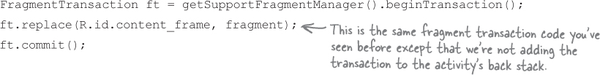
Finally, you need to close the drawer. To do this, you get a reference to the drawer layout, and call its closeDrawer() method:

This closes the drawer so that it slides back to the activity’s start edge.
You now know everything you need in order to write the code for the onNavigationItemSelected() method, so have a go at the following exercise.

Finally, we’ll override what happens when the Back button’s pressed. If the user presses the Back button when the navigation drawer’s open, we’ll close the drawer. If the drawer’s already closed we’ll get the Back button to function as normal.
To do this, we’ll implement the activity’s onBackPressed() method, which gets called whenever the user clicks on the Back button. Here’s the code:

That’s everything we need for MainActivity. We’ll show you the full code over the next couple of pages, and then take it for a test drive.

Here’s the full code for MainActivity.java; update your version of the code to match ours:

The code continues on the next page.
The code continues on the next page.

Let’s see what happens when we run the code.
When we run the app, a drawer toggle icon is displayed in the toolbar. Clicking on this icon opens the navigation drawer. When we click on one of the first four options, the fragment for that option is displayed in MainActivity and the drawer closes; the option for that item is highlighted the next time we open the drawer. When we click on one of the last two options, the activity for that option is started.

We’ve created a fully operational navigation drawer.

You’ve got Chapter 14 under your belt and now you’ve added navigation drawers to your toolbox.
You can download the full code for the chapter from https://tinyurl.com/HeadFirstAndroid.