
Chapter 19: Discovering I/O and Stream Graphs
Within Wireshark, there are numerous tools that help the analyst understand what is happening on the network. In this chapter, we'll first review some of the key elements found in the Statistics menu. So that you are aware of the many choices of built-in reports, we'll cover some general information and ways to assess the data found within a capture. We'll also discover several reports that help assess protocol effectiveness, along with a survey of basic graphs found in the Statistics menu.
We'll then focus on two main ways to visualize traffic, by using input/output (I/O) and Transmission Control Protocol (TCP) stream graphs. We'll explore how to create basic I/O graphs to help visualize network issues such as dropped connections, lost frames, and duplicate acknowledgments (ACKs). We'll then compare the four types of TCP stream graphs and learn how each of the graphs can lend insight into the health of the network.
This chapter will cover the following topics:
Discovering the Statistics menu
Within Wireshark, there are several ways to view data. Some of the data can be viewed in a numeric way, and some can provide a visual, in the form of a graphic. The Statistics menu has several ways to assess the health of your devices and network.
To view all of the choices, drop down the Statistics menu, as shown here:
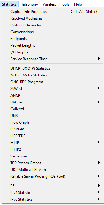
Figure 19.1 – The Statistics menu
In this section, we'll highlight some of the key features of the Statistics menu. We'll first take a look at general statistics and then move to ways we can evaluate protocol effectiveness. We'll then summarize by covering the different ways we can graph and visualize issues within a capture.
To follow along with a few examples, we will use bigFlows.pcap. To get a copy of the file, go to http://tcpreplay.appneta.com/wiki/captures.html#bigflows-pcap. Once there, download and open bigFlows.pcap in Wireshark.
Viewing general information
Within the Statistics menu, there are several menu choices that provide general information about the capture, protocols, and conversations contained in a file.
Some examples include the following options:
- Capture File Properties: This provides general file information, such as packet lengths, size, and time elapsed, along with a section to add comments.
- Resolved Addresses: This provides a summary of resolved hostnames and Internet Protocol (IP) addresses.
- Protocol Hierarchy: This provides a visual of a tiered list of protocols contained in the file.
- Conversations: This provides a list of conversations between two endpoints.
- Endpoints: This lists all of the endpoints found in the capture.
- Packet Lengths: This outlines a list of packet lengths and related information.
Some of the information can provide a snapshot of the traffic on your network. For example, if we go to bigFlows.pcap and select Statistics | Packet Lengths, Wireshark will generate this report:
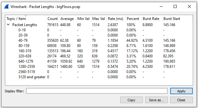
Figure 19.2 – Viewing packet lengths
In addition to being able to view general statistics on traffic flowing across the network, Wireshark has several ways to assess the behavior of specific protocols.
Assessing protocol effectiveness
Wireshark can dissect hundreds of protocols. In addition, the Statistics menu offers a variety of ways to analyze the effectiveness of several protocols.
One way to assess the health of the network is by viewing the Service Response Time of the different protocols interacting on the network. This menu choice offers a submenu of multiple protocols, as shown in the following screenshot:
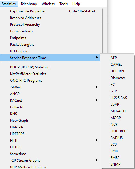
Figure 19.3 – Service Response Time menu
When using this option, Wireshark will evaluate the time between a request and a response for a particular protocol. For example, to generate statistics on Server Message Block (SMB), return to bigFlows.pcap and select Statistics | Service Response Time | SMB, which will result in the following report:
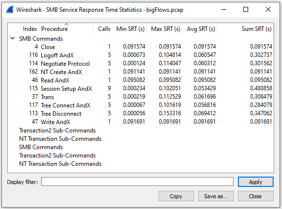
Figure 19.4 – Service response time for SMB
The Statistics menu has many other options to evaluate protocols, including the following options:
- DHCP (BOOTP): This provides metrics on the effectiveness of the Dynamic Host Configuration Protocol (DHCP).
- BACnet: This provides details used when evaluating Building Automation and Control Network (BACnet) traffic.
- DNS: This provides metrics on the effectiveness of the Domain Name System (DNS) transactions.
- HTTP: This allows you to view details of Hypertext Transfer Protocol (HTTP) statistics. This menu choice includes submenu selections, as shown in the following screenshot:
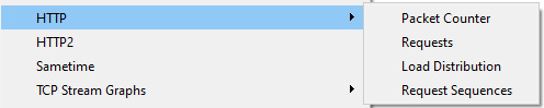
Figure 19.5 – Viewing HTTP submenu choices
The Statistics menu also has a UDP Multicast Streams report that provides the ability to monitor metrics for multicast User Datagram Protocol (UDP). This is a valuable tool, as multicast streams sometimes create bursty traffic that can interfere with the effectiveness of a device.
In addition, you can also view statistics for IP version 4 (IPv4) and IP version 6 (IPv6), as outlined in Chapter 18, Subsetting, Saving, and Exporting Captures.
One of the more impressive options in Wireshark is the ability to create graphs. Within the Statistics menu, you'll find several opportunities to generate a graph to showcase a data flow.
Graphing capture issues
Using graphs to illustrate your point is powerful, as the visual can cut right to the core of the issue. In addition, using graphs instead of plain data will more easily engage your audience.
One type of graph you can use is a Flow Graph, which shows the data exchanged between hosts. To see an example of what you might see, go to bigFlows.pcap. In the display filter, enter udp.stream eq 22 and run the filter. Once complete, go to Statistics | Flow Graph. Wireshark will then display the graph. In the lower left-hand corner of the graph, select Limit to display filter, which will then display the following output:
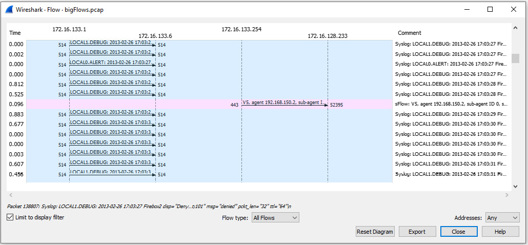
Figure 19.6 – Displaying a flow graph
Once run, the Flow Graph setting has several options to display the data or export the data in a variety of different formats, such as an image or a Portable Document Format (PDF) file.
Additionally, you can also run other graphs in the Statistics menu, as follows:
- I/O Graph will show traffic flowing in both directions.
- TCP Stream Graph will show traffic flowing in one direction.
Either graph will help to provide a visual of common issues, such as dropped frames, duplicate ACKs, and interruptions in the data flow.
In the next section, we'll evaluate how to create a few basic I/O graphs so that we can visualize specific types of traffic while troubleshooting the network.
Creating I/O graphs
An I/O graph provides a way to analyze traffic flowing in both directions and can be created using a live capture or an existing trace file.
To generate graphs on a specific stream, return to bigFlows.pcap. In the display filter, enter tcp.stream eq 198 and run the filter. Once Wireshark presents the information, we'll reduce the file by going to File | Export Specified Packets…, which will bring up this window:
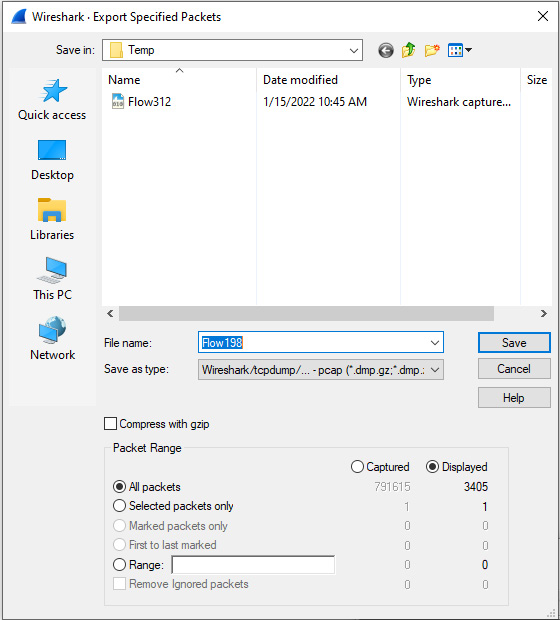
Figure 19.7 – Export Specified Packets window
Make sure you have selected All Packets | Displayed, as shown in Figure 19.7. Then, save the file as Flow198.pcap.
Close bigFlows.pcap and then open Flow198.pcap, where we will see evidence of a congested network.
Examining errors
Within Flow198.pcap, you'll see several areas of concern, as the intelligent scroll bar is littered with black lines, which generally indicates signs of latency. By clicking on one of the black striped areas on the scroll bar, we see TCP DUP ACK (duplicate ACKs) and TCP Fast Retransmissions, as shown in the following screenshot:
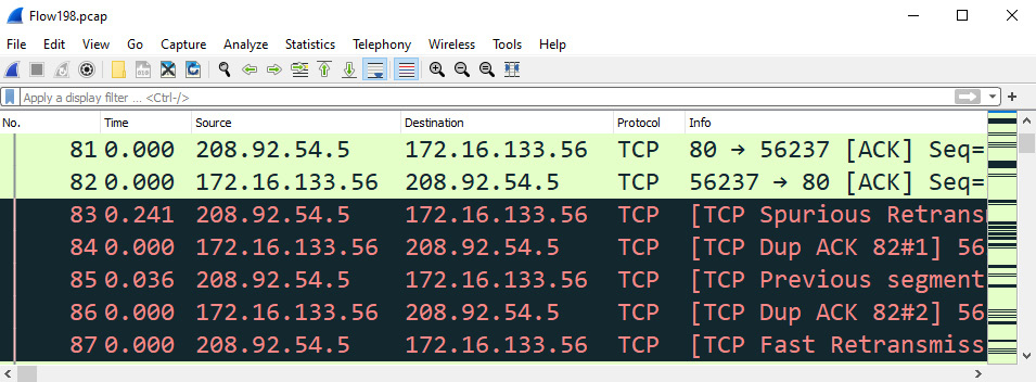
Figure 19.8 – Indications of a congested network
Next, select the Expert Information icon, found on the lower left-hand side of the interface. Once there, narrow the focus by displaying only the Note section, as shown in the following screenshot:
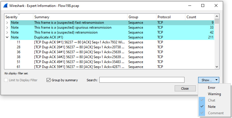
Figure 19.9 – Viewing the Expert Information Note section
Within the Note section, we see that Wireshark suspects that the following are contained within the capture:
- Fast retransmissions
- Spurious retransmissions
- Retransmissions
- Duplicate ACKs
All are indicative that the traffic is not moving as expected. Next, let's create a simple I/O graph of traffic that contains duplicate ACKs.
Graphing duplicate ACKs
While in the Flow198.pcap file, enter tcp.analysis.duplicate_ack in the display filter, and then press Enter. Next, go to Statistics and select I/O Graph. Once run, Wireshark will automatically assume you would like to view a graph of the filtered capture and display the results as shown:
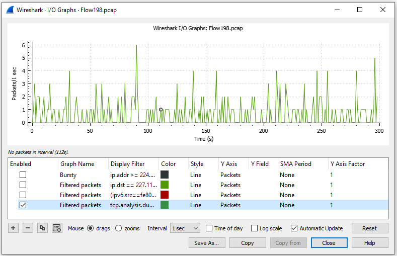
Figure 19.10 – I/O graph showing duplicate ACKs
While in the I/O graph, you'll see several areas where you can modify the settings.
Modifying the settings
Across the top of the screen, you will see the generated graph. In the lower panel, you'll find a list of graphs and column headers that allow you to manipulate the way Wireshark presents the data. Below that, you will find an area where you can further configure the graph, along with providing the ability to add or remove an existing graph.
Let's start by reviewing the column headers as shown in an I/O graph.
Understanding basic column headers
For each graph, you can modify and/or view the field values, as described here:
- Enabled: This is a checkbox where you can select whether or not to display the graph.
- Graph Name: By default, Wireshark generates a name; however, you can modify and personalize the field value by double-clicking on the name.
- Display Filter: This is a filter that you can use to narrow the results to a specific type of traffic. If you do not enter a display filter, all packets will be shown by default.
- Color: Indicates the color of the graph, which can be modified.
- Style: Provides a way to modify and present the data. To see all options, drop down the caret on the right-hand side of the field, which will display a list of options, as shown in the following screenshot:
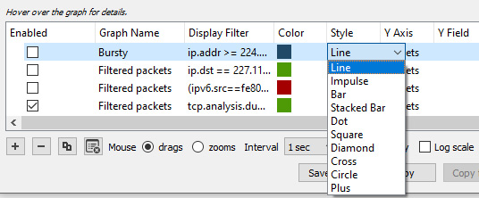
Figure 19.11 – I/O graph style options
- Y Axis: Offers the ability to modify the Y Axis to be either Packets, Bytes, Bits, or advanced selections, such as SUM(Y Field) and COUNT(Y Field). If you drop down the caret, you will see the following choices:
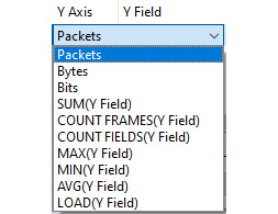
Figure 19.12 – I/O graph y-axis options
- Y Field: This provides the ability to specify a field value when using advanced selections in the Y Axis.
- SMA Period: This provides the ability to specify the interval of a simple moving average (SMA) time period.
- Y Axis Factor: Defaults at 1, as changing this to another integer will modify how Wireshark presents the data.
In addition to the field values for each of the graphs, there is a section where you can add or remove graphs, along with completing other tasks.
Adding, removing, and duplicating graphs
Underneath the list of graphs, we see several options including the following:
- Add a new graph: By selecting the + symbol, a new line will appear in the graph area. This will default as All Packets; however, once created, you can modify the newly created graph.
- Remove a graph: If you want to remove a graph, select the graph by clicking on the name of the graph and then select the – symbol.
- Copy a graph: If you want to copy a graph, select the graph by clicking on the name of the graph and select the duplicate symbol, which is the third symbol from the right.
- Remove all graphs: To remove all graphs, select the clear all graphs symbol, which is the fourth symbol from the left.
Along with having the ability to modify the settings, there are additional options to explore as well. Options include adding a new graph, changing the appearance of a graph, or zooming in on a specific data point.
Exploring other options
Once in a graph, you can manipulate the appearance, add more graphs, and/or move around to better visualize the data. To explore some of these options, return to the duplicate ACKs graph you created for Flow198.pcap, as shown in Figure 19.10, and complete the following actions:
- Select the Add a new graph icon, which will create an All Packets graph by default.
- Enable the graph by clicking on the square to the right of the Graph Name option.
Once the graph is active, you can modify the appearance by changing the style. For example, change the style of the All Packets graph to dots using the drop-down menu, as shown here:
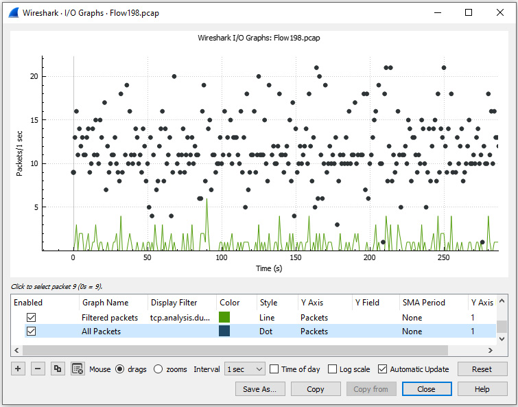
Figure 19.13 – Visualizing two I/O graphs
After you are satisfied with the appearance, you can complete the following actions:
- Select drags to generate a hand symbol and move about the screen.
- Lasso a section and select zooms to zero in on a specific area in the graph.
- Change the Interval option anywhere from 1 millisecond (ms) to 10 minutes.
- Display the Time of day the data was captured.
- Toggle to a logarithmic y axis instead of the (default) linear y axis by selecting Log scale.
- Continuously update the data during a live capture by selecting Automatic Update, as shown in the lower right-hand corner of the interface.
As with most options in Wireshark, you can save the graph in a variety of formats, such as an image or PDF file. In addition, once you have created a graph, Wireshark will save the results in your Configuration Profile settings, which can be exported so that you can share the graph with a co-worker.
As evidenced, there are a variety of ways we can view data with an I/O graph. In the next section, let's take a look at how we can create a TCP stream graph.
Comparing TCP stream graphs
While an I/O graph provides the ability to visualize traffic flowing in both directions, there are times you want to focus on the traffic flowing in a single direction. That is where the value of TCP stream graphs come into play. The graphs will help provide ways to visualize the different streams in a capture.
To see what's available, go to Statistics | TCP Stream Graphs, as shown here:
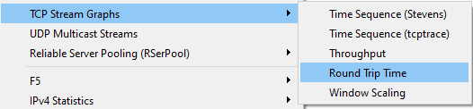
Figure 19.14 – TCP Stream Graphs menu
Once in the TCP Stream Graphs submenu, you can see there are multiple choices. You can select any of the graphs, which will bring up a single window. Once in the window, you can select any one of the five choices.
Let's start with viewing time sequence graphs.
Using time sequence graphs
A time sequence graph will chart sequence numbers over time. When you first launch the graph, you will need to make sure you select the correct direction, as only one direction will be of value.
Within the TCP Stream Graphs submenu, you will see the following two choices:
- Time/Sequence (Stevens)
- Time/Sequence (tcptrace)
Although they have a similar function, there are subtle differences. Either one will help you spot delays or interruptions in the data transfer.
When viewing a graph of sequence numbers over time, we should see a steady flow of data. In this section, we'll step through an example of a steady stream of data using a Stevens graph. We'll then use a tcptrace graph, a more complex option that can show selective ACKs (SACKs) within the graph.
So that you understand the difference, let's compare the two types, starting with a Stevens graph.
Understanding the Stevens graph
A Stevens graph allows us to view the sequence numbers over time on a single stream, using a simple format with no additional options.
To see an example, return to the Flow198.pcap file. Go to Statistics | TCP Stream Graphs | Time Sequence (Stevens), which will result in the following output:
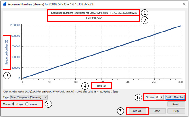
Figure 19.15 – A steady transfer of data
Once in the graph, you will see the following elements, which correspond to the numbers indicated in Figure 19.15:
- This line indicates the details and direction of the stream.
- This line identifies the name of the file.
- Here, we find the y axis, which represents the sequence numbers in bytes (B).
- Here, we find the x axis, which represents the time shown in seconds (s).
- The mouse drags and zooms options, which work in the following manner:
- drags allows you to move the graph. In addition, when you click on a specific packet, Wireshark will adjust the packet list to go directly to that packet.
- zooms can be used to lasso an area of interest and zoom in on a particular packet(s).
- This option will allow you to complete the following:
- Stream identifies the stream number.
- Switch Direction allows you to switch directions to see the traffic coming from either the client or the server.
- Save As… can be used to save the graph in a PDF or image format, to use in a report, or share with a co-worker.
In addition to the Stevens graph, you can also run a tcptrace graph, which is similar, however presents different options when working with the graph.
Outlining a tcptrace graph
A tcptrace graph is based on the TCP trace utility, which gathers traffic on a port and outputs the results.
Return to bigFlows.pcap. Once open, enter tcp.stream eq 634 in the display filter. Select Statistics | TCP Stream Graphs | Time / Sequence (tcptrace) from the menu. A graph will appear, as shown in the following screenshot:
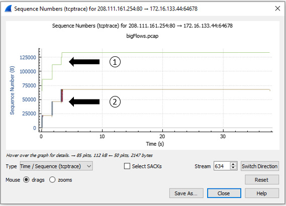
Figure 19.16 – Viewing a tcptrace graph for stream 634
Once in the graph, you will note how Wireshark keeps track of the following information:
- Receive window, shown as number 1 in Figure 19.16, is what the client can accept.
- TCP segment, shown as number 2 in Figure 19.16, is the data that is being transferred.
In addition, along the bottom of the window, you will see a checkbox labeled Select SACKs. Let's step through the process of enabling this option.
Viewing SACKs
During a three-way handshake, the client and server agree on the parameters of the conversation. In most cases, each side will include TCP options to further define the variables used during the data transfer. One of the options is requesting to use Select SACKs during the data exchange. When used, the server will keep sending data, even if it's not in the correct order. The client will notify the sender only if there are missing packets, which helps prevent the need for retransmissions.
To drill down on a group of SACKs, select zooms in the lower left-hand corner of the screen. Once selected, lasso the grouping of packets on the left-hand side of the screen, as shown in the following screenshot:
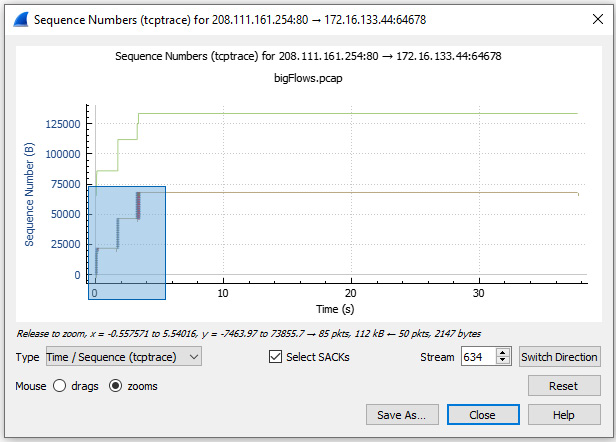
Figure 19.17 – Zooming in on SACKs
Alternate between zooms and drags with the mouse until you zero in on the following view:
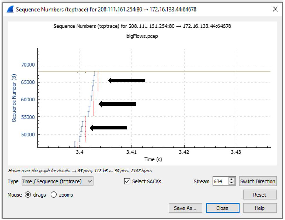
Figure 19.18 – Viewing SACKs
After zooming in on the graph, you will see several vertical lines below the TCP segment line. This represents the SACKs within the capture.
Note
If you do not get the desired results, you can select Reset, as shown on the lower right-hand side of the screen in Figure 19.18.
Once you have drilled down, place your cursor on one of the lines. When you select a data point, Wireshark will mirror your selection so that you can drill down on a single packet. As shown in the following image, I placed my cursor on a SACK line. Below the graph, you can see the text Click to select packet 16479, as highlighted in the following screenshot:
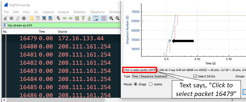
Figure 19.19 – Drilling down on a specific packet
Seeing a few SACKs is not uncommon; however, an excessive amount could mean trouble on the network. In addition, the receiving host will need to hold numerous segments within memory, which could result in the host bogging down or even crashing.
Along with providing the ability to view the transfer of data over time, another helpful tool is a throughput graph.
Determining throughput
Throughput is how much data is sent and received (typically in bits per second, or bps) at any given time. In Wireshark, we can measure throughput as well as goodput, which is useful information that is transmitted.
Using bigFlows.pcap, enter tcp.stream eq 634 in the display filter. Then, select Statistics | TCP Stream Graph | Throughput, which will generate a graph, as shown in the following screenshot:
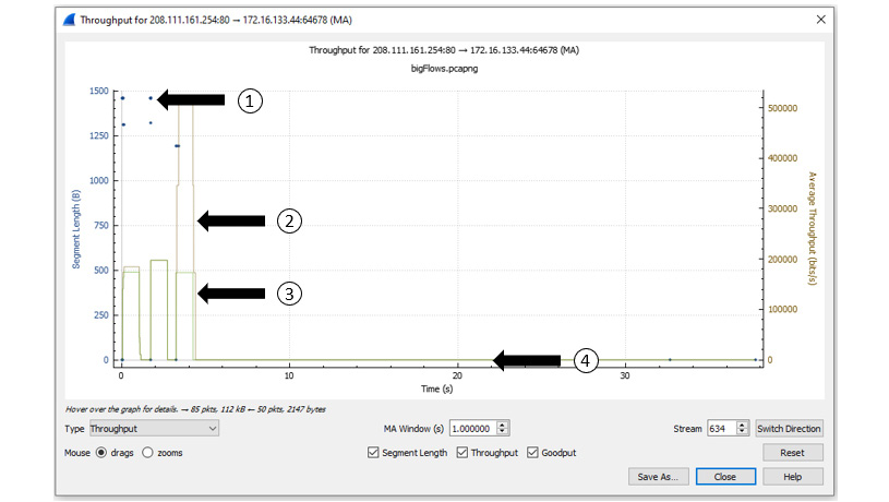
Figure 19.20 – Viewing throughput
This single graph tells us a great deal about what is happening in this capture. Once generated, I selected all three options shown along the bottom of the screen in Figure 19.20. Within the screenshot, I have identified several aspects of the graph, as follows:
- The first identifier represents the segment length, which is the data that follows the TCP header, and any options.
- The second identifier represents the throughput, which is the amount of data that is getting through.
- The third identifier represents the goodput, which is the amount of useful data within the capture.
- The fourth identifier shows all lines at 0, meaning no data is being transferred.
Another useful TCP stream graph is round-trip time (RTT), which is how long it takes to make a complete round trip from A to B, and then from B to A.
Assessing Round Trip Time
In an ideal world, the RTT will be steady, as outlined in Chapter 17, Determining Network Latency Issues, in the Grasping latency, throughput, and packet loss section. However, that is not always the case.
To view an RTT graph, return to the Flow198.pcap file. Select Statistics | TCP Stream Graph | Round Trip Time, which will generate a graph like the one shown here:
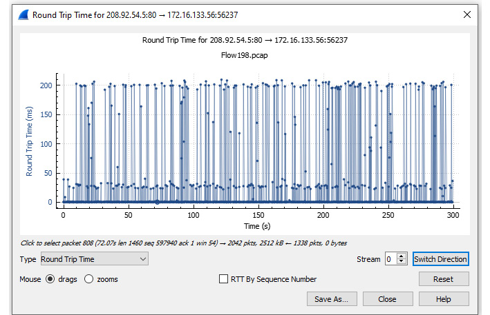
Figure 19.21 – Viewing a RTT graph
Once in the graph, you can view the data using either RTT by Sequence Number or RTT by Time. In this case, I used RTT by Time, which is the default. Within the graph we see the following elements:
- The y axis is the RTT in ms.
- The x axis is the sequence number.
To see the variance in this packet capture, zoom in on the beginning of the graph, as follows:
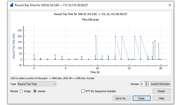
Figure 19.22 – Zooming in on RTT for Flow198.pcap
Once you zoom in, switch to drags and examine the variation in the RTT. In addition, you can also move the graph or zero in on a specific packet.
Next, let's investigate how we can visualize a window scaling graph.
Evaluating window scaling
During the exchange of data, each endpoint continuously advertises a window size (WS) value (in bytes) that indicates how much data they can accept. Window scaling is a value that expands the stated WS by providing a multiplier that more accurately reflects the true WS.
Return to bigFlows.pcap and enter tcp.stream eq 634 in the display filter. Select Statistics | TCP Stream Graph | Window Scaling, as shown here:

Figure 19.23 – Viewing a window scaling graph
This graph tells a few things about this capture. I selected both options shown along the bottom of the graph, as outlined here:
- The first identifier represents the Receive Window (Rcv Win), which represents the advertised WS of the endpoint receiving data.
- The second identifier represents the Bytes Out, which indicates the bytes in flight.
After the peak in the Bytes Out line, we see a flattening of both the Rcv Win and Bytes Out line. This generally means that the receiver has not adjusted the WS and is easily able to accept a continuous stream of data.
This graph can be useful if you are experiencing bottlenecks. For example, you can monitor the receive window of a server to help you assess if the value is shrinking, growing, or staying the same over time.
Summary
Wireshark has a number of useful tools and graphs that help network administrators visualize what's happening on the network, at any given time, using a variety of methods. In this chapter, we began with an overview of various options in the Statistics menu, such as general information on the packet capture, protocol hierarchy, and the ability to assess the health of numerous protocols.
We then investigated I/O graphs and learned how to utilize different filters and expressions, create differently colored graphs, and view several graphs concurrently. Additionally, we evaluated the power of using a TCP stream graph. By using examples, we first evaluated a time sequence graph and compared the differences between a Stevens and a tcptrace graph. We then summarized by learning the value of determining throughput, assessing RTT, and monitoring window scaling.
In the next chapter, you will discover CloudShark (CS), an online packet analysis tool with which you can view captures in your browser, from anywhere there is internet access. We'll cover the benefits of using CS to share and analyze packet captures with your team. You'll get a good understanding of the filters, graphs, and analysis tools included within CS. In addition, we'll take a look at the many online repositories in order to locate sample captures, to enhance our packet analysis skills.
Questions
Now, it's time to check your knowledge. Select the best response to the following questions and then check your answers, which can be found in the Assessment appendix:
- To view a visual of a tiered list of protocols contained in the file, go to Statistics | _____.
- Capture File Properties
- Resolved Addresses
- Protocol Hierarchy
- Endpoints
- Wireshark has several graphs you can run to visualize traffic. One type of graph you can use is a _____, which shows data exchanged between hosts.
- BACnet graph
- Flow graph
- BOOTP graph
- Display graph
- To view a graph showing the traffic flowing in both directions use a(n) _____.
- I/O graph
- TCP stream graph
- BOOTP graph
- Display graph
- Once you have created an I/O graph, Wireshark will save the results in your _____, which can be exported so that you can share the graph with a coworker.
- Protocol chain
- Stream repository
- Boot file
- Configuration profile
- If, when viewing a graph of sequence numbers over time, you need to see any SACKs within the stream, you should use a _____ graph.
- BOOTP
- TCP stream (Stevens)
- TCP stream (tcptrace)
- Display g
- _____ is how much data is sent and received (typically in bits per second) at any given time.
- Throughput
- Throttle
- SACK
- Protocol chain
- During the exchange of data, each endpoint continuously advertises a _____ value (in bytes), which indicates how much data they can accept.
- RTT
- WS
- SACK
- BOOTP