
Stiletto operate around a work philosophy of “quality, surprise and experimentation” say founding partners Stefanie Barth and Julie Hirschfeld. They have had great success translating their creativity into a broad range of applications, from motion to print, commercial to more experimental. When approaching a new project, they identify the most obvious solutions and immediately cast them aside. This begins to function like ‘creative stepping stones’, allowing their ideas to move as fast as possible to an unexpected point in the distance. The results are identifiable within the conventions of form and function, yet on closer inspection are conceptually embellished with abstract ‘twists’. The creative liberties that they take are justified by the clear conceptual nature of their projects.
In the creative melting pot of Lower East Side Manhattan, the neighbouring studios and shared ambition of Stiletto and what was then asFOUR provided the foundation of the relationship. From a simple commission to design an invitation in 2004, mutual appreciation quickly developed into today’s solid partnership. “It’s very nice that they respect our work as much as we do theirs,” says Barth. “That’s what keeps the relationship interesting.”
While there is a certain advantage to working with a single creative director, asFOUR work as a collective of four. What might be considered a precarious situation for Stiletto actually provides a framework for open discussion. “I believe many fashion designers have an idea of what they want to represent, so collaboration seems to be more common,” says Barth. Encouraged by asFOUR to explore the forms of Arabic script, Stiletto integrated and abstracted the key letterforms into a distinct, unified mark. Supplementary typography is minimal and functional to not distract from the logo.
In 2005 asFOUR split acrimoniously, with one member leaving the collective. Because of the implications for the brand name, Stiletto were asked to rebrand the remaining members into threeASFOUR. “The idea was to keep continuity – apart from the logo, the identity was not changed,” says Barth. Skilfully and succinctly, Stiletto navigated this challenge by nestling a ‘3’ beside the original mark. While maintaining visual consistency, they were able to enhance the overall form. The result is more than an improvement, it feels like it was always meant to be.
Being the creators of the original identity grants Stiletto greater freedom to develop the brand’s potential further. From dramatic variation in scale to cropping the edges of the mark, they continue to progress the visual presence of threeASFOUR, a vital requirement in the seasonal fashion industry. “We try to understand how they like to be seen and then we create a graphic language/ vocabulary to express it,” says Barth. Maintaining focus on the end product, ‘construction, experimental and modular’ are recurring keywords for threeASFOUR and can be seen throughout Stiletto’s work.
Stiletto do not subscribe to the perceived advantages of working with a creative client; they put more stock in “personality, vision and articulation”. Well equipped with an internal structure of collaboration, threeASFOUR are able to inspire a collective dialogue about their work. In this environment of mutual respect the process continually evolves to suit each project individually. Immediate approval of the design concept is not a measure of success as further revisions add complexity to the end product. Both Stiletto and threeASFOUR appreciate that if all the diverse members involved can be satisfied, the end result will have broad appeal.
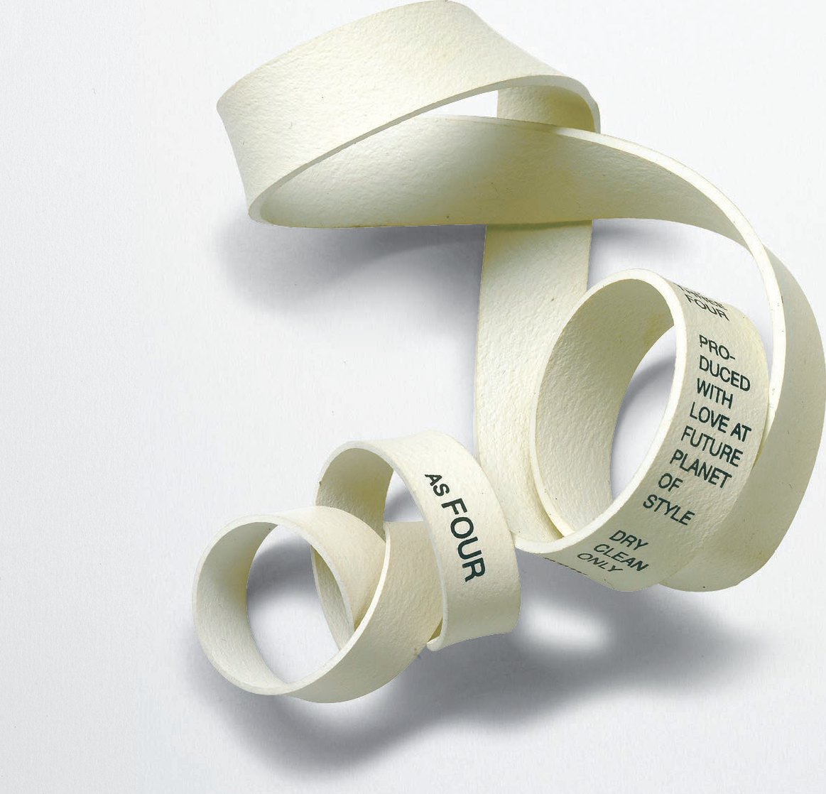
Used for labelling the garments, industrialsized rubber bands were printed with all the sizes and cuts. “One label for all.”
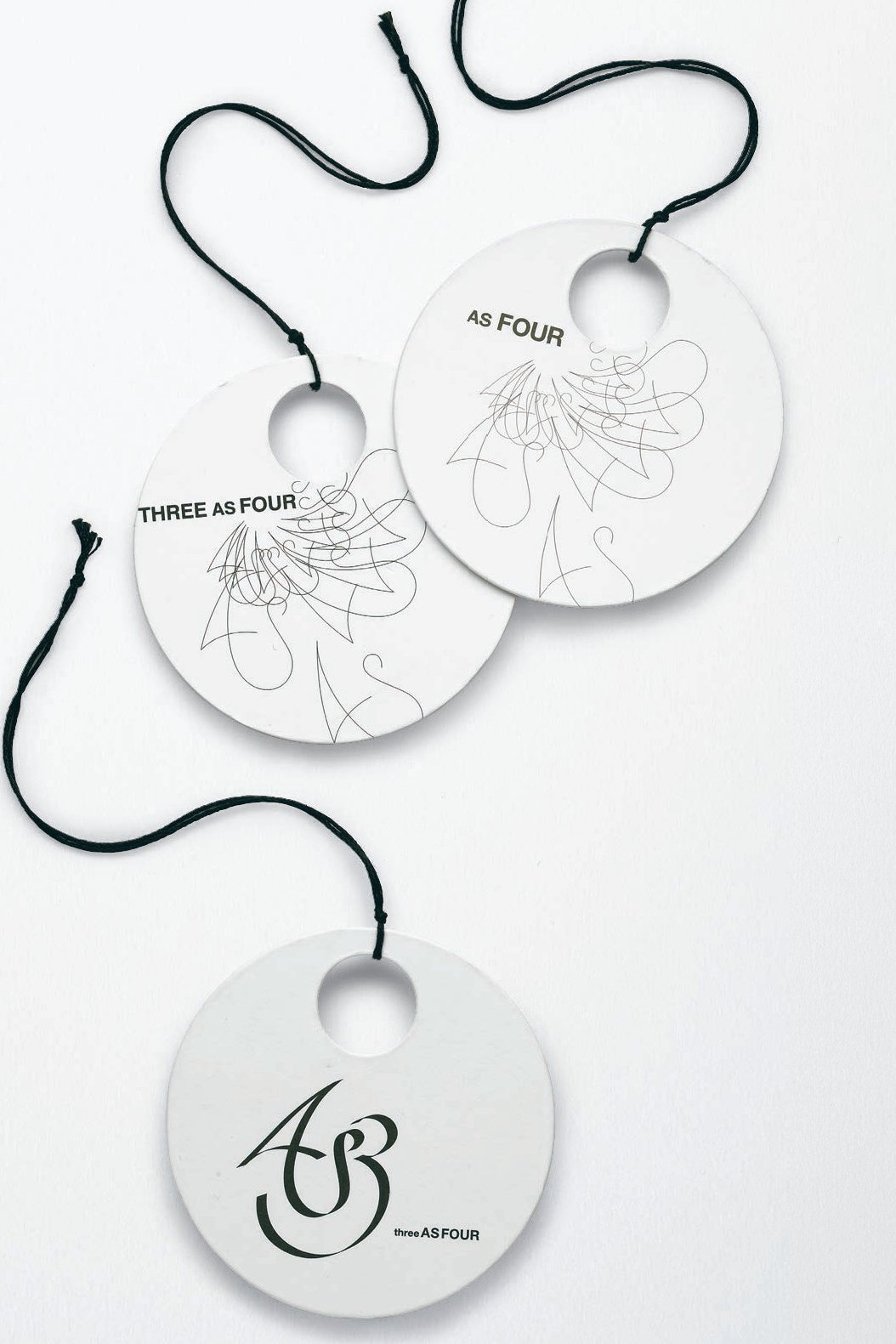
The same circle format for the swing tag, which was inspired by an early handbag design, is maintained here through three stages of the logo.
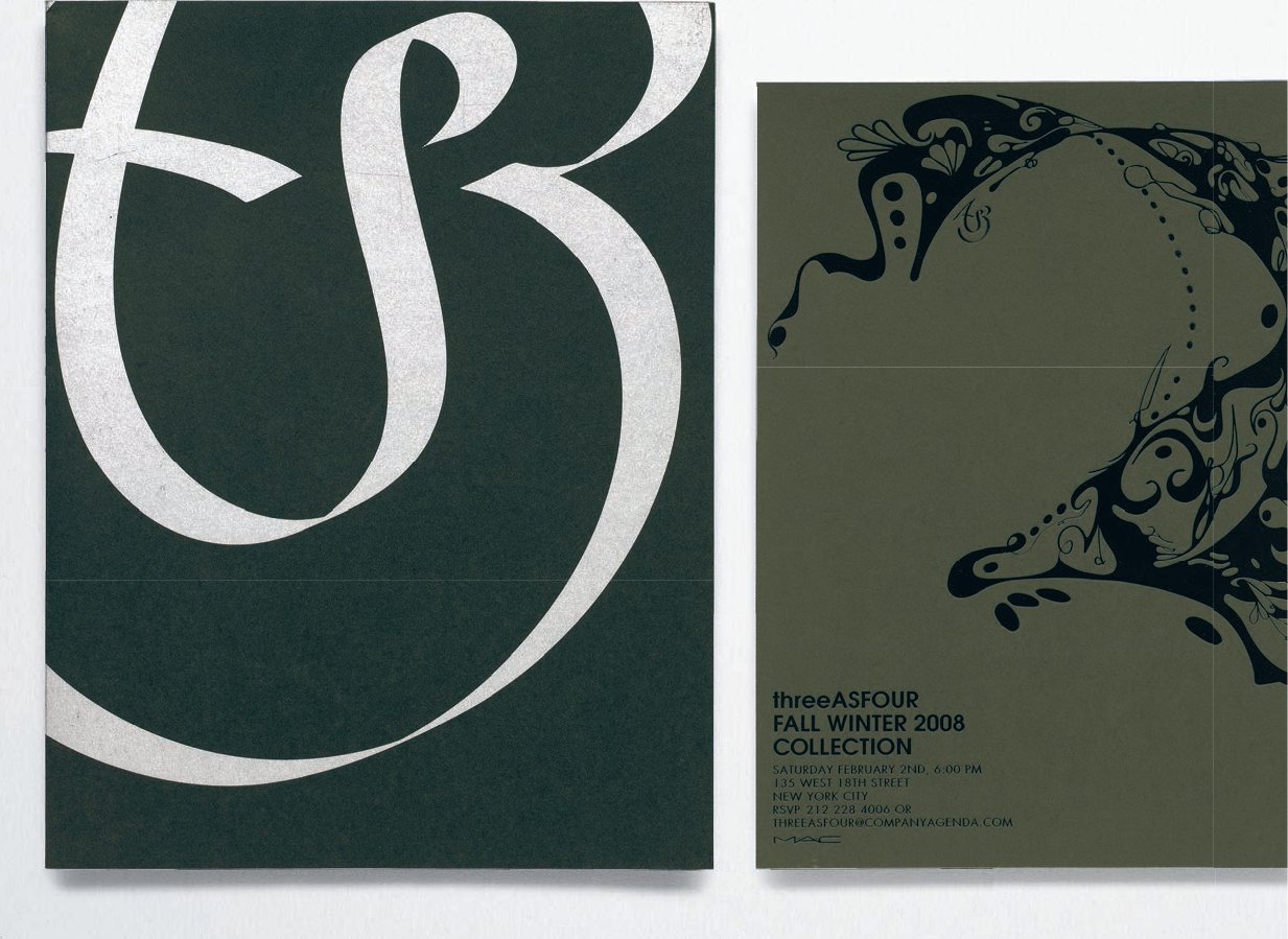
Stiletto manipulate the size and cropping of the logo with confidence. This was a book project that had several, different-sized booklets; as the covers became smaller the logo was cropped more. With black foil stamping on black paper the Autumn/Winter 2008/09 collection invitation saw the logo completely integrated into the illustration.