
In pursuit of a more progressive and personally satisfying creative practice, in 2002 Claus Due decided to establish his own studio. Based in Copenhagen, its name – Designbolaget – translates as ‘design company’ and is a play on that of Sweden’s state-operated alcohol retailer Systembolaget (‘system company’). With previous experience in advertising, Due wanted to refocus his attention on graphic design as the central component of his creative process. Although he works predominantly in print, he operates across a wide remit of art, music and fashion projects to satisfy his diverse interests. With a keen sense of wit and creative enthusiasm, Designbolaget strike the perfect balance between function and concept.
The Scandinavian fashion industry is strong but, apart from a few major exceptions, it is relatively insular. In direct contrast to the stereotypical statuesque, lacquered aesthetic, Designbolaget produce work that has a natural clarity and honesty. Without the gloss, there is an ease to the message; it has an accessibility that is balanced with aspiration. “When you work with fashion clients it is much more about intuition and good taste, you can feel if it is right. There is a shared language. It is OK to talk about feelings and whether something is nice or not nice,” says Due. He acknowledges that the larger financial investment associated with advertising means ‘feelings’ are not enough; there has to be a quantifiable strategy, which leaves little room for the risk-taking required for creative innovation.
Won Hundred is a men’s and women’s fashion line that produces seasonal collections supported by an extensive range of basics. Subtle themes run through the designs for each collection, leaving room for personal creative interpretation. It was launched in 2004 and Designbolaget were called in three years later. Typical of the relative close quarters of the Copenhagen creative industry, both studio and client are on the same street. This physical proximity strengthens the relationship between them and a close rapport has developed.
Designbolaget are responsible for the full range of Won Hundred’s print material, and in the absence of a regular catwalk presentation the lookbooks have an added importance in communicating the company’s direction each season. The creative dynamic of producing them is enhanced by Femmes Regionales, who collaborate on the art direction and style the photography. While Won Hundred are involved throughout the production of the books, they do not participate directly in the creative process, entrusting Designbolaget and Femmes Regionales to drive the project forward. “They are sharp clients, they are really focused but they rely on us as well.”
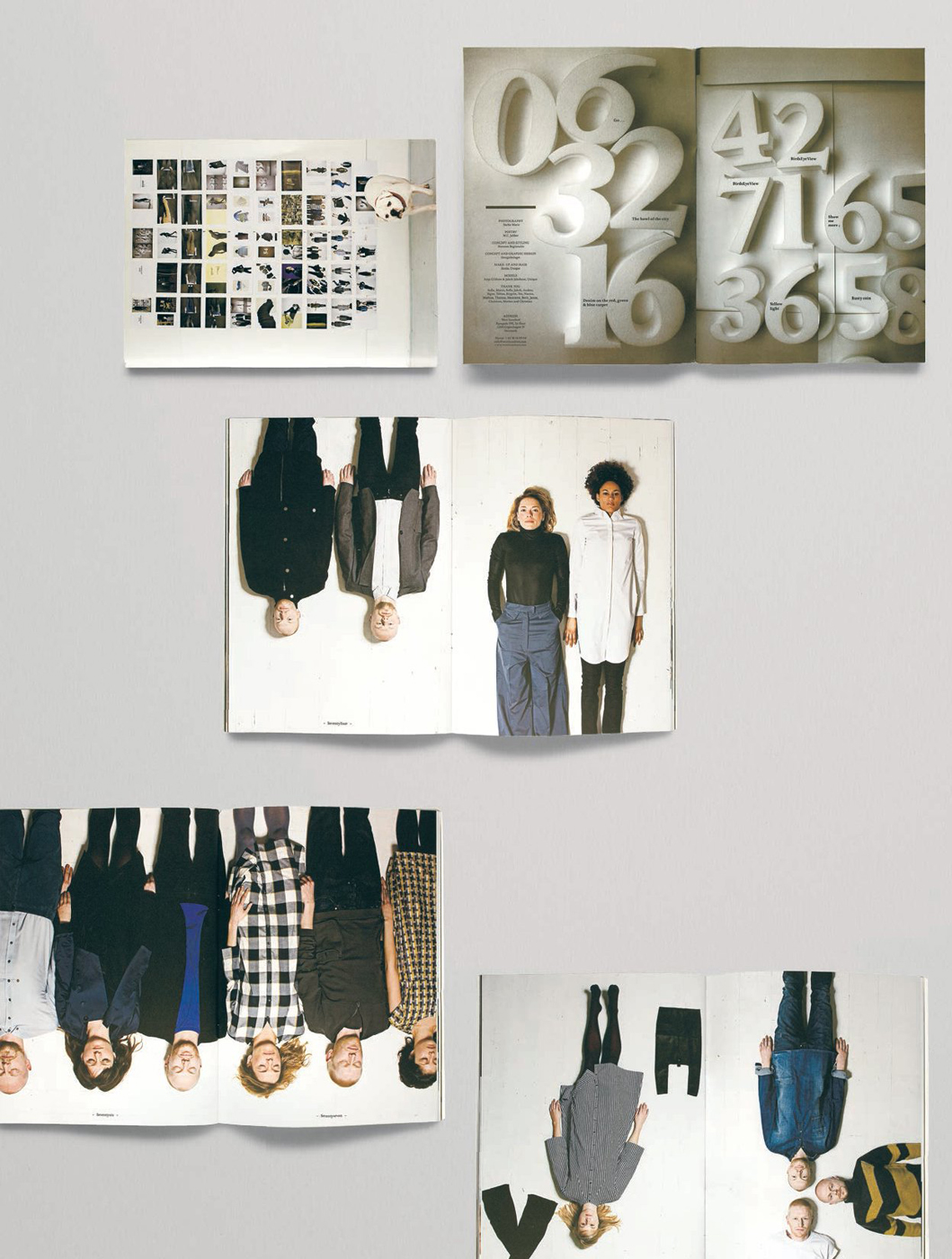
Embracing the responsibility of this freedom, Due approached the Spring/Summer 2008 collection looking for a way to extend the basic concept of the lookbook. This produced the idea of working with 100 pieces of clothing that ran across 100 pages. The end result extended the branding of the label beyond the name or logo, and provided a solid platform from which to build in the future. At times images bled off the page to be completed overleaf, creating a seamless connection from one page to the next. The luxury of so many pages was not wasted: an endless stream of visual exercises and paper stock variations made readers eager to turn them. The book’s success undoubtedly attracted a lot of attention to the brand, and repaid the trust Won Hundred placed in the creative team. Over the last two seasons the company’s lookbooks have evolved into more commercially driven publications, while retaining their core aesthetic. From 100 pages in 2008 to the Spring/Summer 2009 lookbook which featured 100 likes and dislikes, Designbolaget have maintained consistency while ensuring that their client’s changing requirements continue to be met.
Designbolaget are very thorough in how they react to a brief, which means they are able to justify, and if necessary defend, their ideas. “We are good at listening to what the clients have to say. That is a really big part of our job and contribution. I think that is why the small studios are doing well, we meet the people and we talk to the people and we can sense them. We can sense each other’s aesthetic.” Due’s direct involvement in every project undoubtedly reassures his clients, as his dedication to pursuing innovative solutions is clear to see.
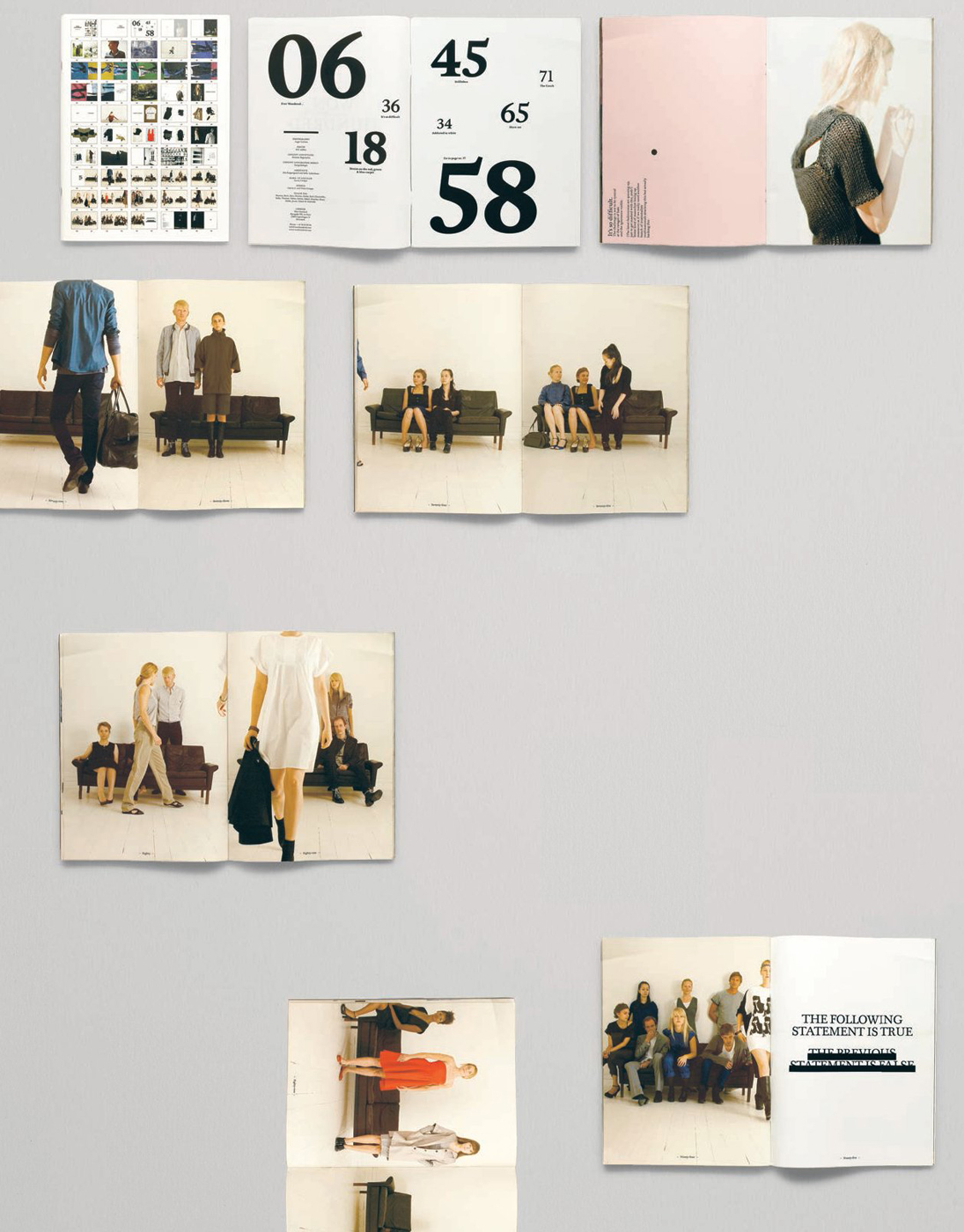
The second lookbook by Designbolaget for the Autumn/Winter 2008/09 season advanced the aesthetic from the previous issue while maintaining the same format. The flatplan cover was photographed on the studio wall – with a special guest – to indicate a change of direction to a more analogue design aesthetic. The photographer Sacha Maric was commissioned to bring a more physical quality to the images and has continued to collaborate on all following lookbooks. “I have to feel something when I am looking at the pictures. Sasha has put something human into these pictures, it does not have that distance.”

At 22 x 29.5cm (8½ x 11½in) and 100 pages, the Spring/Summer 2008 lookbook also uses multiple paper stocks and feels more like a fashion magazine. In collaboration with Femmes Regionales and with photography by Asger Carlsen the title flows through a range of photostories with additional poetry by M.C. Jabber. Designbolaget pulled all these components together to create a cohesive message. “The images were in every direction, there was no style, black and white, colour, studio, outside. So we decided to use 100 pages to try and find something that would tie it all together. It became obvious that the cover would have to show all 100 pages and we completed the design in two days over the weekend.”

While the Autumn/Winter 2009/10 lookbook maintained the 100 pages, the format was reduced to 17 x 24cm (6½ x 9½in). Subtle, photocopied typography supported the analogue aesthetic established in the previous issue, while the photography became more direct and functional. “From my background I am thinking about the branding and identity. I try to make the client recognisable from one season to the next.”

The pagination was reduced by half for Spring/Summer 2009 and ‘The Book of LOVE, HATE and Everything in Between.’ To maintain the central concept of 100 the lookbook carried 100 examples of love and hate that were interwoven with studio and location photography.