
HARRIMANSTEEL for ELEY KISHIMOTO
Intent on finding a way to use their diverse creativity, college friends Julian Harriman-Dickinson and Nick Steel opened HarrimanSteel in 1999. They are able to move between advertising and design, print and moving image with relative ease, as their primary focus is on creative communication and engagement with the audience. This breadth of interest is maintained by constant visual awareness. “Keep your eyes open, watch and listen. Be inspired by the things you like and discard the thing you don’t,” says Steel. They are able to edit what inspires them with speed and precision – an invaluable skill for designers confronted by London’s continual visual stimulation.
After only a year in practice a mutual friend introduced HarrimanSteel to Eley Kishimoto. From this chance encounter a mutually beneficial relationship developed that continues to grow in strength. Known as the ‘patron saints of print’, Eley Kishimoto are primarily a womenswear label but have been particularly successful in translating their playful aesthetic across a wide range of accessories and homeware. Like HarrimanSteel they are creatively prolific and explore art, architecture and other areas less travelled by fashion designers. This common ground provided a creative foundation on which to build the relationship.
The development of a ‘views-paper’ was an innovative step towards a new form of communication for Eley Kishimoto. Produced in a traditional newspaper format, it was initially seen as being complementary to the brand: a “family album of collaborators” the lookbook editors note. An aesthetic exploration rather than a documentation of the collection, it showed a cross-section of what inspired Eley Kishimoto, and was distributed as promotional material to all the collaborators’ clients. The newspaper format was always considered to be organic, and naturally evolved to function as a catwalk memento and subsequent lookbook. “These were far from traditional lookbooks. One issue didn’t show any product, just patterns. Two issues used the original pencil sketches of the collection. It wasn’t until issue four that we began to use real images of the clothes.”
The use of newsprint, inspired by researching the Eley Kishimoto archives, gave the project a distinctive, raw aesthetic which HarrimanSteel felt would emphasize the brand’s craft and traditional values. “We felt this approach would cut through in the glossy world of fashion,” says Steel. HarrimanSteel continue to produce Eley Kishimoto’s lookbooks but these are now in a more conventional and premium format that reflects the progression of the brand. Steel maintains it is still possible for the newspaper version to be revisited in the future.
HarrimanSteel are adamant that collaboration is vital to achieve the full potential of every project, regardless of the creative background of the client. “The cross-fertilization of ideas is what we do. It is about establishing human relationships and dialogue. We are not always right, the client is not always right; if both parties can acknowledge this then we are off to a pretty good start. The best clients will make your work better,” says Steel. A great benefit of the long-term relationship with Eley Kishimoto is that a natural shorthand has developed. Collective responsibility plays into this as HarrimanSteel use initiative and past experience to anticipate possible strengths and weaknesses in their proposals. While this insight is irreplaceable, Steel maintains that the ultimate goal is to stay positive, to ensure that the design process remains enjoyable and does not become a battle.
While a close rapport has been established with Eley Kishimoto, Steel approaches each project for them with fresh eyes. “A chair, a table, a blank piece of paper and a pen. No preconceptions.” This integrity and dedication characterize HarrimanSteel’s highly constructive attitude. Thriving on broad creative challenges, they have been able to maintain an enthusiasm for their work and, importantly, their clients.

Autumn/Winter 2001/02 saw the first incarnation of the Eley Kishimoto ‘views-paper’ that ran to over 28 pages of full colour. “We created a collective newspaper where artists, designers, photographers and writers who are friends and collaborators of Eley Kishimoto could contribute.” As a means of extending the global reach of the publication the cover featured flags from around the world with the currency equivalents of its symbolic cost of 21p. This concept was consistent in future issues and the Spring/Summer 2003 edition was extended to Old English emblems as a reference to the collection.

The spreads from Autumn/Winter 2002/03 emphasize the importance of conveying the inspirations of Eley Kishimoto in addition to the garments from the collection. “The idea came from researching the archives of the label and discovering their passion for print, drawing and silkscreen.”
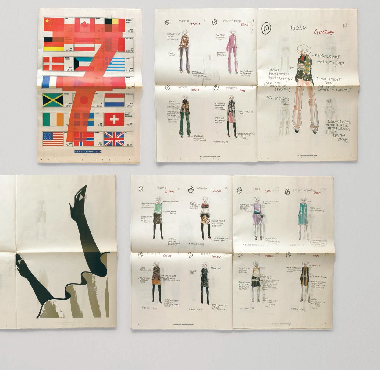
“These were far from traditional lookbooks. One issue didn’t show any product, just patterns. Two issues used the original pencil sketches of the collection. It wasn’t until issue four that we began to use real images of the clothes.” Autumn/Winter 2003/04 is an example of the shift to broadsheet format that indicated the second stage of the concept and fulfilled the role of the lookbook by offering images or illustrations of the collection. The illustrations are strikingly similar to the looks of the final collection.
