
STUDIO NEWWORK for ROBERT GELLER
A distinct typographic refinement and enduring sense of sophistication has been central to Studio Newwork’s recent rise to prominence. Rigid composition principles underpin dissected letterforms, innovative detailing and creative twists as they refine their visual language. This balance appears instantly timeless, poised between classical and contemporary. Newwork, their biannual magazine, has been vital to their development and is extremely well received, encapsulating their aesthetic for potential clients and showcasing their internal creative motivation.
Ryotatsu Tanaka and Ryo Kumazaki began their creative collaboration in 2005 but it was not until 2007, when Hitomi Ishigaki and Aswin Sadha joined them, that Studio Newwork – a phonetic play on New York where they are based – was officially born. A tight-knit studio, looking internally for stimulation and inspiration, their mantra calls for hard work and research. “Study, study, study. More study, better result.” Their success within fashion circles is due to their ability to produce covetable pieces of communication that clearly reflect the aspirations of their clients.
Robert Geller has employed the services of Studio Newwork since he started his menswear label in 2006. The collections have a confident romanticism that mixes the masculine with softer elements. The high-quality craftsmanship that goes into the garments is critical for the brand and must be upheld with all print material. Newwork have risen to this challenge with their typographic strength and attention to detail. Without breaking the bank they have infused the complexity in their projects with a perceptive selection of materials that builds contrasting tensions. The results have a polished, genuine accessibility that elevates the message.
Over the seasons the invitations have become a unique conceptual record. While linked by an understated sophistication, each collection has a new direction that the invitations must relate to. Reference sketches, colour swatches and samples are all used as inspiration. The working relationship with Robert Geller is close and Studio Newwork are integrated into the fashion team. This rapport is welcomed by both parties. “Creatively, collaboration always helps us to look at things from a different angle,” say Newwork. The trust between studio and client builds creative freedom but they appreciate this freedom requires added responsibility.
The success of the collaboration depends on mutual respect for visual expertise and preferences. “Fashion designers are very careful and sometimes very specific about the choice of colours, fonts and material that create the mood and image of their brand.” There seems to be a collective partnership that works to extract the best from each project. With this open platform, differences of opinion are bound to arise, requiring diplomacy and practical explanation. “We are not forceful but are very confident of our vision and what we design, which is always supported by our research.”
There is an underlying creative camaraderie to Newwork’s philosophy. “People from different creative fields might use different materials to work with but the final goal is the same, which is to deliver messages, ideas and thoughts.” Through hard work and trust in their ideas, they believe they can achieve longevity in their work: “We aim to create newness that can last decades.” Timelessness is a difficult challenge in the continually evolving fashion industry, yet Newwork seem to have a flair for creating designs for their clients that will continue to feel contemporary.
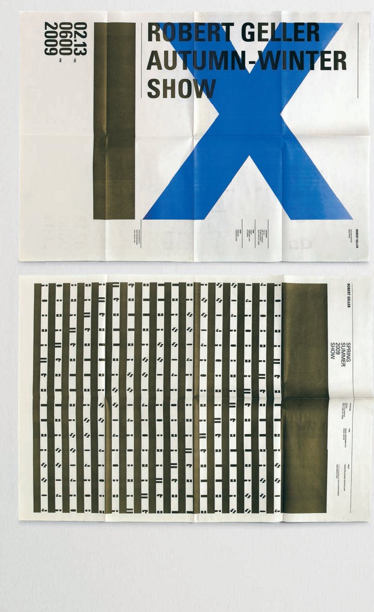
The raw aesthetic of newsprint often features in work by Studio Newwork and for consecutive season invitations it was used for Robert Geller. “For the Autumn/ Winter 2009/10 season we designed a new logo for Robert Geller and wanted to use it as the visual element for the invitation. The new logo is a simple black bar so that you see the logo in the design. For example, you see the logo as part of the Roman numeral nine in the design.” Stripes were the central element from the Spring/Summer 2009 invitation and were appropriated into the invitation design.
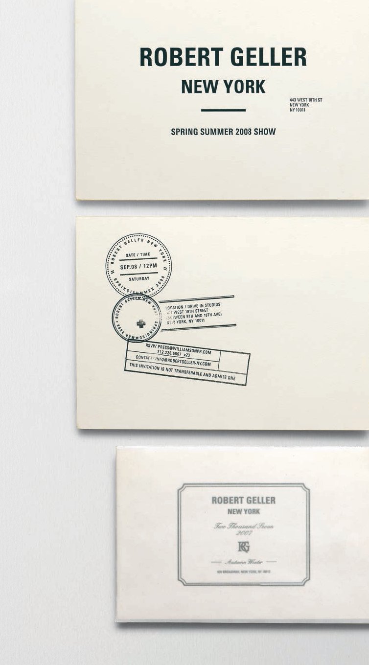
“Inspired by the German art icon, Robert Geller called this his second collection for Spring/Summer 2008 ‘Beuys Don’t Cry’. Robert also mixed his early experience in LA and skateboarding from the 80s with the theme. The fluorescent yellow, trimmed edge of the invitation came from the colour pallete of the collection. The stamp was inspired by actual postcards and letters Joseph Beuys wrote. The key words from the Autumn/Winter 2007/08 collection were ‘elegant’ and ‘classic’. Using UV-coating, shininess creates this great contrast with matt paper to enhance the sense of a classic and elegance.”

“The Autumn/Winter 2008/09 collection was inspired by a book written by an early-nineteenth-century Prussian naturalist. Robert Geller cares about soft material and the quality of washed fabric, the handkerchief represents this part of Robert Geller’s clothes as well. The invitations were washed before sending out so they have a nice laundered quality.”