
For brothers Christopher and Mark Thomson, with their independent backgrounds in prominent design studios, it was a tentative yet logical step for them to cast aside any thoughts of sibling rivalry and form StudioThomson in 2005. The practice is based on an almost tangible mutual trust, and while it is undoubtedly a close-knit operation, surprisingly they do not share an office. Instead they have opted for home studios on opposite sides of London. Regular meetings, with each other and collaborators, are intentionally scheduled to create time away from the computer: now that they have creative freedom and independence they do not want to be tied to the machine. Their ability to work separately while producing a consistent body of work is proof of their aesthetic clarity. They are not swayed by trends, preferring to focus on content and ensure their work remains desirable into the future.
Before the launch of StudioThomson, Mark Thomson had been introduced to Preen by mutual friends and was commissioned to design the label’s Spring/Summer 2004 invitations. He was attracted to the project by the intricacy in the detailing of the collection and the opportunity to stretch his creativity in what was then a side project to his regular job. A little over a year later StudioThomson were formed, with Preen as one of the original clients. They remain central to the studio; both parties have grown together over the years and enjoy each other’s company. Christopher and Mark Thomson seem to seek out clients with whom they can build long-term, mutually productive partnerships, similar to their own internal relationship. They consider their creative process a collective experience with Preen, not necessarily a collaboration. As a practical form of quality control, Preen are kept abreast of their progress throughout a project to ensure that any problems that develop are resolved at the earliest possible moment.
This continual dialogue is vital to the relationship between StudioThomson and Preen. Invitations for an upcoming collection are discussed at Preen’s studio, with the help of moodboards and maybe some rough photographs of garments. It is an open discussion: “Preen do not dictate what they want. We discuss the collection and then go away to get on with it. They respect what we do and encourage us to be creative with it,” says Mark Thomson. The concepts of Preen’s very eclectic seasonal influences set their creative framework. StudioThomson interpret it, from gig tickets to childlike oversized proportions, and are careful to ensure the invitations are relevant, yet only offer a hint of what is to come. “Preen don’t want to give away too much, it has to be quite subtle.”
For StudioThomson, invitations provide the perfect opportunity to experiment with new techniques and processes, as volumes are relatively low and creative expectations are high. Materials, textures and finishes are selected with care to enhance the overall concept. For Autumn/Winter 2004/05 Preen contrasted their established deconstructive aesthetic with a distinct air of sophistication. StudioThomson captured this duality with opposing sides to the invitation: the front was clean, white and timeless, and was juxtaposed with an uncoated, raw texture and rubber stamp type on the reverse. This successful balance provided an intuitive link to the collection without directly revealing any details.
StudioThomson are highly self-motivated in their search for new ideas and challenges. This is in part due to their dedication to their clients but is also indicative of their personal pursuit of satisfaction in the work they do. They seem to be inspired by everything other than graphic design, regular visits to exhibitions and museums are a central form of research and source of inspiration. Their practice has a positive attitude that comes from the freedom they enjoy in their profession and their lifestyle. They are not restricted by the world of graphic design and this is clearly translated into their final products.
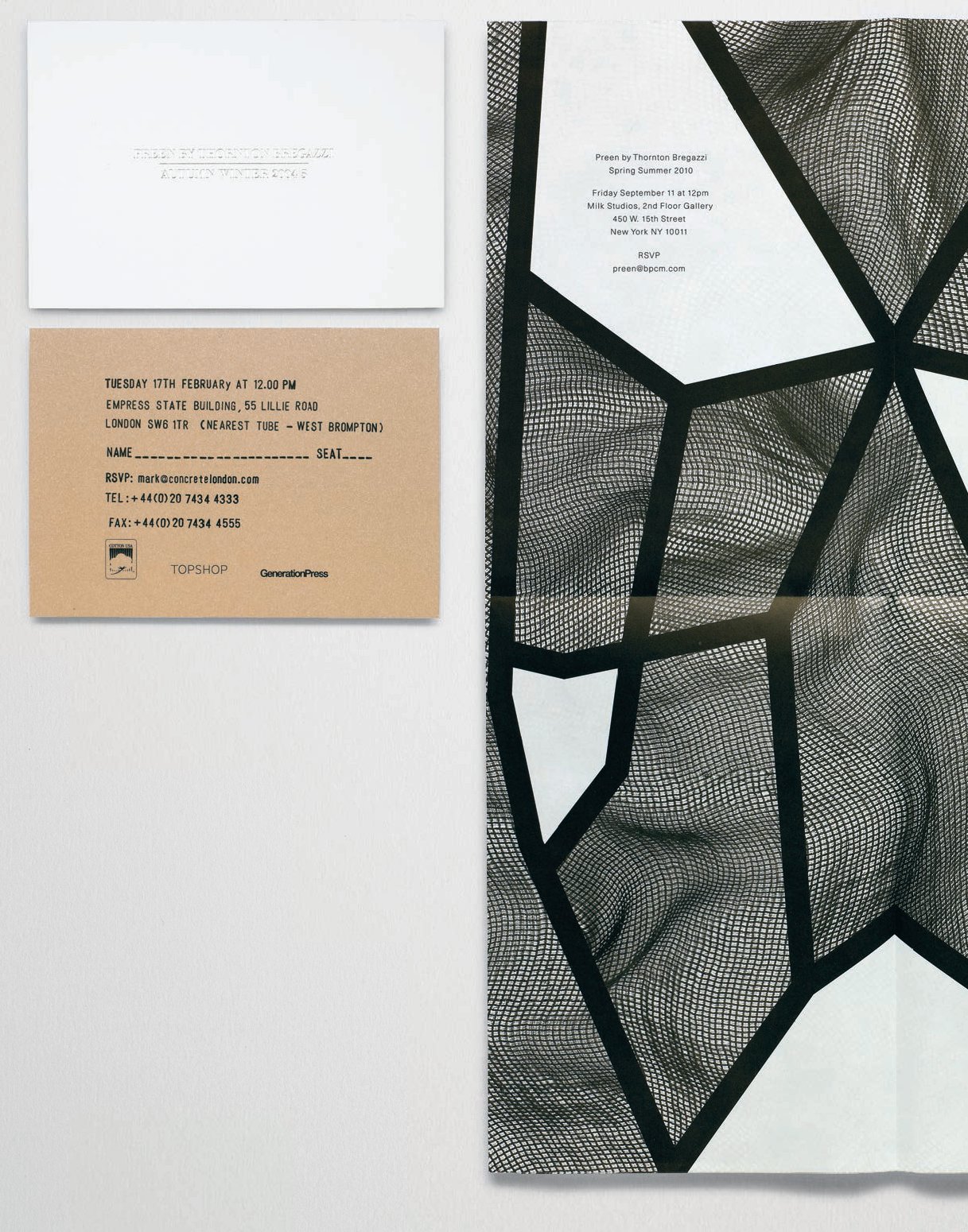
“There were two sides to the Autumn/Winter 2004/05 collection. A very sophisticated side was contrasted with a more grungy side and Preen were mixing the two elements. We produced a two-sided invitation with one side foiled and quite sophisticated and the other more lo-fito represent the other aspect of it. The thick black lines on this Spring/Summer 2010 invitation were inspired by the way bondage ropes are tied on the body, which was a theme running through this collection. There was also a lot of see-through mesh material used in the garments, so we photographed various bits of the material to look like they were on bodies, and applied them to the shapes created by the thick black lines. We used a thin bible paper for the invite and printed on both sides to continue the transparent theme of the collection.”

The Autumn/Winter 2005/06 invitation was inspired by child-like proportions from the collection. An oversized poster was produced to simulate the way a child would feel when holding a conventional invitation. Children’s spelling books inspired the typography. Preen were the source of inspiration for Autumn/Winter 2009/10. It was a particularly space age collection and this directly influenced the typography.

A constant point of reference for all Preen collections, music was a particular focal point for Spring/Summer 2009, which translated into creating a gig ticket for the invitation. Band posters from the 1970s were the inspiration with loads of band logos and different fonts all together. “At the entrance to the show they actually tore one side off as you would when going into a gig.” Two prominent themes of the Spring/Summer 2007 collection were the film 2001: A Space Odyssey and ornate furniture associated with the reign of Louise XIV. “We created a white, debossed invite to give it a space-age feel, with graphics representing the interior of a spaceship, but with seventeenth-century details integrated into it that you would normally find on furniture of that period. The typeface was also intended to be a nod to the period of Louis XIV.” The music theme was again influential for Autumn/Winter 2008/09. There was a grunge element to the collection that resulted in the invitations referencing the typography of the pivotal Nirvana album Nevermind.