
STUDIO SMALL for MARGARET HOWELL
London-based Studio Small approach their practice with simplicity in mind. Founding partners David Hitner and Guy Marshall are focused on the refinement of ideas and not sidetracked by over-analysis. They have been able to build a rational creative process dedicated to their clients’ requirements. “We feel it is our role to really listen to the client and communicate their philosophy and personality,” says Hitner. A close working relationship is fundamental to ensure results are as pertinent as possible. Small have no house style, and work for a broad range of clients, treating each project as a unique exercise. Their strength lies in their ability to progress and evolve with their clients over time and, as a result, they boast a large number of long-term relationships.
Studio Small began to work for Margaret Howell in 2004, with a commission to design a calendar and poster. The relationship grew and Small went on to replace the in-house design team. While they provided a more objective perspective, Small were tasked with consolidating the existing trust and value in the brand. They embraced the challenge as an exercise to nurture and sensitively develop the brand identity over a range of materials, conscious that stagnation would pose the greatest risk.
The Margaret Howell customer base – primarily architects, designers and professional creatives – is visually discerning and loyal. Beyond the fashion collections and contemporary and vintage furnishings. Margaret Howell also present a wide range of in-store exhibitions that reinforce the central brand aesthetic. From historical to contemporary, the events contribute and build upon the broader interests of Howell and her clientele.
Hitner acknowledges that, “Collaboration is essential. We do not profess to know them or their industry better than they do.” Supported by the practical input of Margaret Howell, Small are granted a broad remit to explore creatively. While admitting that a mutual shorthand is advantageous for presenting concepts when working with a creative client, they believe the success of the relationship lies in a shared aesthetic. At the outset of a relationship, it is difficult to evaluate this compatibility, which may not be known until the end of the project. This aesthetic is developed over time and is evident in the increased trust that Small now share with Howell.
In contrast to the consistent reinvention in the broader fashion industry, Margaret Howell collections are a continual progression. Built upon classic tailoring, variations of hue, material and texture timelessly signify the change of season. While a sophisticated message is paramount, the focus on materiality plays to Small’s strengths. “It is more about use of materials rather than form,” says Hitner. “We are always looking at how to use paper, finishes and combinations of different stock and how it folds down. We try and keep a tactile quality to everything we produce for them because that relates back to who they are in terms of their quality and materials, fabrications and structure.”
Self-motivated and determined not to fall into a formula, Small search for a progressive angle to explore each season. Depending on the collection, Howell talk through three or four looks, and perhaps provide only a fabric swatch. The invitations fall into three categories: womenswear, a menswear presentation in Paris and exhibitions throughout the year.
Collectively, the graphic language of the invitations is based on abstracting a key element from a collection. For continuity and distinction, the focus is on fabric and texture for womenswear, menswear is inspired by the construction of the presentation, and invitations to exhibitions are adapted from the subject matter. While directly linked to events, the invitations are successful because they do not reveal details. They are visually striking and the curiosity they arouse can only be resolved by attending a show: receiving one enhances this experience by reinforcing the recipient’s anticipation of models walking down the catwalk.
While Small’s output is diverse, there is a cohesion to how they communicate the Margaret Howell brand. The invitations represent the first piece of a seasonal puzzle that will later be used in broader supporting material. Small have achieved strength through their consistency, providing Margaret Howell with clear and identifiable visual communication that feels fresh and contemporary.

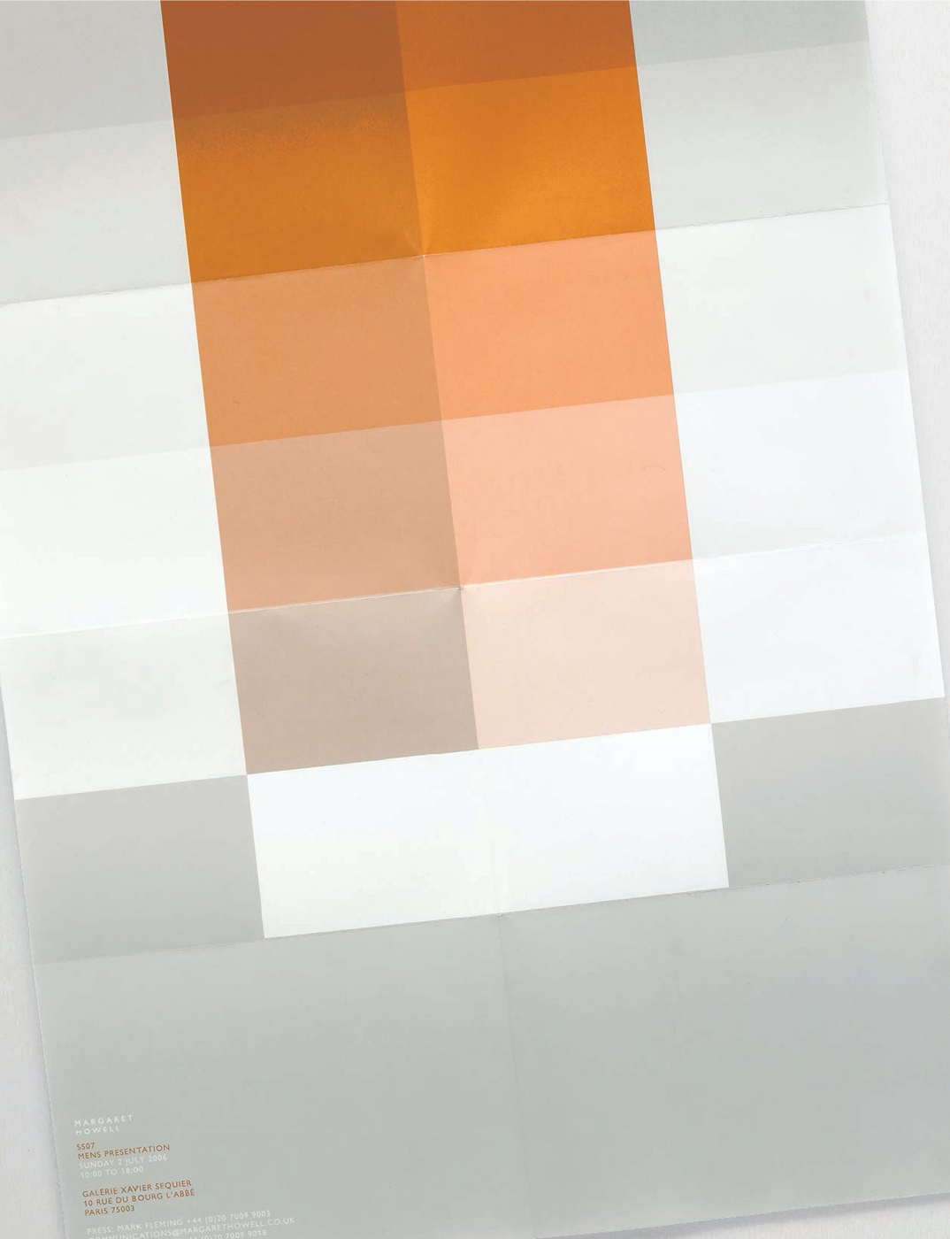
The men’s collection is seasonally presented in Paris as a static exhibition. For the invitations Small use the details of the installation or venue as inspiration. The Spring/Summer 2009 collection presentation was fixed to large wooden boards with punched holes that went on to influence the invitation. “The invitations have relevance to the location but do not give much away about the collection”

The Autumn/Winter 2009/10 men’s presentation was held at the new Margaret Howell store. The ceiling is dotted with skylights that were used to create an abstract pattern on the invitation. Traditional material swatches were used in the Autumn/ Winter 2008/09 presentation and subsequently scanned in for use on the invitation.
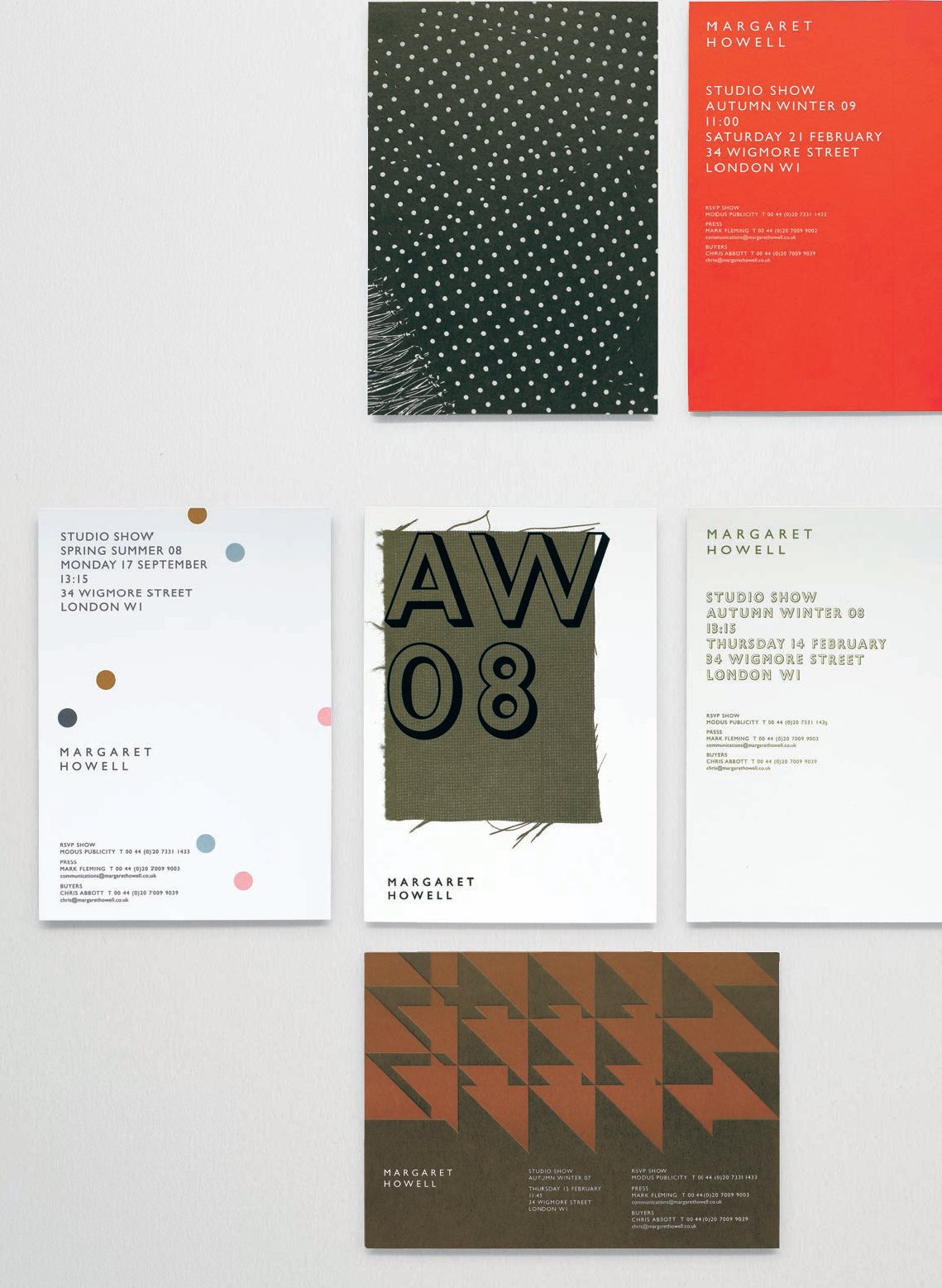
The women’s catwalk invitations are directly inspired by the garments. Studio Small meet with Margaret Howell to talk through three or four pieces she considers central to the collection. In some cases all that can be offered for reference is a few material swatches. The women’s invitations are more uniform in size, remaining approximately A5. Autumn/Winter 2007/08 was inspired by a pattern and hues from the collection and Spring/Summer 2008 interpreted the polka dot pattern from a piece of fabric from the collection. Only given a single fabric swatch as inspiration for Autumn/ Winter 2008/09, Studio Small made it the central feature of the invitation. A graphic abstraction of a scarf was adopted for Autumn/Winter 2009/10.

For Spring/Summer 2009 bars of black flocking again referenced garments from the collection. “We keep looking at how we can use Gill Sans in a slightly different way, the thing about Gill Sans, if you are not careful it can look very retro and very 60’s, it is about keeping it looking very modern.”
A colour palette and grid system inspired by the Bauhaus movement, was applied to a poster for the Spring/Summer 2007 invitation.