
JOHN MORGAN STUDIO for SINHA–STANIC
In the subjective field of graphic design, John Morgan Studio focus exclusively on content – the only constant element. The absence (read abhorrence) of a ‘house style’ is indicative of this, allowing them freedom to explore new ideas and build bespoke solutions specific to the content of each client. Starting from scratch can be creatively exhausting, yet personal engagement acts as a bridge from research to inspiration, and allows the studio to explore visual and conceptual solutions until a point is reached that leads to an original and effective design. Their refined process and so-called ‘modern traditionalist’ aesthetic have become their trademark.
Morgan opened his eponymous studio in London in 2000 and has continued to expand modestly in recent years. In 2004 Fiona Sinha and Aleksandar Stanic started their label and for them it was a natural step to employ the services of a mutual friend, Michael Evidon, who had just joined John Morgan Studio. While based on friendship, the relationship has the professional rigour expected from the studio. Evidon acknowledges that the unique visual language of fashion is loaded with its own connotations and interpretations. “There is a graphic language of fashion design, that I think is often confused with graphic design. When there is just some understanding of what you do, there is often misunderstanding. It takes time to develop trust and with friends there are not the same professional boundaries.”
John Morgan Studio were initially commissioned to develop a logo, but the success of the first Sinha–Stanic collection required the immediate expansion of the project to include a full suite of print materials and website. The speed of developments in the fashion industry somewhat diminishes Evidon’s engagement with the content, and he sees designing for Sinha– Stanic as a collective exercise. He considers speed a positive influence and an important parallel between the two disciplines. “The fast pace is one of the things I like about fashion and graphic design. I like not knowing what I will be working on in six months.”
Establishing a reputation for the subtle balance of draped fabric, Sinha–Stanic developed a harder edge to the collection that seemed to form a closer bond with the logo. The initial intention was to position the new brand as an established label. With time and a growing reputation it has evolved a unique visual aesthetic that is particularly evident in the progression and clarity of the invitations. “As the collections have become tougher and more confident, the graphic language has moved away from image-based solutions drawn from the collection towards bold, type-only posters,” says Evidon.
Conscious of budgetary limitations, Evidon focuses on materials to infuse the invitations with added value. “Independent fashion designers operate on tight budgets. There is a misconception that there is all this money in fashion, which is only true up to a point. We look at the material quality of what we are doing: the right weight of paper, the right shade of white, the right printing process.” This attention to detail ensures that the end result lives up to the visually demanding fashion industry.
Before each season Evidon visits the Sinha–Stanic studio to discuss the coming collection. “It’s too early to see garments, so I look at fabrics or drawings – mostly just what is on their walls, their inspiration, their colour palette.” He appreciates the relative simplicity of invitations as stand-alone objects in comparison to other projects, focusing on their materiality yet remaining innovative. However, he admits they can also be challenging as there is no supporting framework, or time for a project to mature. “It is really a completely formal exercise.”
With content-driven graphic design, collaboration with the client is of great importance. “It is easy to forget to listen to the client, but it helps so much.” Evidon believes that parallels in approach are of greater advantage to the working relationship with Sinha–Stanic than a shared creative background. The extent of their collaboration varies from season to season, a flexible arrangement that reflects the trust between client and studio. The decision-making process is collective to ensure all parties participate and are satisfied with the end product. “Sometimes there is one solution you know from the start will look right, and sometimes there could be twenty to choose from.”
A rich vein of humour and self-awareness supports the thoughtful and rational practice of John Morgan Studio. They have found a fine balance between tradition and style that is undoubtedly timeless. Although they are not the obvious choice for a fashion label, their work is refreshing in times of visual trickery and one-upmanship. While fashion is not the core of their business, their collaboration with Sinha–Stanic has translated into a highly enjoyable creative relationship.

Exploiting the possibility of switching foils several times during a single blocking run, four versions of the Autumn/Winter 2007/08 invitation were created, using black, silver, copper and gold. The collection featured geometric metallic sequins that were attached to the garments through small holes. This, and Barney Bubbles’ cover for Ian Dury & The Blockheads’ album Do It Yourself, inspired John to use holes cut from the logo as the central typographic feature of the poster.
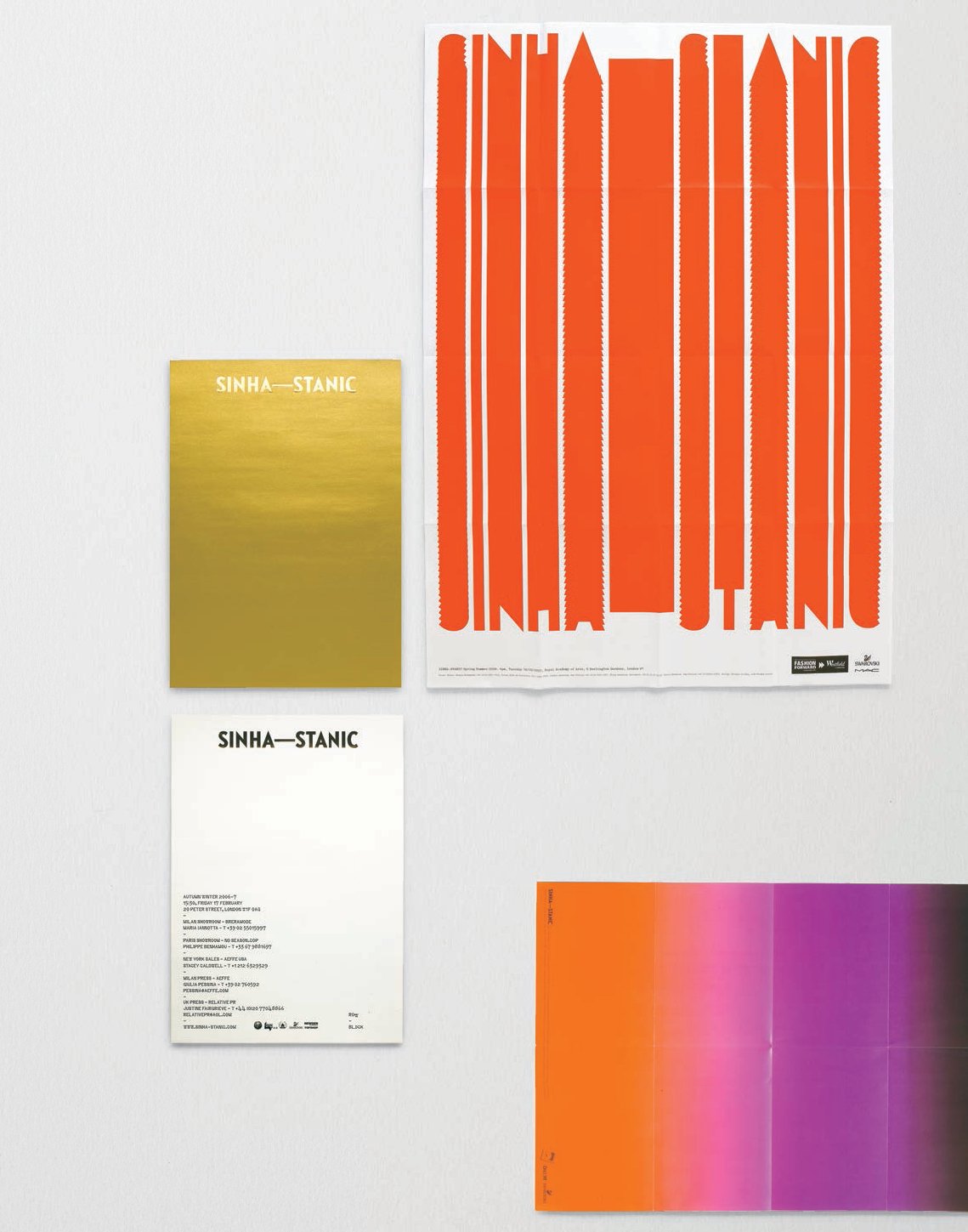
The Autumn/Winter 2006/07 invitation featured the logo blocked in gloss gold foil on the front, an early reference to the metallics that would become increasingly prominent in the Sinha–Stanic collections. The reverse used a bespoke typeface based on the stencil typewriter used on US passports until 2000. The typographic treatment on the predominantly red Spring/Summer 2008 invitation was indicative of the collection’s tighter and sharper look. The Spring/Summer 2009 invitation was directly inspired by the use of bold colour gradients within the collection.
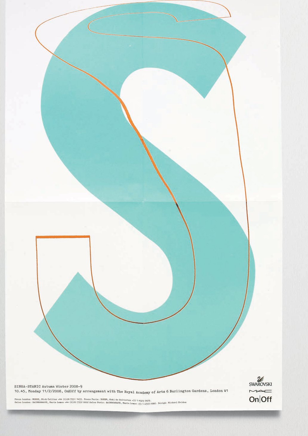
The Autumn/Winter 2008/09 season saw the creation of a semi-diffusion line called ‘Stretch’ that would focus on jersey pieces. As a literal translation the S letterform was stretched by moving over a photocopier and married with an oxidised copper-toned solid letterform. This treatment was also adapted as the logo for the brand.