
MEVIS AND VAN DEURSEN for VIKTOR & ROLF
Since starting their Amsterdam-based studio in 1987, Armand Mevis and Linda van Deursen have refined their vision of graphic design to see it as an active part of the message rather than simply a vehicle for communication. Recipients of much critical acclaim, they have become prominent figures in the progression of the discipline. As educators, and in conjunction with their practice, they have been able to impart their energy and integrity to a new generation of designers to the benefit of the wider profession.
Working predominantly for public sector and cultural institutions, Mevis and van Deursen are pleasantly surprised by the success of their relationship with Viktor & Rolf and the personal satisfaction it brings. It was a commission from the Stedelijk Museum of Modern Art in 1997 to design an invitation for a Viktor & Rolf exhibition that first brought them together. Viktor & Rolf have always occupied a unique, almost interchangeable, area between fashion and art. The commission gave Mevis and van Deursen a stepping stone into the world of fashion when they became responsible for the invitations to the first Viktor & Rolf haute couture show in Paris. Constrained by an impossibly short deadline, minimal funding and a lack of brand identity, the invitations were “none of the things that we intended to make and maybe not exactly what they had wanted, but they functioned well,” admits van Deursen.
Due to the bespoke nature of haute couture there was little need to establish a formalized logo for Viktor & Rolf. It was not until the launch of the prêt-à-porter line for Autumn/Winter 2000/01 that a distinction between the company’s collections was required. Rather than dictate a complete branding system, Mevis and van Deursen opened their dialogue with a range of elements, allowing Viktor & Rolf to experiment with them. “They had a clear idea of where they wanted to be and how they wanted their fashion to be received. And that was quite in the league of the big fashion houses in Paris.” Viktor & Rolf were always aware of the need to appear established; it was a game and Mevis and van Deursen were happy to play along.
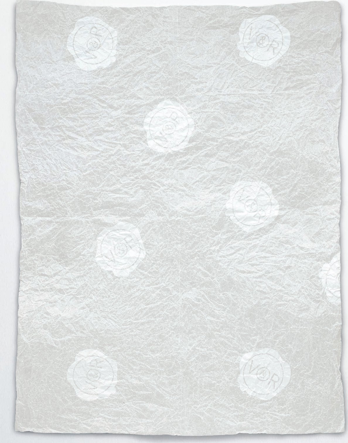
With a background in Dutch modernism, Mevis and van Deursen had confidence in the aesthetic tradition of their previous commissions. Viktor & Rolf were in pursuit of a fashion language dominated by an unfamiliar French heritage. “Fashion (and the language of fashion) works on a subconscious level. It appeals to the subconscious and because of that we probably (also subconsciously) made a connection with the surrealists, who tried to liberate the imagination through hypnosis, dream analysis and so on,” says van Deursen. Mevis and van Deursen were drawn to Salvador Dalí’s soft watch as inspiration for the seal. While old-fashioned, the seal was without any real function and slightly out of proportion, and when used in black it produced “a posh, absurd, fetish-like quality that suited Viktor & Rolf. It is something you cannot really say why, but all those elements together really worked for them.”
Viktor & Rolf were so enthusiastic about the logo that before it was finished they started applying it to their garments in all sorts of materials, colours and finishes. This period of experimentation lasted for approximately two seasons before they commissioned a full suite of print collateral that fixed the parameters for the brand into the refined message it is today. During this exercise, Mevis and van Deursen were able to draw on the extensive practical research involved in designing the print material.
Up until then there was very little funding in Viktor & Rolf’s career but the end result had to look expensive. The prohibitive set-up costs of foil stamping and embossing for a range of sizes, from letterheads to swing tags, resulted in the use of a single-sized logo for all formats. Financial restrictions actually built greater consistency and relevance into how the seal was used.
Viktor & Rolf exercise a conceptual economy that results in a unique clarity. “Their ideas are so direct you can summarize them in one line,” says van Deursen. With such precision, little explanation is required for Mevis and van Deursen to proceed with the invitations to the seasonal collections. While Viktor & Rolf are sometimes able to translate the concept of a collection into a viable print format, there is no obligation for Mevis and van Deursen to follow their direction exclusively. “We do not deny our qualities or interests, we really try to make something we like that also works for them.” In what is not a collaboration in the truest sense, Mevis and van Deursen are bound to the concept of the collection while Viktor & Rolf independently explore applications for the logo. This mutual trust has allowed the brand to maintain a freshness throughout the years.
While Mevis and van Deursen originally treated the invitations and lookbooks from each collection as individual creative challenges, they have now developed a framework that allows greater refinement and efficiency. “There is always a unique character to each collection that it is possible to line the invitations to.” Invitations are always presented on letterhead paper and the lookbooks utilize an A5 format with complementary black and white covers for menswear and womenswear respectively. This foundation allows greater conceptual exploration and clarity, and also supports the impression of an established fashion house.
The Viktor & Rolf brand expanded dramatically, and while success resulted in more careful time management, their relationship with Mevis and van Deursen has remained constant. Hindsight has validated their initial instinct in shaping the brand. “I think it was a unique and funny situation how the branding has arrived,” says van Deursen. “If they were not able to express their strong ideas so clearly we would never have known how to work for them.”
There is a natural confidence in the way Mevis and van Deursen rationalize their process that disguises the complexity of their practice. While their output is an exercise in precision, there is a duality in the fact that they are comfortable with allowing events to unfold. The commercial component of Viktor & Rolf immediately sets them apart from their other clients, yet this unfamiliarity has enhanced Mevis and van Deursen’s satisfaction. “It started quite innocently but Viktor & Rolf also became the most successful and well-known client we have.”

Originally the logo was used at the same size on all print communication to minimize costs, but the visual consistency has become a strength of the brand. “We designed something for them that was a little innocent, but we had a clear goal and ambition from Viktor & Rolf, to try and make something that would work for them to achieve their ambitions, it was more like playing a game and when it finally became really serious it did work.”

All invitations are based on the standard letterhead format. Working within this restricted framework Mevis and van Deursen are able to creatively explore a wide range of conceptual iterations that directly reflect the upcoming collection. “If we put the seal in a different colour, then I always think we should not have done that, it should not have been red, it should not have been gold. Maybe there are some exceptions but usually I only like it when it is black.”
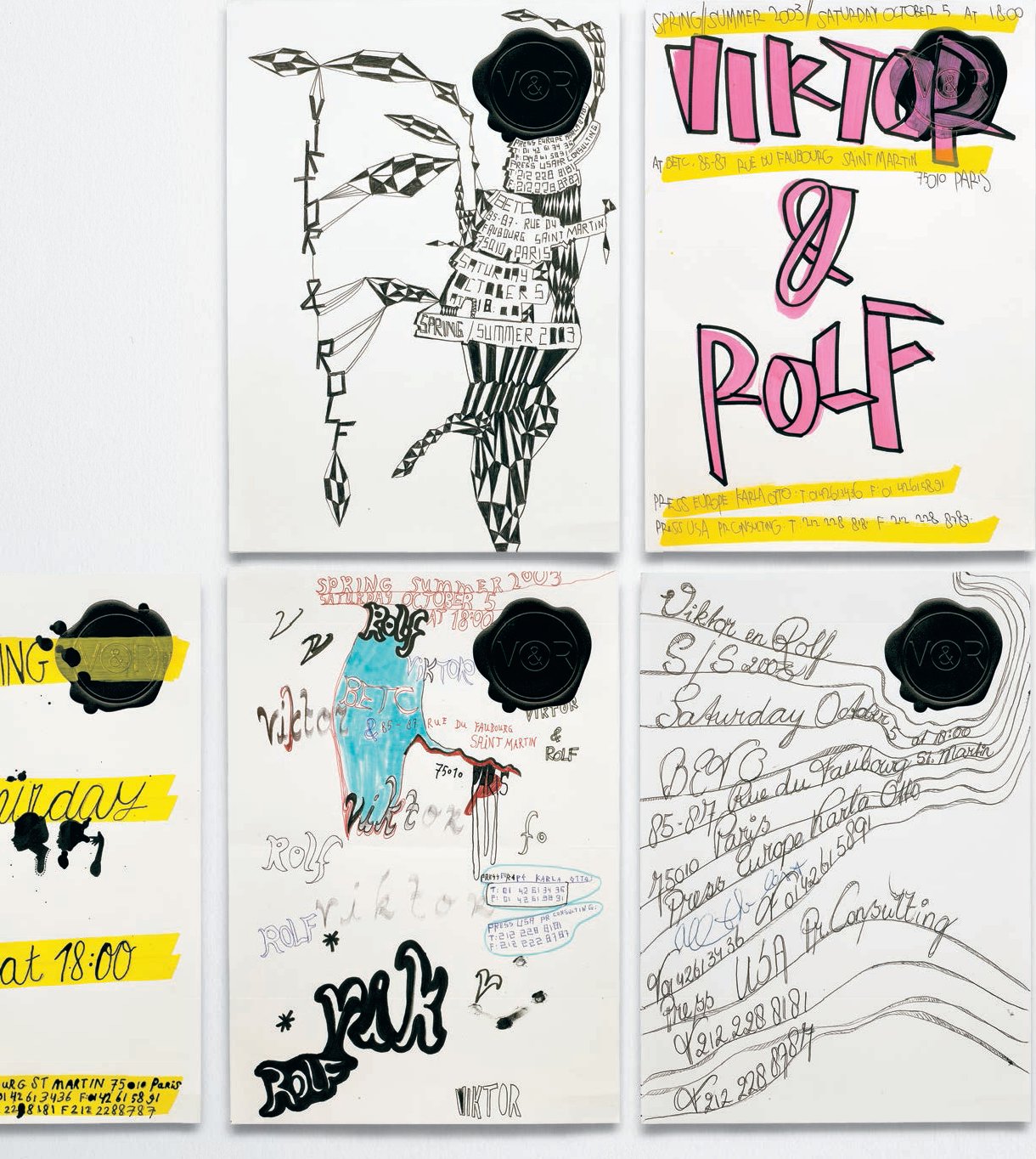
For the Spring/Summer 2003 collection every invitation was an original hand-made design by students of Mevis and van Deursen. As original objects they immediately transformed the conventional letterhead paper into a covetable object. “There is always a clear departing point that gives the collection a unique character and it is always possible to look at the invitations and link them back to the collections.”

Published in 2003 to celebrate ten years of Viktor & Rolf, the ABCDE Magazine subverts the medium with an innovative branding exercise presenting an edited selection of their press clippings. The end result feels like a normal magazine. To complete the effect advertisements from other brands were also featured. “Viktor & Rolf always have fantastic ideas to begin with. They have a super simple strategy that is always a good basis to start from as a designer, it is almost as if you only have to do half the work.”
“Viktor & Rolf always used the logo like they were going to be really gigantic in the future.” The seal has been used extensively over the years and has grown closer to the more classical incarnation of its original reference.
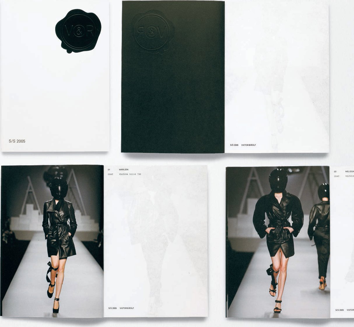

“To always print invitations on their stationery, to use the same size and same elements, I thought I would be really happy to do something similar with the lookbooks as well.” Working with the industry standard of catwalk photography, Mevis and van Deursen create a subtle integration between the men’s and women’s collections. The two covers act as counterweights, the women’s collection has a white cover with images only printed on the left-hand page and vice versa for the men’s collection. The logos on the cover are standard size too. A literal inversion of each other, together they represent a conceptual whole. “We do not have to convince them of our ideas every time, it is quite the opposite. We know exactly what they want and we make fast decisions.”