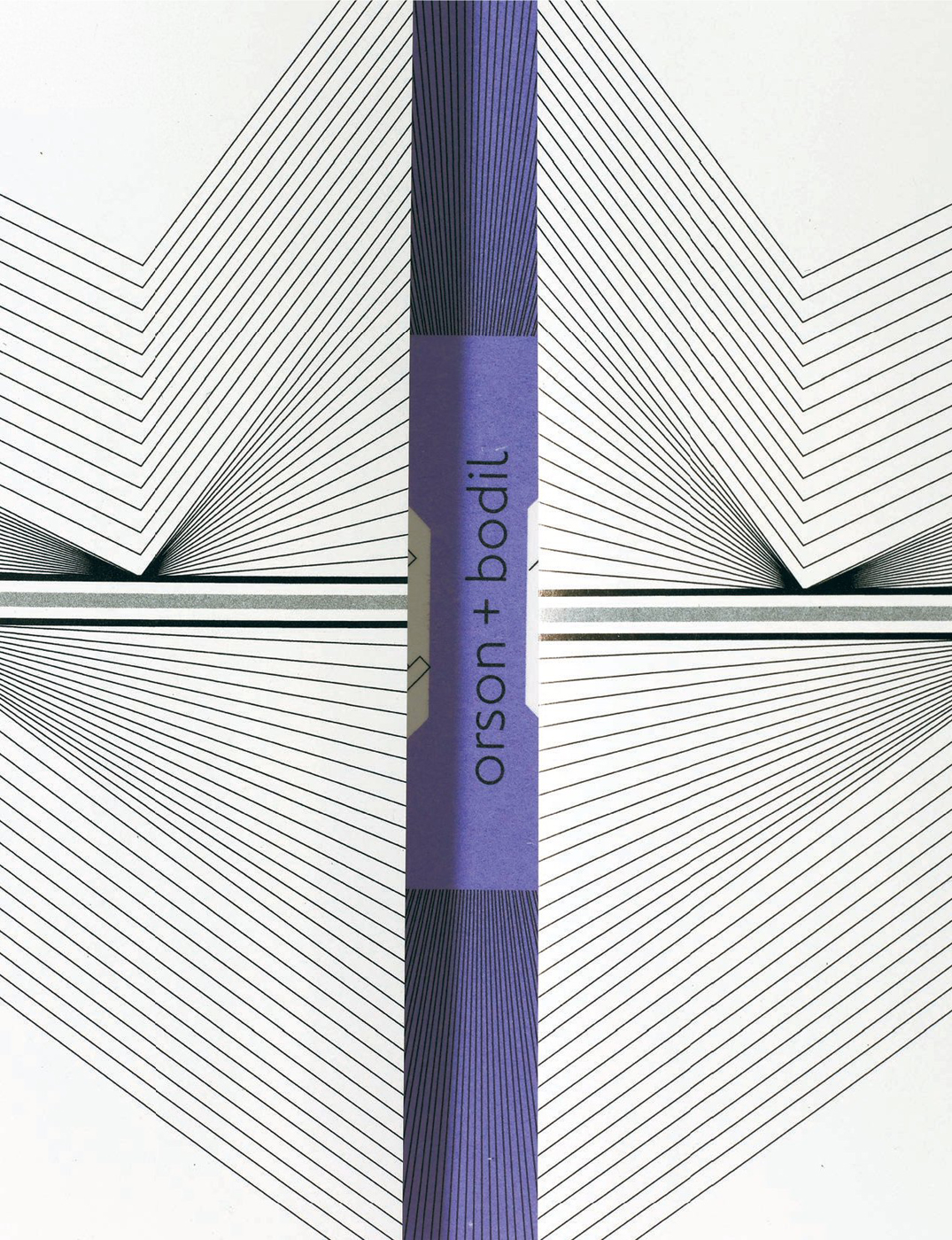
HANSJE VAN HALEM for ORSON+BODIL
When Hansje van Halem graduated in 2003, a series of well-timed commissions distracted her from looking for a job in a design studio. Based in Amsterdam, her practice focuses on geometric typographic structures in an almost tactile way, yet she has little interest in actual letterforms: “My focus has never been the shape of the letter, but the tint of it.” Her work is characterized by the use of highly complex illustrative systems, clearly created by the computer yet retaining residual human quality in the form of imperfections.
While creating a modern world of sharp, graphic forms and texture, surprisingly van Halem looks to the past for inspiration, surrounding herself with old books and generally avoiding the design press. Cautious of the ‘graphic designer’ label, she considers herself more of a labourer, occupying a traditional role within modern society. Her discovery of the Wacom tablet was pivotal, providing the opportunity to “do manual labour in the computer”. She has found a way to reconcile handcraft with technology in a way that is completely original. Without pastiche, she carries the human element into the machine to create something new. “Despite the fact that my letters are made on the computer, I love uneven details, irregularities, visible exhaustion and visible progress in drawings.”
Raised by artistic parents, van Halem’s childhood was filled with creative possibilities and materials to work with, and these formed her fascination with black and white, textiles, paper and patterns. She is dedicated to free experimentation and builds time into her working day to ensure opportunities for inspiration. Although she is a solo practitioner, she is an advocate of collaboration and regularly teams up with her clients. “On the one hand it is really nice to like your clients, and it makes me happy to communicate with them and produce good work for them. It’s like giving gifts and making people happy. On the other hand, it does diffuse the conflict that can make some design so good.”
Established in 1988 and relaunched in 2003, Orson+Bodil is a conceptually driven women’s fashion label designed by Alexander van Slobbe. In Spring/Summer 2007 a last-minute job to design a ‘dossier’ and press release was turned over to van Halem. She seized the opportunity, and the success of the small project opened the door for her to design the invitations for the following two seasons. “It’s usually a blessing to work for creative clients, because they understand the importance of the freedom they can provide. But sometimes it can also work the opposite way. When I get too much freedom I completely freak out without boundaries. Then I long for the understanding client with strange and unrealistic wishes, when the graphic designer is the expert and able to push beyond expectations. For creative clients, this is expected and harder to achieve.” While van Halem admits she is personally disengaged from fashion as a consumer, she sees the connection between fashion and graphic design at street level, fully integrated into life and evolving on a daily basis.
There is a laboured intensity to van Halem’s work – a literally visual tension. Process is important to her: she develops rules and systems then invests large amounts of time in the execution of projects, hoping to reap the rewards with the final product. It is an intuitive process that she considers “an ongoing fight in line widths, scale, texture, cluttering and most of all handwriting”.
The battle continues as she refines her technique and discovers new applications, a back catalogue of creating tints and gradients with simple black lines.

For the Spring/Summer 2008 collection, a ‘dossier’ was designed to hold last-minute notices such as press releases or invitations. “By cutting a diagonal corner, the content is visible. Each season employs a different internal colour that corresponds to the key colour of the collection.” The pattern references the braiding technique used in the collection.

“To celebrate Alexander van Slobbe’s and Fransisco van Benthum’s respective twentieth and fifth years in fashion they combined their Autumn/Winter 2008/09 shows and commissioned a joint invitation. The two invitations are folded into one, each separate side is dedicated to the invite for a separate designer.”

