
Graphic designers work in an industry subject to the fluctuations of personal opinion and regional vernacular, Stefan Sagmeister is one of the very few who has achieved global celebrity status. Intent on making design personal, to touch peoples lives, he creates work that has an emotional connection, but acknowledges that the commercial nature of design can blur this authenticity. Satire, the human body and rebellion are central themes in his work, alongside an intense personal pursuit of honesty; the results are striking and often generate attention.
Originally from Austria, Sagmeister has been based in New York since 1994. His enthusiasm as an educator and lecturer has taken him around the world; travel inspires him and helps to feed his passion for diverse creative dialogue. Undistracted by convention, Sagmeister operates with an objective clarity and foresight. His studio has remained small, allowing him to be selective with clients and creatively liberated because he is financially independent – advice from the late Tibor Kalman. The flexibility this gives him allowed him to close his studio to commercial clients for 12 months in 2001 to focus on creative experimentation. The process was so successful and creatively stimulating that 2009 saw him repeat the adventure.
Sagmeister is realistic about relationships with clients. “It is not possible to do satisfying work for an indifferent client. We need the support and the willingness to collaborate on many levels. They have to want something good.” He is unwilling to embrace the restrictions of professional practice and life in general. Mixing business with pleasure was a risky yet logical step when Sagmeister and fashion designer Anni Kuan became a couple in 1998. Eager to impress Kuan, Sagmeister secretly designed a logo and set of business cards, then offered to take on her seasonal invitations. But there was a catch: he would require complete creative control. While their relationship is obviously much closer than that of the average designer and client, rather than collaborate with Kuan, Sagmeister had the confidence to draw on their mutual trust and work independently of any personal or creative complications. Rather than referencing each collection, the goal is to maintain a message that is collectively consistent over the seasons, an arrangement that has been invaluable and ensured the longevity and continued innovation of the invitations. Sagmeister says, “It is very infrequently that Anni will ask for changes in direction.”
Like Sagmeister, Kuan limits the size of her studio and business to maintain direct contact with the process of developing a collection. Her label has a broad base of loyal customers and is narrative-driven not trend-based. She originally worked with a minimal budget that only allowed for simple postcard invitations. Sagmeister thought the simplicity was limiting and sought to incorporate more complexity in the message. “It was an invitation and to varying degrees a lookbook of the season,” he says. Motivated by an obvious determination to impress, Sagmeister was able to work within the existing financial limitations when a low-cost local newspaper printer was recommended. Since then, the newspaper aesthetic has been an irreplaceable part of the Anni Kuan brand. Rather than being discarded, the invitation has an extended life because of its unique qualities. The natural quality limitations of the printing process do not reveal the details of the collection yet the invitations function particularly well as reminders.
While each season requires a unique concept, the invitations hold together collectively through the materials used: newsprint, cardboard backing and vacuum packing. In addition, a single element from the concept is exploited; this influences the structure of the invitations, and is folded or physically incorporated in the package. Using a plastic horse or a coat hanger, a bunch of flowers, a folded paper boat or paper crushed into a small ball, Sagmeister reinforces the concept, adding physical depth to the presentation. This is indicative of his intention to explore beyond the conventional two-dimensional restrictions of typography and graphic design in practical ways.
Sagmeister has carved a niche for himself in contemporary design and has inspired a generation of students. Celebrated for his ‘rock star’ appeal, he is comfortable to be the subject of his designs if this is appropriate. His work for Anni Kuan is a perfect example of his practice of utilizing optical trickery, hand-made typography, the human body and conceptual acrobatics.
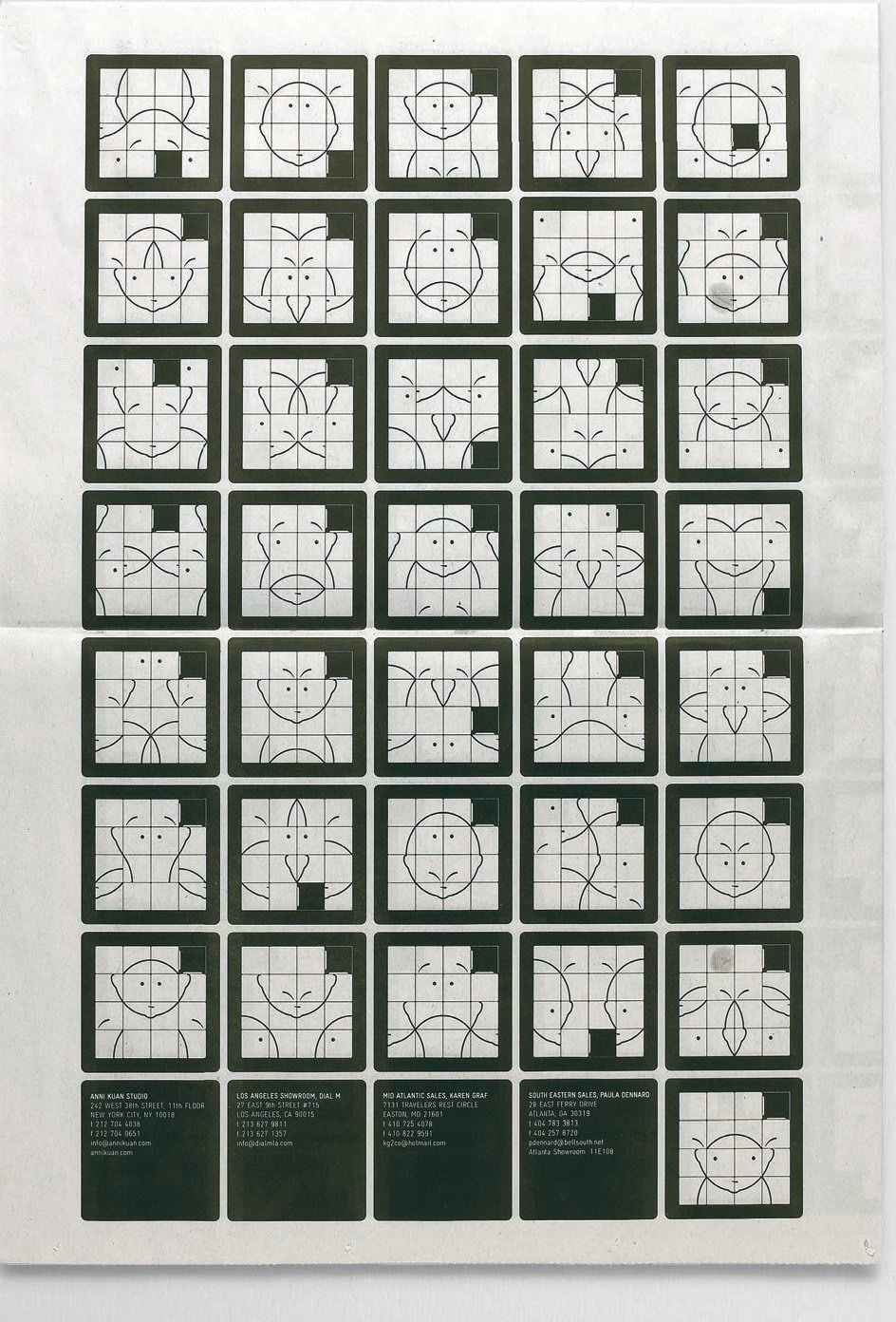
The four-page broadsheet newspaper invitation for Autumn/Winter 2008/09 presents numerous permutations of a classic 4 x 4 slider puzzle, with the original included as a gift. The invitation was designed with Joe Shouldice.
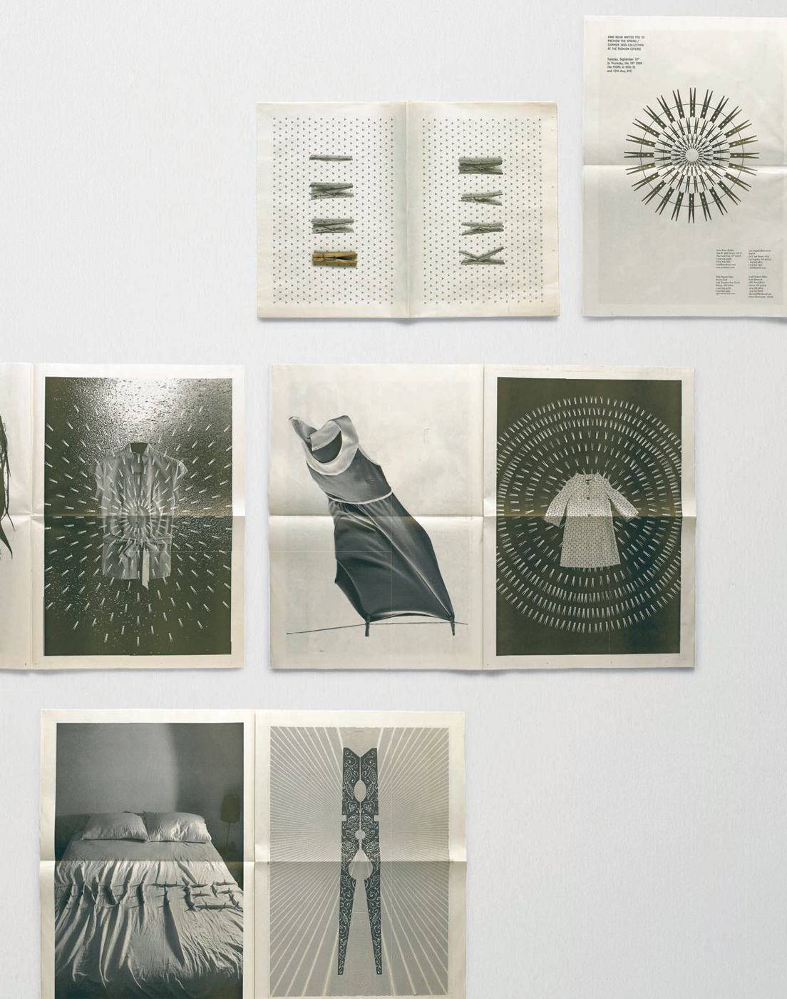
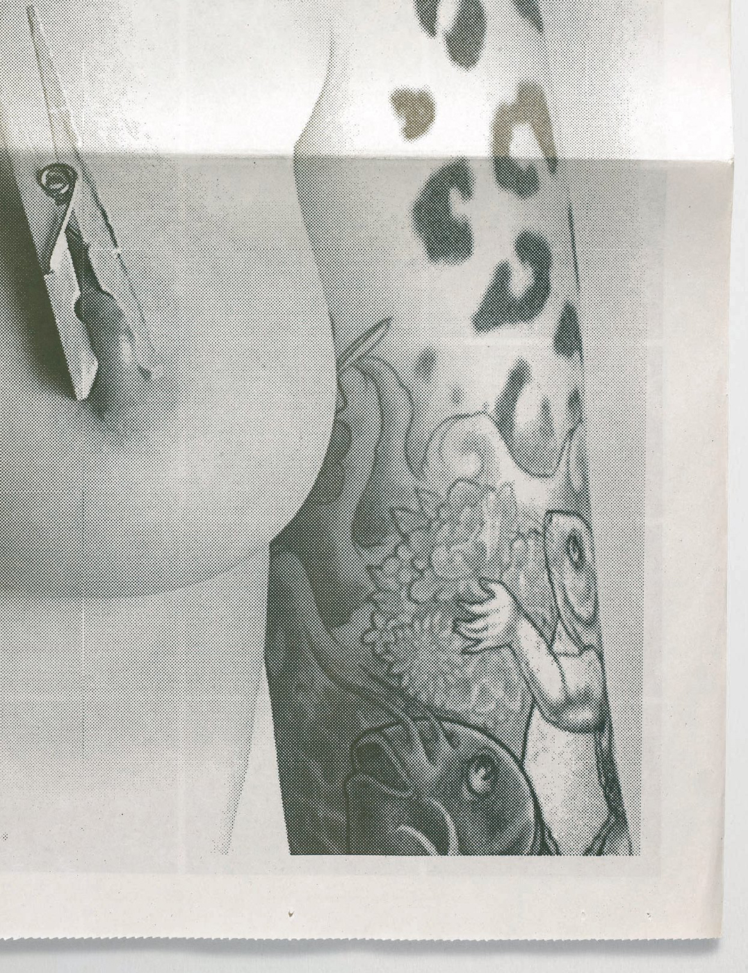
The Spring/Summer 2009 invitation focused on the humble clothes peg. The 16-page broadsheet used a combination of illustration and photography in a series of visual exercises. The cover (opposite page, top) spells ‘Anni Kuan’ with clothes pegs. The invitation was designed with Mark Pernice.

The smaller tabloid formation for Autumn/ Winter 2007/08 ran over 28 pages, featuring images of Anni Kuan shot inside a photo booth by Annika Lischke and Quentin Walesch. The final pages reveal the structure of the set after it has been dismantled. The back cover has a strip of photographs with the details of the collection preview.

For Spring/Summer 2003 the four-page broadsheet poster folded into the classic children’s paper hat. The outer side features typography while the interior includes images of the collection by Barbara Gentile. The invitation was designed with Matthias Ernstberger.