With a natural affinity for “double-acting words” and the simple fact that he initially was combining ‘home’ and ‘work’, in 2002 Jack Dahl set up Homework in Copenhagen. He insists the name relates equally to his practice and his clients as each party in the relationship has certain responsibilities and must do ‘homework’ in order to maximize a project’s potential. In particular, the implication that education is continued beyond professional life is appropriate, supporting his belief that “there is so much more to learn in life and through personal developments; philosophical, spiritual and psychological”. With his enthusiasm for self-improvement, he has maintained a youthful passion for design while building a well-respected creative studio.
Homework have a clean and classical style, which is also contemporary and abstract. This aesthetic has been used with great success in progressive fashion magazines. Bold typography, colour and photography express the confidence in attitude and direction that drives Homework. While he flirts with the balance of creativity and commercial viability, Dahl remains focused on the unique requirements of each project. “It’s not always about creating a completely new solution, but maybe more about trying to make something ordinary feel tempting and look interesting.” This ability to extract nuanced details allows the work of Homework to be comfortable yet progressive.
Although they are entrusted with large-scale projects, Homework have remained a modest size, and deliberately avoid layers of management. Dedicated to implementing designs personally, Dahl is completely hands-on. “If the project and the client’s dreams, beliefs and personality are interesting, it excites me.” His passion for creativity is infectious and draws clients directly into the design process.
Dahl appreciates that when working for the fashion industry the results can be spectacular, but admits there are no guarantees. “I prefer collaborations defined by mutual respect and based on similar ideals and perhaps, but not necessarily, aesthetics.” Since 2007, Homework have provided all the visual communication for Fleur Tang in what has become a very close relationship. There is an ease of communication that has more in common with friendship than with a commercial partnership, and strengthens over time. While each has unique responsibilities, the end result is a true collaboration.
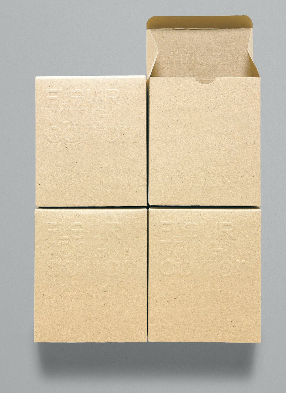
Mutual enthusiasm for the product lies at the heart of the relationship. Fleur Tang is an ethical range of basic clothing, produced with 100 per cent organic cotton, that supports a strong environmental message which is imposed at every stage of the creative and manufacturing process. While they follow the fashion seasons, the collection is limited and only minimal additions are made. “The brief and goal was to discover a new, fresh but understated organic packaging,” says Dahl. Difficult to source in a suitable colour and quality, sustainable, raw card was the material of choice. Focusing on the materiality of the product and packaging, blind embossing of the logo was an ideal solution because of the low environmental impact. In addition, working with local packaging manufacturers, different ways of closing the boxes were explored to build on the complexity and originality of the overall aesthetic. Practical in function, yet refined to touch, the packaging represents a truly cohesive brand communication.

“Fleur Tang garments and packaging are made with 100 per cent organic materials. From the cotton in the mills to the manufacturing, every process is done with the environment in mind – and without harmful chemicals. A piece of clothing with peace of mind.” The minimal design aesthetic features a single logo embossed onto each package. Substantial effort was invested in developing an innovative closure for the box to enhance the uniqueness of the experience.

To increase the environmental economy of the production and distribution of the packaging it was decided that only one size would be produced 12 x 14 x 6cm (4¾ x 5½ x 2½in). Stickers are used to indicate the variation in style, colour and size of the garment within.

Due to the raw quality of the card, subtle tonal variations may appear in different batches of the packaging. Display cases were created in two sizes by Suthi Tang, using the same materials as the packaging, but in contrasting colours.
