
MARQUE CREATIVE for VÍCTOR ALFARO
Marque have offices in London, New York and Glasgow, but distance is no obstacle to creativity as the company maintains a collective work ethic in all its projects. As a branding consultancy, this geographical spread creates an important social and cultural pool from which to draw inspiration. Its head office is in Glasgow, where it first opened its doors in 1994 as Third Eye Design. As the services the company now provides evolved, in mid-2008 it was rebranded as Marque Creative, a reference to its increased focus on branding and a subtle play on the name of the agency founder and managing director: Mark Noë.
In 2007 the New York office won the contract to complete the brand identity and packaging for a new luxury womenswear line by Víctor Alfaro. Also based in New York, Alfaro rose to fame in the early 1990s with body-conscious silhouettes and luxurious materials that projected the refined simplicity of feminine beauty. After stepping away from the fashion industry for a few years, he returned to produce Víctor for Víctor Alfaro exclusively for the American retail store Bon-Ton. Importantly, Alfaro insisted on bringing in Marque to ensure the visual communication would match the high standards he sets for the garments. “Víctor was very eager to make something luxurious out of the project,” says the current director Lisa Smith.
Marque begin all new projects with a ‘branding workshop’ with the client. Alfaro’s participation in the brainstorming session immediately established a sense of collective ownership over the creative process and provided vital information to shape the future direction. Importantly, the agency and client always produce the brief together to ensure the final product meets all expectations. Regardless of the client’s creative capability, the initial collaborative exploration is a trademark of Marque’s highly effective, structured practice.
This refined approach is continued throughout their collaboration with Alfaro; ideas are never just a scribble on a napkin. “Every stage is very engineered, right from the beginning,” says Smith. This is particularly important because of the amount of work the project requires and its logistical complexity. Smith notes that while working for the fashion industry can clearly drive creative innovation, practical concerns and compromise ultimately affect the end product. Marque are responsible for finding the balance between Alfaro’s aesthetic demands and the financial obligations associated with Bon-Ton’s commercial investment.
The packaging is a direct extension of the branding of the label with heavy use of the VA logomark pattern. Modern, and edgy yet accessible, there is a retro feel to the letterform and colour palette. Research into materials was exhaustive as Marque sought to make their presentations as practical as possible. “We did rubdowns, made labels and showed many samples of papers and materials. Víctor is very visual and needs that level of service. He needs to see and feel what he is getting.” The success of the project can be measured by the use of the VA logomark throughout the collection: buttons, denim back pockets, zippers, closures and handbag linings.
Marque are somewhat rare in that they are a global agency with a personal touch. Through their refined creative process and continual internal dialogue they achieve a high level of flexibility to satisfy their broad client base. “You approach fashion the same way you approach every client, with the same level of detail that you want to bring to the project,” says Smith. She maintains that it is important to focus on a client’s requirements and not be distracted by trends and peer approval. Marque produce a body of work that adheres to this belief, but nevertheless consistently insert intimate moments of inspiration.
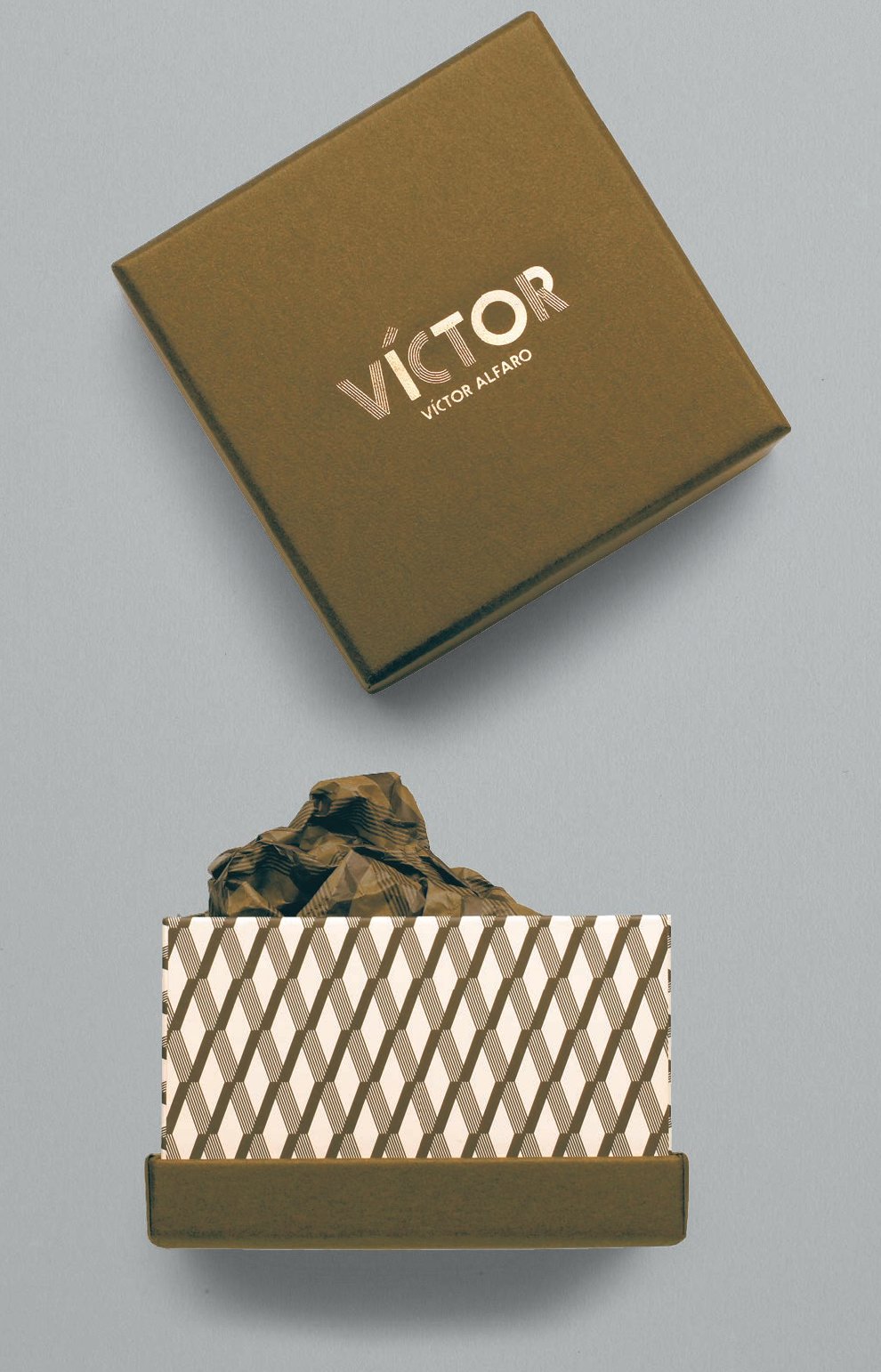
An example of a jewellery box for necklaces and bracelets that was produced in three different sizes.
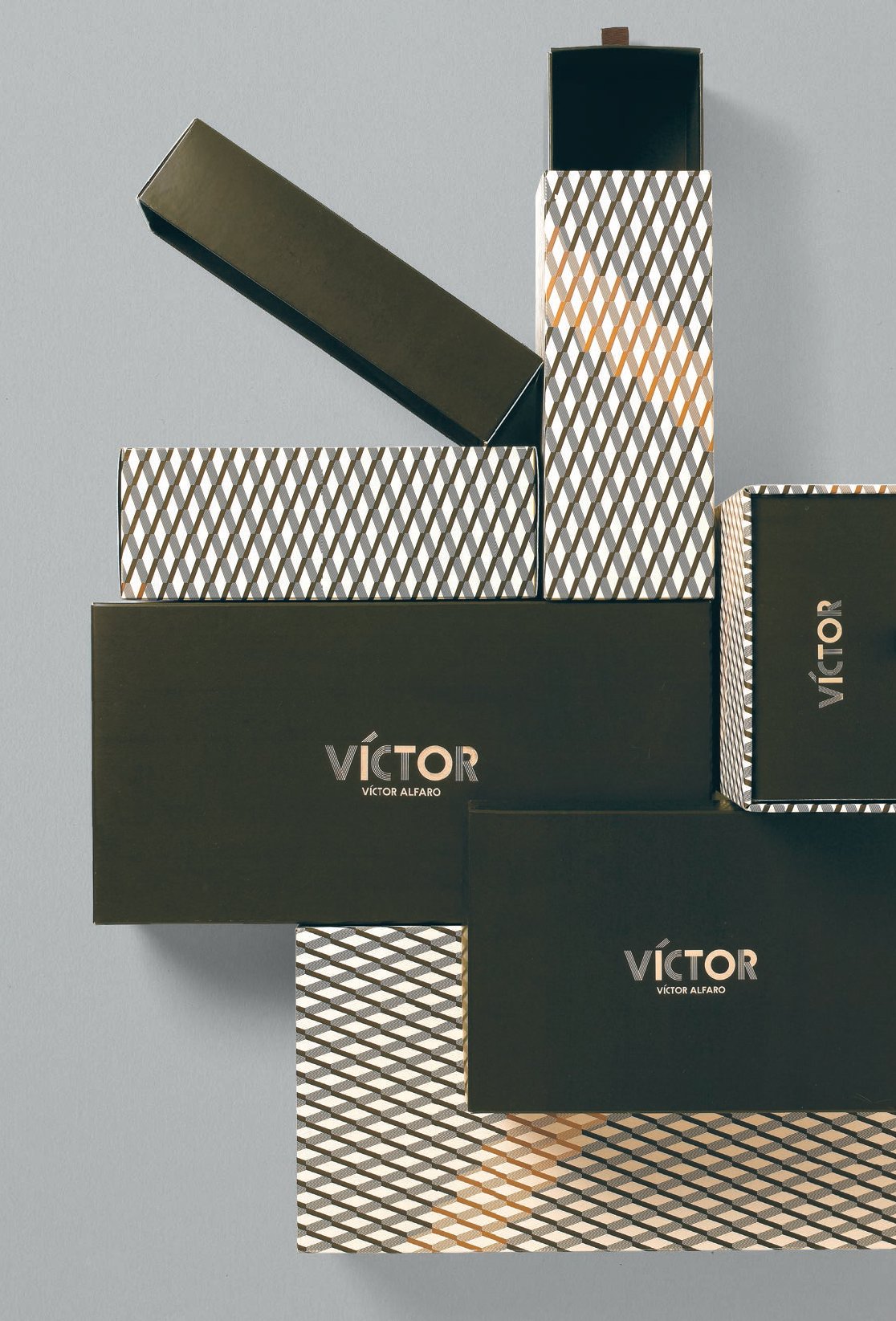
The Víctor Alfaro shoe range features complementary casual and luxury collections. To emphasize this distinction two independent shoebox designs were produced. Each line required ballet-, regular- and boot-sized boxes.
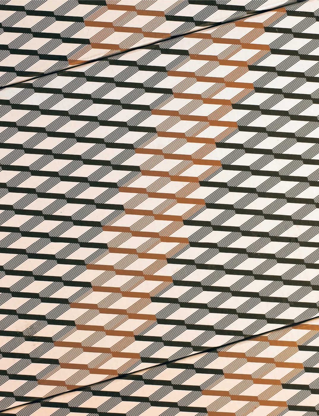
“This VA repeat pattern adds a textural quality, whether through debossing, spot varnishes or as full colour with a matt bronze streak through it on the packaging. Rich, earthy colourways – brown self-coloured stocks and bronze foil detailing – work with the sumptuousness of the materials used in his collections.”