For those of you who have been doing color correction in Final Cut Pro using the Color Corrector 3-way filter, you’ll see a resemblance between many of its controls and those found in Color (FIGURE 20.1). For example, the Color Balance controls and contrast sliders in the Primary In room work more or less the same way as their Final Cut Pro counterparts, and the HSL (Hue, Saturation, and Lightness) qualifiers in the Secondaries room are nearly the same as the Limit Effect controls, albeit with a fancier, more industry-standard name.
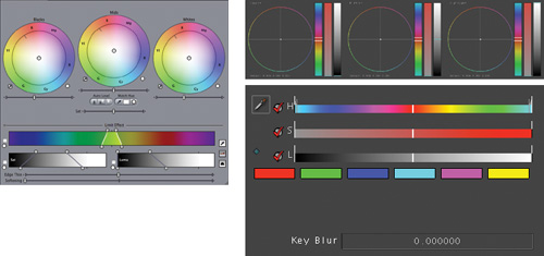
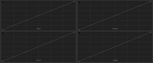
However, many other controls are available only within Color. Principal among these are the curves controls found in the Primary In and Primary Out rooms (FIGURE 20.2). The curves controls let you make specific adjustments to individual color channels by adding control points to bend a diagonal line. There’s one curve control for each color channel (red, green, and blue) and a fourth that controls luma (which controls the lightness of the image).
Those of you who work with Photoshop and other image editing applications are probably already familiar with curves; in fact, the more vocal souls among you may have already been asking for them in Final Cut Pro. Meanwhile, video colorists who’ve been working in other applications specific to color correction and film grading may be asking “why should I use curves when I’m already used to the other primary controls?”
One of my favorite features in Color is the Luma curve (the fourth one at the bottom right). The Luma curve simultaneously adjusts the red, green, and blue components of the image, with the result being a change to the overall lightness of the image. In this article, we’ll focus on how you can use the Luma curve control to make some incredibly specific contrast adjustments that would be difficult to perform with the regular contrast sliders.
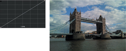
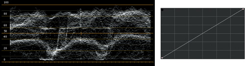
Before diving into the practical examples, let’s step back for a theoretical overview of how, exactly, curves affect the image. Curve controls are essentially two-dimensional graphs. In FIGURE 20.3, the color curve control graph has two dimensions; one is the source axis (the X-axis), and the other is the adjustment axis (the Y-axis).
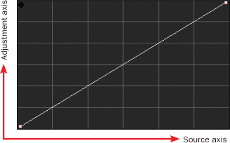
You may consider the white line of the curve itself to represent the actual values in the image. The leftmost part of the curve represents the darkest pixels in the image; the rightmost part of the curve represents the lightest pixels in the image.
When this white line is a straight diagonal from left to right (its default position), the source axis equals the adjustment axis, and the result is that no change is made to the image. The grid in the background of the control helps you verify this, since at its most neutral position the line of the curve control intersects each horizontal and vertical pair of grid lines through the middle diagonal, as you can see in Figure 20.3.
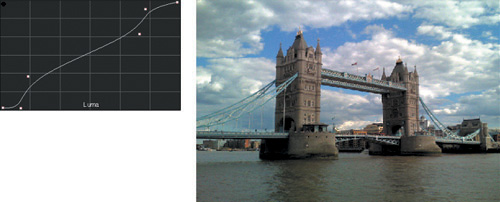
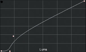
Curves get interesting when you add a control point with which to make adjustments. FIGURE 20.4 shows a control point dragged up, increasing the values along the middle section of the curve.
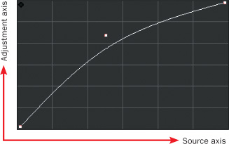
In this case, you can see that the values along the middle of the image (the midtones) are raised. The curve is higher along the adjustment axis than the source axis, so the midtone image values in that channel are consequently raised. If this was the Luma curve, you’d be brightening the midtones of the image. If you instead dragged this control point down in the Luma curve, then the same parts of the image would instead be lowered, darkening the image.
By default, each curve begins with two control points that pin the left and right of the curve to the bottom and top corners. These can also be adjusted to manipulate the darkest and lightest values in that channel, but most of the time you’ll be adding one or more control points along the middle of the curve to make your adjustments.
With that explanation in mind, let’s take a look at how this works in a practical sense.
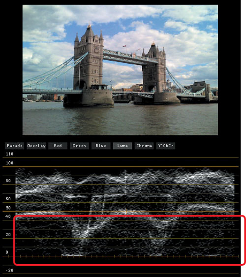
Let’s begin by importing a project into Color and clicking the Primary In tab at the top of the Color window to open the Primary In room. We’ll demonstrate with a shot of the London Bridge (FIGURE 20.5). It’s a late afternoon shot, and the shadows of the towers face the viewer, obscuring valuable detail. Furthermore, the director wants to match this establishing shot to a scene shot earlier in the day, so it would be good to reduce the depth of those shadows for simple continuity. Additionally, the sky is looking a bit flat, so we’ll see if we can’t bring some more detail out of those clouds.
If it’s necessary to expand the overall contrast ratio of the image (to adjust the white and black points of the image to maximize the available contrast), it’s best to do this first. It’s best to make changes to an image’s overall contrast by adjusting the primary contrast sliders to the right of each of the Color Balance controls (FIGURE 20.6).
Since the Luma curve control is pinned at both the highest and lowest parts of the curve control graph, you cannot raise the brightest highlights or lower the deepest shadows using just curves. For this reason, you might consider the Luma curve to be an extremely detailed midtones control.
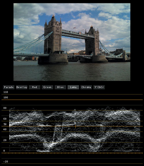
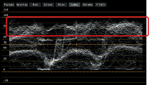
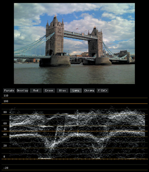
In the London Bridge shot, the white, sunlit highlights in the clouds would look better boosted up to just under 100 percent, maximizing the contrast ratio of the image and giving us more range to work with in the curves control. To do this, simply click anywhere within the Highlight contrast slider and drag up or down to make the adjustment. In FIGURE 20.7, we can see the results of boosting the highlights using the Highlight contrast slider in the Luma graph of the Waveform Monitor.
Once this is done, we can now move on to the adjustments we want to make using the Luma curve. The first order of business is to reduce the depth of the shadows on the bridge. The tricky part of this is that we don’t want to lose all of our deep blacks in the shot; that would make the image look flat and lifeless. Instead, we want to preserve the very deepest shadows in the image, but lighten those shadows on the towers of the bridge. This can be done by adding two control points to adjust the Luma curve.
However, where to add the control points? One thing you should notice is that there’s a rough correspondence between the height of portions of the graph in the Waveform Monitor and the height of the control points you add to a curve control. Since we know we’re making adjustments to the shadows, we want to add control points near the bottom of the curve roughly corresponding to the bottom two dips in the graph that match the position of the shadows on the tower (FIGURE 20.8).
Note
The horizontal position of features on the Waveform Monitor graphs correspond to the horizontal position of features in the image.
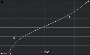
To preserve the darkest shadows in the image, we click once on the white line to add a control point at the bottom-left side of the curve control, and drag it down to reduce the levels. Then we add a second control point to the right of the first one, corresponding to the height of the tower shadows in the waveform graph, and drag the second point up to lighten that portion of the image. The final Luma curve adjustment can be seen in FIGURE 20.9, with the final result in both the image and Waveform graph in FIGURE 20.10.
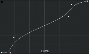
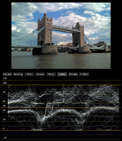
Now the bridge shadows are suitably lightened, but the result has been a lightening throughout the midtones of the image, which is not what we wanted. To correct this, we need to add another control point at the upper-right part of the curve and drag it down to bring the midtones and highlights back down. The change to the curves is shown in FIGURE 20.11, the change to the image in FIGURE 20.12.
You should be noticing that these curve adjustments are pretty subtle. With the Color curve controls, a little bit goes a long way.
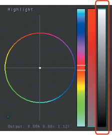
Now that the shadows and midtones of the image have been adjusted, it’s time to do something to pep up those clouds. One of my favorite tricks with curves is to make extremely selective stretches to the contrast in the highlights in order to bring out more cloud detail. The effect can add quite a bit of drama to an otherwise dreary gray day. To do so, we add one more control point to the right of the one we added previously (FIGURE 20.13), affecting the very top of the highlights that correspond to the lighter portions of the clouds. Dragging this control point up selectively stretches the contrast in the clouds, while leaving the rest of the image relatively untouched. The result is more dramatic looking clouds with lots more visible detail, as you can see in FIGURE 20.14.
At this point, I’m satisfied with the image. The overall contrast ratio is nice and wide, with deep blacks and bright highlights; the time of day matches the other scene; and there’s lots of pleasing detail throughout the frame. Let’s take a look at the before (FIGURE 20.15) and after (FIGURE 20.16) to get a better sense of what’s happened to the image.