
The red, green, and blue color adjustment curves in Color are located underneath the color balance controls in the Primary In and Out rooms, as shown in FIGURE 21.1.

Each color curve controls the amount of one primary color component of the image. Adding control points to a curve lets you raise or lower the level of the red, green, and blue color channels to different values at different areas of image tonality. In other words, you can raise the amount of red at the top of the midtones while simultaneously lowering the amount of red at the bottom of the midtones, as shown in FIGURE 21.2.

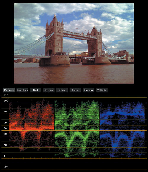
This will be explained in greater detail later on. For now, let’s begin with a simple example of curves in action. FIGURE 21.3 shows the relatively neutral image of the London Bridge.

Note
In all examples in this chapter, the video scope graphs are shown with the Broadcast Safe controls turned off, in order to let you compare the tops and bottoms of the Parade scope graphs without clipping at 0 and 100 percent.
To add more red to this image using the curves, simply click the middle of the Red curve to add a single control point, and then drag it up to raise the amount of red, as shown in FIGURE 21.4.

As you can see in Figure 21.4, dragging up the control point boosts the amount of red throughout the midtones of the image. Making an adjustment with only one control point results in a fairly extreme overall adjustment to the image, since it pulls nearly every part of the curve upwards. This creates a warm color cast over the entire scene.
You should note that the initial two control points that the curve starts out with at the bottom left and upper right (shown in Figure 21.4) partially pin the darkest and lightest parts of the red channel in place. With ordinary adjustments of modest scale, this default position helps to preserve the neutrality of the darkest shadows and the brightest whites in the image. FIGURE 21.5 compares the unadjusted and adjusted red graphs of the Parade scope from the previous image. If you look closely at the top and bottom, you can see that the midtones of the red channel have been stretched by a greater amount than the shadows and highlights of the red channel.

However, the beauty of the curves interface is that it lets you apply multiple adjustments throughout the tonal range of an image from the shadows to the highlights, depending on how many control points you add to the curve, and where you place them. FIGURE 21.6 shows a rough breakdown of which parts of the default slope of the curves interface correspond to which tonal areas of the image. Bear in mind that since the practical definition of shadows, midtones, and highlights overlaps considerably, this is only an approximation.

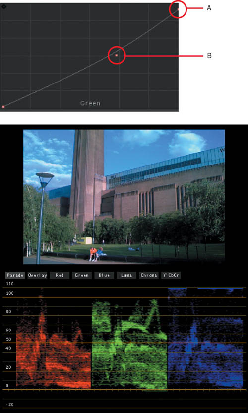
In FIGURE 21.7, we’ve added a second control point to the middle of the Red curve to more finely control the effect. The control point to the left continues to boost the red channel, but now it’s specific to the lower portion of the midtones and shadows. Meanwhile, the second control point to the right pins the Red curve at a more neutral diagonal in the highlights. The curve from one control point to the other is kept very smooth, resulting in a very gradual transition from one region’s adjustment to the next.

The result is that the bridge, the city, and the water that comprise the midtones have the red cast we’ve introduced, but the sky and clouds in the highlights remain neutral, as you can see in FIGURE 21.8.
This is the power of curves. They give you specific, customizable control over the color in different tonal regions of an image that can sometimes border on secondary color correction.
If you want to use curves as a corrective tool to neutralize color casts, one of the best ways to spot which curves need to be adjusted to make the necessary correction is to use the Parade scope. As you’ve already seen in the previous example, the graphs for each of the three color channels in the Parade scope correspond perfectly to the three available color curve controls. Since color casts generally reveal themselves in the Parade scope as an elevated or depressed graph corresponding to the channel at fault, you have an instant guide to show you which curve you need to adjust, and by how much.
FIGURE 21.9 shows an image with a green channel that is obviously too high relative to the rest of the picture, and it’s throwing off the highlights of the shot.

If you look at the tops of the three colors in the Parade scope that correspond to the highlights, you can see that the green channel exhibits a higher graph, contributing to the overly cyan look of the sky and clouds. Since you can measure how much higher the top left portion of the green graph is than the top left portion of the red graph, you have an idea of how much of an adjustment you have to make.
Dragging down the upper-right control point that’s already at the top of the Green curve control causes a corresponding drop at the top of the green graph of the Parade scope. Dragging it down until the top of the green channel lines up with the top of the red channel in the Parade scope corrects the highlights (see callout A in FIGURE 21.10). Clicking the middle of the Green curve control to add another control point and then dragging it down lowers the amount of green in the upper area of the midtones (see callout B in Figure 21.10), revealing an instant improvement to the color of the sky in Figure 21.10.
Unfortunately, the same correction that gives the sky a nicer blue shade has the side effect of desaturating the foliage of the plants. However, this is easily fixed by adding a second control point to the Green curve to boost the bottom half of the curve (see callout A in FIGURE 21.11). I’ve also taken the liberty of adding a third control point to the bottom shadow portion of the Green curve to desaturate and deepen the shadows (see callout B in Figure 21.11). The result is visibly healthier plant life with good color contrast.

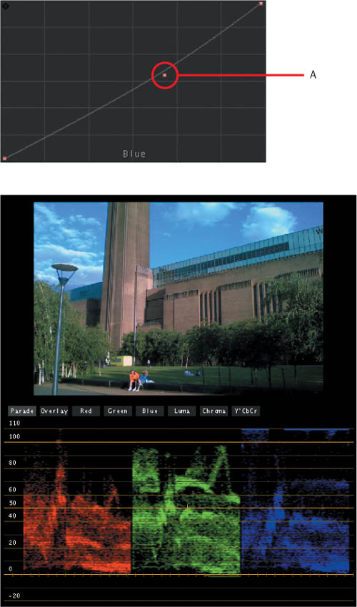
With these other corrections made, it becomes apparent, both visually and by looking at the top of the midtones of the blue Parade scope graph (see the callout in Figure 21.11), that the blue channel is inappropriately high. Looking at the Parade scope graph, it makes sense that the top of the blue graph should be higher than the tops of the red and green graphs, since the brighter sky is blue, but the midtones are proportionally higher as well, which is affecting the building and plants. The solution, shown by callout A in FIGURE 21.12, is to click the upper-middle of the Blue curve to add a control point to the Blue curve, and then gently lower it.
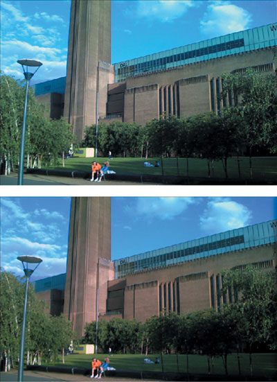
As you can see, there is a fairly direct correspondence between the values displayed in the three graphs of the Parade scope and the three color curve controls. FIGURE 21.13 shows the before and after of all the adjustments made to the image up to this point.
Unlike the color balance controls, which simultaneously adjust the mix of red, green, and blue in the image, each of the color curves adjusts just one color component at a time. This means that sometimes you have to adjust two curves to make the same kind of correction that you could achieve with a single adjustment of the appropriate color balance control.
For example, in FIGURE 21.14, the Parade scope indicates a color cast in the shadows of the image, via a blue channel that’s too high and a red channel that’s too low.

To correct the color cast using the curves controls, you’d have to make two adjustments: raise the bottom control point of the Red curve (callout A in FIGURE 21.15) and crush the shadows of the Blue curve (callout B in Figure 21.15). However, to make the same adjustment using the color balance controls, you would only need to drag the Shadow control up towards orange (callout C in Figure 21.15). Both adjustments result in the same correction.

Which way is better? Well, that’s really a matter of personal preference. The real answer is whichever way lets you work faster. In a client-driven color correction session, time is money, and the faster you work, the happier your client will be.
Both controls have their place, and my recommendation is that if you’re coming to Color from a Photoshop background, take some time to get up to speed with the color balance controls; you may be surprised at how quickly they work. And for colorists from a video background who haven’t used curves that much before, take the time to learn how to make curve adjustments efficiently, as it may open up some quick fixes and custom looks that you may have wrestled with before.
Lastly, one of the more creative uses of the color curve controls is to add tinted undertones to a specific tonal region of the image. This is the way to create the “green shadows” look seen in various film scenes and commercials, although you can use this technique to add any color tint to any area of the image.
The trick is to use a group of control points to add a tightly controlled boost or drop in a particular color channel of the image. For a more sophisticated look, try keeping the darker shadows in the image untinted, so that there’s some contrast between the tinted and untinted regions of shadow. For example, FIGURE 21.16 shows a neutral interior scene.
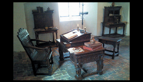
In FIGURE 21.17, you can see a fairly narrow boost to the green channel created with four control points. Notice in particular the pair of control points at the right. Whenever you want to create a sharper curve in order to make an adjustment that’s not so gradual, bring a pair of control points closer together. In this example, the result is to flatten out the curve to a neutral diagonal from the lower midtones all the way through the highlights.
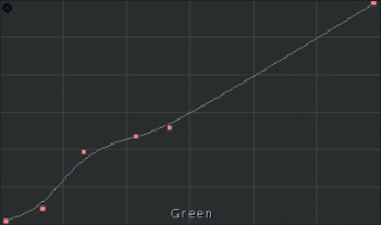
Figure 21.17. Making a selective boost in a portion of the shadows of the green channel. (For a reminder of which parts of the curve correspond to which tonal areas of the image, see Figure 21.6.)
The result of this selective boost is shown in FIGURE 21.18: green undertones throughout the image that contrast well with the natural color and lighting from the original scene.

If you examine some of the premade looks provided in the Color FX bin of the Color FX room, specifically the Movie_Look_Green color effect, you’ll see that the same method is employed there, along with some other selective adjustments to other tonal regions of the red and blue channels, using curve nodes applied to individual image channels.
As you can see, color curves are extremely powerful tools that can be used for a number of corrective and creative tasks. Although they may seem a bit daunting at first, as with all things, the more time you put into practicing to create different effects, the faster you’ll be in using them.