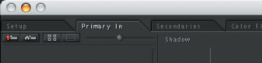
The various “rooms” of the Color interface are ordered according to a traditional colorist’s workflow. Basic corrections to the overall shot are usually performed using the Primary In controls, found in the Primary In tab, located at the top of Color’s interface (FIGURE 22.1). Next, the controls in the Secondaries room are used to make more targeted adjustments to specific features within the shot. After that, the Color FX room provides additional ways to create custom effects and more extreme stylizations, building upon the Primary and Secondary corrections you’ve already made. Lastly, the Primary Out room provides additional controls for fine-tuning the overall shot, allowing you to adjust the output of all work done in the first three rooms.
With one minor exception, the Primary In and Primary Out rooms have the same controls. Interestingly, the Secondaries room also uses many of the controls found in the Primary In room. The bottom line is that once you learn how to use the controls in the Primary In room, you end up learning how to work within many other areas of Color’s functionality. For that reason, it’s worth spending some time to learn how these controls work.
Before we dive into how to make corrections the “long way,” it’s worth taking a quick look at one of the few automated tools that Color provides—the Auto Balance control. The Auto Balance control, found under the Basic tab at the right of the Primary In room (FIGURE 22.2), provides a fast, “one-click” correction that simultaneously adjusts the color and contrast of an image.

When you click Auto Balance, Color “auto-magically” samples the frame at the position of the playhead to determine the darkest five percent of the image, the lightest five percent of the image, and the most neutral midtone pixels that fall between the two. These three sets of values are used to figure out how to adjust the shadows, midtones, and highlights of the image in order to maximize the image contrast, stretching it to fit from 0 to 100, and correcting whatever color casts appear throughout.
To use the Auto Balance button, follow these simple steps:
Move the playhead in the Timeline to a frame of the current shot that’s representative of the image. If you’re correcting a shot with variable exposure, try to pick a reasonably well-exposed frame with visible areas of desaturated white, gray, and/or black.
Click the Auto Balance button.
That’s pretty much it. Color takes a second to think, and then the correction is made. Unlike Final Cut Pro, in which the Automatic Color Balance and Contrast buttons make adjustments to the main controls of the Color Corrector 3-way filter, the automatic adjustments in Color populate the Lift, Gain, and Gamma parameters found in the Advanced tab (FIGURE 22.3). The graphical color balance controls and contrast sliders are left alone for you to make further adjustments.

This may at first seem deliberately obtuse, but trust me, it’s a good thing. The Auto Balance button is meant to give you a head start for your grade, but invariably you’re going to make further manual tweaks as you work on your shot. Doing so with a fresh set of controls is a good way to keep your adjustments separate from those made by the Auto Balance control. If at any point you want to reset your manual adjustment, you won’t also reset the original automatic adjustment.
How well does it work? Well, results vary depending on the shot you’re trying to correct. I’ve found that the effectiveness of the Auto Balance button depends in large part on the type of image you’re correcting. Shots requiring smaller contrast adjustments, and with clearly visible areas of desaturated white, black, or gray, tend to give better results than clips that are under- or overexposed, or with regions that are off-white, such as a pale yellow wall.
In general, I recommend trying it out, and if it provides a good starting point for your work, then great, you’re ahead of the game! If you don’t like the results, you can always click Reset Primary In, located under the Auto Balance button.
Color provides separate controls for contrast and color adjustment. I begin with the manual contrast controls because, in general, these are the first adjustments you’ll make when you start work on a shot.
There are three sets of controls in the Color interface that provide control over contrast (FIGURE 22.4): the Shadow, Midtone, and Highlight contrast sliders; the Lift, Gain, and Gamma parameters in the Basic tab; and the Luma curve control.

All of these controls affect image contrast, which I like to define as the distribution of tonality from the darkest to the lightest pixels in an image. The Luma curve control provides another method of adjusting the contrast of your image. The curve interface allows for extremely detailed contrast adjustments, but we’ll focus on using the primary contrast sliders and the Lift, Gain, and Gamma parameters.
The three primary contrast sliders appear as vertical gradients in the Color interface. Clicking within one of these sliders and dragging up or down lets you adjust the region of image tonality affected by that slider. For example, the Shadow slider lets you adjust the black point of the image, darkening or lightening the shadow region of the image by raising or lowering the darkest pixels, and scaling everything between the shadows and highlights. Similarly, the Highlight slider lets you adjust the white point of the image, darkening or lightening the lightest pixels of the image, and scaling everything between the highlights and shadows.
In FIGURE 22.5, the image contains overexposed highlights, as well as shadows that are somewhat light relative to absolute black. This can be seen by examining the very top and bottom of the graph in the Waveform Monitor while it’s set to Luma, the Waveform Monitor’s mode for evaluating the luma-only component of the image. (In this example, Broadcast Safe is turned off so you can see the overexposed portion of the image.)

To adjust the image so that the shadows are darker, you can click anywhere within the gradient of the vertical Shadow slider, to the right of the shadow color balance control, and drag down to lower the bottom of the graph in the Waveform Monitor until it just touches 0 percent. You can also “crush” the shadows a bit by lowering the Blacks slider (see FIGURE 22.4 to locate the Blacks slider) even more so that even more of the shadows are flattened down to 0 percent, in order to create even denser portions of black in the shadows. Doing so sacrifices a bit of shadow detail, but if we’re careful and don’t overdo it, this isn’t necessarily a problem. If it looks good in your broadcast monitor, then it’s the right thing to do.
Now it’s time to turn your attention to the highlights. All luma above 100 percent is considered “superwhite,” and is not legal for broadcast. (Send a broadcaster a video master with superwhite, and more likely than not it’ll be returned to you with a stern note to fix it.) By default, Color “clips,” or eliminates, all superwhite values above 100 percent to be 100 percent using the built-in Broadcast Safe settings, found in the Project Settings tab of the Setup room. However, clipping the superwhite values in the image will eliminate valuable detail in the highlights, flattening out these areas unnecessarily. Dragging down the Highlight slider brings image detail over 100 that would otherwise be clipped back into the allowable 0 to 100 percent range.
Lowering the black point and the white point has the overall result of darkening the entire image, which is not exactly what we want, so dragging up within the Midtone slider lets you raise the average midtones of the image that fall between the shadows and highlights, to brighten the image. Doing so invariably requires readjustments to the Shadow and Highlight sliders, and you’ll move from one slider to the other, raising the midtones and then lowering the shadows and highlights until you’re satisfied with the overall image.
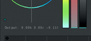
You’ll notice by now that I’m not showing you screenshots of these slider adjustments, and that’s because the sliders aren’t really that visual—the small blue indicator is not a handle, and the amount you can adjust each slider is not limited by the slider’s height. However, if you look at the bottom of each of the three groups of color and contrast controls, you’ll see a small set of three values labeled “Output,” shown in FIGURE 22.6. These show you the (H)ue and (S)aturation of any color control adjustments you’ve made, and the (L)ightness of your contrast adjustment. In the example in Figure 22.6, since we’ve not made any color adjustments yet, we see only that the Shadow contrast slider has been set to a value of –.11.
After all of these adjustments are made, FIGURE 22.7 shows the resulting image and Luma graph.

I’ve turned the Broadcast Safe settings back on, so you can see the clipping that’s occurring at 0 percent in the Waveform Monitor. You may also notice that I’ve flattened the contrast in the highlights of the image by significantly lowering the highlights of the image and simultaneously raising the midtones. I’ve done this in order to minimize the shiny highlights on the woman’s face. Shine on a face is sometimes considered undesirable, depending on the program, and reducing the amount that the highlights stand out from the average brightness of the face is almost like applying digital powder. If the image is looking a bit flat at the moment, don’t worry, it’ll look better after we start adjusting the color of the image.
Once the contrast has been adjusted, it’s time to start working on the color of the image. You have three sets of controls for color, two of which are visible in FIGURE 22.8. The color balance controls let you simultaneously adjust all three of an image’s color channels at once, in specific regions of image tonality. For example, in order to rebalance a color cast (or tint) in the highlights, you’d use the Highlight color balance control. If your color cast was in the shadows, you’d use the Shadow color balance control instead. The tonal regions that are affected by each of the three color balance controls overlap broadly, but generally speaking you want to try and identify which part of the image has the color cast (is it the shadows, the midtones, or the highlights?), and then use the color balance control that corresponds to that region of image tonality.

You can also use the Red, Green, and Blue curve controls, which are used for extremely detailed adjustments to each individual color channel of the image. (See Chapter 21 for more details). In general, you may find that the color balance controls are the fastest way of making corrections to the garden variety color casts that come from color temperatures in lighting that are incompatible with the white balance of the camera or the film stock being used.
However, there’s no reason you can’t use the color balance and curve controls together. I frequently use the color balance controls for simple color temperature corrections, and then use the curve controls to make more specific, nitpicky adjustments. There’s no right or wrong way to work; it’s all a matter of preference.
Speaking of preference, the third set of color controls in the Primary In room are those found in the Advanced tab shown in FIGURE 22.3. Some colorists like to type in the specifications to make fine-tuning adjustments, but I personally prefer the color balance controls and color curves for their graphical interface. Also, if you have used the Auto Balance controls, those parameters will already be populated with values that you may or may not want to adjust further.
Let’s get back to our image. Just from looking at it in FIGURE 22.9, we can see that there’s a blue cast to the image that’s probably the result of an incorrectly white-balanced video camera. However, if we switch the Waveform Monitor to a Parade scope analysis (click the Parade button at the top of the video scope), we can see exactly where within the image the color cast lies.

The Parade scope shows graphs of the red, green, and blue channels in the image next to one another, so you can see how they’re balanced. Areas of the image with no saturation, like white, gray, and black areas, should have corresponding waveforms in the Parade scope that line up. In particular, the tops and bottoms of the graphs are good places to look for color casts, since the brightest highlights and darkest shadows of any image are typically supposed to be desaturated. In this image, the top of the blue channel is really high, even though the image itself consists of the greens of the background foliage and the reds of the woman’s face. This shows how much of a color cast there is right off the bat.
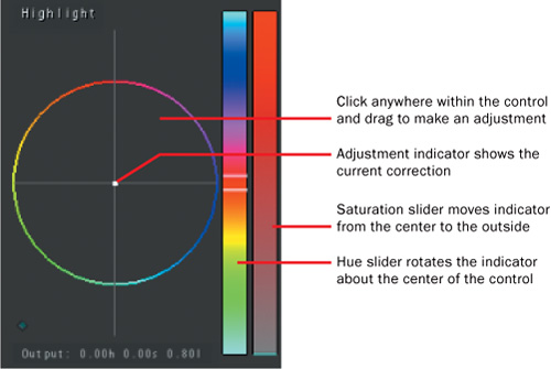
To make an adjustment using any color balance control, you simply click anywhere within the color wheel and drag in the direction you want to manipulate the color. As you drag your mouse, crosshairs with a white dot at the center show you how much of an adjustment you’re making, and the Output values below it show you the hue and saturation of your adjustment. The two sliders immediately to the right of each color balance slider let you make individual hue and saturation adjustments to the color balance control’s correction (FIGURE 22.10).
Now that we know what color we want to neutralize (blue), and where the adjustment needs to take place (in the highlights), we can go ahead and make the necessary adjustment using the Highlight color control.
In FIGURE 22.11, a small adjustment to drag the Highlight color balance control to the right, towards a green/yellow split, neutralizes the blue color cast we’re trying to eliminate by combining it with its complementary (or opposite) color value, while at the same time strengthening the golden yellow in the highlights of her hair. A second adjustment to drag the Midtone color balance control up towards an orange/red split enhances the color in her face, while further reducing the cyan-ish tint that remains in the midtones (orange is the complementary, or opposite, color of cyan).

The final result of these adjustments can be seen in FIGURE 22.12. The prominent reddish/orange of the woman’s face in front of the predominantly green background provides excellent color contrast, which gives depth to the image and compensates for the lack of vivid highlights in bringing the foreground image to the viewer’s attention.

Now that we’ve adjusted the contrast and color balance of the image, it’s time to turn our attention to the last major aspect of the image that remains untouched, the saturation or intensity of the color.
Unlike Final Cut Pro’s Color Corrector 3-way filter, which has a single slider that controls the overall saturation of the image, Color provides three controls in the Basic tab of the Primary In room for controlling saturation, as shown in FIGURE 22.13. The Saturation parameter at the top controls the overall saturation of the entire image. A value of 1 results in no adjustment to image saturation. Higher values result in more intense color (the maximum value is 4); lower values diminish color intensity. A value of 0 results in a grayscale-only image (which reveals the luma-only component of the image).

Note
These are completely different controls from the saturation sliders found next to the color balance controls, which affect only the intensity of the color balance adjustment being made, not the overall image saturation.
Separate Highlight Saturation and Shadow Saturation controls are valuable for preventing unwanted oversaturation in the shadows and highlights of the image, which can give your images a “cheap plastic” look. In general, both deep shadows and bright highlights tend to be desaturated when properly exposed and captured by professional film and video cameras. For this reason, large boosts to overall saturation can be prevented from bleeding into your shadows and highlights with a reduction to highlight and shadow saturation.
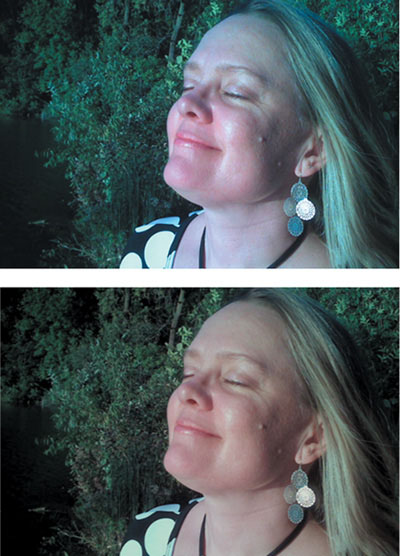
In our image, we might suppose that the client is happy with the overall color balance of the image but wants a more “muted” look, with less intense color. This is easily accomplished by lowering the Saturation, as seen in FIGURE 22.14. This can be done by middle-clicking and dragging in the Saturation parameter field using a three-button mouse (if you’re using Apple’s Mighty Mouse, you can program the scroll ball to be mouse button 3 in the System Preferences). This works with any parameter in Color. Dragging to the left lowers the value; dragging to the right raises the value.

The result of this adjustment, along with a before-and-after comparison of what we’ve accomplished in this shot, can be seen in FIGURE 22.15.
So there you have it. This is but one possible treatment of the example clip. There are many other directions in which we could have taken this initial primary correction, depending on our creative goals, and of course the client’s preference. In addition, the shot might well benefit from additional adjustments in the Secondaries and Color FX rooms—Color gives us plenty of room for further development! However, if you master the ability to manipulate color and contrast using the color balance, contrast, and saturation controls, you’ll be well positioned to be able to use these other rooms effectively.