ALEXIS VAN HURKMAN
The word “vignette” means different things to different people. Optical vignetting occurs when a (usually) inferior lens exhibits darkening or blurring around the outer edge of the image. Mechanical vignetting is an even harsher effect, seen most frequently as black corners around the edges of a recorded image that was shot using a zoom lens at its widest setting.
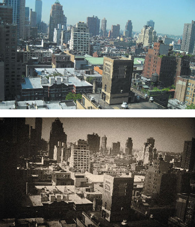
As far as color correction techniques go, vignettes are targeted image adjustments that use shapes, usually ovals and rectangles, to isolate a portion of the picture for specific adjustment. The classic vignette effect, used most often to simulate “old-timey” film, is a round, feathered vignette isolating the outer edge of the image and used to darken it, simulating the effects of optical vignetting (Figure A.1).
Vignettes are an incredibly flexible tool and are useful for tasks ranging from creating “sky grad” optical filter effects to lightening the faces of underlit actors and throwing shadows onto walls of an overlit scene.
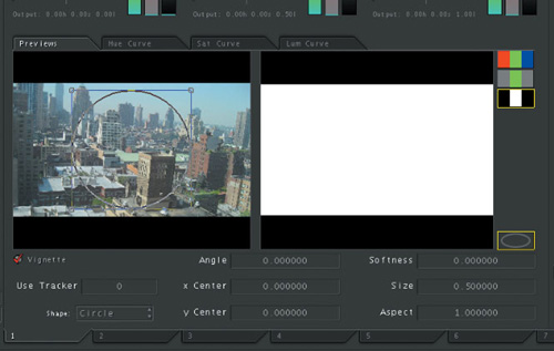
The vignette controls are found in the Secondaries room, both within and underneath the Secondaries Previews tab (Figure A.2).
Color correction is, in large part, a process of problem solving. The image doesn’t look right, and you need to figure out how best to improve it. If you’re working on someone else’s project and you’re charging them money, you also have to figure out how to make the fix as fast as possible so you can move on to the other 900 shots in the program. This is all part of the fun and challenge of the color correction process.
I’d like to offer some words of caution about trying to use vignettes in situations where HSL qualifiers may be a faster solution. I bring this up because I often see people jump straight to using a vignette without even trying the HSL qualifiers in situations where this ultimately creates more work. Allow me to expand on this topic and provide some food for thought as to the pros and cons of each approach to a secondary correction.
Vignettes are an excellent solution when:
There is no easily isolated range of color or lightness that’s distinct from the rest of the image.
The subject you’re trying to isolate using HSL qualifiers is too noisy for a clean result.
There’s not much movement, or the camera or subject’s motion is simple.
The subject is easily defined by an oval or rectangular region.
On the other hand, the HSL qualifiers are a great solution when:
The area of the image you’re trying to isolate is a particularly vivid range of hue or lightness that’s distinct from the rest of the image.
There’s a lot of irregular movement in the camera or subject.
The edges of the subject you’re trying to isolate are extremely irregular, and they’re moving on top of it all.
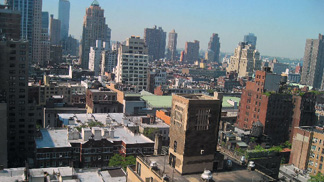
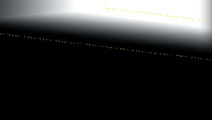
Consider the sky in this uncorrected illustration, shown in Figure A.3.
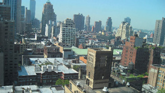
If one of our goals for this shot is to boost the color and quality of the sky, then careful examination of this shot might lead us to the following conclusions:
There’s a lot of blue throughout the image, so it might not be that easy to isolate just the sky.
It’s a locked-down shot.
The sky is easily defined by a rectangle.
Chances are, a vignette will be a good choice for making this correction. Keep in mind that these are generalizations, and like all generalizations they’re bound to be wrong here and there. The bottom line is that, when conditions are right, vignettes are incredibly fast and intuitive to use. Let’s see how it’s done.
As always, before you jump into doing any secondary color corrections, make sure you do your best to optimize the look of the image in the Primary In room first. Some simple adjustments make the overall image look sharper and richer and eliminate some of the dull, bluish haze over the buildings, including:
Lowering the Shadow primary contrast slider, while boosting the midtones just a touch
Dragging the Highlight color balance control a bit towards red to compensate for the blue cast of the haze
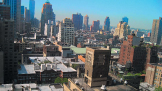
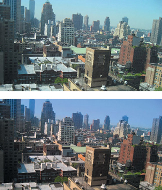
One trick to keep in mind when you’re doing a primary color correction is to focus your adjustments on the most important subjects in the frame. In this image, the main subjects of the shot are the buildings. The sky, while important, is a secondary element. In this case, a good strategy is to bring out the quality of the buildings using a correction that turns out to be the worst thing we could have done for the sky (Figure A.4).
Clearly, this nominates the sky as a candidate for secondary color correction.
To use a vignette effect, follow these steps:
Select the Secondaries tab to open the Secondaries room, and then click one of the numbered secondaries at the bottom to choose which of the eight available secondary operations you want to use. Since we haven’t added an effect just yet, we’ll start with the first tab.
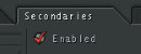
The only control in the Secondaries room that automatically enables the current Secondaries tab is the eyedropper button next to the HSL qualifier controls. Before you begin, it’s always a good practice to turn on the Enabled button at the upper-left side of the room (Figure A.5).
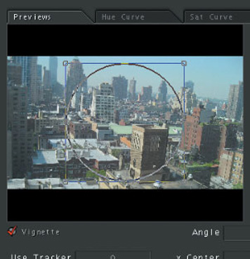
Now you need to turn on the vignette controls. Click the Previews tab to reveal the vignette preview area, and then click the Vignette button below to turn on the vignette onscreen controls. Immediately, the vignette onscreen controls appear in the vignette preview area, ready for adjustment (Figure A.6).
Also, the image in the preview area of the Scopes window changes. By default, the Matte Preview buttons at the right of the preview area in the Secondaries room are set to a desaturated preview. The middle mouse button sets the area outside of the vignette shape to be desaturated, while the area inside of the vignette shape is fully saturated. Before we continue, take a moment to click the top Matte Preview button to set the Scope window preview to show the final image (Figure A.7).

Now that we’ve selected a secondary and turned it on along with the vignette controls, we’re ready to create the shape that we want to use to outline the region of the sky we want to adjust.
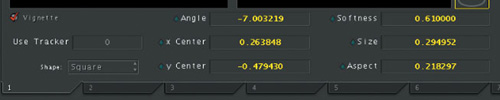
First, choose Square from the Shape pop-up menu. (It’s in the column of controls underneath the Vignette checkbox.) This menu determines the overall shape of the vignette, and you have three choices: Square, Circle, and User Shape (there’ll be more on that last option in a future article). In this case, we want to create a gradient effect that starts at the top of the sky and works its way down, and the closest thing we have to a gradient is a square, which we can customize pretty extensively.
To create the effect we need, you’ll make the following adjustments, and in so doing you’ll learn how to adjust all of the vignette’s onscreen controls:
Move the vignette by dragging anywhere within the shape’s onscreen control in the Vignette Preview area.
Rotate the vignette so that it matches the angle of the horizon by holding down the Control key while dragging any of the shape’s corner controls.
Resize the vignette about the center by holding down the Option key while dragging any of the shape’s corner controls (just dragging a corner control resizes the shape relative to the opposite corner).
Lastly, soften the edge of the vignette by clicking and dragging anywhere outside of the vignette onscreen control (Color pretty much requires you to have a three-button mouse to use it most efficiently). Drag to the right to increase softening, and to the left to decrease softening. Figure A.8 shows the end result.
If, at any point, you want to take a look at the actual matte that you’re creating with this shape, you can set the Matte Preview mode to “matte only” to see the matte in the preview area of the Scopes window (Figure A.9).
Our goal is to move and rotate the vignette to include the sky and the tops of the buildings near the horizon. If at any point the handles of the shape control go off the edge of the Vignette Preview area (this is easy to do), don’t fret—you can always continue to adjust the vignette using the numeric vignette parameters, located underneath the Secondaries Preview area (Figure A.10).
Remember that if you click and drag within any parameter field you can use the “virtual slider” to adjust that parameter. Drag to the right to reduce the value of the parameter and to the left to increase the value of the parameter.
Tip
Some parameters, like the Angle parameter in particular, can take a lot of elbow grease to adjust owing to their extremely slow rate of adjustment. To speed up the effect of any of your adjustments, you can press and hold the Option key while adjusting any control or parameter in the Color interface to multiply the speed of the adjustment by 10.
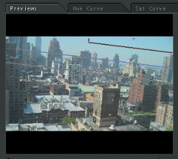
Now that we’ve outlined the region of the sky we want to adjust using a vignette, it’s time to make the actual correction and see how we’ve done. To add some color to the sky, simply drag the Highlight color balance control out towards the middle of blue and cyan (Figure A.11).
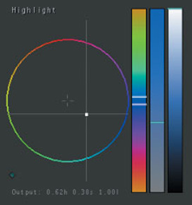
Skies generally fall somewhere in between these two colors. However, if you add too much blue it’ll start looking like Miami Vice, and too much cyan will make it start to look like tornado weather (those of you in the Midwest will know what I mean).
Note
Incidentally, in this particular shot, simply boosting the Saturation without making any other effort to rebalance the color gives us a terrible result (unless you like pastels). This is one example where the natural sky color needs some help! (Figure A.12)
After you’ve created the correction, you’ll probably want to readjust the vignette so that the proper region of the sky is affected. One thing to notice is that both the preview image in the Scopes window and the video out signal update in real time while you’re adjusting the vignette, so you can immediately see how your shape adjustments affect the final result.
As you make these further adjustments, bear in mind that creating a gradient effect between the original, lighter color at the horizon and the new, darker color at the top of the frame is a perfectly valid adjustment (Figure A.13). The sky itself frequently appears as a gradient from light at the horizon to dark at the zenith. How much of a gradient effect you want to create is up to your creative goals for the scene. On the other hand, one thing you want to watch out for is too much of the blue adjustment appearing superimposed over the buildings. A little blue spill won’t look bad, but too much will reveal your little magic trick to the audience and ruin their suspension of disbelief. As is so often the case, the best color correction job is one that will likely go unnoticed by the audience.
And that’s it. As you can see, Color makes vignettes fast and easy to create. The only trick is knowing which shots they’ll work magic with, and when they might be more trouble than they’re worth. This is but one of many, many uses for vignettes. Take the opportunity to experiment and create different effects on as many kinds of shots as you can to get the hang of this versatile tool.
Happy coloring!