
6
AI Fairness with Google's What-If Tool (WIT)
Google's PAIR (People + AI Research) designed the What-If Tool (WIT), a visualization tool designed to investigate the fairness of an AI model. Usage of WIT leads us directly to a critical ethical and moral question: what do we consider as fair? WIT provides the tools to represent what we view as bias so that we can build the most impartial AI systems possible.
Developers of machine learning (ML) systems focus on accuracy and fairness. WIT takes us directly to the center of human-machine pragmatic decision-making. In Chapter 2, White Box XAI for AI Bias and Ethics, we discovered the difficulty each person experiences when trying to make the right decision. MIT's Moral Machine experiment brought us to the core of ML ethics. We represented life and death decision-making by humans and autonomous vehicles.
The PAIR team is dedicated to people-centric AI systems. Human-centered AI systems will take us beyond mathematical algorithms into an innovative world of human-machine interactions.
In this chapter, we will explore WIT's human-machine interface and interaction functionality.
We will start by examining the COMPAS dataset from an ethical and legal perspective. We will define the difference between explainable AI (XAI), and the AI interpretability required in some cases.
We will then get started with WIT, import the dataset, preprocess the data, and create the structures to train and test a deep neural network (DNN) model.
After training the model, we will create a SHapley Additive exPlanations (SHAP) explainer based on Python code that we developed in Chapter 4, Microsoft Azure Machine Learning Model Interpretability with SHAP. We will begin to interpret the model with a SHAP plot.
Finally, we will implement WIT's datapoint explorer and editor human-machine interactive interface. WIT contains Facets functionality, as we learned in Chapter 3, Explaining Machine Learning with Facets. We will discover how to use WIT to decide what we think is fair and what we find biased in ML datasets and model predictions.
This chapter covers the following topics:
- Datasets from ethical and legal perspectives
- Creating a DNN model with TensorFlow
- Creating a SHAP explainer and plotting the features of the dataset
- Creating the WIT datapoint explorer and editor
- Advanced Facets functionality
- Ground truth
- Cost ratio
- Fairness
- The ROC curve and AUC
- Slicing
- The PR curve
- The confusion matrix
Our first step will be to view the dataset and project from an ethical AI perspective.
Interpretability and explainability from an ethical AI perspective
It comes as no surprise that Google's WIT AI fairness example notebook comes with a biased dataset. It is up to us to use WIT to point out the unethical or moral dilemmas contained in the COMPAS dataset.
COMPAS stands for Correctional Offender Management Profiling for Alternative Sanctions. Judges and parole officers are said to score the probability of recidivism for a given defendant.
In this section, our task will be to transform the dataset into an unbiased, ethical dataset. We will analyze COMPAS with people-centered AI before importing it.
We will first describe the ethical and legal perspectives. Then we will define AI explainability and interpretability for our COMPAS example. Finally, we will prepare an ethical dataset for our model by improving the feature names of the dataset.
Our ethical process fits the spirit of Google's research team when they designed WIT for us to detect bias in datasets or models.
But first, let's go through the ethical perspective.
The ethical perspective
The COMPAS dataset contains unethical data that we will transform into ethical data before using the dataset.
On Kaggle, the Context section, as of March 2020, states that the algorithms favor white defendants and discriminate against black defendants: https://www.kaggle.com/danofer/compass.
If you read Kaggle's text carefully, you will notice that it also mentions white defendants and black inmates. The correct formulation should always at least be equal, stating "white and black defendants."
The whole aspect of color should be ignored, and we should only mention "defendants."
The ambiguities we just brought up have legal consequences, and are related to deep social tensions that need to end.
Let's now explain why this is important from a legal perspective as well.
The legal perspective
If you try to use this type of dataset in Europe, for example, you will potentially face charges for racial discrimination or illegal information gathering as described in the General Data Protection Regulation (GDPR), Article 9:
"Art. 9 GDPR Processing of special categories of personal data
Processing of personal data revealing racial or ethnic origin, political opinions, religious or philosophical beliefs, or trade union membership, and the processing of genetic data, biometric data for the purpose of uniquely identifying a natural person, data concerning health or data concerning a natural person's sex life or sexual orientation shall be prohibited."
Source: https://gdpr-info.eu/, https://gdpr-info.eu/art-9-gdpr/
There are many exceptions to this law. However, you will need legal advice before attempting to collect or use this type of data.
We can now go further and ask ourselves why we would need to engage in unethical and biased datasets to explore WIT, Facets, and SHAP.
The straightforward answer is that we must be proactive when we explain and interpret AI.
Explaining and interpreting
In many cases, the words "explaining" and "interpreting" AI describe the same process. We can thus feel free to use the words indifferently. Most of the time, we do not have to worry about semantics. We just need to get the job done.
However, in this section, the difference between these two expressions is critical.
At first, we interpret laws, such as GDPR, Article 9. In a court of law, laws are interpreted and then applied.
Once the law is interpreted, a judge might have to explain a decision to a defendant.
An AI specialist can end up in a court of law trying to explain why an ML program was interpreting data in a biased and unethical manner.
To avoid these situations, we will transform the COMPAS dataset into ethical, educational data.
Preparing an ethical dataset
In this section, we will rename the columns that contain unethical column names.
The original COMPAS file used in the original WIT notebook was named cox-violent-parsed_filt.csv.
I renamed it by adding a suffix: cox-violent-parsed_filt_transformed.csv.
I also modified the feature names.
The original feature names that we will not be using were the following:
# input_features = ['sex_Female', 'sex_Male', 'age',
#                   'race_African-American', 'race_Caucasian',
#                   'race_Hispanic', 'race_Native American',
#                   'race_Other', 'priors_count', 'juv_fel_count',
#                   'juv_misd_count', 'juv_other_count']
The whole people-centered approach of WIT leads us to think about the bias such a dataset constitutes from ethical and legal perspectives.
I replaced the controversial names with income and social class features in the input_features array that we will create in the Preprocessing the data section of this chapter:
input_features = ['income_Lower', 'income_Higher', 'age',
                  'social-class_SC1', 'social-class_SC2',
                  'social-class_SC3', 'social-class_SC4',
                  'social-class_Other', 'priors_count',
                  'juv_fel_count', 'juv_misd_count',
                  'juv_other_count']
The new input feature names make the dataset ethical and still retain enough information for us to analyze accuracy and fairness with SHAP, Facets, and WIT.
Let's analyze the new input features one by one:
'income_Lower': I selected a column with relatively high feature values. Objectively, a person with low income and no resources has a higher risk of being tempted by crime than a multi-millionaire.'income_Higher': I selected a column with relatively low feature values. Objectively, how many people with income over USD 200,000 try to steal a car or a television? How many professional soccer players, baseball players, and tennis players try to rob a bank?It is evident in any country around the world that a richer person will tend to commit fewer major physical crimes than a poor person. However, some wealthy people do commit crimes, and almost all poor people are law-abiding citizens.
It can easily be seen that genetic factors do not make even a marginal contribution to the probability of committing a crime.
When a judge or parole officer makes a decision, the capacity of the defendant to get and keep a job is far more important than genetic factors.
Naturally, this is my firm opinion and belief as the author of this chapter! Others might have other opinions. That is the whole point of WIT. It takes us right to where humans have difficulties agreeing on ethical perspectives that vary from one culture to another!
'age': This becomes an essential feature for people over 70 years old. It's difficult to imagine a hit-and-run crime committed by a 75-year-old defendant!'social-class_SC1': The social class we belong to makes quite a difference when it comes to physical crime. I'm using the term "physical" to exclude white-collar tax evasion crime, which is another domain in itself.There are now four social classes in the feature list. In this social class (
'social-class_SC1'), access to education was limited or very difficult. Statistically, almost everyone in this category never committed a crime. However, the ones that did helped build up the statistics against this social class.Defining what this social class represents goes well beyond the scope of this book. Only sociologists could attempt to explain what this means. I left this feature in this notebook. In real life, I would take it out, as well as
'social-class_SC3'and'social-class_SC4'. The motivation is simple. All social classes have predominantly law-abiding citizens and a few that lose their way.These features do not help. However,
'social-class_SC2', as I define it, does.'social-class_SC2': From a mathematical point of view, this is the only social class that makes a significant difference.I fit people with valuable knowledge in this class: college graduates in all fields, and people with less formal education but with useful skills for society (plumbers and electricians, for example).
I also include people with strong beliefs that work pays and crime doesn't.
Competent, objective judges and parole officers assess these factors when making a decision. As in any social class, the majority of actors in a judicial system try to be objective. As for the others, it brings us back to cultural and personal bias.
The difficulties brought up in this section fully justify people-centered XAI! We can easily see the tensions that can arise from my comments in this section. Life is a constant MIT Moral Machine experiment!
'social-class_SC3': See'social-class_SC1'.'social-class_SC4': See'social-class_SC1'.'social-class_Other': See'social-class_SC1'.- The count features –
'priors_count','juv_fel_count','juv_misd_count','juv_other_count': These features are worth consideration. The arrest record of a person contains objective information. If a person's rap sheet contains thirty lines for a person aged 20 versus one parking ticket offense for another person, this means something.However, these features provide information but also depend on what the present charges or behavior are at the time a decision must be made by a judge or parole officer.
We can safely contend that even with a more ethical dataset, I have raised as many issues as the ones I was trying to solve!
We now have the following considerations, for example:
- Am I biased by my own education and culture?
- Am I right, or am I wrong?
- Do others agree with me?
- Do other people with other perspectives disagree with my views?
- Would a victim of discrimination want to see the biased features anyway?
- Would a person that does not think the feature names are discriminating agree?
I can only conclude by saying that I expressed my doubts just as WIT expects us to investigate.
You are free to view this dataset in many other different ways!
In any case, the transformed dataset contains the information to take full advantage of all of the functionality of the program in this chapter.
Let's now get started with WIT.
Getting started with WIT
In this section, we will install WIT, import the dataset, preprocess the data, and create data structures to train and test the model.
Open WIT_SHAP_COMPAS_DR.ipynb in Google Colaboratory, which contains all of the modules necessary for this chapter.
We must first check the version of TensorFlow of our runtime. Google Colaboratory is installed with TensorFlow 1.x and TensorFlow 2.x. Google provides sample notebooks that use either TensorFlow 1.x or TensorFlow 2.x. In this case, our notebook needs to use TensorFlow 2.x.
Google provides a few lines of code for TensorFlow 1.x as well, plus a link to read for more information on the flexibility of Colab regarding TensorFlow versions:
# https://colab.research.google.com/notebooks/tensorflow_version.ipynb
# tf1 and tf2 management
# Restart runtime using 'Runtime' -> 'Restart runtime...'
%tensorflow_version 1.x
import tensorflow as tf
print(tf.__version__)
In our case, the first cell for this notebook is as follows:
import tensorflow
print(tensorflow.__version__)
The output will be as follows:
2.2.0
Installing WIT with SHAP takes one line of code:
# @title Install What-If Tool widget and SHAP library
!pip install --upgrade --quiet witwidget shap
We now import the modules required for WIT_SHAP_COMPAS_DR.ipynb:
# @title Importing data <br>
# Set repository to "github"(default) to read the data
# from GitHub <br>
# Set repository to "google" to read the data
# from Google {display-mode: "form"}
import pandas as pd
import numpy as np
import tensorflow as tf
import witwidget
import os
from google.colab import drive
import pickle
from tensorflow.keras.layers import Dense
from tensorflow.keras.models import Sequential
from sklearn.utils import shuffle
We can now import the dataset.
Importing the dataset
You can import the dataset from GitHub or your Google Drive.
In WIT_SHAP_COMPAS_DR.ipynb, repository is set to "github":
# Set repository to "github" to read the data from GitHub
# Set repository to "google" to read the data from Google
repository = "github"
The dataset file will be retrieved from GitHub:
if repository == "github":
  !curl -L https://raw.githubusercontent.com/PacktPublishing/Hands-On-Explainable-AI-XAI-with-Python/master/Chapter06/cox-violent-parsed_filt_transformed.csv --output "cox-violent-parsed_filt_transformed.csv"
  # Setting the path for each file
  df2 = "/content/cox-violent-parsed_filt_transformed.csv"
  print(df2)
However, you can choose to download cox-violent-parsed_filt_transformed.csv from GitHub and upload it to your Google Drive.
In that case, set repository to "google":
if repository == "google":
  # Mounting the drive. If it is not mounted, a prompt will
  # provide instructions
  drive.mount('/content/drive')
You can also choose your own directory name and path, for example:
  # Setting the path for each file
  df2 = '/content/drive/My Drive/XAI/Chapter06/cox-violent-parsed_filt_transformed.csv'
  print(df2)
df = pd.read_csv(df2)
The next step consists of preprocessing the data.
Preprocessing the data
In this section, we will preprocess that data before training the model. We will first filter the data that contains no useful information:
# Preprocess the data
# Filter out entries with no indication of recidivism or
# no compass score
df = df[df['is_recid'] != -1]
df = df[df['decile_score'] != -1]
We will now rename our key target feature 'is_recid' so that it can easily be visualized in WIT:
# Rename recidivism column
df['recidivism_within_2_years'] = df['is_recid']
The program now creates a numeric binary value for the 'COMPASS_determination' feature that we will also visualize as a prediction in WIT:
# Make the COMPASS label column numeric (0 and 1),
# for use in our model
df['COMPASS_determination'] = np.where(df['score_text'] == 'Low',
                                       0, 1)
These two columns are considered as dummy columns:
df = pd.get_dummies(df, columns=['income', 'social-class'])
The program now applies the transformations described in the Preparing an ethical dataset section of this chapter.
We will ignore the former column names:
# Get list of all columns from the dataset we will use
# for model input or output.
# input_features = ['sex_Female', 'sex_Male', 'age',
#                   'race_African-American', 'race_Caucasian',
#                   'race_Hispanic', 'race_Native American',
#                   'race_Other', 'priors_count', 'juv_fel_count',
#                   'juv_misd_count', 'juv_other_count']
We will now insert our transformed ethical feature names as well as the two target labels:
input_features = ['income_Lower', 'income_Higher', 'age',
                  'social-class_SC1', 'social-class_SC2',
                  'social-class_SC3', 'social-class_SC4',
                  'social-class_Other', 'priors_count',
                  'juv_fel_count', 'juv_misd_count',
                  'juv_other_count']
to_keep = input_features + ['recidivism_within_2_years',
                            'COMPASS_determination']
to_keep contains the feature names and two labels. 'COMPASS_determination' is the training label. We will use 'recidivism_within_2_years' to measure the performance of the model.
We now finalize the preprocessing phase:
to_remove = [col for col in df.columns if col not in to_keep]
df = df.drop(columns=to_remove)
input_columns = df.columns.tolist()
labels = df['COMPASS_determination']
We now display the first lines of the dataset:
df.head()
The output will appear in a structured way:
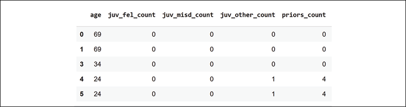
Figure 6.1: The fields of the dataset and sample data
We are all set to create the data structures to train and test the model.
Creating data structures to train and test the model
In this section, we create the data structures to train and test the model.
We first drop the training label, 'COMPASS_determination' and the measuring label, 'recidivism_within_2_years':
df_for_training = df.drop(columns=['COMPASS_determination',
                                   'recidivism_within_2_years'])
Now create the train data and test data structures:
train_size = int(len(df_for_training) * 0.8)
train_data = df_for_training[:train_size]
train_labels = labels[:train_size]
test_data_with_labels = df[train_size:]
We have transformed the data, loaded it, preprocessed it, and created data structures to train and test the model.
We will now create a DNN model.
Creating a DNN model
In this section, we will create a dense neural network using a Keras sequential model. The scope of the WIT example in this notebook is to explain the behavior of a model through its input data and outputs. However, we will outline a brief description of the DNN created in this section.
In a dense neural network, all of the neurons of a layer are connected to all of the layers of the previous layer, as shown in Figure 6.2:
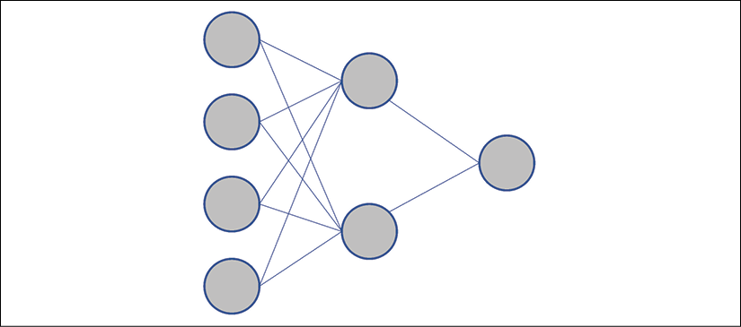
Figure 6.2: Dense layers of a neural network
The graph shows that the first layer contains four neurons, the second layer two neurons, and the last layer will produce a binary result of 1 or 0 with its single neuron.
Each neuron in a layer will be connected to all the neurons of the previous layer.
In this model, each layer contains fewer neurons than the previous layer leading to a single neuron, which will produce a 0 or 1 output to make a prediction.
We now create the model and compile it:
# Create the model
# This is the size of the array we'll be feeding into our model
# for each example
input_size = len(train_data.iloc[0])
model = Sequential()
model.add(Dense(200, input_shape=(input_size,), activation='relu'))
model.add(Dense(50, activation='relu'))
model.add(Dense(25, activation='relu'))
model.add(Dense(1, activation='sigmoid'))
We see that although all of the neurons of a layer are connected to all of the neurons of the previous layer, the number of neurons per layer diminishes: from 200, to 50, 25, and then 1, the binary output.
The neurons of a sequential model are activated by two approaches:
activation='relu': For a neuron x, the rectified linear unit (ReLU) function will return the following: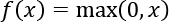
activation='sigmoid': For a neuron x, the logistic sigmoid function will return the following: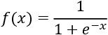
You can add a summary:
model.summary()
The output will confirm the architecture of your model:
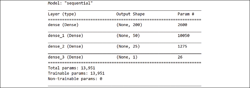
Figure 6.3: The architecture of the model of the neural network
The model requires a loss function and optimizer. The loss function calculates the distance between the model's predictions and the binary labels it should predict. The optimizer finds the best way to change the weights and biases at each iteration:
model.compile(loss='mean_squared_error', optimizer='adam')
'loss': Themean_squared_errorloss function is a mean square regression loss. It calculates the distance between the predicted value of a sample i defined as and
and  . The optimizer will use this value to modify the weights of the layers. This iterative process will continue until the accuracy of the model improves enough for the model to stop training the dataset.
'optimizer': Adam is a stochastic optimizer that can automatically adjust to update parameters using adaptive estimates.
In this section, we briefly went through the DNN estimator. Once again, the primary goal of the WIT approach in this notebook is to explain the model's predictions based on the input data and the output data.
The compiled model now requires training.
Training the model
In this section, we will train the model and go through the model's parameters.
The model trains the data with the following parameters:
# Train the model
model.fit(train_data.values, train_labels.values, epochs=4,
          batch_size=32, validation_split=0.1)
train_data.valuescontains the training values.train_labels.valuescontains the training labels to predict.epochs=4will activate the optimization process four times over a number of samples. The loss should diminish or at least remain sufficient and stable.batch_size=32is the number of samples per gradient update.validation_split=0.1will split the training set, the fraction of the dataset to be used for training, to0.1.
The sequential Keras model has trained the data. Before running WIT, we will create a SHAP explainer to interpret the trained model's predictions with a SHAP plot.
Creating a SHAP explainer
In this section, we will create a SHAP explainer.
We described SHAP in detail in Chapter 4, Microsoft Azure Machine Learning Model Interpretability with SHAP. If you wish, you can go through that chapter again before moving on.
We pass a subset of our training data to the explainer:
# Create a SHAP explainer by passing a subset of our training data
import shap
sample_size = 500
if sample_size > len(train_data.values):
  sample_size = len(train_data.values)
explainer = shap.DeepExplainer(model,
    train_data.values[:sample_size])
We will now generate a plot of Shapley values.
The plot of Shapley values
In Chapter 4, Microsoft Azure Machine Learning Model Interpretability with SHAP, we learned that Shapley values measure the marginal contribution of a feature to the output of an ML model. We also created a plot. In this case, the SHAP plot contains all of the predictions, not only one prediction at a time.
As in Chapter 4, we will retrieve the Shapley values of the dataset and create a plot:
# Explain the SHAP values for the whole dataset
# to test the SHAP explainer.
shap_values = explainer.shap_values(train_data.values[:sample_size])
# shap_values
shap.initjs()
shap.force_plot(explainer.expected_value[0].numpy(), shap_values[0],
                train_data, link="logit")
We can now analyze the outputs of the model displayed in a SHAP plot.
Model outputs and SHAP values
In this section, we will begin to play with AI fairness, which will prepare us for WIT.
The default display shows the features grouped by feature prediction similarity:
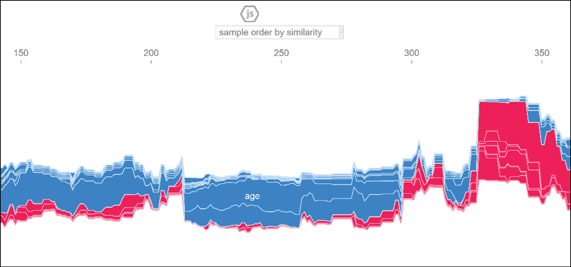
Figure 6.4: SHAP plot
You can change the plot by selecting a feature at the top of the plot. Select social-class_SC2, for example:
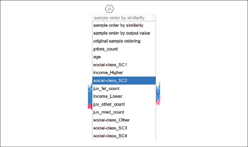
Figure 6.5: Selecting social-class_SC2 from the feature list
To observe the model's predictions, choose a feature on the left side of the plot for the y axis. Select model output value, for example:

Figure 6.6: Selecting model output value from the feature list
In the Preparing an ethical dataset section of this chapter, the value of social-class_SC2 represents the level of education of a person, a defendant. A population with a very high level of education has fewer chances of committing physical crimes.
If we select model output value the plot will display the recidivism prediction of the model.
In this scenario, we can see the positive values decrease (shown in red in the color image) and the negative values (blue in the color image) increase:
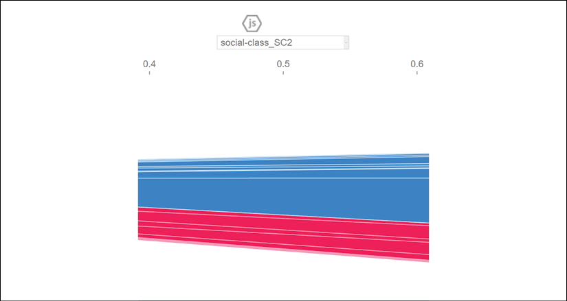
Figure 6.7: SHAP predictions plot
However, if you change the feature to observe to juv_fel_count, you will see that this feature makes the positive (shown in red in the color image) predictions increase:
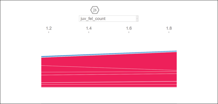
Figure 6.8: juv_fel_count plot
These examples remain educational simulations. However, we will keep this example in mind when we explore WIT.
Let's first create the WIT datapoint explorer and editor.
The WIT datapoint explorer and editor
In this section, we will create the datapoint editor. Then we will explain the model's predictions with the following tools:
- Datapoint editor, an interface to edit datapoints and explain the predictions
- Features, an interface to visualize the feature statistics
- Performance & Fairness, a robust set of tools to measure the accuracy and fairness of predictions
We will now create WIT and add the SHAP explainer.
Creating WIT
In this section, we will create and configure WIT.
The program first selects the number of datapoints to visualize and explore:
# @title Show model results and SHAP values in WIT
from witwidget.notebook.visualization import WitWidget, WitConfigBuilder
num_datapoints = 1000 # @param {type: "number"}
We then take the prediction labels out of the data so that the model can analyze the contributions of the features to the model:
# Column indices to strip out from data from WIT before
# passing it to the model!.
columns_not_for_model_input = [
    test_data_with_labels.columns.get_loc(
        "recidivism_within_2_years"),
    test_data_with_labels.columns.get_loc("COMPASS_determination")
]
The program creates the functions and retrieves the model's predictions and the Shapley values for each inference:
# Return model predictions and SHAP values for each inference.
def custom_predict_with_shap(examples_to_infer):
  # Delete columns not used by model
  model_inputs = np.delete(np.array(examples_to_infer),
                           columns_not_for_model_input,
                           axis=1).tolist()
  # Get the class predictions from the model.
  preds = model.predict(model_inputs)
  preds = [[1 - pred[0], pred[0]] for pred in preds]

  # Get the SHAP values from the explainer and create a map
  # of feature name to SHAP value for each example passed to
  # the model.
  shap_output = explainer.shap_values(np.array(model_inputs))[0]
  attributions = []
  for shap in shap_output:
    attrs = {}
    for i, col in enumerate(df_for_training.columns):
      attrs[col] = shap[i]
    attributions.append(attrs)
  ret = {'predictions': preds, 'attributions': attributions}
  return ret
Finally, we select the examples for SHAP in WIT, build the WIT interactive interface, and display WIT:
examples_for_shap_wit = test_data_with_labels.values.tolist()
column_names = test_data_with_labels.columns.tolist()
config_builder = WitConfigBuilder(
    examples_for_shap_wit[:num_datapoints],
    feature_names=column_names).set_custom_predict_fn(
        custom_predict_with_shap).set_target_feature(
            'recidivism_within_2_years')
ww = WitWidget(config_builder, height=800)
We have created WIT and added SHAP. Let's start by exploring datapoints with the datapoint editor.
The datapoint editor
The datapoint editor will appear with the predicted datapoints, with the labels of the dataset and WIT labels as well:
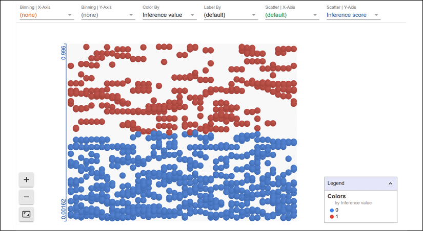
Figure 6.9: Datapoint editor
We already covered the functionality of the datapoint editor in Chapter 3, Explaining Machine Learning with Facets. WIT relies on Facets for this interactive interface. If necessary, take the time to go back to Chapter 3, Explaining Machine Learning with Facets for additional information.
In this section, we will focus on the Shapley values of the features as described in Chapter 4, Microsoft Azure Machine Learning Model Interpretability with SHAP. If necessary, take the time to go back to Chapter 4, Microsoft Azure Machine Learning Model Interpretability with SHAP for the mathematical explanation of SHAP and to check the Python examples implemented.
To view the Shapley values of a datapoint, first click on a negative prediction (shown in blue in the color image):

Figure 6.10: Selecting a datapoint
On the left of the screen, the features of the datapoint you selected will appear in the following format:

Figure 6.11: Shapley values of a datapoint
The Attribution value(s) column contains the Shapley value of each feature. The Shapley value of a feature represents its marginal contribution to the model's prediction. In this case, we have a true negative for the fact that income_Higher and social-class_SC2 (higher education) contributed to the prediction as one of the ground truths expressed in the Preparing an ethical dataset section of this chapter.
We verify this by scrolling down to see the labels of the datapoint:

Figure 6.12: Prediction labels
Our true negative seems correct.
However, since we know this dataset is biased from the start, let's find a counterfactual datapoint by clicking on Nearest counterfactual:
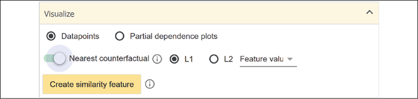
Figure 6.13: Activating Nearest counterfactual
The nearest counterfactual will appear (shown in red in the color image):

Figure 6.14: Displaying the nearest counterfactual
In our scenario, this is a false positive. Let's play with what-ifs.
First, we find a datapoint with social-class_SC2 (higher education) and income_Lower in the positive area (predicted recidivism):
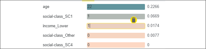
Figure 6.15: Shapley values of the features
The Shapley value of income_Lower is high. Let's set income_Lower to 0:

Figure 6.16: Editing a datapoint
You will immediately see a datapoint with a negative prediction (no recidivism) appear.
Try to change the values of other datapoints to visualize and explain how the model thinks.
We can also explore statistical data for each feature.
Features
If you click on Features, you might recognize the data displayed:
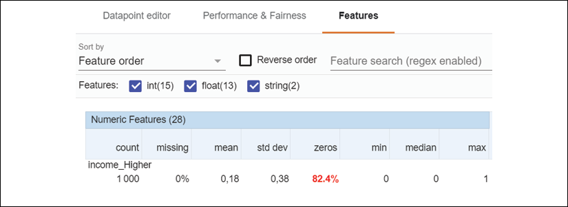
Figure 6.17: Feature statistics
We covered these columns in Chapter 3, Explaining Machine Learning with Facets. You can refer to Chapter 3 if necessary.
Let's now learn how to analyze performance and fairness.
Performance and fairness
In this section, we will verify the performance and fairness of a model through ground truth, cost ratio, fairness, ROC curves, slicing, PR curves, and the confusion matrix of the model.
To access the performance and fairness interface, click on Performance & Fairness:
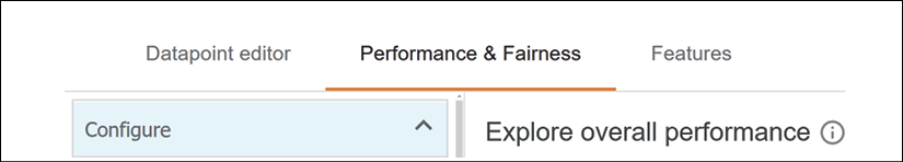
Figure 6.18: Performance & Fairness interface
A world of XAI tools opens to us!
We will begin with the ground truth, a key feature.
Ground truth
The ground truth is the feature that you are trying to predict. The primary target of this dataset is to determine the probability of recidivism of a person: 'recidivism_within_2_years'. WIT contains functions to measure the ground truth that are described in this section.
We defined this in the Creating data structures to train and test the model section of this chapter:
df_for_training = df.drop(columns=['COMPASS_determination',
                                   'recidivism_within_2_years'])
The prediction feature is chosen for the WIT interface in the Show model results and SHAP values in WIT cell:
    feature_names=column_names).set_custom_predict_fn(
        custom_predict_with_shap).set_target_feature(
            'recidivism_within_2_years')
You can now select the prediction in the drop-down list as shown in the following screenshot:

Figure 6.19: Ground truth of a model
Let's verify the cost ratio before visualizing the status of the ground truth of the process.
Cost ratio
A model rarely produces 100% accurate results. The model can produce true positives (TP) or false positives (FP), for example. The predictions of this model are supposed to help a judge or a parole officer, for example, make a decision. However, FPs can lead a parole officer to decide to send a person back to prison, for example. Likewise, a false negative (FN) can lead a judge, for example, to set a guilty defendant free on parole.
This is a moral dilemma, as described in Chapter 2, White Box XAI for AI Bias and Ethics. An FP could send an innocent person to prison. An FN could set a guilty person free to commit a crime.
We can fine-tune the cost ratio to optimize the classification thresholds that we will explain in the following Fairness section.
The cost ratio can be defined as follows:
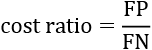
The default value of the cost ratio is set to 1:
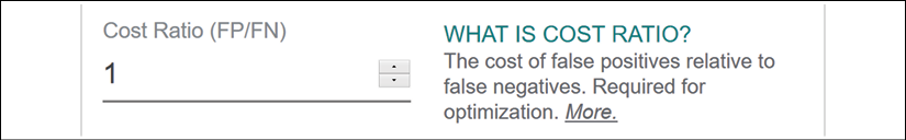
Figure 6.20: Cost ratio for AI fairness
In this case, if the cost ratio is set to 1, FP = FN.
However, other scenarios are possible. For example, if cost ratio = 4, then FP = cost ratio × FN = 4 × FN. The FP will cost four times as much as an FN.
The cost ratio will display the accuracy of the model in numerical terms. We now need to determine the slicing of our predictions.
Slicing
Slicing contributes to evaluating the model's performance. Each datapoint has a value for a feature. Slicing will group the datapoints. Each group will contain the value of the feature we select. Slicing will influence fairness, so we must choose a significant feature.
In our scenario, we will try to measure the model's performance by selecting income_Higher (being a binary feature, 0 or 1, the values are stored in two Buckets):

Figure 6.21: Slicing feature
You can choose a secondary feature once you have explored the interface with one slicing option. For this scenario, the option will be <none>:

Figure 6.22: Secondary slicing feature
We need to choose a fairness option before visualizing the model's performance based on our choice.
Let's now add fairness to WIT to visualize the quality of the predictions.
Fairness
AI fairness will make the user trust our ML systems. WIT provides several parameters to monitor AI fairness.
You can measure fairness with thresholds. On a range of 0 to 1, what do you believe? At what point do you consider a prediction a TP?
For example, do you believe a prediction of 0.4 that would state that a professional NBA basketball player who owns 15 luxury cars just stole a little family car? No, you probably wouldn't.
Would you believe a prediction of 0.6 that a person who as a Ph.D. harassed another person? Maybe you would. Would you believe this same prediction for this person but with a value of 0.1? Probably not.
In WIT, you can control the threshold above which you consider the predictions as TPs just like you would in real-life situations.
WIT thresholds are automatically calculated using the cost ratio and slicing. If the ratio and the data slices are changed manually, then WIT will revert to custom thresholds:

Figure 6.23: Threshold options
If you select Single threshold, the threshold will be optimized with the single cost ratio chosen for all of the datapoints.
The other threshold options might require sociological expertise and special care, such as demographic parity and equal opportunity. In this section, we will let WIT optimize the thresholds.
For our scenario, we will not modify the default value of the fairness thresholds.
We have selected the parameters for ground truth, cost ratio, slicing, and fairness. We can now visualize the ROC curve to measure the output of the predictions.
The ROC curve and AUC
ROC is a metric that evaluates the quality of the model's predictions.
ROC stands for receiver operating characteristic curve.
For example, we selected 'recidivism_within_2_years' as the ground truth we would like to measure.
We will first display ROC with slicing set to <none> to view the influence of the features' combined values:

Figure 6.24: No slicing
ROC represents the TP rate on the y axis and the FP rate on the x axis, as shown in the following screenshot in Figure 6.25:
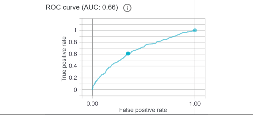
Figure 6.25: WIT ROC curve
The area under the curve (AUC) represents the TP area. If the TP rate never exceeded 0.2, for example, the AUC would have a much smaller value. As in any curve, the area beneath the curve remains small when the values of the y axis remain close to 0.
The threshold values appear in a pop-up window if you explore the curve with your mouse up to the optimized threshold (the point on the curve):

Figure 6.26: Threshold information
The threshold states that fairness applies at that point when TPs reach 0.6.
Let's now activate slicing with the income_Higher feature, as shown in the Slicing section of this chapter. The count column indicates the number of datapoints containing the binary value of the feature:
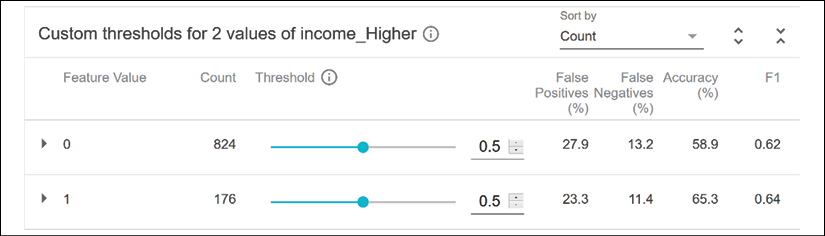
Figure 6.27: Visualizing model outputs
On the right side of the interface, we can consult the FPs and FNs, and the accuracy of the model.
If we click on 0, the ROC curve of the performance of the model for income_Higher appears:

Figure 6.28: WIT ROC curve
We can now measure the model's performance with a ROC curve. However, the PR curve in the next section displays additional information.
The PR curve
PR stands for precision-recall curves. They plot precision against recall at classification thresholds.
We have defined thresholds. In this section, we will define precision and recall.
Let's start by looking at a plot:
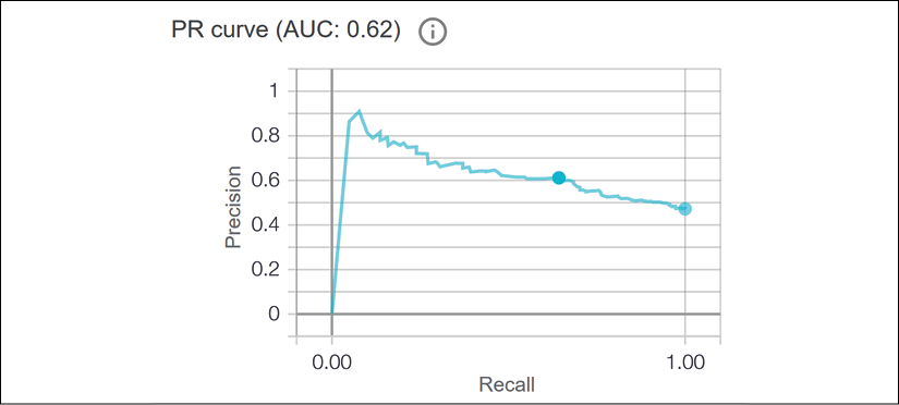
Figure 6.29: PR curve
The y axis contains precision defined as a ratio between TPs and FP:
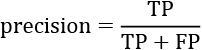
Precision thus measures how well a model can distinguish a positive sample from a negative sample without mislabeling samples.
The x axis contains recall defined as a ratio between TPs and FNs:
An FN can be considered as a positive sample. Recall thus measures how well a model can distinguish all positive samples from the other datapoints.
We have defined a PR matrix that we see in the plot. As for ROC curves, the higher the curve goes upward, the better.
A confusion matrix will provide an additional visualization of the model's performance.
The confusion matrix
A confusion matrix shows the accuracy of a model's performance in one table. The table contains the TPs, FPs, TNs, and FNs.
In WIT, the rows contain the actual labels of the predictions, and the columns contain the predictions:
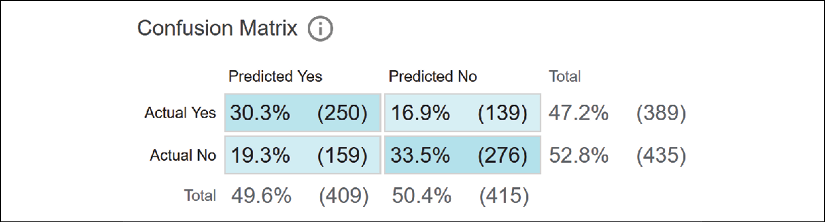
Figure 6.30: WIT confusion matrix
We can visualize the performance of the model in one glance by looking at the Predicted Yes and Actual Yes rate, for example, which is 22.2%. The Predicted No and Actual No rate is 39.8%.
The values in this table are rounded to one decimal, which makes the result a bit imprecise. The total of true and false values of each classification should sum up to about 100. However, we do not need more precision to analyze the predictions, find the weak spots of a model, and explain them.
In this section, we created WIT and explored several tools to interpret and explain the accurate predictions (the TPs), the FPs, TNs, and FNs.
Summary
In this chapter, we went right to the core of XAI with WIT, a people-centric system. Explainable and interpretable AI brings humans and machines together.
We first analyzed a training dataset from an ethical perspective. A biased dataset will only generate biased predictions, classifications, or any form of output. We thus took the necessary time to examine the features of COMPAS before importing the data. We modified the column feature names that would only distort the decisions our model would make.
We carefully preprocessed our now-ethical data, splitting the dataset into training and testing datasets. At that point, running a DNN made sense. We had done our best to clean the dataset up.
The SHAP explainer determined the marginal contribution of each feature. Before running WIT, we already proved that the COMPAS dataset approach was biased and knew what to look for.
Finally, we created an instance of the WIT to explore the outputs from a fairness perspective. We could visualize and evaluate each feature of a person with Shapley values. Then we explored concepts such as ground truth, cost ratio, ROC curves, AUC, slicing, PR curves, confusion matrices, and feature analysis.
The set of tools offered by WIT measured the accuracy, fairness, and performance of the model. The interactive real-time functionality of WIT puts you right in the center of the AI system.
WIT shows that people-centered AI systems will outperform the now-outdated ML solutions that don't have any humans involved. People-centered AI systems will take systems' ethical and legal standards, and accuracy to a higher level of quality.
In the next chapter, A Python Client for Explainable AI Chatbots, we will go further in our quest for human-machine AI by experimenting with XAI by building a chatbot from scratch.
Questions
- The developer of an AI system decides what is ethical or not. (True|False)
- A DNN is the only estimator for the COMPAS dataset. (True|False)
- Shapley values determine the marginal contribution of each feature. (True|False)
- We can detect the biased output of a model with a SHAP plot. (True|False)
- WIT's primary quality is "people-centered." (True|False)
- A ROC curve monitors the time it takes to train a model. (True|False)
- AUC stands for "area under convolution." (True|False)
- Analyzing the ground truth of a model is a prerequisite in ML. (True|False)
- Another ML program could do XAI. (True|False)
- The WIT "people-centered" approach will change the course of AI. (True|False)
References
- The General Data Protection Regulation (GDPR) can be found at https://gdpr-info.eu/ and https://gdpr-info.eu/art-9-gdpr/.
- The COMPAS dataset can be found on Kaggle at https://www.kaggle.com/danofer/compass.
Further reading
- More on WIT can be found at https://pair-code.github.io/what-if-tool/.
- More information on the background of COMPAS, as recommended by Google, can be found at the following links:
- More information on Keras sequential models can be found at https://keras.io/models/sequential/.
- The AI Fairness 360 toolkit contains demos and tutorials not only on measuring unwanted bias, but also mitigating bias using several different types of algorithms, and can be found at http://aif360.mybluemix.net/.