
3
Explaining Machine Learning with Facets
Lack of the right data often poisons an artificial intelligence (AI) project from the start. We are used to downloading ready-to-use datasets from Kaggle, scikit-learn, and other reliable sources.
We focus on learning how to use and implement machine learning (ML) algorithms. However, reality hits AI project managers hard on day one of a project.
Companies rarely have clean or even sufficient data for a project. Corporations have massive amounts of data, but they often come from different departments.
Each department of a company may have its own data management system and policy. When finally you obtain a training dataset sample, you may find that your AI model does not work as planned. You might have to change ML models or find out what is wrong with the data. You are trapped right from the start. What you thought would be an excellent AI project has turned into a nightmare.
You need to get out of this trap rapidly by first explaining the data availability problem. You must find a way to explain why the datasets require improvements. You must also explain which features require more data, better quality, or volume. You do not have the time or resources to develop a new explainable AI (XAI) solution for each project.
Facets Overview and Facets Dive provide visualization tools to analyze your training and testing data feature by feature.
We will start by installing and exploring Facets Overview, a statistical visualization tool. We will use the input virus detection data we are familiar with, taken from Chapter 1, Explaining Artificial Intelligence with Python.
We will then build the Facets Dive display code to visualize data points. Facets Dive offers many options to display and explain data point features. The interactive interface has labels and color options. You will define the binning of the x axis and y axis, among other productive functions.
This chapter covers the following topics:
- Installing and running Facets Overview in a Jupyter Notebook on Google Colaboratory
- Implementing the feature statistics code
- Implementing the HTML code to display statistics
- Analyzing the features by feature order
- Visualizing the minimum, maximum, median, and mean values feature by feature
- Looking for non-uniformity in the data distributions
- Sorting the features by missing records or zeros
- Analyzing the distribution distances and the Kullback-Leibler divergence
- Building the Facets Dive display code
- Comparing the values of a data point and counterfactual data points
Our first step will be to install and run Facets.
Getting started with Facets
In this section, we will install Facets in Python, using Jupyter Notebook on Google Colaboratory.
We will then retrieve the training and testing datasets. Finally, we will read the data files.
The data files are the training and testing datasets from Chapter 1, Explaining Artificial Intelligence with Python. This way, we are in a situation in which we know the subject and can analyze the data without having to spend time understanding what it means.
Let's first install Facets on Google Colaboratory.
Installing Facets on Google Colaboratory
Open Facets.ipynb. The first cell contains the installation command:
# @title Install the facets-overview pip package.
!pip install facets-overview
The installation may be lost when the virtual machine (VM) is restarted. If this is the case, it will be installed again. If Facets is installed, the following message is displayed:
Requirement already satisfied:
The program will now retrieve the datasets.
Retrieving the datasets
The program retrieves the datasets from GitHub or Google Drive.
To import the data from GitHub, set the import option to repository = "github".
To read the data from Google Drive, set the option to repository = "google".
In this section, we will activate GitHub and import the data:
# @title Importing data <br>
# Set repository to "github"(default) to read the data
# from GitHub <br>
# Set repository to "google" to read the data
# from Google {display-mode: "form"}
import os
from google.colab import drive
# Set repository to "github" to read the data from GitHub
# Set repository to "google" to read the data from Google
repository = "github"
if repository == "github":
  !curl -L https://raw.githubusercontent.com/PacktPublishing/Hands-On-Explainable-AI-XAI-with-Python/master/Chapter03/DLH_train.csv --output "DLH_train.csv"
  !curl -L https://raw.githubusercontent.com/PacktPublishing/Hands-On-Explainable-AI-XAI-with-Python/master/Chapter03/DLH_test.csv --output "DLH_test.csv"
The data is now accessible to our runtime. We will set the path for each file:
  # Setting the path for each file
  dtrain = "/content/DLH_train.csv"
  dtest = "/content/DLH_test.csv"
  print(dtrain, dtest)
You can choose the same actions with Google Drive:
if repository == "google":
  # Mounting the drive. If it is not mounted, a prompt
  # will provide instructions
  drive.mount('/content/drive')
  # Setting the path for each file
  dtrain = '/content/drive/My Drive/XAI/Chapter03/DLH_Train.csv'
  dtest = '/content/drive/My Drive/XAI/Chapter03/DLH_Train.csv'
  print(dtrain, dtest)
We have installed Facets and can access the files. We will now read the files.
Reading the data files
In this section, we will use pandas to read the data files and load them into DataFrames.
We will first import pandas and define the features:
# Loading Denis Rothman research training and testing data
# into DataFrames
import pandas as pd
features = ["colored_sputum", "cough", "fever", "headache", "days",
            "france", "chicago", "class"]
The data files contain no headers so we will use our features array to define the names of the columns for the training data:
train_data = pd.read_csv(dtrain, names=features, sep=r's*,s*',
                         engine='python', na_values="?")
The program now reads the training data file into a DataFrame:
test_data = pd.read_csv(dtest, names=features, sep=r's*,s*',
                        skiprows=[0], engine='python', na_values="?")
Having read the data into DataFrames, we can now implement feature statistics for our datasets.
Facets Overview
Facets Overview provides a wide range of statistics for each feature of a dataset. Facets Overview will help you detect missing data, zero values, non-uniformity in data distributions, and more, as we will see in this section.
We will begin by creating feature statistics for the training and testing datasets.
Creating feature statistics for the datasets
Without Facets Overview or a similar tool, the only way to obtain statistics would be to write our programs or use spreadsheets. Writing our own functions can be time-consuming and costly. This is where Facets provides statistics with a few lines of code that we will use now.
Implementing the feature statistics code
In this section, we will encode the data, stringify it, and build the statistics generator. When using JSON, we first stringify information to transfer data into strings before sending it to JavaScript functions.
First, we will import base64:
import base64
base64 will encode a string using a Base64 alphabet. A Base64 alphabet uses 64 ASCII characters to encode data.
We now import Facets' statistics generator and retrieve the data from the train and test DataFrames:
from facets_overview.generic_feature_statistics_generator import GenericFeatureStatisticsGenerator
gfsg = GenericFeatureStatisticsGenerator()
proto = gfsg.ProtoFromDataFrames([{'name': 'train',
                                   'table': train_data},
                                  {'name': 'test',
                                   'table': test_data}])
The program creates a UTF-8 encoder/decoder string that will be plugged into the HTML interface in the next section:
protostr = base64.b64encode(proto.SerializeToString()).decode(
    "utf-8")
You can see that the output is an encoded string:
CqQ0CgV0cmFpbhC4ARqiBwoOY29sb3JlZF9zcHV0dW0QARqNBwqzAgi4ARgB...
We will now plug the protostr in an HTML template.
Implementing the HTML code to display feature statistics
The program first imports the display and HTML modules:
# Display the Facets Overview visualization for this data
from IPython.core.display import display, HTML
Then the HTML template is defined:
HTML_TEMPLATE = """
        <script src="https://cdnjs.cloudflare.com/ajax/libs/webcomponentsjs/1.3.3/webcomponents-lite.js"></script>
        <link rel="import" href="https://raw.githubusercontent.com/PAIR-code/facets/1.0.0/facets-dist/facets-jupyter.html" >
        <facets-overview id="elem"></facets-overview>
        <script>
          document.querySelector("#elem").protoInput = "{protostr}";
        </script>"""
html = HTML_TEMPLATE.format(protostr=protostr)
The protostr variable containing our stringified encoded data is now plugged into the template.
Then, the HTML template named html is sent to IPython's display function:
display(HTML(html))
We can now visualize and explore the data:
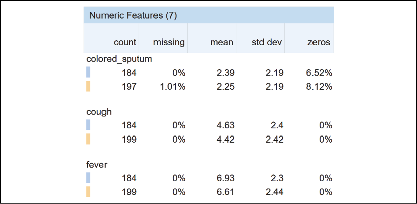
Figure 3.1: Tabular visualization of the numeric features
Once we obtain the output, we can analyze the features of the datasets from various perspectives.
Sorting the Facets statistics overview
You can sort the features of the datasets in several interesting ways, as shown in Figure 3.2:
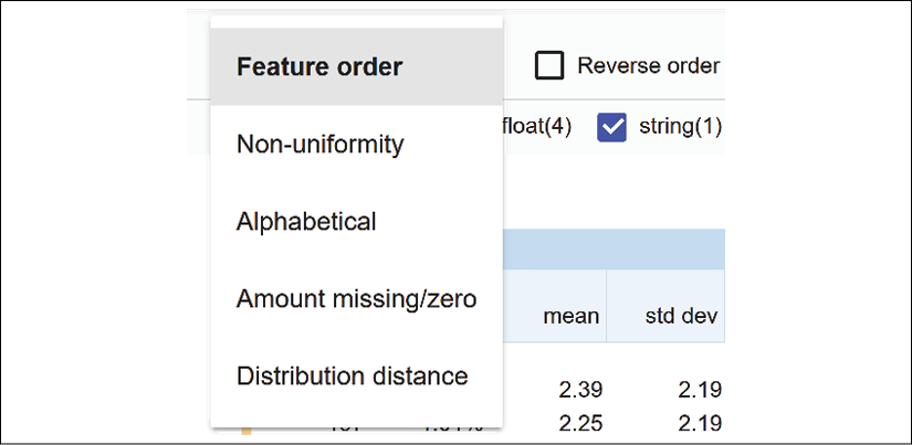
Figure 3.2: Sorting the features of the datasets
We will start by sorting the feature columns by feature order.
Sorting data by feature order
The feature order sorting option displays the features as defined in the DataFrame in the Reading the data files section of this chapter:
features = ["colored_sputum", "cough", "fever", "headache", "days",
            "france", "chicago", "class"]
The order of features can be used as a way to explain why a decision is made.
XAI motivation for sorting features
You can use feature order to explain the reasoning behind a decision. For a given patient, we could sort the features in descending order. The first feature would contain the highest probability value for a given person. The last feature would contain the lowest probability for a given person.
With that in mind, suppose we design our dataset with the features in the following order:
features = ["fever", "cough", "days", "headache", "colored_sputum",
            "france", "chicago", "class"]
Such an order could help a general practitioner make a diagnosis by suggesting a diagnosis process, as follows:
- A patient has a mild fever and has been coughing for two days. The doctor cannot easily reach a diagnosis.
- After two days, the fever increases, the coughing increases, and the headaches are unbearable. The doctor can use the AI and XAI process described in Chapter 1, Explaining Artificial Intelligence with Python. The diagnosis could be that the patient has the West Nile virus.
Consider a different feature order:
features = ["colored_sputum", "fever", "cough", "days", "headache",
            "france", "chicago", "class"]
colored_sputum and fever will immediately trigger an alert. Does this patient have pneumonia, bronchitis, or is this patient infected with one of the strains of coronavirus? The doctor sends the patient directly to the hospital for further medical examinations.
You can create as many scenarios as you wish with preprocessing scripts before loading and displaying the data of your project.
We will now sort by non-uniformity.
Sorting by non-uniformity
The uniformity of a data distribution needs to be determined before deciding whether a dataset will provide reliable results or not. Facets measures the non-uniformity of a data distribution.
The following data distribution is uniform because the elements of the set are balanced between an equal number of 0 and 1 values:
dd1 = {1, 1, 1, 1, 1, 0, 0, 0, 0, 0}
dd1 could represent a coin toss dataset with heads (1) and tails (0). Predicting values with dd1 is relatively easy.
The values of dd1 do not vary much, and the results of ML will be more reliable than a non-uniform data distribution such as dd2:
dd2 = {1, 1, 1, 1, 5, 1, 1, 0, 0, 2, 3, 3, 9, 9, 9, 7}
It is difficult to predict values with dd2 because the values are not uniform. There is only one value to represent the {2, 5, 7} subset and six values representing the {1, 1, 1, 1, 1, 1} subset.
When Facets sorts the features by non-uniformity, it displays the features with most non-uniform features first.
In our case, for this dataset, we will analyze the features by uniformity to see which features are the most stable.
Select Non-uniformity from the dropdown Sort by list:

Figure 3.3: Sorting the data by non-uniformity
Then click on Reverse order to see the data distributions:
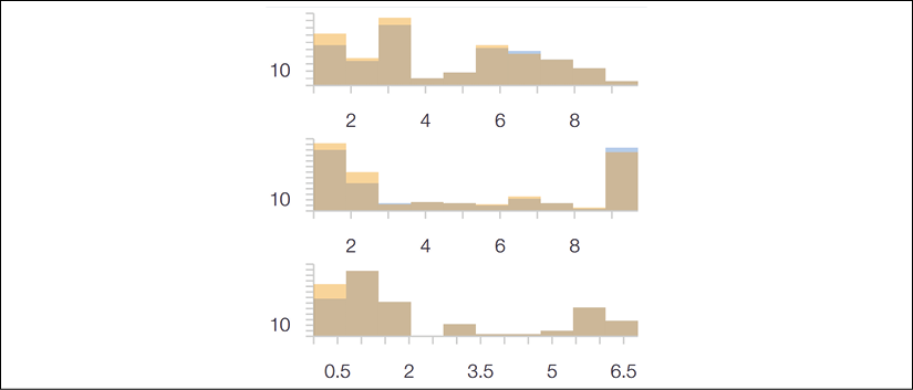
Figure 3.4: The data distribution interface
We see that the first line has a better data distribution than the second and third ones.
We now click on expand to get a better visualization of each feature:

Figure 3.5: Selecting the standard view
cough has a relatively uniform data distribution with values spread out over the x axis:
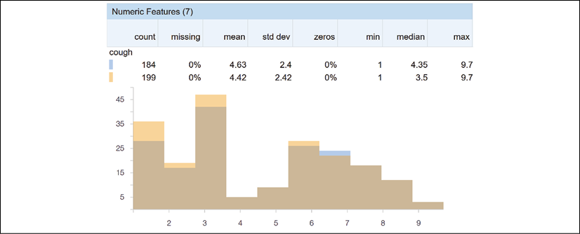
Figure 3.6: Visualizing the data distribution of the features of the dataset
headache is not as uniform as cough:

Figure 3.7: An example of data that is not evenly distributed
Suppose a doctor has to make a diagnosis of a patient that has coughed for several days with a headache that disappeared, then reappeared several days after. A headache that reappears after several days could mean that the patient has a virus, or nothing at all.
Facets provides more information on the data distribution. Uncheck expand to obtain an overview of the features:
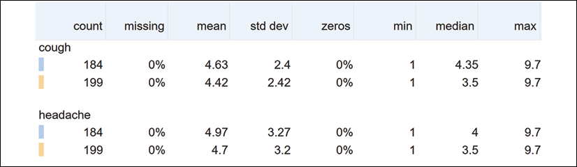
Figure 3.8: Numerical information on the data distribution of the dataset
The fields displayed help to explain many aspects of the datasets:
- count on line 1 is the number of records of the training dataset.
- count on line 2 is the number of records in the test dataset.
- missing is the number of missing records. If the number of missing records is too large, then the dataset might be corrupt. You might have to check the dataset before continuing.
- mean indicates the average value of the numerical values of the feature.
- std dev measures the dispersion of the data. It represents the distance between the data points and the mean.
- zeros helps us to visualize the percentage of values that are equal to 0. If there are too many zero values, it might prove challenging to obtain reliable results.
- min represents the minimum value of a feature.
- median is the middle value of all of the values of a feature.
- max represents the maximum value of a feature.
For example, if the median is very close to the maximum value and far from the minimum value, your dataset might produce biased results.
Analyzing the data distributions of the features will improve your vision of the AI model when things go wrong.
You can also sort the dataset by alphabetical order.
Sorting by alphabetical order
Sorting by alphabetical order can help you reach a feature faster, as shown in Figure 3.9:
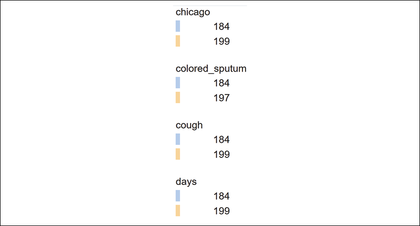
Figure 3.9: Sorting features by alphabetical order
We can also find the features with missing or zero amounts.
Sorting by amount missing/zero
Missing records or features with zero values can distort the training of an AI model. Facets sorts the features by the number of missing or zero values:
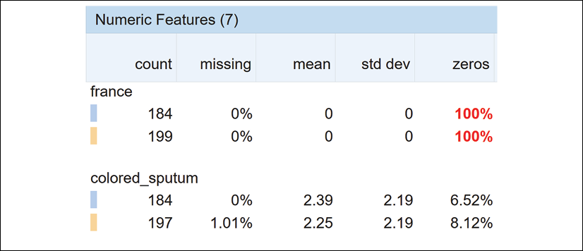
Figure 3.10: Numeric features information
100% of the values of france are equal to 0. While 1.01% of the values of colored_sputum are missing. Observing these values will lead to the improvement of the quality of ML datasets. In turn, the quality of the datasets will produce better outputs when training an ML model.
We will now explore the distribution distance option.
Sorting by distribution distance
Calculating the distribution distance between the training set and the test set, for example, can be implemented with the Kullback-Leibler divergence, also named relative entropy.
We can calculate the distribution distance with three variables:
Sis the relative entropyXis thedtraindatasetYis thedtestdataset
The equation used by scikit-learn for Kullback-Leibler divergence is as follows:
S = sum(X * log(Y/X))
If the values of X or Y do not add up to 1, they will be normalized.
In the cell below Facets Overview, a few examples show that entropy increases as distribution distance increases.
We can start with two data distributions that are similar:
from scipy.stats import entropy
X = [1, 1, 1, 2, 1, 1, 4]
Y = [1, 2, 3, 4, 2, 2, 5]
entropy(X, Y)
The relative entropy is 0.05.
However, if the two data distributions begin to change, they will diverge, producing higher entropy values:
from scipy.stats import entropy
X = [10, 1, 1, 20, 1, 10, 4]
Y = [1, 2, 3, 4, 2, 2, 5]
entropy(X, Y)
The relative entropy has increased. The value now is 0.53.
With this approach in mind, we can now examine the features Facets has sorted by descending relative entropy:
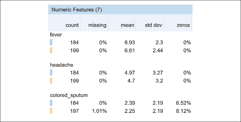
Figure 3.11: Sorting by distribution distance
If the training and test datasets diverge beyond a specific limit, this could explain why some of the predictions of an ML model are false.
We have explored the many functions of Facets Overview to detect missing data, the percentage of 0 values, non-uniformity, distribution distances, and more. We saw that the data distribution of each feature contained valuable information for fine-tuning the training and testing datasets.
We will now learn to build an instance of Facets Dive.
Facets Dive
The ability to verify the ground truth of data distributions is critical in supervised learning. Supervised ML involves training datasets with labels. These labels constitute the target values. An ML algorithm will be trained to predict them. However, some or all of the labels might be wrong. The accuracy of the predictions might not be sufficient.
With Facets Dive, we can explore a large number of data points interactively and analyze their relationships.
Building the Facets Dive display code
We first import the display and HTML modules from IPython:
# Display the Dive visualization for the training data
from IPython.core.display import display, HTML
The next step is to convert a pandas DataFrame containing the training or testing data into JSON. You can run an example that was inserted in the notebook before continuing:
# @title Python to_json example {display-mode: "form"}
from IPython.core.display import display, HTML
jsonstr = train_data.to_json(orient='records')
jsonstr
The output is a JSON string of all of the records in the pandas DataFrame containing the training data:
'[{"colored_sputum":1.0,"cough":3.5,"fever":9.4,"headache":3.0,"days":3,"france":0,"chicago":1,"class":"flu"},
{"colored_sputum":1.0,"cough":3.4,"fever":8.4,"headache":4.0,"days":2,"france":0,"chicago":1,"class":"flu"},{"colored_sputum":1.0,"cough":3.3,"fever":7.3,"headache":3.0,"days":4,"france":0,"chicago":1,"class":"flu"},
{"colored_sputum":1.0,"cough":3.4,"fever":9.5,"headache":4.0,"days":2,"france":0,"chicago":1,"class":"flu"},
...
{"colored_sputum":1.0,"cough":5.0,"fever":8.0,"headache":9.0,"days":5,"france":0,"chicago":1,"class":"bad_flu"}]'
We now define an HTML template:
HTML_TEMPLATE = """
        <script src="https://cdnjs.cloudflare.com/ajax/libs/webcomponentsjs/1.3.3/webcomponents-lite.js"></script>
        <link rel="import" href="https://raw.githubusercontent.com/PAIR-code/facets/1.0.0/facets-dist/facets-jupyter.html">
        <facets-dive id="elem" height="600"></facets-dive>
        <script>
          var data = {jsonstr};
          document.querySelector("#elem").data = data;
        </script>"""
The program now adds the JSON string we created to the HTML template:
html = HTML_TEMPLATE.format(jsonstr=jsonstr)
Finally, we display the HTML page we created:
display(HTML(html))
The output is the interactive interface of Facets Dive:
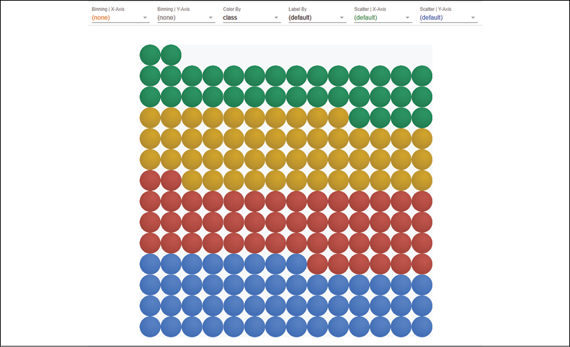
Figure 3.12: Displaying data with Facets Dive
We have built an interactive HTML view of our training dataset. We can now explore the interactive interface of Facets Dive with the training set loaded in the Facets Overview section of this chapter.
Defining the labels of the data points
The bins containing the data points may be enough to analyze a dataset. However, in some cases, it is interesting to analyze the data points with different types of labels.
Click on the Label By dropdown list to see the list of labels to choose from:

Figure 3.13: Defining a label to display
A list of the features of the dataset will appear. Choose the one that you would like to analyze:

Figure 3.14: A selection of labels to choose from
For a medical diagnosis, select the class of the disease, for example:

Figure 3.15: Sorting by label
The data points will be displayed by color and by class:
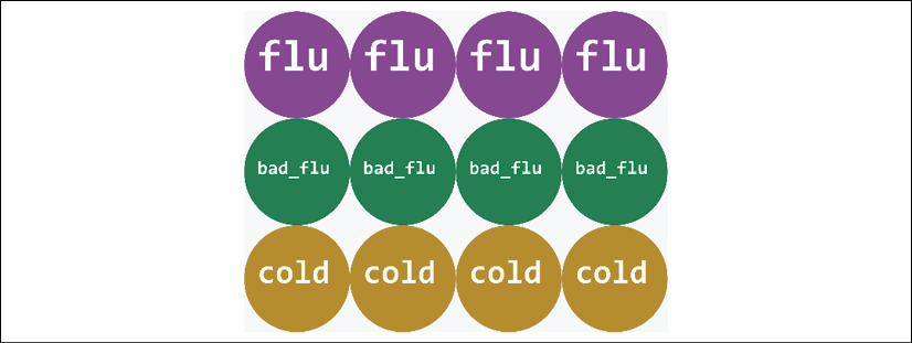
Figure 3.16: Displaying the color and label of the data points
Try other labels to see what patterns you can find in the data points.
We will now add colors to our data points.
Defining the color of the data points
In the previous sections, we learned how to display labels on the data points. We can also add colors. We can use one feature for the labels and another for the colors.
If we click on the Color By dropdown list, we will access the list of the features of our dataset:

Figure 3.17: Selecting a color
Let's choose days, for example.
The bottom of the graph shows the early days of a patient's condition. The top of the graph shows the evolution of the condition of a patient over the days::
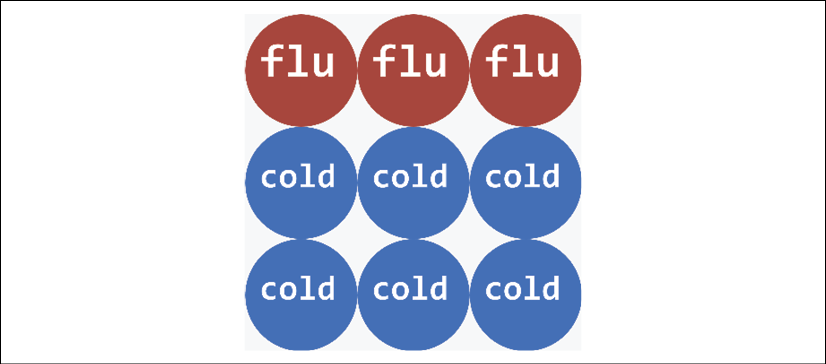
Figure 3.18: Using colors to display data
In this example, over the days, the diagnosis of a patient may have gone from a cold to the flu.
Try using several combinations of labels and colors to see what you can discover.
Let's analyze the data points in more detail by defining the binning of the x axis and y axis.
Defining the binning of the x axis and y axis
You can define the binning of the x axis and y axis in a very flexible way. You can choose the features you wish to combine and see how the data points react to these combinations.
You can make many inferences on your model by observing the way certain features seem to fit together, and others remain outsiders.
For each axis, we can choose a feature from the dropdown list:
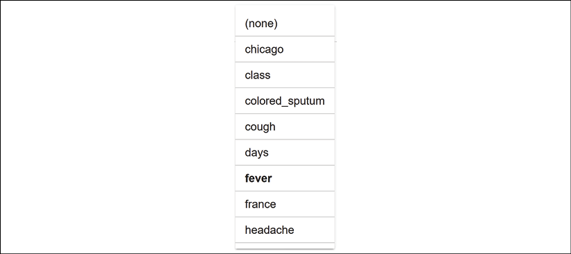
Figure 3.19: Defining the x axis binning
In this case, for the x axis, let's select fever, which is a critical feature for any medical diagnosis:

Figure 3.20: Binning the x axis
For the y axis, choose days, which is also a crucial feature for a diagnosis:

Figure 3.21: Defining the y axis binning
If the fever only lasts one day, the patient might have had a bad cold. If the patient has had a fever for several days with coughing, the diagnosis could be pneumonia or the flu, for example:
Figure 3.22: Displaying data with intuitive features
Change Color By to class to obtain a better image definition if necessary. Before moving on, try some scenarios of your own and see what you can infer from the way the data points are displayed. Before moving on, try some scenarios of your own and see what you can infer from the way the data points are displayed.
Scatter plots can also help us detect patterns. Let's see how Facets Dive displays them.
Defining the scatter plot of the x axis and the y axis
Scatter plots show the data points scattered on a plot defined by the x axis and y axis. It can be useful to visualize features through scattered data points.
The scatter plot displays the relationship between data points. You can also detect patterns that will help explain the features in a dataset.
Let's display an example. Go to the Scatter | X-Axis and Scatter | Y-Axis dropdown lists:

Figure 3.23: Scatter plot options
Choose days for the x axis and colored_sputum for the y axis:

Figure 3.24: Defining scatter plot options
You will see patterns emerge. For example, we can immediately see that a high probability of colored sputum leads to pneumonia. The pneumonia data points are scattered in a pattern over the days:
Figure 3.25: Visually detecting patterns
We can also set the binning x axis to days, the binning y axis to (none), the color to class, the scatter plot x axis to (default), and the scatter plot y axis to colored_sputum, for example. We can then analyze the patterns of the classes per day:

Figure 3.26: Modifying the views to analyze the data from different perspectives
We have covered some of the visualization options of Facets Dive to analyze our data points in real time. For example, a project manager might ask a team to shrink the size of the sample displayed or clean the data.
Visual XAI will progressively become a prerequisite for any AI project.
Summary
In this chapter, we explored a powerful XAI tool. We saw how to analyze the features of our training and testing datasets before running an ML model.
We saw that Facets Overview could detect features that bring the accuracy of our model down because of missing data and too many records containing zeros. You can then correct the datasets and rerun Facets Overview.
In this iterative process, Facets Overview might confirm that you have no missing data but that the data distributions of one or more features have high levels of non-uniformity. You might want to go back and investigate the values of these features in your datasets. You can then either improve them or replace them with more stable features.
Once again, you can rerun Facets Overview and check the distribution distance between your training and testing datasets. If the Kullback-Leibler divergence is too significant, for example, you know that your ML model will produce many errors.
After several iterations and a lot of fine-tuning, Facets Overview provides the XAI required to move on and use Facets Dive.
We saw that Facets Dive's interactive interface displays the data points in many different ways. We can choose the way to organize the binning of the x axis and y axis, providing critical insights. You can visualize the data points from many perspectives to explain how the labels of your datasets fit the goals you have set.
In some cases, we saw that the counterfactual function of Facets Dive takes us directly to data points that contradict our expectations. You can analyze these discrepancies and fine-tune your model or your data.
In the next chapter, Microsoft Azure Machine Learning Model Interpretability with SHAP, we will use the XAI Shapley value algorithms to analyze ML models and visualize the explanations.
Questions
- Datasets in real-life projects are rarely reliable. (True|False)
- In a real-life project, there are no missing records in a dataset. (True|False)
- The distribution distance is the distance between two data points. (True|False)
- Non-uniformity does not affect an ML model. (True|False)
- Sorting by feature order can provide interesting information. (True|False)
- Binning the x axis and the y axis in various ways offers helpful insights. (True|False)
- The median, the minimum, and the maximum values of a feature cannot change an ML prediction. (True|False)
- Analyzing training datasets before running an ML model is useless. It's better to wait for outputs. (True|False)
- Facets Overview and Facets Dive can help fine-tune an ML model. (True|False)
References
The reference code for Facets can be found at the following GitHub repo:
https://github.com/PAIR-code/facets
Further reading
For more on Facets Dive, visit the following web page:
https://github.com/PAIR-code/facets/blob/master/facets_dive/README.md