

Choose and Use Analysis Tools
Step Six
This chapter is all about the analysis tools you can use to solve problems. Although there are many analysis tools available, each tool is fit for a particular purpose and provides clues in its own way. Some provide inductive information, for example, whereas others provide deductive information. Each provides a technique for identifying the differences between acceptable and unacceptable parts, processes, or actions, which can further reduce the time you need to solve problems.
Some of the most useful deductive tools have already been described. These tools require you to evaluate comparisons and generate ideas. The problem definition sheets discussed in Chapter 5, for example, show how visual examination allows you to make deductions about the flaw being observed.
This chapter examines innovative tools and methods that can generate a lot of information. Although they may require a more concentrated effort, they are still easily employed with a little practice. These tools are important because they allow you to move more directly into what may be causing the problem under study.
Six Prime Problem-Solving Tools
This section deals with the six most useful tools. I have provided examples of problems where these methods proved to be effective. These are the mini-power tools of problem solving:
Basic analysis
Trait peculiarities
Sum of extremes
Comparison of individuals, duos, and groups
Fractional analysis (a method of using defect count data )
Tests for clue generation or confirmation
As mentioned more than once, many problem solvers attempt to look at the defect and jump immediately to what their past experience indicates might be the cause. Unfortunately, this is not as productive as taking the time to perform a basic analysis correctly. Sometimes even the simplest problem can be troublesome. In most cases, the time required to resolve a problem is reduced when you take time to define it properly.
For example, issues with electrical components are some of the most difficult to evaluate, because they might not exhibit readily recognized characteristics. Pinched wires, bent connector pins, open circuits, shorts, and other assembly anomalies aren’t readily identified because they are difficult to see. Here, as in most circumstances, basic analysis is vital to eliminating and preventing all problems, as well as to creating a body of corrective actions that can be used in the future.
Basic analysis can be used for problems well beyond the ones that occur in electrical assemblies. It can be applied to physical problems or conceptual problems even if the analyst has only limited knowledge of the system under review. Further, basic analysis focuses on the entire lifespan of the problem. To get to the root of the problem and ensure that it does not recur, you must ask of the problem condition:
For what reason did the problem occur? (specific definition of the problem)
For what reason wasn’t the problem recognized and prevented?
For what reason wasn’t the problem identified when it occurred?
For what reason wasn’t the problem captured and contained?
What corrective action can prevent the problem from recurring?
If the problem is defined correctly, each of the previous questions will provide significant actionable improvements for preventing the problem condition from happening again. Not only does the analysis aim to prevent recurrence, it initiates plans to recognize, identify, and contain similar problems with improvements to the quality process and efficiency. It is imperative to discover the reason for each of the questions before you can convincingly resolve a problem. A problem should be immediately discovered at its workstation and not pass to the next operation. It certainly should not be permitted to leave the operation or be delivered to the customer if it could be recognized at a prior operation. This is especially true when the customer has paid for the object.
![]() Note There are many problem-solvers who attempt to ask “why” many times to pinpoint the problem cause. Unfortunately, the vast majority of the quality professionals who I have had experience with have not been properly trained to use that technique effectively. Therefore, without extensive training, this method appears to be inefficient in identifying the cause of the problem. Using one or more of the methods described in this chapter and the next will help you find the cause faster in most cases.
Note There are many problem-solvers who attempt to ask “why” many times to pinpoint the problem cause. Unfortunately, the vast majority of the quality professionals who I have had experience with have not been properly trained to use that technique effectively. Therefore, without extensive training, this method appears to be inefficient in identifying the cause of the problem. Using one or more of the methods described in this chapter and the next will help you find the cause faster in most cases.
The purpose of a basic analysis is to observe faulty components as well as tooling, systems, and methods employed. The good news is that you have already learned the building blocks for a basic analysis.
First, you collect at least five samples of the units that are defective and five components that are satisfactory. Place them side by side and note any differences between the two distinct groups (bad versus good.) If you can’t see any differences between any of the units in either group, inspect them with a magnifying glass or a microscope. If that does not yield results, use your measuring tools as applicable.
You can also check the components while recording the information on a problem definition sheet, as described in Chapter 5. Compare the fault present with the criteria on the defect scene characteristics table and the contrasts of two table (covered in Chapter 2). If applicable, construct a concept sheet that addresses the fault (see Chapter 3).
Finally, compare the fault to the criteria on the problem corrective action worksheet (see Chapter 1). Believe it or not, using these evaluative sheets will focus attention on the clues necessary to solve the problem in the most efficient manner. But these analyses focus attention only on the first step of the five presented at the beginning of the chapter—What is the problem and for what reason did it occur? This preliminary work will help you solve the problem.
The second question—For what reason wasn’t the problem prevented?—may be discovered from the same corrective action worksheet. Generally, you’ll find that training, routing, instruction, and procedural issues are not adequate or are not in compliance.
This question can be most effectively answered when you are defining the fault. For example, in the case of the cracked crankshafts discussed earlier, the hot crack was found to be due to an impact that resulted from parts being dropped from the handling system instead of being transferred to an overhead conveyor. There was also an unapproved change in the red-hot casting routing. The unapproved change was created by open spaces on the overhead carrier where a significant number of baskets had been removed for repair yet no replacements had been installed.
So the problem condition was caused by a broken conveyor stop mechanism and gaps in the handling system that allowed the castings to drop eight feet to a concrete floor. Since some castings fell upon others, the thinnest counterweights were damaged due to hot cracks in the formed castings.
To prevent the problem going forward, we had to establish an assessment to check the operation of the conveyor stop, ensure the presence of all baskets on the overhead conveyor, and ensure the lack of castings on the floor at the discharge end of the conveyor. Such checking operations must be performed at random times and independently by more than one person.
Why the problem wasn’t identified, the third question, was due to a lack of awareness that handling abuse could cause damage. Assembly line personnel either didn’t know or chose to ignore the operating instructions to stop the production conveyor and to notify the supervisor due to poor training:
Red-hot castings dropped on the floor could be damaged.
A conveyor stop was important to control the material flow.
Castings on the floor were not in the intended routing.
Missing baskets on the overhead conveyor would cause castings to fall.
Question four—For what reason weren’t the damaged parts captured or contained?—was due again to a lack of awareness and training. A lack of supervision added to the problem.
Finally, the last question—What corrective action can prevent the problem from recurring?—should be fairly easy to answer once you’ve answered the first four. These were the actions we took to prevent it from happening again:
Immediately replaced damaged or missing baskets on conveyor.
Installed a gate to prevent parts from dropping to the floor.
Included basket and gate inspection for preventive maintenance.
Included basket and barrier operation in floor check listing criteria.
Revised the DFMEA, PFMEA, control plan, and work instructions.
Created a many-level assessment to check on these items.1
Conducted training of all the personnel involved in checking the operation.
As you can see in this example, there are many details to consider when evaluating a problem and taking ensuing actions. The basic analysis tool provided the insights required to solve the problem and prevent it from recurring.
The strongest clue was a hot crack that was identified in the crankshaft located adjacent to the crack initiation area. This, along with the casting date and the correlation with scrap records, resulted in the equipment malfunction findings. After defining the problem, identifying the cause is the most important step in the problem-solving process. The additional small clues of contrasts and individual identification differences increased the odds that we’d understand the cause. The use of the basic analysis tool has provided the insight to many past studies made in industry and service industries.
Trait Peculiarities
Many clues are available when you’re conducting a study. The object of effective problem solving is to collect only useful clues. So, collecting the clues that cause the most differences is important in identifying the cause of the problem. This focus allows you to eliminate irrelevant variables. The relevant clues can be classified into different trait groupings. Further, these groupings can be separated into four major categories. These categories are:
Unusual differences: When one rare trait appears or repeats in a pattern.
Piece trait differences: Seemingly identical parts are found to be different.
Individual trait differences: Differences found on a single piece.
Other traits: Differences in material, machines, runs, workmanship, and so on.
The process of generating clues can be simplified if you can identify the variables that cause the largest differences. You can develop the means to choose the clues to be analyzed using a trait peculiarities drawing (see Figure 7-1). This drawing is a visual representation of the changes in the defect or condition that has been selected for comparison.
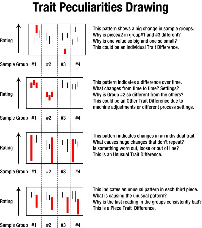
Figure 7-1. Generating Clues Based on Trait Peculiarities
![]() Tip Almost everything you can see or test can be plotted and evaluated, including such things as hole size, true position of holes, alignment, pouring-basin weight, excess flash on components, the amount of shift, mismatch, roughness, strength of sewn bindings, pull strength, and more.
Tip Almost everything you can see or test can be plotted and evaluated, including such things as hole size, true position of holes, alignment, pouring-basin weight, excess flash on components, the amount of shift, mismatch, roughness, strength of sewn bindings, pull strength, and more.
You can create trait peculiarity drawings by following these steps:
Collect three consecutive parts at least three times over three or more days.
Identify each part and measure the characteristic in question.
Record the individual identity and sequence of each part collected.
Attempt to capture the best and worst conditions being studied.
Rate the severity of the unfavorable condition for each part.
Plot the data on a drawing in the collected sequence.
Make comparisons and establish the major patterns.
The plots can be used to compare differences in characteristics or parts over different time periods.
Figure 7-1 illustrates this activity. For illustration purposes, only four groups of data are displayed for each condition described. The sheet displays these four different conditions as daily examples, with anomalies shown in thicker lines. The top display represents a plot for ground assembly pins. These plots were made by using the measurements obtained from ground assembly pins. The shaft diameters were measured twice. The measurements were made ninety degrees relative to each other and the data was plotted for each of the pins in each group for each of the four periods. This study led to a change in the process (discussed later).
In this case, the biggest difference in samples is shown in the first and third sections. The largest value in group 1 is shown much higher than the smallest value in group 3. This distance between the two samples was much greater than the length of each individual line, which represents the difference between the two measurements made for each diameter. So this is an individual trait difference, because one sample has a diameter much larger than a diameter measured in a following period.
In the two lower examples, the length of the individual lines could represent a change in diameters, lengths, or diameter tapers, depending upon the designation of the evaluator.
PLOT YOUR PROBLEM
The layouts in Figure 7-1 represent four individual daily readings. This illustrates one way that measurement data can be plotted and displayed.
Each sample group is designated for each of the four different days. The two uppermost comparisons show individuals or groups highlighted in thicker lines that pinpoint the two or more samples that showed the greatest variability, or difference, in the data.
Time differences are shown as the comparison to the readings on one day versus the other days. The vertical broken lines delineate the separation of one day from the next. Size differences are depicted as increasing when they are toward the top of the display and decreasing as they approach the bottom. This is the rating or measurement.
The distance of consideration is the greatest distance between highlighted samples that appear in the two uppermost example displays. The lower third and fourth groups show individual samples, which are not similar to other samples with the same sample batch of three. In this case, the difference is the magnitude between the longest and shortest sample measured on that day. However, because of their significance, these samples appear to be excessively bad and are highlighted because they are the most important consideration.
An individual trait difference is dominant on the top illustration because the largest variation is found to be between the biggest and the smallest piece. This type of data could be caused by parts machined on different machines or by different settings on the same machine because of operator tampering. Or it might indicate that a tool change was made.
The other trait difference, shown in the second display, could be caused by machine target adjustments or by different machines being used. This is why it is important to identify whether the process has more than one flow path. If it does, this pattern may reflect a difference in the machine used to form the shaft and could be a variation on machine tooling.
The next pattern shows unusual trait differences. This difference could be caused by a worn bearing, loose machining chuck, or another condition that prevents smooth machining along the entire length of the pin. If all of the samples are consistently deviant for within-piece variability, the machine may be out of alignment or affected by lack of lubrication, wear, or overheating.
The bottom pattern shows the piece trait differences pattern and it also requires investigation. The bottom pattern indicates an unusual display on each of the four days. This pattern does not necessarily indicate that the part is scrap, as it depends upon the designation when the comparison was created by the investigator.
In the next few pages, I’ll describe two studies that had similar results. One case involved overheating batteries in a toy and the other involved variation in the size of bearing caps. A harmful temperature condition was created when the battery was installed backward in a toy. In the bearing cap case, presented later in the chapter, different dimensions were created in the castings that were produced using identical dies. This was because the sand was not compacted in the mold to the same density.
A battery-operated toy designed to be used indoors and outdoors was overheating and spontaneously rupturing batteries in the drive mechanism. This sudden eruption caused severe damage to walls, rugs, draperies, and so on, due to uncontrolled carbon dispersion. Testing many units for temperature differences resulted in the pattern being exhibited when one of four batteries was inadvertently inserted backward into the battery compartment (see Figure 7-2). Once the problem was identified, we concluded that the other three batteries were operating in tandem to charge the fourth battery, which resulted in overheating. A redesign of the battery compartment to prevent batteries from being installed backward was a prime correction. In addition, the design (DFMEA) and process failure mode and effect analysis (PFMEA) were adjusted to prevent recurrence of this undesirable assembly operation.
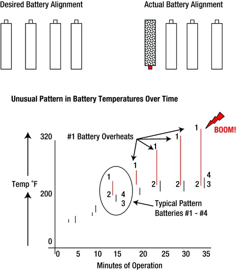
Figure 7-2. Battery Temperature Pattern
Figure 7-2 was generated in a quality control testing lab that conducted numerous experiments to determine whether the problem could be recreated. Luckily, one of the technicians installed a battery backward. If any of the four batteries was installed incorrectly, it was subject to an “interaction” due to the excess temperature and resultant failure. (Interactions are explained in Appendix B. Batteries these days can now only be installed correctly in most electrical devices to prevent these interactions.)
In summary, when an “other trait” pattern is present, it may indicate a shift or retargeting of the process, changed batches of materials, different environmental conditions, or different operator settings. Unusual trait difference changes may be due to worn equipment, bad bearings, lack of lubrication, machine adjustments, or outlier events. Some individual trait differences may be due to the use of two different machines making the same part or changing the machine target setting. These examples are not all-inclusive, as the process dictates the considerations that must be evaluated. The more the data can be digested, the easier it becomes to define the problem causing the defect. Therefore, each time you eliminate a variable, you’re closer to identifying the problem. After you’ve identified the problem, you can pinpoint the cause.
![]() Note One of the most important considerations in problem solving is to confirm that no unauthorized changes have been made to an approved process. These changes generally show up on a trait peculiarities drawing as another trait change. These changes can be attributable to changes in supplier, material, machining targets, manpower, methods, machines, environment, rework, or part routing. For example, an unauthorized reduction in lost foam pattern cure time caused a pinhole porosity flaw. The flaw was due to moisture on the pattern, which transformed into a gas defect when molten metal was introduced into a mold. There must be no unauthorized process changes made, no matter how slight. Your people must be trained to get approval for all internal and external changes in advance of making or approving them.
Note One of the most important considerations in problem solving is to confirm that no unauthorized changes have been made to an approved process. These changes generally show up on a trait peculiarities drawing as another trait change. These changes can be attributable to changes in supplier, material, machining targets, manpower, methods, machines, environment, rework, or part routing. For example, an unauthorized reduction in lost foam pattern cure time caused a pinhole porosity flaw. The flaw was due to moisture on the pattern, which transformed into a gas defect when molten metal was introduced into a mold. There must be no unauthorized process changes made, no matter how slight. Your people must be trained to get approval for all internal and external changes in advance of making or approving them.
A constant in any manufacturing setting are finance managers or outside suppliers who propose material changes as a means to reduce costs. It is imperative that you be aware of any material or process changes to be made to any and all material that is provided to you. It is essential that your supplier and their suppliers be aware of this requirement. This means that your supplier and also their suppliers must not make any unauthorized change to any material or process that you have officially approved. Definitely be aware of any material or process changes or proposals that are contemplated. I cannot stress too much that these are the greatest flaw-creating situations that you will experience.
![]() Note Unapproved changes to materials and processes could create more problems than just about any other cause—and their presence is difficult to discover.
Note Unapproved changes to materials and processes could create more problems than just about any other cause—and their presence is difficult to discover.
Unfortunately, supplies from new suppliers can differ in chemistry, strength, machining, or quality capability, and you must fully test and approve new supplies before they’re implemented.
For example, a new iron oxide supplier contributed to the creation of gas defects when it provided an iron oxide with a higher mix concentration of red iron oxide in place of the approved black iron oxide. Another failure occurred when a bearing pedestal formed of a substitute powdered metal failed under repeated loading after the supplier changed the material without authorization.
Then there are unauthorized procedural changes or poor training that must be discovered and prevented. An operator, for example, may intermittently apply too much pattern spray to a core box to lubricate a pattern. The excess spray will accumulate in the mold and cause gas porosity. Since the operator did not perform the soaking required during each machine cycle, the source of the problem was difficult to identify. This type of problem requires an enormous amount of investigation. We generated the clue using a trait peculiarities drawing. It plotted pinhole size and location in the casting versus differing amounts of pattern spray used in different mold sections, which made the issue obvious. Situations like this show that unclear job instructions and lack of training are frequent causes of quality problems.
Finally, suppliers do not always report the changes they make. When a problem is first being investigated, it is not unusual for suppliers to indicate that nothing has changed in the materials or processes at their location. Unfortunately, I have found that such assurances prove to be untrue about half the time, causing numerous problems. That’s why the use of a many-leveled assessment to check for the use of consistent work is necessary. Remember that consistent work is the performance of a task in accordance with the specified requirements for using the materials, tools, and methods in compliance with the existing operating procedures and control plan.
Unfortunately, you must verify and re-verify compliance to the established requirements.
More Examples of Trait Differences Revealing Problems
A pin supplier finds that some of the coated pins that it supplies to another manufacturer have slight dents and dings that make them unacceptable. In an attempt to salvage the parts and to keep supplies flowing, the supplier decides to polish or buff the pins before shipment to the customer. The supplier finds that a hand grinder that contained an aluminum-based polishing wheel does a good job of buffing the pins to make them look acceptable. Unfortunately, the pins were then contaminated with aluminum oxide particulate from the grinding wheel, which can destroy an engine due to tight tolerances. This condition may display as another trait difference on a plot. These differences can show up due to material, machines, runs, workmanship, and so on. Hand buffing these pins would have shown up as a finish difference between the sample parts.
Aluminum oxide polishing cloths and similar type products have been widely used acceptably in many service and manufacturing applications. Unfortunately, they can also be misused and cause extreme damage when applied to engine components that will be assembled. These same aluminum oxide or carbide particles can enter a close tolerance system and cause interference and distress to the mating components that are subject to oscillation and friction. Contaminants and foreign materials (FM) can cause imperfections in the process that will result in failure. Maintenance personnel may have these products in their toolboxes even though the company has banned them. When detrimental products are banned, it is necessary to thoroughly notify and instruct all personnel of the importance and purpose of such bans.
As shown on the concept sheet in Chapter 6 (see Figure 6-4), pins that have an oversized diameter after processing and are placed back into the rough grinder instead of into the finish grinder as stated in the approved routing can cause costly failures. Because they are smaller than the other rough stock components being supplied to the rough grinder, the grinding wheel can cause a taper to be introduced into the pin, which can create a piston disassembly problem in the field. A trait peculiarity drawing defined the differences in the diameters on either end of the pin as the suspect condition. This was a “piece trait” difference, as shown on the bottom drawing in Figure 7-1.
The text in black on Figure 6-4 shows the path of the ground parts before the problem was encountered. The lighter lines and text indicates the flow path after the changes were made to correct the process. The problem was created in the before flow path section, as indicated by the dashed line, when the oversized parts were placed into the rough grinder rather than the finish grinder. This caused a regrinding taper that was unacceptable. The after flow path shows that the oversized and undersize pins are to be placed into the scrap bin. Note that there were no undersized or tapered pins getting sent to the customer after the change had been made. So even a check of the final product can be evaluated using the part trait method.
Analyzing how energy is applied can play an important role in solving some problems. Questions to be answered will point you toward the correct solution path. For example, did only one of many parts break? Where did the break start? Is the break in the same location and pattern on all the broken parts? Is there any kinetic or potential energy that could have impacted the part? Did the part fail because of impact? Did the part fail because it was too weak or because the force applied to it was excessive?
This could be shown as an unusual trait difference on a plot if broken parts did not all come from the same pattern serial. It could also appear as a piece trait difference if a broken part was always produced by the same pattern serial as the other broken parts.
Here’s an example. A toy plastic horseshoe cracked after it was tossed because it contained voids. The voids caused a weakness that was exposed by the force of impact (see Figure 7-3). Eventually, we discovered that the operator had changed the machine cycle of the plastic bath, which prevented full mold filling, but let’s back up and see how we got there.
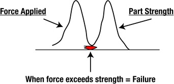
Figure 7-3. Force Applied Versus Part Strength Diagram
First, we had to determine whether excessive force was applied by someone throwing the horseshoe, or whether the part lacked adequate strength to fulfill its form and function. That’s one of the first questions you should ask when energy (damage) is suspect. Since the horseshoe was designed to be tossed in the game, the strength of the toy was more suspect than the impact force.
We decided to use the pull strength as an indicator that could be used in a trait peculiarity chart plot for evaluation. Plotting the pull strength of different horseshoes from within the mold containing four inserts provided clues. The shoes from mold 3 were always weaker than the other molds. This was a shoe-to-shoe difference. If each shoe showed the same relative strength, but the average strength differed over time, it could indicate a material piece trait difference. If samples from two different machines showed different average strengths, it could be an individual trait difference based on production machines.
The force to break a horseshoe might differ from shoe to shoe as a result of different flashing removal operations. They could differ from one time to another due to different batch amounts of regrind material use. Or if one area cracked differently from another, the trimming process to remove the gates and runner might be the culprit. From the data obtained from the pull strength tests, we determined that the weakest horseshoe was always the one that was made from pattern serial 3. The plot revealed differences between this part and the other three that were made in the same mold. Because these were plastic parts, they were sectioned, which revealed that number 3 parts had excess voids that affected their strength. We changed the plastic flow pattern to correct the condition.
The flexibility of using trait peculiarity studies to collect relevant clues is unlimited. Once you plot the most compelling data, you analyze the comparison patterns to find the clue.
Bearing Cap Case: Part Attribute Analysis
Here’s a similar problem to the horseshoe flaw. A machining line was experiencing downtime because some bearing caps from the supplier would jam in the grinder-processing equipment. This was a chronic problem that was worse on some days than others. We checked the machining equipment and found it to be acceptable. By measuring, we found that the problem always seemed to be with the iron casting 1, 2, 5, and 6. Measuring the individual caps showed that castings 3 and 4 were thinner than the others. This measurement was the comparison of the widths of the bearing caps that were made for each bearing cap in each position in the mold. Since there were six bearing cap pattern serials in each mold, each casting was represented by a number, 1thru 6.
There were six bearing caps made within the same mold (see Figure 7-4). Each of the pattern serials conformed to measurement specifications and were identified as 1 through 6, as shown in Figure 7-4. We measured six caps in each of three molds at three different times. Each of the groups contained the range of bearing cap widths measured in each of the three molds.
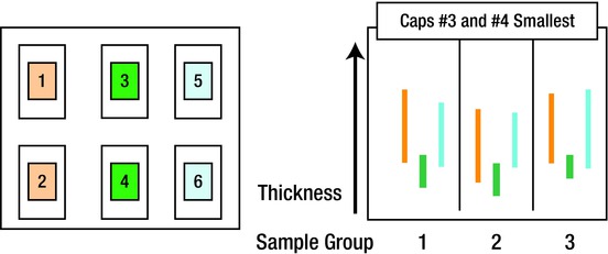
Figure 7-4. Basic Analysis of Bearing Cap Variables
We found that castings 3 and 4 (the lowest bar in each group) always had the smallest width. Since the castings were made from serials that were virtually identical, the finding was troublesome. However, the size differences were not consistent casting to casting. There appeared to be swelling at the top of the 5 bearing cap, whereas there appeared to be more prevalent swelling at the bottom of 2 bearing cap. The picture was still clouded but valuable clues had been obtained.
We decided to gather data from the mold because a concept diagram indicated that the cause of the binding of the production machine was either due to excess flash on the sides of the castings or a condition of mold wall movement. (Mold wall movement is a condition that results when molten iron is poured into green sand molds. The heat of the iron drives the moisture in the sand away from the interface and in effect allows the mold wall to move outward. This can allow the casting to become larger than intended.)
We selected molding properties as the suspect condition because the bearing caps were not considered smart enough to know where to swell unless acted upon by an assignable cause. We took mold-hardness readings and plotted the data, as shown in Figure 7-5. The readings were taken three times at each side and three times closer to the center.
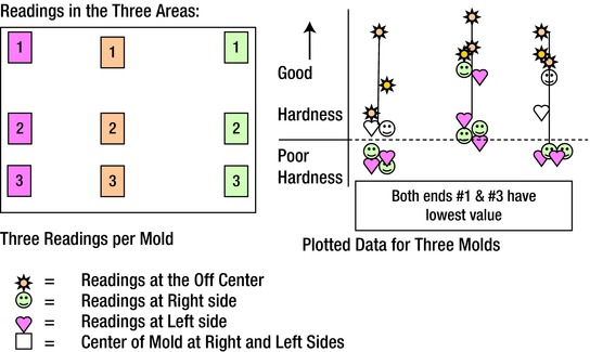
Figure 7-5. Mold Hardness Data Plotted for Three Molds
The first group in the image on the right shows the results from the first group of three molds. The second and third groups further to the right showed almost identical patterns. The findings from the part attribute drawing indicate the following:
The center of the mold always had the highest mold hardness.
The two central readings on either end were harder than the corners.
The mold hardness in the corners was low and not to requirements.
The cause of the insufficient mold hardness was found to be insufficient sand drops from the sand hopper and insufficient squeeze of the sand on the mold pattern to create the mold cavity. The solution was rather easy; we changed the sand gate height and added tucking pads to the machine to help squeeze the sand more firmly in the corners. This helped prevent mold wall movement and the resulting swelling distortion.
A trial run after the corrections were made showed all hardness readings meeting requirements. The new samples passed through the processing machining without causing a jam-up.
This didn’t end the project. Checking the mold hardness and recording the processing data became part of the work instructions. This type of activity helps to prevent the similar problem from recurring.
In addition, we added the assessment of mold hardness to a many-level check sheet to help preserve the gains that had been made. These two items of consistent work and assessments are explained in later sections.
SOMETIMES IT’S THE CUSTOMER
Sometimes the customer or user causes the problem. A toy manufacturer of electrically driven vehicles received reports of home fires caused by one of their vehicles, when they were being recharged. Fires were reported to have started on porches, in garages, and alongside the houses.
Because there was no significant information or testing to indicate this type of problem, we had to conduct an autopsy on the failed vehicles. Upon closer investigation of the melted plastic masses, it was discovered that the customers had inserted foreign material into the fuse slot on the battery on each of the vehicles.
Users were attempting to bypass the electrical safety fuse system. Pieces of washers, thick wire, paper clips, and other unidentifiable metal material was installed to replace blown safety fuses. If you can’t prevent a product failure, you must provide clear instructions to the customer.
The next section explains tools that display and document collected data in pictorial form. The tools also provide a project summary so that you can easily identify actual current status of the visual clues.
The sum of extremes test is based on the fact that there are only 20 ways that two groups of three items can be arranged numerically or combined without duplication or ties. For example, consider three good and three bad items. Arrange them by groups, and you’ll get 20 different combinations.
If you have doubts about this, you can challenge yourself by attempting to prove it incorrect. However, you may want to look in Appendix E for an example that verifies this factual statement. (Or, you can wait until later in this chapter, where the 20 different combinations are displayed.)
Similarly, there are only 70 ways that two groups of four can be arranged without duplication or ties, and 252 ways that two groups of five can be arranged without duplication or ties. Experience has shown that it is creditable and convenient to use five good and five bad samples for comparison. Generally, the differences can be observed if the objects are compared or studied individually. As mentioned, the sample of five good and five bad also leads to other comparisons, verifications, and tests that have proven to be effective for problem resolution. Comparing five of both conditions gives good results.
How effective are they? In taking a sample of five good and five bad, there are only eight distinct combinations of the 252 combinations where the extremities are ranked, counted, and not mixed, and they result in tally of extremes of seven or more. As an example, let’s use the combination of three good and three bad for simplification. This same method is applicable for all other combinations, including four good and four bad and/or five good and five bad. Assume that the good values have a lower leak rate and are measured to have a low number. The bad samples have a higher leak rate and a higher number. The first comparison that shows the separation of the good from the bad might be as follows:
![]()
There is clear separation of the good and the bad based on the test score shown. This row of data comparisons would have an extremes count of three good and three bad, which is a value of 6, because the good and bad values are clearly separated. When data overlaps or is tied it cannot be counted into the extremes count value. This is shown with different data as a tie in values:
![]()
The extremes test result in two good and two bad is a value of 4. Because the values are tied or overlapping, they cannot be counted in the extremes test value. This will be more apparent in the examples given later in this chapter. The basis for the combinations and examples of the values that do not overlap will be fully described and explained next.
When each of the arrangements in the preferred method is compared and the data is arranged by sequential value, the addition of the acceptable (good) on one end and the unacceptable (bad) on the other end results in a value of 7 or more.
Before you get into specifics of how the comparison of five good and five bad works, it is necessary to understand how the comparison is to be conducted. Done right, you can achieve greater than 95% confidence in results.
First, the two data conditions cannot overlap to be used in the sum of extremes test. You must discount any tie value between the good and bad and arrange the most disadvantageous position in the ranking. (This may appear confusing at first, but examples will provide clarity.) G stands for good values and R stands for proposed replacement values in the drawings. If the values tie, they are not shown in bold and they are not counted for the required extremes total of 7.
Using five samples from each group reduces the costs of the study and still delivers at least 95% confidence in the results if sum of extremes is 7 or more.2
![]() Caution Because of chance, you cannot be 100% certain of your result. However, being 95% confident is much better than being 50% certain. Therefore, after each study, always attempt to verify the results with trial runs or statistical tests. You can do this by running five samples of the original material and five samples of the replacement material and comparing the results. If all five duo comparisons fall in the same classification, you can be more than 95% confident that you can make the right decision with the proposed material change. This is based on the assumption that each evaluation gives a 50% chance for success. If all five duo comparisons indicate uniformity and acceptability, you can be 95% confident that the change can be made or is valid:
Caution Because of chance, you cannot be 100% certain of your result. However, being 95% confident is much better than being 50% certain. Therefore, after each study, always attempt to verify the results with trial runs or statistical tests. You can do this by running five samples of the original material and five samples of the replacement material and comparing the results. If all five duo comparisons fall in the same classification, you can be more than 95% confident that you can make the right decision with the proposed material change. This is based on the assumption that each evaluation gives a 50% chance for success. If all five duo comparisons indicate uniformity and acceptability, you can be 95% confident that the change can be made or is valid:
(0.5 x 0.5 x 0.5 x 0.5 x 0.5) x 100 = 3.125. Then, 100% – 3.125% = > 95 %
Sum of Extremes Analysis
Figure 7-6 shows examples of analysis results. They involve the comparison of samples from both a current (G) and a proposed replacement (R) sample population. The sketches show any overlap in the population characteristic being measured. If there is complete separation of the data groups, they are likely from different populations. The separation of the recorded values from the R (Replacement) or the G (Current) populations often indicates that there may be a significant statistical difference even when some of the data overlaps.
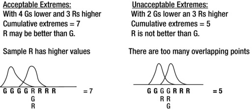
Figure 7-6. Sum of Extremes Explanation and Examples
For example, the upper left sketch indicates that with a sample of five G and five R measurements there is over 95% confidence that there is an acceptable difference between the two groups. (Confidence is a measure of sureness.) The total sum of extremes meets requirements of 7 or more with no overlapping data values. From the diagram, you can see 4 Gs + 3 Rs = 7 cumulative extremes. If the measurement values overlap, as shown in the right-side sketch, where only three Rs are larger than two Gs, there is no confidence of any statistical difference between them. The sum of extremes is 3 Rs + 2 Gs = 5, which is not acceptable. There must be 7 or more in the two groups of five.
A tally of 6 or less indicates that the measurement may be from similar or different populations or may have happened by chance alone. This chance occurrence is minimized by using five of each sample. Depending on the setup for the test, the data could indicate that there is a lower rate of defectives with the R condition or it could mean that the current product (G) is better than the proposed replacement part (R). (It depends on the original definition used.)
A sample follows in which five current and five proposed pipes were tested to verify the quality of a proposed supplier’s product. Current pipes were tested as were five proposed pipes. The results are shown in Figure 7-7.
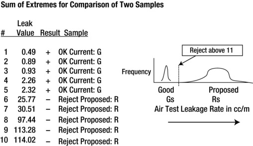
Figure 7-7. Sum of Extremes for Comparison of Two Samples
We applied a sum of extremes test to verify separation of the five current and five proposed pipe assemblies with an air test. Although tested at random, the results of leaking in cubic centimeters per minute (cc/m) are displayed in rank form. Each of the good pipes tested much lower than the proposed pipes on an air test and there was clear separation of the data. All of the current G samples passed the test with lower values than the proposed R samples. Therefore, this test had an acceptable sum of extremes value of 10, which exceeded 7.
sSum of extremes = 10 (5 G + 5 R). Groups were separated with no data overlap. This meant that the proposed pipes had greater leakage and should not be accepted or used as replacements for the current pipes.
The results of the air test showed that each of the proposed pipe assemblies leaked more than the allowable specification and more than the current pipe assemblies. The comparison indicated that the minimum count of 7 was achieved for statistical significance when the test consisted of five good and five proposed samples. Since the cumulative count was 10 (and therefore greater than 7), there is more than 95% confidence that the two groups are statistically different. After measurement, the critical difference was found to be in the individual fuel pipe diameter dimensions.
For those inexperienced with sum of extremes testing, it is advisable to test a minimum of five samples of each condition. If five random units of each condition are used and there is not more than three data points equal and/or overlapped, the evaluator can be certain that there is at least 95% confidence that the two samples groups are indeed different. This amount of samples allows you to possess the data for all of the tests and evaluations used in the analysis. I recommend that you save the acceptable samples from the study to provide background information for sample reviews if required. (Remember that confidence does not equal certainty.)
Comparison of Individuals in Duos (Sets of Two Units)
There is another valuable tool that you can use with most manufacturing problems, called the comparison of duos. A duo is a matched pair of individual samples that are scrutinized for differences. This tool can be used to compare a leaking fuel pipe to one that doesn’t leak. It might be used to compare a present part to a replacement part to determine which is better. Consider the following example, which can make the concept clearer.
A leaking fuel rail (pipe) problem was discovered on an engine assembly line. Production stopped and an immediate containment was issued to capture the suspect engines. We started an evaluation by constructing a part attribute analysis that measured the circularity (roundness) of the fuel pipes. Measurements were made at 90-degree increments when it was suspected that some appeared to be out of round. The leaking fuel tubes did not pass the air test and appeared to be from the same supplier but from a different shipment. These fuel lines (identified as B) were more oval and not as round as the current acceptable fuel pipes (identified as A). The biggest difference that appeared on a drawing analysis was the difference in circularity of the parts, which approached 0.002 of an inch. Also, the presence of a groove in the weld bead area reduced the effective minimum diameter by the depth of the groove on the leaking fuel lines.
To verify the finding, we inserted a mixed series of identified fuel rails randomly into the production line. Each time one of the units arrived at the test station, it was marked O if it was rejected by the air test and by the starburst if it was acceptable. Figure 7-8 shows the results.
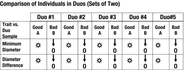
Figure 7-8. Comparison of Individuals in Duos (Diameters)
![]() Tip You can use any symbols to differentiate between good and bad results—plus or minus signs, directional arrows, Xs and Os, or what have you. Use whatever is most meaningful to you and that others can interpret and recognize quickly and accurately.
Tip You can use any symbols to differentiate between good and bad results—plus or minus signs, directional arrows, Xs and Os, or what have you. Use whatever is most meaningful to you and that others can interpret and recognize quickly and accurately.
Visually comparing the duos will show separation of the observable data as provided by the ranking indication. This allowed us to evaluate the current and proposed components as a pair. The minimum diameter of each bad part was less than the minimum diameter of a matching good part, as shown in Figure 7-8. (Arrows can be used to indicate greater or lesser trait values.) In addition, the difference of the diameters measured at 90 degrees from each other (“diameter difference” in the figure) showed that the acceptable parts had less out-of-round conditions than did the unacceptable parts. This data showed that there was clear separation of the test data that gave a degree of confidence that the new shipment characteristics were different and not an equal to the samples in the existing group.
Figure 7-8 shows how five good and five bad fuel pipes compare. They were compared on a good to bad basis five times with one good sample and one bad sample in each duo comparison. Even though this comparison is not as thorough as the sum of extremes test, it does allow you to make preliminary visual findings. In this case, it showed that there was a significant difference between the groups under study. Attribute comparisons are not as thorough or as specific as numerical contrasts, but they are still useful.
If there are clear differences between the samples in each duo, then there will be a pattern of the comparison, where all of the good or all of the bad samples contain a measurable characteristic.
In Figure 7-8, the minimum diameter and diameter difference is different in the good (A) and the bad (B) fuel line samples. This means that they appear to be significantly different. However, Figure 7-9 shows that there is no difference in the lengths of the fuel pipes, as all the display marks show equal or nondiscernable values. This means that there is no reason to suspect that they are significantly different. The surface finish data, on the other hand, suggests that there is dissimilarity between the good and bad parts in some duo comparisons. Results are mixed.
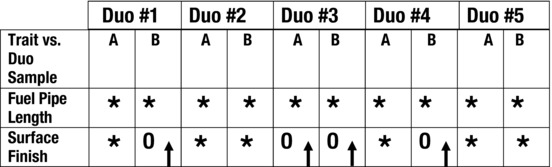
Figure 7-9. Comparison of Duos (Length and Finish)
If measurement values of good and supposedly bad samples are equal, as shown in the fuel pump length example, this means the parts are similar and no comparison of this trait can be made. Surface finish results show that the two samples overlap and that they may be significantly different when compared. Or at least the populations overlap.
Comparing the two units in each duo shows that minimum diameter and roundness of tubing are suspect in Figure 7-8. This can be noted by the visual signal that all the indicators in the row are consistent for each set of duos but not for each individual in the duo set. The proposed (bad) unit always had a smaller minimum diameter than the current (good) unit. Also, the diameter difference of the proposed (bad) unit was always more out-of-round than its duo matching current (good) unit. The consistency of the indicator in Figure 7-9 for fuel pipe length indicates that there is no significant difference between the two groups.
Earlier in this section, you learned that using five of each sample can provide more than 95% confidence in the results. However, there is a caveat to that assumption. When comparing duos, it’s possible for more than three values of the proposed replacement material or process to be more acceptable than the materials or process to which it’s being compared. In this event, there is no confidence, because the necessary seven minimum cumulative extremes are not available. Figure 7-10 shows an example of when a maximum pull strength in pounds is required and duos are being compared.
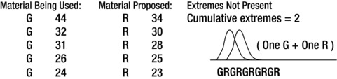
Figure 7-10. Sum of Extremes Example for Materials
Each of the G values is stronger than the matching R values in each duo. However, value R = 34 is greater than G = 32 and G = 31. R = 30 is greater than G = 26 and G = 24. R = 28 is greater than G = 26. Also, R = 25 is greater than G = 24. So the cumulative extremes is calculated by the left G and the most right extreme R. All the rest of the G and R values overlap. This gives a sum of extremes value of 1 + 1 = 2. So be aware that even two samples of five each can have similar overlap and therefore they will not meet the sum of extremes test value of 7 minimum extremes. (Tests of extremes give confidence in the result, not in the certainty!)
In most circumstances, the comparison of five duos will not result in this anomaly and will provide a good clue for further evaluation. The presence of the individual data for comparison will point to a potential cause. In most cases, the patterns exhibited by the data will be random and will not show a pattern, as it should not happen by chance alone. (However, you now know to look for this anomaly.)
There is a way to generate a significant difference between an acceptable sample of three and a test sample of three, as shown in Figure 7-11. Consider a sample currently being used as “better” and a proposed sample being classified as “inferior.” Since we know the acceptance of the current sample, we should always test the proposed replacement sample as being suspect because it has not yet been certified or approved for use. Even if it is designated as inferior for the trial, it may be a better material if it surpasses the current material. We want to know which is the optimal material.
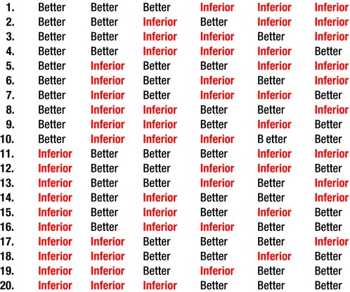
Figure 7-11. Sample of 20 Matrix (Better Versus Inferior)
Suppose for example that we designate “better” for the material currently being used and “inferior” for the proposed material. We can then make our test and determine the sequence of outcomes, as shown in Figure 7-11. Only in condition 1 of 20 shown below do the three “better” results fall to the left of the three “inferior” results. There is clear separation between the two groups that show better to the left of inferior. Depending on the test requirement, case 1 could be the better condition if lower test values are required. Or, case 20 could indicates that a new method or material, which was called “inferior” for example, actually has a lower test output than the existing “better” method. This would indicate that the replacement material should be considered for approval and use if it meets the desired test criteria. The following example provides an explanation.
Suppose you want to show the number of ways that two groups of three items (six items total) can be combined when taken three at a time in each group. Recall that there can be 20 different ways in which the results of the test can be ranked or described. These conditions depending on test definitions are shown in Figure 7-11. (I provided this sample in place of a sample of five from each of two groups, because it would have necessitated the listing of over 252 different arrangement combinations.)
Condition 1 shows that all the better parts are ranked lower. In this case, each of the inferior parts had a higher (or more unacceptable) test score than each of the better parts. Since they ranked completely different, there was no data overlap and there was clear separation of the two group’s measurements. So if only one of 20 combinations can produce the results in condition 1, there is only a 5% chance that it can occur by chance alone: 1/20 = 0.05, or 5%.
Condition 20, on the other hand, indicates that the inferior samples ranked lower than the better samples as a result of an imaginary test score. So again, if only one of 20 combinations can produce these results in Condition 20, there is only a 5% chance that it can occur by chance alone. That is 1/20 = 0.05 or 5%.
You may be inclined to conclude that there is a 95% chance that your comparison shows that a significant difference between them is present: 100% - 5% = 95%. The reason that you cannot be certain about this is that there is a 5% chance that the result you obtained that indicated 95% confidence will be incorrect 5% of the time. Now I know that that is confusing, and it’s why I’ve attempted to write these chapters without requiring the understanding of statistical theory or statistical calculations.
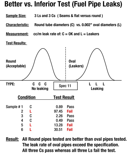
Let’s look at another example, which ranks, separates, and compares samples to determine which product should be used. Two different conditions of fuel pipes are compared while investigating a leak problem. We compared a round diameter pipe and what appeared to be an oval diameter pipe. These were designated C and L, respectively. We made measurements and each of the C pipes had a lower or nonexistent leak rate than did the L pipes, with the oval diameter. (Be advised that the test criteria was excessive in order to induce leaks for this test. Leaking fuel pipes would never be allowed to be used.)
These values are shown as pass and fail for each of the six pipes. You can see the separation in the distributions, as there is no overlap in the values between the C and L pipes. If the data is ranked by leak value and then arranged, it results in a “C C C L L L” pattern.
From the results, we can be 95% confident that the round fuel pipes are significantly different and better for this application. They are much less likely to leak.
Comparison of Individuals in Groups
If you’re unable to separate your samples into good and bad groups with certainty, you can use a process that compares data by groups as the evaluative tool. The test actually employs a sum of extremes technique. It compares the rank of data generated by the individuals in each of the two groups as they compare to the individual, ranked values of both groups combined.
Say for example that the data in Figure 7-13 has been collected for a single trait.
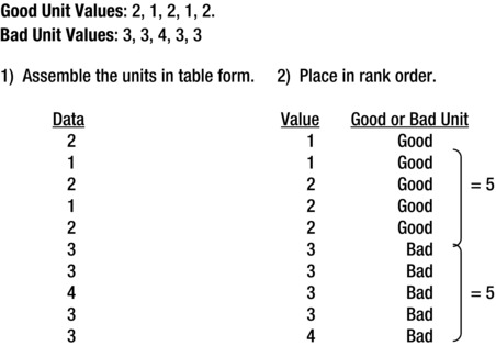
Figure 7-13. Comparison of Individuals in Groups
Since no bad value is less than or equal to a good value, the extremes sum is 10 additive extremes. Remember, counts of difference of 7 or more are required to give 95% confidence. This shows clear separation and provides 95% confidence that there is a significant difference. The count is obtained by adding the number of extremes from either side that are not equal or that overlap. Since all five good samples have lower values than the five bad samples, the sum of acceptable extremes is equal to 10 (5 + 5 = 10). (Which means that there is a 95% chance that there is a significant difference between the two groups. )
The next example illustrates the method of determining the sum of extremes when there is data overlap. (See Figure 7-14.) This additional example is provided for clarity to show you how to handle tied scores.
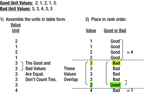
Figure 7-14. Comparison of Individuals in Groups
Remember, a sum of extremes of 7 or more must be present for 95% confidence. The tally here is 5 because ties cancel each other out.
Four values at the top and one at the bottom do not equal the required extremes value, so we can’t conclude that there is a real difference.
The reason that the count at the bottom is one is because the good value of three is equal to the bad value of three, which was measured for one of four individual bad samples. This prevents it from taking a position in the tied ranking. It could be in the fifth or the ninth position Therefore, it should be considered to be in the most detrimental position, which is the ninth position from the top. Since there was one value of 4, it is the only unit measured at the bottom for an extreme. Both of the extremes of 4 and 1 mean a cumulative sum of five extremes.
Note that the confidence level is below 95% if more than one trait from the sample is being compared, due to the fact that at least 5% error uncertainty comes into play. (If you simultaneously check 100 traits for 95% confidence, you may find five of the 100 comparison results could be incorrect due to the 5% uncertainty in confidence. Inaccurate results could be higher or lower, so be aware of this weakness when designing tests).
Sometimes when you’re studying a complex process, it is not readily possible to recognize the significant information. Consequently, it may be necessary to create a data sheet and collect all the peripheral information.
Figure 7-15 shows three tables that contain the peripheral data from an aluminum void study. Because the flaw under study was the porosity and the resulting rating, we used the quality of the final product as the measuring indicator. Because we were not certain what caused the porosity issue, we gathered data from six different variables. We collected the data and placed it in a table, as shown in the top-left side of Figure 7-15. We developed a rating system and classified the porosity in the casting for evaluation. This was accomplished in the second table in Figure 7-15, lower left. We then selected the horizontal lines of data that contained the three best porosity values and the three worst porosity values. The data was rearranged by descending porosity rating, as shown in the table to the upper right. That made it possible to continue the study and to observe that two variables—biscuit size and die temperature in degrees Fahrenheit—clearly separated the good and bad values.
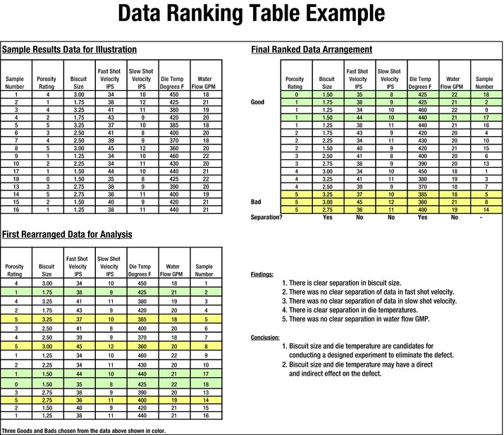
Figure 7-15. Data Ranking Table Example Using Comparison
After experimentation, it was found that biscuit size was indeed a contributing factor in the development of porosity in the casting under study. The temperature variable was found to be not significant.
The table in the upper left of Figure 7-15 shows that 16 individual samples were observed for each of the five suspect variables. The data was recorded as generated by the process variables at random intervals.
The first rearranged data for analysis table is shown in the lower left. Six lines are highlighted to reflect the three highest and the three lowest porosity ratings. These were 1, 5, 5, 1, 0, and 5; they reflect the best and the worst quality manufactured during the period. (One is the best and five is the worst.)
The final ranked data arrangement at the upper right was rearranged according to the ranking order of the porosity rating. You can see that there is clear separation of the data regarding biscuit size and die temperature. We used this information to determine the two traits to be used in an experiment to identify the cause of the porosity problem.
Since only three of each group were compared to establish the variables for the experiment, the confidence of the results was suspect. The sheet shown in Figure 7-16 provides a more thorough analysis, which in turn provides more confidence when five of each group were compared. These analyses show a relationship in the comparability to a regression analysis, which follows the group comparison.
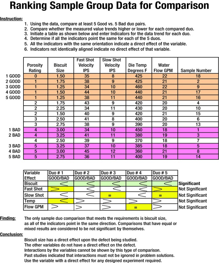
Figure 7-16. Ranking Sample Group Data Using Five Good and Five Bad Samples
The following example uses a couple of tools to show the results. Note that the use of five good and five bad resulted in a more accurate clue generation. This was due to the fact that the comparison of duos indicated that only the biscuit size showed a significant difference between the good and bad porosity ratings.
For those who insist on some type of statistical analysis, and who have some knowledge of it, Figure 7-17 provides an example that verifies the five good versus five bad sample visual comparison shown earlier. This study uses a method provided within the Analysis ToolPak in Excel. The acceptable results that are required are shaded. They are as follows:
The adjusted R value must be > 0.70. (It is 0.8074.)
The significance F value must be < 0.001. (It is 1.38E-06.)
Each of the acceptable P values must be < 0.05. (They are < 0.05.)
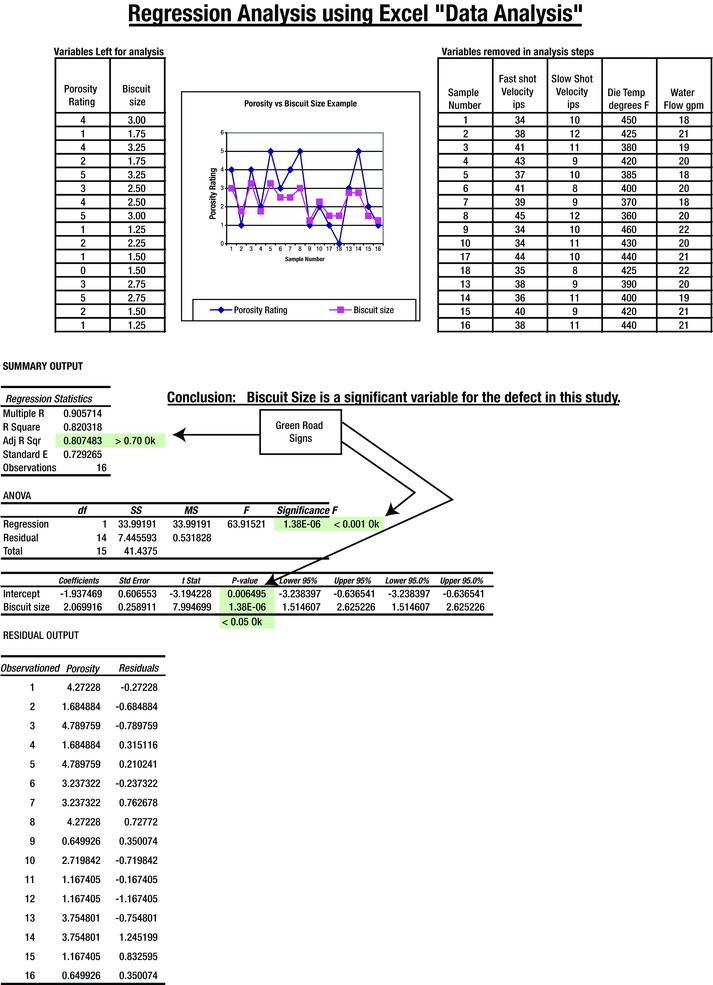
Figure 7-17. Regression Analysis Using Excel
The regression analysis example was calculated using Excel with the same information shown in Figure 7-16. The analysis shows that the biscuit size was the important factor in the defect being studied. This was the same result as in the group comparison study.
This does not mean that biscuit size is the determining factor for eliminating all types of porosity. It simply indicates that the porosity defined and evaluated in the ranking system was affected by the biscuit size. Verifying comparable test results using five of each sample or a formal regression analysis allows you to use either system.
Again, to maintain a high confidence in the result, compare only one trait at a time in each investigation. Because this was not a decision test or a validation test to prove certainty, we compared more than one characteristic in an attempt to determine clues about the important variables involved.
At this point, be aware that a comparison of two groups of five can also be used to confirm that a change was made. You can prove that materials, processes, repairs, or other conditions are effective by using a sum of extremes test and getting a result of 7 or greater.
As you can see, a sum of extremes test is a very useful tool and can be applied effectively for trial comparisons and to validate changes.
Fractional Analysis
This section deals with a manufacturing problem that required a fractional analysis to identify the causes of automatic assembly machine jams. This analysis is based on a matrix that records data generated in a system. The name is meant to relay that it is not a complete analysis of a system or its components. It differs in that it uses count data in a matrix to generate a numerical rating that can aid in the ranking of clues. I show examples that will help you understand. If you feel uncomfortable with the previous information, read Appendix A. It contains a complete explanation, with a sample problem and calculations. I include a problem and example later in this section.
Fractional analyses can help you decide which variables are important. They can designate variables to be used in designed experiments. They can also be used to generate clues when other insights are not present. (This is explained further in Appendix A.)
Consider this problem: Downtime was caused by jams at an engine block assembly line during a piston-stuffing operation. This occurred when an automatic feeder introduced pistons into the engine blocks. When the operation jammed, the entire production line became inoperative, because it was set up in a series orientation and the line could not move past the jammed loading station.
The facility had one engine block assembly operation with two piston stuffers and had two separate machining lines supplying the engine blocks for assembly. The machined blocks were then transferred to the assembly line, where cases were assembled into automobile engines.
One of the assembly operations was to install pistons into the machined block bores at one of two piston-stuffing stations. These stations were in a series, on the same production line. Although each of these stuffers had the capability to stuff any of the four pistons, they each stuffed two different pistons. These operations were identified as 2050 and 2060, respectively. (They were building four-cylinder engines.)
One day there was an inordinate amount of jams at the stuffing station, which created line downtime. Manufacturing suspected that the supplied pistons were not to specification. This action required an immediate response, as the cost of the downtime was prohibitive. A suspect piston load was removed from the assembly line and replaced with another load from a previous batch, which was processed without incident. Shortly thereafter, the problem returned and was accompanied by a loud “snap” whenever the operation was placed into the manual or automatic mode.
A further examination resulted in the following information (the italicized words were all meaningful in helping to define the problem):
Because of the spikes in occurrence, the condition was irregular and not continual.
It appeared to be related to part size and not to component assembly.
The condition was the result of an event in that something did not fit.
These failures were not due to part strength.
There was work applied, as the piston was squeezed to compress the rings prior to insertion into the bores.
It was an assembly problem that involved throughput that allowed a malfunction.
The failure occurred during processing and assembly on both stuffing operations.
Because of the nature of the fault, it was not possible to determine if there were any witness marks (scratches or markings) in any area or region.
We decided to search for unusual random patterns, as the failures happened on both shifts on multiple shipments and the design had not been changed. All of these bullet points pointed to a technical problem with the assembly block and virgin piston components.
Fortunately there was no other plant affected, and recreating the failure with photographs was not possible. A random sample of the pistons and rings from the suppliers appeared to be within specifications. Even with this information, a summation of this information still did not allow a more accurate definition of the problem even though many variables were eliminated.
Normally at this point, at least five pistons and piston rings would have been captured and identified from each of the good and suspect piston loads. However, measurements were made to ensure that the parts were to specification. In addition, all individual data would have been subject to analysis to determine if there was clear separation of any of the characteristics measured. Since the piston assemblies were too complex to measure locally, five samples of both good lots or jamming pistons lots that had failed were returned via air shipment to the supplier for immediate observation and measurements.
We developed a piston-stuffing concept diagram and data sheet to define the defect characteristics, which were still unclear. These sheets indicated that there could be multiple sources of the problem, as shown on the concept diagram and data sheet in Figures 7-18 and 7-19.
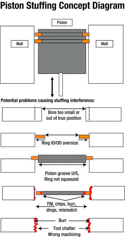
Figure 7-18. Piston-Stuffing Concept Diagram
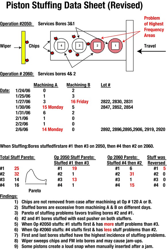
Figure 7-19. Piston-Stuffing Data Sheet
A revised data sheet—dissimilar from the one normally used on the line—was immediately created at the failing operations to capture as much information as possible (see Figures 7-19 and 7-20). These data included piston lot number, date of block machining, machining operation A or B, bore that jammed, and stuffing operation number (either 2050 or 2060). In addition, other observations were made of the troubled process to collect accurate current data relevant to the study. It is important to collect current data to allow accurate analysis of each problem. In most cases, historical data might have different time variables affecting the outcome, making it less useful.
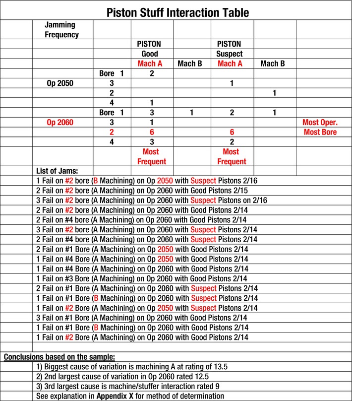
Figure 7-20. Piston-Stuffing Interaction Table
The collected data is presented in the piston-stuff interaction table (see Figure 7-20). It is laid out in an arrangement with four variables:
Machining performed at operation A or B
Identified good or suspect piston assemblies used
Stuffing operation 2050 or 2060
Individual bores in the block that were loaded
The defect summarized in each block is the number of failures associated with each of the variables for that specific block in the matrix.
The conclusions in Figure 7-20 summarize the fractional calculations, which are explained and shown on the following pages. If you are uncomfortable with accepting the analysis results that will be given without first knowing the method used, refer to Appendix A, where the process of fractional analysis is explained.
These conclusions indicated that machining A contributed the most to the piston-stuffing problem, as it had the highest calculated effect rating of 13.5. Even though all of the machining characteristics were found to be within specification, it was the largest contributor. Operation 2060 had the second highest effect rating of 12.5, which indicated that it was much more prone to failures than was operation 2050. In addition, the calculations show that there was an interaction with effect ratisng of 9.0 between machining A and operation 2060, especially on bore 2, which had the highest incidence of failure.
There were other incidental effects, which were not as predominant as those previously listed. These were:
Bore-to-bore variation had an effect rating of 3.5
Piston quality and machining variation interaction had a rating of 3.0
Piston quality variation had the lowest effect rating of 2.0
Conclusions Based on Current Samples3
The conclusions in this section are the result of calculations that will be presented in the examples., The variable listed and the results that follow indicate the relative effect that the variable has on the process being evaluated. That is, the greater the number value shown the greater the variable’s influence in causing jams at the loading stations.
Machining A caused the most failures, with an effect of 13.5. with 27 jam-ups.
Operation 2060 caused the second highest variation, with an effect of 12.5 with 25 jam-ups.
Machining A and operation 2060 have an interaction, with an effect of 9.0. (See example for interaction jam-ups.)
The direct, indirect, and interactions are equally strong with operation 2060.
Something is wrong at the operation 2060 stuffing station.
Machining effects are larger than operation-stuffing effects.
Recommendation: Machining A must be refurbished and retargeted to nominal.
What had appeared to be a piston-quality problem was in reality a machining setup and stuffer operation problem. Retargeting machining operation A to be more like operation B and adjusting the alignment and operation of stuffer 2060 prevented recurrence of the problem.
There were other variables that were acting during the study, but they were not as significant as those that caused the majority of the stuffing problem. The load of pistons also contributed, but was not as responsible for the jams as were the other factors. Remember, use only current data in evaluations as historical data may contain other variables that can confound the investigation.
Now that the overall scope of the project has been presented, let’s look at the method used to determine the association of variables and the assignment of their responsibility to the problem. (See Figure 7-21.)
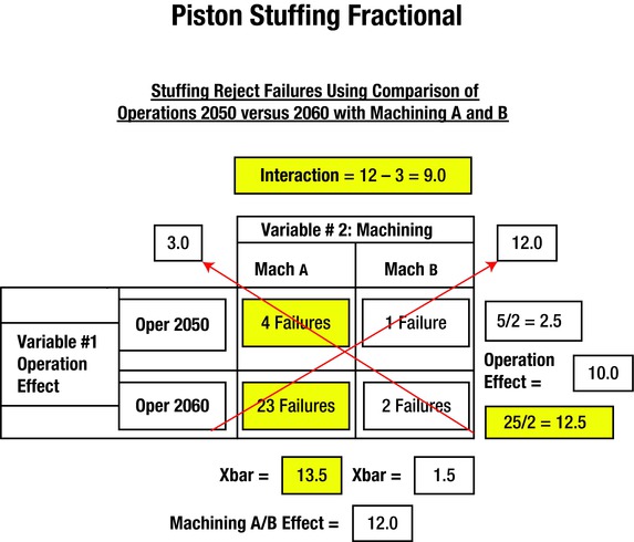
Figure 7-21. Piston Stuffing Fractional Example
The steps listed next were used to set up the matrix. The main horizontal variable was addressed as machining, whereas the vertical variable was addressed as the stuffing operation. There were two machining operations designated as A and B. There were two stuffing operations designated as operation 2050 and 2060. The data in each cell of the matrix was determined by adding the number of jams that occurred with the conditions that correspond to the squares in the matrix in Figure 7-20. Operation 2050 had four failures with blocks machined on line A, whereas it had 1 jam with blocks machined on B. Operation 2060 had 23 jams with machining A while only two with machining B. This resulted in the following first four assignments listed. The numbers generated on the display (Figure 7-21) are shown in steps 5 thru 13.
The matrix contains two main variables—operation and machining.
Operation has two levels (2050 ad 2060).
Machining has two levels (machining A and machining B ).
The number of failures is placed in each box for operation and machining pairs. (Machining A had four failures in operation 2050, whereas machining B had two failures in operation 2060.)
Operation 2050 had five failures with Machining A plus B. The average calculation for this severity is (4+1)/2 = 2.5.
Operation 2060 had 25 failures with machining A plus B. The average calculation for this severity is (23+2)/2 = 12.5.
Operation effect = 12.5 – 2.5 = 10.
Machining A had an average of (4+23)/2 = 13.5.
Machining B had an average of (1+2)/2 = 1.5.
Machining effect = 13.5 – 1.5 = 12.0.
Machining A, Operation 2050 vs Machining B, Operation 2060 = (4+2)/2 = 3.0.
Machining A, Operation 2060 vs Machining B, Operation 2050 = (23+1)/2 = 12.0.
Interaction between operations and machines is (12 – 3) = 9.0.
Machining accomplished with process A at 13.5 has the largest effect on producing jams when combined with piston-stuffing operation 2060. A high interaction is also present (9.0) when they interact together.
Tests for Clue Generation or Verification
You can perform clue generation or verification by comparing two populations. The different populations may be referred to as the “best” and the “worst,” or can have any designation. It could be the comparison of two different materials, machines, tools, processes, methods, suppliers, or environmental conditions that are proposed or on hand.
In the following test, the desired result is zero. A water filter manufacturer wanted to change the plastic cover for its pitcher because of customer complaints that the covers cracked when dropped to the floor. A replacement plastic was proposed, but there was uncertainty as to whether the covers were better with the proposed new material.
The first order of business was to devise a rating system. 0 equaled no cracks whereas 5 signified broken in half. The second step was to devise a drop test from a 40-inch height to replicate the drop from a countertop to the floor. The third step was to randomly drop and rate the damage of three of each of the old plastic covers (the dotted columns in the chart) and three of the newer plastic covers (solid columns in the chart). The results were depicted in graphic form (see Figure 7-22).
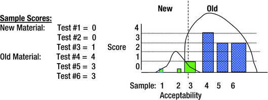
Figure 7-22. Old Material Versus New Material Test
As you can see, there was adequate separation of the data. The new covers cracked less. Although the new material is better than the old, it was still subject to cracking. One of the new covers cracked slightly, but three of the old covers cracked severely. Unless an even better material is tested, the new material should replace the old.
New plastic covers still break occasionally but appear to be stronger than old ones. The customer requested the newer replacement material covers until a more suitable stronger cover could be found.
Figure 7-23 shows another example of a comparison test. The test was conducted to determine clues as to what was causing the gears to bend in the gearboxes of juvenile electrical-powered vehicles. We disassembled three failed and three operable gearboxes and measured each component. The following characteristics were suspect: Hub Gear ID, Gear Post Diameter, Third Cluster Bore Pin, Pin Diameter, and Third Cluster Bore Gear. Each of the measurements for the failed and acceptable parts had populations that overlapped with the first four characteristics. The data did not overlap for the third cluster bore gear when each sample was measured in four different locations.

Figure 7-23. Third-Cluster Bore Gear Data Table
There is clear separation of the data, as shown in the two halves of the table in Figure 7-23. The difference of only a few thousandths of an inch created an interference fit that resulted in premature toy failure. The difference was with one of two gears in the mold used to manufacture the gears.
Besides the clear separation in the data, there was 95% confidence that the good and failed gear units came from different populations. However, in situations like this, use caution. In this case, the spacing between the populations was small and failures were still possible with the perceived good gears if a larger outlier4 was created.
This type of test can be used to verify that corrective action placed into effect is effective. There is good confidence if the change data is clearly better and statistically separated from the before (unacceptable) data values. Always confirm the effectiveness of changes after they are made.
Sometimes it is necessary to determine the nature of the differences between acceptable and unacceptable products. In this case, it is sometimes possible to use the comparisons method described previously. This is an example of testing that you can use with the application of test achievement comparisons.
Comparison of Good and Bad Assemblies
A juvenile product manufacturer designed a door gate to restrict access of toddlers to a specific room. The gate was designed to be installed within the door frame and was actuated by stepping on a locking lever. Actuation of the lever forced the walls of the gate to push against the door frame, ensuring the doorway was sealed. This type of gate could be used at the second-floor level to prevent toddlers from tumbling down an unguarded stairway. It had to be a safe and reliable barrier.
Unfortunately, some test gates were not stable and did not provide a satisfactory barricade. A test was developed to verify that the gate would prevent a child from disassembling it from a doorway even if the child threw a tantrum and shook the gate violently. We attached a cylinder to an installed gate and applied a force of 40 pounds in repetitive cycles to a forward and backward rocking motion.
Some gates were highly satisfactory, whereas others fell out of the doorway with only a limited number of cycles. Characteristics of the three best and the three worst gates were compared, as shown in Figure 7-24. Only five of the items checked are shown in the illustration. The one that shows separation is most critical.
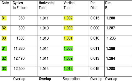
Figure 7-24. Toddler Door Gate Material Overlap
Components from three good toddler door gates (G1, G2, and G3) were measured and compared to components from three bad toddler door gates (B1, B2, and B3), which failed to stay in place. Some of the resulting ranked measurements were as follows:
The top three sections represent the identity and the measurements of vertical tube width in inches for the gates that failed to stay in place.
The lower three sections represent those good gates and the vertical tube measurements that exceeded the test bogey of 10,000 cycles of vibration that were deemed to be acceptable.
The only dimension that showed clear separation was the vertical tube width, with 0.006 of an inch between the separated values (see Figure 7-25). We discovered that the supplier used a different tubing source without prior approval. The supplier did not provide the certified material that was required to produce a safe operating gate. An unauthorized change therefore created failures.
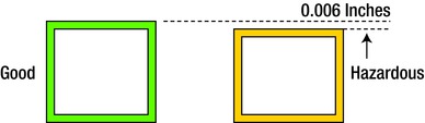
Figure 7-25. Drawing of Steel Tubing Supplied
This had to be controlled to ensure that the door gates would operate properly in the field. The supplier made the change and provided two different batches of tubing for the trial production run without authorization. It was necessary to establish a certification requirement for these materials for this supplier to prevent a serious injury or death.
By now you can recognize the significance of this method of comparison. It can generate powerful clues quickly. However, this system is flawed in that it is not completely reliable for decision making. Sometimes the variable that shows the separation difference does not affect the outcome that you are trying to evaluate. It is best to employ the comparison of five good and five bad samples so that you can observe any characteristic differences in the parts.
In addition, it is best to always strive for a minimum separation between the two populations of more than one sixth of the widest population. Distance is represented by the X shown in Figure 7-26. The distribution on the left is wider than the one on the right. If you divide it into six equal sections, you end up with a width as shown by X. The two distributions should be more than X distance apart to give you confidence that they are entirely different populations and that there should be no outlier data point that is well outside of its relative distribution.
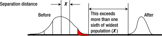
Figure 7-26. Required Sample Separation
The data spread from the “before” sample—when the bad items showed up— must be separated from the data spread of the “after” results—when you found replacement or known “good” components. If they overlap or touch, then you cannot have complete confidence that the results are different and significant.
Summary
This chapter discussed innovative tools and methods that you can use to investigate more complicated problems. They do require a more concentrated effort because actual measurements and data comparisons are involved. They will help you to move more directly to what may be causing the problem under study. The next chapter involves the use of some other tools that utilize visual inspections, flow charts, lot identification, sounds, and crack and broken component considerations.
1The many-level checks are basically individual inspections, checks, or audits that are conducted by more than one person individually. The checks are comprised of individual items that may have been created over time that have been recognized to create problems with the product or process being reviewed. These checks can range from observations for the proper tools, methods, and materials being used in an assembly operation. They can also include inspection, safety, and other considerations that are not included here.
2This is verified by the calculation of 8 divided by 252, which equals 0.031746. The 8 is from the total acceptable extremes combination of five good and five bad. The 252 is the total number of ways that the two samples can be listed without duplication or overlap. Therefore, the total of (1.0 – 0.031746) x 100 equals 96.8254%. That shows 95%+ confidence and that there is a significant difference between groups. There are only eight ways to get a total of seven or more extremes with a comparison of two groups of five.
3Refer to Appendix A for more comprehensive calculations and discussion.
4An outlier is a point of data that falls far away from the mean of the distribution from which it came. It is an anomaly in that it is significantly distant from the rest of the samples from which it came. In this case, the outlier could mingle with a sample from the other part distribution if they were not sufficiently far from each other.