
Now that we have several different visuals on a page, we can explore how these visuals interact with one another as well as how we can control visual interactions:
- Start by making sure that 2019 is selected in the slicer in the upper-left corner of the page.
- Click on July in the column chart in the lower left-hand corner of the page.
The July column becomes highlighted in our visual. Also notice that the card visual changes to display 31 and that the bar chart bars shrink to highlight just the number of each weekday in the month of July 2019. This behavior is called cross filtering or cross highlighting. - Click on July again to return the chars to their original state.
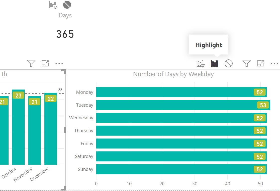
- Click on Monday in the bar chart. Again, Monday becomes highlighted, our card visual changes to 52, and our column chart changes to show the number of Mondays in each month of the year.
- Click the highlighted portion of the column chart.
You might expect that our filters would now be Monday and these five days in July. Instead, the charts simply switch to only have July selected. However, we can make these filters additive. - Click back on Monday in the bar chart. Hover your mouse over July again, but, this time, hold down the Ctrl key and then click again. Note that the card visual changes to read 5. By using the Ctrl key, we can make filters selected within visuals additive with one another.
But what if you do not want your visuals to cross filter one another? Well, you can control that as well. If you have been paying attention, you would have noticed that the date slicer in the upper-right has not been changing when selecting elements of the other visuals. If you have been paying really close attention, you would also have noticed that, when you select a visual, the ribbon changes to display a Visual Tools area that consists of Format and Data/Drill tabs. Let's explore the Format tab with regard to editing the interactions between visuals:
- Select the slicer in the upper-left corner.
- Click on Format in the ribbon and then click on Edit interactions, which is the button all the way across on the left-hand side. Notice that the Edit interactions button becomes shaded and small icons appear at the top or bottom of all of our other visuals:

One icon looks like a column chart with a small funnel, and the other is a circle with a line through it. If you hover over these icons, you will see that the chart icon is called Filter and the circle icon is called None. The icon that is shaded in gray is the active icon.
- Hover your mouse over the date slicer visual and then click on the Filter icon. The Filter icon becomes active, and the None icon becomes inactive.
- Click on the card visual and then click the None icon.
- Select the date slicer visual, hover over the slicer visual, and then select the None icon.
- Select the column chart visual and hover your mouse pointer over the bar chart. Notice that a third icon appears that is simply shaded in the column chart. This is the Highlight icon, which explains the behavior of this chart when we clicked on months within our column chart:
- Hover over the card visualization and choose the None filter icon.
- Repeat this same procedure for the bar chart visual so that the bar chart does not filter the card visual, but, this time, changes the column chart to Filter instead of Highlight.
- Click on the card visual and notice that all of the Filter and None icons disappear. This is because card visuals cannot filter other visuals.
- Click on the Format tab of the ribbon and now deselect Edit interactions by clicking on the button.
Let's see what happens now as we click elements within our visualization:
- Click on 2017 in the slicer and notice that the date slicer changes to a range that only includes 2017.
- Click back onto 2019 and the date slicer changes to only include 2019.
Notice, that this entire time, the card visual has remained at displaying 1095. This is because the slicer is no longer filtering the card visual. - Move the date range in the date slicer.
Notice that our original slicer remains with the three options: 2017, 2018, and 2019. Also notice that the card visual changes numbers. This is because the date slicer is filtering the card visual. - Click on a weekday in the bar chart visual. Notice that the column chart visual no longer does highlighting but is instead filtered. Click on a month in the column chart visual to observe the different behavior between Filter and Highlight.
Once again, save your work using File and then Save from the ribbon.