
Data Studio includes a map chart type that can be used to create simple maps. In order to create maps, a map dimension will need to be included in your data, along with a metric. Here, we will use the Google BigQuery public dataset for Medicare data. You'll need to create a new data source:
- Accessing BigQuery data: Once logged in, the next step is to connect to BigQuery. This can be done by clicking on the DATA SOURCES button on the left-hand-side navigation.
- You'll be prompted to create a data source by clicking on the large plus sign to the bottom-right of the screen.
- On the right-hand-side navigation, you'll get a list of all of the connectors available to you. Select BigQuery.
- At this point, you'll be prompted to select from your projects, shared projects, a custom query, or public datasets. Since you are querying the Google Analytics BigQuery Export test data, select Custom Query.
- Select the project you would like to use.
- In the Enter Custom Query prompt, add this query and click on the Connect button on the top right:
SELECT CONCAT(provider_city,", ",provider_state) city, AVG(average_estimated_submitted_charges) avg_sub_charges
FROM `bigquery-public-data.medicare.outpatient_charges_2014`
WHERE apc = '0267 - Level III Diagnostic and Screening Ultrasound'
GROUP BY 1
ORDER BY 2 desc
This query will pull the average of submitted charges for diagnostic ultrasounds by city in the United States. This is the most submitted charge in the 2014 Medicaid data.
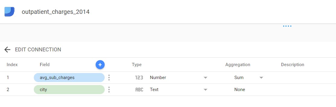
- The next screen shows the schema of the data source you have created. Here, you can make changes to each field of your data, such as changing text fields to date fields or creating calculated metrics:
- Click on Create Report.
- Then click on Add to Report. At this point, you will land on your report dashboard. Here, you can begin to create charts using the data you've just pulled from BigQuery. Icons for all the chart types available are shown near the top of the page.
- Hover over the chart types and click on the chart labeled Map Chart; then in the grid, hold your right-click button to draw a rectangle.
- Click on the chart to bring up the Dimension Picker on the right-hand-side navigation, and click on Create New Dimension:

Right click on the City dimension and select the Geo type and City subtype. Here, we can also choose other sub-types (Latitude, Longitude, Metro, Country, and so on).

Data Studio will plot the top 500 rows of data (in this case, the top 500 cities in the results set).

Hovering over each city brings up detailed data:

Data Studio can also be used to roll up geographic data. In this case, we'll roll city data up to state data.
- From the edit screen, click on the map to bring up the Dimension Picker and click on Create New Dimension in the right-hand-side navigation.
- Right-click on the City dimension and select the Geo type and Region subtype. Google uses the term Region to signify states:

Once completed, the map will be rolled up to the state level instead of the city level. This functionality is very handy when data has not been rolled up prior to being inserted into BigQuery:
