
Now, we'll consider another example dashboard that demonstrates slightly different objectives. Let's say everyone in the organization has agreed upon a key performance indicator of Profit Ratio. Furthermore, there is consensus that the cut-off point between an acceptable and poor profit ratio is 15%, but management would like to have the option of adjusting the value dynamically to see whether other targets might be better.
Consider the following dashboard:
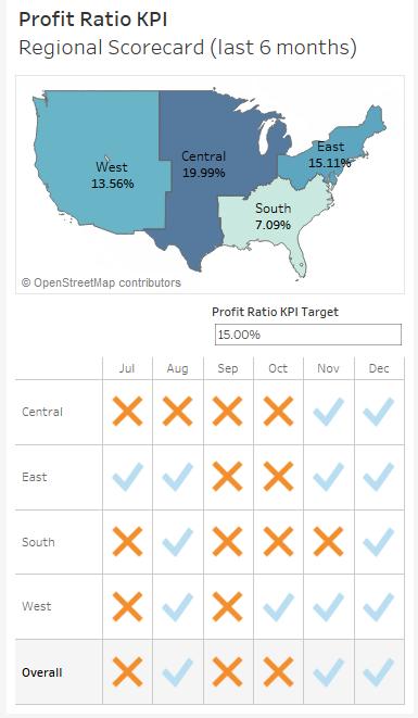
This dashboard allows your audience to very quickly evaluate the performance of each region over the last six months. Executive management could very quickly pull this dashboard up on their mobile device and take appropriate action as needed.
The dashboard provides interactivity with the KPI target parameter. Additional drill down into other dashboards or views could be provided if desired. If this view were published on Tableau Server, it is not unreasonable to think that regional managers might subscribe to the view and receive a scheduled email containing an up-to-date image of this dashboard.
Let's consider how to create a similar dashboard:
- Create a float type parameter named Profit Ratio KPI Target set to an initial .15, formatted as a percent.
- Create a calculation named Profit Ratio with the code SUM([Profit]) / SUM([Sales]). This is an aggregate calculation that will divide the profit total by the sum of sales at the level of detail defined in the view.
- Create a second calculation named KPI - Profit Ratio with the following code:
IF [Profit Ratio] >= [Profit Ratio KPI Target]
THEN "Acceptable"
ELSE "Poor"
END
This code will compare the profit ratio to the parameterized cut-off value. Anything equal to or above the cut-off point will get the value of Acceptable, and everything below will get the value of Poor.
- Create a new sheet named Region Scorecard. The view consists of Region on Rows, Order Date as a discrete date part on Columns, and the KPI - Profit Ratio field on both shape and color. You'll observe that the shapes have been edited to use checkmarks and Xs, and that the color palette is using color-blind-safe blue and orange.
- Add Column Grand Totals using the Analytics pane and format the grand totals with a custom label of Overall, with bold font and light gray shading.
- Add Order Date as a filter and set it to to the Top 6 by field (Order Date as Min). This will dynamically filter the view to the last six months:

- Create another sheet named Profit Ratio by Region.
- If you skipped the set actions example, use the drop-down menu on Region to select Geographic Role | Create from... | State. This tells Tableau to treat Region as a geographic field based on its relationship with the geographic field State.
- Double-click the Region field in the data pane. Tableau will automatically generate a geographic visualization based on Region. We'll examine the creation of custom geographies in more detail in Chapter 11, Advanced Visualizations, Techniques, Tips, and Tricks.
- Place Profit Ratio on Color and Label. You will also want to format Profit Ratio as a percentage. You may do so by formatting the field in this view specifically, or by setting the default number format for the field in the data pane (the latter is probably preferred as you will almost always want it to display as a percent).
- Additionally, add Region to Label. Rearrange the fields in the marks card to reorder the label or click the Label shelf to edit the label text directly.
- Apply the same filter to this view as you did to the Region Scorecard view. You may wish to navigate to the Region Scorecard sheet and use the drop-down on Order Date on the Filters shelf to apply the existing filter to multiple sheets:

Once both views have been created, the dashboard can be constructed by arranging the two sheets, parameter control, and text appropriately. The example in the Chapter 07 Complete workbook has a phone layout applied to it. Experiment with various layouts and positioning of the elements.
Existing objects can be switched between floating and tiled by holding Shift while moving the object or using the drop-down caret menu. The drop-down caret menu also gives you options for adjusting the floating order of objects. Additionally, floating objects can be resized and positioned with pixel precision by selecting the floating object and using the positioning and sizing controls in the lower left.
You can mix tiled and floating elements, but many dashboard authors prefer to build dashboards that are composed of entirely of one or the other. This ensures consistency between different layouts and sizes of screens (especially if the dashboard is set to an Automatic or Range sizing option).