
Box and whisker plots (sometimes just called box plots) add additional statistical context to distributions. To understand a box and whisker plot, consider the following diagram:
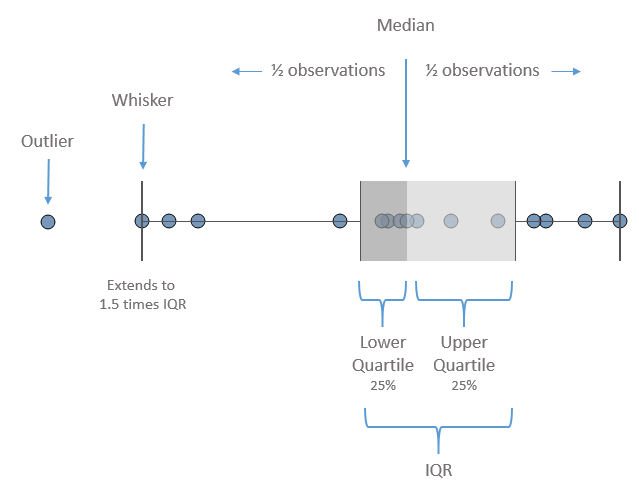
Here, the box plot has been added to a circle graph. The box is divided by the median, meaning that half of the values are above and half are below. The box also indicates the lower and upper quartiles, which each contain a quarter of the values. The span of the box makes up what is known as the Interquartile Range (IQR). The whiskers extend to 1.5 times the IQR value (or the maximum extent of the data). Any marks beyond the whiskers are outliers.
To add box and whisker plots, use the Analytics tab on the left sidebar and drag Box Plot to the view. Doing this to the circle chart we considered previously yields the following chart:

The box plots help us to see and compare the medians, ranges of data, concentration of values, and any outliers. You may edit box plots by clicking or right-clicking the box or whisker and selecting Edit. This will reveal multiple options, including how whiskers should be drawn, whether only outliers should be displayed, and other formatting possibilities.