
Circle charts are one way to visualize a distribution. Consider the following view, which shows how each doctor compares to other doctors within the same type of department in terms of the average number of minutes it takes to start treating a patient:

Here, you can easily see that certain doctors do better or worse on average than others in terms of the time it takes to start treating a patient. It is also interesting to note that certain types of departments take more or less time on average. This makes sense as each type of department has different constraints and operating procedures. There are also certain departments where time is more critical than others. Being able to evaluate doctors within their type of department makes comparisons far more meaningful.
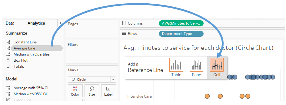
To create the preceding circle chart, you need to place the fields on the shelves that are shown and then simply change the mark type from Automatic (which was a bar mark) to Circle. Department Type defines the rows, and each circle is drawn at the level of Doctor, which is in the level of Detail on the Marks card. Finally, to add the average lines, simply switch to the Analytics tab of the left sidebar and drag the Average Line to the view, specifically dropping it on the Cell option:
You may also click one of the resulting average lines and select Edit to find fine-tuning options, such as labeling.