
Take a line chart and then fill in the area beneath the line. If there are multiple lines, then stack the filled areas on top of each other. That's how you might think of an area chart.
In fact, in Tableau, you may find it easy to create a line chart, like you've done previously, and then change the mark type on the Marks card to Area. Any dimensions on the Color, Label, or Detail shelves will create slices of area that will be stacked on top of each other. The Size shelf is not applicable to an area chart.
As an example, consider a visualization of patient visits over time, segmented by hospital branch:

Each band represents a different hospital branch location. In many ways, the view is aesthetically pleasing and it does highlight some patterns in the data. However, it suffers from some of the same weaknesses as the stacked bar chart. Only the bottom band (South) can be read in terms of the values on the axis.
The other bands are stacked on top and it becomes very difficult to compare. For example, it is obvious that there is a spike in February of each year. But is it at each branch? Or is one of the lower bands pushing the higher bands up? Which band has the most significant spike?
Now, consider the following view:
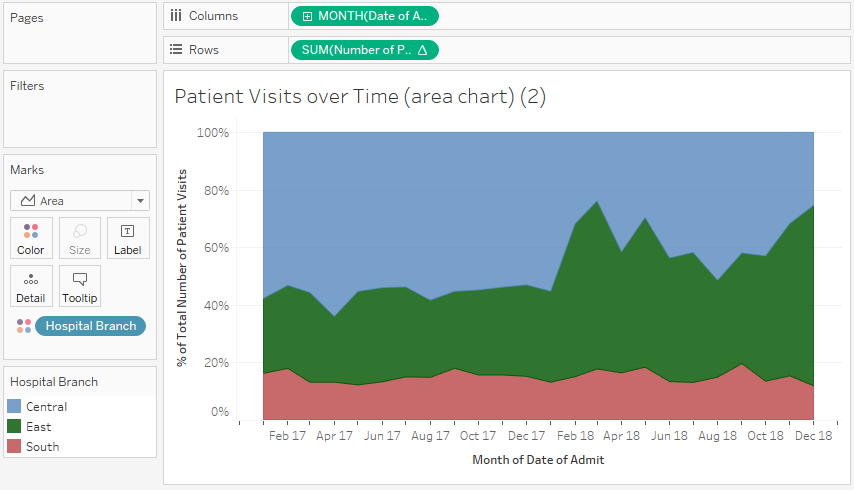
This view uses a quick table calculation, similar to the stacked bars example. It is no longer possible to see the spikes, as in the first chart. However, it is much easier to see that there was a dramatic increase in the percentage of patients seen by the East branch (the middle band) around February 2018, and that the branch continued to see a significant amount of patients through the end of the year.
It is important to understand what facets of the data story are emphasized (or hidden) by selecting a different chart type. You might even experiment in the Chapter 3 workbook by changing the first area chart to a line chart. You may notice that you can see the spikes as well as the absolute increase and decrease in patient visits per branch. Each chart type contributes to a certain aspect of the data story.