
This is one of the basic graphs that are created using the packets available in the capture file. To create the IO graph, select any TCP packet in your capture file and then click on IO Graph under Statistics. Refer to the following screenshot:
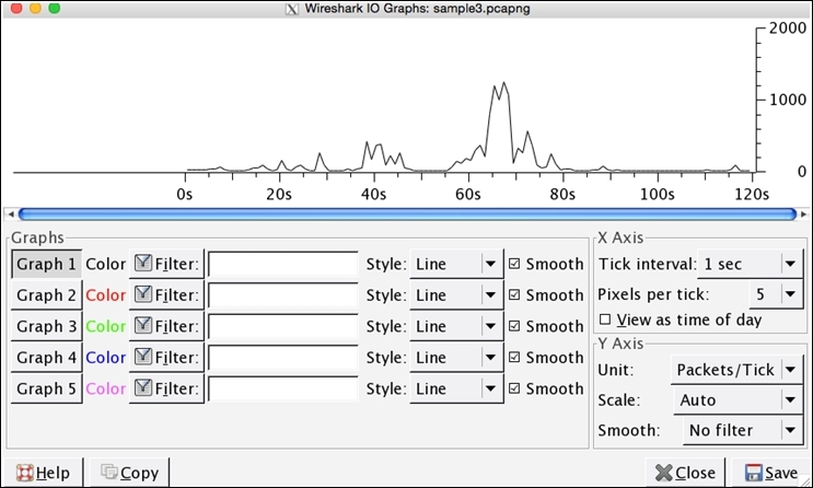
Figure 3.10: IO graphs
This way, you can see the highs and lows in your traffic, which can be used to rectify problems or can even be used for monitoring purpose. In the preceding graph, the data on the x axis represents the time in seconds and the data on y axis represents the number of packets per tick. The scale for the x and y axis can be altered if needed, where x axis will have a range between 10 and 0.001 seconds and y axis values will range between packets/bytes/bits.
From the preceding graph, we can easily depict that between sixtieth to eightieth second of the capture process, the network was most active, which generated approximately 1000 packets each second of the capture process. Now, you will be realizing how easy it was to gather that specific information from thousands of packets in merely 4-5 seconds; this is what graphing makes you capable of.
Just below the plotted area, you can see the Graph section, which lists various tools, such as Graphs 1-5, several filters, and the line format, and various other details. Let's take an example and try to understand the functioning of each of them.
The preceding graph displays the generalized form of our network traffic. Now, my requirement is that I just want to see the frequency of the UDP traffic separately in the same graph plotted with a red line. For such specifications, follow these steps:
- Write
UDPas a filter in the second filter box from the top - Click on the Graph 1 button to deactivate it
- Click on the Graph 2 button to activate it
- Now, you will see the same window as shown in the following screenshot:
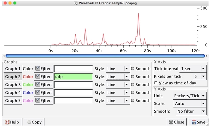
Figure 3.11 : IO graph-UDP traffic only
Analyzing specifically UDP traffic becomes easier in just a few steps. It is clearly visible from the preceding graph that most of the UDP traffic was generated between the seventieth to eightieth second of the capture process, and more than 250 packets were received during the capture process. If you want to compare both TCP and UDP traffic in the same graph, take a look at the following screenshot:

Figure 3.12: IO Graphs—TCP and UDP together
Comparing two things gives us a new angle to view regular things, and generally speaking, the learning process becomes better when we start comparing.