
Chapter 6
Check Out This View!
IN THIS CHAPTER
![]() Finding your way around Project
Finding your way around Project
![]() Exploring Project views
Exploring Project views
![]() Personalizing views for your needs
Personalizing views for your needs
In Project, a view is a way to display task and resource information. It’s essentially a template with a predetermined set of columns in the worksheet, a way to enter data in a pane, or a way to view data in a chart. Though earlier chapters in this book describe how to enter task information into a worksheet in Gantt Chart view (the default view and the most common view), it is by no means the only way to look at data in Project. Project has lots and lots of different views that you can use to look at and analyze your project data.
After you know how to enter basic task information into Project, you can begin to display the information in different ways. First, I give you a high-level explanation of views and then dip into more detail about the more common views. Though I can’t possibly cover every combination of data that you might want to see, I show you how to customize the views in Project to look at data in the way that best suits your needs at the time.
A Project with a View
Views organize data so that you can see information in logical ways. Because of the complexity of information in a typical Project schedule, Project offers many views for slicing and dicing (organizing) the information. If an average word processing document is as complex as a cookie, your average Project file is more like a five-tier wedding cake adorned with intricate flowers and garlands in delicate swirls of sugary icing.
A Project file holds information about these elements:
- Tasks: Task name, duration, start and finish dates, assigned resources, costs, constraints, and dependencies, for example
- Resources: Resource name, resource type, rate per hour, overtime rate, department, cost per use, and others
- Assignments: Information about which resources will complete which tasks, including hours of work, units of effort, and remaining work
- Timing and progress: Several types of calendars, project start and finish dates, percentage of tasks completed, resource hours spent, baseline information, critical path information, and more
- Financial information: Earned value, time-and-cost variance, and projected costs for work not completed, for example
Navigating tabs and views
For each project schedule file you create, Project essentially builds an extensive database of information. The different views in Project enable you to zero in on different combinations of the data you need. Having several views from which to observe your project information is helpful, but having all those views does you no good if you don’t know how to move around in a view after you find it or how to move from one to another.
One way to move from one view to another is by using the Task tab on the Ribbon. Clicking the bottom section (with the down arrow) of the Gantt Chart button to the left of the Task tab displays a menu of Project’s most-often-used views, as shown in Figure 6-1, as well as any custom views you create. Simply click any listed view to display it. In case it isn’t obvious, clicking the top section of the Gantt Chart button redisplays Gantt Chart view.

FIGURE 6-1: View choices.
You can see the same list of views by going to the Resource tab and clicking the View group’s Team Planner drop-down menu.
Clicking the View tab on the Ribbon gives you all kinds of options for selecting a view. Using the Task Views group on the far left end, you can select the Gantt Chart, Task Usage, Network Diagram, Calendar, Task Sheet, Task Form, or Timeline view. The Resource Views group enables you to select the Team Planner, Resource Usage, Resource Sheet, Resource Graph, or Resource Form view. Other groups on the View tab offer choices for sorting data, changing the timescale, and zooming a view to see it better. You can also split the view by adding the timescale to whichever view is active, or you can add details to a specific view.
 The lower-right corner of the Project window has buttons for jumping directly to the Gantt Chart, Task Usage, Team Planner, Resource Sheet, and Report views.
In addition to the views you can display via the Task tab or the View tab, you may need to use one of the dozen or so other views as you work on your project. To display views not directly available via the Ribbon, follow these steps:
- Select either the Task tab or Resource tab on the Ribbon.
- Click the down arrow on the Gantt Chart button.
Click More Views at the bottom of the menu.
The More Views box appears, as shown in Figure 6-2.
- Use the scroll bar to locate the view you want.
- Select the view you want and click the Apply button.

FIGURE 6-2: More than two dozen views are available for display in Project.
If you liked the View bar that was available in earlier versions of Project, you can still use it: Right-click the gray bar on the left side of Project, and choose View Bar to display the View bar. To hide it again, right-click the View bar and choose View Bar.
Scrolling around
The simplest views, such as Calendar view, have a single pane, with horizontal and vertical scroll bars. Other views, such as Resource Usage view (shown in Figure 6-3), have two panes: Each pane has its own horizontal scroll bar, and because the panes share the vertical scroll bar, the panes move up and down together.

FIGURE 6-3: Multiple panes of information maximize space in many views.
In most views with two panes, the pane to the left is the sheet — a spreadsheet-like interface that displays columns of information. To the right of this view is the chart; it uses bars, symbols, and lines to represent each task in your project and the dependency relationships among them.
At the top of the chart area is the timescale. This tool is used as a scale against which you can interpret the timing of the taskbars. To see your plan in greater or lesser timing detail, you modify the time units used in the timescale. For example, you can look at your tasks in detail over days or in a broader overview in months.
See the “Changing the timescale” section, later in this chapter, to find out how to change the time increments displayed in the timescale.
By using the horizontal scroll bars in each pane, you can view additional columns or additional periods in any pane with a timescale. Timescale panes cover the life of the project.
Use these methods to work with scroll bars:
- Drag the scroll box on a scroll bar until you reach the location in the pane that you want to look at. When you drag the scroll box to move in a timescale display, the date display indicates where you are at any time in the scrolling calendar. Release the mouse button when the date display matches the date you want to view.
- Click to the left or right of the horizontal scroll box to move one page at a time. Note that a page in this instance is controlled to some extent by how you resize a given pane. For example, with a timescale pane and a timescale set to weeks, you move one week at a time. In a sheet pane that displays three columns, you move to the next (or preceding) column.
- Click the right or left arrow at either end of a scroll bar to move in smaller increments. On a sheet pane, you move about one half column per click. In a timescale view with weeks displayed, you move about a day at a time.
Reaching a specific spot in your plan
To reach a particular area of your Project plan, you can also press the F5 key to use the Go To feature. Simply enter either of two items in the Go To dialog box when you want to find a task:
- A date from a drop-down calendar
- A task ID
You can also click the Scroll to Task button in the Editing group of the Task tab of the Ribbon (or press Ctrl+Shift+F5) to scroll the chart pane of the view to show the taskbar for a selected task in the sheet pane.
 The task ID, which is a number that’s assigned automatically whenever you create a task, provides a unique identifier for every task in the plan.
To see more or less detail in your schedule, use the Zoom command on the View tab — in every view. Read more about using the Zoom button in the sidebar “Zooming in and out,” later in this chapter.
For more about modifying the format of elements displayed in a view, see Chapter 13.
More Detail about Views
Finding out how to use Project views to enter, edit, review, and analyze Project data can help you focus your attention on the aspects of the project you are interested in, whether it’s resources, budget, task sequencing, or some other aspect. Don’t worry that you’ll be overwhelmed by the number of views you can use: After a while, using them will become second nature.
This section describes the most common views: Gantt Chart, Resource Sheet, Team Planner, Network Diagram, Timeline, and Calendar.
Home base: Gantt Chart view
Gantt Chart view is similar to a favorite room in your house — the place where your family members most often hang out. It’s the view that appears first whenever you open a new project. Gantt Chart view, shown in Figure 6-4, is a combination of spreadsheet data and a chart with a graphical representation of tasks; it offers a wealth of information in one place. The spreadsheet can display any combination of columns of data that you want.

FIGURE 6-4: Gantt Chart view.
Gantt Chart view has two major sections: the sheet pane on the left and the chart pane on the right. In Gantt Chart view (or in any view with a sheet pane), you can use tables to specify which information is shown in the sheet. A table is a preset combination of columns (fields) of data that you can easily display by going to the View tab, and then clicking the Tables button in the Data group. From there you can choose one of nine preset tables:
- Cost
- Entry (the default table)
- Hyperlink
- Schedule
- Tracking
- Variance
- Work
- Summary
- Usage
You can also customize the column display of any table by displaying or hiding individual columns of data, one at a time. (See the section “Displaying different columns,” later in this chapter, for information about this procedure.)
Resourceful views: Resource Sheet and Team Planner
In Resource Sheet view, shown in Figure 6-5, you add the resources that will handle the work in your project. You can type entries in cells and press the Tab and arrow keys to move around. Chapter 7 describes the purpose of each field in this view and tells you how to set up your resource information correctly.

FIGURE 6-5: Resource Sheet view.
Team Planner view, shown in Figure 6-6, shows you what each team member is scheduled to work on, and when. You can change an assignment by simply dragging it from one resource to another. Voilà — assignment problems solved! You can find out more about this view in Chapter 9.

FIGURE 6-6: Team Planner view.
Getting your timing down with the Timeline
Your sponsor and the project’s client may not want to see every detail in your grand plan. If you need to share project information with a person whose eyes glaze over easily, meet your new best friend: the Project Timeline. Appearing in its own, small pane (by default) with certain other views, it presents a simplified picture of the entire schedule. You can also display individual tasks, parent tasks, or milestones on the Timeline. The Timeline in Figure 6-7 shows the upfront planning, the summary-level work, the race-day milestone, and the closeout. To display the Timeline go to the View Tab, Split View group, and check the Timeline box. Chapter 18 delves into how to work with the Timeline and use it as a communication tool.

FIGURE 6-7: Timeline view covers the whole schedule.
Going with the flow: Network Diagram view
The organization of information in Network Diagram view, as shown in Figure 6-8, represents the workflow in your project in a series of task boxes. The boxes include dependency lines that connect them to reflect the sequence of tasks. (See Chapter 4 for more about dependency relationships.) You read this view from left to right; earlier tasks on the left flow into later tasks and subtasks to the right. Tasks that happen in the same time frame are aligned vertically above each other. Tasks with an X through them have been marked as complete. Tasks with only one line through them have some progress but are less than 100 percent complete.

FIGURE 6-8: Network Diagram view.
Traditionally known as a PERT chart, the network diagram method was developed by the U.S. Navy in the 1950s for use in building the Polaris missile program. PERT stands for program evaluation and review technique.
Network Diagram view has no timescale; the view isn’t used to see specific timing, but to see the general logical order of tasks in a plan. However, each task box, or node, holds specific timing information about each task, such as its start date, finish date, and duration. (You can customize the information in the task boxes, as described in the later section “Customizing Views.”)
Calling up Calendar view
Who can conceive of creating a schedule without opening a calendar? This familiar view of time is one of the many views offered in Project. Calendar view, as shown in Figure 6-9, looks like a monthly wall calendar, with boxes that represent days on a calendar in rows that represent the days in a week. Using this view, you can see all tasks that are scheduled to happen in any given day, week, or month.

FIGURE 6-9: Calendar view.
You can modify Calendar view to display as many weeks as you need by clicking the Custom button located directly along the upper-left side of the calendar and changing the Number of Weeks setting in the Zoom dialog box.
More than two dozen views are built into Project. You encounter many more as you work on specific elements of Project in this book.
Customizing Views
Just when you thought you were starting to get a handle on the two dozen or so views available in Project, I dazzle you with even more possibilities: Every one of those views can be customized to show different types of information.
You can customize every view in Project to show specific types of information. For example, you can choose to show columns of information in spreadsheets, labels in Network Diagram boxes or taskbars, and sets of data in graph views. You can also modify the size of panes of information and adjust the timescale.
Why all this flexibility with the information you see onscreen? At various times in a project, you need to focus on different aspects of your tasks. If you’re having a problem with costs, take a look at Resource Usage view and insert various columns of cost information, such as resource rates and total actual costs. If your plan is taking longer than the Hundred Years’ War, consider displaying Tracking Gantt view and looking at a bunch of baseline columns with timing and dependency data or examining the project’s critical path in the chart pane. If you need to display more of the sheet area so that you can read those columns without having to scroll, you can do that, too. In the following sections, you find out how to do all the things you need to do to show a variety of information in each view.
Working with view panes
Like Gantt Chart view, several views have two panes, such as Task Usage, Tracking Gantt, and Resource Usage. When the Timeline appears with a view, it appears in a third, horizontal pane at the top. You can modify the information you see in the sheet pane as well as the scale for timing in the chart pane. You can also display information near taskbars in the chart pane.
Resizing a pane
In views that show more than one pane, you can reduce or enlarge each pane. This capability helps you see more information in one area, depending on your focus at the time.
The overall area occupied by the panes is constant, so when you enlarge one pane, you reduce the other.
Follow these steps to change the size of a pane in a view:
- Place the mouse pointer over the edge of a pane.
- When you see a pointer composed of a line and two arrows pointing in opposite directions, you can drag the pointer to resize the pane:
- Drag to the left: Enlarge the pane on the right.
- Drag to the right: Enlarge the pane on the left.
- Drag up or down: Change the size of the Timeline pane versus the area that’s available for the rest of the view.
Release the mouse button.
The panes are resized.
Changing the timescale
I wish I could tell you that Project lets you control time and bestow lots more of it on your project, but it doesn’t. What it does allow you to do is modify the timescale to display your plan in larger or smaller time increments.
A timescale consists of a possible total of three tiers that you can use to display different time increments. For example, the top tier can mark months; the middle tier, weeks; and the bottom tier, days. This variety of detail lets you easily observe the overall task length and points in time during the life of the task. You can use all three tiers, only the middle tier, or the middle and bottom tiers (as shown in Figure 6-10). This feature is especially helpful because projects can span several weeks to several years, such as construction or pharmaceutical projects. This scaling feature is the only way to view such large-scale efforts.

FIGURE 6-10: The three-tiered Timescale dialog box.
You can modify the units of time and the alignment of each tier and also add tick lines to mark the beginning of each increment on the timescale. You also decide whether to include nonworking time on the timescale. For example, if you add an indication of nonworking time on a project for which weekends are nonworking, Saturdays and Sundays are indicated by a shaded area in the display, which can make a useful visual divider between weeks.
You can also display text labels near taskbars and specify which data is included. Labels can be placed above, below, inside, or to the left or right of the taskbars. Especially in projects where you display many columns of data and a lengthy schedule, a taskbar can be placed far to the right of the sheet pane data. You can then include information such as task name, start date, or resource alongside the taskbar to make your plan more readable.
To modify the timescale, select the View tab, click the drop-down arrow next to Timescale in the Zoom group, and choose the time increments you want visible on the chart. If you select Timescale in the drop-down list, you can modify the information on any of the three tiers. Here’s how:
- Click the View tab.
Click the Timescale format at the bottom of the Timescale drop-down menu.
The Timescale dialog box opens (refer to Figure 6-10).
- Click a tier tab and select a style for Units, Label, and Align.
Set the count.
For example, if your Units choice is weeks and you change the Count option to 2, the timescale appears in two-week increments.
- To prevent the display of a certain tier, select One Tier or Two Tiers from the Show drop-down list in the Timescale Options section.
If you want Project to use fiscal-year notation in the timescale, select the Use Fiscal Year check box.
Set the start date of the fiscal year by choosing File ⇒ Options ⇒ Schedule.- To show marks at the beginning of each unit of time, select the Tick Lines check box.
- Repeat Steps 2 through 6 for each tier that you want to modify.
- Click the Non-Working Time tab.
In the Formatting options, select the one you prefer.
Your choices are to have the shaded area for nonworking time appear behind taskbars or in front of taskbars or to simply not appear.
- In the Color list or Pattern list, select different options for the shading format.
Click the Calendar setting and select a different calendar on which to base the timescale.
You can find out more about calendar choices in Chapter 8.
- Click the OK button to save your new settings, which apply only to the timescale for the currently displayed view.
Use the Size setting on the three tier tabs to shrink the display proportionately and to squeeze more information on your screen or the printed page.
Use these keystroke combinations to navigate the timescale:
- Alt+Home: Move to the beginning of the project.
- Alt+End: Move to the end of the project.
- Alt+right arrow: Scroll the timescale to the right.
- Alt+left arrow: Scroll the timescale to the left.
- Alt+Page Down: Move the timescale one page to the right.
- Alt+Page Up: Move the timescale one page to the left.
Displaying different columns
Each spreadsheet view has certain default columns of data that are stored in tables. Gantt Chart view with the Tracking table displayed, for example, has data related to the progress of tasks. The Resource sheet contains many columns of data about resources that can be useful for entering new resource information. In addition to choosing to display predefined tables of columns, you can modify any spreadsheet table to display any columns you like.
To insert a column, go to the Format tab. In the Columns group, click Insert Column. Another option is to follow this procedure to show selected columns of data:
Scroll the table to the right, and click the Add New Column heading.
A list of available columns appears. The available columns are shown in alphabetical order — I’m only showing you 34 here and I’m not even through the Bs! So yes, as you can see in Figure 6-11 there are quite a few options to choose from!
In the list, select the field that contains the information you want to include.
Typing the first letter of the field name scrolls the list more quickly.
If you want to enter a different label for the field heading, right-click the field heading and choose Field Settings; type the name in the Title box and click the OK button.
The title in the current view appears in the column heading for this field.
- Move the mouse pointer over the column heading, select the column, drag the column to the left or right, and reposition the column where you want it relocated within the table.

FIGURE 6-11: New columns to insert.
To hide a column, right-click its heading in the sheet pane and then choose Hide Column. Or, to insert a column at a particular location, right-click the column heading at that location and choose Insert Column. It’s then inserted directly to the left of the selected column.
You can display preset tables of sheet data, such as Tracking for recording progress on tasks or Entry for entering new task information: Simply choose View ⇒ Tables (in the Data group) and then click the name of the table you want to display. The default table is the Entry table.
Modifying Network Diagram view
Network Diagram view is useful for understanding the flow of tasks throughout your project, and it can help you understand which series of tasks determines the overall project duration. Known as the critical path, it’s the longest chain of tasks (in duration, not in number of tasks) in your project. The tasks on the critical path are critical tasks; tasks that aren’t on the critical path are noncritical tasks.
When you first display Network Diagram view, you see boxes of various types — one for each task in your project. You can modify the information contained in those boxes and modify the field formatting.
By default, a typical task contains the task name, task ID, start date, finish date, duration, and resource name. A milestone displays only the milestone date, milestone name, and task ID number.
Different categories of tasks (such as critical or noncritical) can contain different information, and you can modify the field information contained in any individual box or category of boxes.
Changing what’s in the box
Sometimes, you want to see information about task timing, and at other times, you focus on other issues, such as resources. To accommodate these various information needs, Network Diagram view allows you to use various templates for the information contained in the diagram boxes.
To modify the information included in these boxes, follow these steps:
Right-click anywhere in Network Diagram view outside any box and choose Box Styles in the right-click menu.
The Box Styles dialog box appears, as shown in Figure 6-12.
- In the Style Settings For list, select a task category.
To modify the data included in the task boxes, select a different template from the Data Template list.
You can choose additional templates (and edit any template to include whatever data you like) by clicking the More Templates button.A preview of the data included in the template appears in the Preview area.
- Click the OK button to save the new template.

FIGURE 6-12: You can use templates of data for task boxes in Network Diagram view.
You can also apply different templates to each box separately by right-clicking a box (rather than clicking outside it), choosing Format Box, selecting a different template from the Data Template drop-down list, and then clicking the OK button.
Beautifying diagram boxes
Are you the creative type? Do you dislike the shape or color of the boxes in Network Diagram view? Do you want to add shading to the box backgrounds? Project lets you do all this and more.
Follow these steps to modify the format of Network Diagram boxes:
Right-click anywhere in Network Diagram view outside any box and choose Box Styles in the right-click menu.
The Box Styles dialog box appears, as shown in Figure 6-13.
- Click the Shape drop-down list and select a different shape from the list that appears.
Click the Color drop-down list in the Border section and select a different color from the list of colors.
Note: This choice specifies the color of the line that forms the box, not a background color. For that topic, see Step 5 in this list.
- Click the Width drop-down list and select a line width from the ones that are displayed.
- Click the Color drop-down list in the Background section and select a color for the background that fills the inside of each box.
- Click the Pattern drop-down list and select a pattern of lines to fill the interior of each box.
- Click the OK button to save the new settings.
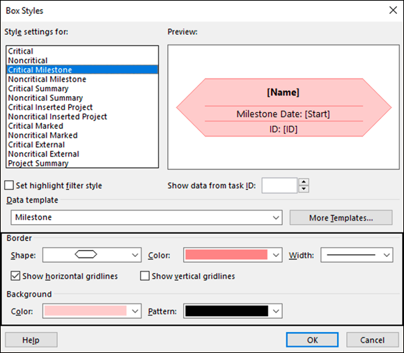
FIGURE 6-13: The Box Styles dialog box in Network Diagram view.
Combinations of certain patterns and colors in backgrounds can make the text in the box difficult to read, so look at the preview in the Box Styles dialog box to ensure that your combination works.
You can also format individual boxes by right-clicking a box, choosing Format Box, and formatting the border, and background as described in the information on Box Styles earlier.
Modifying the Network Diagram layout
You can modify the layout of Network Diagram view by right-clicking outside a box and selecting Layout. The Layout dialog box opens as shown in Figure 6-14, you can either allow Project to position the boxes or position them manually. You can also define how to lay out the boxes and whether to show summary tasks.

FIGURE 6-14: Modifying the Network Diagram layout.
Cosmetic options include defining the link style and whether to show link labels or connector arrows. You can set the critical path to show in a specific color (red is the default) and change the background color. A neat trick is to edit the layout to show link labels, such as FS (for finish-to-start). When you check this box, the type of dependency between tasks is shown.
You can also collapse the boxes so that only the task number appears. Simply right-click outside a box and select Collapse Boxes. You might also want to zoom the Network Diagram view to show as much information as you need. See the “Zooming in and out” sidebar earlier in this chapter. Figure 6-15 shows collapsed diagram boxes and the link labels on the dependency lines.
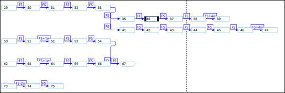
FIGURE 6-15: The modified Network Diagram view.
Resetting the view
Most changes you make in a view apply as long as you have saved them. But if you’ve made so many changes that the view is now messy, you can reset it at any time: Click the Task tab on the Ribbon, click the bottom of the Gantt Chart button, and click Reset to Default. Once you click Yes, the view reverts to the default settings.