
Chapter 18
Spreading the News: Reporting
IN THIS CHAPTER
![]() Generating standard reports
Generating standard reports
![]() Creating custom reports
Creating custom reports
![]() Dazzling readers with Visual Reports
Dazzling readers with Visual Reports
![]() Adding graphics and formatting to reports
Adding graphics and formatting to reports
![]() Making printer settings
Making printer settings
![]() Sharing a snapshot of the Timeline
Sharing a snapshot of the Timeline
![]() Enhancing reports with copy and paste
Enhancing reports with copy and paste
Here it is — the big payoff. It’s your reward for entering all those task names and resource hourly rates, and for tracking activity on dozens of tasks during those late-hour sessions in the first hectic weeks of the project. You’re finally ready to print a report or another type of project data, receiving tangible benefits from Project that you can hand out at meetings and show off to impress the boss.
Reports help you communicate information about projects by conveying schedule progress, resource assignments, cost accumulation, and activities that are in progress or scheduled soon. You can take advantage of built-in reports or create new reports to include the data that’s most relevant to you. Dashboard Reports and Visual Reports in Project 2019 offer graphical possibilities to help paint a picture of the progress.
Knowing that you want to impress people, Project also makes it possible to apply certain themes, images, shapes, charts, and tables to reports to help make the point.
A report isn’t the only tool you use to communicate with. You can customize headers, footers, and legends, and insert graphics into the schedule to make a presentation memorable. Other capabilities, such as customizing and copying Timeline view, enable you to incorporate Project data into reports in other programs.
Generating Standard Reports
Standard reports are already designed for you, offering numerous choices regarding the information you can include. You do little more than click a few buttons to generate them. Essentially, you select a report category, choose a specific report, and print it. If the plain-vanilla version of a report isn’t quite right, you can modify standard reports in a variety of ways.
 You can also print any view in Project: Simply press Ctrl+P, and then click Print. The entire project is printed in whichever view is onscreen at the time. Or you can choose File ⇒ Print. In the Print dialog box that appears, you can choose to print only certain pages of the project or only a specific date range from the timescale. Any filter or grouping that you’ve applied is shown in the printed document.
What’s available
On the Report tab, Project has four standard report categories: Dashboards, Resources, Costs, and In Progress. Each category contains several predesigned reports (as you can see on the Report tab of the Ribbon, shown in Figure 18-1), for a total 16 standard reports.

FIGURE 18-1: The Report tab of the Ribbon.
Standard reports vary in content, format (for example, a table, chart, or a comparison report), and sometimes page orientation (landscape or portrait). You can edit a report to change its name, the period it covers, the table of information it’s based on, and the filters applied to it. You can also sort information as you generate the report and add formatting, such as themes, images, and shapes.
Overviewing the dashboard reports
One cool feature in Project 2019 is dashboard reporting. The program has five standard dashboard reports: Burndown, Cost Overview, Project Overview, Upcoming Tasks, and Work Overview.
To see a dashboard report, simply click the Report tab, click the Dashboards down arrow, and select the report you want. Figure 18-2 shows an example of a Cost Overview dashboard report.
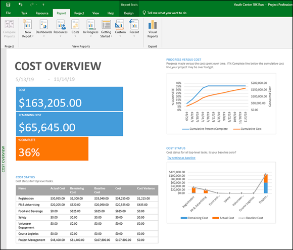
FIGURE 18-2: Cost Overview report.
A dashboard report you may not be familiar with is a burndown chart. You use it to compare the amount of work remaining to the baseline work remaining and the number of tasks remaining compared with the baseline remaining tasks. On the burndown chart, you can see the rate of work compared with the planned rate of work to determine whether you’re accomplishing work at the same rate as planned. If the number of tasks remaining is higher than the baseline rate, you’re in jeopardy of delivering late. Figure 18-3 shows a burndown chart.

FIGURE 18-3: Burndown report.
Creating New Reports
Suppose that the standard report set doesn’t have exactly what you want. No problem! The reporting function in Project 2019 makes it a snap to create a new report. Follow these steps:
From the Report tab, select New Report.
Select the type of report you want: Blank, Chart, Table, or Comparison.
When the Report Name dialog box opens, enter a name for the report and click OK.
If you choose a Chart, Table, or Comparison report, a split window opens, as shown in Figure 18-4; the left side holds the report, and the right side holds a Field List.
- In the Select Category drop-down list, choose among Time, ID, Name, Resource Names, and Unique ID.
- From the Select Fields expandable list, check the check box next to the fields you want from the various categories (cost, duration, number, or work).
- If you want to apply a filter, such as incomplete tasks or active tasks, select one from the Filter drop-down list.
- If you want to group information, select the appropriate grouping from the Group By drop-down list.
- Select at which level you want to see information reported using the Outline Level drop-down list — for example, Level 1 (the entire project), Level 2, or Level 3.
Choose how to sort the data.
It’s the order in which you want to present it based on the fields you selected in Step 4.

FIGURE 18-4: Building a custom report.
After you create a new report, you can access the report in the Custom category in the Reports dialog box or by choosing Report ⇒ View Reports ⇒ Custom and then clicking the report’s name.
Gaining a new perspective on data with visual reports
Project offers six categories of visual reports and some custom reports that you can build yourself. Some visual reports are based on time-phased data (data distributed over time, such as allocations of resource time or costs), and some aren’t. Report categories are described in this list:
- Task Usage: Based on time-phased data for tasks, this report category lets you peek at cash flow over time using Excel.
- Resource Usage: Based on time-phased resource data, this type of report includes resource costs, resource availability, resource work data, and a cash flow report based in Visio.
- Assignment Usage: Also based on time-phased data, this category provides information in areas such as baseline versus actual costs and baseline versus actual work. It also provides an earned value report.
- Task Summary, Resource Summary, and Assignment Summary: These three report categories provide diagram views of a variety of work and cost data. None of these three categories is based on time-phased data.
 All Visual Reports require you to have Microsoft Excel 2010 or higher; some require Visio.
Creating a visual report
Generating a visual report is simplicity itself. Follow these steps:
From the Report tab, click the Visual Reports button in the Export group.
The Visual Reports – Create Report dialog box appears, as shown in Figure 18-5.
- Click the type of report you want from the available tabs.
- Click View.

FIGURE 18-5: The Visual Reports dialog box.
To customize a visual report, you need to know about pivot tables. Using pivot tables, you can view data from a variety of perspectives beyond the standard Project report capabilities. Pivot tables offer perspectives that are especially useful for data analysis. Because a discussion of pivot tables in those products is beyond the scope of this book, I heartily recommend Excel 2019 For Dummies, by Greg Harvey (Wiley) or Excel Data Analysis For Dummies by Paul McFedries (Wiley).
You can modify the Visual Reports templates or create your own templates by using the Edit Template and New Template buttons in the Visual Reports dialog box. When you edit a template, you add fields to it or remove fields from it. Creating a new template involves specifying the format (Excel or Visio), choosing the data you want to report on, and selecting fields to include.
Fine-Tuning a Report
After you have lots of data available to you in Project reports, it would be a shame not to customize the presentation to maximize its impact. Project 2019 helps you create reports that not only show off the information, but also make the information look good!
As soon as you start creating a report, Project displays the Report Tools contextual tab group, which contains the Design tab. From this tab, you can work with themes; insert images, shapes, and charts; and work with Page Setup in the print function. Before getting into all the wonderful ways you can make reports attractive, I cover some of the easy ways you can manipulate the information in the reports.
Dragging, dropping, and sizing
In Project 2019, you can resize and relocate any item on a report by simply clicking the item and then resizing it or relocating it. If you want a particular section of the project overview to stand out, enlarge it and shrink the other sections.
You can also change the way almost any report looks by simply right-clicking and working with the pop-up menus that appear. Figure 18-6 shows the Project Overview Dashboard report with the % Complete section after right-clicking. Notice that you can change its fill, outline, plot area, chart type, and fields. I also drew a box around the Report Tools and Chart Tools contextual tabs.
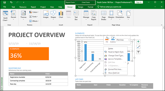
FIGURE 18-6: Changing the report layout.
You can format the data series in the chart by double-clicking a chart section. Figure 18-7 shows what happens when you double-click the % Complete chart on the Project Overview dashboard. Notice on the Ribbon that you can change the colors, chart data, and chart type. Along the right side of the chart are options to format the plot area by changing the border, color, transparency, width, line format, and dash type.

FIGURE 18-7: Changing the report format.
Looking good!
If you have no creative flair, don’t worry — Project does. You can work with the themes that Project provides to present all the reports with flair. Choose Report Tools ⇒ Design ⇒ Themes ⇒ Themes to display the Themes gallery. You see 34 different themes that you can apply to reports. Themes include color, type, font, and effect. Play around with a few to find one you like.
If none of the themes works for you, look around on the Colors drop-down list, Fonts drop-down list, and Effects drop-down list until you create just the look you’re hoping for.
To customize the reports even more, you can add images such as a team logo, shapes, and text boxes. Figure 18-8 shows a portion of a report with a text box and shape added.

FIGURE 18-8: Customizing with shapes and text boxes.
 Experimenting with customization options can be fun, but as with any other business document, the goal in layout and formatting is readability.
Keep these points in mind when you’re formatting Project text:
- Font: Choose simple sans serif fonts, such as Arial. If you’re publishing the project on the web, consider using Verdana, which is a font created for readability online.
- Color: You have to consider factors such as whether the printout will be in color or black and white, whether the use of too many colors will become confusing for the reader, and whether certain colors (such as yellow) will be difficult to read.
- Font size: Use a font size that’s readable, without making it so big that the taskbar labels become too crowded.
- Effects: Avoid text effects that can make certain text difficult to read (such as bold, italic, or underlining). Use these effects only to call attention to a few elements of the project.
Spiffing Things Up
These days, image is everything. You and the project may be judged to a certain extent by how professional the printed information looks. Even if the project is over budget and four months behind, making reports or other printouts look good can make delivering bad news easier to do. You can make the project presentation look good by adding graphics.
Wouldn’t the company logo look spiffy in the header of the report? Or a picture of the new product box in Gantt Chart view of the New Product Launch project?
Graphics can add visual information or make the plan just plain look nicer. You can insert graphics in the project file by using one of these three methods:
- Cut and paste a graphic from another file. A graphical image that you cut and paste essentially can’t be edited by you in Project.
- Insert a link to an existing graphics file. Linking takes up less room than inserting the image.
- Embed a graphic. Embedding lets you edit the content of the graphic in Project, using the tools of an image program such as Paint.
You can’t add graphics willy-nilly, however. You can add graphics in only a few places: the chart pane of any Gantt Chart view; a task note; a resource note; or a header, footer, or legend that’s used in reports or printouts of views.
For example, you may put pictures of resources in the Resource Note field so that you can remember who’s who, or you may include a photo of the corporate headquarters in the header of the report.
When you paste or embed graphics, the Project file’s size can swell like a sponge in a pail of water. If you’re thinking of using a lot of graphics, don’t let them detract from the main information in printouts. Or try linking to them instead of inserting them into the file.
If you want to insert an existing graphics file into a Notes box, follow these steps:
- Double-click a task in the Gantt Chart view. Then select the Notes tab in the Task Information or Resource Information dialog box.
Click the Insert Object button.
The Insert Object dialog box, shown in Figure 18-9, appears. The arrow in Figure 18-9 points to the Insert Object button.
- Choose the Create from File radio button.
- Click the Browse button to locate the file.
To insert to the file, click the Insert button and then click the OK button.
You may see a warning before you insert an image. If you want to continue, click Yes.
To link the file, select the Link check box next to the Browse button.
If you don’t select this check box, the object is embedded in the file.
To insert the object as an icon, select the Display as Icon check box.
When you display the object as an icon, someone viewing the project on a computer can click the icon to view the picture.- Click the OK button.

FIGURE 18-9: Browse to locate a file on the network or the hard drive.
If you want to insert an existing graphics file in a header or footer, follow these steps:
- Choose File ⇒ Print.
- Click the Page Setup link at the bottom of the page.
- Go to the Header or Footer tab in the Page Setup dialog box.
Click the Insert Picture button, as shown in Figure 18-10.
The Insert Picture dialog box appears.
- Navigate to the folder that holds the file to insert.
- Click to select the file.
Click the Insert button.
The image appears in the header or footer.
- Click OK.
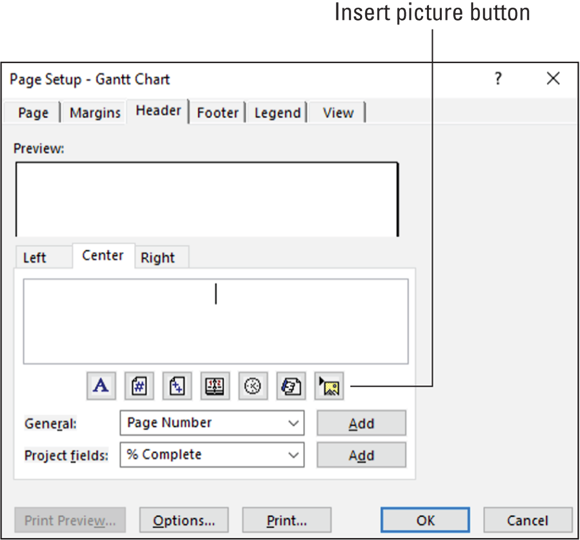
FIGURE 18-10: The Page Setup dialog box.
Call the Printer!
The proof of the report is in the printing, but you should see to several adjustments before you click the button to print. In Project, it’s not only margins or page orientation that you need to set (although you have to set them, too); you can also add useful information to headers and footers and set legends to help readers understand the many bars, diamonds, and other graphical elements that many Project views and reports display.
Working with Page Setup
The Page Setup dialog box can be used to control printouts of any displayed Project view. You can open this dialog box by choosing File ⇒ Print ⇒ Page Setup. The Page Setup dialog box, as shown in Figure 18-11, contains six tabs.

FIGURE 18-11: Page setup.
Sizing
The Page tab contains several basic page settings that determine the orientation, the paper size, and the way content is scaled to fit the page. By making these settings, you influence how much material can fit on a page and how many pages comprise the document.
You have these choices on the Page tab (refer to Figure 18-11):
- Portrait or Landscape orientation: You’ve no doubt already dealt with this choice. Portrait orientation is set up like the Mona Lisa, with the short edge of the paper running across the top of the page. In landscape orientation, the long edge of the paper runs across the top instead.
- Scaling: You can use the Adjust To setting, which is based on a percentage of the original size, or the Fit To setting, which gives you some control over scaling to fit to the width of a single page or to the height of a single page.
- Other: This area covers Paper Size and First Page Number. All the standard choices for paper size are available in the Paper Size list, including index cards and envelopes. First Page Number can remain as Auto (in which case the first page is numbered 1, the second page is 2, and so on), or you can enter another number there yourself.
Staying within the margins
I won’t bore you by defining a margin. However, I’ll remind you that a margin serves the dual purpose of controlling how much information can fit on a page and creating a border of white space that frames the document (making it cleaner-looking and easier to read).
To set margins using the Page Setup dialog box, follow these steps:
Click the Margins tab.
As you modify margin settings, the preview shows you where they’ll appear on the page.
Use the arrows to set the top, bottom, left, and right margins.
Click the up arrow for a wider margin, and click the down arrow for a narrower margin.
If you want a border that marks the margin, use the Borders Around options.
You can choose to print a border on every page, on only outer pages (print a border on the first and last pages only — available only when printing in Network Diagram view), or on none of the pages.
Setting margins to less than ¼ inch (.25”) can cut off the printed output, because printers can print only so close to the edge of a page.
Inserting headers and footers
Throughout the life of a project, you will likely print many versions of the project, many reports, and many types of information using various tables. Headers and footers are useful features to help you, and readers, keep track of all this information.
You can use the Header and Footer tabs of the Page Setup dialog box (see Figure 18-12) to set and preview header (top) and footer (bottom) contents.

FIGURE 18-12: The Header and Footer tabs are nearly identical.
This list describes the settings you can make on these tabs:
- Text section: Specify that the text you enter will appear to the left, at the center, or to the right of the header or footer by clicking the corresponding tab and then typing the text.
- Format text: Use the tool buttons, or quickly insert such elements as the page number, the date, or a picture file.
Select standard text: Insert additional text by using these lists:
- General: Includes such options as Total Page Count, Project Title, and Company Name
- Project Fields: Includes all fields available in Project
You can use these fields to alert readers to important fields to review or to the nature of the printout. To add General or Project Fields items, select them from their respective lists and then click the Add button to add them to the Left, Center, or Right tab.
Working with a legend
A legend acts as a guide to the meanings of various graphical elements, as shown in Figure 18-13. The Legend tab bears a striking resemblance to the Header and Footer tabs except that the legend is generated automatically.
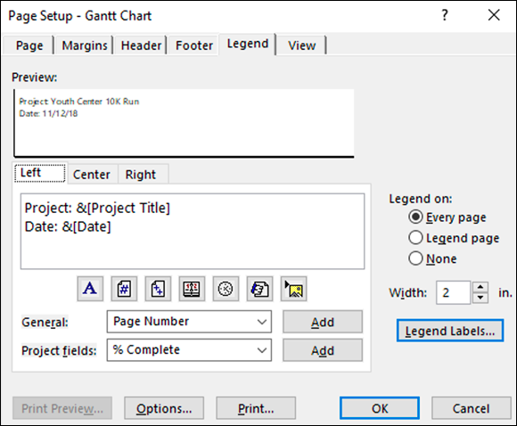
FIGURE 18-13: Page setup with legend information.
The Legend tab of the Page Setup dialog box has a few settings that differ from the Header and Footer tabs:
- You can print the legend on every page or on a separate legend page, or you can decide not to print a legend.
- You can establish the width of the text area of the legend (the area where you can insert elements such as the page number or the date).
- You can edit the text font, style, size, and color of the legend by clicking the Legend Labels box.
Unlike a header or footer, where you have to enter something to make anything appear, a legend prints by default. If you don’t want a legend to print, click the Legend tab and then select the None radio button in the Legend On area.
Deciding what to print
If you’re printing a currently displayed view, the View tab of the Page Setup dialog box is available to you, as shown in Figure 18-14.
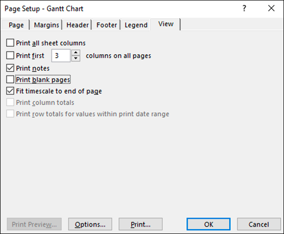
FIGURE 18-14: The View tab.
You can make these settings on the View tab:
- Print All Sheet Columns: Prints every sheet column in the view, regardless of whether it’s visible onscreen. With this check box unchecked, only the columns that show in the view are printed.
- Print First # Columns on All Pages: Lets you specify a specific number of columns to print, such as the information, WBS, and Task columns.
- Print Notes: Prints every task, resource, and assignment note. These items are printed on a separate Notes page.
- Print Blank Pages: Lets you print blank pages. For example, check this check box to print a page that represents a time in the project when no tasks are occurring. If you want a smaller number of pages in the printout, ignore this setting.
- Fit Timescale to End of Page: This nifty little setting scales the timescale to fit more of the project on the page.
- Print Column Totals: Adds a column that contains column totals. It pertains to printouts of Usage views. If you aren’t printing a Usage view, this option is not available.
- Print Row Totals for Values within Print Date Range: Adds a column that contains row totals. It pertains to printouts of Usage views. If you aren’t printing a Usage view, this option is not available.
Getting a preview
Granted, although software print previews aren’t quite as exciting as movie previews, they help you make everything look right before you print the project. When you choose a report or choose File ⇒ Print to print a view, the preview automatically appears in the Backstage. Figure 18-15 has a box around the buttons in the lower-right corner of the preview that enable you to modify the preview so that you can work with the settings more effectively.

FIGURE 18-15: Backstage Print view.
You can use the buttons in the Backstage preview to:
- Move around the pages of the report by using the first four arrow buttons.
- View more detail by clicking the Actual Size button and then using the vertical and horizontal scroll bars to zero in on the section you want to see.
- Focus on a single page or all pages in the report by using the One Page and Multiple Pages buttons.
Note: Always preview the document before printing it to review the number of pages being printed. One click or one instance of zooming in or out can easily double — or cut in half — the number of pages being sent to the printer. You can easily waste paper if you’re not careful.
Printing, at last!
In this section, I describe how to print the document for which you’ve made all the eye-pleasing settings discussed in this chapter. For this task, you need to make the print settings to the left of the preview in the Backstage, as shown in Figure 18-15.
This list describes the settings you encounter in this area:
- The Copies box: Click the Copies up arrow to print more copies, or click the down arrow to print fewer (but not less than 1).
- Printer area: This area of the dialog box indicates the printer you will use. You can choose a printer from the list and click the Printer Properties link to control printer settings such as color quality and paper source.
- Settings area: You can print the entire project or select another option from the drop-down list so that you can print specific dates, print specific pages, or print custom dates and pages. The accompanying options change depending on the choice. You also can use the Settings drop-down list to specify whether to print notes, all sheet columns, or only the left column of pages (to print only the leftmost column on every page). In addition you can specify the orientation and paper size in the Settings area.
After you make all the settings and you’re ready to print, simply click the big Print button in the upper-left corner.
Working on the Timeline
The Timeline gives sort of a 10,000-foot overview of the project schedule. It shows a graphical timeline spanning from the project’s start date to its end date, and it highlights the period shown in the main view, such as the time frame shown on the Gantt chart. You can toggle the Timeline on and off as needed. To do so, click the View tab on the Ribbon and check or uncheck the Timeline check box in the Split View group.
The Timeline even has its own toolbar, Timeline Tools, as shown in Figure 18-16.

FIGURE 18-16: The Timeline Tools contextual tab group.
From the Format tab in the Timeline Tools contextual tab group, you can format text and dates, format the display of tasks on the timeline, and copy the Timeline in various presentation formats.
Adding tasks to the Timeline
You can add summary tasks, detailed tasks, and milestones to the Timeline. For example, the Timeline shown in Figure 18-17 shows a milestone, the Planning summary task and the Registration summary task, and a callout for the Registration Contingency. Yes, you can do all these wonderful things!

FIGURE 18-17: The Timeline, with tasks, summary tasks, and milestones.
You can add information to the Timeline in a number of ways. To add several tasks at a time, follow these simple steps:
Open the Timeline from the View tab.
Click the View tab, go to the Task Views group, click the Other Views button, and then click the Timeline view. The timeline will be visible in the chart area, and the Timeline Tools contextual tab group will show up above the Format tab.
- Click Timeline Tools to show the Timeline Tools contextual tab group (refer to Figure 18-16).
Click Existing Tasks in the Insert group.
The Add Tasks to Timeline dialog box opens, as shown in Figure 18-18, showing an outline of all tasks in the project. You can select as many as you like. They appear on the Timeline as individual tasks, summary tasks, or milestones, depending on how they’re entered in Project.
- Click OK.
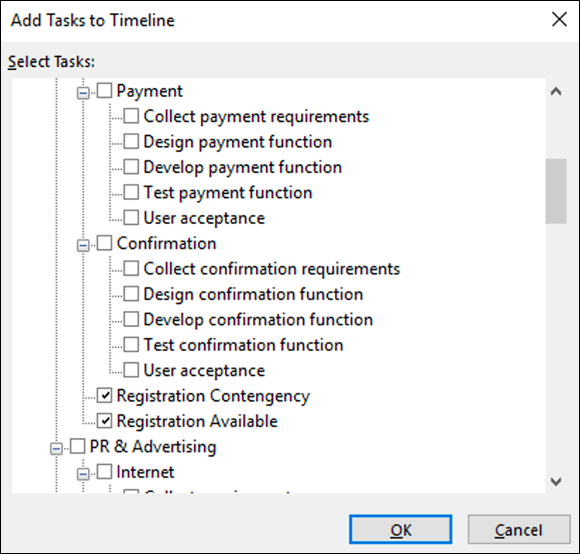
FIGURE 18-18: Adding tasks to the Timeline.
You can also add a new task by clicking the Task button in the Insert group to open the Task Information dialog box. When you select the Display on Timeline check box, the task appears on the Timeline.
If you want to change the way a task appears on the Timeline, follow these steps:
- Click to select the task.
- In the Current Selection group, select either Display as Bar to show a bar that indicates the duration or Display as Callout to create a callout box that holds the task information. If you want to remove a task from the Timeline, select Remove from Timeline.
- Reposition the callout box to improve readability, if you have several tasks close together.
You can right-click a task and click Add to Timeline to make the task show up on the Timeline.
Customizing the Timeline
Project lets you customize the Timeline to make it truly fit your needs. For example, you can freeze the Timeline or move it around so that it focuses on a particular time frame. When you move the timeframe in Timeline, the Gantt chart moves in parallel. To move the Timeline, follow these steps:
- Click the Timeline so that the Timeline Tools contextual tab group appears.
In the Show/Hide group on the Format tab, select Pan & Zoom.
A green frame surrounds the current time frame.
- Position the cursor on the edge to drag the time frame to the size you like.
- To shift the time frame to a different one, move the cursor to the top of the frame, wait for the four-way arrow, and drag the green frame to the time frame you want.
You can also change the date format from the Show/Hide group on the Format tab in the Timeline Tools contextual tab group. Simply click the down arrow and select the way you want to see the date displayed on the Timeline.
The Timeline can be displayed with details about tasks, such as the task name and dates, or without the detail and just milestones and bars that represent tasks, but no names associated with the tasks. If you want a detailed view, click the Detailed Timeline button in the Show/Hide group.
Copying the Timeline
Because that vendor you’re trying to coordinate with doesn’t use Project, you need to share the graphical Timeline information via another file format. Project builds in the special capability to take a snapshot of the Timeline so that you can paste it into an email message; a presentation; or another program, such as Word.
Follow these steps to copy and use the Timeline:
- Create the email message or document where you want to use the Timeline image.
Choose Timeline Tools ⇒ Format ⇒ Copy ⇒ Copy Timeline, and then select a format.
The available format choices are For E-Mail, For Presentation, and Full Size.
- In the program where you want to insert the Timeline, position the cursor where you want the Timeline image to appear.
Press Ctrl+V.
The image appears in the message or document.