![]()
Plotting and Visualization
Visualization is a universal tool for investigating and communicating results of computational studies, and it is hardly an exaggeration to say that the end product of nearly all computations – be it numeric or symbolic – is a plot or a graph of some sort. It is when visualized in graphical form that knowledge and insights can be most easily gained from computational results. Visualization is therefore a tremendously important part of the workflow in all fields of computational studies.
In the scientific computing environment for Python, there are a number of high-quality visualization libraries. The most popular general-purpose visualization library is Matplotlib; its main focus is on generating static publication-quality 2D and 3D graphs. Many other libraries focus on niche areas of visualization. A few prominent examples are Bokeh (http://bokeh.pydata.org) and Plotly (http://plot.ly), which both primarily focus on interactivity and web connectivity. Seaborn (http://stanford.edu/~mwaskom/software/seaborn), which is a high-level plotting library, targets statistical data analysis and is based on the Matplotlib library. The Mayavi library (http://docs.enthought.com/mayavi/mayavi) for high-quality 3D visualization uses the venerable VTK software (http://www.vtk.org) for heavy-duty scientific visualization. It is also worth noting that other VTK-based visualization software, such as Paraview (http://www.paraview.org), is scriptable with Python and can also be used from Python applications. In the 3D visualization space there are also more recent players, such as VisPy (http://vispy.org), which is an OpenGL-based 2D and 3D visualization library with great interactivity and connectivity with browser-based environments, such as the IPython notebook.
The visualization landscape in the scientific computing environment for Python is vibrant and diverse, and it provides ample options for various visualization needs. In this chapter we focus on exploring traditional scientific visualization in Python using the Matplotlib library. With traditional visualization, I mean plots and figures that are commonly used to visualize results and data in scientific and technical disciplines, such as line plots, bar plots, contour plots, colormap plots, and 3D surface plots.
![]() Matplotlib Matplotlib is a Python library for publication-quality 2D and 3D graphics, with support for a variety of different output formats. At the time of writing, the latest version is 1.4.2. More information about Matplotlib is available at the project’s web site http://www.matplotlib.org. This web site contains detailed documentation and an extensive gallery that showcases the various types of graphs that can be generated using the Matplotlib library, together with the code for each example. This gallery is a great source of inspiration for visualization ideas, and I highly recommend exploring Matplotlib by browsing this gallery.
Matplotlib Matplotlib is a Python library for publication-quality 2D and 3D graphics, with support for a variety of different output formats. At the time of writing, the latest version is 1.4.2. More information about Matplotlib is available at the project’s web site http://www.matplotlib.org. This web site contains detailed documentation and an extensive gallery that showcases the various types of graphs that can be generated using the Matplotlib library, together with the code for each example. This gallery is a great source of inspiration for visualization ideas, and I highly recommend exploring Matplotlib by browsing this gallery.
There are two common approaches to creating scientific visualizations: using a graphical user interface to manually build up graphs, and using a programmatic approach where the graphs are created with code. Both approaches have their advantages and disadvantages. In this chapter we will take the programmatic approach, and we will explore how to use the Matplotlib API to create graphs and control every aspect of their appearance. The programmatic approach is a particularly suitable method for creating graphics for scientific and technical applications, and in particular for creating publication-quality figures. An important part of the motivation for this is that programmatically created graphics can guarantee consistency across multiple figures, can be made reproducible, and can easily be revised and adjusted without having to redo potentially lengthy and tedious procedures in a graphical user interface.
Importing Matplotlib
Unlike most Python libraries, Matplotlib actually provides multiple entry points into the library, with different application programming interfaces (APIs). Specifically, it provides a stateful API and an object-oriented API, both provided by the module matplotlib.pyplot. I strongly recommend only using the object-oriented approach, and the remainder of this chapter will solely focus on this part of Matplotlib.1
To use the object-oriented Matplotlib API, we first need to import its Python modules. In the following, we will assume that Matplotlib is imported using the following standard convention:
In [1]: %matplotlib inline
In [2]: import matplotlib as mpl
In [3]: import matplotlib.pyplot as plt
In [4]: from mpl_toolkits.mplot3d.axes3d import Axes3D
The first line is assuming that we are working in an IPython environment, and more specifically in the IPython notebook or the IPython QtConsole. The IPython magic command %matplotlib inline configures the Matplotlib to use the “inline” back end, which results in the created figures being displayed directly in, for example, the IPython notebook, rather than in a new window. The statement import matplotlib as mpl imports the main Matplotlib module, and the import statement import matplotlib.pyplot as plt is for convenient access to the submodule matplotlib.pyplot that provides the functions that we will use to create new figure instances.
Throughout this chapter we also make frequent use of the NumPy library, and as in Chapter 2, we assume that NumPy is imported using:
In [5]: import numpy as np
and we also use the SymPy library, imported as:
In [6]: import sympy
Getting Started
Before we delve deeper into the details of how to create graphics with Matplotlib, we begin here with a quick example of how to create a simple but typical graph. We also cover some of the fundamental principles of the Matplotlib library, to build up an understanding for how graphics can be produced with the library.
A graph in Matplotlib is structured in terms of a Figure instance and one or more Axes instances within the figure. The Figure instance provides a canvas area for drawing, and the Axes instances provide coordinate systems that are assigned to fixed regions of the total figure canvas; see Figure 4-1.

Figure 4-1. Illustration of the arrangement of a Matplotlib Figure instance and an Axes instance. The Axes instance provides a coordinate system for plotting, and the Axes instance itself is assigned to a region within the figure canvas. The figure canvas has a simple coordinate system where (0, 0) is the lower-left corner, and (1,1) is the upper right corner. This coordinate system is only used when placing elements, such as an Axes, directly on the figure canvas
A Figure can contain multiple Axes instances, for example, to show multiple panels in a figure or to show insets within another Axes instance. An Axes instance can manually be assigned to an arbitrary region of a figure canvas; or, alternatively, Axes instances can be automatically added to a figure canvas using one of several layout managers provided by Matplotlib. The Axes instance provides a coordinate system that can be used to plot data in a variety of plot styles, including line graphs, scatter plots, bar plots, and many other styles. In addition, the Axes instance also determines how the coordinate axes are displayed, for example, with respect to the axis labels, ticks and tick labels, and so on. In fact, when working with Matplotlib’s object-oriented API, most functions that are needed to tune the appearance of a graph are methods of the Axes class.
As a simple example for getting started with Matplotlib, say that we would like to graph the function ![]() , together with its first and second derivative, over the range
, together with its first and second derivative, over the range ![]() . To do this we first create NumPy arrays for the x range, and then compute the three functions we want to graph. When the data for the graph is prepared, we need to create Matplotlib Figure and Axes instances, then use the plot method of the Axes instance to plot the data, and set basic graph properties such as x and y axis labels, using the set_xlabel and set_ylabel methods, and generating a legend using the legend method. These steps are carried out in the following code, and the resulting graph is shown in Figure 4-2.
. To do this we first create NumPy arrays for the x range, and then compute the three functions we want to graph. When the data for the graph is prepared, we need to create Matplotlib Figure and Axes instances, then use the plot method of the Axes instance to plot the data, and set basic graph properties such as x and y axis labels, using the set_xlabel and set_ylabel methods, and generating a legend using the legend method. These steps are carried out in the following code, and the resulting graph is shown in Figure 4-2.
In [7]: x = np.linspace(-5, 2, 100)
   ...: y1 = x**3 + 5*x**2 + 10
   ...: y2 = 3*x**2 + 10*x
   ...: y3 = 6*x + 10
   ...:
   ...: fig, ax = plt.subplots()
   ...: ax.plot(x, y1, color="blue", label="y(x)")
   ...: ax.plot(x, y2, color="red", label="y'(x)")
   ...: ax.plot(x, y3, color="green", label="y''(x)")
   ...: ax.set_xlabel("x")
   ...: ax.set_ylabel("y")
   ...: ax.legend()

Figure 4-2. Example of a simple graph created with Matplotlib
Here we used the plt.subplots function to generate Figure and Axes instances. This function can be used to create grids of Axes instances within a newly created Figure instance, but here it was merely used as a convenient way of creating a Figure and an Axes instance in one function call. Once the Axes instance is available, note that all the remaining steps involve calling methods of this Axes instance. To create the actual graphs we use ax.plot, which takes as first and second arguments NumPy arrays with numerical data for the x and y values of the graph, and it draws a line connecting these data points. We also used the optional color and label keyword arguments to specify the color of each line, and assign a text label to each line that is used in the legend. These few lines of code are enough to generate the graph we set out to produce, but as a bare minimum we should also set labels on the x and y axis and, if suitable, add a legend for the curves we have plotted. The axis labels are set with ax.set_xlabel and ax.set_ylabel methods, which takes as argument a text string with the corresponding label. The legend is added using the ax.legend method, which does not require any arguments in this case since we used the label keyword argument when plotting the curves.
These are the typical steps required to create a graph using Matplotlib. While this graph, Figure 4-2, is complete and fully functional, there is certainly room for improvements in many aspects of its appearance. For example, to meet publication or production standards, we may need to change the font and the font size of the axis labels, the tick labels, and the legend, and we should probably move the legend to a part of the graph where it does not interfere with the curves we are plotting. We might even want to change the number of axis ticks and label, and add annotations and additional help lines to emphasize certain aspects of the graph, and so on. With a few changes along these lines the figure may, for example, appear like in Figure 4-3, which is considerably more presentable. In the remainder of this chapter we look at how to fully control the appearance of the graphics produced using Matplotlib.

Figure 4-3. Revised version of Figure 4-2
Interactive and Noninteractive Modes
The Matplotlib library is designed to work well with many different environments and platforms. As such, the library does not only contain routines for generating graphs, but it also contains support for displaying graphs in different graphical environments. To this end, Matplotlib provides back ends for generating graphics in different formats (for example, PNG, PDF, Postscript, and SVG), and for displaying graphics in a graphical user interface using variety of different widget toolkits (for example, Qt, GTK, wxWidgets and Cocoa for Mac OS X) that are suitable for different platforms.
Which back end to use can be selected in the Matplotlib resource file,2 or using the function mpl.use, which must be called right after importing matplotlib, before importing the matplotlib.pyplot module. For example, to select the Qt4Agg back end, we can use:
import matplotlib as mpl
mpl.use('qt4agg')
import matplotlib.pyplot as plt
The graphical user interface for displaying Matplotlib figures, as shown in Figure 4-4 is useful for interactive use with Python script files or the IPython console, and it allows to interactively explore figures, for example, by zooming and panning. When using an interactive back end, which displays the figure in a graphical user interface, it is necessary to call the function plt.show to get the window to appear on the screen. By default, the plt.show call will hang until the window is closed. For a more interactive experience, we can activate interactive mode by calling the function plt.ion. This instructs Matplotlib to take over the GUI event loop, and show a window for a figure as soon as it is created, and returning the control flow to the Python or IPython interpreter. To have changes to a figure take effect, we need to issue a redraw command using the function plt.draw. We can deactivate the interactive mode using the function plt.ioff, and we can use the function mpl.is_interactive to check if Matplotlib is in interactive or noninteractive mode.

Figure 4-4. A screenshot of the Matplotlib graphical user interface for displaying figures, using the Qt4 back end on Mac OS X. The detailed appearance varies across platforms and back ends, but the basic functionality is the same
While the interactive graphical user interfaces has unique advantages, when working the IPython Notebook or Qtconsole, it is often more convenient to display Matplotlib-produced graphics embedded directly in the notebook. This behavior is activated using the IPython command %matplotlib inline, which activates the “inline back end” provided for IPython. This configures Matplotlib to use a noninteractive back end to generate graphics images, which is then displayed as static images in, for example, the IPython Notebook. The IPython “inline back end” for Matplotlib can be fine tuned using the IPython %config command. For example, we can select output format for the generated graphics using the InlineBackend.figure_format option,3 which, for example, we can set to 'svg' to generate SVG graphics rather than PNG files:
In [8]: %matplotlib inline
In [9]: %config InlineBackend.figure_format='svg'
With this approach the interactive aspect of the graphical user interface is lost (for example, zooming and panning), but embedding the graphics directly in the notebook has many other advantages. For example, keeping the code that was used to generate a figure together with the resulting figure in the same document eliminates the need for rerunning the code to display a figure, and the interactive nature of the IPython Notebook itself replaces some of the interactivity of Matplotlib’s graphical user interface.
When using the IPython inline back end, it is not necessary to use plt.show and plt.draw, since the IPython rich display system is responsible for triggering the rendering and the displaying of the figures. In this book, I will assume that code examples are executed in the IPython notebooks, and the calls to the function plt.show are therefore not in the code examples. When using an interactive back end, it is necessary to add this function call at the end of each example.
Figure
As introduced in the previous section, the Figure object is used in Matplotlib to represent a graph. In addition to providing a canvas on which, for example, Axes instances can be placed, the Figure object also provides methods for performing actions on figures, and it has several attributes that can be used to configure the properties of a figure.
A Figure object can be created using the function plt.figure, which takes several optional keyword arguments for setting figure properties. In particular, it accepts the figsize keyword argument, which should be assigned to a tuple on the form (width, height), specifying the width and height of the figure canvas in inches. It can also be useful to specify the color of the figure canvas by setting the facecolor keyword argument.
Once a Figure is created, we can use the add_axes method to create a new Axes instance and assign it to a region on the figure canvas. The add_axes takes one mandatory argument: a list containing the coordinates of the lower-left corner and the width and height of the Axes in the figure canvas coordinate system, on the format (left, bottom, width, height).4 The coordinates and the width and height of the Axes object are expressed as fractions of total canvas width and height, see Figure 4-1. For example, an Axes object that completely fills the canvas corresponds to (0, 0, 1, 1), but this leaves no space for axis labels and ticks. A more practical size could be (0.1, 0.1, 0.8, 0.8), which corresponds to a centered Axes instance that covers 80% of the width and height of the canvas. The add_axes method takes a large number of keyword arguments for setting properties of the new Axes instance. These will be described in more details later in this chapter, when we discuss the Axes object in depth. However, one keyword argument that is worth to emphasize here is axisbg, with which we can assign a background color for the Axes object. Together with the facecolor argument of plt.figure, this allows us to select colors of both the canvas and the regions covered by Axes instances.
With the Figure and Axes objects obtained from plt.figure and fig.add_axes, we have the necessary preparations to start plotting data using the methods of the Axes objects. For more details on this, see the next section of this chapter. However, once the required plots have been created, there are more methods in the Figure objects that are important in graph creation workflow. For example, to set an overall figure title, we can use suptitle, which takes a string with the title as argument. To save a figure to a file, we can use the savefig method. This method takes a string with the output filename as first argument, as well as several optional keyword arguments. By default, the output file format will be determined from the file extension of the filename argument, but we can also specify the format explicitly using the format argument. The available output formats depend on which Matplotlib back end is used, but commonly available options are PNG, PDF, EPS, and SVG format. The resolution of the generated image can be set with the dpi argument. DPI stands for “dots per inch,” and since the figure size is specified in inches using the figsize argument, multiplying these numbers gives the output image size in pixels. For example, with figsize=(8, 6) and dpi=100, the size of the generated image is 800 x 600 pixels. The savefig method also takes some arguments that are similar to those of the plt.figure function, such as the facecolor argument. Note that even though the facecolor argument is used with a plt.figure, it also needs to be specified with savefig for it to apply to the generated image file. Finally, the figure canvas can also be made transparent using the transparent=True argument to savefig. The result is shown in Figure 4-5.
In [10]: fig = plt.figure(figsize=(8, 2.5), facecolor="#f1f1f1")
    ...:
    ...: # axes coordinates as fractions of the canvas width and height
    ...: left, bottom, width, height = 0.1, 0.1, 0.8, 0.8
    ...: ax = fig.add_axes((left, bottom, width, height), axisbg="#e1e1e1")
    ...:
    ...: x = np.linspace(-2, 2, 1000)
    ...: y1 = np.cos(40 * x)
    ...: y2 = np.exp(-x**2)
    ...:
    ...: ax.plot(x, y1 * y2)
    ...: ax.plot(x, y2, 'g')
    ...: ax.plot(x, -y2, 'g')
    ...: ax.set_xlabel("x")
    ...: ax.set_ylabel("y")
    ...:
    ...: fig.savefig("graph.png", dpi=100, facecolor="#f1f1f1")

Figure 4-5. Graph showing the result of setting the size of a figure with figsize, adding a new Axes instance with add_axes, setting the background colors of the Figure and Axes objects using facecolor and axisbg, and finally saving the figure to a file using savefig
Axes
The Figure object introduced in the previous section provides the backbone of a Matplotlib graph, but all the interesting content is organized within or around Axes instances. We have already encountered Axes objects on a few occasions earlier in this chapter. The Axes object is central to most plotting activities with the Matplotlib library. It provides the coordinate system in which we can plot data and mathematical functions, and in addition it contains the axis objects that determine where the axis labels and the axis ticks are placed. The functions for drawing different types of plots are also methods of this Axes class. In this section we first explore different types of plots that can be drawn using Axes methods, and how to customize the appearance of the x and y axis and the coordinate systems used with an Axes object.
We have seen how new Axes instances can be added to a figure explicitly using the add_axes method. This is a flexible and powerful method for placing Axes objects at arbitrary positions, which has several important applications, as we will see later in the chapter. However, for most common use-cases, it is tedious to specify explicitly the coordinates of the Axes instances within the figure canvas. This is especially true when using multiple panels of Axes instances within a figure, for example, in a grid layout. Matplotlib provides several different Axes layout managers, which create and place Axes instances within a figure canvas following different strategies. Later in this chapter we look into more detail of how to use such layout managers. However, to facilitate the forthcoming examples, we here briefly look at one of these layout managers: the plt.subplots function. Earlier in this chapter, we already used this function to conveniently generate new Figure and Axes objects in one function call. However, the plt.subplots function is also capable of filling a figure with a grid of Axes instances, which is specified using the first and the second arguments, or alternatively with the nrows and ncols arguments, which, as the names implies, creates a grid of Axes objects, with the given number of rows and columns. For example, to generate a grid of Axes instances in a newly created Figure object, with three rows and two columns, we can use
fig, axes = plt.subplots(nrows=3, ncols=2)
Here, the function plt.subplots returns a tuple (fig, axes), where fig is a figure and axes is a NumPy array of size (ncols, nrows), in which each element is an Axes instance that has been appropriately placed in the corresponding figure canvas. At this point we can also specify that columns and/or rows should share x and y axes, using the sharex and sharey arguments, which can be set to True or False.
The plt.subplots function also takes two special keyword arguments fig_kw and subplot_kw, which are dictionaries with keyword arguments that are used when creating the Figure and Axes instances, respectively. This allows us to set and retain full control of the properties of the Figure and Axes objects with plt.subplots a similar way as is possible when directly using plt.figure and the make_axes method.
Plot Types
Effective scientific and technical visualization of data requires a wide variety of graphing techniques. Matplotlib implements many types of plotting techniques as methods of the Axes object. For example, in the previous examples we have already used the plot method, which draws curves in the coordinate system provided by the Axes object. In the following sections we explore some of Matplotlib’s plotting functions in more depth by using these functions in example graphs. A summary of commonly used 2D plot functions is shown in Figure 4-6. Other types of graphs, such as color maps and 3D graphs, are discussed later in this chapter. All plotting functions in Matplotlib expect data as NumPy arrays as input, typically as arrays with x and y coordinates as the first and second arguments. For details, see the docstrings for each method shown in Figure 4-6, using, for example, help(plt.Axes.bar).

Figure 4-6. Overview of selected 2D graph types. The name of the Axes method for generating each type graph is shown together with the corresponding graph
Line Properties
The most basic type of plot is the simple line plot. It may, for example, be used to depict the graph of a univariate function, or to plot data as a function of a control variable. In line plots, we frequently need to configure properties of the lines in the graph. For example the line width, line color, line style (solid, dashed, dotted, etc.). In Matplotlib we set these properties with keyword arguments to the plot methods, such as for example plot, step, bar. A few of these graph types are shown in Figure 4-6. Many of the plot methods has their own specific arguments, but basic properties such as colors and line width are shared among most plotting methods. These basic properties and the corresponding keyword arguments are summarized in Table 4-1.
Table 4-1. Basic line properties and their corresponding argument names for use with the Matplotlib plotting methods
|
Argument |
Example values |
Description |
|---|---|---|
|
color |
A color specification can be a string with a color name, such as “red,” “blue,” etc., or a RGB color code on the form “#aabbcc.” |
A color specification. |
|
alpha |
Float number between 0.0 (completely transparent) to 1.0 (completely opaque). |
The amount of transparency. |
|
linewidth, lw |
Float number. |
The width of a line. |
|
linestyle, ls |
‘-‘ – solid ‘--’ – dashed ‘:’ – dotted ‘.-’ – dash-dotted |
The style of the line, i.e., whether the line is to be draw as a solid line, or if it should be, for example, dotted or dashed. |
|
marker |
+, o, * = cross, circle, star s = square . = small dot 1, 2, 3, 4, ... = triangle-shaped symbols with different angles. |
Each data point, whether or not it is connected with adjacent data points, can be represented with a marker symbol as specified with this argument. |
|
markersize |
Float number. |
The marker size. |
|
makerfacecolor |
Color specification (see above). |
The fill color for the marker. |
|
markeredgewidth |
Float number. |
The line width of the marker edge. |
|
markeredgecolor |
Color specification (see above). |
The marker edge color. |
To illustrate the use of these properties and arguments, consider the following code, which draws horizontal lines with various values of the line width, line style, marker symbol, color and size. The resulting graph is shown in Figure 4-7.
In [11]: x = np.linspace(-5, 5, 5)
    ...: y = np.ones_like(x)
    ...:
    ...: def axes_settings(fig, ax, title, ymax):
    ...:     ax.set_xticks([])
    ...:     ax.set_yticks([])
    ...:     ax.set_ylim(0, ymax+1)
    ...:     ax.set_title(title)
    ...:
    ...: fig, axes = plt.subplots(1, 4, figsize=(16,3))
    ...:
    ...: # Line width
    ...: linewidths = [0.5, 1.0, 2.0, 4.0]
    ...: for n, linewidth in enumerate(linewidths):
    ...:     axes[0].plot(x, y + n, color="blue", linewidth=linewidth)
    ...: axes_settings(fig, axes[0], "linewidth", len(linewidths))
    ...:
    ...: # Line style
    ...: linestyles = ['-', '-.', ':']
    ...: for n, linestyle in enumerate(linestyles):
    ...:     axes[1].plot(x, y + n, color="blue", lw=2, linestyle=linestyle)
    ...: # custom dash style
    ...: line, = axes[1].plot(x, y + 3, color="blue", lw=2)
    ...: length1, gap1, length2, gap2 = 10, 7, 20, 7
    ...: line.set_dashes([length1, gap1, length2, gap2])
    ...: axes_settings(fig, axes[1], "linetypes", len(linestyles) + 1)

    ...: # marker types
    ...: markers = ['+', 'o', '*', 's', '.', '1', '2', '3', '4']
    ...: for n, marker in enumerate(markers):
    ...:     # lw = shorthand for linewidth, ls = shorthand for linestyle
    ...:     axes[2].plot(x, y + n, color="blue", lw=2, ls='*', marker=marker)
    ...: axes_settings(fig, axes[2], "markers", len(markers))
    ...:
    ...: # marker size and color
    ...: markersizecolors = [(4, "white"), (8, "red"), (12, "yellow"), (16, "lightgreen")]
    ...: for n, (markersize, markerfacecolor) in enumerate(markersizecolors):
    ...:     axes[3].plot(x, y + n, color="blue", lw=1, ls='-',
    ...:                  marker='o', markersize=markersize,
    ...:                  markerfacecolor=markerfacecolor, markeredgewidth=2)
    ...: axes_settings(fig, axes[3], "marker size/color", len(markersizecolors))

Figure 4-7. Graphs showing the result of setting the line properties: line width, line style, marker type and marker size, and color
In a practical example, using different colors, line widths, and line styles are important tools for making a graph easily readable. In a graph with a large number of lines, we can use a combination of colors and line styles to make each line uniquely identifiable, for example, via a legend. The line width property is best used to give emphasis to important lines. Consider the following example, where the function sin(x) is plotted together with its first few series expansions around ![]() , as shown in Figure 4-8.
, as shown in Figure 4-8.
In [12]: # a symbolic variable for x, and a numerical array with specific values of x
    ...: sym_x = sympy.Symbol("x")
    ...: x = np.linspace(-2 * np.pi, 2 * np.pi, 100)
    ...:
    ...: def sin_expansion(x, n):
    ...:     """
    ...:     Evaluate the nth order Talyor series expansion
    ...:     of sin(x) for the numerical values in the array x.
    ...:     """
    ...:     return sympy.lambdify(sym_x, sympy.sin(sym_x).series(n=n+1).removeO(), 'numpy')(x)
    ...:
    ...: fig, ax = plt.subplots()
    ...:
    ...: ax.plot(x, np.sin(x), linewidth=4, color="red", label='exact')
    ...:
    ...: colors = ["blue", "black"]
    ...: linestyles = [':', '-.', '--']
    ...: for idx, n in enumerate(range(1, 12, 2)):
    ...:     ax.plot(x, sin_expansion(x, n), color=colors[idx // 3],
    ...:             linestyle=linestyles[idx % 3], linewidth=3,
    ...:             label="order %d approx." % n)
    ...:
    ...: ax.set_ylim(-1.1, 1.1)
    ...: ax.set_xlim(-1.5*np.pi, 1.5*np.pi)
    ...:
    ...: # place a legend outsize of the Axes
    ...: ax.legend(bbox_to_anchor=(1.02, 1), loc=2, borderaxespad=0.0)
    ...: # make room for the legend to the right of the Axes
    ...: fig.subplots_adjust(right=.75)

Figure 4-8. Graph for sin(x) together with its Talyor series approximation of the few lowest orders
Legends
A graph with multiple lines may often benefit from a legend, which displays a label along each line type somewhere within the figure. As we have seen in previous example, a legend may be added to an Axes instance in a Matplotlib figure using the legend method. Only lines with assigned labels are included in the legend (to assign a label to a line use the label argument of, for example, Axes.plot). The legend method accepts a large number of optional arguments. See help(plt.legend) for details. Here we emphasize a few of the more useful arguments. In the example in the previous section we used the loc argument, which allows us to specify where in the Axes area the legend is to be added: loc=1 for upper right corner, loc=2 for upper left corner, loc=3 for the lower-left corner, and loc=4 for lower right corner, as shown in Figure 4-9.

Figure 4-9. Legend at different positions within an Axes instance, specified using the loc argument ot the method legend
In the example of the previous section, we also used the bbox_to_anchor, which helps the legend be placed at an arbitrary location within the figure canvas. The bbox_to_anchor argument takes the value of a tuple on the form (x, y), where x and y are the canvas coordinates within the Axes object. That is, the point (0, 0) corresponds to the lower-left corner, and (1, 1) corresponds to the upper right corner. Note that x and y can be smaller that 0 and larger than 1 in this case, which indicates that the legend is to be placed outside the Axes area, as was used in the previous section.
By default, all lines in the legend are shown in a vertical arrangement. Using the ncols argument, it is possible to split the legend labels into multiple columns, as illustrated in Figure 4-10.

Figure 4-10. Legend displayed outside the Axes object, and shown with 4 columns instead the a single one, here using ax.legend(ncol=4, loc=3, bbox_to_anchor=(0, 1))
Text Formatting and Annotations
Text labels, titles, and annotations are important components in most graphs, and having full control of, for example, the font types and font sizes that are used to render such texts is a basic requirement for producing publication-quality graphs. Matplotlib provides several ways of configuring fonts properties. The default values can be set in the Matplotlib resource file, and session-wide configuration can be set in the mpl.rcParams dictionary. This dictionary is a cache of the Matplotlib resource file, and changes to parameters within this dictionary are valid until the Python interpreter is restarted and Matplotlib is imported again. Parameters that are relevant to how text is displayed includes, for example, 'font.family' and 'font.size'.
![]() Tip Try print(mpl.rcParams) to get a list of possible configuration parameters and their current values. Updating a parameter is as simple as assigning a new value to the corresponding item in the dictionary mpl.rcParams, for example mpl.rcParams['savefig.dpi'] = 100. See also the mpl.rc function, which can be used to update the mpl.rcParams dictionary, and the mpl.rcdefaults to restore to the default values.
Tip Try print(mpl.rcParams) to get a list of possible configuration parameters and their current values. Updating a parameter is as simple as assigning a new value to the corresponding item in the dictionary mpl.rcParams, for example mpl.rcParams['savefig.dpi'] = 100. See also the mpl.rc function, which can be used to update the mpl.rcParams dictionary, and the mpl.rcdefaults to restore to the default values.
It is also possible to set text properties on a case-to-case basis, by passing a set of standard keyword arguments to functions that creates text labels in a graph. Most Matplotlib functions that deal with text labels, in on way or another, accepts the keyword arguments summaried in Table 4-2 (this list is an incomplete selection of common arguments, see help(mpl.text.Text) for a complete reference). For example, these arguments can be used with the method Axes.text, which create a new text label at a given coordinate. They may also be used with for example set_title, set_xlabel, set_ylabel, etc. For more information on these methods see the next section.
Table 4-2. Summary of selected font properties and the corresponding keyword arguments
|
Argument |
Description |
|---|---|
|
fontsize |
The size of the font, in points. |
|
family |
The font type. |
|
backgroundcolor |
Color specification for the background of the text label. |
|
color |
Color specification for the font color. |
|
alpha |
Transparency of the font color. |
|
rotation |
Rotation angle of the text label. |
In scientific and technical visualization, it is clearly important to be able to render mathematical symbols and expressions in text labels. Matplotlib provides excellent support for this through LaTeX markup within its text labels: Any text label in Matplotlib can include LaTeX math by enclosing it within $ signs: for example "Regular text: $f(x)=1-x^2$". By default, Matplotlib uses an internal LaTeX rendering, which supports a subset of LaTeX language. However, by setting the configuration parameter mpl.rcParams["text.usetex"]=True it is also possible to use an external full-featured LaTeX engine (if it is available on your system).
When embedding LaTeX code in strings in Python there is a common stumbling block: Python uses as escape character, while in LaTeX it is used to denote the start of commands. To prevent the Python interpreter from escaping characters in strings containing LaTeX expressions it is convenient to use raw strings, which are literal string expressions that are prepended with and an r, for example: r"$int f(x) dx$" and r'$x_{ m A}$'.
The following example demonstrates how to add text labels and annotations to a Matplotlib figure using ax.text and ax.annotate, as well as how to render a text label that includes an equation that is typeset in LaTeX. The resulting graph is shown in Figure 4-11.
In [13]: fig, ax = plt.subplots(figsize=(12, 3))
    ...:
    ...: ax.set_yticks([])
    ...: ax.set_xticks([])
    ...: ax.set_xlim(-0.5, 3.5)
    ...: ax.set_ylim(-0.05, 0.25)
    ...: ax.axhline(0)
    ...:
    ...: # text label
    ...: ax.text(0, 0.1, "Text label", fontsize=14, family="serif")
    ...:
    ...: # annotation
    ...: ax.plot(1, 0, "o")
    ...: ax.annotate("Annotation",
    ...:             fontsize=14, family="serif",
    ...:             xy=(1, 0), xycoords="data",
    ...:             xytext=(+20, +50), textcoords="offset points",
    ...:             arrowprops=dict(arrowstyle="->", connectionstyle="arc3, rad=.5"))
    ...:
    ...: # equation
    ...: ax.text(2, 0.1, r"Equation: $ihbarpartial_t Psi = hat{H}Psi$",
    ...:         fontsize=14, family="serif")

Figure 4-11. Example demonstrating the result of adding text labels and annotations using ax.text and ax.annotation, and including LaTeX formatted equations in a Matplotlib text label
Axis Properties
After having created Figure and Axes objects, plotted the data or functions using some of the many plot functions provided by Matplotlib, and customized the appearance of lines and markers – the last major aspect of a graph that remains to be configured and fine tuned is the axis instances. A two-dimensional graph has two axis objects: for the horizontal x axis and the vertical y axis. Each axis can be individually configured with respect to attributes such as the axis labels, the placement of ticks and the tick labels, and the location and appearance of the axis itself. In this section we look into detail of how to control these aspects of a graph.
Axis labels and titles
Arguably the most important property of an axis, that needs to be set in nearly all cases, is the axis label. We can set the axis labels using the set_xlabel and set_ylabel methods: they both take a string with the label as first arguments. In addition, the optional labelpad argument specifies the spacing, in units of points, from the axis to the label. This padding is occasionally necessary to avoid overlap between the axis label and the axis tick labels. The set_xlabel and set_ylabel methods also take additional arguments for setting text properties, such as color, fontsize and fontname, as discussed in detail in the previous section. The following code, which produces Figure 4-12, demonstrates how to use the set_xlabel and set_ylabel methods, and the keyword arguments discussed here.
In [14]: x = np.linspace(0, 50, 500)
    ...: y = np.sin(x) * np.exp(-x/10)
    ...:
    ...: fig, ax = plt.subplots(figsize=(8, 2), subplot_kw={'axisbg': "#ebf5ff"})
    ...:
    ...: ax.plot(x, y, lw=2)
    ...:
    ...: ax.set_xlabel("x", labelpad=5, fontsize=18, fontname='serif', color="blue")
    ...: ax.set_ylabel("f(x)", labelpad=15, fontsize=18, fontname='serif', color="blue")
    ...: ax.set_title("axis labels and title example", fontsize=16,
    ...:              fontname='serif', color="blue")

Figure 4-12. Graph demonstrating the result of using set_xlabel and set_ylabel for setting the x and y axis labels
In addition to labels on the x and y axis, we can also set a title of an Axes object, using the set_title method. This method takes mostly the same arguments as set_xlabel and set_ylabel, with the exception of the loc argument, which can be assigned to 'left', 'centered', to 'right', and which dictates that the title is to be left aligned, centered, or right aligned.
Axis range
By default, the range of the x and y axis of a Matplotlib is automatically adjusted to the data that is plotted in the Axes object. In many cases these default ranges are sufficient, but in some situations it may be necessary to explicitly set the axis ranges. In such cases, we can use the set_xlim and set_ylim methods of the Axes object. Both these methods take two arguments that specify the lower and upper limit that is to be displayed on the axis, respectively. An alternative to set_xlim and set_ylim is the axis method, which, for example, accepts the string argument 'tight', for a coordinate range tightly fit the lines it contains, and 'equal', for a coordinate range where one unit length along each axis corresponds to the same number of pixels (that is, a ratio preserving coordinate system).
It is also possible to use the autoscale method to selectively turn on and off autoscaling, by passing True and False as first argument, for the x and/or y axis by setting its axis argument to 'x', 'y', or 'both'. The example below shows how to use these methods to control axis ranges. The resulting graphs are shown in Figure 4-13.
In [15]: x = np.linspace(0, 30, 500)
    ...: y = np.sin(x) * np.exp(-x/10)
    ...:
    ...: fig, axes = plt.subplots(1, 3, figsize=(9, 3), subplot_kw={'axisbg': "#ebf5ff"})
    ...:
    ...: axes[0].plot(x, y, lw=2)
    ...: axes[0].set_xlim(-5, 35)
    ...: axes[0].set_ylim(-1, 1)
    ...: axes[0].set_title("set_xlim / set_y_lim")
    ...:
    ...: axes[1].plot(x, y, lw=2)
    ...: axes[1].axis('tight')
    ...: axes[1].set_title("axis('tight')")
    ...:
    ...: axes[2].plot(x, y, lw=2)
    ...: axes[2].axis('equal')
    ...: axes[2].set_title("axis('equal')")
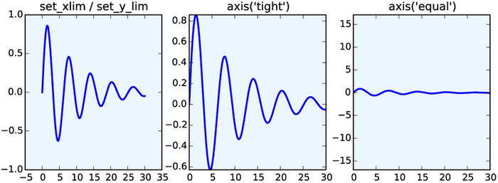
Figure 4-13. Graphs that show the result of using the set_xlim, set_ylim, and axis methods for setting the axis ranges that are shown in a graph
Axis ticks, tick labels, and grids
The final basic property of the axis that remains to be configured is the placement of axis ticks, and the placement and the formatting of the corresponding tick labels. The axis ticks is an important part of the overall appearance of a graph, and when preparing publication and production-quality graphs, it is frequently required to have detailed control over the axis ticks. Matplotlib module mpl.ticker provides a general and extensible tick management system that gives full control of the tick placement. Matplotlib distinguishes between major ticks and minor ticks. By default, every major tick has a corresponding label, and the distances between major ticks may be further marked with minor ticks that do not have labels, although this feature must be explicitly turned on. See Figure 4-14 for an illustration of major and minor ticks.
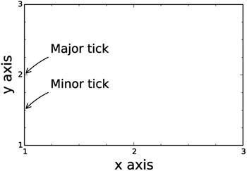
Figure 4-14. The difference between major and minor ticks
When approaching the configuration of ticks, the most common design target is to determine where the major tick with labels should be placed along the coordinate axis. The mpl.ticker module provides classes for different tick placement strategies. For example, the mpl.ticker.MaxNLocator can be used to set the maximum number ticks (at unspecified locations), the mpl.ticker.MultipleLocator can be used for setting ticks at multiples of a given base, and the mpl.ticker.FixedLocator can be used to place ticks at explicitly specified coordinates. To change ticker strategy, we can use the set_major_locator and the set_minor_locator methods in Axes.xaxis and Axes.yaxis. These methods accept an instance of a ticker class defined in mpl.ticker, or a custom class that is derived from one of those classes.
When explicitly specifying tick locations we can also use the methods set_xticks and set_yticks, which accepts list of coordinates for where to place major ticks. In this case, it is also possible to set custom labels for each tick using the set_xticklabels and set_yticklabels, which expects lists of strings to use as labels for the corresponding ticks. If possible it is a good idea to use generic tick placement strategies, for example, mpl.ticker.MaxNLocator, because they dynamically adjust if the coordinate range is changed, while explicit tick placement using set_xticks and set_yticks then would require manual code changes. However, when the exact placement of ticks must be controlled, then set_xticks and set_yticks are convenient methods.
The code below demonstrates how to change the default tick placement using combinations of the methods discussed in the previous paragraphs, and the resulting graphs are shown in Figure 4-15.
In [16]: x = np.linspace(-2 * np.pi, 2 * np.pi, 500)
    ...: y = np.sin(x) * np.exp(-x**2/20)
    ...:
    ...: fig, axes = plt.subplots(1, 4, figsize=(12, 3))
    ...:
    ...: axes[0].plot(x, y, lw=2)
    ...: axes[0].set_title("default ticks")
    ...: axes[1].plot(x, y, lw=2)
    ...: axes[1].set_title("set_xticks")
    ...: axes[1].set_yticks([-1, 0, 1])
    ...: axes[1].set_xticks([-5, 0, 5])
    ...:
    ...: axes[2].plot(x, y, lw=2)
    ...: axes[2].set_title("set_major_locator")
    ...: axes[2].xaxis.set_major_locator(mpl.ticker.MaxNLocator(4))
    ...: axes[2].yaxis.set_major_locator(mpl.ticker.FixedLocator([-1, 0, 1]))
    ...: axes[2].xaxis.set_minor_locator(mpl.ticker.MaxNLocator(8))
    ...: axes[2].yaxis.set_minor_locator(mpl.ticker.MaxNLocator(8))
    ...:
    ...: axes[3].plot(x, y, lw=2)
    ...: axes[3].set_title("set_xticklabels")
    ...: axes[3].set_yticks([-1, 0, 1])
    ...: axes[3].set_xticks([-2 * np.pi, -np.pi, 0, np.pi, 2 * np.pi])
    ...: axes[3].set_xticklabels(['$-2pi$', '$-pi$', 0, r'$pi$', r'$2pi$'])
    ...: x_minor_ticker = mpl.ticker.FixedLocator([-3 * np.pi / 2, -np.pi/2, 0,
    ...:                                           np.pi/2, 3 * np.pi/2])
    ...: axes[3].xaxis.set_minor_locator(x_minor_ticker)
    ...: axes[3].yaxis.set_minor_locator(mpl.ticker.MaxNLocator(4))

Figure 4-15. Graphs that demonstrate different ways of controlling the placement and appearance of major and minor ticks along the x axis and the y axis
A frequently used design element in a graph is grid lines, which are intended to help visually reading of values from the graph. Grids and grid lines are closely related to axis ticks, since they are drawn at the same coordinate values, and are therefore essentially extensions of the ticks that span across the graph. In Matplotlib, we can turn on axis grids using the grid method of an axes object. The grid method takes optional keyword arguments that are used to control the appearance of the grid. For example, like many of the plot functions in Matplotlib, the grid method accepts the arguments color, linestyle and linewidth, for specifying the properties of the grid lines. In addition, it takes argument which and axis, that can be assigned values 'major', 'minor', and 'both', and 'x', 'y', and 'both', respectively, and which are used to indicate which ticks along which axis the given style is to be applied to. If several different styles for the grid lines are required, multiple calls to grid can be used, with different values of which and axis. For an example of how to add grid lines and how to style them in different ways, see the following example, which produces the graphs shown in Figure 4-16.
In [17]: fig, axes = plt.subplots(1, 3, figsize=(12, 4))
    ...: x_major_ticker = mpl.ticker.MultipleLocator(4)
    ...: x_minor_ticker = mpl.ticker.MultipleLocator(1)
    ...: y_major_ticker = mpl.ticker.MultipleLocator(0.5)
    ...: y_minor_ticker = mpl.ticker.MultipleLocator(0.25)
    ...:
    ...: for ax in axes:
    ...:     ax.plot(x, y, lw=2)
    ...:     ax.xaxis.set_major_locator(x_major_ticker)
    ...:     ax.yaxis.set_major_locator(y_major_ticker)
    ...:     ax.xaxis.set_minor_locator(x_minor_ticker)
    ...:     ax.yaxis.set_minor_locator(y_minor_ticker)
    ...:
    ...: axes[0].set_title("default grid")
    ...: axes[0].grid()
    ...:
    ...: axes[1].set_title("major/minor grid")
    ...: axes[1].grid(color="blue", which="both", linestyle=':', linewidth=0.5)
    ...:
    ...: axes[2].set_title("individual x/y major/minor grid")
    ...: axes[2].grid(color="grey", which="major", axis='x', linestyle='-', linewidth=0.5)
    ...: axes[2].grid(color="grey", which="minor", axis='x', linestyle=':', linewidth=0.25)
    ...: axes[2].grid(color="grey", which="major", axis='y', linestyle='-', linewidth=0.5)

Figure 4-16. Graphs demonstrating the result of using grid lines
In addition to controlling the tick placements, the Matplotlib mpl.ticker module also provides classes for customizing the tick labels. For example, the ScalarFormatter from the mpl.ticker module can be used to set several useful properties related to displaying tick labels with scientific notation and for displaying axis labels for large numerical values. If scientific notation is activated using the set_scientific method, we can control the threshold for when scientific notation is used with the set_powerlimits method (by default, tick labels for small numbers are not displayed using the scientific notation), and we can use the useMathText=True argument when creating the ScalarFormatter instance in order to have the exponents shown in math style rather than using code style exponents (for example, 1e10). See the following code for an example of using scientific notation in tick labels. The resulting graphs are shown in Figure 4-17.
In [19]: fig, axes = plt.subplots(1, 2, figsize=(8, 3))
    ...:
    ...: x = np.linspace(0, 1e5, 100)
    ...: y = x ** 2
    ...:
    ...: axes[0].plot(x, y, 'b.')
    ...: axes[0].set_title("default labels", loc='right')
    ...:
    ...: axes[1].plot(x, y, 'b')
    ...: axes[1].set_title("scientific notation labels", loc='right')
    ...:
    ...: formatter = mpl.ticker.ScalarFormatter(useMathText=True)
    ...: formatter.set_scientific(True)
    ...: formatter.set_powerlimits((-1,1))
    ...: axes[1].xaxis.set_major_formatter(formatter)
    ...: axes[1].yaxis.set_major_formatter(formatter)

Figure 4-17. Graphs with tick labels in scientific notation. The left panel uses the default label formatting, while the right panel uses tick labels in scientific notation, rendered as math text
Log plots
In visualization of data that spans several orders of magnitude, it is useful to work with logarithmic coordinate systems. In Matplotlib, there are several plot functions for graphing functions in such coordinate systems. For example: loglog, semilogx, and semilogy, which uses logarithmic scales for both the x and y axes, for only the x axis, and for only the y axis, respectively. Apart from the logarithmic axis scales, these functions behave similar to the standard plot method. An alternative approach is to use the standard plot method, and to separately configure the axis scales to be logarithmic using the set_xscale and/or set_yscale method with 'log' as first argument. These methods of producing log-scale plots are exemplified below, and the resulting graphs are shown in Figure 4-18.
In [20]: fig, axes = plt.subplots(1, 3, figsize=(12, 3))
    ...:
    ...: x = np.linspace(0, 1e3, 100)
    ...: y1, y2 = x**3, x**4
    ...:
    ...: axes[0].set_title('loglog')
    ...: axes[0].loglog(x, y1, 'b', x, y2, 'r')
    ...:
    ...: axes[1].set_title('semilogy')
    ...: axes[1].semilogy(x, y1, 'b', x, y2, 'r')
    ...:
    ...: axes[2].set_title('plot / set_xscale / set_yscale')
    ...: axes[2].plot(x, y1, 'b', x, y2, 'r')
    ...: axes[2].set_xscale('log')
    ...: axes[2].set_yscale('log')

Figure 4-18. Examples of log-scale plots
Twin axes
An interesting trick with axes that Matplotlib provides is the twin axis feature, which allows displaying two independent axes overlaid on each other. This is useful when plotting two different quantities, for example, with different units, within the same graph. A simple example that demonstrates this feature is shown below, and the resulting graph is shown in Figure 4-19. Here we use the twinx method (there is also a twiny method) to produce a second Axes instance with shared x axis and a new independent y axis, which is displayed on the right side of the graph.
In [21]: fig, ax1 = plt.subplots(figsize=(8, 4))
    ...:
    ...: r = np.linspace(0, 5, 100)
    ...: a = 4 * np.pi * r ** 2  # area
    ...: v = (4 * np.pi / 3) * r ** 3  # volume
    ...:
    ...: ax1.set_title("surface area and volume of a sphere", fontsize=16)
    ...: ax1.set_xlabel("radius [m]", fontsize=16)
    ...:
    ...: ax1.plot(r, a, lw=2, color="blue")
    ...: ax1.set_ylabel(r"surface area ($m^2$)", fontsize=16, color="blue")
    ...: for label in ax1.get_yticklabels():
    ...:     label.set_color("blue")
    ...:
    ...: ax2 = ax1.twinx()
    ...: ax2.plot(r, v, lw=2, color="red")
    ...: ax2.set_ylabel(r"volume ($m^3$)", fontsize=16, color="red")
    ...: for label in ax2.get_yticklabels():
     ...:    label.set_color("red")

Figure 4-19. Example of graphs with twin axes
Spines
In all graphs generated so far we have always had a box surrounding the Axes region. This is indeed a common style for scientific and technical graphs, but in some cases, for example, when representing schematic graphs, moving these coordinate lines may be desired. The lines that make up the surrounding box are called axis spines in Matplotlib, and we can use the Axes.spines attribute to changes their properties. For example, we might want to remove the top and the right spines, and move the spines to coincide with the origin of the coordinate systems.
The spine attribute of the Axes object is a dictionary with the keys right, left, top and bottom, which can be used to access each spine individually. We can use the set_color method to set the color to 'None' to indicate that a particular spine should not be displayed, and in this case we also need to remove the ticks associated with that spine, using the set_ticks_position method of Axes.xaxis and Axes.yaxis (which takes the arguments 'both', 'top', and 'bottom' and 'both', 'left' and 'right', respectively). With these methods we can transform the surrounding box to x and y coordinate axes, as demonstrated in the following example. The resulting graph is shown in Figure 4-20.
In [22]: x = np.linspace(-10, 10, 500)
    ...: y = np.sin(x) / x
    ...:
    ...: fig, ax = plt.subplots(figsize=(8, 4))
    ...:
    ...: ax.plot(x, y, linewidth=2)
    ...:
    ...: # remove top and right spines
    ...: ax.spines['right'].set_color('none')
    ...: ax.spines['top'].set_color('none')
    ...:
    ...: # remove top and right spine ticks
    ...: ax.xaxis.set_ticks_position('bottom')
    ...: ax.yaxis.set_ticks_position('left')
    ...:
    ...: # move bottom and left spine to x = 0 and y = 0
    ...: ax.spines['bottom'].set_position(('data', 0))
    ...: ax.spines['left'].set_position(('data', 0))
    ...:
    ...: ax.set_xticks([-10, -5, 5, 10])
    ...: ax.set_yticks([0.5, 1])
    ...:
    ...: # give each label a solid background of white, to not overlap with the plot line
    ...: for label in ax.get_xticklabels() + ax.get_yticklabels():
    ...:     label.set_bbox({'facecolor': 'white',
    ...:                     'edgecolor': 'white'})

Figure 4-20. Example of a graph with axis spines
Advanced Axes Layouts
So far, we have repeatedly used plt.figure, Figure.make_axes and plt.subplots to create new Figure and Axes instances, which we then used for producing graphs. In scientific and technical graphs, it is common to pack together multiple figures in different panels, for example, in a grid layout. In Matplotlib there are functions for automatically creating Axes objects and placing them on a figure canvas, using a variety of different layout strategies. We have already used the plt.subplots function, which is capable of generating a uniform grid of Axes objects. In this section we explore additional features of the plt.subplots function and introduce the subplot2grid and GridSpec layout managers, which are more flexible in how the Axes objects are distributed within a figure canvas.
Insets
Before diving into the details of how to use more advanced Axes layout managers, it is worth taking a step back and to consider an important use-case of the very first approach we used to add Axes instances to a figure canvas: the Figure.add_axes method. This approach is well suited for creating so-called insets, which is a smaller graph that is displayed within the region of another graph. Insets are, for example, frequently used for displaying a magnified region of special interest in the larger graph, or for displaying some related graphs of secondary importance.
In Matplotlib we can place additional Axes objects at arbitrary locations within a figure canvas, even if they overlap with existing Axes objects. To create an inset we therefore simply add a new Axes object with Figure.make_axes and with the (figure canvas) coordinates for where the inset should be placed. A typical example of a graph with an inset is produced by the following code, and the graph that this code generates is shown in Figure 4-21. When creating the Axes object for the inset, it may be useful to use the argument axisbg='none', which indicates that there should be no background color, that is, that the Axes background of the inset should be transparent.
In [23]: fig = plt.figure(figsize=(8, 4))
    ...:
    ...: def f(x):
    ...:     return 1/(1 + x**2) + 0.1/(1 + ((3 - x)/0.1)**2)
    ...:
    ...: def plot_and_format_axes(ax, x, f, fontsize):
    ...:     ax.plot(x, f(x), linewidth=2)
    ...:     ax.xaxis.set_major_locator(mpl.ticker.MaxNLocator(5))
    ...:     ax.yaxis.set_major_locator(mpl.ticker.MaxNLocator(4))
    ...:     ax.set_xlabel(r"$x$", fontsize=fontsize)
    ...:     ax.set_ylabel(r"$f(x)$", fontsize=fontsize)
    ...:
    ...: # main graph
    ...: ax = fig.add_axes([0.1, 0.15, 0.8, 0.8], axisbg="#f5f5f5")
    ...: x = np.linspace(-4, 14, 1000)
    ...: plot_and_format_axes(ax, x, f, 18)
    ...:
    ...: # inset
    ...: x0, x1 = 2.5, 3.5
    ...: ax.axvline(x0, ymax=0.3, color="grey", linestyle=":")
    ...: ax.axvline(x1, ymax=0.3, color="grey", linestyle=":")
    ...:
    ...: ax = fig.add_axes([0.5, 0.5, 0.38, 0.42], axisbg='none')
    ...: x = np.linspace(x0, x1, 1000)
    ...: plot_and_format_axes(ax, x, f, 14)

Figure 4-21. Example of a graph with an inset
Subplots
We have already used plt.subplots extensively, and we have noted that it returns a tuple with a Figure instance and a NumPy array with the Axes objects for each row and column that was requested in the function call. It is often the case when plotting grids of subplots that either the x or the y axis, or both, are shared among the subplots. Using the sharex and sharey arguments to plt.subplots can be useful in such situations, since it prevents the same axis labels to be repeated across multiple Axes.
It is also worth noting that the dimension of the NumPy array with Axes instances that is returned by plt.subplots is “squeezed” by default: that is, the dimensions with length one is removed from the array. If both the requested number of column or row is greater than one, then a two-dimensional array is returned, but if either (or both) the number of columns or rows is one, then a one-dimensional (or scalar, i.e., the only Axes object itself) is returned. We can turn off the squeezing of the dimensions of the NumPy arrays by passing the argument squeeze=False to the plt.subplots function. In this case the axes variable in fig, axes = plt.subplots(nrows, ncols) is always a two-dimensional array.
A final touch of configurability can be achieved using the plt.subplots_adjust function, which allows us to explicitly set the left, right, bottom, and top coordinates of the overall Axes grid, as well as the width (wspace) and height spacing (hspace) between Axes instances in the grid. See the following code, and the corresponding Figure 4-22, for a step-by-step example of how to set up an Axes grid with shared x and y axes, and with adjusted Axes spacing.
In [24]: fig, axes = plt.subplots(2, 2, figsize=(6, 6), sharex=True, sharey=True,
    ...:                          squeeze=False)
    ...:
    ...: x1 = np.random.randn(100)
    ...: x2 = np.random.randn(100)
    ...:
    ...: axes[0, 0].set_title("Uncorrelated")
    ...: axes[0, 0].scatter(x1, x2)
    ...:
    ...: axes[0, 1].set_title("Weakly positively correlated")
    ...: axes[0, 1].scatter(x1, x1 + x2)
    ...:
    ...: axes[1, 0].set_title("Weakly negatively correlated")
    ...: axes[1, 0].scatter(x1, -x1 + x2)
    ...:
    ...: axes[1, 1].set_title("Strongly correlated")
    ...: axes[1, 1].scatter(x1, x1 + 0.15 * x2)
    ...:
    ...: axes[1, 1].set_xlabel("x")
    ...: axes[1, 0].set_xlabel("x")
    ...: axes[0, 0].set_ylabel("y")
    ...: axes[1, 0].set_ylabel("y")
    ...:
    ...: plt.subplots_adjust(left=0.1, right=0.95, bottom=0.1, top=0.95, wspace=0.1, hspace=0.2)
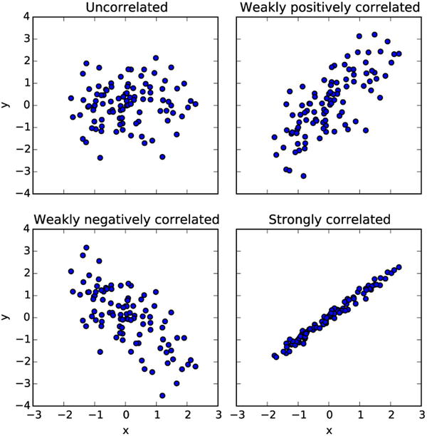
Figure 4-22. Example graph using plt.subplot and plt.subplot_adjust
Subplot2grid
The plt.subplot2grid function is an intermediary between plt.subplots and GridSpec (see the next section) that provides a more flexible Axes layout management than plt.subplots, while at the same time being simpler to use than GridSpec. In particular, plt.subplot2grid is able to create grids with Axes instances that span multiple rows and/or columns. The plt.subplot2grid takes two mandatory arguments: the first argument is the shape of the Axes grid, in the form of a tuple (nrows, ncols), and the second argument is a tuple (row, col) that specifies the starting position within the grid. The two optional keyword arguments colspan and rowspan can be used to indicate how many rows and columns the new Axes instance should span. An example of how to use the plt.subplot2grid function is given in Table 4-3. Note that each call to the plt.subplot2grid function results in one new Axes instance, in contrast to plt.subplots, with creates all Axes instances in one function call and returns them in a NumPy array.
Table 4-3. Example of a grid layout created with plt.subplot2grid and the corresponding code
|
Axes Grid Layout |
Code |
|---|---|
|
|
ax0 = plt.subplot2grid((3, 3), (0, 0)) ax1 = plt.subplot2grid((3, 3), (0, 1)) ax2 = plt.subplot2grid((3, 3), (1, 0), colspan=2) ax3 = plt.subplot2grid((3, 3), (2, 0), colspan=3) ax4 = plt.subplot2grid((3, 3), (0, 2), rowspan=2) |

GridSpec
The final grid layout manager that we cover here is GridSpec from the mpl.gridspec module. This is the most general grid layout manager in Matplotlib, and in particular it allows creating grids where not all rows and columns have equal width and height, which is not easily achieved with the grid layout managers we have used earlier in this chapter.
A GridSpec object is only used to specify the grid layout, and by itself it does not create any Axes objects. When creating a new instance of the GridSpec class, we must specify the number of rows and columns in the grid. Like for other grid layout managers, we can also set the position of the grid using the keyword arguments left, bottom, right, and top, and we can set the width and height spacing between subplots using wspace and hspace. Additionally, GricSpec allows specifying the relative width and heights of columns and rows using the width_ratios and height_ratios arguments. These should both be lists with relative weights for the size of each column and row in the grid. For example, to generate a grid with two rows and two columns, where the first row and column is twice as big as the second row and column, we could use mpl.gridspec.GridSpec(2, 2, width_ratios=[2, 1], height_ratios=[2, 1]).
Once a GridSpec instance has been created, we can use the Figure.add_subplot method to create Axes objects and place them on a figure canvas. As argument to add_subplot we need to pass an mpl.gridspec.SubplotSpec instance, which we can generate from the GridSpec object using an array-like indexing: For example, given a GridSpec instance gs, we obtain a SubplotSpec instance for the upper left grid element using gs[0, 0], and for a SubplotSpec instance that covers the first row we use gs[:, 0], and so on. See Table 4-4 for concrete examples of how to use GridSpec and add_subplot to create Axes instance.
Table 4-4. Examples of how to use the subplot grid manager mpl.gridspec.GridSpec
|
Axes Grid Layout |
Code |
|---|---|
|
|
fig = plt.figure(figsize=(6, 4)) gs = mpl.gridspec.GridSpec(4, 4) ax0 = fig.add_subplot(gs[0, 0]) ax1 = fig.add_subplot(gs[1, 1]) ax2 = fig.add_subplot(gs[2, 2]) ax3 = fig.add_subplot(gs[3, 3]) ax4 = fig.add_subplot(gs[0, 1:]) ax5 = fig.add_subplot(gs[1:, 0]) ax6 = fig.add_subplot(gs[1, 2:]) ax7 = fig.add_subplot(gs[2:, 1]) ax8 = fig.add_subplot(gs[2, 3]) ax9 = fig.add_subplot(gs[3, 2]) |
|
|
fig = plt.figure(figsize=(4, 4)) gs = mpl.gridspec.GridSpec( 2, 2, width_ratios=[4, 1], height_ratios=[1, 4], wspace=0.05, hspace=0.05) ax0 = fig.add_subplot(gs[1, 0]) ax1 = fig.add_subplot(gs[0, 0]) ax2 = fig.add_subplot(gs[1, 1]) |


Colormap Plots
We have so far only considered graphs of univariate functions, or, equivalently, two-dimensional data in x-y format. The two-dimensional Axes objects that we have used for this purpose can also be used to visualize bivariate functions, or three-dimensional data on x-y-z format, using so-called color maps (or heat maps), where each pixel in the Axes area is colored according to the z value corresponding to that point in the coordinate system. Matplotlib provides the functions pcolor and imshow for these types of plots, and the contour and contourf functions graphs data on the same format by drawing contour lines rather than color maps. Examples of graphs generated with these functions are shown in Figure 4-23.

Figure 4-23. Example graphs generated with pcolor, imshow, contour, and contourf
To produce a color map graph, for example, using pcolor, we first need to prepare the data in the appropriate format. While standard two-dimensional graphs expect one-dimensional coordinate arrays with x and y values, in the present case we need to use two-dimensional coordinate arrays, as for example generated using the NumPy meshgrid function. To plot a bivariate function or data with two dependent variables, we start by defining one-dimensional coordinate arrays, x and y, which span the desired coordinate range, or correspond to the values for which data is available. The x and y arrays can then be passed to the np.meshgrid function, which produces the required two-dimensional coordinate arrays X and Y. If necessary, we can use NumPy array computations with X and Y to evaluate bivariate functions to obtain a data array Z, as done in line 1 to 3 in In [25] (see below).
Once the two-dimensional coordinate arrays and data array are prepared, they are easily visualized using for example pcolor, contour or contourf, by passing the X, Y and Z arrays as first few arguments. The imshow method works similarly, but only expects the data array Z as argument, and the relevant coordinate ranges must instead be set using the extent argument, which should be set to a list on the format [xmin, xmax, ymin, ymax]. Additional keyword arguments that are important for controlling the appearance of colormap graphs are vmin, vmax, norm and cmap: The vmin and vmax can be used to set the range of values that are mapped to the color axis. This can equivalently be achieved by setting norm=mpl.colors.Normalize(vmin, vmax). The cmap argument specifies a color map for mapping the data values to colors in the graph. This argument can either be a string with a predefined colormap name, or a colormap instance. The predefined color maps in Matplotlib are available in mpl.cm. Try help(mpl.cm) or try to autocomplete in IPython on the mpl.cm module for a full list of available color maps.5
The last piece required for a complete color map plot is the colorbar element, which gives the viewer of the graph a way to read off the numerical values that different colors correspond to. In Matplotlib we can use the plt.colorbar function to attach a colorbar to an already plotted colormap graph. It takes a handle to the plot as first argument, and it takes two optional arguments ax and cax, which can be used to control where in the graph the colorbar is to appear. If ax is given, the space will be taken from this Axes object for the new colorbar. If, on the other hand, cax is given, then the colorbar will draw on this Axes object. A colorbar instance cb has its own axis object, and the standard methods for setting axis attributes can be used on the cb.ax object, and we can use for example the set_label, set_ticks and set_ticklabels method in the same manner as for x and y axes.
The steps outlined in the previous in paragraphs are shown in following code, and the resulting graph is shown in Figure 4-24. The functions imshow, contour, and contourf can be used in a nearly similar manner, although these functions take additional arguments for controlling their characteristic properties. For example, the contour and contourf functions additionally take an argument N that specifies the number of contour lines to draw.
In [25]: x = y = np.linspace(-10, 10, 150)
    ...: X, Y = np.meshgrid(x, y)
    ...: Z = np.cos(X) * np.cos(Y) * np.exp(-(X/5)**2-(Y/5)**2)
    ...:
    ...: fig, ax = plt.subplots(figsize=(6, 5))
    ...:
    ...: norm = mpl.colors.Normalize(-abs(Z).max(), abs(Z).max())
    ...: p = ax.pcolor(X, Y, Z, norm=norm, cmap=mpl.cm.bwr)
    ...:
    ...: ax.axis('tight')
    ...: ax.set_xlabel(r"$x$", fontsize=18)
    ...: ax.set_ylabel(r"$y$", fontsize=18)
    ...: ax.xaxis.set_major_locator(mpl.ticker.MaxNLocator(4))
    ...: ax.yaxis.set_major_locator(mpl.ticker.MaxNLocator(4))
    ...:
    ...: cb = fig.colorbar(p, ax=ax)
    ...: cb.set_label(r"$z$", fontsize=18)
    ...: cb.set_ticks([-1, -.5, 0, .5, 1])

Figure 4-24. Example of the use pcolor to produce a color map graph
3D plots
The color map graphs discussed in the previous section were used to visualize data with two dependent variables by color-coding data in 2D graphs. Another way of visualizing the same type of data is to use 3D graphs, where a third axis z is introduced and the graph is displayed in a perspective on the screen. In Matplotlib, drawing 3D graphs requires using a different axes object, namely the Axes3D object that is available form the mpl_toolkits.mplot3d module. We can create a 3D-aware axes instance explicitly using the constructor of the Axes3D class, by passing a Figure instance as argument: ax = Axes3D(fig). Alternatively, we can use the add_subplot function with the projection='3d' argument:
ax = fig.add_subplot(1, 1, 1, projection='3d')
or use plt.subplots with the subplot_kw={'projection': '3d'} argument:
fig, ax = plt.subplots(1, 1, figsize=(8, 6), subplot_kw={'projection': '3d'})
In this way, we can use all the of the axes layouts approaches we have previously used for 2D graphs, if only we specify the projection argument in the appropriate manner. Note that using add_subplot, it is possible to mix axes objects with 2D and 3D projections within the same figure, but when using plt.subplots the subplot_kw argument applies to all the subplots added to a figure.
Having created and added 3D-aware axes instances to a figure, for example, using one of the methods described in the previous paragraph, the Axes3D class methods – for example plot_surface, plot_wireframe, contour – can be used to plot data in as surfaces in a 3D perspective. These functions are used in a manner that is nearly the same as how the color maps were used in the previous section: these 3D plotting functions all take two-dimensional coordinate and data arrays X, Y, and Z as first arguments. Each function also takes additional parameters for tuning specific properties. For example, the plot_surface function takes the arguments rstride and cstride (row and column stride) for selecting data from the input arrays (to avoid data points that are too dense). The contour and contourf functions take optional arguments zdir and offset, which is used to select a projection direction (the allowed values are 'x', 'y' and 'z') and the plane to display the projection on.
In addition to the methods for 3D surface plotting, there are also straightforward generalizations of the line and scatter plot functions that are available for 2D axes, for example plot, scatter, bar, and bar3d, which in the versions that are available in the Axes3D class take an additional argument for the z coordinates. Like their 2D relatives, these functions expect one-dimensional data arrays rather than the two-dimensional coordinate arrays that are used for surface plots.
When it comes to axes titles, labels, ticks, and tick labels, all the methods used for 2D graphs, as described in detail earlier in this chapter, are straightforwardly generalized to 3D graphs. For example, there are new methods set_zlabel, set_zticks, and set_zticklabels for manipulating the attributes of the new z axis. The Axes3D object also provides new class methods for 3D specific actions and attributes. In particular, the view_init method can be used to change the angle from which the graph is viewed, and it takes the elevation and the azimuth, in degrees, as first and second argument.
Examples of how to use these 3D plotting functions are given in below, and the produced graphs are shown in Figure 4-25.
In [26]: fig, axes = plt.subplots(1, 3, figsize=(14, 4), subplot_kw={'projection': '3d'})
    ...:
    ...: def title_and_labels(ax, title):
    ...:     ax.set_title(title)
    ...:     ax.set_xlabel("$x$", fontsize=16)
    ...:     ax.set_ylabel("$y$", fontsize=16)
    ...:     ax.set_zlabel("$z$", fontsize=16)
    ...:
    ...: x = y = np.linspace(-3, 3, 74)
    ...: X, Y = np.meshgrid(x, y)
    ...:
    ...: R = np.sqrt(X**2 + Y**2)
    ...: Z = np.sin(4 * R) / R
    ...:
    ...: norm = mpl.colors.Normalize(-abs(Z).max(), abs(Z).max())
    ...:
    ...: p = axes[0].plot_surface(X, Y, Z, rstride=1, cstride=1, linewidth=0,
    ...:                          antialiased=False, norm=norm, cmap=mpl.cm.Blues)
    ...: cb = fig.colorbar(p, ax=axes[0], shrink=0.6)
    ...: title_and_labels(axes[0], "plot_surface")
    ...:
    ...: axes[1].plot_wireframe(X, Y, Z, rstride=2, cstride=2, color="darkgrey")
    ...: title_and_labels(axes[1], "plot_wireframe")
    ...:
    ...: axes[2].contour(X, Y, Z, zdir='z', offset=0, norm=norm, cmap=mpl.cm.Blues)
    ...: axes[2].contour(X, Y, Z, zdir='y', offset=3, norm=norm, cmap=mpl.cm.Blues)
    ...: title_and_labels(axes[2], "contour")

Figure 4-25. 3D surface and contour graphs generated by using plot_surface, plot_wireframe and contour
Summary
In this chapter, we have covered the basics of how to produce 2D and 3D graphics using Matplotlib. Visualization is one of the most important tools for computational scientists and engineers, both as an analysis tool while working on computational problems, and for presenting and communicating computational results. Visualization is therefore an integral part of the computational workflow, and it is equally important to be able to quickly visualize and explore data, and to be able to produce picture-perfect publication-quality graphs, with detailed control over every graphical element. Matplotlib is a great general-purpose tool for both exploratory visualization and for producing publication-quality graphics. However, there are limitations to what can be achieved with Matplotlib, especially with respect to interactivity and high-quality 3D graphics. For more specialized use-cases, I therefore recommend exploring some of the other graphics libraries that are available in the scientific Python ecosystem, some of which was briefly mentioned in the beginning of this chapter.
Further Reading
The Matplotlib is treated in books dedicated to the library, such as the ones by Tosi and Devert. Books with a wider scope include the ones by Milovanovi and McKinney. For interesting discussions on data visualization and style guides and good practices in visualization, see the books by Yau and Steele.
References
Devert, A. (2014). Matplotlib Plotting Cookbook. Mumbai: Packt.
McKinney, W. (2013). Python for Data Analysis. Sebastopol: O’Reilly.
Milovanovi, I. (2013). Python Data Visualization Cookbook. Mumbai: Packt.
Steele, N. I. (2010). Beautiful Visualization. Sebastopol: O’Reilly.
Tosi, S. (2009). Matplotlib for Python Developers. Mumbai: Packt.
Yau, N. (2011). Visualize This. Indianapolis: Wiley.
__________________
1Although the stateful API may be convenient and simple for small examples, the readability and maintainability of code written for stateful APIs scales poorly, and the context-dependent nature of such code makes it hard to rearrange or reuse. I therefore recommend to avoid it altogether, and to only use the object-oriented API.
2The Matplotlib resource file, matplotlibrc, can be used to set default values of many Matplotlib parameters, including which back end to use. The location of the file is platform dependent. For details, see http://matplotlib.org/users/customizing.html.
3For Max OS X users, %config InlineBackend.figure_format='retina' is another useful option, which improves the quality of the Matplotlib graphics when viewed on retina displays.
4An alternative to passing a coordinate and size tuple to add_axes, is to pass an already existing Axes instance.
5A nice visualization of all the available color maps is available at http://wiki.scipy.org/Cookbook/Matplotlib/Show_colormaps. This page also describes how to create new color maps.