From cell phones that take pictures to Web sites that let you print and share your latest batch of vacation photos, color images have never been more prevalent and universally accessible. Even someone on a meager budget can afford a low-end digital camera, an inkjet printer, and some photo paper — thus making the taking and printing of color photos something just about anyone can do. This also puts the use of color images for commercial use — brochures, ads — within the reach of more organizations, resulting in their producing more color themselves or expecting the graphic artists they employ to do the same. For those who still find the color brochure to be too expensive, a full-color Web site is entirely doable and can be updated at any time, which allows for timely information to be maintained continuously and for marketing efforts to be both proactive and responsive.
Photoshop, of course, is not typically the domain of the family photographer or the small business. At least in the past it hasn't been, due to its price tag, and it's still a more serious tool for more serious photographers and graphic artists. If you own Photoshop and are reading this book, don't be put off or think anyone's telling you that you're in over your head, because you're not. Anyone who can use a computer can use Photoshop, but it has always been considered a higher-end application for very specific uses and users.
Note
Photoshop's "lite" cousin, Elements, brings much of Photoshop's power to the home and small-business user, and that makes color photos and their capture and manipulation even more commonplace.
In the meantime, check out Photoshop's color tools. With color, color everywhere, you need to know how to use Photoshop's tools to select colors, edit them, apply them, and tinker with them. And you need to know how Photoshop looks at and interprets color and how you can enhance its ability to give you the color results you're looking for. So let's get started.
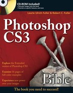
To begin your journey into the world of color, Photoshop provides four color controls in the Toolbox, as shown in Figure 4.1. These icons work as follows:
Foreground color: The foreground color icon indicates the color you apply when you use the Paint Bucket, Pencil, Brush, or one of the type tools, and also if you Alt-drag (Option-drag on the Mac) with the Smudge tool. The foreground color also begins any gradation created with the Gradient tool in its default state. Photoshop uses the current foreground color to fill any shape you create with the shape tools, and if you make a selection and then click inside it with the Paint Bucket or use the Edit

To change the foreground color, click the foreground color icon to display the Color Picker dialog box. Then select a new color in the Color palette, or click anywhere in an open image window with the Eyedropper tool. You also can set the foreground color by clicking a swatch in the Swatches palette. (All are explained later in this chapter.)
Background color: The active background color indicates the color you apply with the Eraser tool when you're working on the background layer. By default, the background color also ends any custom gradation created with the Gradient tool. To change the background color, click the background color icon to display the Color Picker dialog box. Or define the color by using the Color palette, clicking a swatch in the Swatches palette, or Alt-clicking (Option-clicking on the Mac) any open image window with the Eyedropper tool.
You can apply the background color to a selection by pressing Backspace or Delete, or by choosing Background Color from the Use list in the Fill dialog box opened by choosing Edit
Switch colors: Click this icon (or press X) to swap the current foreground and background colors.
Default colors: Click this icon (or press D) to make the foreground color black and the background color white, according to their factory default settings. If you're editing a layer mask or an adjustment layer, the default colors are reversed, as explained in Chapters 9 and 18.
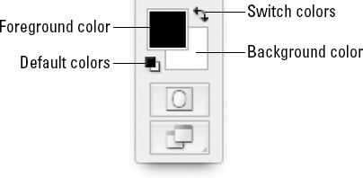
When you click the foreground or background color icon in the Toolbox or the Color palette, Photoshop displays the Color Picker dialog box, which is shown in Figure 4.2. The assumption is that you're also looking at the Adobe Color Picker, and if you're saying "As opposed to what?", we refer you now to Chapter 2. You'll find that you can use an OS-based version of the Color Picker. If you aren't sure which picker you've selected, or if you'd like to pick a different picker (try saying that five times fast), check the General panel of the Preferences dialog box.
All tongue-twisters aside, you are now presented with the many elements and options offered by the Color Picker dialog box:
Color slider: Use the color slider to home in on the color you want to select. Click and drag up or down on either of the slider triangles to select a color from within the range. You also can click directly on any color in the slider. The colors represented inside the slider correspond to the selected radio button. For example, if you select the H (Hue) radio button, which is the default setting, the slider colors represent the full 8-bit range of hues. If you select S (Saturation), the slider shows the current hue at full saturation at the top of the slider, down to no saturation — or gray — at the bottom of the slider. If you select B (Brightness), the slider shows the 8-bit range of brightness values, from solid color at the top of the slider to absolute black at the bottom. You also can select R (Red), G (Green), or B (Blue), in which case the top of the slider shows you what the current color looks like when subjected to full-intensity red, green, or blue (respectively), and the bottom of the slider shows every bit of red, green, or blue subtracted.
Color field: The color field shows a 16-bit range of variations on the current slider color. Click inside it to move the color selection marker and select a new color. The field plots colors against the two remaining attributes not represented by the color slider. For example, if you select the H (Hue) radio button, the field displays colors according to brightness vertically and saturation horizontally.
Note
Slider and field always work together to represent a range of over 16-million-colors. The slider displays 256 colors, and the field displays 65,536 variations on the slider color; 256 times 65,536 is 16,777,216. No matter which radio button you select, you have access to the same colors; only your means of accessing them changes.
Current color: The color currently selected from the color field appears in the top rectangle immediately to the right of the color slider. Click OK or press Enter or Return to make this the current foreground or background color (depending on which color control icon in the Toolbox you originally clicked to display the Color Picker dialog box).
Previous color: The bottom rectangle to the right of the color slider shows how the foreground or background color whichever one you are in the process of editing — looked before you displayed the Color Picker dialog box. Click Cancel or press Esc to leave this color intact.
Alert triangle: The alert triangle appears when you select a color that Photoshop can't print using standard process colors. The box below the triangle shows the closest CMYK equivalent, invariably a duller version of the color. Click either the triangle or the box to bring the color into the printable range. Pressing Ctrl+Shift+Y (

Web-safe alert cube: This little cube appears if you select a color that's not included in the so-called Web-safe palette, a 216-color spectrum that's supposedly ideal for creating Web graphics — "supposedly" refers to the fact that it's been a long time since any computer was limited to displaying only 216 colors. If you click either the cube or the swatch below it, Photoshop selects the closest Web-safe equivalent to the color you originally selected.
Only Web Colors: This option changes the display in the Color Field so that it displays delineated sections of Web-safe colors. The rest of the options in the dialog box work the same way when you're in Only Web Colors mode.
Add to Swatches: This button, new in Photoshop CS3, does just what you'd imagine. It allows you to add the new color (see the top half of the new/current box) to the Swatches palette, where it will be available for you to select with the Eyedropper while you're working in your image. When you click this button, a dialog box opens, asking you to name your new color; do so, and then click OK.
Color Libraries: This button opens the Color Libraries dialog box, through which you can choose from colors in various commercial color sets — Pantone, Focoltone, Trumatch — just to name a few. You find out more about these options and how to use this dialog box later in this chapter.
In addition to selecting colors using the slider and color field, you can type specific color values in the option boxes in the lower-right region of the Color Picker dialog box. Novices and intermediates may find these options less satisfying to use than the slider and field. These options, however, enable artists and print professionals to specify exact color values, whether to make controlled adjustments to a color already in use, or whether to match a color used in another document. The options fall into one of four camps:
HSB: These options stand for hue, saturation, and brightness. Hue is measured on a 360-degree circle. Saturation and brightness are measured from 0 to 100 percent. These options permit access to more than 3 million color variations.
RGB: You can change the amount of the primary colors red, green, and blue by specifying the brightness value of each color from 0 to 255. These options enable access to more than 16 million color variations.
Lab: This acronym stands for luminosity, measured from 0 to 100 percent, and two arbitrarily named color axes, a and b, whose brightness values range from −120 to 120. These options enable access to more than 6 million color variations.
CMYK: These options display the amount of cyan, magenta, yellow, and black ink required to print the current color, using percentages from 0 to 100. When you click the alert triangle, these are the only values that don't change, because they make up the closest CMYK equivalent.
At the bottom of the dialog box, the value next to the pound sign (#) shows you the hexadecimal value for the chosen color (refer to Figure 4.2). This value comes into play only if you're creating Web graphics — and maybe not even then.
When creating graphics for use on a Web page, you may want to make sure that the Only Web Colors option is selected, so that you can easily select only those colors deemed "Web-safe" for older computers' monitors. Every color in the 216-color Web-safe palette has a numeric value based on the hexadecimal numbering system. Each value includes a total of three pairs of numbers or letters, one pair each for the R, G, and B values. When you create a color tag in HTML code, you type the hexadecimal value for the color you want to use. Fortunately, you can create a Web page without having to write your own HTML code; page-creation programs like GoLive and Macromedia Dreamweaver do the work for you. But if you prefer to do your own coding or if you have been given a hexadecimal number and told to use that color in your design (say, by a client who already has Web content that you have to work with or enhance), make note of the hexadecimal value in the Color Picker dialog box.
Tip
The hexadecimal number can be useful if you want to precisely match a color on an existing Web page and don't have a client telling you what color that is. Just look at the HTML coding for the page (in Internet Explorer, for example, choose View
You may find the numerical range of your various color options somewhat confusing. For example, the CMYK options enable you to create 100 million unique colors, whereas the RGB options enable the standard 16 million variations, and the Lab options enable a measly 6 million. Despite this deficit, Lab is the largest color space, theoretically encompassing all colors from both CMYK and RGB. The printing standard CMYK provides by far the fewest colors, the opposite of what you might expect. Huh? These statistics seem misleading and unrelated to what we think of as the reality of displayed and printed color. To find out more about color models and how they really work, read on.
The four sets of option boxes in the Color Picker dialog box represent color models — or, if you prefer, color modes, which more closely matches the Image
Outside the Color Picker dialog box, you can work in any one of these color models by choosing a command from the Image
Rather than discuss the color models in the order in which they occur in the Mode submenu, let's talk about them in logical order, starting with the most common and widely accepted color model, RGB. The Multichannel mode, meanwhile, is not even a color model. Rather, Image
Note
Duotone mode is not covered here. The Image
RGB is the color model of light. RGB comprises three primary colors — red, green, and blue — each of which can vary between 256 levels of intensity, called brightness values. The RGB model is also called the additive primary model because a color becomes lighter as you add higher levels of red, green, and blue light. All monitors, projection devices, and other items that transmit or filter light — including televisions, movie projectors, colored stage lights, and even stained glass — rely on the additive primary model. This, in case you were wondering, is why RGB is the color mode for Web graphics.
Red, green, and blue light mix as follows:
Red and green: Full-intensity red and green mix to form yellow. Subtract some red to make chartreuse; subtract some green to make orange. All these colors assume a complete lack of blue.
Green and blue: Full-intensity green and blue with no red mix to form cyan. If you try hard enough, you can come up with 65,000 colors in the turquoise/jade/sky-blue/sea-green range.
Blue and red: Full-intensity blue and red mix to form magenta. Subtract some blue to make rose; subtract some red to make purple. All these colors assume a complete lack of green.
Red, green, and blue: Full-intensity red, green, and blue mix to form white, the absolute brightest color in the visible spectrum.
No light: Low intensities of red, green, and blue plunge a color into blackness.
As far as image editing is concerned, the RGB color model is ideal for editing images onscreen because it provides access to the entire range of 24-bit screen colors. Furthermore, you can save an RGB image in every file format supported by Photoshop except GIF and the two DCS formats. As shown in Table 4.1, grayscale is also compatible with a wide range of file formats.
Table 4.1. File-Format Support for Photoshop CS3 Color Models
Grayscale | Duotone | Indexed | RGB | CMYK | Lab | ||
|---|---|---|---|---|---|---|---|
Photoshop | Yes | Yes | Yes | Yes | Yes | Yes | Yes |
BMP | Yes | Yes | No | Yes | Yes | No | No |
DCS 1.0 | No | No | No | No | No | Yes | No |
DCS 2.0 | Yes | Yes | Yes[a] | No | No | Yes | No |
EPS | Yes | Yes | Yes | Yes | Yes | Yes | Yes |
GIF | Yes | Yes | No | Yes | No | No | No |
JPEG | No | Yes | No | No | Yes | Yes | No |
PCX | Yes | Yes | No | Yes | Yes | No | No |
Yes | Yes | No | Yes | Yes | Yes | Yes | |
PICT | Yes | Yes | No | Yes | Yes | No | No |
PNG | Yes[b] | Yes | No | Yes | Yes | No | No |
Scitex CT | No | Yes | No | No | Yes | Yes | No |
TIFF | Yes | Yes | No | Yes | Yes | Yes | Yes |
[a] You can save a duotone in DCS 2.0 only after first converting the image to the Multichannel mode. For more information, consult Chapter 18. [b] PNG supports bitmap mode only on the Mac. | |||||||
On the negative side, the RGB color model provides access to a wider range of colors than you can print. If you are designing an image for full-color printing, therefore, you can expect to lose many of the brightest and most vivid colors in your image. The only way to avoid any color loss whatsoever is to have a professional scan your image to CMYK and then edit it in the CMYK mode. Colors can get clipped when you apply special effects, and the editing process can be exceptionally slow. The better solution is to scan your images to RGB and edit them in the Lab mode, as explained in the section "CIE's Lab."
Way back in Photoshop 2, the Modes submenu provided access to the HSB — hue, saturation, brightness — color model, now relegated to the Color Picker dialog box and the Color palette (discussed later in this chapter). Hue is pure color, the stuff rainbows are made of, measured on a 360-degree circle. Red is located at 0 degrees, yellow at 60 degrees, green at 120 degrees, cyan at 180 degrees (midway around the circle), blue at 240 degrees, and magenta at 300 degrees. This is basically a pie-shaped version of the RGB model at full intensity and is the basis of the color wheel you often see offered as a tool for selecting complementary and opposite colors; colors' relationships (what goes with what) can be demonstrated on that wheel.
Saturation represents the purity of the color. A zero saturation value equals gray. White, black, and any other colors you can express in a grayscale image have no saturation. Full saturation produces the purest version of a hue.
Brightness is the lightness or darkness of a color. A zero brightness value equals black. Full brightness combined with full saturation results in the most vivid version of any hue.
In nature, our eyes perceive pigments according to the subtractive color model. Sunlight contains every visible color found on Earth. When sunlight is projected on an object, the object absorbs (subtracts) some of the light and reflects the rest. The reflected light is the color you see. For example, a fire engine is bright red because it absorbs all the light that is not red — meaning all blue and green — from the white-light spectrum.
Pigments on a sheet of paper work the same way. You can even mix pigments to create other colors. Suppose you paint a red brushstroke, which absorbs green and blue light, over a blue brushstroke, which absorbs green and red light. You get a blackish mess with only a modicum of blue and red light left, along with a smidgen of green because the colors weren't absolutely pure.
But wait! Every child knows red and blue mix to form purple. So what gives? What gives is that what you learned in elementary school is only a clumsy approximation of the truth. Did you ever try mixing a vivid red with a canary yellow only to produce an ugly orange-brown glop? The reason you didn't achieve the bright orange you wanted is because red starts out darker than bright orange, which means you must add a great deal of yellow before you arrive at orange. And even then, the yellow had better be an incredibly bright lemon yellow, not some deep canary yellow with lots of red in it.
The subtractive primary colors used by commercial printers — cyan, magenta, and yellow — are for the most part very light. Cyan absorbs only red light, magenta absorbs only green light, and yellow absorbs only blue light. On their own, these colors unfortunately don't do a good job of producing dark colors. In fact, at full intensities, cyan, magenta, and yellow all mixed together don't get much beyond a muddy brown. That's where black comes in. Black helps to accentuate shadows, deepen dark colors, and, of course, print real blacks.
In case you're wondering how colors mix in the CMYK model, it's basically the opposite of the RGB model. Because pigments are not as pure as primary colors in the additive model, though, some differences exist:
Cyan and magenta: Full-intensity cyan and magenta mix to form a deep blue with a little violet. Subtract some cyan to make purple; subtract some magenta to make a dull medium blue. All these colors assume a complete lack of yellow.
Magenta and yellow: Full-intensity magenta and yellow mix to form a brilliant red. Subtract some magenta to make vivid orange; subtract some yellow to make rose. All these colors assume a complete lack of cyan.
Yellow and cyan: Full-intensity yellow and cyan mix to form a bright green with a hint of blue. Subtract some yellow to make a deep teal; subtract some cyan to make chartreuse. All these colors assume a complete lack of magenta.
Cyan, magenta, and yellow: Full-intensity cyan, magenta, and yellow mix to form a muddy brown.
Black: Black pigmentation added to any other pigment darkens the color.
No pigment: No pigmentation results in white (assuming white is the color of the paper).
If you're used to editing RGB images, editing in the CMYK mode can require some new approaches, especially when editing individual color channels. When you view a single color channel in the RGB mode (as discussed later in this chapter), white indicates high-intensity color and black indicates low-intensity color. It's the opposite in CMYK. When you view an individual color channel, black means high-intensity color and white means low-intensity color.
This doesn't mean RGB and CMYK color channels look like inverted versions of each other. In fact, because the color theory is inverted, they look much the same. But if you're trying to achieve the full-intensity colors mentioned in the preceding section, you should apply black to the individual color channels, not white as you would in the RGB mode.
RGB doesn't accurately represent the colors you get when you print an image because the RGB color space contains many colors — particularly very bright colors — that CMYK can't touch. This is why when you switch from RGB to CMYK, the colors appear somewhat dull.
For this reason, many people advocate working exclusively in the CMYK mode, but you may want to reconsider just blindly following this advice. Although working in CMYK eliminates color disappointments, it also is much slower because Photoshop must convert CMYK values to your RGB screen on the fly.
Furthermore, your scanner and monitor are RGB devices. No matter how you work, a translation from RGB to CMYK color space must occur at some time. If you pay extra to purchase a commercial drum scan, for example, you simply make the translation at the beginning of the process — Scitex has no option but to use RGB sensors internally — rather than at the end. In fact, nearly every color device on earth is RGB except the printer.
You should wait to convert to the CMYK mode until right before you print. After your artwork is finalized, choose Image
Note
Before converting an image to the CMYK color space, make certain Photoshop is aware of the monitor you're using and the printer you intend to use. These two items can have a pronounced effect on how Photoshop generates a CMYK image. You learn how to set up your personal RGB and CMYK color spaces in Chapter 16.
Note
The advice about converting to CMYK before printing applies only to professional printing situations. If you're just in your home office printing to your inkjet printer, you should leave your image in RGB mode when you print. Your printer and the printer driver installed to run it will handle the CMYK conversion, with no effort required from you.
While you're editing in RGB mode, you can soft proof your image — display a rough approximation of what the image will look like when converted to CMYK and printed. To display colors in the CMYK color space, choose View
Before you proof your colors, however, you should select the output you want to preview from the View
View
RGB isn't the only mode that responds quickly and provides a bountiful range of colors. Photoshop's Lab color space comprises all the colors from RGB and CMYK and is every bit as fast as RGB. Many high-end users prefer to work in this mode, and even if you don't consider yourself "high end," give it a shot to see if you like it.
Whereas the RGB mode is the color model of your luminescent computer screen and the CMYK mode is the color model of the reflective page, Lab is independent of light or pigment. Perhaps you've already heard the bit about how, in 1931, an international color organization called the Commission Internationale d'Eclairage (CIE) developed a color model that, in theory, contains every single color the human eye can see. Then, in 1976, the CIE came up with two additional color systems. One of those systems was Lab, and the other was either a big secret or somebody lost the minutes to the meeting where the systems were devised, because we don't know what the other one was.
The beauty of the Lab color model is it fills in gaps in both the RGB and CMYK models. RGB, for example, provides an overabundance of colors in the blue-to-green range but is stingy on yellows, oranges, and other colors in the green-to-red range. Meanwhile, the colors missing from CMYK are as numerous as the holes in the Albert Hall. Lab gets everything right.
The Lab mode features three color channels, one for luminosity and two others for color ranges, known simply by the initials a and b. Upon hearing luminosity, you might think, "Of course, just like HSL," but that's not entirely so. To make things confusing (weren't they already?), Lab's luminosity is like HSB's brightness. White indicates full-intensity color.
Meanwhile, the a channel contains colors ranging from deep green (low-brightness values) to gray (medium-brightness values) to vivid pink (high-brightness values). The b channel ranges from bright blue (low-brightness values) to gray to burnt yellow (high-brightness values). As in the RGB model, these colors mix together to produce lighter colors. Only the brightness values in the luminosity channel darken the colors. So you can think of Lab as a two-channel RGB with brightness thrown on top. Now it's clear why in elementary school, you learn that red and blue make purple — can you imagine the reaction of an average five-year-old if you read him or her the beginning of this paragraph? "Pass me the crayons and shut up!"
Because the Lab mode is device independent, you can use it to edit any image. Editing in the Lab mode is as fast as editing in the RGB mode and several times faster than editing in the CMYK mode. If you plan on printing your image to color separations, you may want to experiment with using the Lab mode instead of RGB, because Lab ensures that no colors are altered when you convert the image to CMYK, except to change colors that fall outside the CMYK range. In fact, anytime you convert an image from RGB to CMYK, Photoshop automatically converts the image to the Lab mode as an intermediate step.
Tip
If you work with photo CDs often, open the scans directly from the Photo CD format as Lab images. Kodak's proprietary YCC color model is nearly identical to Lab, so you can expect an absolute minimum of data loss; some people claim that no loss whatsoever occurs.
Choose Image
Tip
Before the advent of the Save for Web dialog box, which was added to Photoshop in version 5, you needed to use the Indexed Color dialog box to prepare images for the Web — especially GIF images. However, with the Save for Web dialog box (accessed by choosing File
Photoshop doesn't let you apply the Indexed Color command to Lab or CMYK images. And although you can apply Indexed Color to a grayscale image, you don't get any control over the indexing process; Photoshop doesn't let you reduce the image to fewer than 256 colors, for example. So if you want to index a Lab or CMYK image or custom-prepare a grayscale image, choose Image
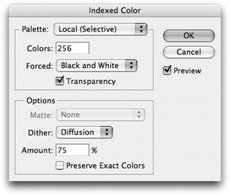
Figure 4.3. Use the Palette option to select the kinds of colors that remain in the image. Use the Colors option to specify how many colors remain.
Warning
Don't expect to be able to edit your image after indexing it. Most of Photoshop's functions — including the Gradient tool, all the edit tools, and the filters — will refuse to work. Others, such as Feathering and the Brush tool, produce undesirable effects. If you plan on editing an 8-bit image much in Photoshop, convert it to the RGB mode, edit it as desired, and then switch back to the Indexed Color mode when you finish.
Now that you have all the warnings and special advice, the following list provides a brief rundown of the options inside the Indexed Color dialog box, along with some recommended settings for Web graphics:
Palette: This pop-up menu tells Photoshop how to compute the colors in the look-up table. You have lots of options here, but only a handful are really useful. If your image already contains fewer than 256 colors, the Exact option appears by default, in which case you should just press Enter or Return and let the command do its stuff. The Web option converts your image to the 216 so-called "Web-safe" colors. The Adaptive option selects the most frequently used colors in your image, which typically delivers the best possible results. The Perceptual and Selective options are variations on Adaptive. But where Adaptive maintains the most popular colors, Perceptual is more intelligent, sampling the colors that produce the best transitions. The Selective option tries to maintain key colors, including those in the Web-safe palette. The Adaptive, Perceptual, and Selective options each come in two flavors: Local and Master. Choose Local if you want Photoshop to consider the colors in only the current image. If you have several images open and want to create a palette based on all the images, choose Master.
Tip
Select Perceptual for images in which smooth transitions are more important than color values. Use Selective when an image contains bright colors or sharp, graphic transitions. And if an image contains relatively few colors and you want to maintain those colors as exactly as possible, go for Adaptive.
Colors: You can specify the number of colors in the palette by typing a number in this option box. As you can guess, fewer colors result in smaller files. For GIF images, you might start with 64 colors. If the image looks okay, try going even lower.
Forced: This option enables you to lock in important colors so that they don't change. Black and White locks in black and white. Primaries protects 8 colors — white, red, green, blue, cyan, magenta, yellow, and black. And Web protects the 216 colors in the Web-safe palette. If you choose Custom, you can select the colors that you want to lock in.
Transparency: If an image is set on a layer against a transparent background, selecting this option maintains that transparency. Bear in mind, however, that transparency in a GIF file is either on or off; there are no soft transitions as in a Photoshop layer.
Matte: The Matte option works in collaboration with the Transparency option. (If an image has no transparency — that is, all layers cover one another to create a seamless opacity — the Matte option is dimmed.) When you select Transparency, the specified Matte color fills the translucent pixels in the image. When Transparency is deselected, the Matte color fills all translucent and transparent areas.
Dither: This option controls how Photoshop mimics the colors that you asked it to remove from an image. The None setting maps each color in the image to its closest equivalent in the look-up table, pixel for pixel. This results in the harshest color transitions, but it is frequently the preferable option. Diffusion dithers colors randomly to create a naturalistic effect. Pattern dithers colors in a geometric pattern, which is altogether ugly. Noise mixes pixels throughout the image, not merely in areas of transition.
Amount: When you choose Diffusion as the dithering mode, you can modify the amount of dithering by raising or lowering this value. Lower values produce harsher color transitions but decrease the file size. It's a trade-off. Keep an eye on the image window to see how low you can go.
Preserve Exact Colors: This option is available only when the Diffusion option is selected from the Dither pop-up menu. When selected, this option turns off dithering inside areas of flat color that exactly match a color in the active palette. As mentioned before, you may often get better-looking images if you apply no dithering. But if you decide to dither, select the Preserve Exact Colors option. Even if you can't see a difference on your screen, it may show up on another screen.
Grayscale is pretty neat because it frees you from all the problems and potential expense of working with color and provides access to every bit of Photoshop's power and functionality. Anyone who says you can't do as much with grayscale as you can with color probably likes what Ted Turner did to great old movies like It's a Wonderful Life. Let's not even talk about that; it's too depressing. Anyway, you can print grayscale images to any laser printer, reproduce them in any publication, and edit them on nearly any machine. In addition to being universally printable and displayable, they look great, they remind you of classic movies (before Ted got his hands on 'em), and they make a humongous book, such as this one, affordable. What could be better?
Beyond discussing how neat grayscale is, however, there isn't a whole lot to say about it. You can convert an image to the grayscale mode regardless of its current mode, and you can convert from grayscale to any other mode just as easily. In fact, choosing Image
When you convert an image from one of the color modes to the grayscale mode, Photoshop normally weights the values of each color channel in a way that retains the apparent brightness of the overall image. For example, when you convert an image from RGB, Photoshop weights red more heavily than blue when computing dark values. This is because red is a darker-looking color than blue (much as that may seem contrary to popular belief).
Tip
If you choose Image
So before switching to the grayscale mode, be sure to look at the individual color channels — particularly the red and green channels (the blue channel frequently contains substandard detail) — to see how each channel might look on its own. To browse the channels, use the following shortcuts (on the Mac, substitute
The potential number of colors that an image can contain depends on the image's bit depth. A pixel 2 bits long can be one of four colors, and each additional bit doubles the number of colors available to the pixel. A typical RGB image contains 8 bits per channel, or a total of 24 bits (3 channels × 8 bits = 24 bits), which translates to 224 = 16.8 million colors. You can increase the bit depth of an image by choosing Image
Note
When your images are in 32 Bits/Channel mode, they're considered HDR — High Dynamic Range — images, which are typically used in 3D rendering and advanced special effects software for animation. Photoshop's support for these images has increased with recent versions of the software, and you can choose View
Tip
Want to make your image a 32 Bits/Channel image? The command is dimmed until you raise your RGB image to 16 bits/channel. After you increase the bits per channel in the image to 16, you can increase it again to 32 and take advantage of HDR viewing options.
When you consider that even the largest images don't contain more than a couple million pixels, and each pixel can display only one color, 281.5 trillion colors may seem like overkill. In most cases it probably is, but 16-bit mode, and certainly 32-bit mode, does offer one big advantage: You can apply multiple color adjustments without noticeably damaging your image. And now that most of Photoshop's features are applicable to images in 16-bit mode (fewer are applicable in 32-bit mode) — prior to version CS, many commonly used features, such as layers, text, and paint tools, were unavailable — it's more practical for everyday image editing.
But Photoshop's 16-bit and 32-bit modes have their drawbacks. Most significantly, when you double the bit depth of an image, you double the size of the file in memory, which can make for some very large and unwieldy files. You have a limited choice of file formats, including TIFF and PSD, but not JPEG, and most of the commands on the Filter menu are unavailable to images in 16-bit or 32-bit mode. Also note that the 16 Bits/Channel command is applicable to RGB, CMYK, Lab, and grayscale images but not indexed or black-and-white files, and only RGB images can be set to 32-bits/channel.
Choose Image
When you choose Image
Output: Specify the resolution of the black-and-white file. If you want control over every single pixel available to your printer, raise this value to match your printer's resolution. As a general rule, try setting the Output value somewhere between 200 to 250 percent of the Input value.
50% Threshold: Select this option from the Use pop-up menu to change every pixel that is darker than 50 percent gray to black and every pixel that is 50 percent gray or lighter to white. Unless you are working toward some special effect — for example, overlaying a black-and-white version of an image over the original grayscale image — this option most likely isn't for you. (And if you're working toward a special effect, Image
Pattern Dither: To dither pixels is to mix them up to emulate different colors. In this case, Photoshop mixes up black and white pixels to produce shades of gray. The Pattern Dither option (in the Use pop-up menu) dithers an image using a geometric pattern. Unfortunately, the results are pretty ugly, as demonstrated in the left example in Figure 4.5. And the space between dots has a tendency to fill in, especially when you output to a laser printer.
Diffusion Dither: Select this option from the Use pop-up menu to create a mezzotint-like effect, as demonstrated in the right example in Figure 4.5. Again, because this option converts an image into thousands of stray pixels, you can expect your image to darken dramatically when it is output to a low-resolution laser printer and reproduced. So be sure to lighten the image with something like the Levels command (as described in Chapter 17) before selecting this option.
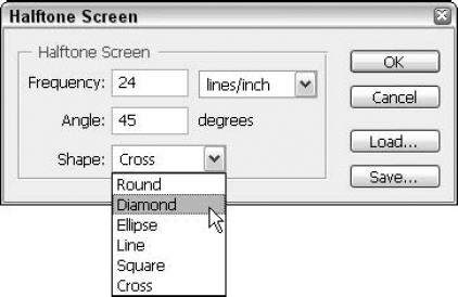
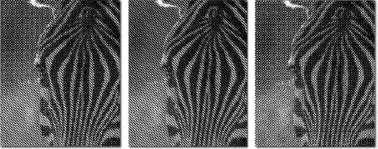
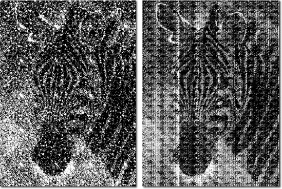
Halftone Screen: When you select this option from the Use pop-up menu and press Enter or Return, Photoshop displays the dialog box shown in Figure 4.6. These options enable you to apply a dot pattern to the image, as demonstrated in Figure 4.7. Type the number of dots per inch in the Frequency option box and the angle of the dots in the Angle option box. Then select a dot shape from the Shape pop-up menu. Figure 4.7 shows examples of three dot patterns applied to a photo of a zebra, each with a frequency of 24 lines per inch.
Note
You can learn all about screen patterns and frequency settings in Chapter 20.
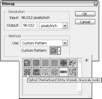
Custom Pattern: To use a custom dither pattern, select this option from the Use pop-up menu and open the Custom Pattern palette, as shown in Figure 4.8. The palette includes a number of predefined patterns that ship with Photoshop as well as any custom preset patterns that you may have defined using Edit
Tip
To access additional preset patterns, choose Load Patterns from the palette menu (click the right-pointing triangle in the upper-right corner of the palette to display the menu). You can find the patterns in the Patterns folder, which lives inside the Presets folder. To delete a pattern from the palette, click its icon and choose Delete Pattern from the palette menu.
Note
For a complete guide to creating and defining patterns in Photoshop, see Chapter 6.
Warning
Photoshop lets you edit individual pixels in the so-called bitmap mode, but that's about the extent of it. After you go to black-and-white, you can neither perform any serious editing nor expect to return to the grayscale mode and restore your original pixels. So be sure to finish your image editing before choosing Image
In addition to the Color Picker dialog box, Photoshop provides a handful of additional techniques for selecting colors. The next several sections explain how to use the Color Libraries dialog box, the Color palette, and the Eyedropper tool. When you've finished reading it, words like Pantone and sampling will become allegedly valuable additions to your vocabulary, and you can use them to dazzle your friends — at least the ones who don't know anything about Photoshop or commercial printing.
If you click the Color Libraries button in the Color Picker dialog box, Photoshop displays the Color Libraries dialog box shown in Figure 4.9. In this dialog box, you can select from a variety of predefined colors by choosing the color family from the Book pop-up menu, moving the slider triangles up and down the color slider to specify a general range of colors, and ultimately, selecting a color from the color list on the left. If you own the swatchbook for a color family, you can locate a specific color by typing its number on the keyboard.
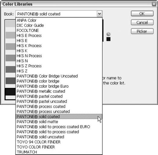
Figure 4.9. The Color Libraries dialog box enables you to select predefined colors from brand-name libraries such as Pantone, Focoltone, and Trumatch.
The color families represented in the Book pop-up menu fall into seven brands: ANPA (now actually NAA, as explained shortly), DIC, Focoltone, HKS, Pantone, Toyo, and Trumatch. At the risk of offending a few of these companies, you're likely to find certain brands more useful than others. The following sections briefly introduce the brands in order of their impact, from smallest to greatest, on the American market — with apologies to readers in other parts of the world, of course.
Tip
The most popular use for predefined colors in Photoshop is in the creation of duotones, tritones, and quadtones (described in Chapter 18). You also can use predefined colors to match the colors in a logo or some other important element in an image to a commercial standard. And you can add an independent channel for a predefined color and print it to a separate plate, as discussed later in this chapter.
Focoltone, Dianippon Ink and Chemical (DIC), Toyo, and HKS have a very small impact on the market and are foreign color standards with followings abroad. Focoltone is a British company, and DIC and Toyo are popular in the Japanese market, but have very few subscribers outside Japan. HKS formerly was provided only in the German and French versions of Photoshop, but enough people asked for it to be included in other languages that it now is available in all versions of the program.
American Newspaper Publishers Association (ANPA) is now part of NAA, which stands for Newspaper Association of America, and has updated its color catalog. NAA provides a small sampling of 45 process colors (mixes of cyan, magenta, yellow, and black ink) plus five spot colors (colors produced by printing a single ink). The idea behind the NAA colors is to isolate the color combinations that reproduce most successfully on inexpensive newsprint and to provide advertisers with a solid range of colors from which to choose, without allowing the color choices to get out of hand.
Designed entirely using a desktop system and created especially with desktop publishers in mind, the Trumatch Colorfinder swatchbook features more than 2,000 process colors, organized according to hue, saturation, and brightness. Each hue is broken down into 40 tints and shades. Reducing the saturation in 15 percent increments creates tints; adding black ink in 6 percent increments creates shades. The result is a guide that shows you exactly which colors you can attain using a desktop system. If you're wondering what a CMYK blend will look like when printed, you need look no further than the Trumatch Colorfinder.
As if the Colorfinder weren't enough, Trumatch provides the ColorPrinter Software utility, which automatically prints the entire 2,000-color library to any PostScript-compatible output device. The utility integrates EfiColor and PostScript Level 2, thereby enabling design firms and commercial printers to test the entire range of capabilities available to their hardware. Companies can provide select clients with swatches of colors created on their own printers, guaranteeing that what you see is darn well what you'll get.
On the heels of Trumatch, Pantone released a 3,006-color Process Color System Guide (labeled Pantone Process in the Book pop-up menu) priced at around $85. Pantone also produces the foremost spot-color swatchbook, the Color Formula Guide. Then there's the Solid to Process Guide, which enables you to figure out quickly if you can closely match a Pantone spot color using a process-color blend or if you ought to give it up and stick with the spot color.
Pantone spot colors are ideal for creating duotones and adding custom colors to an image for logos and the like, both discussed in Chapter 18. Furthermore, Pantone is supported by every computer application that aspires to the color prepress market. As long as the company retains the old competitive spirit, you can, most likely, expect Pantone to remain the primary color-printing standard for years to come.
Another means of selecting colors in Photoshop is to use the Color palette, shown in Figure 4.10. The Color palette is convenient, it's always there, and it doesn't take up lots of your screen like the Color Picker dialog box does.
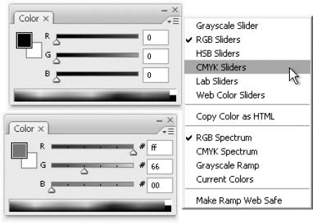
Figure 4.10. The Color palette as it appears normally (top) and with the Web Color Sliders option selected (bottom)
The Color palette is a default palette in the default workspace, found in a group with the Swatches and Styles palettes. If it's not showing, however, you can display it by choosing Window
Foreground color or background color: Click the foreground or background color icon in the Color palette to specify the color you want to edit. If you click the foreground or background color icon when it's already highlighted — as indicated by a double-line frame — Photoshop displays the Color Picker dialog box.
Sliders: Click and drag the triangles in the slider controls to edit the highlighted color. By default, the sliders represent the red, green, and blue primary colors when a color image is open. You can change the slider bars by choosing a different color model from the palette menu.
Option boxes: Alternatively, you can type numerical values in the option boxes to the right of the sliders. Press Tab to advance from one option box to the next; press Shift+Tab to go to the previous option.
Alert triangle and cube: Photoshop displays the alert triangle when a color falls outside the CMYK color gamut. The color swatch to the right of the triangle shows the closest CMYK equivalent. Click the triangle or the color swatch to replace the current color with the CMYK equivalent.
If you select the Web Color Sliders option from the palette menu, the alert cube appears to indicate colors that aren't included in the Web-safe palette. The palette also displays the hexadecimal values for the color, as shown in Figure 4.10. And as you drag the sliders, they automatically snap to Web-safe hues. To limit the palette so that it displays only Web-safe colors, choose Make Ramp Web Safe from the palette menu.
Tip
If you're writing your own HTML code to set up a Web page, you can use the Color palette to help you grab the hexadecimal number for any color you're using on the page. After you define a Web color, choose Copy Color as HTML from the palette menu to save the hexadecimal code for the color to the Clipboard. You can then paste the code into an HTML file by choosing Edit
Color bar: The bar along the bottom of the Color palette displays all colors in the CMYK spectrum. Click or drag inside the color bar (your mouse pointer turns to an eyedropper when you're pointing in or on the bar) to make the color you choose the current foreground or background color. Which color it becomes depends on whether the foreground or background icon is selected. The sliders update as you drag. Alt-click (Option-click on the Mac) or drag to lift the background color if the foreground icon is selected or the foreground color if the background color is selected.
You needn't accept the CMYK spectrum in the color bar, however. To change to a different spectrum, just choose the spectrum from the palette menu. Or Shift-click the color bar to cycle through the available spectrums. You can opt for the RGB spectrum, a black-to-white gradation (Grayscale Ramp), or a gradation from the current foreground color to the current background color (Current Colors). The color bar continuously updates to represent the newest foreground and background colors.
Notice the black and white squares at the right end of the color bar? You can click them to set a color to absolute black or white. But if all you want to do is set the foreground color to black, don't bother with the Color palette — just press D. For white, press D and then X. The first shortcut restores the foreground and background colors to black and white, respectively; pressing X swaps the colors to make white the foreground color and black the background color.
Another of the default workspace palettes, the Swatches palette should be hanging out in a group with Color and Styles. If you're in a custom workspace or have turned this palette off, however, you can bring it back by choosing Window
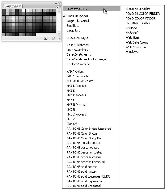
Here's how to take advantage of the Swatches palette:
Click a color swatch to make that color the foreground color. Ctrl-click (
To add the current foreground color to the reservoir, Shift-click an existing color swatch to replace the old color or click an empty swatch to append the new color. In either case, your cursor temporarily changes to a Paint Bucket. After you click, you're asked to give the swatch a name. Type the name, and click OK. If you later want to change the name, just double-click the swatch to redisplay the name dialog box.
Tip
You can bypass the dialog box and add an unnamed color to the palette by Alt-clicking (Option-clicking on the Mac) an empty space in the palette.
To delete a color from the palette, Alt-click (Option-click on the Mac) a color swatch. Your cursor changes to a pair of scissors and cuts the color away.
The Swatches palette includes a New icon (it's the one that looks like a page) and a Trash icon, similar to those you find in the Layers palette. The icons provide alternative methods of adding and deleting colors: Click the New icon to add a new swatch in the current foreground color; Alt-click (Option-click on the Mac) to display the Name dialog box and then add the color. Drag a swatch to the Trash icon to delete it from the palette.
You also can save and load color palettes on disk using options in the palette menu. Load Swatches appends swatches stored in a swatches file to the current set of swatches; Replace Swatches replaces the current swatches with the ones in the file. Save Swatches lets you create a new swatch collection and save it to disk.
The Presets folder, located inside the main Photoshop folder, contains folders for all available preset items: Tool presets (see Chapter 2) and color swatches are only two of them. The Photoshop Only folder, found inside the Color Swatches folder of the Presets folder, contains palettes for the major color libraries from Pantone, Trumatch, and others. You can load these palettes by simply selecting them from the palette pop-up menu. You're then given the choice of appending the swatches to the existing swatches or replacing the current swatches altogether. Custom swatch sets that you create also appear on the palette menu, but only after you close and restart Photoshop.
Tip
When a color library palette is loaded, positioning your cursor over a color swatch displays a tool tip showing the name of that color. If you prefer to select colors by using the color names, select Small List from the palette menu. Now you see a scrolling list of colors instead of just the swatches.
You also can create and manage swatch collections using the Preset Manager dialog box. Choose Preset Manager from the Swatches palette menu, choose Edit
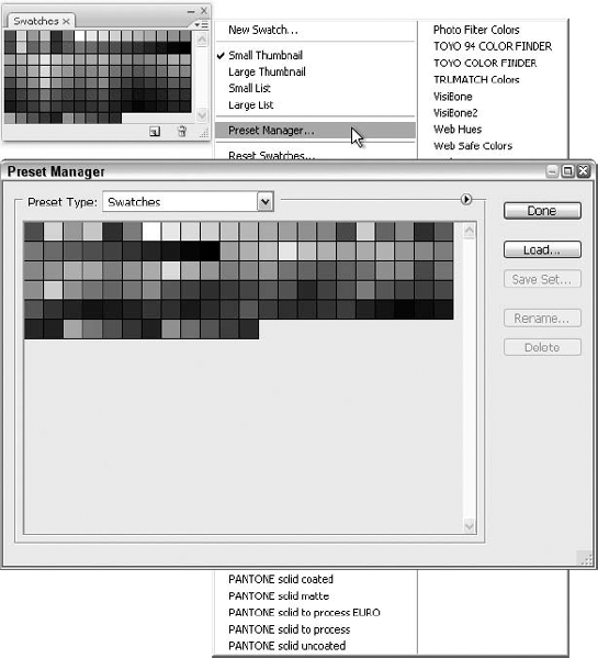
Figure 4.12. To easily create a new swatch collection using just some colors from an existing collection, head for the Preset Manager.
Many functions in the Swatches panel of the Preset Manager duplicate those offered by the Swatches palette. If you click the arrow to the upper left of the Done button (refer to F 4.12), a pop-up menu appears that's nearly identical to the Swatches palette menu. You can choose the Replace Swatches command on the pop-up menu to replace the current swatch collection with another or choose Reset Swatches to return to the default swatch collection. To append a collection, click Load. Alternatively, click a collection name in the pop-up menu, in which case you have the choice of appending or replacing the current collection with the new one. To create a new swatch collection comprised of colors from an existing set, Shift-click the swatches you want to include, click Save Set, and then name the collection and store it in the Color Swatches folder.
Note
For complete details on using the Preset Manager, see Chapter 2.
The Eyedropper tool — which you can select by pressing I at any time or by pressing the Alt (Option) key while you're using a painting tool — provides the most convenient and straightforward means of selecting colors in Photoshop. The process is so straightforward, in fact, that you may be surprised that there is so much to say about it — but there is, so please read on:
Selecting a foreground color: To select a new foreground color, click the desired color inside any open image window with the Eyedropper tool. (This assumes the foreground icon in the Color palette is selected, which it is by default, unless you've tinkered with the palette. If the background icon is selected, Alt-click or Option-click with the Eyedropper tool to lift the foreground color.) You can even click inside the image window of an open, yet inactive image to lift a color without bringing that window to the foreground.
Tip
To select a color on your computer screen that isn't contained in one of Photoshop's image windows, click inside an image window with the Eyedropper, and then drag the tool outside the window. This means that you can select a color found on the Photoshop workspace (in any open image window, or in various palettes), or on your desktop, should the Photoshop window not be obscuring the desktop beneath it. As you drag the Eyedropper, you'll see it pick up all the colors you pass — to select one of the colors as you drag over it, just release the mouse and see that color appear in the Foreground Color block (or the Background Color block, if that's what you have selected in the Color palette).
Selecting a background color: To select a new background color, Alt-click (Option-click on the Mac) the desired color with the Eyedropper tool. (Again, this assumes that the foreground icon is selected in the Color palette. If the background icon is selected, click with the Eyedropper to lift the background color.)
Skating over the color spectrum: You can animate the foreground color icon by clicking and dragging with the Eyedropper tool. As soon as you achieve the desired color, release the mouse button. To animate the background color icon, Alt-drag (Option-drag on the Mac) with the Eyedropper tool. The icon color changes as you move the Eyedropper tool. Again, swap these procedures if the background color icon is selected in the Color palette.
Sampling multiple pixels: Normally, the Eyedropper tool selects the color from the single pixel you click, because it's set to Point Sample by default. If you prefer to average the colors of several neighboring pixels, however, select any of the other choices from the Sample Size drop list on the options bar. You can pick 3 by 3, 5 by 5, 11 by 11, 31 by 31, 51 by 51 or 101 by 101 Average, or right-click (Control-click on the Mac) with the Eyedropper to display a pop-up menu of sampling options near the cursor. In this case, you get one additional option, Copy Color as HTML, which works just as it does when you select it from the Color palette pop-up menu. Photoshop determines the hexadecimal code for the color and sends the code to the Clipboard so that you can use Edit
Obviously, the larger the Sample Size that you choose, the wider the variety of pixels that is considered part of the sample. Unless that entire field of pixels, say in an 11 by 11 sample, is made up of identically colored pixels, the Eyedropper is going to give you a color that's a combination of the colors found within that sample area — thus the term "Average," for the sample size you chose.
Tip
To access the Eyedropper tool temporarily (and set a new Foreground color) when using the Paint Bucket, Gradient, Line, Pencil, or Brush tool, press and hold Alt (Option on the Mac). The Eyedropper cursor remains in force for as long as Alt or Option is pressed, and then when you release the key, you return to the tool that you were using before activating the Eyedropper. To set the Background color, switch to the Eyedropper tool by pressing I and then Alt-click (Option-click on the Mac) in an image window.
Found in the same Toolbox flyout as the Eyedropper, the Color Sampler tool looks like the Eyedropper with a little cross-hair target. Unlike the Eyedropper, however, which lifts foreground and background colors, the Color Sampler merely measures the colors of pixels so that you can monitor how the pixels react to various color changes.
To use the tool, select the Color Sampler and click somewhere inside the image window. By default, the tool is set to Point Sample (see the Options bar's Sample Size), and Photoshop adds a cross-hair target to indicate the point you clicked. You also can switch to the same 3 by 3, 5 by 5, 11 by 11, 31 by 31, 51 by 51, or 101 by 101 Average options found in the Eyedropper's Options bar, enabling you to sample groups of pixels instead.
When you begin using the Color Sampler, Photoshop opens the Info palette (or brings it to the top of its palette group it is grouped by default with the Navigator and Histogram palettes — if it was already open) and adds a new color measurement item labeled #1. This item corresponds to the target in the image, which is also labeled #1. Click again, and you add a second target and a corresponding item #2 in the Info palette. You can add up to four targets to an image, as demonstrated in Figure 4.13, which also shows the Info palette and four targets' worth of information.
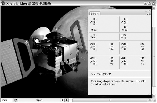
Figure 4.13. The Color Sampler tool lets you click on and measure the colors of four points in your image. You can also measure a fifth point by merely moving the cursor around, without clicking.
Note
The Color Sampler is intended primarily for printers and technicians who want to monitor the effects of color corrections on specific points in an image. If you apply Image
Here are a few more techniques of interest when color sampling:
Photoshop limits you to four color targets. If you try to create a fifth one, the program generates an error message. If you want to measure a different point in the image, you can either position your cursor over the point and note the top set of color values in the Info palette (as in Figure 4.13), or you can move one of the existing targets to the spot you now want to sample.
To move a target inside the image window, click and drag it with the Color Sampler tool. You also can move a target by pressing Ctrl (Win) or
To delete a target, Alt-click (Win) or Option-click (Mac) it. To delete all targets, click the Clear button in the Options bar.
The Info palette grows to more than twice its normal size when you start clicking with the Color Sampler. To hide the sampler information without deleting targets, click the Info palette's collapse box or choose Color Samplers from the palette menu. If you go the second route, you have to choose Color Samplers again to bring the samples back.
By default, the sampler items in the Info palette measure colors in the active color space. If you want to track a target in a different color space, click the item's Eyedropper icon in the Info palette or right-click (Control-click on the Mac) the target in the image window. Either way, you get a pop-up menu of color-space alternatives, including Grayscale, RGB, and several others that you may recall from previous explanations in this chapter.
Tip
To select the Color Sampler, press I when the Eyedropper is active or Alt-click (Option-click on the Mac) the Eyedropper icon. Or press I repeatedly to cycle between the Eyedropper, Color Sampler, and Measure tool (add Shift if you selected the Use Shift Key for Tool Switch option in the Preferences dialog box). You can temporarily access the Color Sampler anytime the Eyedropper is active by pressing Shift. You also can use this convenient trigger when a color correction dialog box such as Levels or Curves is open, as explained in Chapter 17.
It may surprise you, especially in a chapter devoted to color, to read that Photoshop approaches a full-color image not as a single collection of 24-bit pixels but as three or four bands of 8-bit (grayscale) pixels. This is because Photoshop is really a grayscale editor, even though it offers tools for applying, tweaking, printing, and displaying color. How does this work in a color image? An RGB file contains a band of red, a band of green, and a band of blue, each of which functions as a separate grayscale image. A Lab image likewise contains three bands, one corresponding to luminosity and the others to the variables a and b. A CMYK file contains four bands, one for each of the process-color inks. These bands are known as channels.
Channels frequently correspond to the structure of an input or output device. Each channel in a CMYK image, for example, corresponds to a different printer's plate when the document goes to press. The cyan plate is inked with cyan, the magenta plate is inked with magenta, and so on. Each channel in an RGB image corresponds to a pass of the red, green, or blue scanner sensor over the original photograph or artwork. Only the Lab mode is device independent, so its channels don't correspond to any piece of hardware.
You're not alone in thinking that channels are something you don't really need to think about. Like many people, you use Photoshop to edit the way a photo looks and prints, and isolating one of the aforementioned channels is something you've never had to do in the past (assuming you've used Photoshop before, even momentarily), and your photos look just fine, thank you.
But what would you do if your client is self-publishing a book about bird-watching and wants you to use what turn out to be some really below-average photos? Given that many bird sightings are fleeting, irreproducible events, you can't say, "Man, these are awful. Can you go out again and get a new shot of this yellow-bellied sapsucker?" No, you have to go with what he's given you, and that's it. So you're faced with tinkering endlessly with Photoshop's commands found in the Image
So now that we've sold you on the value of channels, how do you use them? First, let's do some math, which will show you how this all works:
For a typical full-color image, Photoshop devotes 8 bits of data to each pixel in each channel, thus permitting 256 brightness values, from 0 (black) to 255 (white). Therefore, each channel is actually an independent grayscale image. At first, this may throw you off. If an RGB image is made up of Red, Green, and Blue channels, why do all the channels look gray?
Photoshop provides an option in the Display & Cursors panel of the Preferences dialog box (that's Ctrl+K and then Ctrl+2 on the PC or
When you view an 8-bit image composed exclusively of shades of red, for example, it's easy to miss subtle variations in detail that may appear obvious when you print the image. You may have problems accurately gauging the effect of filters and tonal adjustments. So leave the Show Channels in Color option deselected (it's off by default for good reason) and temporarily suspend your understandable desire for onscreen color. With a little experience, you can better monitor your adjustments and predict the outcome of your edits in plain old grayscale.
Note
You can add channels above and beyond those required to represent a color or grayscale image for the purpose of storing masks, as described in Chapter 9. But even then, each channel is typically limited to 8 bits of data per pixel — meaning that it's just another grayscale image. Mask channels do not affect the appearance of an image onscreen or when it is printed. Rather, they serve to save selection outlines, as Chapter 9 explains.
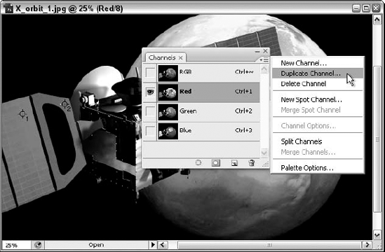
The Channels palette is part of the default workspace, docked in a group with the Layers and Paths palettes, so it may well be on the screen right now. If it's not, though, you can redisplay it by choosing Window
To switch to a different channel, click a channel name in the Channels palette. The channel name becomes selected — like the Blue channel in Figure 4.14 — showing that you can now edit it independently of other channels in the image.
Tip
To edit more than one channel at a time, click one channel name, and then Shift-click another. You also can Shift-click an active channel to deactivate it independently of any others.
When you select a single channel, Photoshop displays that one channel's content in the active image window. However, you can view additional channels beyond those that you want to edit. To specify which channels appear and which remain invisible, click in the boxes in the far-left column of the Channels palette. Click the Visibility icon (an eye, as appears in the Layers palette, also used there to hide and display) to make the eye disappear and therefore hide that channel. Click where there is no eye and an eye appears, thus displaying the channel.
When only one channel is visible, that channel appears as a grayscale picture in the image window (possibly colorized in accordance with the Color Channels in Color option in the Preferences dialog box, should you have ignored the advice to leave this option in its default off state). However, when more than one channel is visible, you always see color. If both the Blue and Green channels are visible, for example, the image appears blue-green. If the Red and Green channels are visible, the image has a yellow cast, and so on.
In addition to the individual channels, Photoshop provides access to a composite view that displays all colors in an RGB, a CMYK, or a Lab image at once. (The composite view does not show mask channels; you have to specify their display separately.) The composite view is listed first in the Channels palette and is displayed by default. Notice that when you select the composite view, the names of all individual color channels in the Channels palette become highlighted along with the composite channel. This shows that all the channels are active. The composite view is the default in which you will perform the majority of your image editing.
Press Ctrl (
Note
You do not need to press Shift to execute a keyboard shortcut that includes the tilde character or any other Shift value character.
The shortcuts are slightly different when you're working on a grayscale image. You access the image itself by pressing Ctrl+1 (
Tip
When editing a single channel, you may find it helpful to monitor the results in both grayscale and full-color views. Choose Window
Of course, if you're like most people, you need to see or use something to understand it. Luckily, channels are something you can both see and use, and the following sections show you exactly how to use channels for each of the major image color modes and how to control what's seen in the Channels palette.
Suppose that the Alaskan seal is an RGB image. Figure 4.15 compares a grayscale composite of this same image (created by choosing Image
As you look at Figure 4.15, you probably notice that each of the channel versions of the image has its own unique and interesting qualities. For example, the Red channel is darker overall, and the oily water looks more dense and, well, oily. You can feel the weight of the water and the ripples around the seal look less like clean, clear water. The Blue channel looks more washed out overall, and you focus more on the seal and the name of the ship in the background. Both versions of the image make a similar statement but in different ways. The Green channel, being closest to the grayscale composite of the image, doesn't say anything that the image as a whole doesn't say on its own.
The point? If you see that one of your channels, when viewed on its own, creates an interesting version that you might like to keep, remember that when converting a color image to grayscale, you have the option of retaining the image exactly as it appears in one of the channels. You also can calculate a grayscale composite by choosing Image
Warning
When the Warning dialog box appears, carefully consider the impact of selecting the Do Not Show Again option. It can be tempting to select this, especially if you think you don't want Photoshop to ask for permission to dump color information or channels when you convert to grayscale in the future — but turning this prompt off is risky. Without the warning, you may not realize that you have a single channel selected and end up tossing the other channels when all you meant to do was convert to grayscale. Of course, if you decide to ignore the warning here, and you later realize you should have listened, click Reset All Warning Dialogs on the General panel of the Preferences dialog box.
If only to show you the interesting single-channel versions of this photo in CMYK and Lab modes, Figures 4.16 and 4.17 (respectively) show the channels from the image after it was converted to these two color modes. In Figure 4.16, the image has been converted to the CMYK mode with each of the individual channels captured. Because this color mode relies on pigments rather than light, as explained in the section "CMYK," dark areas in the channels represent high color intensity.
The CMY channels have more contrast than their RGB pals, but the basic brightness distribution is the same. Here's another graphic demonstration of color theory. You would think that the CMY channels would be very similar to the RGB channels — one color model would simply be the other turned on its head, with cyan pairing up with blue, magenta with red, and yellow with green. But they don't — and as a result, Photoshop has to boost the contrast of the CMY channels and throw in black to punch up those shadows.
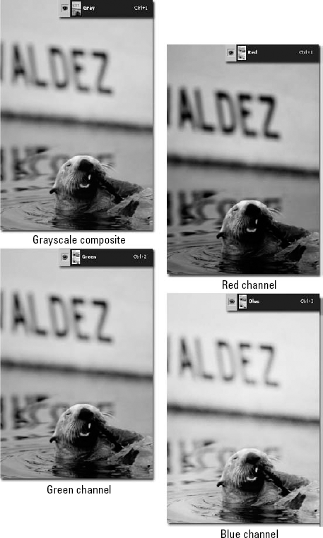
Figure 4.15. A grayscale composite of an image from the Exxon Valdez oil spill, with views of the same photo's Red, Green, and Blue color channels
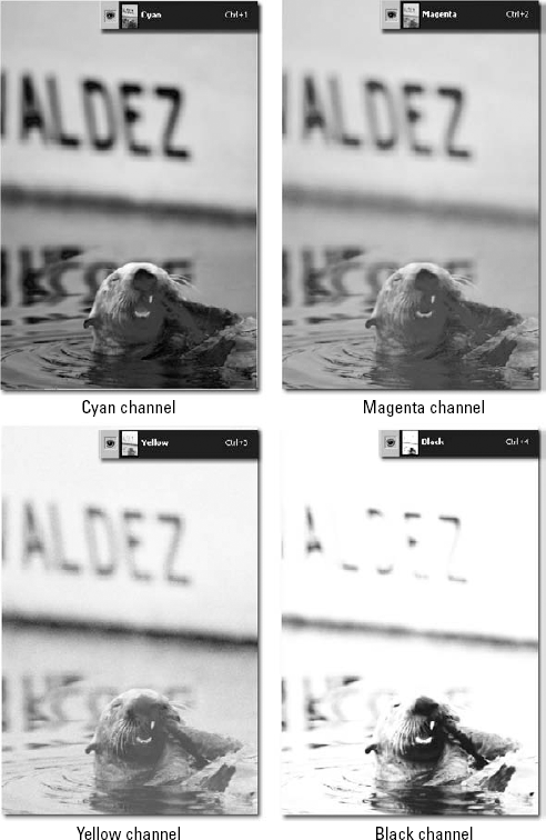
Figure 4.16. The contents of the cyan, magenta, yellow, and black channels from the image first seen in Figure 4.15
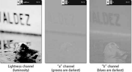
To create Figure 4.17, the original image was converted to the Lab mode. The image in the luminosity channel looks similar to the grayscale composite in Figure 4.15 because it contains the lightness and darkness values for the image. The a channel maps the greens and magentas, while the b channel maps the yellows and blues, so both channels are working hard to provide color information for this photograph. Certainly there are differences — the seal is much darker in the a channel, and there is a dark halo around the seal's head and the letters on the side of the ship in the b channel — but the two channels carry roughly equivalent amounts of color information.
In addition to viewing and editing channels using any of the techniques discussed in future chapters of this book, you can choose commands from the Channels palette menu and select icons along the bottom of the palette (refer to Figure 4.14). The following items explain how the commands and icons work:
Note
Channels are discussed in Chapters 9 and 14, so after have the basics under your belt with this chapter, you can flip ahead and check out these subsequent discussions.
Palette Options: Even though this is the last command in the menu, it's the easiest, so you can start with it. When you choose Palette Options, Photoshop displays four Thumbnail Size radio buttons, enabling you to change the size of the thumbnail previews that appear along the left side of the Channels palette. Why might you want to change the thumbnail size? Most likely so that you can see the image and see the differences between the individual channels' views from within the palette — large gives you the best view, and None, of course, gives you, well, None. The default is small, and for the terminally wishy-washy, there's medium.
Tip
Have you ever wondered what those thumbnail icons in the Palette Options dialog box are supposed to show? No? Well, shame on you for not being more inquisitive. Whether you want to know or not, you're gonna find out. They're silhouettes of tiny Merlins (wizards) on a painter's palette. Want proof? Switch to the Layers palette and choose Palette Options, and you see them in color. But how do I know they're specifically Merlins? Press Alt (Option on the Mac) when choosing Palette Options to see the magician up close. This is a real "Easter egg" here — going back to Photoshop 2.5.
New Channel: Choose this command to add a mask channel to the current image. The Channel Options dialog box appears, requesting that you name the channel. You also can specify the color and translucency that Photoshop applies to the channel when you view it with other channels. We explain how these options work in Chapter 9.
Tip
You also can create a new channel by clicking the Create New Channel icon at the bottom of the Channels palette (it's the one that looks like a little page with a dog-eared corner). Photoshop creates the channel without displaying the dialog box. To force the dialog box to appear, Alt-click (Option-click on the Mac) the page icon.
Note
How many channels can one image contain? The answer used to be 24, but as of the release of Photoshop CS, you can have up to 56 total channels, regardless of color mode — and of course in Photoshop CS3 you can still have all 56 of 'em.
Duplicate Channel: Choose this command to create a duplicate of the selected channel, either inside the same document or as part of a new document. (If the composite view is active, the Duplicate Channel command is dimmed because you can duplicate only one channel at a time.) The most common reason to use this command is to convert a channel into a mask. Again, you can find real-life applications in Chapter 9.
Tip
You also can duplicate a channel by dragging the channel name onto the new channel icon. No dialog box appears; Photoshop merely names the channel automatically. To copy a channel to a different document, drag the channel name and drop it into an open image window. Photoshop automatically creates a new channel for the duplicate.
Delete Channel: To delete a channel from an image, click the channel name in the palette and choose this command. You can delete only one channel at a time. The Delete Channel command is dimmed when any essential color channel is active or when more than one channel is selected.
Tip
If you're all tuckered out and choosing a command is too much effort, just drag the channel onto the delete channel icon (the little trash icon in the lower-right corner of the Channels palette). You also can click the trash icon, in which case Photoshop asks you if you really want to delete the channel — a nice little reminder and your last chance to rethink. Of course, if you are absolutely sure and don't want Photoshop questioning your intentions, you can bypass this warning by Alt-clicking (Option-clicking on the Mac) the trash icon.
New Spot Channel: Photoshop lets you add spot-color channels to an image. Each spot-color channel prints to a separate plate, just like spot colors in Illustrator or QuarkXPress. When you choose the New Spot Channel command, Photoshop asks you to specify a color and a Solidity, as shown in Figure 4.18. Click the color square to display the Color Picker and then as needed, click the Color Libraries button to bring up the Color Libraries dialog box, from which you can select a Pantone or other spot color. The Solidity option in the New Spot Channel dialog box lets you set the opacity of the ink, perfect for special effects inks like Day-Glo fluorescents and metallics.
Tip
To create a spot-color channel without choosing a command, Ctrl-click (
Merge Spot Channel: Select a spot-color channel, and choose this command to merge the spot color with the RGB, Lab, or CMYK colors in the image. Most spot colors don't have precise RGB or CMYK equivalents, so you lose some color fidelity in the merge. Adobe includes this command to enable you to proof an image to a typical midrange color printer.
Channel Options: Choose this command or double-click the channel name in the palette's scrolling list to change the settings assigned to a spot-color or mask channel. The Channel Options command is dimmed when a regular, everyday color channel is active.
Split Channels: When you choose this command, Photoshop splits off each channel in an image to its own independent grayscale image window with the channel color appended to the end of the window name. The Split Channels command is useful as a first step in redistributing channels in an image before choosing Merge Channels, which is demonstrated later in this chapter.
Merge Channels: Choose this command to merge several images into a single multichannel image. The images you want to merge must be open, grayscale, and absolutely equal in size — the same number of pixels horizontally and vertically — so be sure to verify these common attributes before proceeding. When you choose Merge Channels, Photoshop displays the Merge Channels dialog box, shown in Figure 4.19. It then assigns a color mode for the new image based on the number of open grayscale images that contain the same number of pixels as the foreground image.
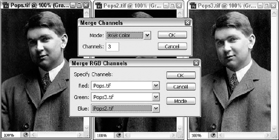
Figure 4.19. The two dialog boxes that appear after you choose Merge Channels enable you to select a color mode for the merged image (top) and associate images with color channels (bottom).
You can override Photoshop's choice by selecting a different option from the Mode pop-up menu. (Generally, you won't want to change the value in the Channels option box because doing so causes Photoshop to automatically select Multichannel from the Mode pop-up menu. You find out more about multichannel images in the section "Using multichannel techniques.")
After you press Enter or Return, Photoshop displays a second dialog box, which also appears in Figure 4.19. In this dialog box, you can specify which grayscale image goes with which channel by choosing options from pop-up menus. When working from an image split with the Split Channels command, Photoshop automatically organizes each window into a pop-up menu according to the color appended to the window's name.
Tip
If the thumbnails for the channels aren't big enough for you, choose Palette Options from the menu and choose a larger thumbnail size from the three choices offered. You also can choose None if you don't want any thumbnails at all.
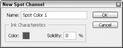
Now that you know how to navigate among channels and apply commands, it's time to talk about why you'd do these things. There are lots of reasons for tinkering with channels in an image, but one of the most pragmatic applications for channel effects involve the restoration of bad color scans. If you use a color scanner, you know what is meant by "bad color scans," of course. Everyone has ended up with scans that look like all the people in the photo were terminally embarrassed, nauseated, or under water. The excess red, green/yellow, or blue can be eliminated with some of the Image
The following are a few channel-editing techniques that you can use to improve the appearance of poorly scanned full-color images. Keep in mind that these techniques don't work miracles, but they can make a big difference.
Note
Don't forget that you can choose Window
Aligning channels: Every so often, a scan may appear out of focus even after you use Photoshop's sharpening commands to try to correct the problem, as discussed in Chapter 10. If, on closer inspection, you can see slight shadows or halos around colored areas, one of the color channels probably is out of alignment. To remedy the problem, switch to the color channel that corresponds to the color of the halos. Then select the move tool (by pressing V), and use the arrow keys to nudge the contents of the channel into alignment. Use the separate composite view (created by choosing Window
Channel focusing: If all channels seem to be in alignment (or, at least, as aligned as they're going to get), one of your channels may be poorly focused. View each individual channel (using the visibility icon on the Channels palette), and when you find out which one's the culprit, use the Unsharp Mask filter to sharpen it as desired. You also may find it helpful to blur a channel, to eliminate moiré patterns in a scanned halftone, for example. To find out more about these and other corrective filters, check out Chapter 10.
Bad channels: In your color channel tour, if you discover that a channel is not so much poorly focused as simply rotten to the core — complete with harsh transitions, jagged edges, and random brightness variations — you may be able to improve the appearance of the channel by mixing other channels with it.
For an example of how this might be done, imagine that in your image, the blue channel is awful, but the red and green channels are in fairly decent shape. The Channel Mixer command lets you mix channels together, whether to repair a bad channel or achieve an interesting effect. Choose Image
Note
You also can try the new Preset option, which appears at the top of the Channel Mixer dialog box. Select from some these combinations of black and white with a color filter — blue, green, orange, red, or yellow. Applied to a particular layer, this can be useful in improving an image if the offending content can be (or is) isolated on a single layer. After a preset is chosen, you can change its effects by dragging the Source Channels' sliders. If you like a particular setup — through the presets or with the Preset option set to None and you've simply dragged the Source Channel sliders to a desirable set of percentages — save those settings with the button to the right of the Preset drop-down list. Choose Save Preset, and then use the resulting dialog box to name the settings for future loading (see the Load Preset command available through the same button). Of course, choosing a name that describes the situation where the given preset would be most useful is a good idea.
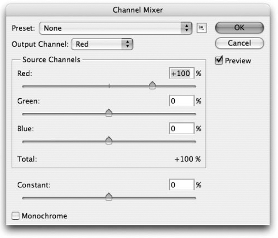
Note that Channel Mixer is also a great command for creating custom grayscale images. Rather than choosing Image
Incidentally, the Constant slider simply brightens or darkens the image across the board. Usually, you want to leave it set to 0, but if you're having problems getting the color balance right, give it a nudge with your mouse or the arrow keys.
If at any point you hate the effects you're seeing through the Preview, click Reset to go back to the way things were before you opened the dialog box in the first place.
The one channel function not looked at so far is Image
In terms of multichannel's use in converting between different color modes, when you normally convert between the RGB and CMYK modes, Photoshop maps RGB colors to the CMYK color model, changing the contents of each channel as demonstrated back in Figures 4.15 and 4.16. But suppose, just as an experiment, that you want to bypass the color mapping and instead transfer the exact contents of the red channel to the cyan channel, the contents of the green channel to the magenta channel, and so on. You convert from RGB to the multichannel mode and then from multichannel to CMYK as described in the following procedure.
STEPS: Using Multichannel mode as an intermediary step
Open an RGB image. If the image is already open, make sure that it is saved to disk.
Choose Image
Click the new channel icon at the bottom of the Channels palette. Or choose the New Channel command from the palette menu, and press Enter or Return to accept the default settings. Either way, you add a mask channel to the image. This empty channel serves as the black channel in the CMYK image. (Photoshop won't let you convert from the multichannel mode to CMYK with less than four channels.)
Press Ctrl+I (
Choose Image
Press Ctrl+Shift+L (
Convert the image to RGB and then back to CMYK. The problem with the image is that it lacks any information in the black channel. So although it may look okay onscreen, it will lose much of its definition when printed. To fill in the black channel, choose Image
Keep in mind that these steps are by no means a recommended procedure for converting an RGB image to a CMYK image. Rather, they merely suggest one way to experiment with channel conversions to create a halfway decent image. Likewise, you can experiment with converting between the Lab, multichannel, and RGB modes, or Lab, multichannel, and CMYK.
Tip
If you want to really manipulate the colors in an RGB or a CMYK image, there's nothing like replacing one color channel with another to produce spectacular (or at least quite interesting) effects — and the Channel Mixer is your manipulation tool of choice. You can try swapping the Red and Blue channels in an RGB image, setting red to 0 and blue to 100, then flip that around, setting red to 100 and blue to 0. You can mix and match your CMYK image channels, too, tinkering with the sliders until you get bored.
In this chapter, you learned about using the color controls in the Toolbox, selecting and defining colors in the Color Picker dialog box, and all about the RGB, HSB, CMYK, Lab color, and HDR modes. You learned how to convert images to 16 and 32 bits per channel and how to create grayscale and black-and-white images.
You learned to apply colors using the Color palette, Eyedropper, and color sampler, and you found out how color channels work. You also learned to use channel editing commands in the Channels palette and how to improve the appearance of poorly scanned images.