
3
Life Data Analysis and Probability Plotting
3.1 Introduction
It is frequently useful in reliability engineering to determine which distribution best fits a set of data and to derive estimates of the distribution parameters. The mathematical basis for the approaches to these problems was covered in Chapter 2.
3.1.1 General Approach to Life Data Analysis and Probability Plotting
The methods described in this chapter can be used to analyse any appropriate data, such as dimensional or parameter measurements. However, their use for analysing reliability time-to-failure (life data) will be emphasized.
General-purpose statistical software such as Minitab¯ includes capabilities for probability plotting. Since the Weibull distribution is the most commonly applied in reliability life data analysis, computer software packages have been developed specifically for this purpose, such as ReliaSoft Weibull++¯, SuperSMITH Weibull¯ and few others. This chapter makes use of ReliaSoft Weibull++ ¯ software to illustrate how to perform these tasks.
Note that probability plotting methods to derive time-to-failure distribution parameters are only applicable when the data are independently and identically distributed (IID). This is usually the case for non-repairable components and systems but may not be the case with failure data from repairable systems. The reason is that repaired systems can have secondary failures, which are dependent on the primary failures. Also due to successive repairs the population of repairable systems can experience more failures than the size of that population causing cdf > 1.0, which is mathematically impossible. Reliability modelling and data analysis for repairable systems will be covered later in Chapters 6 and 13.
3.1.2 Statistical Data Analysis Methods
The process of finding the best statistical distribution based on the observed failure data, can be graphically illustrated by Figure 3.1. Based on the available data comprising the shaded segment of the pdf the rest of f(t) can be ‘reconstructed’. The goal of this process is to find the best fitting statistical distribution and to derive estimates of that distribution's parameters and consequently the reliability function R(t). However in practical terms, this procedure is typically done based on constructing the cdf curve which has the best fit to the existing data.

Figure 3.1 Probability plotting alternatives in regards to the possible pdf of failure distribution.
The least mathematically intensive method for parameter estimation is the method of probability plotting. As the term implies, probability plotting in general involves a physical plot of the data on specially constructed probability plotting paper (different for each statistical distribution). The axes of probability plotting papers are transformed in such a way that the true cdf plots as a straight line. Therefore if the plotted data can be fitted by a straight line, the data fit the appropriate distribution (see Figure 3.2 fitting the normal probability plot). Further constructions permit the distribution parameters to be estimated. This method is easily implemented by hand, given that one can obtain the appropriate probability plotting paper. Probability plotting papers exist for all the major distribution including normal, lognormal, Weibull, exponential, extreme value, and so on and can be downloaded from the internet (see, e.g. ReliaSoft, 2011) However most of probability plotting these days is done with the use of computer software, which is covered later in this chapter.
The Weibull distribution (see Chapter 2) is a popular distribution for analysing life data, so the process is often referred to as Weibull analysis. The Weibull model can be applied based on 2-parameter, 3-parameter or mixed distributions. Other commonly used life distributions include the exponential, extreme value, lognormal and normal distributions. The analyst chooses the life distribution, that is most appropriate to model each particular data set based on goodness-of-fit tests, past experience and engineering judgement. The life data analysis process would require the following steps:
- Gather life data for the product.
- Select a lifetime distribution against which to test the data.
- Generate plots and results that estimate the life characteristics of the product, such as the reliability, failure rate, mean life, or any other appropriate metrics.
This chapter will discuss theoretical and practical aspects of performing probability plotting and life data analysis.
3.2 Life Data Classification
In reliability work, life data can be time, distance travelled, on/off switches, cycles, and so on to failure. The accuracy and credibility of any parameter estimations are highly dependent on the quality, accuracy and completeness of the supplied data. Good data, along with the appropriate model choice, usually results in good parameter estimations.

Figure 3.2 Normal probability plot.
In using life data analysis (as well as general statistics), one must be very cautious in qualifying the data. The first and foremost assumption that must be satisfied is that the collected data, or the sample, are truly representative of the population of interest. Most statistical analyses assume that the data are drawn at random from the population of interest. For example, if our job was to estimate the average life of humans, we would expect our sample to have the same make-up as the general population, that is equal numbers of men and women, a representative percentage of smokers and non-smokers, and so on. If we used a sample of ten male smokers to estimate life expectancy, the resulting analysis and prediction would most likely be biased and inaccurate. The assumption that our sample is truly representative of the population and that the test or use conditions are truly representative of the use conditions in the field must be satisfied in all analyses. Bad, or insufficient data, will almost always result in bad estimations, which has been summed up as ‘Garbage in, garbage out.’
3.2.1 Complete Data
Complete data means that the value of each sample unit is observed or known. For example, if we had to compute the average test score for a sample of ten students, complete data would consist of the known score for each student. Likewise in the case of life data analysis, our data set if complete would be composed of the times-to-failure of all units in our sample. For example, if we tested five units and they all failed and their times-to-failure were recorded (see Figure 3.3) we would then have complete information as to the time of each failure in the sample.
3.2.2 Censored Data
In many cases when life data are analysed, all of the units in the sample may not have failed (i.e. the event of interest was not observed) or the exact times-to-failure of all the units are not known. This type of data is commonly called censored data. There are three types of possible censoring schemes, right censored (also called suspended data), interval censored and left censored.
3.2.3 Right Censored (Suspended)
The most common case of censoring is what is referred to as right censored data, or suspended data. In the case of life data, these data sets are composed of units that did not fail. For example, if we tested five units and only three had failed by the end of the test, we would have suspended data (or right censored data) for the two non-failed units. The term ‘right censored’ implies that the event of interest (i.e. the time-to-failure) is to the right of our data point. In other words, if the units were to keep on operating, the failure would occur at some time after our data point (or to the right on the time scale), see Figure 3.4.
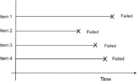
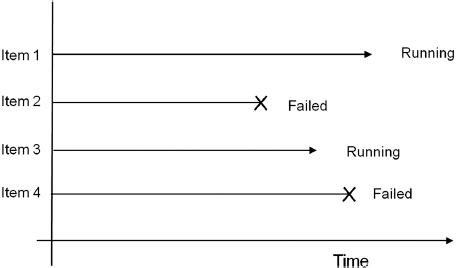
Figure 3.4 Right censored data.
3.2.4 Interval Censored
The second type of censoring is commonly called interval censored data. Interval censored data reflects uncertainty as to the exact times the units failed within an interval. This type of data frequently comes from tests or situations where the objects of interest are not constantly monitored. If we are running a test on five units and inspecting them every 100 hours, we only know that a unit failed or did not fail between inspections. More specifically, if we inspect a certain unit at 100 hours and find it is operating and then perform another inspection at 200 hours to find that the unit is no longer operating, we know that a failure occurred in the interval between 100 and 200 hours. In other words, the only information we have is that it failed in a certain interval of time (see Figure 3.5). This is also often referred to as inspection data.

Figure 3.5 Interval censored data.
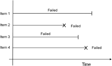
Figure 3.6 Left censored data.
3.2.5 Left Censored
The third type of censoring is similar to the interval censoring and is called left censored data. In left censored data, a failure time is only known to be before a certain time (see Figure 3.6) or to the left of our data point. For instance, we may conduct the first inspection at 100 hours and find that the part has already failed. In other words, it could have failed any time between 0 and 100 hours. This is identical to interval censored data in which the starting time for the interval is zero.
Complete data is much easier to work with than any type of censored data. While complete data sets and right censored data can often be analysed using graphical methods the left and interval censored data require more sophisticated approaches involving software tools. Some of these methods will be covered in this chapter.
3.3 Ranking of Data
Probability plotting (manual or computerized) is often based upon charting the variable of interest (time, miles, cycles, etc.) against the cumulative percentage probability. The data therefore need to be ordered and the cumulative probability of each data point calculated. This section will cover the methods used to rank various types of data and make them suitable for analysis and plotting.
3.3.1 Concept of Ranking
Data ranking provides an estimate of what percentage of population is represented by the particular test sample. Ranking presents an alternative to submitting data in frequency-histogram form due to the fact that in engineering applications often only small samples are available. For example, if we test five items and observe failures at 100, 200, 300, 400 and 500 hours respectively, then the rank of the first data point at 100 hours would be 20% (![]() ), the rank of the second 40% (
), the rank of the second 40% (![]() ), and so on, which is sometimes referred as naïve rank estimator. This, however, would statistically imply that 20% of the population would have shorter life than 100 hours. By the same token assuming that the fifth sample represents 100% of the population we concede to the assumption that all of the units in the field will fail within 500 hours. However, for probability plotting, it is better to make an adjustment to allow for the fact that each failure represents a point on a distribution. To overcome this, and thus to improve the accuracy of the estimation mean and median ranking were introduced for probability plotting.
), and so on, which is sometimes referred as naïve rank estimator. This, however, would statistically imply that 20% of the population would have shorter life than 100 hours. By the same token assuming that the fifth sample represents 100% of the population we concede to the assumption that all of the units in the field will fail within 500 hours. However, for probability plotting, it is better to make an adjustment to allow for the fact that each failure represents a point on a distribution. To overcome this, and thus to improve the accuracy of the estimation mean and median ranking were introduced for probability plotting.
3.3.2 Mean Rank
Mean ranks are based on the distribution-free model and are used mostly to plot symmetrical statistical distributions, such as the normal. The usual method for mean ranking is to use (N + 1) in the denominator, instead of N, when calculating the cumulative percentage position:
![]()
3.3.3 Median Rank
Median ranking is the method most frequently used in probability plotting, particularly if the data are known not to be normally distributed. Median rank can be defined as the cumulative percentage of the population represented by a particular data sample with 50% confidence. For example if the median rank of the second sample out of 5 is 31.47% (see Table 3.1), that means that those two samples represent 31.47% of the total population with 50% confidence. There are different techniques which can be employed to calculate the median rank. The most common methods include cumulative binomial and its algebraic approximation.
3.3.4 Cumulative Binomial Method for Median Ranks
According to the cumulative binomial method, median rank can be calculated by solving the cumulative binomial distribution for Z (rank for the jth failure) (Nelson 1982):

where N is the sample size and j is the order number.
The median rank would be obtained by solving the following equation for Z:

The same methodology can then be repeated by changing P from 0.50 (50% ) to our desired confidence level. For P = 95% one would formulate the equation as:

Table 3.1 Median rank for the sample size of 5.
As it will be shown in this chapter, the concept of ranking is widely utilised in both graphical plotting and computerized data analysis methods.
3.3.5 Algebraic Approximation of the Median Rank
The median ranks are well tabulated and published, also most statistical software packages have the option to calculate them (Minitab¯, SAS¯, etc.). For example, Weibull++ ¯ software has a ‘Quick Calculator Pad’ allowing the user to calculate any rank for any combination of sample size and number of failures. However when neither software nor tables are available or when the sample is beyond the range covered by the available tables the approximation formula (3.5), known as Benard's approximation, can be used. The jth rank value is approximated by:
![]()
Where: j = failure order number and N = sample size.
This approximation formula is widely utilized in manual probability plotting employing graphical methods with distribution papers, such as Weibull, Normal, Lognormal, Extreme Value and others.
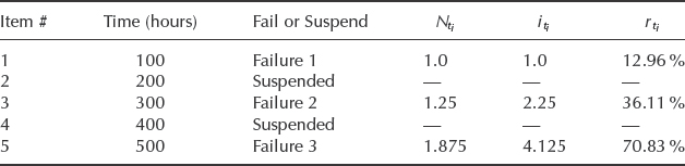
3.3.6 Ranking Censored Data
When dealing with censored data, the probability plotting procedure becomes more complicated. The concept of censored data analysis is easier to explain with right censored data. Suspended items are not plotted as data points on the graph, but their existence affects the ranks of the remaining data points, therefore the ranks get adjusted. This is done to reflect the uncertainty associated with the unknown failure time for the suspended items. The derivation of adjusted median ranks for censored data is carried out as follows:
- List order number (i) of failed items (i = 1, 2, . . .).
- List increasing ordered sequence of life values (ti) of failed items.
- Against each failed item, list the number of items which have survived to a time between that of the previous failure and this failure (or between t = 0 and the first failure).
- For each failed item, calculate the mean order number iti using the formula

where

in which n is sample size.
- Calculate median rank for each failed item, using the approximation from (3.5):

For the applications of this method, please see Example 3.2 later in this chapter (Section 3.4.2).
3.4 Weibull Distribution
In reliability engineering Weibull probability data analysis is probably the most widely utilized technique of processing and interpreting life data. One of many advantages is the flexibility of the Weibull distribution, easy interpretation of the distribution parameters, and their relation to the failure rates and the bathtub curve concept shown in Figure 1.6. In this chapter the Weibull distribution will be used to illustrate the techniques of probability plotting and life data analysis. Most of the same principles apply to data analysis involving other statistical distributions, many of which were covered in Chapter 2.
3.4.1 Two Parameter Weibull
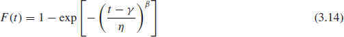
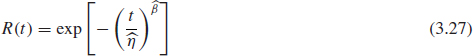
The simpler version of the Weibull distribution is the 2-parameter model. In accordance with its name, this distribution is defined by two parameters. As described in Chapter 2, Section 2.6.6 the cumulative failure distribution function F(t) is:

where: t = time.
β = Weibull slope (the slope of the failure line on the Weibull chart), also referred as a shape parameter.
η = Characteristic life, or the time by which 63.2% of the product population will fail, also referred to as a scale parameter.
Equation (3.9) can be rewritten as:
![]()
Or by taking two natural logarithms Eq. (3.10) will take the form of:
![]()
It can be noticed that (3.11) has a linear form of Y = βX + C.
Where:

Therefore (3.11) represents a straight line with a slope of β and intercept C on the Cartesian X, Y coordinates (3.12). Hence, if the data follows the 2-parameter Weibull distribution, the plot of ln ![]() against ln(t) will be a straight line with the slope of β.
against ln(t) will be a straight line with the slope of β.
3.4.2 Weibull Parameter Estimation and Probability Plotting
This type of scale is utilized in what is called Weibull paper, Figure 3.7. Weibull paper is constructed based on the X- and Y-transformations mentioned above, where the Y-axis (or double log reciprocal scale) represents unreliability F(t) = 1 − R(t) and the X-axis represents time or other usage parameter (miles, km, cycles, runs, switches, etc.). Then, given the x and y value for each data point, each point can easily be plotted.
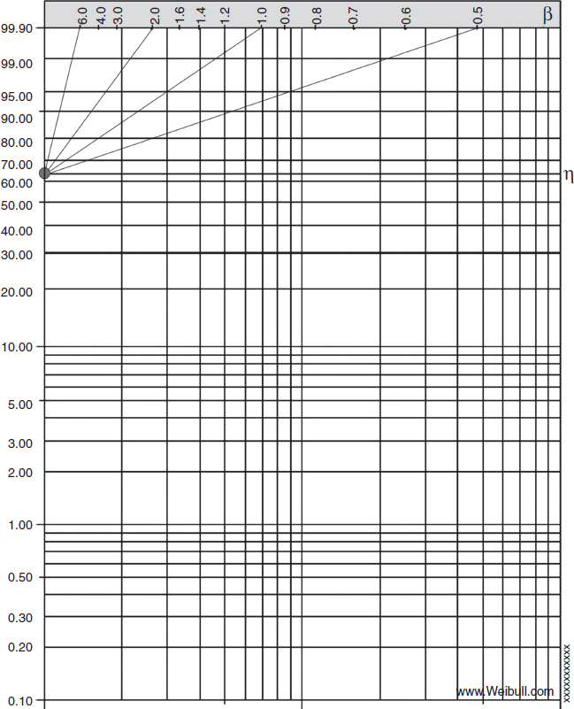
Figure 3.7 Weibull probability paper. Abscissa - ln t, Ordinate - ln ln ![]() .
.
The points on the plot represent our times-to- failure data. In probability plotting, we would use these times as our x values or time values. The appropriate y plotting positions, or the unreliability values would correspond to the median rank of each failure point.
After plotting each data point on the Weibull paper we draw the best fitting straight line through those points. Parameter β can be determined as the slope of that line (graphically or arithmetically) and parameter η can be determined as the time corresponding to 63.2% unreliability on the Y-axis. To derive this number we substitute t = η into (3.10) and calculate the cumulative failure function:

Even though Weibull paper is rarely used these days, understanding and ability to work with it provides a good foundation for using software tools. In addition, most commercially available Weibull analysis packages use the same graphics format as Weibull paper.
As mentioned before, one of the advantages of the Weibull distribution is its flexibility. For example, in the case of β = 1 the Weibull distribution reduces to the exponential distribution. When β = 2 the Weibull distribution resembles Rayleigh distribution (see, e.g. Hines and Montgomery, 1990). In the case of β = 3.5 the Weibull pdf will closely resemble the normal curve.
Example 3.1 Weibull Analysis using Rank Regression
Let us revisit the case where five units on test fail at 100, 200, 300, 400, 500 hours. Pairing those numbers with their median ranks (Table 3.1) would generate the following five data points: (100 hours, 12.94%) (200 hours, 31.47% ) (300 hours, 50.0% ) (400 hours, 68.53% ) (500 hours, 87.06% ). Plotting those points on Weibull paper would produce the graph shown in Figure 3.8.
Once the line has been drawn, the slope of the line can be estimated by comparing it with the β-lines on the Weibull paper. Figure 3.8 shows the slope β ≈ 2.0. According to Eq. (3.13), η is the life corresponding to 63.2% unreliability, hence η ≈ 320.
Therefore the reliability function for this product can be presented as a Weibull function:

and can be calculated for any given time, t.
Having ranked and plotted the data (regardless of the particular statistical distribution), the question that often arises is What is the best straight line fit to the data? (assuming, of course, that there is a reasonable straight line fit). There can be a certain amount of subjectivity or even a temptation to adjust the line a little to fit a preconception. Normally, a line which gives a good ‘eyeball fit’ to the plotted data is satisfactory, and more refined manual methods will give results which do not differ by much. On the other hand, since the plotted data are cumulative, the points at the high cumulative proportion end of the plot are more important than the early points. However, a simple and accurate procedure to use, if rather more objectivity is desired, is to place a transparent rule on the last point and draw a line through this point such that an equal number of points lie to either side of the line.
Those are just general considerations for manual probability plotting. Clearly, computer software can process the data without subjectivity, with more precision, and with more analytical options of data processing. Computerized data analysis will be discussed in detail in Section 3.5.
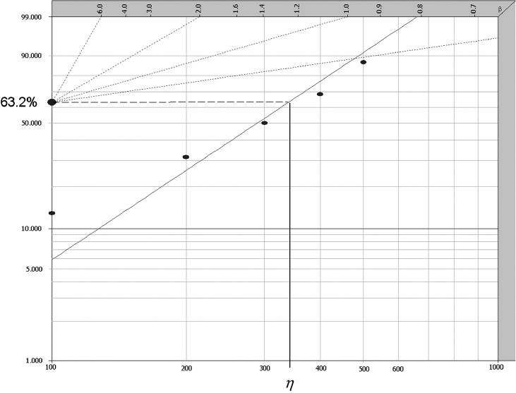
Figure 3.8 Data plotted on Weibull paper for Example 3.1, β ≈ 2.0 and η ≈ 320.
Example 3.2 Calculating Adjusted Ranks
Consider the same five items on test as in Example 3.1 only this time units 2 and 4 have not failed and were removed from test at the same times 200 and 400 hours respectively (summarized in Table 3.2). Calculate the adjusted ranks for the new data set.
From Eqs. (3.6) to (3.8)

Table 3.2 presents the summary of the steps in calculating the adjusted ranks for the three failure points. After the adjusted ranks are calculated the probability plotting follows the same procedure as in Example 3.1 only with three data points (#1, #3, #5).
Table 3.2 Data summary and adjusted ranks calculation for Example 3.2.
Even though the rank adjustment method is the most widely used method for performing suspended items analysis, it has some serious shortcomings. It can be noticed from this analysis of suspended items that only the position where the failure occurred is taken into account, and not the exact time-to-suspension. This shortfall is significant when the number of failures is small and the number of suspensions is large and not spread uniformly between failures, as with Example 3.2. That is the reason that in most cases with censored data the Maximum Likelihood method (see Section 3.5.2) is recommended to estimate the parameters instead of using least squares, presented in Section 3.5.1. The reason is that maximum likelihood does not look at ranks or plotting positions, but rather considers each unique time-to-failure or suspension.
3.4.3 Three Parameter Weibull
As mentioned in Chapter 2, the product cumulative failure distribution function F(t) is presented in a form, that is slightly more complicated than (3.9) with an additional parameter γ:
Where γ = expected minimum life, also referred as location parameter, because it defines the starting location of the pdf graph along the X-axis of the coordinate system. (Other literature may use the characters X0, t0, or ρ in place of γ for the location parameter.) Under the assumption of 3-parameter Weibull no failure of the product can possibly occur prior to the time γ, therefore it is also referred as minimum life.
A 3-parameter Weibull plot can no longer be represented by a straight line on a Weibull plot (see Figure 3.9) thus creating more difficulty for manual probability plotting. There is a technique for manual 3-parameter Weibull plotting, involving shifting every data point to the left (or right) by a certain value in the logarithmic scale until the data points become aligned. That shift value determines the minimum life γ, however computerized plotting would clearly provide a more accurate and certainly more expedient solution.
The inclusion of a location parameter for a distribution whose domain is normally [0, ∞] will change the domain to [γ, ∞], where γ can be either positive or negative. This can have some profound effects in terms of reliability. For a positive location parameter, this indicates that the reliability for that particular distribution is always 100% up to that point γ. On some occasions the location parameter can be negative, which implies that failures theoretically occur before time zero. Realistically, the calculation of a negative location parameter is indicative of quiescent failures (failures that occur before a product is used for the first time) or of problems with the manufacturing, packaging or shipping processes.
Discretion must be used in interpreting data that do not plot as a straight line, since the cause of the non-linearity may be due to the existence of mixed distributions or because the data do not fit the Weibull distribution. The failure mechanisms must be studied, and engineering judgement used, to ensure that the correct interpretations are made. For example, in many cases wearout failure modes do exhibit a finite failure-free life. Therefore a value for γ can sometimes be estimated from knowledge of the product and its application.
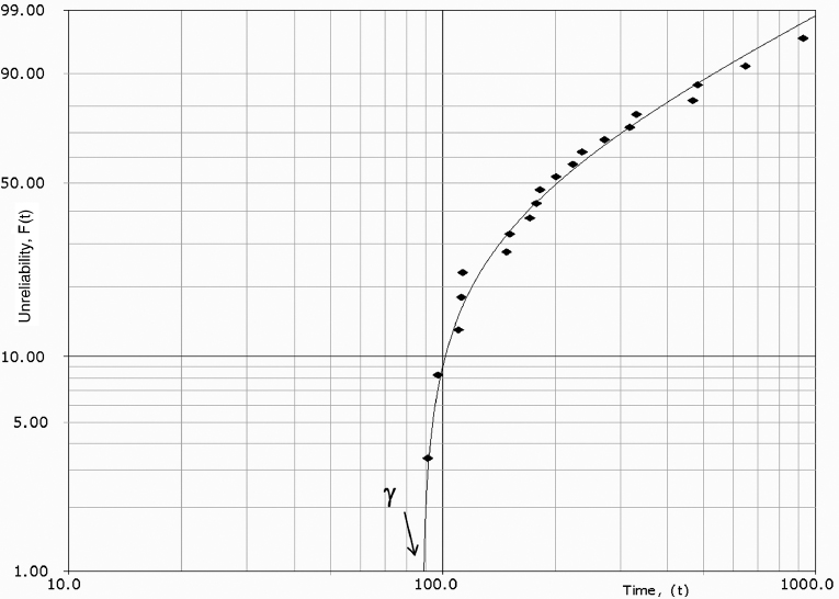
Figure 3.9 3-parameter Weibull distribution plotted with Weibull++¯ (Reproduced by permission of ReliaSoft).
In quality control and reliability work we often deal with samples which have been screened in some way. For example, machined parts will have been inspected, oversize and undersize parts removed, and electronic parts may have been screened so that no zero-life (‘dead-on-arrival’) parts exist. Screening can show up on probability plots, as a curvature in the tails. For example, a plot of time to failure of a fatigue specimen will normally be curved since quality control will have removed items of very low strength. In other words, there will be a positive minimum life and be a good fit for 3-parameter Weibull.
Additional recommendations for preferring 3-parameter Weibull over 2-parameter Weibull include the number of data points (which should be no less than 10) and justification of the minimum life existence based on the failure mechanism. Therefore, better mathematical fit alone is not a good enough reason for choosing 3-parameter Weibull. Choice of the distribution will greatly affect reliability numbers, even between 2-parameter and 3-parameter Weibull! Both parameters β and η will be affected by that choice.
3.4.4 The Relationship of β-Parameter to Failure Rates and Bathtub Curve
As explained in Chapter 2, the value of β reflects the hazard function or the expected failure rate of the Weibull distribution and inferences can be drawn about a population's failure characteristics by considering whether the value of β is less than, equal to, or greater than one. The relationship between the value of β and the corresponding section on the bathtub curve (Figure 1.6) can be illustrated in Figure 3.10.
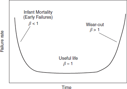
Figure 3.10 Relationship between the bathtub curve and the Weibull slope β.
Since most Weibull analysis these days is done with commercially available software, the users may have a tendency to run an analysis and report the results without closely analysing their validity. Therefore the following guide would help to better evaluate the results and make an appropriate solution about the data based on the value of β:
If β < 1 indicates a decreasing failure rate and is usually associated with infant mortality, sometimes referred as early failures. It often corresponds to manufacturing related failures and failures recorded shortly after production. This can happen for several reasons including a proportion of the sample being defective or other signs of early failure.
If β ≈ 1 a constant failure rate and is usually associated with useful life. Constant failure rate, which often corresponds to the mid-section of the life of the product and can be a result of random failures or mixed failure modes.
If β > 1 indicates an increasing failure rate and is usually associated with wearout, corresponding to the end life of the product with closer inter-arrival failure times. If recorded at the beginning of the product life cycle it can be a sign of a serious design problem or a data analysis problem.
If β > 6, it is time to become slightly suspicious. Although β > 6 is not uncommon, it reflects an accelerated rate of failures and fast wearout, which is more common for brittle parts, some forms of erosion, failures in old devices and less common for electronic systems. Some biological and chemical systems may have β > 6 value, for example human mortality, oil viscosity breakdown, and so on. Also, a large number of censored data points compared to complete data sets can result in high β. Different data analysis options can be recommended to re-evaluate the validity of the results.
If β > 10, it is time to become highly suspicious. Such a high β is not unheard of, but fairly rare in engineering practice. It reflects an extremely high rate of wearout, and not an expected value for the analysis of complete or nearly complete data set. However, it can be a result of highly censored data with a small number of failures (e.g. as an exercise, try the case with two units failing at 900 and 920 hours respectively and five units suspended at 1000 hours). Also a high β could be a result of stepped overstress testing, where environmental conditions become more and more severe with each step, therefore causing the parts to fail at the accelerated rate.
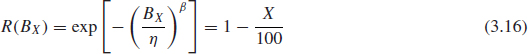
3.4.5 BX-Life
Another parameter, that is used to specify reliability is the B-life, which is the time (or any other usage measure) by which a certain percent of the population can be expected to fail. It is expressed as BX, where X is the percentage of the population failing. For example B10 life of 15 years would be equivalent to 90% reliability for 15 year mission life. This relationship can be expressed by the equation:
![]()
and, as applied to Weibull distribution,
3.5 Computerized Data Analysis and Probability Plotting
Computerized life data analysis in essence uses the same principles as manual probability plotting, except that it employs more sophisticated mathematical methodology to determine the line through the points, as opposed to just ‘eyeballing’ it. Modern data analysis software offers clear advantages by providing the capability to perform more accurate and versatile calculations and data plotting. This section will cover the two most commonly used techniques of computerized data analysis: Rank Regression and Maximum Likelihood Estimator (MLE). Probability plotting in this section will be done with the use of Weibull++¯ software. This program is widely utilized by reliability engineers worldwide and has enough versatility and statistical capability to handle multiple analytical tasks with various types of reliability data and a range of distribution functions. As mentioned before, even though most of the material in this chapter is applied to the Weibull distribution, the general principles remain the same regardless of the statistical distribution being modelled.
3.5.1 Rank Regression on X
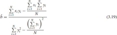
One of the ways to draw the line through the set of data points is to perform a rank regression. It requires that a line mathematically be fitted to a set of data points such that the sum of the squares of the vertical or horizontal deviations from the points to the line is minimized.
Assume that a set of data pairs (x1, y1), (x2, y2), . . ., (xN, yN) were obtained and plotted. Then, according to the least squares principle, which minimizes the horizontal distance between the data points and the straight line fitted to the data Figure 3.11, the best fitting straight line to these data is the straight line x = â + ![]() y such that:
y such that:
![]()
Where, ![]() and
and ![]() are the least squares estimates of a and b and N is the number of data points.
are the least squares estimates of a and b and N is the number of data points.
The solution of (3.17) (see ReliaSoft, 2008a) for ![]() and
and ![]() yields:
yields:

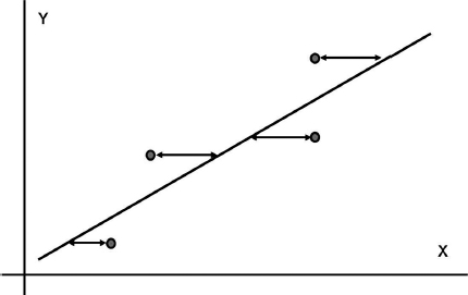
Figure 3.11 Minimizing distance in the X-direction.
and
One of the advantages of the rank regression method is that it can provide a good measure for the fit of the line to the data points. This measure is known as the correlation coefficient. In the case of life data analysis, it is a measure for the strength of the linear relation between the median ranks (Y-axis values) and the failure time data (X-axis values). The population correlation coefficient has the following form:
![]()
where σxy is the covariance of x and y, σx is the standard deviation of x, and σy is the standard deviation of y (based on the available data sample). The estimate of the correlation coefficient for the sample of N data points can be found in ReliaSoft (2008a) or other statistical references.
The closer the correlation coefficient is to the absolute value of 1, the better the linear fit. Note that +1 indicates a perfect fit with a positive slope, while -1 indicates a perfect fit with a negative slope. A perfect fit means that all of the points fall exactly on a straight line. A correlation coefficient value of zero would indicate that the data points are randomly scattered and have no pattern or correlation in relation to the regression line model. ρ2 is often used instead of ρ to indicate correlation, since it provides a more sensitive indication, particularly with probability plots.
As an alternative, the data can be analysed using Rank Regression on Y, which is very similar to Rank Regression on X with the only difference that the solution minimizes the sum of the Y-distances between the data points and the line. It is important to note that the regression on Y will not necessarily produce the same results as the regression on X, although they are usually close.
3.5.2 Maximum Likelihood Estimation (MLE)
Many computer-based methods present a probability plotting alternative to rank regression, an example is the Maximum Likelihood Estimator (MLE). The idea behind maximum likelihood parameter estimation is to determine the parameters that maximize the probability (likelihood) of the sample data fitting that distribution (see ReliaSoft, 2008a). Maximum likelihood estimation endeavours to find the most ‘likely’ values of distribution parameters for a set of data by maximizing the value of what is called the likelihood function. From a statistical point of view, the method of maximum likelihood is considered to be more robust (with some exceptions) and yields estimators with good statistical properties. In other words, MLE methods are versatile and apply to most models and to different types of data (both censored and uncensored).
If x is a continuous random variable with pdf:
![]()
where θ1, θ2, . . . θk are k unknown constant parameters that need to be estimated, conduct an experiment and obtain N independent observations, x1, x2, . . ., xN which correspond in the case of life data analysis to failure times. The likelihood function (for complete data) is given by:

The logarithmic likelihood function is:

The maximum likelihood estimators (MLE) of θ1, θ2, . . . θk, are obtained by maximizing L or Λ.
By maximizing Λ, which is much easier to work with than L, the maximum likelihood estimators (MLE) of θ1, θ2, . . . θk are the simultaneous solutions of k equations such that:
![]()
Please note that many commercially available software packages plot the MLE solutions using median ranks (points are plotted according to median ranks and the line according to the MLE solutions). However as can be seen from Eq. (3.21), the MLE method is independent of any kind of ranks. For this reason, many times the MLE solution appears not to track the data on the probability plot. This is perfectly acceptable since the two methods are independent of each other, and in no way suggests that the solution is wrong.
More on Maximum Likelihood Estimator including the analysis of censored data can be found in ReliaSoft (2008a), Nelson (1982), Wasserman (2003) or Abernethy (2003).
Example 3.3 Illustrating MLE Method on Exponential distribution
This method is easily illustrated with the one-parameter exponential distribution. Since there is only one parameter, there is only one differential equation to be solved. Moreover, this equation is closed-form, owing to the nature of the exponential pdf. The likelihood function for the exponential distribution is given by:
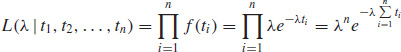
where λ is the parameter we are trying to estimate. For the exponential distribution, the log-likelihood function (3.22) takes the form:

Taking the derivative of the equation with respect to λ and setting it equal to zero results in:
![]()
From this point, it is a simple matter to rearrange this equation to solve for λ:

This gives the closed-form solution for the MLE estimate for the one-parameter exponential distribution. As can be seen, parameter λ is estimated as the inverse of MTTF (Mean Time to Failure). Obviously, this is one of the most simplistic examples available, but it does illustrate the process. The methodology is more complex for distributions with multiple parameters and often does not have closed-form solutions. Applying MLE to censored data is also fairly complex and mathematically involved process reserved for computerized solutions. More details on MLE mathematics can be found in ReliaSoft (2011), Nelson (1982) and other Bibliography at the end of this chapter.
3.5.3 Recommendation on Using Rank Regression vs. MLE
Rank regression methods often produce different distribution parameters than MLE, therefore it is a logical question to ask which method should be applied with which type of data. Based on various studies (see ReliaSoft (2008a), Wasserman (2003) and Abernethy (2003)) regression generally works best for data sets with smaller (<30) sample sizes (as sample sizes get larger, 30 or more, these differences become less important) that contain only complete data. Failure-only data is best analysed with rank regression on X, as it is preferable to regress in the direction of uncertainty. When heavy or uneven censoring is present and/or when a high proportion of interval data is present, the MLE method usually provides better results. It can also provide estimates with one or no observed failures, which rank regression cannot do.
In the case where it is not clear which method would provide more accurate results, it is advisable to run both methods and compare the results. The following scenarios are possible:
- The RR and MLE results do not differ much.
- The results differ and one method might provide unreasonable values of β- (too high or too low).
- The results differ and one method provides the values of β which do not fit the model IFR vs. DFR (see Section 3.4.4).
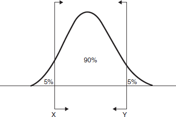
Figure 3.12 Two-sided 90% confidence bounds.
Those outcomes can help to make a more intelligent choice of the analysis method. It is also advisable to try several distributions using both MLE and RR The choice of MLE vs. RR may also affect the choice of best fit distribution for a particular data set, for example 2P Weibull may show the best fit using MLE, while the normal distribution can be the best fit for the same data set using RRX method (see Section 3.7 for more details).
3.6 Confidence Bounds for Life Data Analysis
Because life data analysis results are estimates based on the observed lifetimes of a sample of units, there is uncertainty in the results due to the limited sample sizes. Confidence bounds (also called confidence intervals) briefly covered in Chapter 2 are used to quantify this uncertainty due to sampling error by expressing the confidence that a specific interval contains the quantity of interest. Whether or not a specific interval contains the quantity of interest is unknown. For continuous distributions, confidence bounds calculations involve the area under pdf curve corresponding to the percentage confidence sought for the particular solution, Figure 3.12.
When we use two-sided confidence bounds (or intervals), we are looking at a closed interval where a certain percentage of the population is likely to lie. That is, we determine the values, or bounds, between which lies a specified percentage of the population. For example, when dealing with 90% two-sided confidence bounds of [X, Y], we are saying that 90% of the population lies between X and Y with 5% less than X and 5% greater than Y. Figure 3.12.
With one-sided intervals we define the target value to be greater or less than the bound value. For example, if X is a 95% upper one-sided bound; this would imply that 95% of the population is less than X. If X is a 95% lower one-sided bound, this would indicate that 95% of the population is greater than X, Figure 3.13.
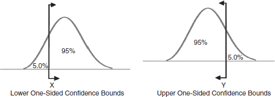
Figure 3.13 One-sided confidence bounds.
Table 3.3 5 and 95% ranks for the sample size of 5.
Care must be taken to differentiate between one- and two-sided confidence bounds, as these bounds can take on identical values at different percentage levels. For example, the analyst would use a one-sided lower bound on reliability, a one-sided upper bound for percentage failing under warranty and two-sided bounds on the parameters of the distribution. Note that one-sided and two-sided bounds are related. For example, the 90% lower two-sided bound is the 95% lower one-sided bound and the 90% upper two-sided bound is the 95% upper one-sided bound. See Figure 3.12 and Figure 3.13.
3.6.1 Confidence Intervals for Weibull Data
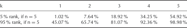
Weibull analysis can also be done with various degrees of confidence level. The rank calculations were made using the median rank, which corresponds to 50% confidence level. Thus, for example, for 2-sided 90% confidence level similar to Figure 3.12, we would need to use different ranks for the data plotting. Specifically, we would need to graph the same failure points using 5% and 95% ranks to provide [5%; 95%] confidence bounds. That can be accomplished by applying, for example, the cumulative binomial method per equation (3.2). Table 3.3 provides 5% and 95% ranks respectively for the sample size of 5. More 5% and 95% rank values for various sample sizes are provided in the tables in Appendix 4.
As applied to Example 3.1 the first failure at 100 hours has the following ranking: 1.02% (5% rank) and 45.07% (95% rank). Thus 90% confidence interval for unreliability at 100 hours, F(100 hrs) would be between 1.02% and 45.07%. Similarly, we can plot 5% and 95% ranks for each of the five failure points resulting in the graph Figure 3.14.
The confidence bounds Figure 3.14 are quite wide. With 90% confidence, the reliability at 100 hours of operation can be anywhere between 54.93 and 98.98%. The reason for such wide intervals is the small number of data points.
As the number of samples increases the respective ranks would come in smaller increments and thus closer together. As a result, the confidence bounds become narrower and thus closer to the median rank straight line.
To illustrate the effect of a larger sample size on the confidence bounds, consider the 5% rank of the 2nd sample out of 10. Quantitatively 2 out of 10 represents the same 20% of the population as the 1st sample out of 5, however the 5% rank in this case is 3.68% as opposed to 1.02% for the five samples (see Appendix 4). Similarly the 95% rank of the 2nd sample out of 10 is 39.2% as opposed to 45.07% for the 1 out of 5 case. In both cases the 10-sample ranks would be plotted closer to the centre line, which would result in narrower confidence bounds for the same data fit.
3.6.2 Individual Parameter Bounds
It is often important to derive the confidence limits on the parameters of the distribution since decisions may be based upon those values. For example, the β-value characterizes the trend in failure rate of the product population and its place on the bathtub curve, Figure 3.10. Individual parameter bounds are used to evaluate uncertainty in terms of the expected (or mean) values of the parameters. For bounds on individual parameters, statistical software usually provides the Fisher matrix, likelihood ratio, beta binomial, Monte Carlo and Bayesian confidence bounds.

Figure 3.14 Weibull++¯ two-sided 90% confidence bounds for Weibull distribution (Reproduced by permission of ReliaSoft).
3.6.2.1 Fisher Matrix Bounds
Fisher Matrix bounds are used widely in many statistical applications. These bounds are calculated using the Fisher information matrix. The inverse of the Fisher information matrix yields the variance-covariance matrix, which provides the variance of the parameter Var(![]() ), see ReliaSoft (2008a). The bounds on the parameters are then calculated using the following equations:
), see ReliaSoft (2008a). The bounds on the parameters are then calculated using the following equations:

where: ![]() is the estimate of mean value of the parameter θ.
is the estimate of mean value of the parameter θ.
Var(![]() ) is the variance of the parameter.
) is the variance of the parameter.
α = 1 − C, where C is the confidence level.
zα/2 is the standard normal statistic. Excel function = -NORMSINV(α/2) or see Appendix 1.
Parameters that do not take negative values are assumed to follow the lognormal distribution and the following equations are used to obtain the confidence bounds:

Despite its mathematical intensity, the Fisher matrix method for confidence bounds is widely utilized by most commercially available software packages. For more details see ReliaSoft (2008a).
3.6.2.2 Likelihood Ratio Bounds
For data sets with very few data points, Fisher matrix bounds are not sufficiently conservative. The likelihood ratio method produces results that are more conservative and consequently more suitable in such cases. (For data sets with larger numbers of data points, there is not a significant difference in the results of these two methods.) Likelihood ratio bounds are calculated using the likelihood function as follows:
![]()
where: L(θ) is the likelihood function for the unknown parameter θ.
L(![]() ) is the likelihood function calculated at the estimated parameter value
) is the likelihood function calculated at the estimated parameter value ![]() .
.
α = 1 – C, where C is the confidence level.
![]() is the Chi-Squared statistic with k degrees of freedom, where k is the number of quantities jointly estimated. Excel function = CHIINV(α, k) or see Appendix 2.
is the Chi-Squared statistic with k degrees of freedom, where k is the number of quantities jointly estimated. Excel function = CHIINV(α, k) or see Appendix 2.
In the calculations of the likelihood ratio bounds on individual parameters, only one degree of freedom (k = 1) is used in the ![]() statistic. This is due to the fact that these calculations provide results for a single confidence region. For more details, refer to ReliaSoft (2008a) and Nelson (1982).
statistic. This is due to the fact that these calculations provide results for a single confidence region. For more details, refer to ReliaSoft (2008a) and Nelson (1982).
3.6.2.3 Beta Binomial Bounds
The beta-binomial method of confidence bounds calculation is a non-parametric approach to confidence bounds calculations that involves the use of rank tables or rank calculations as described in (3.2) and similar to the calculations presented in Section 3.6.1.
3.6.2.4 Monte Carlo Confidence Bounds
In this method Monte Carlo simulation is used to create many samples from a known distribution. The proportion of times that the true value of a parameter is contained in the confidence interval is estimated along with the width (or half-width) of the intervals. For more details on generating Monte Carlo confidence bounds see Wasserman (2003).
3.6.2.5 Bayesian Confidence Bounds
This method of estimating confidence bounds is based on the Bayes theorem, where prior information is combined with sample data in order to get new parameter distributions called posterior and make inferences about model parameters and their functions. The posterior yields estimates and Bayesian confidence limits for the parameters. Details on the calculation of these bounds are available in ReliaSoft (2008a) and ReliaSoft (2006).
Example 3.4 Manual Calculation of Confidence Bounds on the Weibull Parameter β
Manual calculations of confidence limits on the shape parameter β can be done using the Figure 3.15 graph containing factors Fβ against sample size for different confidence levels (99%, 95%, 90% ) on β. Figure 3.15 is based on a graphical approximation of Fisher matrix bounds (3.24). The upper and lower confidence limits are then
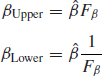
Derive the upper and lower confidence limits if n = 10, β = 1.6 for C = 90% (double-sided). From Figure 3.15, Fβ = 1.37; therefore,
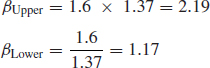
that is we have a 90% confidence that 2.19 ≥ β ≥ 1.17.
3.6.3 Alternative Methods for Calculating Confidence Bounds
Obtaining confidence bounds, especially on censored data is an involved process and can be done in several different ways. Besides using the cumulative binomial method per (3.2) described in Section 3.6.1, there are other techniques described in Section 3.6.2. Those methods have a high level of mathematical complexity and are utilized mostly by commercially available statistical software packages. Based on a variety of methods, confidence bounds in life data analysis applications may differ based on the value being estimated. Several software packages including Weibull++ give the user the option to perform separate calculation of confidence bounds on time (Type 1) and on reliability (Type 2).
Confidence bounds on time (Type 1) can be estimated by first solving the Weibull reliability Eq. (3.9) for time T:
![]()
The confidence bounds on T will be defined by the upper and lower bounds on the estimates of the individual Weibull parameters ![]() and
and ![]() depending on which analytical method is chosen (see Section 3.6.2) and also will depend on the value of the third parameter R.
depending on which analytical method is chosen (see Section 3.6.2) and also will depend on the value of the third parameter R.
Figure 3.15 Confidence limits for shape parameter β for different confidence values.
For the confidence bounds on reliability (Type 2) the Weibull Eq. (3.9) can be written in its traditional form:
The confidence bounds on a reliability for a given time value are calculated in the same manner as the bounds on time. The only difference is that the solution must now be considered in terms of β, η and t, where t is now considered to be a parameter instead of R, since the value of time must be specified in advance. In this approach, the confidence bounds on R can be defined by the upper and lower bounds on the estimates of Weibull parameters ![]() and
and ![]() , which would produce results different from those for time (Type 1). The Fisher Matrix method, which is most commonly used in software packages, would generate a different set of confidence bounds depending on whether it is Type 1 or Type 2. The choice between Type 1 and Type 2 would depend on the value that we are trying to estimate. For example, to determine the B10-life (time by which 10% of the units have failed) then we would use confidence bounds on time (Type 1). To estimate reliability at a certain point of time (e.g. 200 hours of operation) then the confidence bound on reliability should be displayed. More details on those calculations can be found in the Life Data Analysis ReliaSoft (2008a).
, which would produce results different from those for time (Type 1). The Fisher Matrix method, which is most commonly used in software packages, would generate a different set of confidence bounds depending on whether it is Type 1 or Type 2. The choice between Type 1 and Type 2 would depend on the value that we are trying to estimate. For example, to determine the B10-life (time by which 10% of the units have failed) then we would use confidence bounds on time (Type 1). To estimate reliability at a certain point of time (e.g. 200 hours of operation) then the confidence bound on reliability should be displayed. More details on those calculations can be found in the Life Data Analysis ReliaSoft (2008a).
Figure 3.16 shows the 90% confidence bounds on B10-life (Type 1) and 90% confidence bounds on reliability at 200 hours (Type 2) based on the analysis of the data presented in Example 3.1.
Note that similar approaches can be used to calculate the confidence bounds on the variables calculated with the data analysis involving most other statistical distributions.
3.7 Choosing the Best Distribution and Assessing the Results
A range of statistical distributions is available to reliability practitioners. The most commonly used were presented in Chapter 2 and due to the available computing power all of them can be applied to probability plotting. However, that presents a question of which distribution model should a practitioner use to fit the data in a given particular data set? The distribution which is likely to provide the best fit to a set of data is not always readily apparent. The process of determining the best model can be fairly comprehensive and usually starts with evaluating the available distributions based on how well they fit the data, that is mathematical goodness of fit. However, in engineering applications having the best mathematical fit is not sufficient, since the chosen statistical distribution should also be appropriate for the physical nature of observed failures. Therefore both approaches need to be carefully considered before selecting the best mathematical model to analyse the data.
3.7.1 Goodness of a Distribution Fit
Statistical goodness-of-fit tests should be applied to test the fit to the assumed underlying distributions. There are many statistical tools that can help in deciding whether or not a distribution model is a good choice from a statistical point of view. Section 3.5 presents an overview of the tools and the approaches, which are often based on the type of data (complete vs. censored), number of data points (small vs. large number) and other criteria. The rank regression (least squares RRX and RRY) and Maximum Likelihood Estimator (MLE) methods have been covered earlier in Section 3.5. The correlation coefficient ρ, Eq. (3.20) is a measure of how well the straight line fits the plotted data for the rank regression method. For MLE, the likelihood L, Eq. (3.21) would best characterize its goodness of fit. In general, the best fit would provide ρ closest to 1.0 (Rank Regression) or the highest likelihood value in case of MLE. Goodness-of-fit tests including χ2 (chi-square) and Kolmogorov–Smirnov (K–S) methods are covered in Chapter 2.
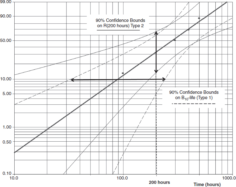
Figure 3.16 Weibull++¯ 90% confidence bounds on B10-life and Reliability (Example 3.1) (Reproduced by permission of ReliaSoft).
It is also important to ensure that the time axis chosen is relevant to the problem; otherwise misleading results can be generated. For example, if a number of items are tested, and the running times recorded, the failure data could show different trends depending upon whether all times to failure are taken as cumulative times from when the test on the first item is started, or if individual times to failure are analysed. If the items start their tests at different elapsed or calendar times the results can also be misleading if not carefully handled. For example, a trend might be caused by exposure to changing weather conditions, in which case an analysis based solely on running time could conceal this information. The same considerations would apply to warranty data analysis, where time count starts from the date of sales or production. In those cases the life data should not be counted as a calendar time, but rather as an individual age of the warranted part. The methods of exploratory data analysis, described in Chapter 13, can be applied when appropriate.
Statistical software can be used to rank different distributions based on the best mathematical fit depending on which statistical method is chosen. Figure 3.17 shows the ReliaSoft Weibull++ tool called Distribution Wizard¯ allowing the user to compare different distribution models based on how well they fit the analysed data.
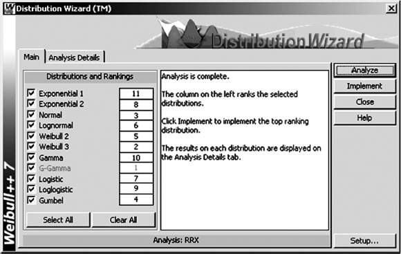
Figure 3.17 Weibull++¯ distribution ranking based on the goodness of fit (Rank Regression on X) (Reproduced by permission of ReliaSoft).
The table in Figure 3.17 shows the ranking of the available distributions for the data in Example 3.1. Distribution Wizard uses a combination of goodness of fit (K–S method), correlation coefficient and likelihood value to determine the best fitting distribution. Note that for the MLE data analysis the ranking of the distributions will be different, since a quantitative measure of goodness of fit (combination of weight factors) will depend on the chosen data analysis method. However, the ranking based on the goodness of fit as the one shown in Figure 3.17 should only be considered as the first step in the decision-making process. The next step should be based on evaluating data groups/patterns, failure modes, amount of data and other considerations presented later in this section.
3.7.2 Mixed Distributions
A plot of failure data may relate to one failure mode or to multiple failure modes within an item. If a straight line does not fit the failure data, particularly if an obvious change of slope is apparent, the causes of failure should be investigated to estimate the possible number of failure modes. For example, after a certain length of time on test, a second failure mode may become apparent, or an item may have two superimposed failure modes. In such cases each failure mode must be isolated and analysed separately. However, such separation is appropriate only if the failure processes are independent, that is there is no interaction. In cases where it is difficult or impossible to separate the failure modes the life data can be analysed as a homogeneous population with a changing trend. In most cases it can be approached as a mixed Weibull distribution.
Many of the commercially available software packages can handle clusters of data points and to fit the data into mixed distributions. For example Figure 3.18 shows three distinct groups of data points clearly showing different trends and their slopes. One group includes the data points between 1 and 100 hours, another between 100 and 1000 hours and the third is between 1000 and 10000 h.
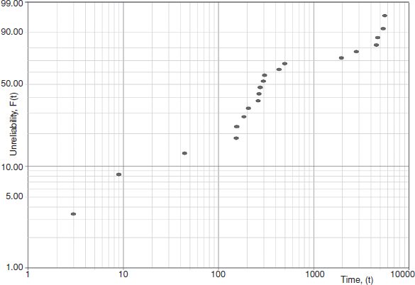
Figure 3.18 Separate groups of data points (Reproduced by permission of ReliaSoft).
These data points can be split into three groups and fit into the mixed Weibull distribution as shown in Figure 3.19. It is important to note that each group has different β-slope and therefore different failure rates and data pattern.
Figure 3.19 shows the plot of mixed Weibull distribution as unreliability vs. time as a fitted curve with three sections and failure rate vs. time, which follows the bathtub curve pattern due to the failure rate changing from one group to another.
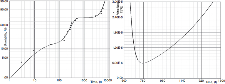
Figure 3.19 Mixed Weibull distribution plotted with Weibull++¯ (Reproduced by permission of ReliaSoft): (A) Probability Plot (unreliability vs. time); (B) Hazard Rate.
3.7.3 Engineering Approach to Finding Best Distribution
While analysing life data and finding the best statistical model for it (Section 3.7.1), it is important to remember that we are dealing with failures of a real engineering device and the knowledge and understanding of that device will also be a factor in determining the likely best distribution. The engineering considerations should include the following:
Maturity of the system and its place on the bathtub curve.
Type of failures (failure modes and physics of failure).
Sample size and size of the population it represents.
Maturity of the system will affect the trend for its failure rate and in the case of the Weibull distribution can be easily characterized by the β-value as presented by the bathtub model (see Figure 3.10).
As mentioned before, situations, where β < 1 represents the decreasing failure rate (DFR). This is usually a sign of manufacturing defects and/or immature products. Therefore, if that life data comes from the mature system, which has been in the field for a significant amount of time, some other distributions need to be considered. For example, normal and extreme value distributions exhibit a perpetually increasing failure rate. It is important to understand that the forecast based on the distribution with decreasing failure rate may significantly underestimate the percentage of the failed population because it will extrapolate that trend into the useful life section of the bathtub curve. Therefore Weibull curves with DFR trends in some cases need to be merged with different distributions (see, e.g. Kleyner and Sandborn, 2005).
If a constant hazard rate (β ≈ 1) is apparent, this can be an indication that multiple failure modes exist or that the time-to-failure data are suspect. This is often the case with systems in which different parts have different ages and individual part operating times are not available. A constant hazard rate can also indicate that failures are due to external events, such as faulty use or maintenance. If none of those conditions apply, again other statistical options should be considered.
Whilst wearout failure modes are characterised by β > 1, the Weibull parameters of the wearout failure mode can be derived if it is possible to identify the defective items and analyse their life and failure data separately from those of the non-defective items.
Failure modes and physics of the observed failures should play an important part in the analysis. It is very important that the physical nature of failures be investigated as part of any evaluation of failure data, if the results are to be used as a basis for engineering action, as opposed to logistic action. For example, if an assembly has several failure modes, but the failure data are being used to determine requirements for spares and repairs, then we do not need to investigate each mode and the parameters applicable to the mixed distributions are sufficient. If, however, we wish to understand the failure modes in order to make improvements, we must investigate all failures and analyse the distributions separately, since two or more failure modes may have markedly different parameters, yet generate overall failure data which are fitted by a distribution which is different to that of any of the underlying ones. Also certain failure modes have known historical β-slopes, which can be considered as guidelines. For example, in the electronics industry low cycle solder fatigue is characterized by the β-slopes in the range of [2.0; 4.0] and metal fatigue failures often have β-slopes in the range of [3.0; 6.0]. According to Abernethy (2003) ball bearing failures have β ≈ 2.0, rubber V-belts β ≈ 2.5, corrosion-erosion [3.0; 4.0]. Obviously those are just generic numbers, but they can be used as an additional verification of the results, especially in the cases of analysing censored data. Also if the failures are caused by some extreme conditions, like extreme high values of electrical load or extreme low values of bond strength, then extreme value distribution may be the best way to fit the data regardless of the goodness of fit ranking.
It is also important to understand that some distributions are not as flexible as others. While the Weibull distribution can fit the data with any type of failure rate, other distributions exhibit only a certain pattern, for example, the normal and extreme value distributions would demonstrate only increasing failure rate (IFR), where lognormal displays more complex pattern of early IFR transitioning later into DFR. The physics of failure can also affect the choice between the 2-parameter and the 3-parameter Weibull distribution. Existence of the additional parameter γ provides an opportunity to better fit the data (e.g. Distribution Wizard in Figure 3.17 ranks 3P Weibull higher than 2P Weibull), however it would also mean that by choosing 3-parameter Weibull we accept the existence of the failure free time. In engineering practice only a few failure mechanisms have a true failure-free period (e.g. corrosion, fatigue), in the most cases failure modes can exhibit themselves from the very beginning of the product life. Therefore when choosing 3-parameter Weibull one should be able to justify the reason why the product is very unlikely to fail before it passes γ hours (days, miles, etc.) of operation.
Sample size and size of the population also can play a critical part in defining the mathematical model. It is important to realize that cumulative probability plots are to a large extent self-aligning, since succeeding points can only continue upwards and to the right. Goodness-of-fit tests will nearly always indicate good correlation with any straight line drawn through such points. Analysing the large amount of failure data, such as warranty claims, sometimes presents a problem where several distributions may show a high degree of goodness of fit due to the fact that the number of failed parts can still be relatively small compared to the overall size of the population. On the chart in Figure 3.1 it would show a very small shaded section of f(t) on the left compared to the rest of the distribution. In the automotive warranty databases it is not uncommon to process several thousand failure data points based on the 3-year warranty claims from the population of several hundred thousand vehicles. In those cases 2-parameter Weibull often shows almost identical likelihood value with the lognormal data fit, however the extrapolation of those distribution data to 10-year life may show significant differences in the forecast number of failures (sometimes a factor of 2). In those cases understanding of failure rate trend (increasing-decreasing pattern of the lognormal distribution vs. increasing pattern of Weibull with β > 1) can help to make a correct choice. This example shows that it is doubly important for large data sets to carefully consider the engineering aspects of the failures. In addition to that, large data sets, such as warranty databases, may contain secondary failures, which would require a totally different approach to probability plotting.
On the other spectrum are small samples or small numbers of actual failures. It is not uncommon during product testing to experience one or two failures out of relatively small sample size of five to ten units. Most software packages can handle two or even one failure using the MLE technique; however the plotting produces questionable results with arbitrary values or β-slopes. In some of those cases the knowledge of the expected β-value could help to force-fit the data into the most probable distribution and obtain more practical results than in the case of straight mathematical fitting.
Other data analysis criteria may also apply, for example the earliest time(s) to failure could be more important than later times (or vice versa), so the less important data points could be considered as ‘outliers’ unless there is adequate engineering justification for not doing so. Overall, it is clear that in the majority of the cases the principle of engineering trumps mathematics should apply in choosing the best distribution for the life data analysis.
Example 3.5 Breaking Strength of a Wire
The breaking strength of a long wire was tested, using a sample of 15 equal lengths. Since the strength of a wire can be considered to depend upon the existence of imperfections, the extreme value distribution of minimum values might be an appropriate fit. The results are shown in Table 3.4. Since this would be a distribution of minimum value it will be left-skewed, and the data are therefore arranged in descending order of magnitude. Plotting the data the other way around would generate a convex curve, viewed from above. A plot of an extreme value distribution of maximum values would be made with the data in ascending order.
Table 3.4 Breaking strengths of 15 samples of wire of equal length.
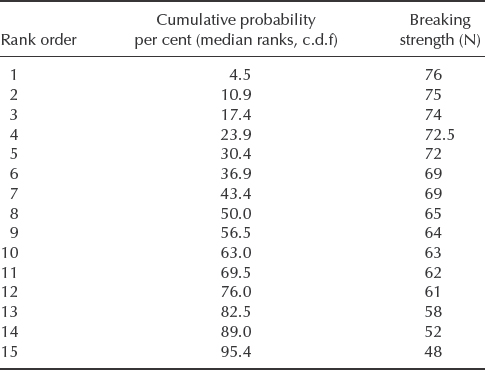
The mode ![]() can be estimated directly from the data. In this case
can be estimated directly from the data. In this case ![]() = 69.0 N.
= 69.0 N.
σ, the measure of variability, can be derived from the expression in Chapter 2, Section 2.6.7.1.
The value of 1/σ is sometimes referred to as the Gumbel slope. Now, applying the cdf equation from Chapter 2, F(y) = 1 − exp [− exp (y)], where y = (x − μ)/σ, we can calculate x = 50.3N for F(y) = 0.05.
In this case the probability scale represents the cumulative probability that the breaking strength will be greater than the value indicated, so that there is a 95% probability that the strength of a wire of this length will be greater than 50.3N. If the wire is longer it will be likely to be weaker, since the probability of its containing extreme value imperfections will be higher.
The return period 1/F(y) represents the average value of x (e.g. number of times, or time) between recurrences of a greater (or lesser) value than represented by the return period. Therefore, there is a 50% chance that a length of wire of breaking strength less than 50.3N will occur in a batch of 1/0.05 = 20 lengths. The return period is used in forecasting the likelihood of extreme events such as floods and high winds, but it is not often referred to in reliability work.
The use of Weibull++¯ provides a more refined extreme value solution presented in Figure 3.20. It calculates using the rank regression the parameters ![]() = 69.2858 and
= 69.2858 and ![]() = 7.2875.
= 7.2875.

Figure 3.20 Probability plot of the breaking strength (Weibull++¯), Extreme value distribution (Reproduced by permission of ReliaSoft).
Figure 3.20 demonstrates that there is 95% probability of breaking strength being higher than 47.64N. This number is 5.3% lower than the earlier value of 50.3N obtained by the manual calculations.
3.8 Conclusions
Probability plotting methods can be very useful for analysing reliability data; however the methods presented in this chapter apply to circumstances where items can only fail once. This distinction is important, since the methods, and the underlying statistical theory, assumes that the individual times to failure are independently and identically distributed (IID). That is, that failure of one item cannot affect the likelihood of, or time to, failure of any other item in the population, and that the distribution of times to failure is the same for all the failures considered. If these conditions do not hold, then the analysis can give misleading results. Techniques for analysing reliability data when these conditions do not apply (e.g. the failed units can be repaired) are described in Chapter 13.
Probability plotting and life data analysis can also be used for analysing other IID data, such as sample measurements in quality control. It is important to understand the decision making process leading to the best statistical model to analyse the data, especially with today's range of available software based tools. The technique of choosing the best distribution should involve mathematical goodness of fit tests. This should be combined with engineering judgement, including understanding of the relevant physics or other causes of failures. It is essential that practical engineering criteria are applied to all phases of the data analysis and the interpretation of the results.
Questions
Some of the problems below require life data analysis software. If such software is not available a trial version of Weibull++ can be downloaded from: http://www.reliasoft.com/downloads.htm.
-
- Explain briefly (and in non-mathematical terms) why, in Weibull probability plotting, the ith ordered failure in a sample of n is plotted at the ‘median rank’ value rather than simply at i/n.
- Planned replacement is to be applied to a roller bearing in a critical application: the bearing is to be replaced at its B10 life. Ten bearings were put on a test rig and subjected to realistic operating and environmental conditions. The first seven failures occurred at 370, 830, 950, 1380, 1550 and 1570 hours of operation, after which the test was discontinued. Estimate the B10 life from (i) the data alone; (ii) using a normal plot (normal paper can be downloaded from www.weibull.com/GPaper/index.htm). Comment on any discrepancy.
- Process this data choosing the 2-parameter Weibull distribution. What is the difference in B10 value?
-
- Twenty switches were put on a rig test. The first 15 failures occurred at the following numbers of cycles of operation: 420, 890, 1090, 1120, 1400, 1810, 1815, 2150, 2500, 2510, 3030, 3290, 3330, 3710 and 4250. Plot the data on Weibull paper and give estimates of (i) the shape parameter β; (ii) the mean life μ; (iii) the B10 life; (iv) the upper and lower 90% confidence limits on β; (v) the upper and lower 90% confidence limits on the probability of failure at 2500 operations. Finally, use the Kolmogorov-Smirnov test to assess the goodness-of-fit of your data.
- Alternatively, find the solution to the part (a) using a software. If using Weibull++ run Distribution Wizard to compare your choice against other different distributionns in the package. What is the best fit distribution for this data.
- Six electronic controllers were tested under accelerated conditions and the following times to failure were observed: 46, 64, 83, 105, 123 and 150 hours. Do the following:
- Determine how you would classify this data, that is individual, grouped, suspended, censored, uncensored, and so on.
- Select rank regression (least squares) method on X as the parameter estimation method and determine the parameters for this data using the following distributions and plot the data for each distribution. From the plot, note how well you think each distribution tracks the data, that is how well does the fitted line track the plotted points?
- 2-Parameter Weibull.
- 3-Parameter Weibull.
- Normal.
- Log-normal.
- Exponential.
- Extreme Value (Gumbel).
- Gamma.
- A pump used in large quantities in a sewage works is causing problems owing to sudden and complete failures. There are two dominant failure modes, impeller failure (I) and motor failure (M). These modes are thought to be independent. Records were kept for 12 of these pumps, as follows:
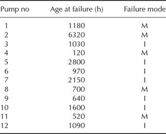
Estimate Weibull parameters for each mode of failure.
If using Weibull++ you can differentiate the failure modes by different ‘Subset ID’ and run the ‘Batch Auto run’ option.
- A type of pump used in reactors at a chemical processing plant operates under severe conditions and experiences frequent failures. A particular site uses five reactors which, on delivery, were fitted with new pumps. There is one pump per reactor: When a pump fails, it is returned to the manufacturer in exchange for a reconditioned unit. The replacement pumps are claimed to be ‘good as new’. The reactors have been operating concurrently for 2750 h since the plant was commissioned, with the following pump failure history:
Reactor 1 – at 932, 1374 and 1997 h.
Reactor 2 – at 1566, 2122 and 2456 h.
Reactor 3 – at 1781 h.
Reactor 4 – at 1309, 1652, 2337 and 2595 h.
Reactor 5 – at 1270 and 1928 h.
- Calculate the Laplace statistic (Eq. 2.46) describing the behaviour of the total population of pumps as a point process.
- Estimate Weibull parameters for both new and reconditioned pumps.
- In the light of your answers to (a) and (b), comment on the claim made by the pump manufacturer.
- A vehicle manufacturer has decided to increase the warranty period on its products from 12 to 36 months. In an effort to predict the implications of this move, it has obtained failure data from some selected fleets of vehicles over prolonged periods of operation. The data below relate to one particular fleet of 20 vehicles, showing the calendar months in which a particular component failed in each vehicle. (There is one of these components per vehicle and when repaired, it is returned to ‘as good as new’ condition.) If there are no entries under ‘Component failure dates’, that vehicle had zero failures. The data are up-to-date to October 1995, at which data all the vehicles were still in use. The component currently gives about 3% failures under warranty.
Use any suitable method to estimate the scale and shape parameters of a fitted Weibull distribution, and comment on the implications for the proposed increase in warranty period.
- The data below refer to failures of a troublesome component installed in five similar photocopiers in a large office. When photocopier fails, it is repaired and is ‘good as new’.

- Estimate the parameters of a Weibull distribution describing the data.
- Calculate a Laplace trend statistic (Eq. 2.46) and, in the light of its value, discuss whether your answer to part (a) is meaningful.
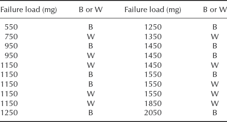
- The data below relate to failures of terminations in a sample of 20 semiconductor devices. Each failure results from breaking of either the wire (W) or the bond (B), whichever is the weaker. The specification requirement is that fewer than 1% of terminations shall have strengths of less than 500 mg.
- Estimate Weibull parameters for (i) termination strength; (ii) wire strength; (iii) bond strength. Comment on the results.
- If using Weibull++ select rank regression on X (RRX) and run ‘Distribution Wizard’ for this data. Choose the best fitting statistical distribution for those results and re-evaluate the strength termination requirement.
- Derive the solution for the MLE estimate of the parameters of the normal distribution
 and
and  similar way to how it is done in Example 3.3.
 - Seventeen electronic units were put through a 1000 hr temperature test. Every 200 hr the number of units that failed was counted. At 200 hr of testing, one failure was observed; at 400 hr two more failures were observed; at 600 hr four more failures were observed; at 800 hr five more failures were observed; and five more failures were observed at 1000 hr. Find the β and η of the 2-Parameter Weibull pdf representing this data using Rank Regression on X (least squares) and Maximum Likelihood Estimation. Compare RRX vs. MLE results. Explain the difference.
- While fitting data with Weibull distribution (either using software or a Weibull paper), can you determine by the β-value if your data can be potentially fitted better with other distributions, such as normal or exponential?
- Automotive manufacturer is testing the ignition system for the number of on/off switches. Seven ignition devices were tested to failure with the following results: 10 522, 14 232, 17 811, 21 762, 29 830, 39 411 and 43 901 switches. Using the software or Weibull probability paper determine
- the parameters of 2-parameter Weibull distribution.
- 2-sided 90% confidence on reliability of the system at 10 000 switches.
- As discussed in Section 3.4.4, run the analysis of the case where 2 units failing at 900 and 920 hours and the remaining 5 units are suspended at 1000 hours. Analyse the Weibull distribution parameters. What is the beta value? Explain the reason for such a high value.
- Analysis of the interval data: Eight electronic units were released in a small test market. Every 200 hours of operation the units functionally tested for failures and malfunctions. As a result 2 units showed some sign of malfunctioning sometime between 400 and 600 hr, 2 units begin malfunctioning between 600 and 800 hr, 1 was considered failed between 800 and 1000 hr and 3 are still operating in the field after 1500 hours:
- Determine the parameters of the 2-Parameter Weibull distribution using Rank Regression (least squares) on X.
- Obtain the probability plot for this data.
- Estimate the B10 life for this device.
- Try different options with MLE vs. rank regression, Weibull vs. lognormal distribution. Compare the B10 life for different methods.
- Given the Weibull parameters of β = 1.86 and η = 21 620 h with a population of 1600 units:
- How many failures can be expected when each unit reaches 1500 hours?
- 3000 hours?
- 50 units were placed on test without continuous monitoring. After 100 hours of high temperature exposure the units were tested for functionality. Four units have failed and the remaining ones were still functional. What type of life data we are dealing with?
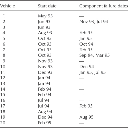
Bibliography
Abernethy, R. (2003) The New Weibull Handbook, 5th edn, Dr. Robert Abernethy.
Hines, W. and Montgomery, D. (1990) Probability and Statistics in Engineering and Management Science, 3rd edn, Wiley.
Kleyner A. and Sandborn P. (2005) A warranty forecasting model based on piecewise statistical distributions and stochastic simulation. Reliability Engineering and System Safety, 88(3), 207–214.
Lawless, J. (2002) Statistical Models and Methods for Lifetime Data, Wiley.
Meeker, W. and Escobar, L. (1998) Statistical Methods for Reliability Data, Wiley.
Nelson, W. (1982) Applied Life Data Analysis, Wiley.
ReliaSoft (2006) Life Data Analysis Reference: Confidence Bounds. Online tutorial. Available at: http://www.weibull.com/LifeDataWeb/confidence_bounds.htm.
ReliaSoft (2008a) Life Data Analysis Reference, ReliaSoft Publishing.
ReliaSoft (2008b) Weibull++¯ User's Guide, ReliaSoft Publishing.
ReliaSoft (2011) Probability Plotting Papers. Available at http://www.weibull.com/GPaper/index.htm.
Wasserman, G. (2003) Reliability Verification Testing, and Analysis in Engineering Design, Marcel Dekker.
Weibull, W. (1951) A statistical distribution function of wide applicability. Journal of Applied Mechanics, 18, 293–297.