Appealing or Appalling? Beginning Character Design
“You mean somebody’s actually waiting to see this?”
—Director William “One-Shot” Beaudine’s reply when he was asked to speed up production to meet a deadline
You do not have to like a character to find it appealing. You need only care to know about what happens to it. Appeal in animation may be defined in the phrase, “Do I, the viewer, want to spend a few minutes or hours of my life with this character and this story? Am I willing to suspend disbelief and accept the character as a sentient being? Are its problems of interest to me?”
An appealing character is interesting to look at. Appeal does not mean that it is ‘cute’, lovable, infantile, or cuddly. Monster movies contain good examples of appealing ‘negative’ characters. We want to know about the monster and the victims. Victims are often disposable props who never develop as personalities. We are horrified by what happens to them, but we sometimes identify more with the monster!
An appealing character will have a design that is interesting, but not so complex that it is unable to perform actions required by the story. The design of the character and the production must never prevent the character’s actions from being clearly perceived by the audience.
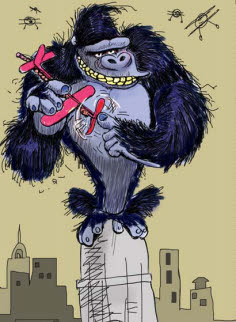
[Fig. 6-1] Giant Ape attacks city! Do we identify with the city or the ape? We may feel empathy for the human victims and sympathy for the monster.
Form follows function in animation. The story and its action will affect your character’s design. For example, if Character A has to hug Character B, it is very important to make Character A’s arms long enough to fit around Character B’s body! (Figure 6-2)
If character A is designed in isolation and not concurrently with Character B, such accidents can easily occur. Make your mistakes on paper. It is an easy matter to adjust the length of Character A’s arms before you start animating, but not so easy once you have already built the puppet on a set or on the computer.
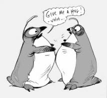
[Fig. 6-2] Know what the character has to do before you model it. The design should help, not hinder, character motion.
The storyboard artists should be made aware of a character’s scale, strength, and physical limitations at the start of production so that they do not board actions that are impossible for the ‘actors’ to perform. Characters without fingers and thumbs such as the penguins in Figure 6-2 would have to play piano by some other method. Dealing with a physical limitation can produce very entertaining animated solutions.
Drawn characters can stretch their arms if necessary, but we must consider this stretchiness a conscious design on the part of the creator, not an attempt to repair a design mistake. We now are dealing with a chicken-or-egg theory. If we haven’t yet set our story, but want to design an appealing character, where do we start?
Reading the Design: Silhouette Value
A good animated character, in any medium, will have a recognizable shape. When we can identify it instantly in silhouette, we say that it reads well.
A common design failing is to add details to the character without first working on underlying construction. This results in a weak, unconvincing design as shown in Figure 6-4.
[Fig. 6-3] A famous silhouette.
[Fig. 6-4] A weak design, with most of the effort spent on the surface details.
Construction Sights
Create a rough silhouette for each character at the start of the project. Work loosely and experiment with a variety of shapes. When you have found one that you like, shade the silhouette in to test the readability. If you have more than one character, work on them simultaneously and vary the size and shapes of the silhouettes as shown in Figure 6-5.
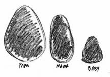
[Fig. 6-5] The Three Bears’ rough silhouettes are ovals with no two the same size and shape. This creates a contrast in scale before the characters are designed.
After you have your basic silhouettes, design your characters from the inside out. Break each silhouette into sections to indicate the size of the head and length of the legs. Do not divide the shape evenly since this leads to uninteresting design. The bears’ heads and torsos are designed within the oval shapes in Figure 6-6. Simple graphic shapes are used to construct the head, body, and limbs. Legs and arms are ‘drawn through’ the torso so that they attach on opposite sides of the body and create a feeling of volume in the design. Ears and hair are added as separate shapes after the underlying head and body shapes are constructed. Surface details (clothing, textures, and patterns) are added last.
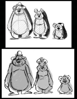
[Fig. 6-6] The Three Bears’ construction works within the oval silhouettes. The second drawing refines the body shapes and adds texture (hair). Separate shapes for hair and ears are added after the body is constructed.
Body shapes can impart subconscious meaning to the viewer. For example, two figures in an animated story represent Youth and Old Age. I designed the younger figure in Figure 6-7 as a column of coltish long legs topped by a large ellipse of a head that suggests childish inexperience. The older figure is entirely contained in a circle that symbolizes her self-sufficiency and age. The shapes tell us something about their characters before they have even begun to move.
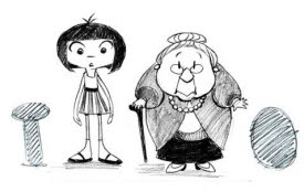
[Fig. 6-7] Characters portray their age in their silhouettes. The older figure contains some infantile features such as small extremities scaling against a larger body.
The bony structure of the human skeleton, particularly the jaw and spine, shrinks as a person ages. This loss of bone mass and a heavier body causes an old person’s hands and feet to appear proportionately smaller than those of younger people. Babies also have large, heavy bodies that contrast with small, rounded arms and legs. Some elderly character designs may share these infantile proportions, as shown in Figure 6-7. Young animals tend to have large feet and longer legs than adults, depending on the species. The girl in Figure 6-7 has long legs that resemble those of a young horse or deer.
Conversely, the cartilaginous tissue in the nose and ears never stops growing and joints become gnarled with arthritis as a person ages. Elderly people appear to have larger noses and ears because they really do, as illustrated by the troll family in Figure 6-8. The troll parent’s hands have enlarged finger joints and her nose and ears are enormous. The young troll’s skeletal definition is hidden under a layer of baby fat.
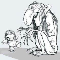
[Fig. 6-8] Youth and age also exhibit significant physical differences. The old troll has a huge nose and ears that keep growing throughout life. Its hands are gnarled but are relatively small in relation to its large body. The baby troll’s infantile proportions are shared by the older character in Figure 6-7.
Always consider silhouette value when designing a character. The standard method of testing a design is to black in the entire shape. If you can still understand the meaning of the design or pose after you have done this, the character or pose is said to ‘read’ well. Some characters read more strongly than others. Here are silhouette figures of two Chinese monks that represent enthusiasm and experience. The younger character is unbalanced and top-heavy. His form was based on the shape of a long-necked vase. This character’s motions are strong but ineffective, since he does not think before he acts. The Master is weightier due to his age and experience. His form is based on that of a rock; he is grounded, stable, and his moves are deliberate and decisive. (Figure 6-9)
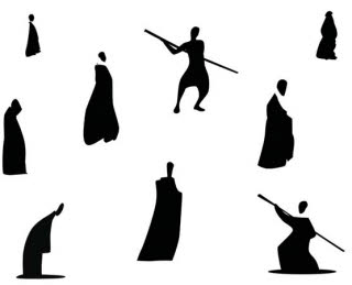
[Fig. 6-9] These silhouettes read well and depict typical attitudes of two characters. Reproduced by permission of Joseph Daniels and Jedidiah Mitchell.
Even ‘ordinary’ characters can become interesting if props and appropriate costume are designed with the figure. Tools and uniforms symbolizing specific occupations can create variety in background or crowd character designs. Never just draw ‘a man’ or ‘a woman’. Simple props can create a personality.
Analyze the design of a graphic character to determine how it moves. Does its shape morph (distort) or will it remain unaffected while surface details animate across it? All of these questions must be answered before your character design is put into production.
[Fig. 6-10] Design props along with a character’s body shape. This will help establish their character and create interest in your design. Shading in the silhouette tests the design’s readability.
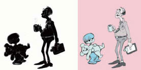
[Fig. 6-11] A graphic character may not deform or move in three dimensions when animating. Standardized models ensure that its features do not morph constantly. This technique should be used sparingly since it can become distracting. Reproduced by permission of Nina L. Haley.
Foundation Shapes and Their Meaning
I will refer to some shapes as “foundation” shapes since they form the basis for complex designs in the art of many cultures. The four foundation shapes are circles and ovals, which are easiest to draw and distort, squares, triangles, and cylinders. These shapes translate into ‘primitives’ in CGI programs. The graphic animated symbol and the more rounded, dimensional character will both be created from the interplay of these foundation shapes. A graphically-styled film may use the shapes with little modification, as shown in Figure 6-12. A dimensional character’s design will seem more complex but will still use graphic foundation shapes for its basic construction.
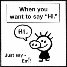
[Fig. 6-12] A simple character may consist only of foundation shapes. EM! ® from We All Die Alone by Mark Newgarden. Reproduced by permission of Mark Newgarden.
Human faces display the same variant on a simple pattern. Figure 6-13 shows different face shapes with the features at differing levels. One is round, one square, and two are oval. The size of the eyes, mouth, and nose vary to create even greater differences. The shape of the hair complements and emphasizes the facial design.
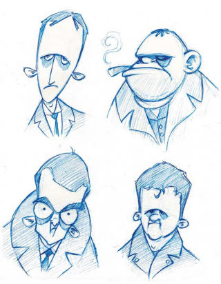
[Fig. 6-13] Varied proportions on basic shapes will create new characters. Faces with even proportions will often seem less lifelike than caricatures. These Gangster Studies were based on antique photographs. Reproduced by permission of William Robinson.
Caricatures of famous or infamous people may provide inspiration for a character design. This gives it more depth than one created from whole cloth. Figure 6-14 shows variations on one woman’s face. If you use a caricature of a person as a basis for your character, determine which foundation shapes and proportions suggest their likeness. Use these shapes as a starting point for construction and “push” the design so that it becomes something new. You may combine features from more than one person and even add a few animal traits to create an original character. Use sketchbook drawings as reference for typical poses and features. Vary the proportions and try several different designs where some features are emphasized more than the others—but make sure that all of them work together as part of an organic whole. A good design features repetition with variation and exaggeration. The least interesting proportions are closest to reality.
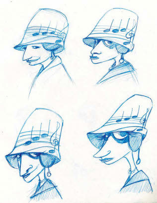
[Fig. 6-14] Different characters are created by varying facial and body proportions. These caricatures were all based on the same historic photograph. Reproduced by permission of William Robinson.
Exercise: Take drawings from your sketchbook and one photograph or illustration of a person from a specific historical era. Design a new character wearing period clothing standing in the sketchbook pose. Then “push” the proportions in several drawings as shown in Figure 6-14.
Certain shapes have taken on symbolic meaning over the centuries. Circular characters are seen as cute or non-threatening. A character constructed primarily from triangular shapes will seem proactive or aggressive. Sherlock Holmes is a perfect example of this character type: he has a pointed nose, pointed fingers, wears a triangular cape, and even his name sounds ‘sharp’. Watson, the steadfast friend who narrates the stories, sounds like a ‘square’. Generations of illustrators have portrayed him as a square-jawed, square-bodied, heavyset figure as a contrast to Holmes’ thinness (Figure 6-15).
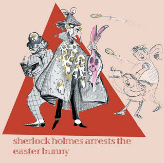
[Fig. 6-15] Sherlock Holmes and Doctor Watson, a triangle and a square. I’ve accentuated Watson’s ‘squareness’ by adding a checkered pattern to his clothing.
It is very amusing to turn these stereotypes upside down and work against type. An adorable round little character could have a nasty personality, a triangular design can be used for a reactive or passive character, and a square can be a real blockhead. Variations on the basic shapes are used in character construction in all media. The shapes have, over time, taken on specific meanings in certain contexts. Sometimes the same shape can be used to portray diametrically opposing characteristics. A circle is open and trusting or a babyish nonentity (Fig. 6-16). A square is trustworthy, dependable, and centered or it can be a real blockhead (Fig. 6-17). A triangle is quick, sharp, aggressive, and insightful. Triangular characters precipitate the action and get things done. They may be either heroes or villains, but they are always active (Fig. 6-18). Yet a triangle, when used point uppermost as the foundation shape for a head, indicates a character of low intelligence (Fig. 6-19). These stereotypical shapes can help the character’s appearance convey its personality.
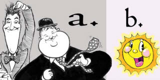
[Fig. 6-16] CIRCLE/OVAL: (a) reassuring, trusting, nonaggressive, OR (b) bland, saccharine, infantile.
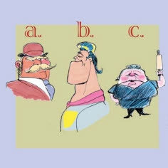
[Fig. 6-17] SQUARE: (a) Solid, dependable, (b) strong, balanced, OR: (c) unyielding, inflexible.
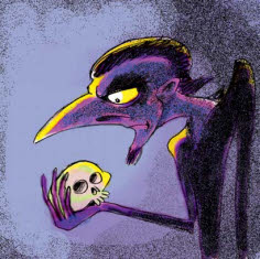
[Fig. 6-18] Alas, poor Hamlet… I drew him, Horatio.
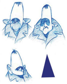
[Fig. 6-19] A pointy-headed gangster. Reproduced by permission of William Robinson.
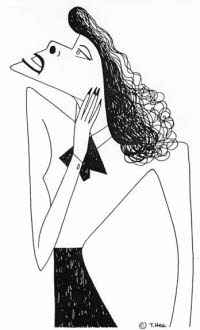
[Fig. 6-20] The opposition of curved and straight forms and positive and negative space creates interest in the design. Caricature of Katherine Hepburn by T. Hee (Nancy Beiman collection).
Stereotyped characters are very common: ‘Fat people are jolly, thin people with glasses are nerds, villains are huge and menacing’. This is not true at all times but it will be useful to you sometimes. Stereotypical elements may appear in the design to render characters’ personalities instantly recognizable. It is more interesting to avoid using them and instead create personality through the character’s body language and movement. The creation of character through movement will be discussed in Chapter 8.
Stereotypes are shortcuts: everything is familiar to your audience, so you don’t have to work to establish anything new. If you must work with stereotypical characters, think of personality quirks that will differentiate them from the hundreds of similar stereotypes that have been done before. Always remember: there is never ‘only one way’ to do anything. The ‘right’ way is the one that works for the story.
You will find that you can create more variety in the design by playing forms against one another. Work for a pleasing variety of shapes and good silhouette value. Figure 6-20’s negative space is as important to the design as the drawing itself.
Going Organic
Good design is a continuing process of simplification and communication. Inanimate objects may be ‘organic’ in the sense that animation brings them to life, but the meaning of the word differs when used in a design sense. Organic designs have shapes that flow into one another. They are not simply stuck together like a snowman. Remember that your designs describe a volume, not merely the outline of a shape. Think in the third dimension, not in line. Design the whole character, not a series of discrete components.
Identically-sized foundation shapes can create a repetitive and uninteresting design as shown in Figure 6-21. A flat and symmetrically-constructed character is in danger of illustrating what I call the cookie-cutter or “Gingerbread Man” effect. This symmetry is generally avoided unless you are actually designing a Gingerbread Man.
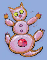
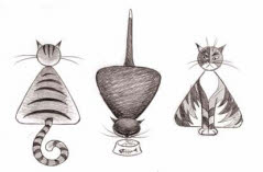
[Fig. 6-21] Each part of the cat’s form is a discrete shape with no blending. The shapes are roughly the same size, which gives the design a cookie-cutter appearance.
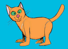
[Fig. 6-22] Another cat. The character is still symmetrical, but the separate parts of the design have now blended to make an organic whole.
The figure in 6-22 is slightly more organic but could use improvement. The head is roughly the same size as the body, and the length of the legs is about equal to the height of the cat’s head.
Let us try varying the proportions of the cat. Perhaps the chest area might be smaller and flow more into the body shape, creating a softly triangular body. The head could be distinctly separated from the body by a thinner neck. The legs might be long and slender for an exotic look, or we might shorten the body and create a heavier character with simple shapes that suggest long fur. The entire cat might be contained in a triangular shape, or it might be a large oval with pinpoint legs and thin tail. Tiny extremities will make the body look larger and heavier. Construct the cat’s body along a “line of action” and then draw the legs through the body shape. The placement of joints and volumes can vary but the character must be able to animate.
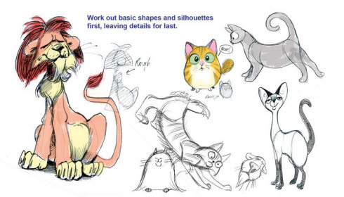
[Fig. 6-23] These cats are variations on a theme. Note how the leg and body proportions change in the sketches. The final design may consist of a head taken from one sketch with the body and feet taken from another. Rough constructions, lines of action, and foundation shapes are indicated in gray tone.
Study human and animal anatomy to learn how a character’s external shape and range of motion are both determined by its underlying muscle and bone structure. Mammalian, avian, or reptilian skeletons can be adapted or combined to give naturally occurring or fantastic creatures a solid structure that helps you design, draw, and rig believable characters. Figure 6-24 shows a simple skeleton with muscle masses that can be modified and used for many four-legged characters. Some artistic anatomy books are listed in Chapter 24 for further reading.
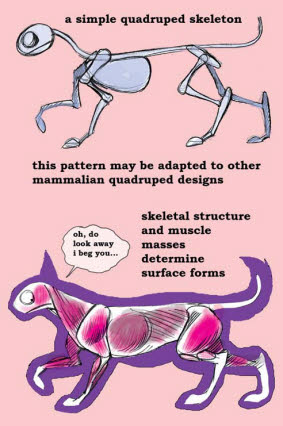
[Fig. 6-24] Here is a simple four-legged skeleton with overlaid muscle masses. It is important to design your character from the inside out since muscle and bone structure influence its surface appearance and its range of motions.
Creating Character from Inanimate Objects
Thus far we have only discussed organic shapes and creatures. Animation allows you to bring inorganic or inanimate objects to life. Inanimate objects have frequently been used to suggest human personality types. Their construction is similar to that used for organic characters. The only difference may be that the primary or ‘foundation’ shapes may appear more obviously in the final design, which may not permit the elastic movement commonly found in an organic character.
Use visual puns when working with inanimate objects. Silhouettes can suggest other creatures. Do a chair’s proportions suggest a child or an adult character? Does a musical instrument resemble a bird?
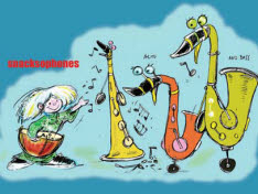
[Fig. 6-25] Three saxophones turn into goose bodies and the mouthpieces became the beaks. The silhouette creates a ‘visual pun’ but the design resembles the musical instrument more than the bird.
Try to avoid simply slapping a face on top of the object. Work with elements in the original design. See which ones suggest facial features or limbs. A good way to work is to start with an unmodified picture of the object and do repeated drawings, each more exaggerated, to evolve the features from it. Think of how the object’s shape can suggest other creatures. Materials can also influence character motion, as shown in Figure 6-26. This technique may also be used when turning a human character into an object or an animal.

[Fig. 6-26] The fluidly flexible cat’s movement is caricatured in quicksilver. The inorganic and the organic blend in this visual pun.
Exercise: Blend a human or animal design with an inanimate object in three drawings. Show the human or animal character in drawing A, then draw the object that you wish to combine it with as drawing C. Blend the features in drawing B. You may add more blend drawings if necessary. An example is shown in Figure 6-27. You may find that the midpoint drawing is more interesting than the final. Each design will vary. Try changing your original character into several different objects. Then try the exercise in reverse, starting with the inanimate object and translating it into a human or animal.
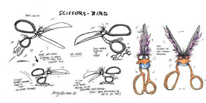
[Fig. 6-27] Inanimate objects can suggest human or animal characteristics and be brought to life in animation. The secret is to combine organic and inorganic elements in a way that does not completely lose the characteristics of the original object. Evolve the design in a series of sketches to see which features work best.
Inorganic designs may have different sections appear as discrete forms (wheels and headlights on a truck body, for example). Or you may combine the organic and the inorganic in one design (a talking truck with lips in its grille). Care should be taken in this instance not to lose the quality that reads as “truck.” The degree of organic input to the inorganic original will vary depending on the type of universe you create for your characters.
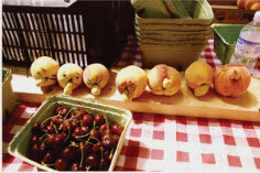
[Fig. 6-28] Character inspiration can come from organic or inorganic sources. These peaches from a Vancouver farmers’ market resemble human faces. Photo by Nancy Beiman.
“In the beginning the Universe was created. This has made a lot of people very angry and has been widely regarded as a bad move.”
—Douglas Adams, The Hitchhiker’s Guide to the Galaxy
Characters, backgrounds, and props that share a common context by their design are said to be from the same universe. Design standards may be derived from inspirational artwork, or they can be set by the lead designer on the production. HERCULES was a film that used both of these tools to create its universe. Illustrator Gerald Scarfe interpreted ancient Greek vase paintings and sculpture in his inspirational sketches. The final character designs merged elements of Scarfe’s style with hallmarks of Greek design.
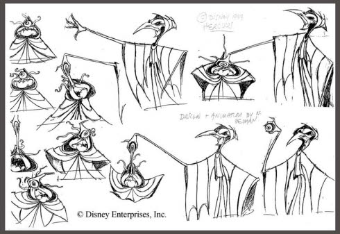
[Fig. 6-29] My designs for The Fates in HERCULES were based on ancient Greek sculpture and character sketches drawn by designer Gerald Scarfe. Reproduced by permission of Disney Enterprises, Inc.
Establishing a ‘universe’ is very important when a large crew is working on one project. Individual styles are incorporated into the universal matrix. The ‘universal’ design principle, like all the other rules of design, can be broken if your story requires it. An alien being may literally be ‘from another universe’.
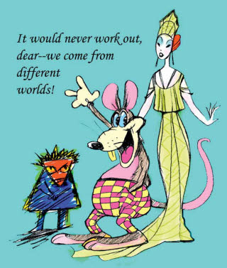
[Fig. 6-30] Characters that work together usually exist in a universe where their props, backgrounds, and character designs are unified by design. Characters can be from different universes if an explanation is provided in the story. Too much variation can cause confusion.
WHO FRAMED ROGER RABBIT? featured animated characters from very different universes performing together (Betty Boop, Donald Duck, and Daffy Duck) and even marrying one another (Jessica and Roger Rabbit). The “toons” work in 1940s Hollywood but live in Toontown, a parallel cartoon universe that contains characters from all of animation history including some that appeared in films made later than WHO FRAMED ROGER RABBIT’s time period. (The apparent anachronism was intentional: some characters had to wait for their big “break.”) The TOY STORY movies are also exceptions to the ‘unified-universe’ theory of character design. The toys were designed in a variety of sizes and styles. A cartoon dinosaur, a troop of plastic Marines, a china piggy bank, a spaceman, and a rag-doll cowboy each existed in its individual ‘universe’ while sharing the common world of Andy’s room. The toys ventured out into yet another universe, the ‘real world’ outside their house, where they were all out of place. These are exceptions that prove the rule. In most cases there will be a stylistic device—the shape of the eyes or the heads, the lightness or heaviness of the outlines, a common rendering style—that sets a film’s characters, backgrounds, and props into the same universe.
Not all animated characters have a family resemblance. How many cartoon families have children who look nothing at all like their parents? The Inappropriates in Figure 6-31 may be deliberately designed that way for comic purposes. The characters in Figure 6-32 all exist in the same universe.
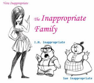
[Fig. 6-31] Contrasting styles will call attention to themselves. Or they may make a comic point. The daughter of these two grotesques is designed in a completely different style from her parents.
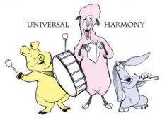
[Fig. 6-32] Unification of design creates believability in your characters and settings. Each animated film creates its own reality.
Exercise: Design three dogs using the principles discussed in this chapter. Base one on circles, another on squares, and another on triangles. Are there certain breeds whose body types suggest these basic shapes?
Next, design three characters based on inanimate objects. Will you be able to use ‘foundation shapes’ to delineate different character types? Are these characters from the same universe?
Once you have rough designs worked out and a universe established, the next step is to scale the characters to each other and to the backgrounds and props in your project. You might say that Size Matters.