Color My World: Art Direction and Storytelling
“Griselda woke up feeling blue. The violet vault sparkled with a billion points of white as the blotched banana of the moon rose behind the gray ramparts of the Castle Preposterous. Suddenly she espied Cyril and Cynthia gamboling through the forsythia. Griselda turned green with envy and then rose in a red rage since she’d never approved of gamboling.…”
—“Purple Prose,” excerpted from the unpublished romance novel Love’s Annoying Ache
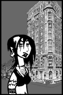
Color can convey symbolic meanings that add depth and resonance to characters and stories. An animated character can literally start out ‘blue’, then turn green and red in rapid succession. Color changes describe a character’s emotional state even when they appear outside of a story context.
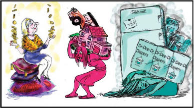
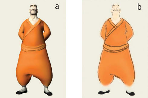
[Fig. 17-1] Color symbolizes the women’s emotional and financial state. Illustration by Nancy Beiman for the film IN DEBT WE TRUST, reproduced by permission of Globalvision, Inc.
Some color symbols apply to settings rather than characters. It is possible to see things in black and white, look at the world through rose-colored glasses, have a red-letter day, live in a golden age, see something happen once in a blue moon, or find yourself in a gray area. Many animated films use color very creatively. Consider how color, or the absence of color, can help tell your story.
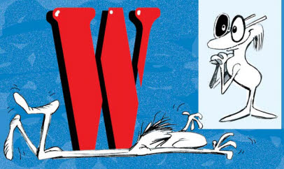
[Fig. 17-2] One character has a Red-Letter Day while another is in a gray area trying to see things in black and white. Stereotypical colors convey meaning whether used for characters or for backgrounds.
Fishing for Complements
I recommend purchasing a rotating color wheel that allows you to compare and analyze warm and cool, primary, complementary, and split complementary colors. This will become an indispensable tool. Some wheels are specially designed for interior decorators and others are intended for use by Web artists. You may need to get more than one wheel, depending on your choice of medium.
A color reference library, or morgue, is a useful tool for the art director. I’ve used snippets of magazine photos that showed the color effect I wanted when pitching to clients. Keep your eyes open and your bookshelf and files updated with interesting books, pictures from magazines, stamps, postcards, and anything else that might provide good color reference for your project. I also like to get paint chips from a hardware store. These are helpfully filed by hue, often with four or five different values on each chip. Note the many shades of ‘white’ offered. Certain companies have published detailed guides offering advice on which color combinations work best with particular types of décor. Others suggest palettes for specific historical periods. Many interesting effects can be obtained with little effort by juxtaposing two or three paint chip samples and comparing the different values and hues.
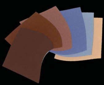
[Fig. 17-3] This color palette was based on paint chips obtained from a hardware store.
The Internet is the world’s largest reference library. A good search engine will find even the most esoteric pictorial materials in a matter of seconds. These can inspire you and suggest new and different color combinations for your project. I recommend keeping a color morgue as well since not everything appears on the Internet!
You should also observe colors in nature and in the home environment. Color should not be an afterthought to your production design. The right colors can create an emotional mood that helps you tell your story more effectively.
Colors can stereotype as easily as character designs. A yellow sun shines in a bright blue sky, a gray thundercloud hovers over a wine-dark sea, white snowflakes tumble across a velvety blue background punctuated by yellow light shining from chill-gray cabin windows. It can be as much fun to work against stereotypes when planning your art direction as it was when planning the character designs.
Is a haunted house always moldy gray and black, illuminated by occasional stark flashes of white light? Maurice Noble used bright, cheery colors when he designed the ‘ghost town’ backgrounds for Chuck Jones’ film CLAWS FOR ALARM. Sylvester Pussycat and Porky Pig stay in a ‘haunted’ hotel that boasts ‘painted lady’ late-Victorian detail and colors. Gingerbread carvings throw pink shadows on purple and green walls. The full moon casts brilliant yellow light outlined by tall, asymmetric French windows. There are no parallel lines in any of the rooms; everything is slightly askew and a little too brightly colored. This helps us understand Porky’s ignorance of the dangerous situation. Porky sees a quaint old hotel. Sylvester knows better, as do we. Maurice Noble’s unusual color palette and crisp art direction still look fresh today.
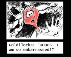
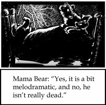
[Fig. 17-4] Red is added to the black and white storyboard to convey Goldilocks’ emotional mood.
Warner Brothers Studio art director Maurice Noble said:
“We had less to work with, [the cartoons] were spontaneous, and we had fun designing them. Chuck [Jones] gave me leeway and all of a sudden I was my own boss. I tried to be fresh in designing with color for each cartoon. I believe … that the graphic style was more fun to look at.… The graphics of animation stretch in surprises and that’s what animation is all about.… The graphic style started because [the artists] began to realize that they could have more fun with it. It’s like any other art medium.… What’s the difference between a Picasso and a Van Gogh? I’m not comparing our talents to [theirs], but on the other hand maybe we are the modern artists. I do believe that animation is a fine art.… I think it still has a long way to go if we go back to graphics and forget the computer. When I give talks I always emphasize there is a difference between pushing a button and drawing. You can put down plenty of ideas quickly with a pencil.”
—Interview with Nancy Beiman, August 2000
Saturation Point: Colors and Tonal Values
Color saturation, or intensity, is the equivalent of the gray and black values used on tonal storyboards.
Storyboards usually use shades of grey tone. Color is used as an accent. At times it will be necessary to do an entire storyboard in color. Everything depends on the story context.
A quick way of testing the readability of your color palette or background is to view it through narrowed or half-closed eyes as you did when testing the grayscale values on your storyboards. Lowering the light that reaches your eye also lowers the intensity of the color values. If the colors and objects now appear to merge, there is not enough contrast in your composition and you will have to change values or hues to make it read better. If certain areas are so contrasty they appear to ‘pop off’ the backgrounds, be sure that that is where you want the audience to look at first. A strong color accent in the wrong place can distract the viewer from the center of interest.
[Fig. 17-5] The bright color accent on the wall distracts us from the characters in the foreground. Toning down the value of the background color corrects the problem.
Ken O’Connor, the great Disney layout and story man, maintained that tonal values were the most important elements of the scene even when the composition was in color rather than in black and white. If the tonal values read well in grayscale, according to Ken, just about any color combination would work in the shot. Legibility is the most important thing, no matter what the medium. Viewing your color choices in grayscale will help you see whether the colors you have chosen for your backgrounds provide the same amount of contrast that their black-and-white equivalents would do.
Ken O’Connor would view his color compositions through a red gel filter to gray them down. Nowadays this comparison may be arranged with the click of a button. Let us see what happens when a color illustration is converted into gray tonal values using the ‘grayscale’ command in Adobe Photoshop. It is very important to use the grayscale and not the desaturate command when transforming your artwork. The gray tones that result from desaturation will not be accurate. Figure 17-6 shows color values that have been grayed out using the two different methods.
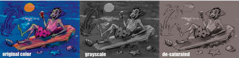
[Fig. 17-6] This color image was put into grayscale and then changed with the desaturate command in Adobe Photoshop. Always use the grayscale command for accurate tonal values.
If you get into the habit of viewing your color artwork in this fashion, your characters and background elements will read well in every scene. You can also test your compositions by viewing them in reverse (flopped) in a mirror, or turning them upside down.
[Fig. 17-7] Looking at your artwork from a different perspective will help you make your values and composition read better. Turn it upside down or mirror it so that you can view it as an abstract design.
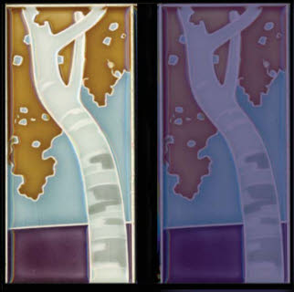
Color sources can be anywhere. The palette in Figure 17-8 was taken from an antique ceramic tile. The swatches are proportionately scaled to each color in the composition. These colors may be used in a completely different context. This figure shows them applied to a character rather than a background.
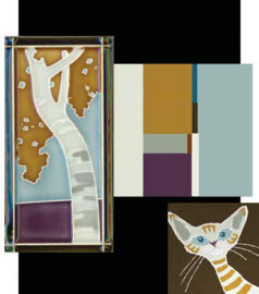
[Fig. 17-8] An antique German ceramic tile and a small cat colored with a palette based on the tile (Nancy Beiman collection).
One of the signature-style goofs from the “Decade That Taste Forgot”—the 1970s— was the use of blazing-hot, fully-saturated, split-complementary colors in large areas. A violent repeated pattern was often applied in a contrasting and equally saturated color. Nothing appeared in moderation. There is a reason why some colors are called loud.
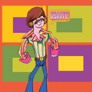
[Fig. 17-9] This split-complementary color scheme uses four equally hot colors “screaming” at top volume.
Hot, fully saturated colors can cancel each other out when liberally applied to characters or backgrounds. They work much better when used in small areas as accents. Oddly enough, the same hot, blazing 1970’s palette we saw in Figure 17-9 does appear in the natural world, as shown in Figures 17-10 and 17-11.
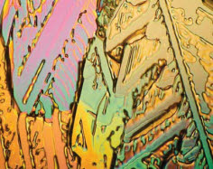
[Fig. 17-10] Garish hues become attractive when values and saturation are modified. Urea photograph reproduced by permission of Alycia Yee.
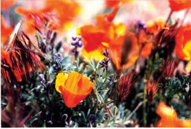
[Fig. 17-11] Flowers use brilliant hues to attract insects. The flower’s contrast with the duller stem attracts humans. California Poppies and Lupine photographed by Nancy Beiman.
Line is lighter than color. Figure 17-12 shows the same character in final line and in its original CGI rendering. The rendered version reads as a solid shape; line reads as the outline of a positive space. The rendered animation will appear slower than the line version even if the animation timing does not change. A line will always ‘move’ faster than a solid.
[Fig. 17-12] Color reads as a solid shape while line will read faster. Reproduced by permission of Joseph Daniels and Jedidiah Mitchell.
Colors can animate. They may advance or recede, as in Figure 17-13. We are shown two squares, one of which appears to have a larger center than the other.
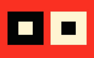
[Fig. 17-13] The two squares and their centers are exactly the same size, but our eye makes the central white square appear larger than the black one.
Advancing and receding colors used in combination may produce startling results when used on an animated character. In Figure 17-14 cool body hues contrast with the much lighter, warmer eye color so that the character’s eyes appear to glow.
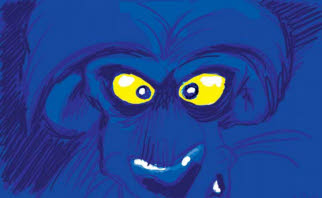
[Fig. 17-14] Color can be used to create glowing metallic effects or glowing eyes, with no need for special effects.
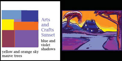
Colors may also appear to advance or recede in relation to another color. This contrast can actually create a feeling of motion in a still composition as we saw in Figure 17-13. Cooler hues can indicate early morning or late afternoon, while warmer ones suggest midday. Very close monochromatic values depict eventide, fog, or distance if they are cool and dark; bright sunlight if they are light and bright.
[Fig. 17-15] The changing time of day may be implied by color changes on the same background.
Color changes are often combined with the weather. How many climactic emotional or physical confrontations in animated films take place during a sudden thunderstorm?
[Fig. 17-16] No matter what the time of day, no matter what the season, violent emotional conflict in an animated film often coincides with the sudden arrival of a lightning-and-thunder-storm.
Figure 17-16 is an example of a cliché. The emotional atmosphere need not be obvious to be effective.
Color adds another dimension to film and raises some interesting questions. How do you determine which color schemes work ‘when’ and ‘where’? Take color cues from your story. A tale set in the Caribbean will use brighter and more intense colors than one set in Iceland—or will it? You’ll start with nature, but then art takes over. The inspirational color for the Three Bears’ house might be found in a piece of pottery or a fine silk scarf. Inspiration can come from anywhere. An icescape may use colors that are as fanciful as those in Maurice Noble’s haunted house if they work within the context of the story. Can color indicate a change in emotional moods a bit more subtly than a lightning-and-thunder-storm? Yes, but it requires a script—one that is not written, but painted.
Writing the Color: Color Scripts
“As the light changed from red to green to yellow and back to red again, I sat there thinking about life. Was it nothing more than a bunch of honking and yelling? Sometimes it seemed that way.”
—Jack Handey, Deep Thoughts
A color script will be designed by the art director to indicate how the art direction changes during the time in which the film takes place. This color script will resemble a filmstrip of storyboard panels. Often, photocopies of storyboard panels are simply painted over.
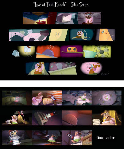
[Fig. 17-17] A color script shows how the color evolves from the first sequence of the film to the last. The art director determines the palettes and indicates transitional colors where necessary. Frames from the finished film show how the color keys were modified in production. Reproduced by permission of William Robinson.
The art director will determine which color dominates each sequence and indicate transitional colors that help maintain continuity when the scene shifts to a new location. Each sequence may have a different dominant color. A dominant color from an earlier sequence may appear with different values or in different proportions in a later one to maintain the visual flow. This is known as a color bridge. Color bridges link to other related colors. For example, a yellow-orange shape that is near a yellow-green one has the ‘yellow’ in common. The yellow hue creates motion within the composition since our eye will travel from one object to another via the ‘bridge’. Our eye is attracted by contrasts in hue in the same way that tonal contrasts attract it in black-and-white storyboard drawings. This concept applies equally to still drawings and motion picture art direction.
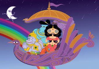
[Fig. 17-18] The eye can be directed around the frame by bridges; areas in the composition where the same color appears on two contiguous objects. Colors from the rainbow are repeated with variations on the characters in this still from SITA SINGS THE BLUES. Reproduced by permission of Nina Paley.
The art director will also create proportional color charts for each scene. Colors appear as simple blocks. The different sizes of the blocks indicate the proportion of the color that is used in the scene. Lighting color (especially important for CGI films) will also be indicated with a proportional grid, as shown in Figure 17-19.
[Fig. 17-19] A color grid will be created for each sequence. The size of the square indicates the proportion of the color in the overall composition. Lighting effects are indicated separately if a CGI production is being art directed.
Color can be composed, like music. It can be harmonious or discordant, soft or loud. Color may be classical, romantic, jazzy, or modern. Use it creatively so that your visual compositions don’t fall flat.
Exercise: Create a small atmospheric sketch (4×6 inches) set in a specific location. The scene may take place indoors or outdoors. Draw simple background details, props, and one character. Construct a simple color script by creating four copies of the same sketch, each painted in color palettes that indicate different times of day. Start at dawn; have the second depict the scene at midday, the third at dusk, and the last one at midnight during a full moon. You may paint roughly and put the pigment directly on the drawings if you are working on paper, or you may use a computer graphics program to color the panels. Will your composition use different values of the same basic hues or will there be a complete color shift as time passes? Are your light sources from the sun and moon, electric lights, gas lamps, candles, firelight, or reflected light? What time of year do you wish to indicate? Summer light is very different from that of winter. Next, scan each of your designs and turn them into grayscale, black-and-white versions. Do the tonal values work well?
O Tempora, O More or Less
Color can create a sense of place and time. An art director must research period styles and colors. Some color combinations are suggested by art that is contemporary with the film’s setting. Historic painters are a terrific guide for period color. You’ll find that contemporary artists from one country paint very different types of light. Palettes also vary from country to country and artists will reproduce the color of the local foliage and even the sky with great accuracy. Monet’s hues are excellent representations of the colors of the 19th-century French countryside while Turner utilizes a grayer, equally accurate palette for his English landscapes.
You may also use the work of modern illustrators and painters as a guide for period films. Paintings and illustrations can give you the colors of a country or a culture from the distant past. Museums usually have brochures about their collection that contain color reproductions, or postcards of specific paintings. Old auction catalogues are
a terrific and cheap reference source. They are sometimes available in secondhand bookstores. Anything and everything is grist for your color and design mill. You should never feel restricted by this material, but it provides great reference for possible color combinations and artistic styles.
Here’s a little design secret: A film that is set in a particular era need not use only contemporary material. Any object, particularly architecture, dating from a period earlier than the movie’s timeframe may be utilized in your background design and art direction. Oddly enough, some animated films that exclusively used then-contemporary design styles have dated more than films that contain a mixture of design elements from various time periods. Nothing dates faster than modernity.
[Fig. 17-20] A period piece may use elements from earlier time periods. This implies that settings grew over time and avoids the ‘newly-minted look’ that can occur when characters, backgrounds, and props all date to a brief historical period.
TOY STORY contains many elements of a 1960s universe, such as period toys and Swedish Modern furniture, but its laser-shooting spaceman and themed restaurant (and video game in TOY STORY 2) date from the 1990s. The mixture of styles gives the TOY STORY films a period quality without making them appear dated. This is the same technique that Ken Anderson used for ONE HUNDRED AND ONE DALMATIANS (a discussion of this film’s art direction appears in Chapter 9).
I do not recommend referencing artwork from other animated films since these may be familiar to your audience. Another art director has already researched the period and assembled color palettes and design elements from various sources. Find your own reference and adapt it so that your work does not slavishly copy the work of someone else. Specific cartoon or illustration styles should be viewed through the subjective lens of your own judgment and experience. Look through your own eyes, not someone else’s. Artistic interpretation will make a style yours.
You now have rough character designs and color and atmospheric sketches that can be presented to an audience along with your storyboards. It is time to step up to the Pitch in Chapter 18.
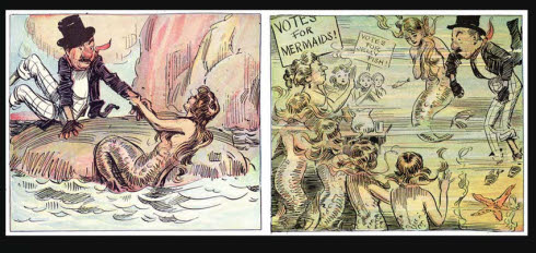
[Fig. 17-21] A mixture of styles and period elements may be used for comic effect as shown in James Montgomery Flagg’s comic strip NERVY NAT. Nat, a New York street tough from the 1850s, discusses 1912 political issues with some fifth-century mythological mermaids (Nancy Beiman collection).