Appendix 1
Discussion with A. Kendall O’Connor
Ken O’Connor worked as a story man, art director, and layout artist at the Walt Disney Studio. He began on short cartoons in 1935 and worked on most Disney films up until THE LITTLE MERMAID in 1989. This interview was conducted by Nancy Beiman at the California Institute of the Arts while she was a student in Ken O’Connor’s layout and storyboard class.
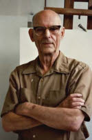
Ken O’Connor, photographed in 1987 by Nancy Beiman.
NANCY BEIMAN: When you were doing tonal studies, did you always have the color of the final background in mind?
KEN O’CONNOR: No, I’d say not. Not always.
NANCY BEIMAN: These layouts are highly rendered. You brought in one which was sketchier.
KEN O’CONNOR: Well, circumstances alter cases here all the time.… I think of the pure line effect, then the tone, then the color. It evolves that way sometimes; of course, there are no real hard-and-fast rules. Inspirational material—in this case Maxfield Parrish-like inspirational paintings—had been done before this was done. So you’ve got that in mind, you see. You know what shade of lavender you would reasonably use for the shadows, and you’ve seen the inspirational painting.
NANCY BEIMAN: I was wondering whether tonal rendering layouts was a general practice, or was it just done for the sheer pleasure of doing it?
KEN O’CONNOR: No, there was very little done for the sheer pleasure of doing it. There are a number of reasons for rendering, there’s no simplistic answer…. This thing in line wouldn’t impress a director anywhere near as impressively as a tonal version of the same landscape. And then, of course, the end product of layout is something for background. So the background man has to think in values, tonality; and you give him the best sendoff you can. If you hand the background man just a line drawing, he’s got to do all the thinking of the values, the light scheme; where’s the light coming from, where do you want the dramatic emphasis? We put in flashes of light and dark where we wanted it.
You can see how your eye tends to go to [a certain area]. That’s where the layout man wants you to go. Everything else is subservient. The tonality tells the background man to keep that in mind when painting. You bring one thing out, powerfully, and play that other down tonally.
NANCY BEIMAN: In animation, when you use reference material, the general guideline is to look at it once and never look at it again. Would you do the same thing when you were researching backgrounds?
KEN O’CONNOR: I would get every piece of reference I could lay my hands on before I started. Which frequently wasn’t much time, I might say. I‘d go to the library; go to other artists who kept scrapbooks; I’d go to my own collection at home. I keep a clip-file with maybe 200,000 clippings classified by subject, I imagine. I’d gather everything in like a big vacuum cleaner, almost regardless of exactly how valuable it would be —then I’d try to go through a period of absorbing it. … Then I’d regurgitate it as layouts.
NANCY BEIMAN: How long would this take you, on the average?
KEN O’CONNOR: Very variable—a matter of hours on a short film sometimes; a matter of months on a picture like PINOCCHIO or THE RESTLESS SEA. Before we did THE RESTLESS SEA, we sat down and read books for maybe two months. We were not up on such things as, for example, the differences between zooplankton and phytoplankton, or internal waves.
Storyboards and final layout by Ken O’Connor from “The Dance of the Hours” sequence from FANTASIA. Reproduced by permission of Disney Enterprises, Inc.
These things are not in the average man’s vocabulary, you see. We had to study a great deal because this was to be authentic. Having got all the reference together, I would hang onto it right through the picture.… I’d often pass it on to the background men.… As far as I was concerned reference was a thing to be used the whole time.
NANCY BEIMAN: Would you caricature it?
KEN O’CONNOR: Yes, I’d try to make it appropriate to the picture. In this picture (FANTASIA) you can see that it is a very decorative style.… We warped everything toward the idyllic, romantic, classical, decorative mood in this particular sequence. We went in other directions depending on the mood of the picture.… There were certain key backgrounds painted from layouts which the other background men were expected to follow stylistically … we did a lot of conferring with the director, the head animator, and the background man as much as we could.
NANCY BEIMAN: Is it better to have more camera moves, or cut to a new shot?
KEN O’CONNOR: I think everything should be judged by what the scene calls for. I think there’s probably a certain amount of ignorance today that’s behind a lot of the lack of use of the camera. We studied live action very closely, and stole everything we could from it.… I’ll give you an example. Alfred Hitchcock, in some of his suspense pictures, used what he called a “fluid camera.” He kept it moving the whole time. It resulted in a flow to the picture that you don’t get by “cut, cut, cut,” you know. If you are building up toward a collision, or going to a battle, you build the tempo with shorter pans and faster cuts to get a staccato effect. It’s like music; staccato versus legato. That’s the way we thought of the thing.
Ken O’Connor’s rough thumbnails for “The Dance of the Hours” sequence from FANTASIA. The shots were staged differently in the finished film. Reproduced by permission of Disney Enterprises, Inc.
NANCY BEIMAN: How did they manage to get sequence directors to work together?
KEN O’CONNOR: Well … certain things tend to pull [a picture] together. One is model sheets, so the characters, at least, are consistent. Another is a good lead background painter who can see to it that the appearance of the thing doesn’t suddenly jolt when you cut from one sequence to another. People respond to repetition, gradation of size and shapes, and airbrush gradations. These are things we know that people just love to see.
NANCY BEIMAN: Aren’t curves also supposed to be something audiences respond to?
KEN O’CONNOR: Well, men respond to curves all the time. (Laughter.) Yes, if you play them off right—a curved line against a straight line, that’s the strong thing.… Curves versus straights is a basic, and good, principle.... Different styles are good for study.
NANCY BEIMAN: You were talking about contrasts. A cartoon character, no matter how realistically animated, isn’t real.
KEN O’CONNOR: Well, we’ve tried to get consistency. We’ve tried to make the backgrounds look like the characters, and the characters look like the backgrounds. I like experimentation and contrast too … there was a fashion for a while to take colored tissue paper and tear it up and use it for backgrounds. Frank Armitage used that in THE RESTLESS SEA…. It all depends on how much you want to convey the idea of the third dimension. Characters are, at Disney, normally animated in the round. They seem to be round, so the idea has been to try to make the background seem to have depth too. If you get it sketchy and flat, it won’t achieve that. It might achieve something else, and I’m all for checking that out. Originally they used watercolor washes in pastel colors so that the character would kick out. Then they got more depth into the thing. Poster colors can really make the background go back.… I started the switch on THE MOOSE HUNT. We painted the characters in flat colors and then painted the rocks, and trees, and bushes in … poster technique. With the right values it did go back.…
It’s always been a two-way stretch to try to make the characters and the background so rendered that they seem like one picture on the screen, and not like two disparate objects; the second direction of the two-way stretch is [that the] character must read and be seen as separate from the background. The primary thing is to have the character legible. This can be done by line design and color and sometimes by texture contrasts.
In other words, if you have a large, smooth character, you can put a lot of little texture things in the background for contrast.… Separating characters from backgrounds [while relating to them at the same time] has always been the big struggle.
NANCY BEIMAN: Do color key artists have a background in front of them so that they can relate characters to the background?
KEN O’CONNOR: No, color key starts at the story sketch stage. The color [modelist] has frequently seen the storyboards and so has a general idea of the color and tonality of the probable backgrounds. Background painting is frequently one of the last functions to happen [on a film]. The character is one of the first, so they have to get some sort of a model early on.
NANCY BEIMAN: When you have nighttime and daytime sequences in the same picture, do you design characters with colors that would fit in with practically any type of lighting?
KEN O’CONNOR: Some of the characters are naturally difficult. Pluto is difficult because he’s sort of an intermediate, middle-value tan. This is the sort of color you’re liable to use in a background quite a bit; so you want contrast. You’ve got to push the background down or up relative to his value. Some characters have built-in contrasts. A penguin, for example; put it on a dark background, only the light will show up, and vice versa. You can get contrasts within the character. You know that part of it is going to read, whatever you put it over. That could be important.
[Character colorists in the model department] would design what they thought would make a good character. A king, lion, whatever, would be designed for itself. Later they frequently had to be adjusted for color to go with the backgrounds that showed up. But they had good basic design and good tonality.
NANCY BEIMAN: There’s a design principle which states that dark colors are “slower” than light ones.
KEN O’CONNOR: Yes, the “heavy” is heavy in the value sense as well as in the mind.
NANCY BEIMAN: How useful are inspirational paintings?
KEN O’CONNOR: There’s an evolution that has to go on. When you do thumbnails [for storyboard] you find out that these [artists] are not concerned with, for instance, screen directions. We would change things around. These [sketches] are not too specific. They just have the atmosphere and feeling which they thought would be good [for the picture]. Almost none of [the sketches] have survived.
NANCY BEIMAN: Are there problems that are common to both short and feature films? Was there any difference other than that of scale?
KEN O’CONNOR: Nancy, you’re full of questions like a dog is full of fleas.… Well, a lot of difference was time.… And there were essential differences in tempo. Short films had to be finished in six or seven minutes, so the story man had to gear his mind up to a rapid tempo and so did everybody else. Features have more opportunity for pacing—slow, fast, and climactic drops, rises, and dramatics and so on.
[Short-film] tempo is fast underneath, and scenes had to be shorter. Action was faster and we tried to get as much quality as we could into them, but due to time and budget they were necessarily simplified.
NANCY BEIMAN: I was wondering if you could comment on some of the early “Silly Symphonies,” some of which had rather slow pacing.
KEN O’CONNOR: This was probably because they were geared to the music. But “Silly Symphonies” were different from the Mickey or Donald cartoons. They were into prettiness, beauty, and that stuff. They were more into the look of things rather than the story, such as the Plutos and Ducks and so on were.
NANCY BEIMAN: Would you do as much research for a short film as for a feature?
KEN O’CONNOR: Oh yes, I would do as much research on everything as I had time for, and that means getting data from every available source.
NANCY BEIMAN: On the shorts, what kind of story construction worked best for you?
KEN O’CONNOR: Normally the simplest story was the best.… This sometimes affected the features such as DUMBO, where the story is very simple.… Simplicity in story didn’t mean that our settings or our drawings were simple necessarily. THE UGLY DUCKLING was a simple story ... but we had a really complex forest and pond and all the hunter eyes there.… I didn’t lay that out but wish I had.
We had shots down to eight frames in length in SNOW WHITE AND THE SEVEN DWARFS, where she’s running through the forest and the trees came at her. Simple things were done here because there’s no point in putting massive [detail] behind an 8-frame scene. It would never be seen. Contrariwise, if you had a 15-foot scene you would try to elaborate the background so that the eye didn’t have to look at a blank wall for that length of time. Circumstances alter cases.
NANCY BEIMAN: Could you talk about some of the short films you worked on?
KEN O’CONNOR: Oh boy, that’s like picking out of the Sears Catalog! Well, I liked CLOCK CLEANERS, because we got violent angle shots. There were some who felt that perhaps the layout man put in angle shots just for the sake of putting in angle shots! However, the picture called for it.
NANCY BEIMAN: What characters did you work with?
KEN O’CONNOR: I worked with all the characters. I was with Freddy Spencer right from the very beginning when he was first developing the Duck, before the Duck became cute.
NANCY BEIMAN: Would you try for a different feel for each series, to get them to differentiate from each other? Would you do a different background for the Goof and the Duck?
KEN O’CONNOR: You fit the setting into the story each time. In MOVING DAY (1936) the story largely dictated the set [as well as] the action. The story man didn’t necessarily have to work the [backgrounds] out thoroughly, but the layout person did.…
Silhouette value was something that [director] David Hand was very strong on, and it was particularly important to make the characters legible so that Walt could read them.
NANCY BEIMAN: If you were doing an atmospheric thing wouldn’t you have to sacrifice some silhouette value to get the proper effect?
KEN O’CONNOR: Sometimes in a sinister or mysterious film you’d play silhouette down and it would be hard to see because that was part of the story … you’d see mysterious, dark figures moving through patches of light. Dramatics controls everything. But in a normal cartoon, we made things very clear and very plain.… [The characters] had to show up as strongly as we could make them, and silhouette value was [stressed] by the layout person and animator particularly.
I know of no law that is invariable. I think every rule is made to be broken. But you have to work on general average, and in general average you’ll come out ahead by stressing silhouette value. When we have quick action, the audience has to figure things out very fast. [In life-drawing class Don Graham would say,] “Now black it in.” Doing this to your drawings was oddly revealing because you’d [sometimes] find that you just had a blob that didn’t express anything. It’s very good training … and not only for animated cartoons.
“Circumstances alter cases.”
“Now, that’s better than a poke in the eye with a sharp stick!”
“That’s clear as mud!”
—Ken O’Connor
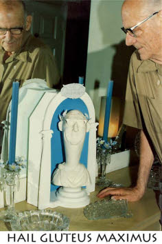
Ken O’Connor with selfcaricature bust, 1987. Photo by Nancy Beiman.