Starting Story Sketch: Compose Yourself
Tonal Sketches
At this point you have a rough story idea and rough character designs to act it out.
The verbal blueprint for your project must now be translated into visuals. A rough character lineup (such as the one in Figure 7-4) or an atmospheric sketch sets the characters’ scale to each other, to the background, and to important props. Placeholders such as the ones in Figure 10-1 are used to stage the action and acting on the boards if character designs have not yet been finalized.
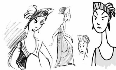
[Fig. 10-1] Very rough drawings will read as the same character if the silhouette values are good. This woman’s headdress and oval face make her easy to recognize when different artists draw her.
Scale must be determined at this stage to prevent problems later on. A storyboard using two adult-sized placeholder characters will need to be completely redrawn if one of them is later redesigned as a child, since eye-lines and horizon lines will change. Rough drawings will read as the same character even if different artists draw them,
as long as the character silhouette remains consistent. This system saves time since storyboards may be produced quickly using non-standardized placeholders. Sometimes boards are redrawn when final character models are set.
The characters’ appearance and personality will develop as they act and react on the storyboards. Storyboard drawings are frequently pasted up into “action only” model sheets to assist the character designers since the rough drawings show actions and expressions that the character needs to be able to perform in the film. This mutual feedback works equally well in feature, student, or independent films.
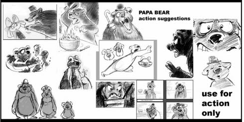
[Fig. 10-2] This action model sheet of Papa Bear is composed of rough storyboard drawings that capture his personality and typical actions. It is used by the animator for acting tips and by the designer as reference for the character’s final appearance.
The most important considerations in story sketch and character design are selection, simplification, and emphasis. You select what you want the viewer to see, simplify the staging so that there is a defined center of interest, and emphasize important elements in the scene.
The following elements are used to create a story sketch:
Line, value (light and shadow)
Silhouettes and shapes (consider both positive and negative space)
Texture
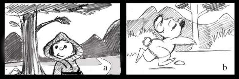
![]() Each board drawing should read from a minimum distance of 15 feet. Storyboards must read from a distance since they are commonly pitched to a large audience in a large story room. Tonal modeling enables the drawing to read from a far greater distance than boards done only in line. The two boards in Figure 10-3 demonstrate greater and lesser degrees of readability. Try viewing this illustration from the other side of the room. If you wear glasses, view the boards without them.
Each board drawing should read from a minimum distance of 15 feet. Storyboards must read from a distance since they are commonly pitched to a large audience in a large story room. Tonal modeling enables the drawing to read from a far greater distance than boards done only in line. The two boards in Figure 10-3 demonstrate greater and lesser degrees of readability. Try viewing this illustration from the other side of the room. If you wear glasses, view the boards without them.
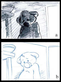
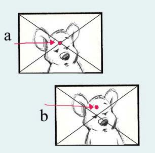
[Fig. 10-3] Storyboard (a) will be visible from the other side of the room. Storyboard (b) will not read unless the viewer is very close to the boards.
![]() The optical center of the screen is higher than the actual geometric center of the screen. The optical center is where the viewer’s vision goes first. It is located slightly above the actual center of the screen. Objects placed at the optical center will automatically draw the viewer’s attention. Staging and design can be utilized to counter the natural tendency to look at the optical center. Optical and actual screen centers are depicted in Figure 10-4.
The optical center of the screen is higher than the actual geometric center of the screen. The optical center is where the viewer’s vision goes first. It is located slightly above the actual center of the screen. Objects placed at the optical center will automatically draw the viewer’s attention. Staging and design can be utilized to counter the natural tendency to look at the optical center. Optical and actual screen centers are depicted in Figure 10-4.
[Fig. 10-4] The Optical center of the screen (a) is higher than the actual center (b). It is a frame’s focal point that is recognized first by the human eye.
Exercise: Create a simple palette of basic tonal ranges by dividing a rectangle into four sections as shown in Figure 10-5. The rectangle need not be very large.
- Use a soft pencil to put your darkest value in the top panel. Label this “a.”
- The lightest value is determined next. It will be at the bottom of your chart. If your lightest value is white, leave the bottom panel blank. If you are boarding a shadowy or foggy scene, the lightest value could be gray and not pure white. Whichever way you go, put your lightest tone at the bottom of the diagram and label it “b.”
- Next, take a value that is roughly halfway between the darkest and lightest. Put that tone on the second panel from the top and label it “c.”
- Take a tone halfway between your middle value “c” and lightest value “b,” put it in the third panel, and label it “d.”
Refer to these values when completing the storyboard exercises.
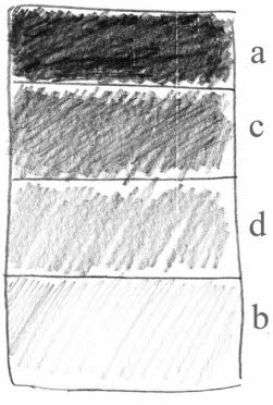
[Fig. 10-5] A progression of tonal values. Four should give you enough range to emphasize areas of the frame that you want the viewer to see first. You must be able to create the tones quickly on hundreds of boards. Contrast between these values can create a wide variety of moods and lighting effects.
Why use only four values? Why not use a dozen? Storyboards are revised so frequently that it would be a shame to spend hours creating full presentation boards only to see most of them “go by the boards” when the story changes (as it assuredly will). Simple tonal values add depth and readability to the boards with a minimum of tears. The number ‘four’ is merely the smallest number of values I recommend that you use. It is permissible to use five. You should not spend all your time working on fussy tonal details in the drawings at this stage. Your object should be to work quickly, concentrate on depicting important story points, and make the boards read well using simple line and a few distinct tonal values.
Tonal values set the mood of the sequence and direct the eye to the most important areas of the frame. Use tonal values to maximize readability. Line drawings are the least effective communicators. Figure 10-6 is a busy composition with no real emphasis on any particular area.
[Fig. 10-6] This linear composition is confusing and we don’t know where we are supposed to look.
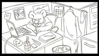
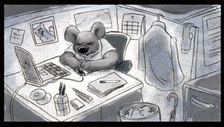
The strongest tonal contrast should appear on the areas of greatest importance. Poorly applied tonal values can read as badly as the pure lines used in Figure 10-6. In Figure 10-7, the coat on the wall appears to be the center of interest since it contains stronger tonal contrasts than the main character.
[Fig. 10-7] Our office guy is at his desk. His coat appears to be the center of interest since tonal values have been poorly applied.
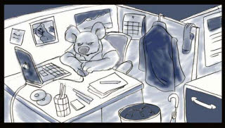
Good tonal values will create a feeling of depth in the scene, enable a drawing to read for the requisite 10-15 feet, and direct the eye to the center of interest. In Figure 10-8, the background has been “knocked down” (had its contrast reduced) by making it a single value. Different values indicate depth of field in the scene. The character is isolated by a pool of light that helps set the mood and improve the drawing’s readability.
[Fig 10-8] In this version tone places different elements at varying distances from the camera. Foreground silhouettes frame the shot and direct the eye toward the character. Background elements can be simple suggestions since they are not as important.
Exercise: Draw a storyboard panel in line similar to the one shown in Figure 10-6. Pin it on the wall and view it from the other side of the room. Does the image read clearly? Next, shade the central figure with your darkest tonal value (A). Use the lightest value (B) on the background and the two medium values (C, D) for prop or background detail. Pin the second drawing on the wall and view it from the other side of the room. The second drawing should read more clearly.
Graphic Images Ahead!
Silhouettes read best, but tone can work just as effectively to highlight important areas of the storyboard frame. Some common techniques used in graphic illustration are shown in Figure 10-9.
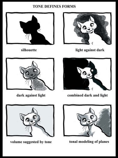
[Fig. 10-9] There is more than one way to skin a cat, or draw one!
Layout man Ken O’Connor always stressed that you “should not paint the Sistine Chapel ceiling for a three-second shot.” In other words, it is a waste of time and effort to put extensive detail onto your backgrounds if the scene is too short and the action too fast for the audience to see it. Background patterns can interfere with the character action. Figure 10-10 shows some problem backgrounds and their solutions. Elaborate backgrounds are better suited for long and medium shots. Simple tonal backgrounds work best for closer shots.
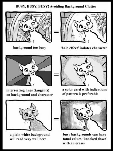
[Fig. 10-10] The character performance is the most important part of the storyboard in an animated film. Background detail should support it, not interfere with it.
Backgrounds can consist of a solid color (known as a ‘limbo’ or color-card background) that fits in with the rest of the sequence. If you have established your location and color scheme in earlier shots, scenes on color cards will seem to take place in the same location as boards with detailed backgrounds. Cutting, color, and consistent screen direction will create the illusion of action in a continuous space. Chuck Jones’ DUCK AMUCK uses many ‘limbo backgrounds’ with Daffy Duck emoting full-figure on the blank white movie screen for a large part of the picture.
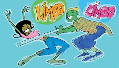
[Fig. 10-11] A ‘limbo’ background is also known as a color card.
The Drama in the Drawings: Using Contrast to Direct the Eye
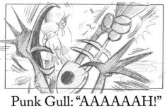
The human eye is drawn to the area of greatest contrast just as it is naturally drawn to the optical center of the frame. The most dramatic contrast is between black and white as shown in Figure 10-12, but this principle applies even if your tonal values are relatively close, as Figure 10-13 demonstrates.
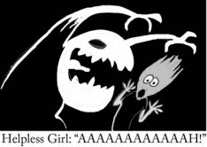
[Fig. 10-12, Fig. 10-13] A screaming gal in a monster movie and a screaming gull in a beach picture. The eye immediately goes to the areas of greatest tonal contrast even when the values are close, as shown in Figure 10-13.
I recommend that you use pencil, graphite, or charcoal to apply tones. It’s relatively easy to take an eraser to a board that is done in graphite or charcoal and “carve out” lighter values and highlights.
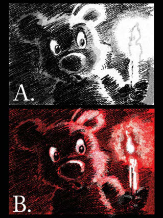
[Fig. 10-14] Boards may be drawn on black or colored paper with white and colored pastels and pencils. Highlights may be “carved out” with an eraser. The red panel is more dramatic than the black-and-white version.
It’s very hard to change a tonal value on a board that’s been done in marker. This is not an issue if you are comfortable with this medium and don’t mind doing your boards over again when changes are made. A marker board appears in Figure 10-15.

[Fig 10-15] An example of a storyboard with tonal values done in marker.

[Fig. 10-16] Computer graphics make it easy to vary tonal values on the same background.
You may wish to do your storyboards on computer but this has its drawbacks. The computer screen’s small size (when compared to that of a storyboard) makes it difficult to view more than two or three panels at a time—which can lead to serious problems since entire storyboards must often be reworked and reviewed on a daily basis. A computer screen may only be seen clearly by three or four people. Drawn panels pinned
to the wall are the easiest way for a group of people to view all of the artwork in a sequence at once during a pitch or turnover session. Paper storyboards can be easily and inexpensively changed by adding, rearranging, or deleting panels. The story crew is not dependent on the availability or functionality of software, hardware, codecs, or operating systems. Computer graphics programs can easily resize, flop, change tones, and re-composite existing artwork when you create the story reel or animatic. They are invaluable aids to animation production—after the boards have been drawn.
The Best Laid Floor Plans
For the sake of argument let us assume that your story and characters work with props and visual landmarks in a recognizable location. Drawing a simple floor plan will help you stage major scenic elements, such as doors and windows, along with furniture and other inanimate objects. If your picture is set outdoors, you can place landmarks such as rocks, paths, streams, and trees into the floor plan. ‘Wild’ forests are always meticulously planned in animation!
Floor plans are usually shown from a three-quarter angle or a top-down view. I prefer the top-down view since it shows all portions of the location equally well and lets you block your character’s action with little effort. The three-quarter view is useful for establishing character scale to props or other elements in the shot. A three-quarter floor plan is necessary for CGI projects that literally create the background in the third dimension, as shown in Figure 10-17.
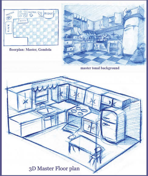
[Fig. 10-17] The artist creates a floor plan viewed from overhead and the tonal background based on it. A three-quarter view floor plan is a more accurate indication of scale. Reproduced by permission of William Robinson.
At this stage you may work up a tonal Master Background based on your floor plan, but this is not always necessary. I have worked on productions that were handled both ways. In some instances the art director provided a master background with tonals
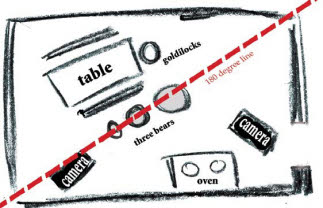
for the board artists to work with. This was a useful tool since the action involved multiple characters in a busy kitchen with several work tables on the floor, a huge fireplace along one wall, prop-laden shelves, and doors at opposite ends of the room. An example of a master background and an elaborate floor plan of this type are shown in Figure 10-18. Master backgrounds typically include the characters to indicate relative sizes and scales.
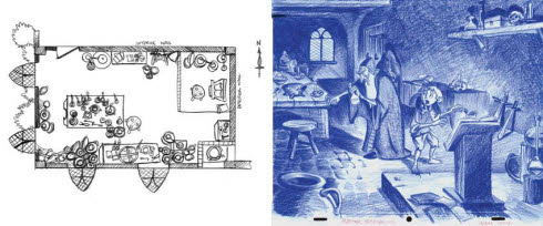
[Fig. 10-18] This floor plan locates the windows and every dish on the table. The master background includes the characters for scale. Reproduced by permission of Adam Fox.
Not every location needs a floor plan. Figure 10-19 shows characters on a color card (a) and (b) on a background in deep space. The kangaroo and koala appear to be stationary when placed on a color card. The starfield background suggests that they are flying. It is not necessary to plot the location of each planet or nebula in the background since the characters do not interact with them.
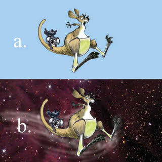
[Fig. 10-19] Characters (a) pose on a color card or (b) move through outer space.
Whose viewpoint is the action seen from? Do we see it from a God’s-eye-view or from the perspective of one of the characters? Staging will affect the mood of the scene. Figure 10-20 shows two panels illustrating a very old joke. The flat staging in (a) reads well enough, but it does not indicate the atmosphere or the characters’ mood. Figure (b) uses an upshot to literally put the kangaroo’s head in the air as he delivers the corny punch line with obvious distaste. Several versions of the second panel are thumbnailed below the storyboards. Thumbnail 1 uses the same flat staging as storyboard (a), but the camera has pulled back to add depth to the shot as the kangaroo walks away from the bar. Characters may advance or retreat from the picture plane to create the illusion of the third dimension.
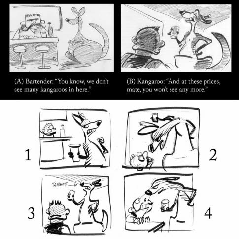
[Fig. 10-20] “This kangaroo walks into a bar.…” A dramatic upshot in the second panel shows the relationship of the characters in the shot. Thumbnails show how the scene would read with different camera angles and character attitudes.
Work for an interesting variety of shots. Each shot must contribute to the story. Don’t use extreme cuts because you can; use them when they are the best way to stage the action. Medium shots and long shots distance us from the characters; close-ups can show us their reactions and inner thoughts. Successful animation has been created in one single shot, but it tends to be very short. Use film grammar correctly. Thumbnail a scene from different angles to see which one works best for your story. An example of this technique is shown in Figure 10-21.
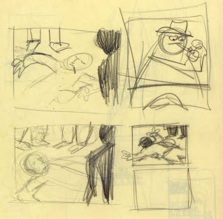
[Fig. 10-21] Thumbnail drawings by T. Hee showing three possible angles for the same storyboard panel. (Nancy Beiman collection)
The mood of the scene changes along with the staging. Low-angle or high-angle shots can indicate tension or show one character dominating another in the scene. The viewpoint can be ours, or that of one of the characters. Ken O’Connor recommended drawing a floor plan with cameras blocked in at different angles, as shown in Figure 10-22.
[Fig. 10-22] Ken O’Connor suggested adding camera indications to a simple floor plan. This helps the artist choose the best angle for the shot.
Here are some guidelines to follow when creating storyboards:
- Work for clarity of staging.
- Simple staging is always the best.
- Make sure that your shots work into one another.
- Use good film grammar.
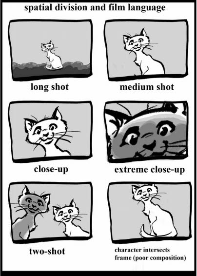
[Fig. 10-23] Use the language of film to tell your story. A close-up is more intimate than a long shot. Don’t jam characters against the frame line.
“Matching horizons on a cut” is a common error. Characters will appear to pop on and off the screen if the background perspective remains the same in every cut. Maintain eye-lines when characters are speaking to one another. Figure 10-24 shows an example of poor eye-line continuity and matching horizons. Who are Goldilocks and Papa Bear talking to and where are they standing?
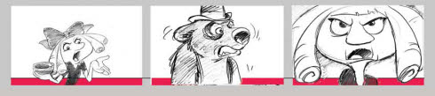
[Fig. 10-24] Poor film grammar will distract from your story. Characters’ eye-lines should make us believe that they are looking at one another. Matching horizon lines on a cut give the impression that the characters are popping on and off the same background.
Do not animate the camera. Work out action thoroughly for story points before determining cuts and camera moves. Concentrate on the best staging of the action. Use the moving camera to help tell the story, not distract from it.
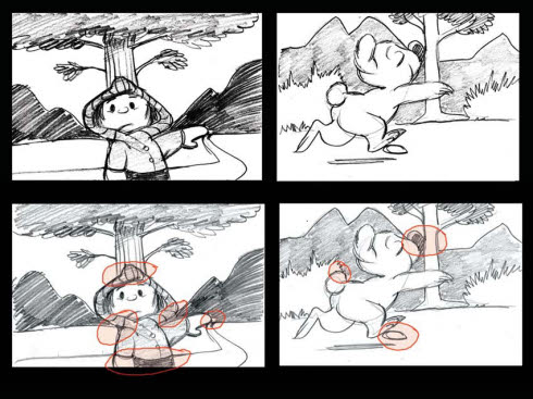
Design your frames. Use props and the design of the character to create good silhouette value within the frame. Certain objects can serve as directional elements or “pointers” to direct the viewer’s attention to a specific part of the frame. All elements in the frame should have a purpose and help tell the story. The wolves in Figure 10-25 are giant “pointers” leading our eyes to the center of interest.
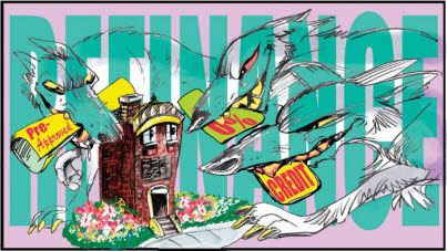
[Fig. 10-25] Directional elements in the background and foreground act as “pointers” directing your attention to the center of interest. Illustration by Nancy Beiman from the film IN DEBT WE TRUST, reproduced by permission of Globalvision Inc.
Tangents are intersecting lines that direct the viewer’s attention to a specific point. This tangential action can be involuntary. It is commonly used in design and graphics, but is generally avoided in animation since it flattens the composition and destroys the illusion of depth in the frame. Figure 10-26 shows two frames with numerous tangential absurdities such as a tree that appears to grow from a little girl’s head. The tangents are corrected in Figure 10-27.
[Fig. 10-26] Tangential lines flatten perspective and eliminate differentiation between the characters and the backgrounds. They can also direct the eye to an important part of the composition, but too often the tangent distracts from the center of interest. Tangential areas are highlighted in red.
[Fig. 10-27] Panel (a) moves the background, (b) moves the character. Tangents disappear and the illusion of the third dimension is restored.
Use tonal values, not pure line. Storyboards work best in tone. Linear ones do not read as well from a distance and they won’t show moods or time of day. There is also a danger of losing the characters against a busy background. Tonal values can be applied and modified to direct the eye precisely where you want it to go. (Figure 10-28)
[Fig. 10-28] Close tonal values helps knock the patterns in the background down and focus our attention on the characters. A section of the tonal background can be rubbed out with a kneaded eraser for a ‘halo effect’ around the center of interest. Reproduced by permission of William Robinson.
Color should not be used unless it is absolutely necessary. Sometimes color will help put over a story point—for example, when red is used for Little Red Riding Hood’s cloak as shown in Figure 10-29b. A blushing or intoxicated character might have its nose or face colored red to convey the story point.
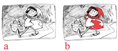
[Fig. 10-29] Rendering result: Red Riding Hood reads right.
Figure 10-30 shows panels from a storyboard that used the characters’ color as an important part of the story. Color, especially the color of the symbols on their heads, signified life. Gray values symbolized death and sadness. Color gave individuality to characters with nearly identical silhouettes. The boards could have been done in grayscale but were far more effective in color.
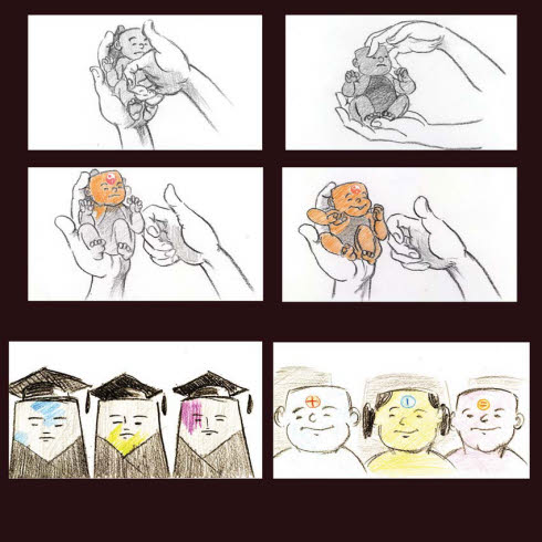
[Fig. 10-30] The hero and heroine of this story were brought to life through color and bore brightly colored life-symbols on their foreheads. Gray tonal values were used for the backgrounds and a symbolic death-figure. A character died when its color faded to gray. Reproduced by permission of Rui Jin.
Lastly, avoid placing the character directly against the frame line. This creates a tangent, and it is also weak staging. A portion of the aperture is lost when the film is projected (depending on the medium, the “safety” area can be up to 15% of the picture area). Portions of your character may be cut off by the frame. All lettering must be created inside this ‘safety zone’ or else it may be cut off when the film is projected, as shown in Figure 10-31. Figure 10-32 corrects the problem. Note that the man’s arm is no longer parallel to the frame line.
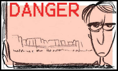
[Fig. 10-31] Characters and lettering must fall within the letter-safe area. Modern monitors have larger safety areas than older ones, but a portion of the frame is invariably lost. Characters’ heads and bodies should not intersect the frame. The portion of the image that is in the white area will be cut off when the film is screened. Red tones indicate the lettering safety area.
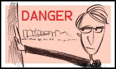
[Fig. 10-32] The action and text now appear well within the letter-safe area. The man’s arm is staged at a diagonal to eliminate parallels with the frame.
All the world’s a stage and the people merely players. But animators design the stage and the players and then stage the action. Chapter 11 examines this paradox.